Methods of representing multi-dimensional data in visualizations
VerifiedAdded on 2022/10/17
|4
|2585
|112
AI Summary
This paper contains a literature review on various methods for representing multidimensional data visualization, required in business analytics. Scatter plot, treemaps, box plots, line graphs, permutation matrix are some of the visualization methods that have been discussed in this paper.
Contribute Materials
Your contribution can guide someone’s learning journey. Share your
documents today.
Header: FOR CONFERENCE-RELATED PAPERS, REPLACE THIS LINE WITH YOUR SESSION NUMBER, E.G., AB-02 (DOUBLE-CLICK HERE)
Methods of representing multi-dimensional data in
visualizations
Authors Name/s per 1st Affiliation (Author)
line 1 (of Affiliation): dept. name of organization
line 2: name of organization, acronyms acceptable
line 3: City, Country
line 4: e-mail address if desired
Authors Name/s per 2nd Affiliation (Author)
line 1 (of Affiliation): dept. name of organization
line 2: name of organization, acronyms acceptable
line 3: City, Country
line 4: e-mail address if desired
Abstract— This paper contains a literature review on various
methods for representing multidimensional data visualization,
required in business analytics. An extensive study of various
literatures has shown that there are multiple techniques that can
be used for representing multidimensional data. In business
cases, usually the issues and the forecasting data contain various
dimensions and it is highly important to present data
visualization as it helps in representing the findings in an easier
and comprehensible manner. Thus, based on the nature and
dimensions, effective visualization tool should be chosen by the
analysts. Scatter plot, treemaps, box plots, line graphs,
permutation matrix are some of the visualization methods that
have been discussed in this paper.
Keywords- multidimensional data, data visualization, business
analytics, visualization techniques
I. INTRODUCTION
nformation visualization is very important aspect in data
analysis and business analytics. The field of business
analytics deals with large amount of data related to the
business cases. It requires detailed investigation to get the
solution to the business problems and to forecast the business
performances [14]. However, it is often impossible to present
the summary of analytical findings in a qualitative form,
which can be comprehended in a simpler manner. Thus, data
visualization is highly essential to present a snapshot of the
findings so that it is easier to have an idea about the pattern of
the data and its characteristics as well as the solution it is
providing. The business cases in economics or statistics or in
the corporate business management often contain
multidimensional data. As stated by Tang et al. (2017),
multidimensional data is referred to the information with more
than two dimensions. The data with two dimensions is called
Panel data, and when it contains more than two dimensions, it
is known as multidimensional data. For example, some
business forecast information contains more than one or two
target periods, and the forecasts were conducted by multiple
forecasters and conducted at different time periods, covering
several time horizons. Information covering all these aspects
have more insights than the one or two-dimensional panel data
can provide [1]. Thus, it can be inferred that as businesses
I
consist of various aspects and cover several time periods, the
forecasts also contain several dimensions and thus,
multidimensional business analytics is required for business
forecasts and performance analysis. In this analytical
approach, data visualization is used to provide insights into the
financial performance of the business over various
dimensions, based on which forecasts are made.
Multidimensional visualization is highly beneficial when
comprehending various dimensions in the business becomes
difficult [2].
Over the years, as technology has been getting advanced,
many data visualization tools have been developed for more
efficient visual exploration of the multidimensional business
information. Scatter plot, star plot, radar plot, tree plot,
conditional plot, contour plot, surface plot, Cell mean
plot/Aiken and West's plot, box plot, multiple line graphs,
Permutation matrix, Principal component analysis (PCA),
Sammon’s mapping, Self-Organizing Maps (SOM) and many
more techniques are used for multidimensional data
visualizations [3]. Each have different characteristics, but their
main purpose is same, that is, to present the data visualization
efficiently. This paper will present a comprehensive literature
review or discussion on different tools and methods for
presenting multidimensional information in an efficient and
simpler manner. A comparative discussion will also be made
to provide an overview of the benefits and drawbacks of these
visualization methods and recommendations will be provided
to utilize the tools effectively.
II. DISCUSSION
A. Various visualization methods for presenting multi-
dimensional data
Data visualization is a method of communication of the
data in the form of visuals or graphics and in this process, the
raw information are turned into useful insights, which can be
easily comprehended by the readers [4]. The most commonly
used multidimensional data visualization methods include
scatter plot, pie charts, stacked bar graphs, histograms and
0018-9464 © 2015 IEEE. Personal use is permitted, but republication/redistribution requires IEEE permission.
See http://www.ieee.org/publications_standards/publications/rights/index.html for more information. (Inserted by IEEE.)
Secure Best Marks with AI Grader
Need help grading? Try our AI Grader for instant feedback on your assignments.
Header: FOR CONFERENCE-RELATED PAPERS, REPLACE THIS LINE WITH YOUR SESSION NUMBER, E.G., AB-02 (DOUBLE-CLICK HERE)
Venn diagrams [5]. All the above mentioned techniques help
to present the features and pattern of multidimensional data in
a comprehensive manner. Various software packages are
available these days for data visualizations, such as, Data
Desk, MatLab, SPSS, SAS etc., which can present 3D scatter
plot with user interactivity. These are helpful as these
interfaces produce flexibility to the users to dynamically
explore the multidimensional picture which is generated from
raw information [6]. Few data visualization methods are
discussed below.
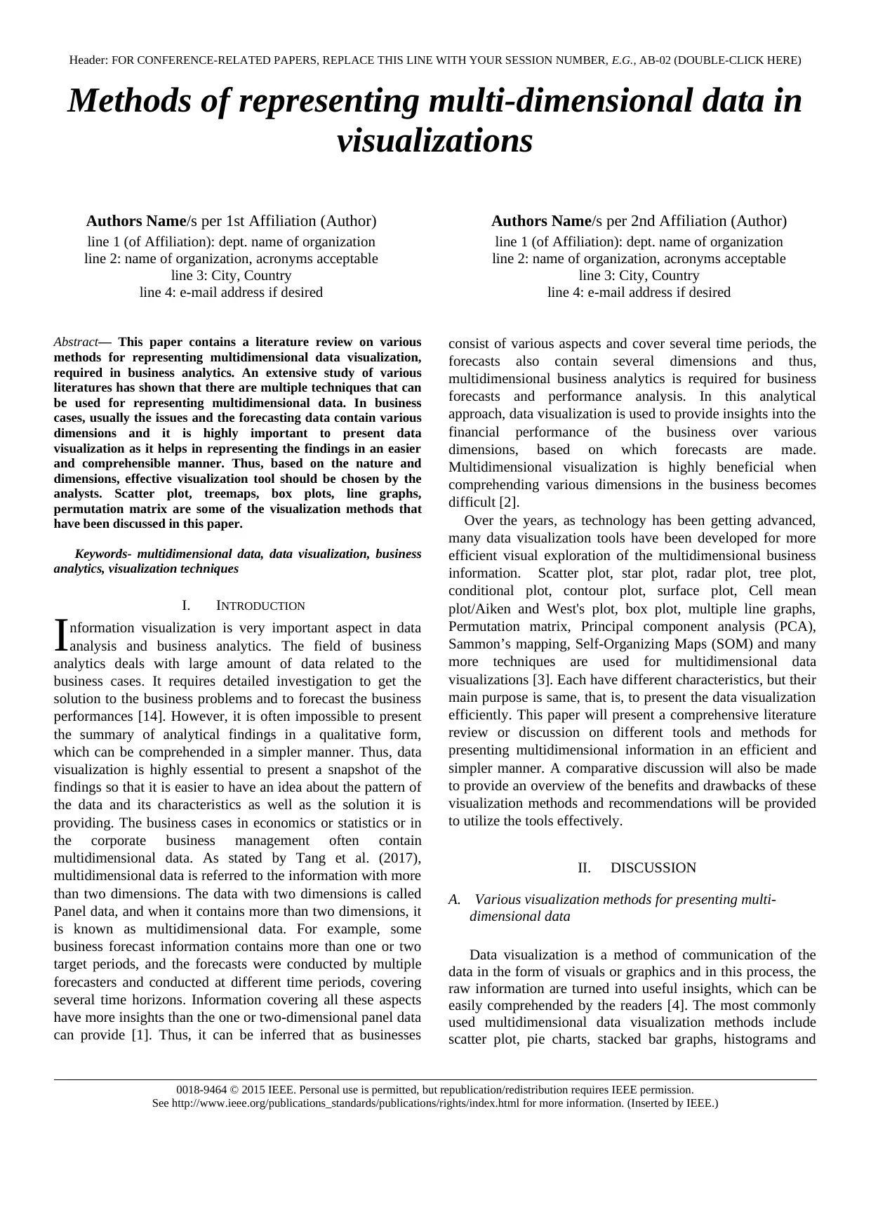
Line graphs are a measure of representing one-dimensional
information by the combination of the points from horizontal
and vertical axis. To present multiple information, multiple
line graphs are presented, and, different dimensions of the data
such as regions can be presented through different colors, as
shown in the diagram below.
Figure 1: Line graphs presenting multidimensional data
(Source: Marghescu 2007)
In a financial dataset containing the operating margin
(OM) and Return on Equity (ROE) for companies operating in
5 regions, Europe, North Europe, USA, Canada and Japan are
presented in the above manner [7].
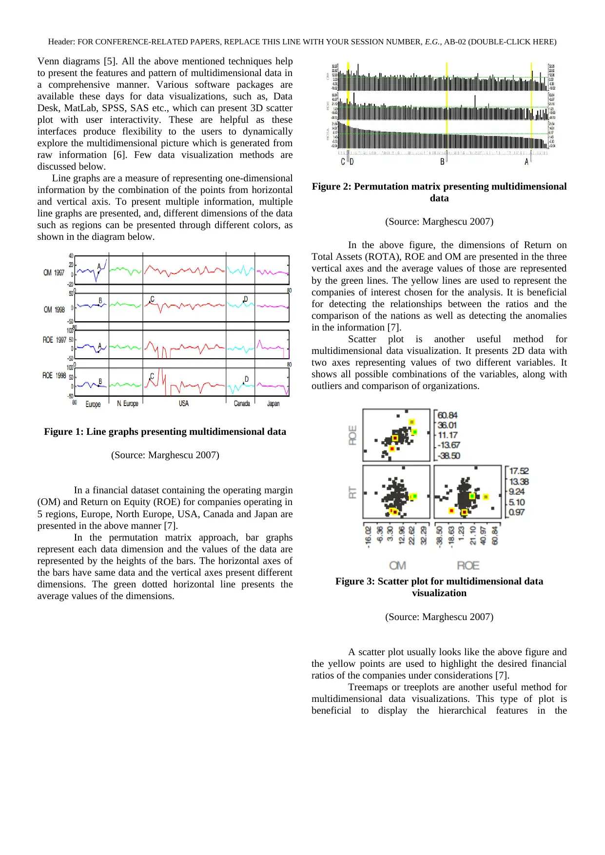
In the permutation matrix approach, bar graphs
represent each data dimension and the values of the data are
represented by the heights of the bars. The horizontal axes of
the bars have same data and the vertical axes present different
dimensions. The green dotted horizontal line presents the
average values of the dimensions.
Figure 2: Permutation matrix presenting multidimensional
data
(Source: Marghescu 2007)
In the above figure, the dimensions of Return on
Total Assets (ROTA), ROE and OM are presented in the three
vertical axes and the average values of those are represented
by the green lines. The yellow lines are used to represent the
companies of interest chosen for the analysis. It is beneficial
for detecting the relationships between the ratios and the
comparison of the nations as well as detecting the anomalies
in the information [7].
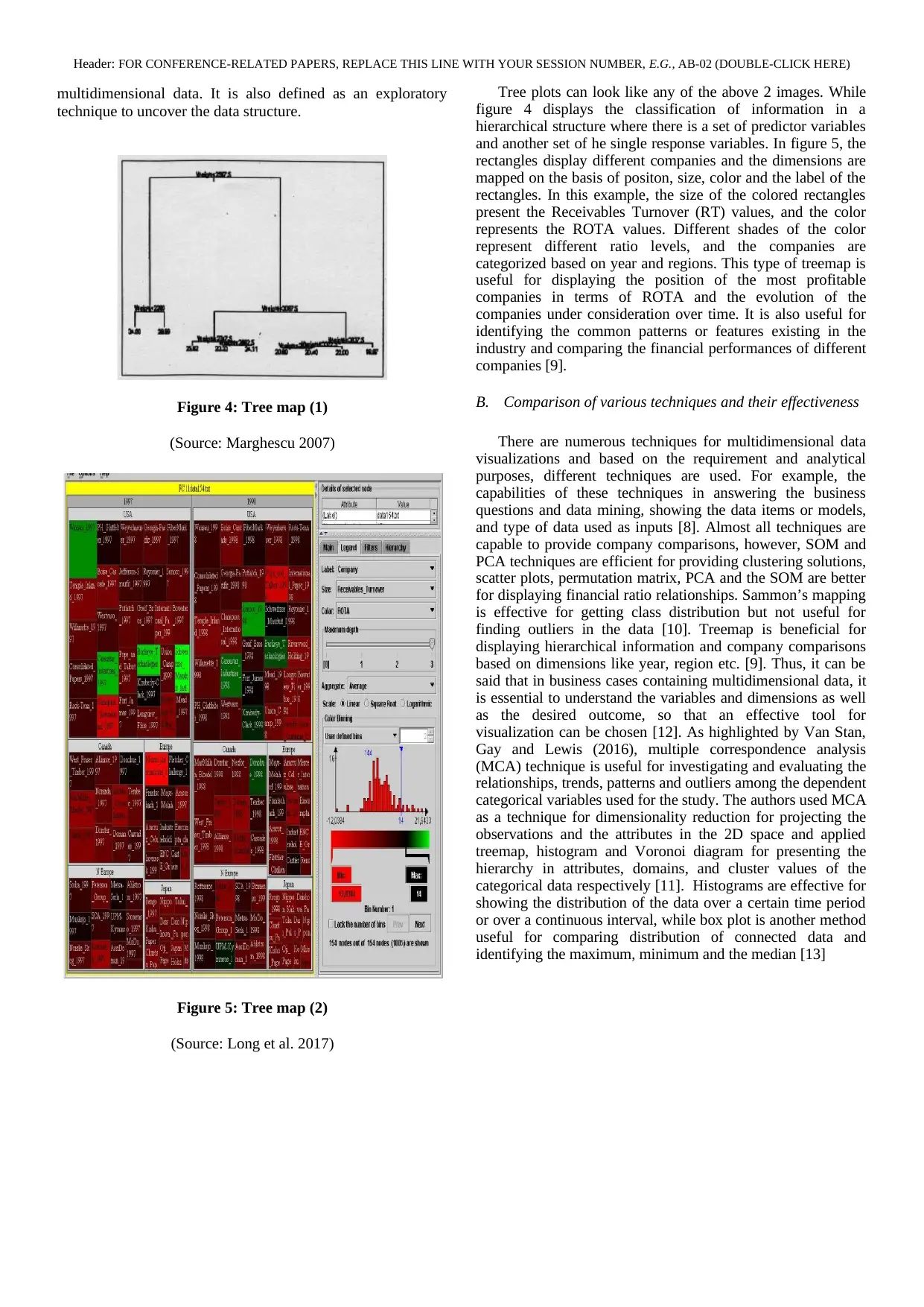
Scatter plot is another useful method for
multidimensional data visualization. It presents 2D data with
two axes representing values of two different variables. It
shows all possible combinations of the variables, along with
outliers and comparison of organizations.
Figure 3: Scatter plot for multidimensional data
visualization
(Source: Marghescu 2007)
A scatter plot usually looks like the above figure and
the yellow points are used to highlight the desired financial
ratios of the companies under considerations [7].
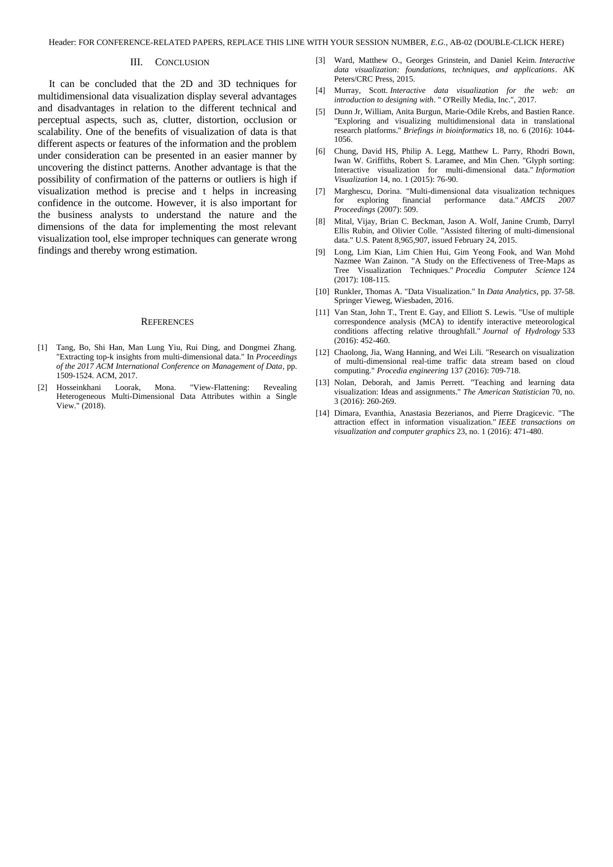
Treemaps or treeplots are another useful method for
multidimensional data visualizations. This type of plot is
beneficial to display the hierarchical features in the
Venn diagrams [5]. All the above mentioned techniques help
to present the features and pattern of multidimensional data in
a comprehensive manner. Various software packages are
available these days for data visualizations, such as, Data
Desk, MatLab, SPSS, SAS etc., which can present 3D scatter
plot with user interactivity. These are helpful as these
interfaces produce flexibility to the users to dynamically
explore the multidimensional picture which is generated from
raw information [6]. Few data visualization methods are
discussed below.
Line graphs are a measure of representing one-dimensional
information by the combination of the points from horizontal
and vertical axis. To present multiple information, multiple
line graphs are presented, and, different dimensions of the data
such as regions can be presented through different colors, as
shown in the diagram below.
Figure 1: Line graphs presenting multidimensional data
(Source: Marghescu 2007)
In a financial dataset containing the operating margin
(OM) and Return on Equity (ROE) for companies operating in
5 regions, Europe, North Europe, USA, Canada and Japan are
presented in the above manner [7].
In the permutation matrix approach, bar graphs
represent each data dimension and the values of the data are
represented by the heights of the bars. The horizontal axes of
the bars have same data and the vertical axes present different
dimensions. The green dotted horizontal line presents the
average values of the dimensions.
Figure 2: Permutation matrix presenting multidimensional
data
(Source: Marghescu 2007)
In the above figure, the dimensions of Return on
Total Assets (ROTA), ROE and OM are presented in the three
vertical axes and the average values of those are represented
by the green lines. The yellow lines are used to represent the
companies of interest chosen for the analysis. It is beneficial
for detecting the relationships between the ratios and the
comparison of the nations as well as detecting the anomalies
in the information [7].
Scatter plot is another useful method for
multidimensional data visualization. It presents 2D data with
two axes representing values of two different variables. It
shows all possible combinations of the variables, along with
outliers and comparison of organizations.
Figure 3: Scatter plot for multidimensional data
visualization
(Source: Marghescu 2007)
A scatter plot usually looks like the above figure and
the yellow points are used to highlight the desired financial
ratios of the companies under considerations [7].
Treemaps or treeplots are another useful method for
multidimensional data visualizations. This type of plot is
beneficial to display the hierarchical features in the
Header: FOR CONFERENCE-RELATED PAPERS, REPLACE THIS LINE WITH YOUR SESSION NUMBER, E.G., AB-02 (DOUBLE-CLICK HERE)
multidimensional data. It is also defined as an exploratory
technique to uncover the data structure.
Figure 4: Tree map (1)
(Source: Marghescu 2007)
Figure 5: Tree map (2)
(Source: Long et al. 2017)
Tree plots can look like any of the above 2 images. While
figure 4 displays the classification of information in a
hierarchical structure where there is a set of predictor variables
and another set of he single response variables. In figure 5, the
rectangles display different companies and the dimensions are
mapped on the basis of positon, size, color and the label of the
rectangles. In this example, the size of the colored rectangles
present the Receivables Turnover (RT) values, and the color
represents the ROTA values. Different shades of the color
represent different ratio levels, and the companies are
categorized based on year and regions. This type of treemap is
useful for displaying the position of the most profitable
companies in terms of ROTA and the evolution of the
companies under consideration over time. It is also useful for
identifying the common patterns or features existing in the
industry and comparing the financial performances of different
companies [9].
B. Comparison of various techniques and their effectiveness
There are numerous techniques for multidimensional data
visualizations and based on the requirement and analytical
purposes, different techniques are used. For example, the
capabilities of these techniques in answering the business
questions and data mining, showing the data items or models,
and type of data used as inputs [8]. Almost all techniques are
capable to provide company comparisons, however, SOM and
PCA techniques are efficient for providing clustering solutions,
scatter plots, permutation matrix, PCA and the SOM are better
for displaying financial ratio relationships. Sammon’s mapping
is effective for getting class distribution but not useful for
finding outliers in the data [10]. Treemap is beneficial for
displaying hierarchical information and company comparisons
based on dimensions like year, region etc. [9]. Thus, it can be
said that in business cases containing multidimensional data, it
is essential to understand the variables and dimensions as well
as the desired outcome, so that an effective tool for
visualization can be chosen [12]. As highlighted by Van Stan,
Gay and Lewis (2016), multiple correspondence analysis
(MCA) technique is useful for investigating and evaluating the
relationships, trends, patterns and outliers among the dependent
categorical variables used for the study. The authors used MCA
as a technique for dimensionality reduction for projecting the
observations and the attributes in the 2D space and applied
treemap, histogram and Voronoi diagram for presenting the
hierarchy in attributes, domains, and cluster values of the
categorical data respectively [11]. Histograms are effective for
showing the distribution of the data over a certain time period
or over a continuous interval, while box plot is another method
useful for comparing distribution of connected data and
identifying the maximum, minimum and the median [13]
Header: FOR CONFERENCE-RELATED PAPERS, REPLACE THIS LINE WITH YOUR SESSION NUMBER, E.G., AB-02 (DOUBLE-CLICK HERE)
III. CONCLUSION
It can be concluded that the 2D and 3D techniques for
multidimensional data visualization display several advantages
and disadvantages in relation to the different technical and
perceptual aspects, such as, clutter, distortion, occlusion or
scalability. One of the benefits of visualization of data is that
different aspects or features of the information and the problem
under consideration can be presented in an easier manner by
uncovering the distinct patterns. Another advantage is that the
possibility of confirmation of the patterns or outliers is high if
visualization method is precise and t helps in increasing
confidence in the outcome. However, it is also important for
the business analysts to understand the nature and the
dimensions of the data for implementing the most relevant
visualization tool, else improper techniques can generate wrong
findings and thereby wrong estimation.
REFERENCES
[1] Tang, Bo, Shi Han, Man Lung Yiu, Rui Ding, and Dongmei Zhang.
"Extracting top-k insights from multi-dimensional data." In Proceedings
of the 2017 ACM International Conference on Management of Data, pp.
1509-1524. ACM, 2017.
[2] Hosseinkhani Loorak, Mona. "View-Flattening: Revealing
Heterogeneous Multi-Dimensional Data Attributes within a Single
View." (2018).
[3] Ward, Matthew O., Georges Grinstein, and Daniel Keim. Interactive
data visualization: foundations, techniques, and applications. AK
Peters/CRC Press, 2015.
[4] Murray, Scott. Interactive data visualization for the web: an
introduction to designing with. " O'Reilly Media, Inc.", 2017.
[5] Dunn Jr, William, Anita Burgun, Marie-Odile Krebs, and Bastien Rance.
"Exploring and visualizing multidimensional data in translational
research platforms." Briefings in bioinformatics 18, no. 6 (2016): 1044-
1056.
[6] Chung, David HS, Philip A. Legg, Matthew L. Parry, Rhodri Bown,
Iwan W. Griffiths, Robert S. Laramee, and Min Chen. "Glyph sorting:
Interactive visualization for multi-dimensional data." Information
Visualization 14, no. 1 (2015): 76-90.
[7] Marghescu, Dorina. "Multi-dimensional data visualization techniques
for exploring financial performance data." AMCIS 2007
Proceedings (2007): 509.
[8] Mital, Vijay, Brian C. Beckman, Jason A. Wolf, Janine Crumb, Darryl
Ellis Rubin, and Olivier Colle. "Assisted filtering of multi-dimensional
data." U.S. Patent 8,965,907, issued February 24, 2015.
[9] Long, Lim Kian, Lim Chien Hui, Gim Yeong Fook, and Wan Mohd
Nazmee Wan Zainon. "A Study on the Effectiveness of Tree-Maps as
Tree Visualization Techniques." Procedia Computer Science 124
(2017): 108-115.
[10] Runkler, Thomas A. "Data Visualization." In Data Analytics, pp. 37-58.
Springer Vieweg, Wiesbaden, 2016.
[11] Van Stan, John T., Trent E. Gay, and Elliott S. Lewis. "Use of multiple
correspondence analysis (MCA) to identify interactive meteorological
conditions affecting relative throughfall." Journal of Hydrology 533
(2016): 452-460.
[12] Chaolong, Jia, Wang Hanning, and Wei Lili. "Research on visualization
of multi-dimensional real-time traffic data stream based on cloud
computing." Procedia engineering 137 (2016): 709-718.
[13] Nolan, Deborah, and Jamis Perrett. "Teaching and learning data
visualization: Ideas and assignments." The American Statistician 70, no.
3 (2016): 260-269.
[14] Dimara, Evanthia, Anastasia Bezerianos, and Pierre Dragicevic. "The
attraction effect in information visualization." IEEE transactions on
visualization and computer graphics 23, no. 1 (2016): 471-480.
1 out of 4


Your All-in-One AI-Powered Toolkit for Academic Success.
+13062052269
info@desklib.com
Available 24*7 on WhatsApp / Email
![[object Object]](/_next/static/media/star-bottom.7253800d.svg)
Unlock your academic potential
© 2024 | Zucol Services PVT LTD | All rights reserved.