Comprehensive User Experience Review of Hyperloop Mobile App
VerifiedAdded on 2019/09/20
|12
|3264
|377
Report
AI Summary
This report offers a comprehensive user experience (UX) review of the Hyperloop mobile application. The review analyzes various aspects of the app, including its functionality, design, and usability across different screens such as the home screen, sign-in, registration, and trip planning sections. The report identifies both strengths and weaknesses in the app's interface, providing specific suggestions for improvement. These include recommendations for enhancing visual elements like contrast and image integration, improving button placement and styling, and ensuring consistency across the application. The report emphasizes the importance of adhering to UX best practices to enhance user satisfaction and efficiency, ultimately aiming to provide a more intuitive and enjoyable user experience for the Hyperloop mobile app.
Running head: USER EXPERIENCE REVIEW OF HYPERLOOP MOBILE APP
User Experience Review of Hyperloop Mobile App
Your Name (First M. Last)
School or Institution Name (University at Place or Town, State)
1
User Experience Review of Hyperloop Mobile App
Your Name (First M. Last)
School or Institution Name (University at Place or Town, State)
1
Paraphrase This Document
Need a fresh take? Get an instant paraphrase of this document with our AI Paraphraser
USER EXPERIENCE REVIEW OF HYPERLOOP MOBILE APP
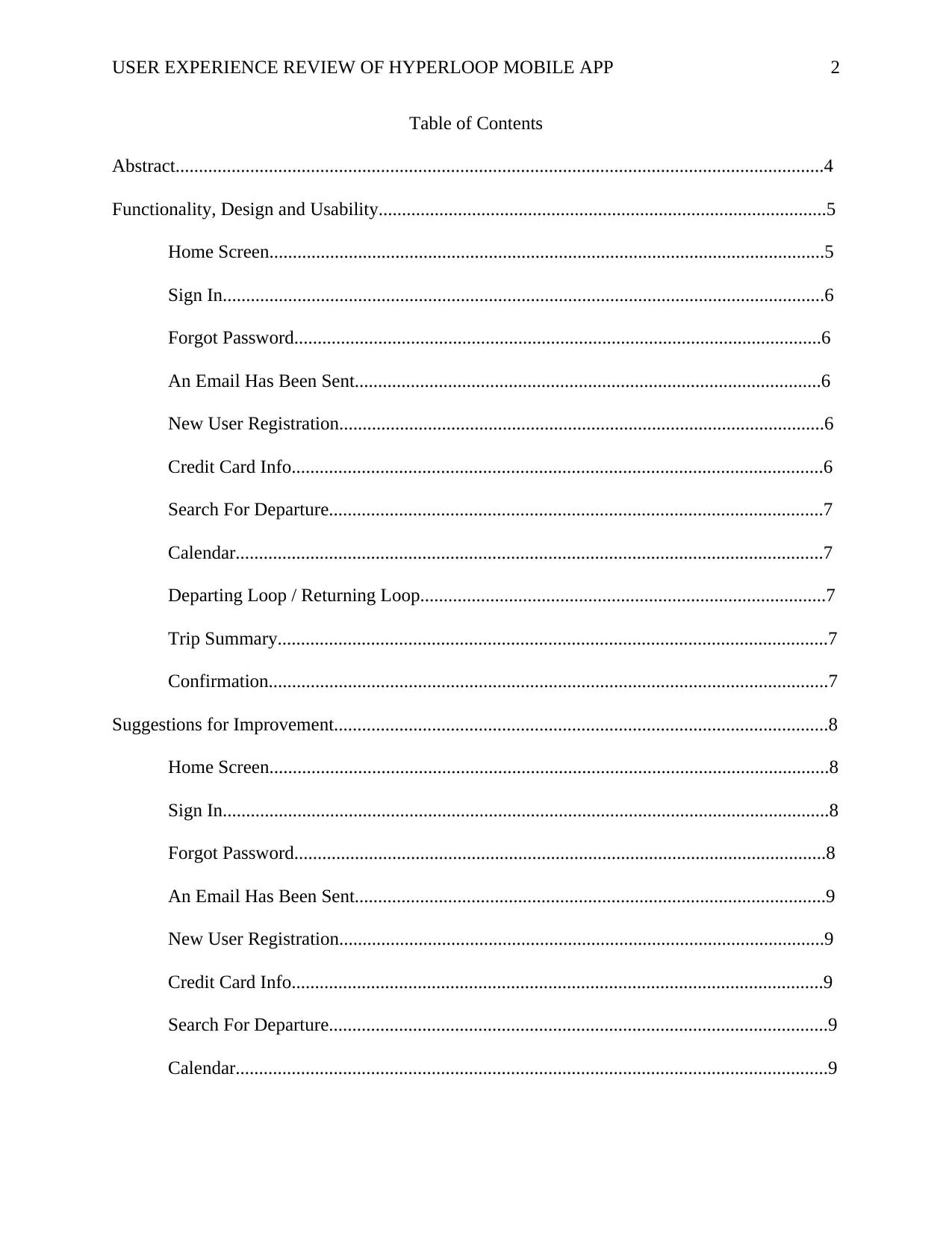
Table of Contents
Abstract...........................................................................................................................................4
Functionality, Design and Usability................................................................................................5
Home Screen.......................................................................................................................5
Sign In.................................................................................................................................6
Forgot Password.................................................................................................................6
An Email Has Been Sent....................................................................................................6
New User Registration........................................................................................................6
Credit Card Info..................................................................................................................6
Search For Departure..........................................................................................................7
Calendar..............................................................................................................................7
Departing Loop / Returning Loop.......................................................................................7
Trip Summary......................................................................................................................7
Confirmation........................................................................................................................7
Suggestions for Improvement..........................................................................................................8
Home Screen........................................................................................................................8
Sign In..................................................................................................................................8
Forgot Password..................................................................................................................8
An Email Has Been Sent.....................................................................................................9
New User Registration........................................................................................................9
Credit Card Info..................................................................................................................9
Search For Departure...........................................................................................................9
Calendar...............................................................................................................................9
2
USER EXPERIENCE REVIEW OF HYPERLOOP MOBILE APP
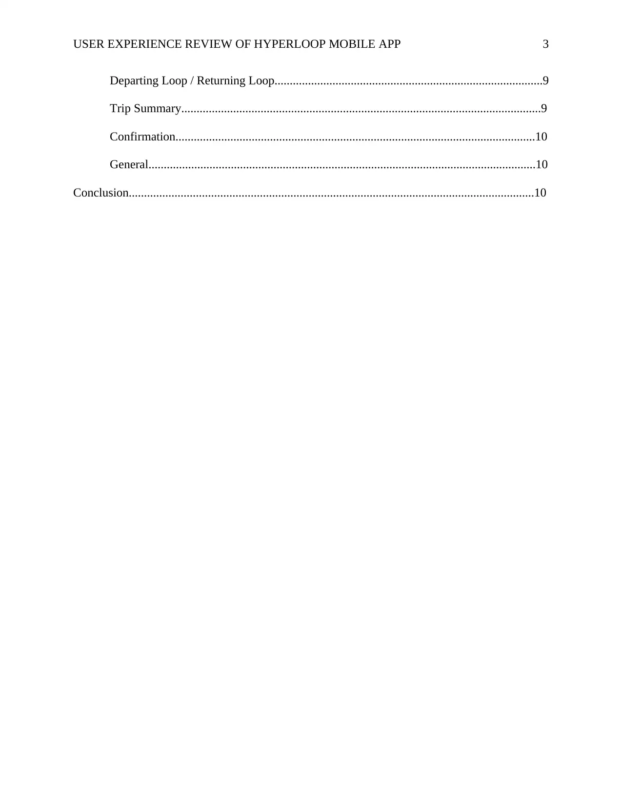
Departing Loop / Returning Loop........................................................................................9
Trip Summary......................................................................................................................9
Confirmation......................................................................................................................10
General...............................................................................................................................10
Conclusion.....................................................................................................................................10
3
⊘ This is a preview!⊘
Do you want full access?
Subscribe today to unlock all pages.

Trusted by 1+ million students worldwide
USER EXPERIENCE REVIEW OF HYPERLOOP MOBILE APP
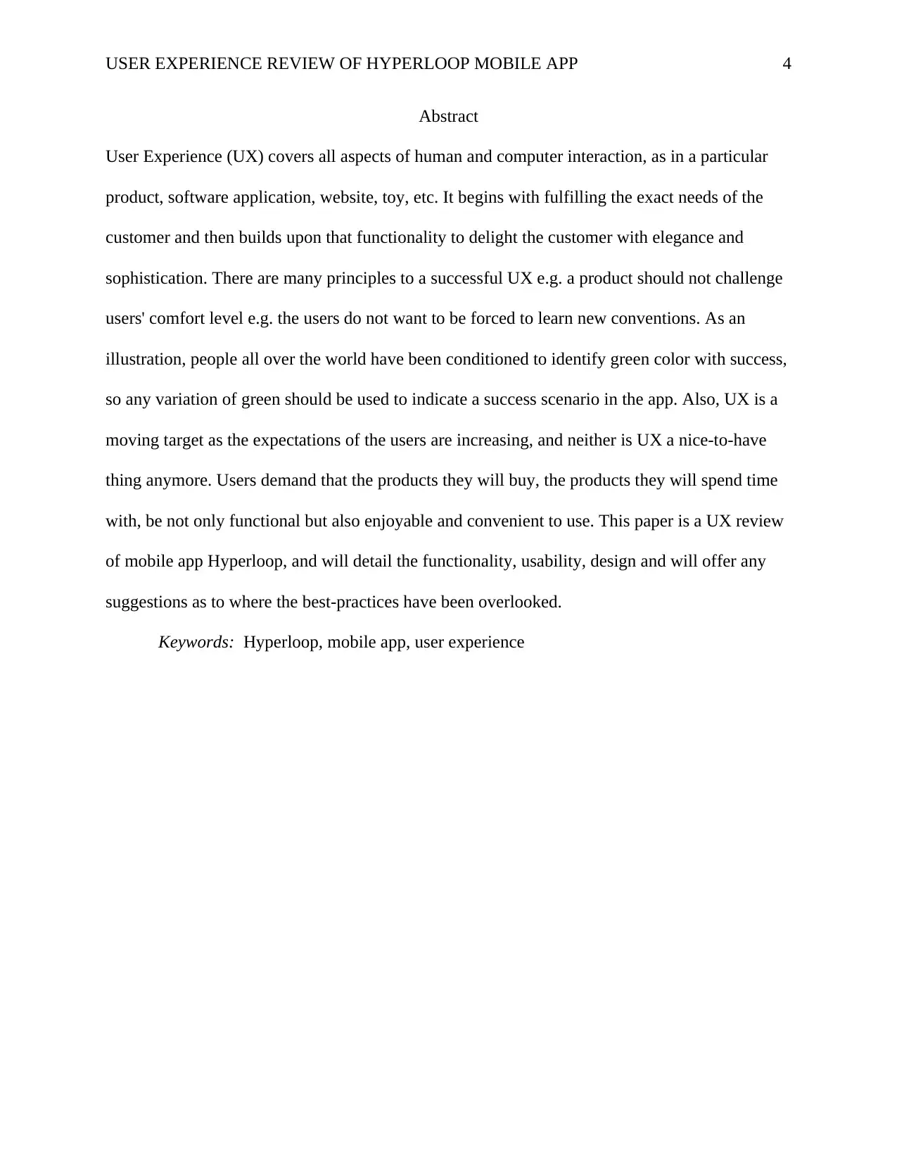
Abstract
User Experience (UX) covers all aspects of human and computer interaction, as in a particular
product, software application, website, toy, etc. It begins with fulfilling the exact needs of the
customer and then builds upon that functionality to delight the customer with elegance and
sophistication. There are many principles to a successful UX e.g. a product should not challenge
users' comfort level e.g. the users do not want to be forced to learn new conventions. As an
illustration, people all over the world have been conditioned to identify green color with success,
so any variation of green should be used to indicate a success scenario in the app. Also, UX is a
moving target as the expectations of the users are increasing, and neither is UX a nice-to-have
thing anymore. Users demand that the products they will buy, the products they will spend time
with, be not only functional but also enjoyable and convenient to use. This paper is a UX review
of mobile app Hyperloop, and will detail the functionality, usability, design and will offer any
suggestions as to where the best-practices have been overlooked.
Keywords: Hyperloop, mobile app, user experience
4
Paraphrase This Document
Need a fresh take? Get an instant paraphrase of this document with our AI Paraphraser
USER EXPERIENCE REVIEW OF HYPERLOOP MOBILE APP
User Experience Review of Hyperloop Mobile App
User Experience (UX) is the totality of experience a user has with a product and covers
not only the fulfillment of his exact requirements from the product, but also the emotions and
attitudes while using the product. As per Norman & Nielsen (n.d.) true UX goes far beyond
meeting customers' stated requirements or providing a checklist of features. Also, user
expectations are always increasing. A new feature which adds to the customer convenience is
released, liked by users, copied by competition and forgotten. Then, the users demand better
experiences, built on top of the previous successes. All this while, competitors are working on
their own also. Thus, competition and ever-increasing expectations of users make UX a moving
target. What was satisfactory a year back is no longer pleasing to the user, and this makes the
field of UX, along with the related work of User Interface (UI) and usability an exciting field for
the practitioner and a delight for the customer.
This paper will evaluate a mobile app - Hyperloop (herein after "app") which provides
users a way to book hyperloop train tickets to travel between cities, with an addition for picking
the user up using self-driven cars. The app will be described for its functionality, evaluated for
usability with review of its design. Also, any best-practice that may have been overlooked, or
any areas where the UX can be improved will be presented in this paper.
Functionality, Design and Usability
Home Screen
The app opens up in full screen of the mobile device with an image of a hyperloop train
moving out of a loop, covering less than one-third of the vertical space. The remaining portion
includes two similarly sized and styled buttons for 'Sign In' and 'Sign Up', with the exception of
icons preceding the text on buttons.
5
USER EXPERIENCE REVIEW OF HYPERLOOP MOBILE APP
Sign In
The sign-in screen has two input boxes stacked on top of each other near the top of the
window, and 'Sign In' and 'Forgot Password' buttons near the middle of the window. The buttons
are styled similarly, and do not have any icons on them. Beside this, there is no feature on the
screen. There is a Home icon in the top navigation bar, which is a good addition.
Forgot Password
The sign-in screen has two input boxes stacked on top of each other near the top of the
window, and 'Sign In' and 'Forgot Password' buttons near the middle of the window. The buttons
are styled similarly, and do not have any icons on them. Beside this, there is no feature on the
screen. There is a Home icon in the top navigation bar, which is a good addition.
An Email Has Been Sent
This is the screen that is shown after a user successfully requests reset of their password.
Beside the plaintext information, and a home button on top, there is no other feature on this
screen.
New User Registration
This screen contains the fields required, with the name of the field as lightly colored
placeholder text, which disappears when the user focuses on a field to input. This is a
recommended best practice and the app has implemented it well. The image on top is missing on
this screen also.
Credit Card Info
This screen contains the fields required for adding credit card information of the client. In
keeping with best-practice of allowing a user to skip registration forms, a Skip button has been
provided. Overall, the layout and spacing on this screen is appealing and well spaced.
6
⊘ This is a preview!⊘
Do you want full access?
Subscribe today to unlock all pages.

Trusted by 1+ million students worldwide
USER EXPERIENCE REVIEW OF HYPERLOOP MOBILE APP
Search For Departure
This screen is shown once the user is logged in and has submitted credit card details. This
screen introduces a footer with links to train and taxi screens. These links contain icons which
make it attractive and clear their intentions at a glance. It contains the fields for planning a
journey. Overall, the layout and spacing on this screen is appealing and well spaced.
Calendar
The Calendar screen shows the current month, and again the action buttons are moved to
top navigation bar. Except for the calendar portion and the footer, the rest of the portion is
empty.
Departing Loop / Returning Loop
These screens contain the information required as per the time-table of the hyperloop
trains. The information provided is satisfactory and the clear indication on right side of the
information block with a text link 'Select' is user-friendly.
Trip Summary
This screen provides details of the trip chosen. along with some crucial details for
authorizing payment on the credit card.
Confirmation
This screen provides feedback to user as to the purchase he completed. In addition to the
unique number generated, options using radio buttons are provided as to whether the user would
like to have the facility for a self-driving car to pick him up.
Tapping yes to car pickup opens a new screen under the same head which shows a map,
some input boxes and an action button for 'Request Tesla'. Finally a confirmation screen is
shown.
7
Paraphrase This Document
Need a fresh take? Get an instant paraphrase of this document with our AI Paraphraser
USER EXPERIENCE REVIEW OF HYPERLOOP MOBILE APP
Suggestions for Improvement
Home Screen
In the home screen, the contrast between the image and the text is less, especially in the
first word. Contrast between foreground and background is essential for legibility. As per L. Hill
(1997), this is essential for any written text whether print or on electronic devices. He contends
that while it is irritating and fatiguing to young readers, it may be impossible to read for older or
colorblind readers. It is recommended that either a contrasting color to the background image be
chosen, or a partially opaque background be added below the text. This will help user read the
text easily.
The text for the two buttons is similar, as in 'Sign...'. This could be made better by using
words which are separate from each other in spelling and pronunciation e.g. 'Sign In' and
'Register'.
Sign In
This screen is relatively bland. It is recommended to maintain a consistent look
throughout the app and have a relevant image on the top. Consistency in interface affords user to
expect certain features in certain locations and lowers his cognitive burden, and thus increase the
satisfaction with the product.
Forgot Password
The buttons which are supposed to do action after the user enters his information are
placed in the navigation bar at top. This is not a good place as users are accustomed to seeing the
action buttons below the area they enter the information. It is recommended that these form
action buttons be moved below the text box. Also, an image to cover the top portion which is
8
USER EXPERIENCE REVIEW OF HYPERLOOP MOBILE APP
relevant to the task of this screen is recommended. The home button should be placed as in the
Sign In screen.
An Email Has Been Sent
It is recommended to add a picture at the top which shows success in sending email
message. Also, to give user something to click, and not get lost as to the next action, it is
recommended that a home link be added below the success message.
New User Registration
It is recommended that a relevant image be added to this screen.
Credit Card Info
It is recommended that a relevant image be added to this screen. Also, button colors
should be consistent, as this screen does not have the pink color as in all other screens. Whatever
color is chosen should be consistent throughout the screens.
Calendar
It is recommended that the action links be moved to a more semantic location below the
calendar and that the top navigation bar only contains the navigation link.
Departing Loop / Returning Loop
It is recommended that the spacing in between the information boxes be increased, and
there should be an app-wide consistency. An image at the top would be a nice addition.
Trip Summary
It is recommended that the spacing between the information boxes be increased and also
this should be consistent among all screens.
9
⊘ This is a preview!⊘
Do you want full access?
Subscribe today to unlock all pages.

Trusted by 1+ million students worldwide
USER EXPERIENCE REVIEW OF HYPERLOOP MOBILE APP
Confirmation
This screen contains a typo in that the word to be used in Confirmation and not
Conformation. It is recommended that the radio buttons be increased in size and have spacing
around them to allow user to tap correctly easily. Also, spacing should be consistent. Addition of
an image to top will make the screen more attractive.
The second screen that shows when user taps yes to car pickup can include text
instructions that the user can navigate the map by using single finger to move the map around,
pinch fingers together to zoom out and vice-versa, etc.
The final confirmation screen can include a link to homepage to direct users. It will give
the users a sense of purpose and help them stay in the app and thus encourage user to stick with
the app.
General
In general, it is recommended that consistent styling be used e.g. the spacing between
input boxes varies among the screens. Also, an image with a legible heading is recommended on
every screen. Also, the button colors should be consistent throughout the screens. Also, the links
in footer which is displayed to a logged in user are recommended to be divided equally e.g. in
Search For Departure screen, Hyperloop link in footer is occupying less space than Tesla link.
The colors for action buttons and other boxes should be separate. The users need to be trained
that any button in a particular color means an action button.
Conclusion
The mobile app reviewed in this paper (Hyperloop) is satisfactory in core implementation
and meets the user needs successfully. In this regard, it is complete. However, many deviations
from standard principles of UX have been observed and their rectifications advised, along with
10
Paraphrase This Document
Need a fresh take? Get an instant paraphrase of this document with our AI Paraphraser

USER EXPERIENCE REVIEW OF HYPERLOOP MOBILE APP
the theory wherever applicable. With the minor changes in design, color and positioning, the app
can delight the user better and help him complete his task that much faster and thus provide a
better UX.
11
the theory wherever applicable. With the minor changes in design, color and positioning, the app
can delight the user better and help him complete his task that much faster and thus provide a
better UX.
11
USER EXPERIENCE REVIEW OF HYPERLOOP MOBILE APP
References
L. Hill, A. (1997). Readability Of Websites With Various Foreground/Background Color
Combinations, Font Types And Word Styles. Mmeissner.de. Retrieved 9 December 2016,
from http://www.mmeissner.de/AHNCUR.html
Norman, D. & Nielsen, J. The Definition of User Experience (UX). Nngroup.com. Retrieved 9
December 2016, from https://www.nngroup.com/articles/definition-user-experience/
12
⊘ This is a preview!⊘
Do you want full access?
Subscribe today to unlock all pages.

Trusted by 1+ million students worldwide
1 out of 12
Your All-in-One AI-Powered Toolkit for Academic Success.
+13062052269
info@desklib.com
Available 24*7 on WhatsApp / Email
![[object Object]](/_next/static/media/star-bottom.7253800d.svg)
Unlock your academic potential
Copyright © 2020–2025 A2Z Services. All Rights Reserved. Developed and managed by ZUCOL.