COIT 20268: Responsive Web Design Portfolio 1 - Hobby & Collectibles
VerifiedAdded on 2022/09/18
|14
|1524
|21
Project
AI Summary
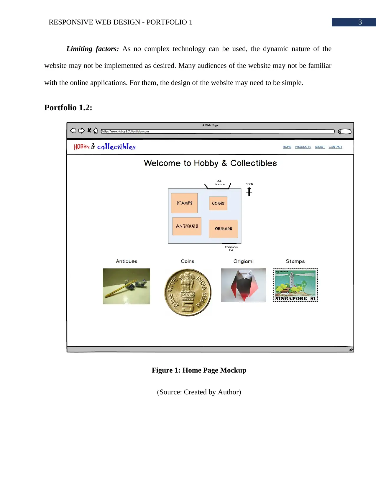
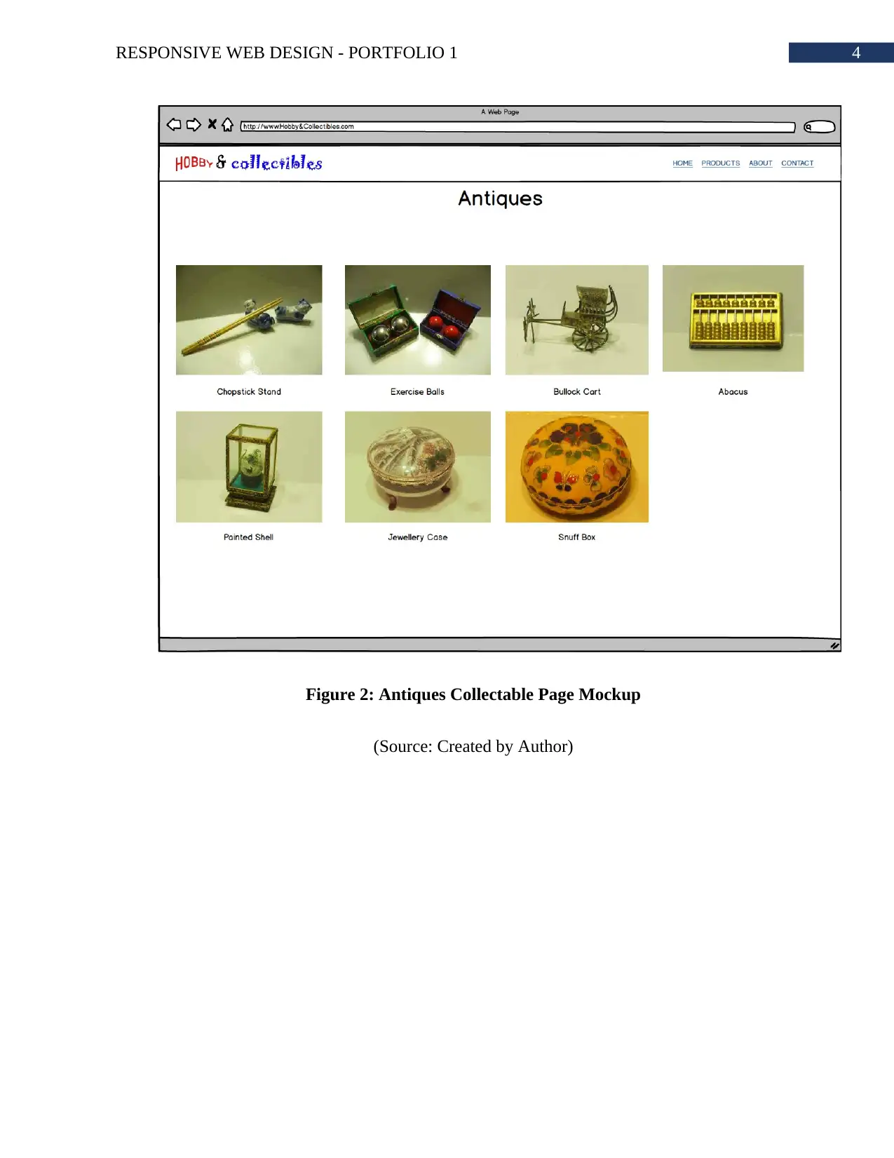
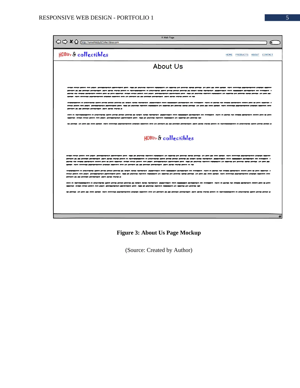
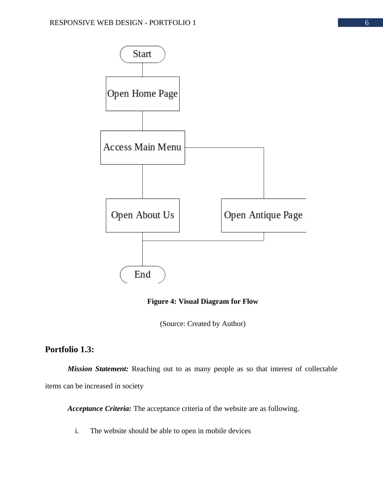
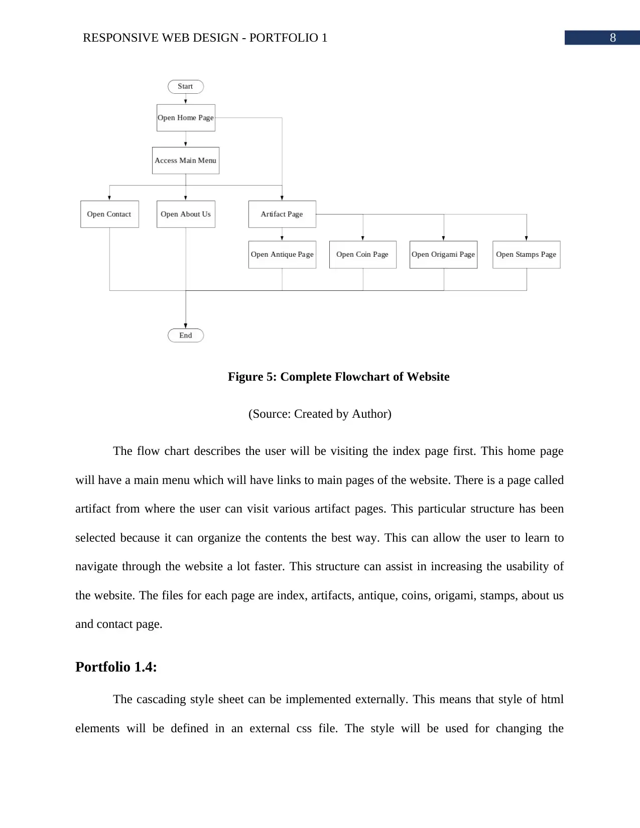
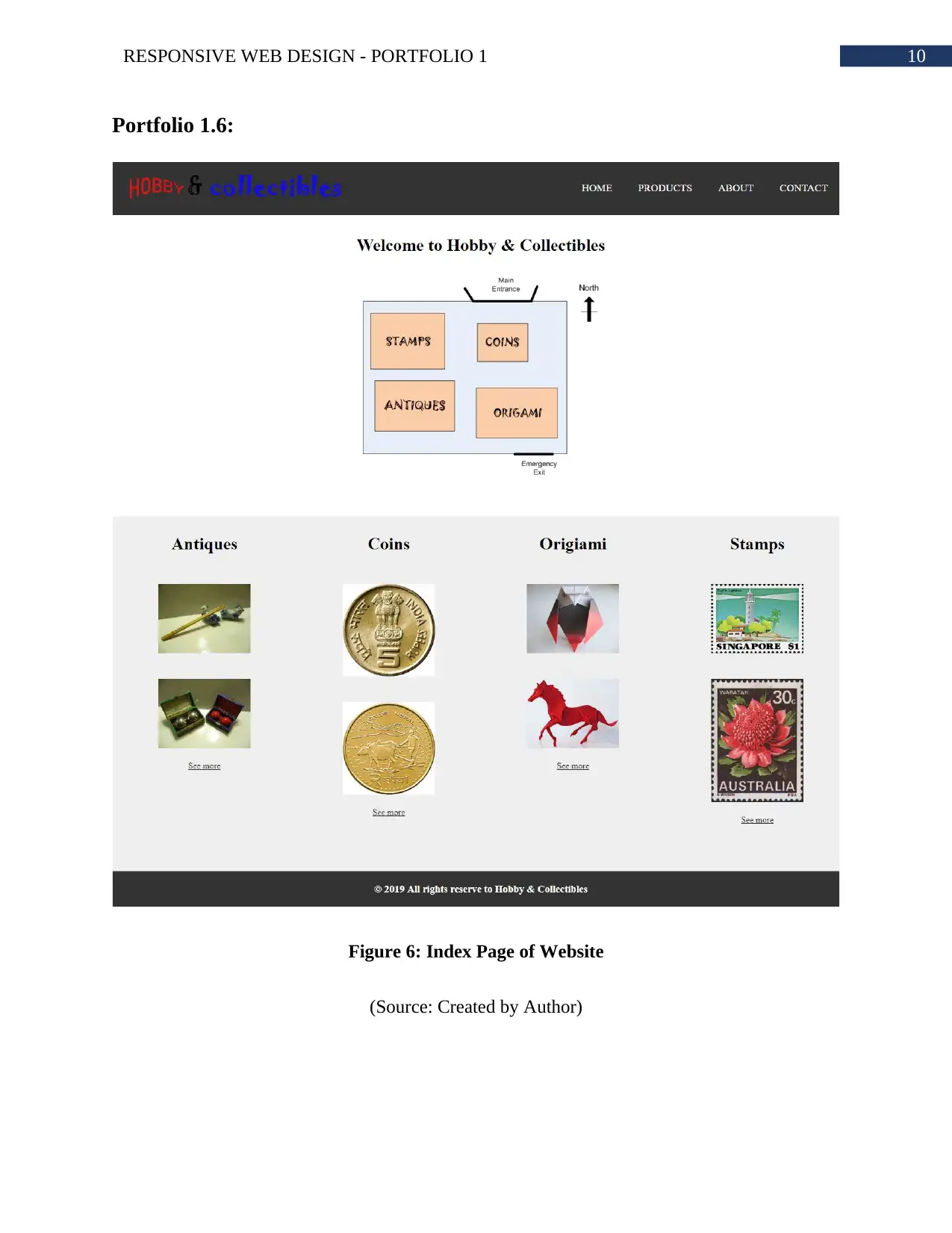
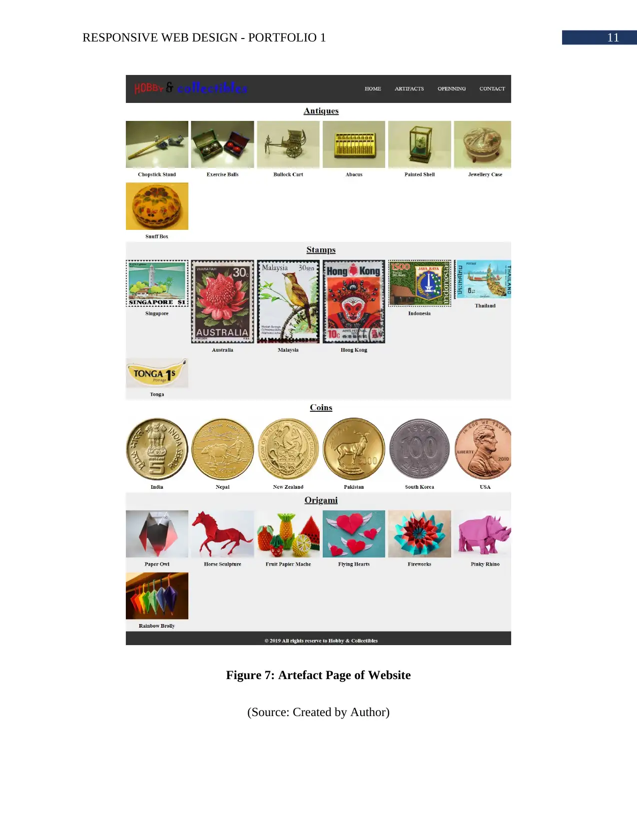
This assignment is a comprehensive portfolio project focusing on responsive web design for the COIT 20268 course, centered around creating a website for Hobby & Collectibles. The project includes detailed design considerations, such as responsive layouts for mobile devices, and outlines the website's structure, which includes an index page, pages for different collectibles (antiques, coins, origami, stamps), an 'About Us' page, and a 'Contact' page. The portfolio details the rationale, target audience (collectors and general visitors), and the website's acceptance criteria, including usability, proper image presentation, and navigation. It also discusses technical aspects, such as the use of CSS for styling, including the use of flex for element positioning and the use of sans-serif fonts, heading levels, and text emphasis. Mockups, flowcharts, and a bibliography of relevant resources are also included, providing a complete overview of the project's design and implementation. The website is designed to provide information to customers who want to visit the shop and obtain an overview of the shop layout and to find details of items available from the shop. The website is not an online shopping site.
1 out of 14
Related Documents


Your All-in-One AI-Powered Toolkit for Academic Success.
+13062052269
info@desklib.com
Available 24*7 on WhatsApp / Email
![[object Object]](/_next/static/media/star-bottom.7253800d.svg)
Copyright © 2020–2026 A2Z Services. All Rights Reserved. Developed and managed by ZUCOL.