INF70005 Strategic Management: Amazon Go Case Study Evaluation
VerifiedAdded on 2023/06/08
|10
|2543
|229
Report
AI Summary
This report provides a comprehensive analysis of Amazon Go's strategic management, examining its business model, project implementation, and challenges. The report begins with a background of Amazon Go, highlighting its innovative approach to online retail and its initial project stores. It then explores emerging issues such as minimalistic design, technology challenges, and customer accessibility. The core of the report focuses on a critical identification and justification of criteria, evaluating the project's feasibility and long-term viability. The report also includes a critical analysis of the case, considering the design concept, target audience, and technical needs of the online store. The conclusion emphasizes the importance of simplicity, convenience, and detailed product descriptions. The report also provides suggestions and recommendations for improving the project's strategic management. The report includes references from various academic sources and provides insights into the factors contributing to the success or failure of Amazon Go's strategic initiatives. The report also includes information on the different types of supermarkets and their offerings.
1
Strategic Management
Name:
Course
Professor’s name
University name
City, State
Date of submission
Strategic Management
Name:
Course
Professor’s name
University name
City, State
Date of submission
Paraphrase This Document
Need a fresh take? Get an instant paraphrase of this document with our AI Paraphraser
2
Background of the Company
Amazon Go is an online retail grocery store operated by the giant online retailer Amazon.
It has two locations currently in Washington State and another in Seattle. It is partially automated
and customers can be able to buy their grocery purchases without using the help of a cashier or a
self-checkout station. The first company project store was opened in December 5, 2016 to the
employees and the official opening to the public was January 22, 2018. The flagship project or
flagship store had meal kits, prepared foods, limited groceries and liquor available for purchase.
A flagship grocery project which was a success according to many took many years to visualize
and setup (Bishop, 2017).
With the Amazon brand behind the Amazon Go brand, it was easier to market and the
market to be successful. The concept model was created for the purposes of supplying groceries
to the people who need it online. The project Amazon store however did not impact the society
as the project had initially been set up to show. It was known as the store of the future which had
the best interest for the people (Clemons, et al, 2016).
The wall street journal reported that Amazon had planned to open three Amazon Go in
the initial project and each had a different format. The business insider reported that Amazon
would open 2000 online stores over the next ten years according to internal Amazon documents.
However, Amazon refuted the claims insisting the company was still in a learning process
(Cusumano, 2017). The business insider predicted that the online store could open at least twenty
during the next two years.
3
It said that the rest of the stores were to be larger. By the end of 2017, the store had yet to
open due to challenges in technology and tracking issues. The project was facing challenges in
tracking and could only serve about 20 people at a go. Amazon Go, has taken a lot of time to do
feasibility test and the project does not look feasible in the long run (Grewal,et al,2017).
In 2018, the store opened two stores. It was stocking house brands like 365 and wickedly
prime. The major challenge is that food stamps for low income earners’ were not allowed and
public assistance for low income earners was not also allowed. Customers without smartphones
were also denied entries and so did customers with smartphones but did not have the Amazon Go
app downloaded. A second larger store was opened in downtown Seattle at the Madison center
on 27th august 2018.
Emerging issues in Amazon Go
The minimalistic design of the resource only at first seems somehow primitive. Most web
designers somehow believe that it's the easiest to implement. But this is the most erroneous
opinion. In fact, in minimalism you need to accommodate everything. Another thing is a large
site, on which everything is mixed in a bunch, a lot of information, etc. Everything is simpler
there. Technology at Amazon Go was so complex and had to be made simple.
Minimalism in the construction of sites particularly impresses visitors to the Internet
sites. One of the reasons people visit online stores is time-saving. And if the site is "Amazon Go
and long to load, then it will not interest visitors at all (Hasan, 2016).
⊘ This is a preview!⊘
Do you want full access?
Subscribe today to unlock all pages.

Trusted by 1+ million students worldwide
4
An ideal example of a minimalist, fast design is the site https://www.telory.ru/. Everything is
simple, beautiful and understandable. Fact: Online stores lose 40% of 100% of potential
customers only because the pages of the site are very long loaded (Lee, et al,2017).
Critical identification and justification of the Criteria
Despite all the advantages, this type of sites has its drawbacks:
Minimalism is a difficult work. It is necessary to think over everything to the last detail. Simply
dazzle an ordinary site - it will be even faster and cheaper.
Any blunder is a failure. When everything is minimal on the site, then any small error can spoil
all the works of the web designer.
Minimalism in the style of "anorexia." There is always a risk to remove too much, which in the
end will lead to the fact that the site will look like a cheap free template.
Strong restrictions. Over time, your site will start to grow, new tools will appear, etc. This will
severely restrict you, since the minimalist design is very painfully experiencing any adjustments.
Today, most manufacturers, as well as trade business owners understand that Internet commerce
has become an important business site. The growing popularity of distance trading is a reality
that requires attention and proper treatment. Among Internet resources that carry out electronic
sales, you can see different types of sites. Most often this is an online store, a virtual shop
window is also used, or a business card site. In any case, the formula for success, which would
guarantee huge sales in the network from the first day of the existence of the site, has not yet
Paraphrase This Document
Need a fresh take? Get an instant paraphrase of this document with our AI Paraphraser
5
been found. Creating and promoting an online store is a painstaking work requiring effort both
from its owner and from the webmaster who carries out technical work (Miller, 2018).
It will be more correct to say that the success of the online store has many components. It
is impossible to build a successful e-commerce without first determining the target audience,
selecting the product, evaluating competitors and finding suppliers. However, one of the most
important components of the success of electronic sales is the appearance of the resource, on
which the potential buyer in the store will be delayed or will plow through the Internet in search
of something more attractive.
Making an online store requires a lot of hard work. To begin with, you should analyze
and evaluate the sites of competing companies from the point of view of a potential buyer: try to
determine what you like as a buyer, and what causes the desire to leave the site. Thus, there will
be a plan for the future of the online store. In addition, the analysis of competitors' sites will not
allow repeating themselves when creating your own online store. One of the keys to success on
the Internet is the uniqueness and uniqueness of the resource (Lian and Yen, 2014).
Critical analysis of the case based on the case choosen
Before starting to design an online store, the design concept must be thought out, taking
into account the preferences of the target audience. That's why there are difficulties in the
presence of a wide range of potential buyers, when it is difficult to take into account the tastes
and needs of each group. The way out of this situation seems to be in applying the most neutral
design possible.
6
With a narrow target audience, a greater choice of design opens with the possibility of
using ethnic, exotic or other unique style. With specialization on one group of products, you can
use different types of thematic design. For example, sporting goods will suit a sporting style. In
addition, the design of the online store should be conducted taking into account the social status
of the target audience. Therefore, when trading inexpensive goods, a simple design is more
suitable, and for the sale of exclusive and expensive goods, decorative luxury in design is
acceptable. The design of the online store must be made according to its technical needs, since
many buyers may be limited in traffic or use low-power computers.
A resource intended for sales should not be loaded with animation, banners, flash movies
and other content that hampers its work and distracts the attention of visitors from the main
purpose of visiting - buying goods (Pappas,et al, 2016).
Presentation of Appropriate Conclusion
Simplicity and convenience of navigation should not be sacrificed to a unique and
original design. Like an ordinary store, in an online store, all the goods must be laid out "on the
shelves": the simpler the buyer finds the thing he needs, the more likely the purchase is made.
Difficult orientation and long searches is one of the main reasons why a potential client leaves
the site almost immediately.
The Internet has no borders and many online stores offer their products to customers
living in different regions of the country (Sener, et al,2015). This should certainly be taken into
account in the design development: the choice of the desired region should be made when going
to the site and before getting to know the assortment of the store. The location of navigation
⊘ This is a preview!⊘
Do you want full access?
Subscribe today to unlock all pages.

Trusted by 1+ million students worldwide
7
elements (menus, sections of the site, product catalog) should be in a prominent place, usually at
the top of the site, in the right or left corner. All items in the catalog of goods should be informed
in detail about what is contained in each of them. A necessary element of navigation for an
online store is the search. Its usual location is at the top of the page in a prominent place (Shao
and Hu,2014).
Provisions of suggestions and recommendations
One of the serious disadvantages of electronic commerce is the inability to closely
consider and touch the goods. This is solved with the help of a detailed description of the
product: its characteristics, color, material from which it is made, size, weight, distinctive
qualities and application possibilities. Convenient navigation involves the location of operations
such as entering your personal cabinet, accessing a list of pending items, and checking bonuses
within a single click. The location of less important services can be within three clicks: the
visitor gets there, where he wants after making no more than three clicks (Wu,et al, 2014).
The first organizational moment for those who live or lived in a large city in USA and is
used to that there is a non-stop supermarket in the district, and if not - then in any shop, shop, etc.
24 hours. You quickly become accustomed to such accessibility, it is very convenient, because in
your mind besides the working schedule, family affairs and various meetings, you do not need to
keep the idea that you have time to buy food until Sunday. I have them divided into classes,
affecting the appearance, the atmosphere of the store and, of course, the price. Large
supermarkets located on the outskirts, or out of town. You can come here for a long time, they
usually sell not only food, but also groceries, etc., you can spend time with children and have a
good snack. Prices are average, not economical and not top-class. Supermarkets of high class in
Paraphrase This Document
Need a fresh take? Get an instant paraphrase of this document with our AI Paraphraser

8
the city, often in the center in shopping centers, specializing mainly on products. Here, in the
first place is quality, the appearance of the store and the packaging of goods, hence the price, of
course, higher than in economy class stores.
the city, often in the center in shopping centers, specializing mainly on products. Here, in the
first place is quality, the appearance of the store and the packaging of goods, hence the price, of
course, higher than in economy class stores.
9
References
Bishop, T., 2017. How ‘Amazon Go’works: The technology behind the online retailer’s
groundbreaking new grocery store. GeekWire (Dec. 2017). URL: https://perma. cc/C8GC-LJ5S.
Clemons, E.K., Wilson, J., Matt, C., Hess, T., Ren, F., Jin, F. and Koh, N.S., 2016. Global
differences in online shopping behavior: Understanding factors leading to trust. Journal of
Management Information Systems, 33(4), pp.1117-1148.
Cusumano, M.A., 2017. Amazon and whole foods: follow the strategy (and the
money). Communications of the ACM, 60(10), pp.24-26.
Grewal, D., Roggeveen, A.L. and Nordfält, J., 2017. The future of retailing. Journal of
Retailing, 93(1), pp.1-6.
Hasan, B., 2016. Perceived irritation in online shopping: The impact of website design
characteristics. Computers in Human Behavior, 54, pp.224-230.
Lee, R.J., Sener, I.N., Mokhtarian, P.L. and Handy, S.L., 2017. Relationships between the online
and in-store shopping frequency of Davis, California residents. Transportation Research Part A:
Policy and Practice, 100, pp.40-52.
Lian, J.W. and Yen, D.C., 2014. Online shopping drivers and barriers for older adults: Age and
gender differences. Computers in Human Behavior, 37, pp.133-143.
Miller, M., 2018. The Effects of Amazon Go on the US Economy.
⊘ This is a preview!⊘
Do you want full access?
Subscribe today to unlock all pages.

Trusted by 1+ million students worldwide
10
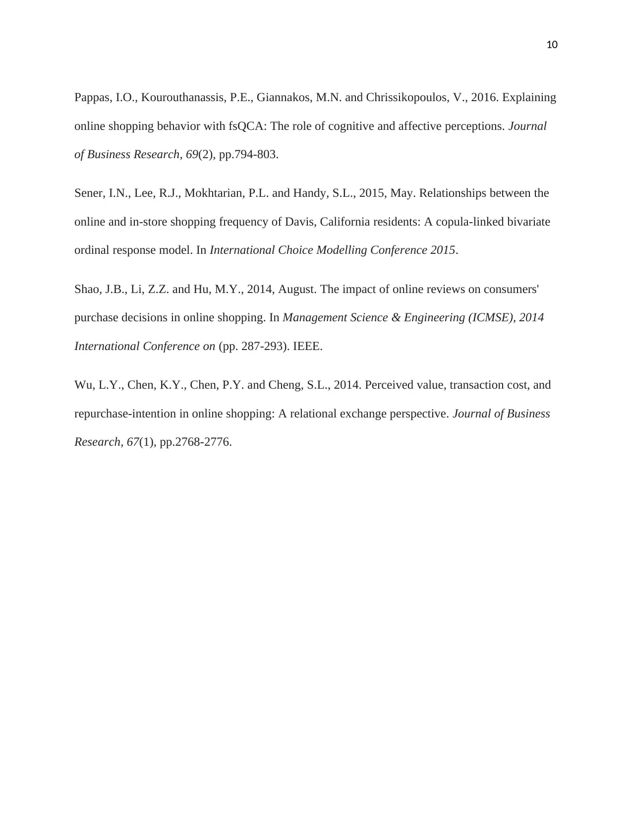
Pappas, I.O., Kourouthanassis, P.E., Giannakos, M.N. and Chrissikopoulos, V., 2016. Explaining
online shopping behavior with fsQCA: The role of cognitive and affective perceptions. Journal
of Business Research, 69(2), pp.794-803.
Sener, I.N., Lee, R.J., Mokhtarian, P.L. and Handy, S.L., 2015, May. Relationships between the
online and in-store shopping frequency of Davis, California residents: A copula-linked bivariate
ordinal response model. In International Choice Modelling Conference 2015.
Shao, J.B., Li, Z.Z. and Hu, M.Y., 2014, August. The impact of online reviews on consumers'
purchase decisions in online shopping. In Management Science & Engineering (ICMSE), 2014
International Conference on (pp. 287-293). IEEE.
Wu, L.Y., Chen, K.Y., Chen, P.Y. and Cheng, S.L., 2014. Perceived value, transaction cost, and
repurchase-intention in online shopping: A relational exchange perspective. Journal of Business
Research, 67(1), pp.2768-2776.
1 out of 10
Your All-in-One AI-Powered Toolkit for Academic Success.
+13062052269
info@desklib.com
Available 24*7 on WhatsApp / Email
![[object Object]](/_next/static/media/star-bottom.7253800d.svg)
Unlock your academic potential
Copyright © 2020–2026 A2Z Services. All Rights Reserved. Developed and managed by ZUCOL.
