Strategic Dashboard Analysis and Data Visualization in E-commerce
VerifiedAdded on 2022/08/15
|7
|1115
|11
Report
AI Summary
This report provides a comprehensive analysis of a strategic dashboard, focusing on its design, key principles, and potential enhancements. It explores the dashboard's role in monitoring long-term strategies, particularly within the marketing and sales departments. The report then delves into the application of data visualization in the e-commerce industry, highlighting the utilization of big data analytics (BDA) to improve time-cost efficiency, track user behavior, and drive higher conversion rates. The study examines the objectives of data analytics in the e-commerce sector, including empowering consumers and improving decision-making processes. Several examples, such as Netflix and American Express, are used to illustrate the practical application of data analytics tools. The report also identifies limitations and references relevant academic sources.

Analytics for Decision making
Student’s Name:
Student’s ID:
Student’s Name:
Student’s ID:
Paraphrase This Document
Need a fresh take? Get an instant paraphrase of this document with our AI Paraphraser

1
Table of Contents
Description of Dashboard............................................................................................................................2
Application of data visualization in e-commerce industry...........................................................................3
References...................................................................................................................................................5
Appendix.....................................................................................................................................................6
2
Description of Dashboard
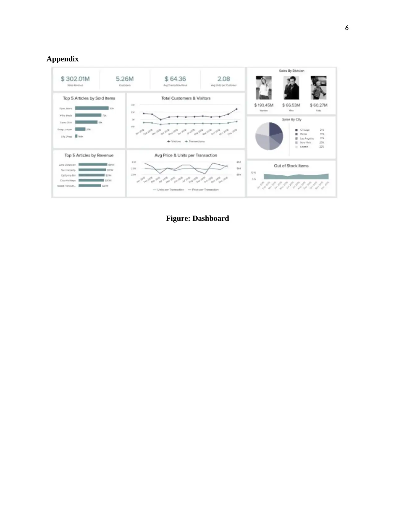
The strategic dashboard is commonly used by the managers and executives to monitor the long-
term strategy1. The selected dashboard is strategic because it uses the key performance indicator
to demonstrate essential information visually that help the decision makers to accomplish their
objectives. The dashboard represents the total number of customers, total sales revenue, total
sales per customer segment, the graph of sold items and average transaction value. However, all
these information are beneficial for the senior management of the organization to make key
decisions to enhance revenue and sales. Besides this, this strategic dashboard is particularly
designed for the marketing and sales department so that they could improve the marketing and
sales strategy to increase the number of consumers and sales of products2.
Several principles were used to build the strategic dashboard for the company. One of the key
principles used is to keep all the visuals defined and focused. Every graph requires to be
purposeful as well as intentional and seems to answer a specific question3. Another principle
used is good data foundation without which a manager or executive could not generate
meaningful visualizations. However, it is essential to ensure that everything is understandable
and clear so that the users could easily interpret the data. Selecting the right metrics is an
essential principle to develop a dashboard to enhance the interest of the users.
Three possible general enhancements needed to improve the quality of the dashboard, which are:
Filters – Use of dashboard filters can reduce maintenance along with increase quality of data
used in the dashboard. It is recommended to use a global filter for building the dashboard.
Redundant encoding – It assists in improving the chance of the reader to interpret the
visualization promptly and appropriately. Redundant encoding is the use of multiple visual
1 Alper Sarikaya, Michael Correll, Lyn Bartram, Melanie Tory, and Danyel Fisher. "What do we
talk about when we talk about dashboards?." IEEE transactions on visualization and computer
graphics 25, no. 1 (2018): 682-692.
2 Alptekin Erkollar, and Birgit Oberer. "Multidimensional dashboards for evaluating strategic
brand management processes for multi-brand companies." Procedia-Social and Behavioral
Sciences 235 (2016): 505-513.
3 Stefan Pauliuk. "Critical appraisal of the circular economy standard BS 8001: 2017 and a
dashboard of quantitative system indicators for its implementation in organizations." Resources,
Conservation and Recycling 129 (2018): 81-92.
⊘ This is a preview!⊘
Do you want full access?
Subscribe today to unlock all pages.

Trusted by 1+ million students worldwide
3
elements to represent one variable in a chart that can enhance readability as well as maximize
accuracy4.
Pages – Use of pages can help to create an awesome dashboard and offer a positive influence on
the performance of the dashboard.
The selected dashboard reflects the data necessary for the management to make better decisions
for the company. The graphs highlight the price per unit used for each transaction and the
number of customers as well as visitors throughout the year. It also displayed the total sales
revenue earned by the business in the financial year. However, all the data demonstrated in the
dashboard related to the sales and profit of the business and thus, help the management team to
analyze the data and adopt the strategy in the decision- making process. The dashboard assists
the team to overview and interpret the data for increasing revenue by sales and differentiate the
product categories. The strategic dashboard would enable the management to monitor the long-
term strategy and manage decisions5.
Application of data visualization in e-commerce industry
Currently, there has been an increasing focus on big data analytics (BDA) within the e-
commerce industry. The article will explore the utilization of BDA in e-commerce by
determining challenges of BDA, business value, types and explanatory context. The objectives of
the business is to improve their time-cost efficiency, the market contract of cost effectiveness
and managerial transaction cost efficacy. While the objectives of data analytics is to attain both
strategic value and transaction value in digital markets by converting human resource
management, relationship, knowledge, finance, inventory and production through analytics.
Another objective of e-commerce is to track user’s behavior to analyze significant ways to
transform one time consumers into repeat purchasers.
The utilization of data analytics helped the e-commerce industry to empower consumers,
improve the process of decision-making and drive a higher conversion rate. In the e-commerce
4 M. T. Amini, M. Akbari, and H. Pashootanizadeh. "Business Strategic Control; Dynamic
Approach Application of Quality Function Deployment Method Based on The Balanced
Scorecard Dashboard." Journal of Administrative Management, Education and Training 12, no.
4 (2016): 156-170.
5 Erik T Mitchell. "Lightweight tools and dashboards for program management in
libraries." Technical Services Quarterly 35, no. 1 (2018): 68-82.
Paraphrase This Document
Need a fresh take? Get an instant paraphrase of this document with our AI Paraphraser
4
industry, data analytics has also been used in the form of voice and video data. For example,
Netflix uses video data to analyze the quality of experiences and estimate viewing habits. Thus,
the demand and visualization analytics tools helped Netflix in improving its cost efficiency and
market transaction cost efficiency6. Another example is of American Express who used voice
data to track the data based on call center operations to provide personalized offers in less time
that helped in improving cost efficiency. Thus, visualization analytics helped most of the
organizations within the e-commerce industry to analyze consumer preferences and behavior.
One of the major limitations of the article is that the research was limited to the abstract field due
to which it did not provide information regarding the use of the Web of Knowledge database in
the e-commerce industry. It is because the overall focus was towards gathering information
regarding the usage of BDA in the e-commerce business.
6 Shahriar Akter, and Samuel Fosso Wamba. "Big data analytics in E-commerce: a systematic
review and agenda for future research." Electronic Markets 26, no. 2 (2016): 173-194.
5
References
Akter, Shahriar, and Samuel Fosso Wamba. "Big data analytics in E-commerce: a systematic
review and agenda for future research." Electronic Markets 26, no. 2 (2016): 173-194.
Amini, M. T., M. Akbari, and H. Pashootanizadeh. "Business Strategic Control; Dynamic
Approach Application of Quality Function Deployment Method Based on The Balanced
Scorecard Dashboard." Journal of Administrative Management, Education and
Training 12, no. 4 (2016): 156-170.
Erkollar, Alptekin, and Birgit Oberer. "Multidimensional dashboards for evaluating strategic
brand management processes for multi-brand companies." Procedia-Social and
Behavioral Sciences 235 (2016): 505-513.
Mitchell, Erik T. "Lightweight tools and dashboards for program management in
libraries." Technical Services Quarterly 35, no. 1 (2018): 68-82.
Pauliuk, Stefan. "Critical appraisal of the circular economy standard BS 8001: 2017 and a
dashboard of quantitative system indicators for its implementation in
organizations." Resources, Conservation and Recycling 129 (2018): 81-92.
Sarikaya, Alper, Michael Correll, Lyn Bartram, Melanie Tory, and Danyel Fisher. "What do we
talk about when we talk about dashboards?." IEEE transactions on visualization and
computer graphics 25, no. 1 (2018): 682-692.
⊘ This is a preview!⊘
Do you want full access?
Subscribe today to unlock all pages.

Trusted by 1+ million students worldwide
6
Appendix
Figure: Dashboard
Appendix
Figure: Dashboard
1 out of 7
Related Documents
Your All-in-One AI-Powered Toolkit for Academic Success.
+13062052269
info@desklib.com
Available 24*7 on WhatsApp / Email
![[object Object]](/_next/static/media/star-bottom.7253800d.svg)
Unlock your academic potential
Copyright © 2020–2026 A2Z Services. All Rights Reserved. Developed and managed by ZUCOL.


