Applied Statistical Methods | Assignment
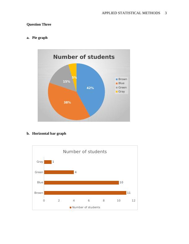
Based on the frequency polygon displayed below, the most common test grade was around what score? Explain. In a box plot, what percent of the scores are between the lower and upper hinges? For the data from the 1977 Stat. and Biom. 200 class for eye color, construct: pie graph horizontal bar graph vertical bar graph a frequency table with the relative frequency of each eye color Eye Color Number of students Brown 11 Blue 10 Green 4 Gray 1 (Question submitted by J. Warren, UNH) 4. A graph appears below showing the number of adults and children who prefer each type of soda. There were 130 adults and kids surveyed. Discuss some ways in which the graph below could be improved. 5. Which of the box plots below has a large positive skew? Which has a large negative skew? (relevant section & relevant section)
Added on 2022-08-28
Applied Statistical Methods | Assignment
Based on the frequency polygon displayed below, the most common test grade was around what score? Explain. In a box plot, what percent of the scores are between the lower and upper hinges? For the data from the 1977 Stat. and Biom. 200 class for eye color, construct: pie graph horizontal bar graph vertical bar graph a frequency table with the relative frequency of each eye color Eye Color Number of students Brown 11 Blue 10 Green 4 Gray 1 (Question submitted by J. Warren, UNH) 4. A graph appears below showing the number of adults and children who prefer each type of soda. There were 130 adults and kids surveyed. Discuss some ways in which the graph below could be improved. 5. Which of the box plots below has a large positive skew? Which has a large negative skew? (relevant section & relevant section)
Added on 2022-08-28

End of preview
Want to access all the pages? Upload your documents or become a member.