Quantitative and Qualitative Data Analysis for Desklib
VerifiedAdded on 2022/11/17
|11
|2256
|325
AI Summary
This assessment involves analysing qualitative and quantitative data. The qualitative data analysis involves coding and categorising while the quantitative data analysis involves moving averages and descriptive statistics. The findings and discussion are presented in the context of the broader literature of the topic.
Contribute Materials
Your contribution can guide someone’s learning journey. Share your
documents today.
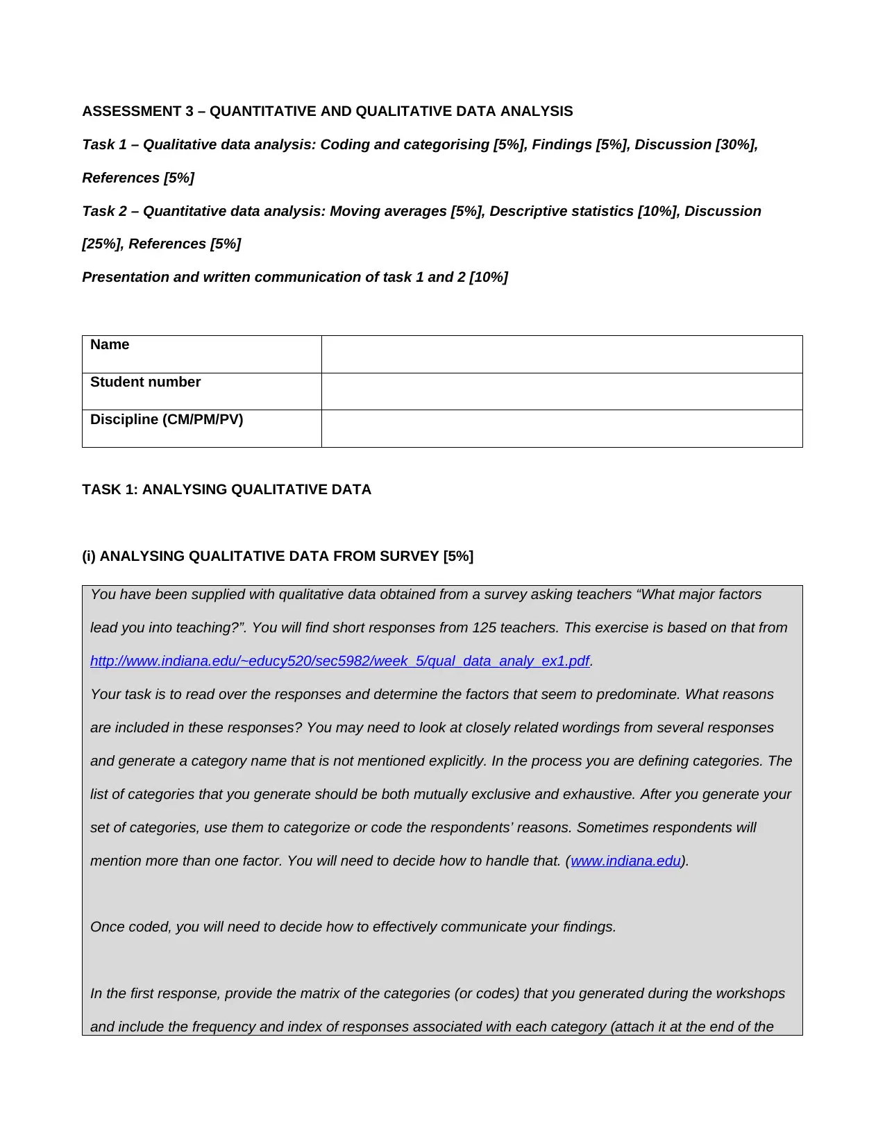
ASSESSMENT 3 – QUANTITATIVE AND QUALITATIVE DATA ANALYSIS
Task 1 – Qualitative data analysis: Coding and categorising [5%], Findings [5%], Discussion [30%],
References [5%]
Task 2 – Quantitative data analysis: Moving averages [5%], Descriptive statistics [10%], Discussion
[25%], References [5%]
Presentation and written communication of task 1 and 2 [10%]
Name
Student number
Discipline (CM/PM/PV)
TASK 1: ANALYSING QUALITATIVE DATA
(i) ANALYSING QUALITATIVE DATA FROM SURVEY [5%]
You have been supplied with qualitative data obtained from a survey asking teachers “What major factors
lead you into teaching?”. You will find short responses from 125 teachers. This exercise is based on that from
http://www.indiana.edu/~educy520/sec5982/week_5/qual_data_analy_ex1.pdf.
Your task is to read over the responses and determine the factors that seem to predominate. What reasons
are included in these responses? You may need to look at closely related wordings from several responses
and generate a category name that is not mentioned explicitly. In the process you are defining categories. The
list of categories that you generate should be both mutually exclusive and exhaustive. After you generate your
set of categories, use them to categorize or code the respondents’ reasons. Sometimes respondents will
mention more than one factor. You will need to decide how to handle that. (www.indiana.edu).
Once coded, you will need to decide how to effectively communicate your findings.
In the first response, provide the matrix of the categories (or codes) that you generated during the workshops
and include the frequency and index of responses associated with each category (attach it at the end of the
Secure Best Marks with AI Grader
Need help grading? Try our AI Grader for instant feedback on your assignments.
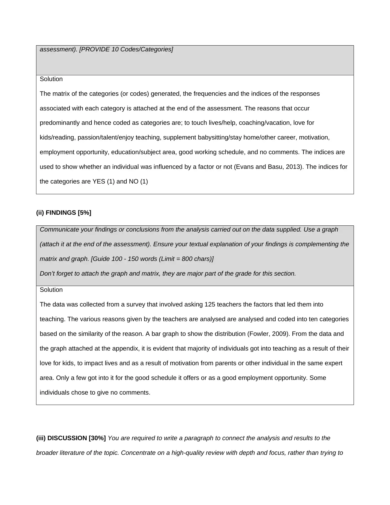
assessment). [PROVIDE 10 Codes/Categories]
Solution
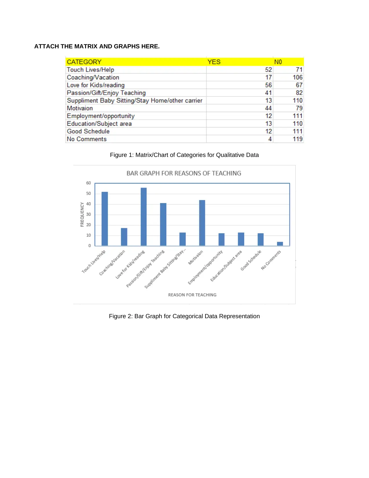
The matrix of the categories (or codes) generated, the frequencies and the indices of the responses
associated with each category is attached at the end of the assessment. The reasons that occur
predominantly and hence coded as categories are; to touch lives/help, coaching/vacation, love for
kids/reading, passion/talent/enjoy teaching, supplement babysitting/stay home/other career, motivation,
employment opportunity, education/subject area, good working schedule, and no comments. The indices are
used to show whether an individual was influenced by a factor or not (Evans and Basu, 2013). The indices for
the categories are YES (1) and NO (1)
(ii) FINDINGS [5%]
Communicate your findings or conclusions from the analysis carried out on the data supplied. Use a graph
(attach it at the end of the assessment). Ensure your textual explanation of your findings is complementing the
matrix and graph. [Guide 100 - 150 words (Limit = 800 chars)]
Don’t forget to attach the graph and matrix, they are major part of the grade for this section.
Solution
The data was collected from a survey that involved asking 125 teachers the factors that led them into
teaching. The various reasons given by the teachers are analysed are analysed and coded into ten categories
based on the similarity of the reason. A bar graph to show the distribution (Fowler, 2009). From the data and
the graph attached at the appendix, it is evident that majority of individuals got into teaching as a result of their
love for kids, to impact lives and as a result of motivation from parents or other individual in the same expert
area. Only a few got into it for the good schedule it offers or as a good employment opportunity. Some
individuals chose to give no comments.
(iii) DISCUSSION [30%] You are required to write a paragraph to connect the analysis and results to the
broader literature of the topic. Concentrate on a high-quality review with depth and focus, rather than trying to
Solution
The matrix of the categories (or codes) generated, the frequencies and the indices of the responses
associated with each category is attached at the end of the assessment. The reasons that occur
predominantly and hence coded as categories are; to touch lives/help, coaching/vacation, love for
kids/reading, passion/talent/enjoy teaching, supplement babysitting/stay home/other career, motivation,
employment opportunity, education/subject area, good working schedule, and no comments. The indices are
used to show whether an individual was influenced by a factor or not (Evans and Basu, 2013). The indices for
the categories are YES (1) and NO (1)
(ii) FINDINGS [5%]
Communicate your findings or conclusions from the analysis carried out on the data supplied. Use a graph
(attach it at the end of the assessment). Ensure your textual explanation of your findings is complementing the
matrix and graph. [Guide 100 - 150 words (Limit = 800 chars)]
Don’t forget to attach the graph and matrix, they are major part of the grade for this section.
Solution
The data was collected from a survey that involved asking 125 teachers the factors that led them into
teaching. The various reasons given by the teachers are analysed are analysed and coded into ten categories
based on the similarity of the reason. A bar graph to show the distribution (Fowler, 2009). From the data and
the graph attached at the appendix, it is evident that majority of individuals got into teaching as a result of their
love for kids, to impact lives and as a result of motivation from parents or other individual in the same expert
area. Only a few got into it for the good schedule it offers or as a good employment opportunity. Some
individuals chose to give no comments.
(iii) DISCUSSION [30%] You are required to write a paragraph to connect the analysis and results to the
broader literature of the topic. Concentrate on a high-quality review with depth and focus, rather than trying to
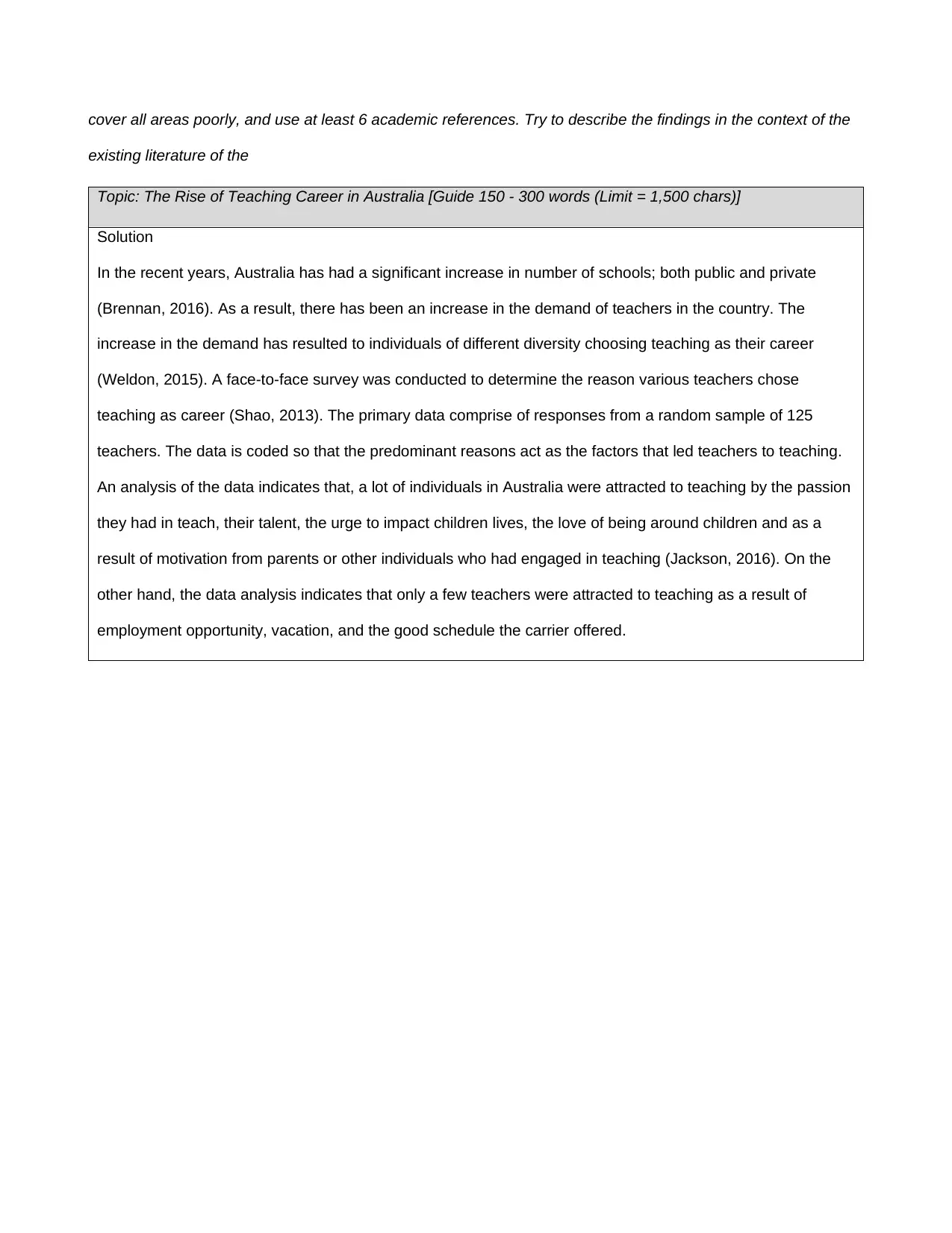
cover all areas poorly, and use at least 6 academic references. Try to describe the findings in the context of the
existing literature of the
Topic: The Rise of Teaching Career in Australia [Guide 150 - 300 words (Limit = 1,500 chars)]
Solution
In the recent years, Australia has had a significant increase in number of schools; both public and private
(Brennan, 2016). As a result, there has been an increase in the demand of teachers in the country. The
increase in the demand has resulted to individuals of different diversity choosing teaching as their career
(Weldon, 2015). A face-to-face survey was conducted to determine the reason various teachers chose
teaching as career (Shao, 2013). The primary data comprise of responses from a random sample of 125
teachers. The data is coded so that the predominant reasons act as the factors that led teachers to teaching.
An analysis of the data indicates that, a lot of individuals in Australia were attracted to teaching by the passion
they had in teach, their talent, the urge to impact children lives, the love of being around children and as a
result of motivation from parents or other individuals who had engaged in teaching (Jackson, 2016). On the
other hand, the data analysis indicates that only a few teachers were attracted to teaching as a result of
employment opportunity, vacation, and the good schedule the carrier offered.
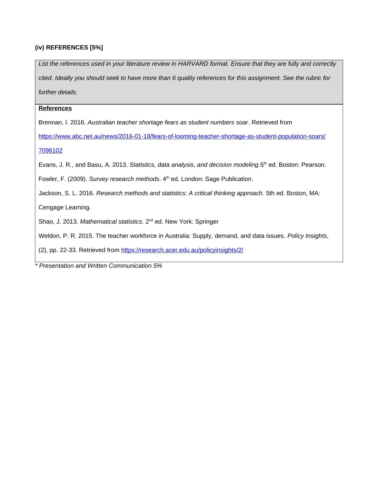
(iv) REFERENCES [5%]
List the references used in your literature review in HARVARD format. Ensure that they are fully and correctly
cited. Ideally you should seek to have more than 6 quality references for this assignment. See the rubric for
further details.
References
Brennan, I. 2016. Australian teacher shortage fears as student numbers soar. Retrieved from
https://www.abc.net.au/news/2016-01-18/fears-of-looming-teacher-shortage-as-student-population-soars/
7096102
Evans, J. R., and Basu, A. 2013. Statistics, data analysis, and decision modeling.5th ed. Boston: Pearson.
Fowler, F. (2009). Survey research methods. 4th ed. London: Sage Publication.
Jackson, S. L. 2016. Research methods and statistics: A critical thinking approach. 5th ed. Boston, MA:
Cengage Learning.
Shao, J. 2013. Mathematical statistics. 2nd ed. New York: Springer
Weldon, P. R. 2015. The teacher workforce in Australia: Supply, demand, and data issues. Policy Insights,
(2), pp. 22-33. Retrieved from https://research.acer.edu.au/policyinsights/2/
* Presentation and Written Communication 5%
Secure Best Marks with AI Grader
Need help grading? Try our AI Grader for instant feedback on your assignments.
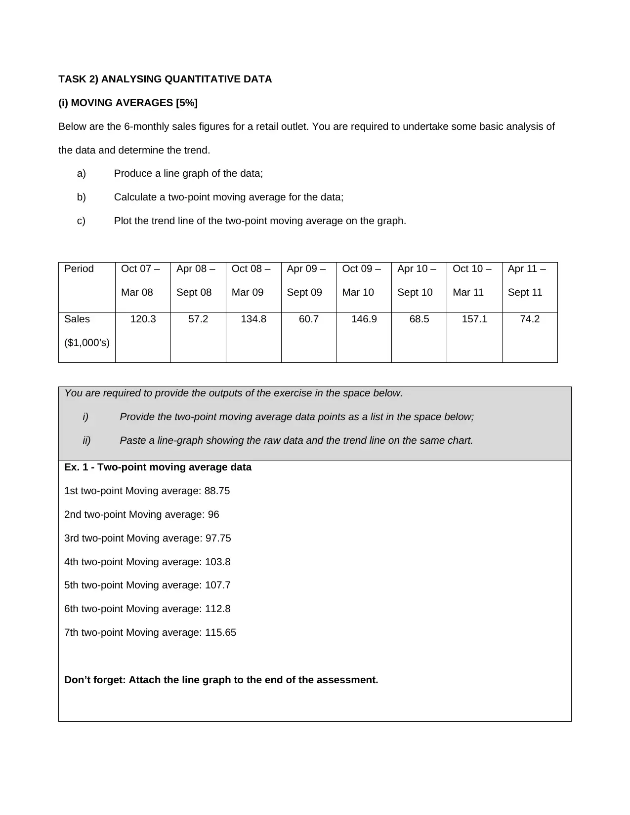
TASK 2) ANALYSING QUANTITATIVE DATA
(i) MOVING AVERAGES [5%]
Below are the 6-monthly sales figures for a retail outlet. You are required to undertake some basic analysis of
the data and determine the trend.
a) Produce a line graph of the data;
b) Calculate a two-point moving average for the data;
c) Plot the trend line of the two-point moving average on the graph.
Period Oct 07 –
Mar 08
Apr 08 –
Sept 08
Oct 08 –
Mar 09
Apr 09 –
Sept 09
Oct 09 –
Mar 10
Apr 10 –
Sept 10
Oct 10 –
Mar 11
Apr 11 –
Sept 11
Sales
($1,000’s)
120.3 57.2 134.8 60.7 146.9 68.5 157.1 74.2
You are required to provide the outputs of the exercise in the space below.
i) Provide the two-point moving average data points as a list in the space below;
ii) Paste a line-graph showing the raw data and the trend line on the same chart.
Ex. 1 - Two-point moving average data
1st two-point Moving average: 88.75
2nd two-point Moving average: 96
3rd two-point Moving average: 97.75
4th two-point Moving average: 103.8
5th two-point Moving average: 107.7
6th two-point Moving average: 112.8
7th two-point Moving average: 115.65
Don’t forget: Attach the line graph to the end of the assessment.
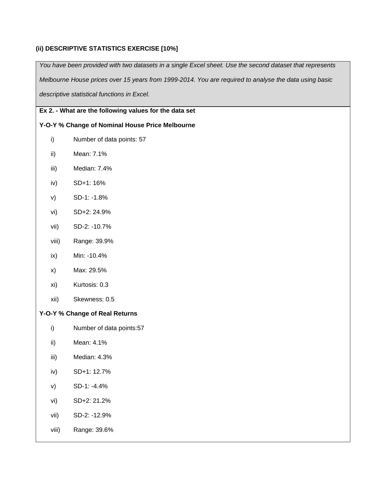
(ii) DESCRIPTIVE STATISTICS EXERCISE [10%]
You have been provided with two datasets in a single Excel sheet. Use the second dataset that represents
Melbourne House prices over 15 years from 1999-2014. You are required to analyse the data using basic
descriptive statistical functions in Excel.
Ex 2. - What are the following values for the data set
Y-O-Y % Change of Nominal House Price Melbourne
i) Number of data points: 57
ii) Mean: 7.1%
iii) Median: 7.4%
iv) SD+1: 16%
v) SD-1: -1.8%
vi) SD+2: 24.9%
vii) SD-2: -10.7%
viii) Range: 39.9%
ix) Min: -10.4%
x) Max: 29.5%
xi) Kurtosis: 0.3
xii) Skewness: 0.5
Y-O-Y % Change of Real Returns
i) Number of data points:57
ii) Mean: 4.1%
iii) Median: 4.3%
iv) SD+1: 12.7%
v) SD-1: -4.4%
vi) SD+2: 21.2%
vii) SD-2: -12.9%
viii) Range: 39.6%
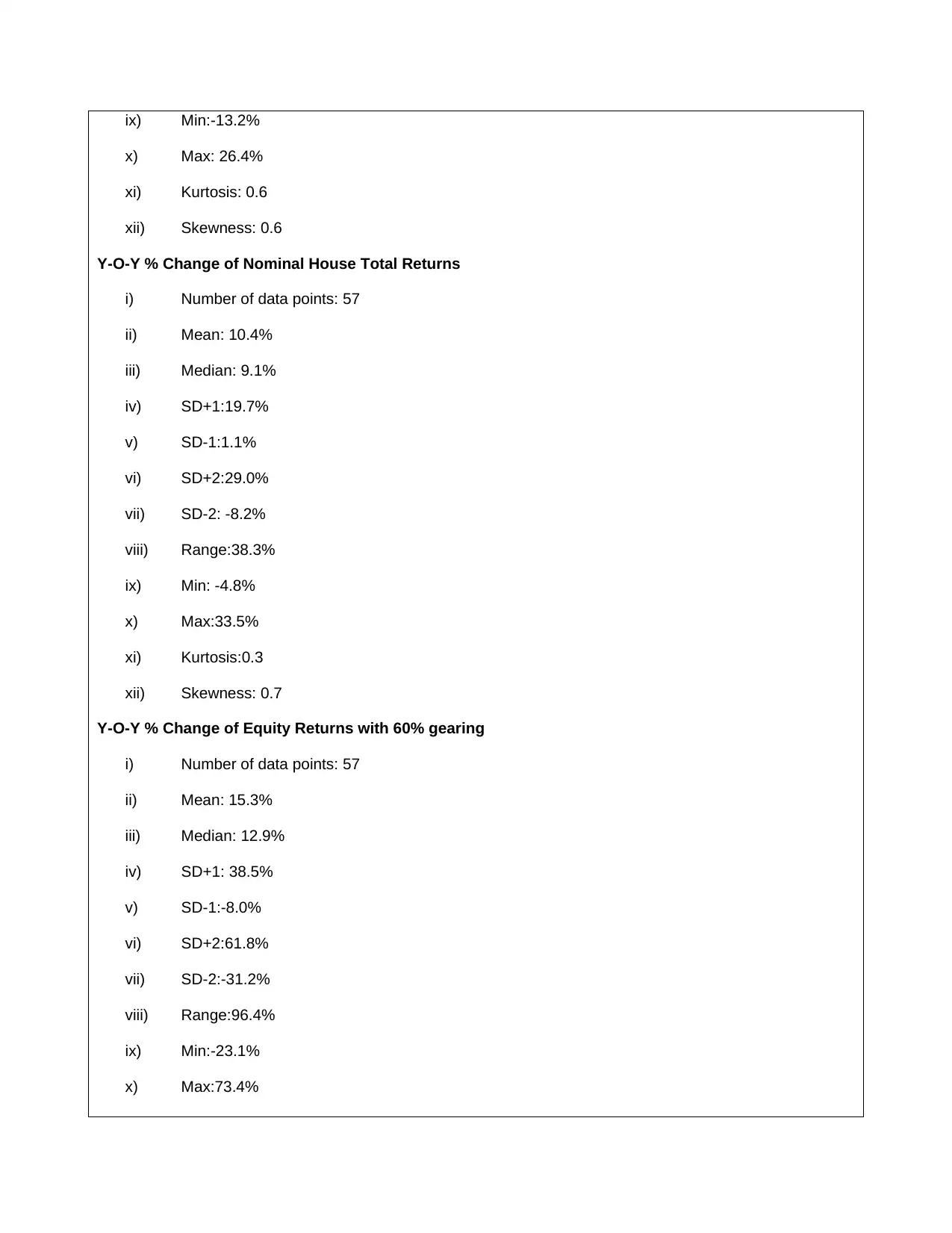
ix) Min:-13.2%
x) Max: 26.4%
xi) Kurtosis: 0.6
xii) Skewness: 0.6
Y-O-Y % Change of Nominal House Total Returns
i) Number of data points: 57
ii) Mean: 10.4%
iii) Median: 9.1%
iv) SD+1:19.7%
v) SD-1:1.1%
vi) SD+2:29.0%
vii) SD-2: -8.2%
viii) Range:38.3%
ix) Min: -4.8%
x) Max:33.5%
xi) Kurtosis:0.3
xii) Skewness: 0.7
Y-O-Y % Change of Equity Returns with 60% gearing
i) Number of data points: 57
ii) Mean: 15.3%
iii) Median: 12.9%
iv) SD+1: 38.5%
v) SD-1:-8.0%
vi) SD+2:61.8%
vii) SD-2:-31.2%
viii) Range:96.4%
ix) Min:-23.1%
x) Max:73.4%
Paraphrase This Document
Need a fresh take? Get an instant paraphrase of this document with our AI Paraphraser
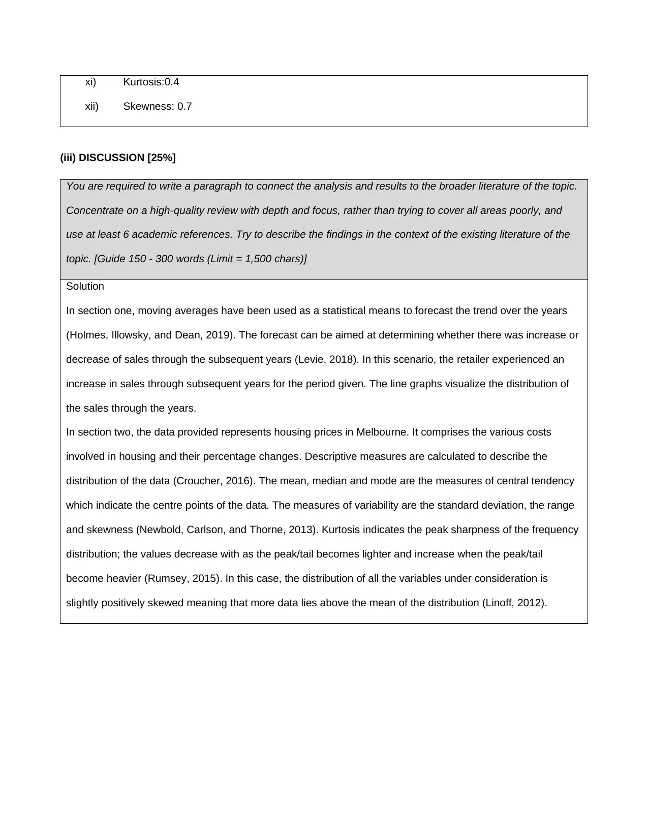
xi) Kurtosis:0.4
xii) Skewness: 0.7
(iii) DISCUSSION [25%]
You are required to write a paragraph to connect the analysis and results to the broader literature of the topic.
Concentrate on a high-quality review with depth and focus, rather than trying to cover all areas poorly, and
use at least 6 academic references. Try to describe the findings in the context of the existing literature of the
topic. [Guide 150 - 300 words (Limit = 1,500 chars)]
Solution
In section one, moving averages have been used as a statistical means to forecast the trend over the years
(Holmes, Illowsky, and Dean, 2019). The forecast can be aimed at determining whether there was increase or
decrease of sales through the subsequent years (Levie, 2018). In this scenario, the retailer experienced an
increase in sales through subsequent years for the period given. The line graphs visualize the distribution of
the sales through the years.
In section two, the data provided represents housing prices in Melbourne. It comprises the various costs
involved in housing and their percentage changes. Descriptive measures are calculated to describe the
distribution of the data (Croucher, 2016). The mean, median and mode are the measures of central tendency
which indicate the centre points of the data. The measures of variability are the standard deviation, the range
and skewness (Newbold, Carlson, and Thorne, 2013). Kurtosis indicates the peak sharpness of the frequency
distribution; the values decrease with as the peak/tail becomes lighter and increase when the peak/tail
become heavier (Rumsey, 2015). In this case, the distribution of all the variables under consideration is
slightly positively skewed meaning that more data lies above the mean of the distribution (Linoff, 2012).
(iv) REFERENCES [5%]
List the references used in your literature review in HARVARD format. Ensure that they are fully and correctly
cited. Ideally you should seek to have more than 6 quality references for this assignment. See the rubric for
further details.
References
Croucher, J. S. 2016. Introductory mathematics & statistics.6th ed. Australia: North Ryde, N.S.W. McGraw-Hill
Education.
Holmes, A., Illowsky, B., and Dean, S. 2019. Introductory business statistics. OpenStax.
Levie, R. D. 2018. Advanced Excel for scientific data analysis. 2nd ed. New York, NY: Oxford University Press.
Linoff, G. 2012. Data analysis using SQL and Excel. Indianapolis, Ind.: Wiley Pub.
Newbold, P., Carlson, W. and Thorne, B. 2013. Statistics for business and economics. Harlow, Essex:
Pearson Education.
Rumsey, D. 2015. Intermediate statistics for dummies. 1st ed. Hoboken, N.J.: Wiley.
* Presentation and Written Communication 5%
ATTACH THE MATRIX AND GRAPHS HERE.
Figure 1: Matrix/Chart of Categories for Qualitative Data
Figure 2: Bar Graph for Categorical Data Representation
Figure 1: Matrix/Chart of Categories for Qualitative Data
Figure 2: Bar Graph for Categorical Data Representation
Secure Best Marks with AI Grader
Need help grading? Try our AI Grader for instant feedback on your assignments.
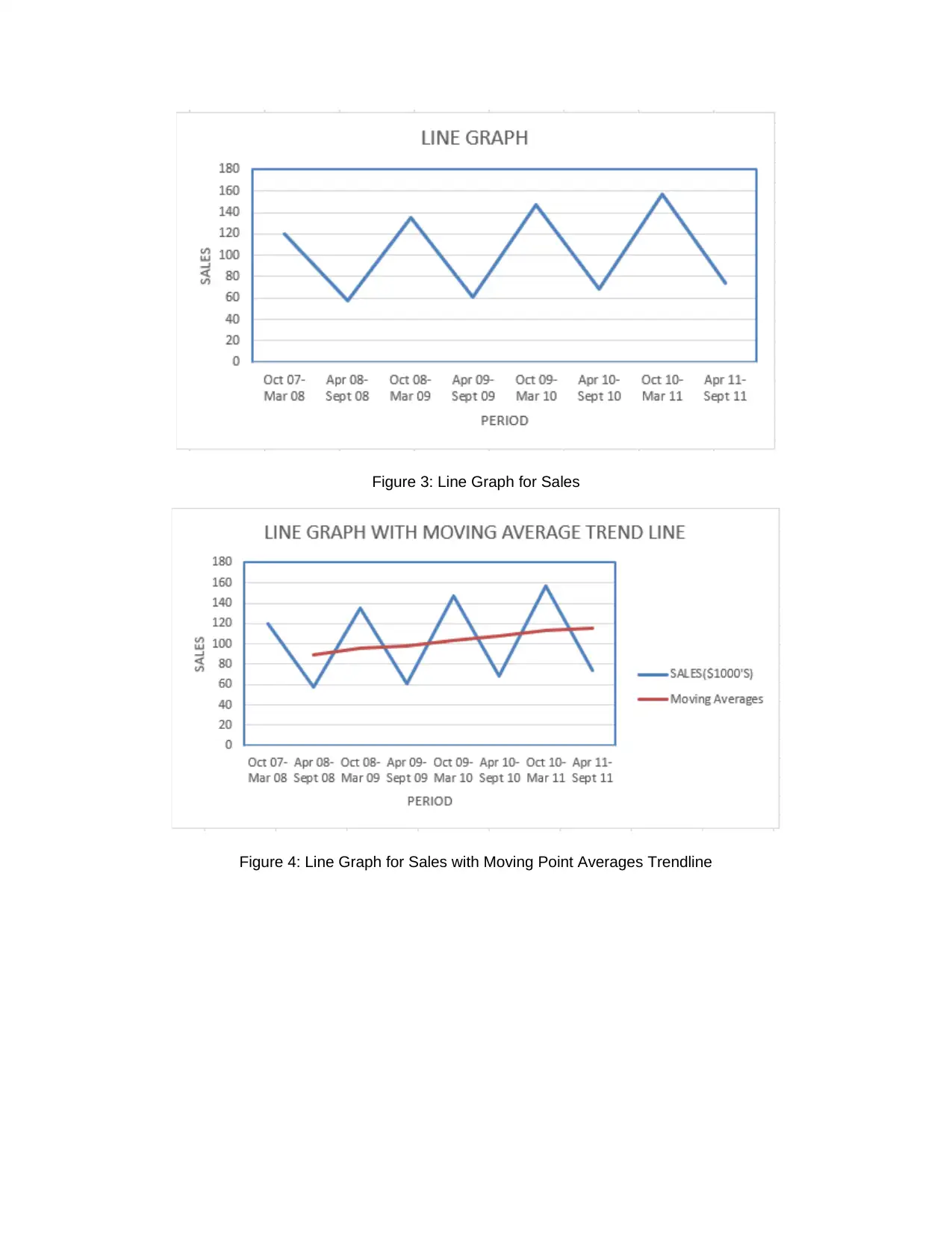
Figure 3: Line Graph for Sales
Figure 4: Line Graph for Sales with Moving Point Averages Trendline
Figure 4: Line Graph for Sales with Moving Point Averages Trendline
1 out of 11
Related Documents
Your All-in-One AI-Powered Toolkit for Academic Success.
+13062052269
info@desklib.com
Available 24*7 on WhatsApp / Email
![[object Object]](/_next/static/media/star-bottom.7253800d.svg)
Unlock your academic potential
© 2024 | Zucol Services PVT LTD | All rights reserved.


