Data Analysis of Netflix Viewers: Assignment and Report
VerifiedAdded on 2023/01/04
|11
|2016
|40
Homework Assignment
AI Summary
This assignment presents a comprehensive analysis of Netflix viewer data, encompassing various statistical methods and practical applications. The analysis begins with calculating descriptive statistics such as mean, standard deviation, and coefficient of variance to understand the age distribution of Netflix viewers. It then progresses to creating frequency tables and cumulative frequency curves to analyze grouped data, comparing grouped and ungrouped data means and standard deviations. A significant portion of the assignment focuses on creating scatter graphs, calculating regression equations, and determining the coefficient of determination to identify the best predictor of job separation. The report interprets the correlation coefficient and regression equation within the context of the data. Furthermore, the assignment includes the construction of network diagrams and critical path analysis to illustrate network structures and project timelines. The student reflects on the assignment, highlighting strengths, challenges, and areas for improvement, providing a detailed overview of the process and findings.
Assessment
Paraphrase This Document
Need a fresh take? Get an instant paraphrase of this document with our AI Paraphraser
Table of Contents
Table of Contents.............................................................................................................................2
Creation of scatter graph along with trend, regression equation and coefficient of
determination on the chart...........................................................................................................1
Stating the best predictor and the reason for the choice..............................................................1
Interpretation of the relevant correlation coefficient and the coefficient of determination.........2
Stating the regression equation in context and interpret the intercept and gradient....................3
MAIN BODY
TASK 1
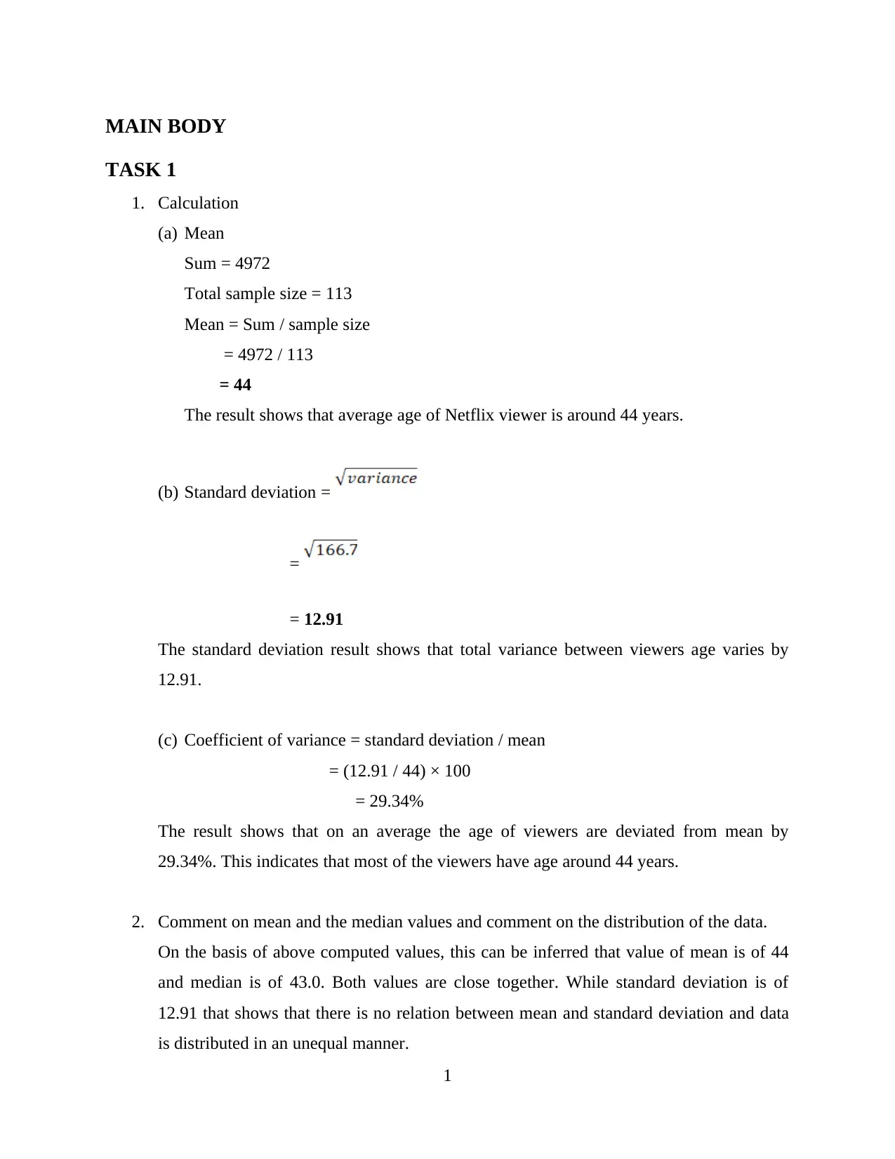
1. Calculation
(a) Mean
Sum = 4972
Total sample size = 113
Mean = Sum / sample size
= 4972 / 113
= 44
The result shows that average age of Netflix viewer is around 44 years.
(b) Standard deviation =
=
= 12.91
The standard deviation result shows that total variance between viewers age varies by
12.91.
(c) Coefficient of variance = standard deviation / mean
= (12.91 / 44) × 100
= 29.34%
The result shows that on an average the age of viewers are deviated from mean by
29.34%. This indicates that most of the viewers have age around 44 years.
2. Comment on mean and the median values and comment on the distribution of the data.
On the basis of above computed values, this can be inferred that value of mean is of 44
and median is of 43.0. Both values are close together. While standard deviation is of
12.91 that shows that there is no relation between mean and standard deviation and data
is distributed in an unequal manner.
1
⊘ This is a preview!⊘
Do you want full access?
Subscribe today to unlock all pages.

Trusted by 1+ million students worldwide
TASK 2
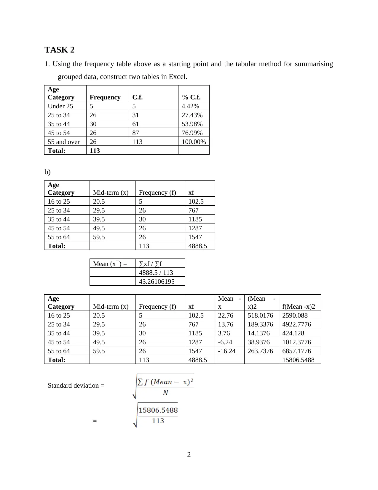
1. Using the frequency table above as a starting point and the tabular method for summarising
grouped data, construct two tables in Excel.
Age
Category Frequency C.f. % C.f.
Under 25 5 5 4.42%
25 to 34 26 31 27.43%
35 to 44 30 61 53.98%
45 to 54 26 87 76.99%
55 and over 26 113 100.00%
Total: 113
b)
Age
Category Mid-term (x) Frequency (f) xf
16 to 25 20.5 5 102.5
25 to 34 29.5 26 767
35 to 44 39.5 30 1185
45 to 54 49.5 26 1287
55 to 64 59.5 26 1547
Total: 113 4888.5
Mean (x¯) = ∑xf / ∑f
4888.5 / 113
43.26106195
Age
Category Mid-term (x) Frequency (f) xf
Mean -
x
(Mean -
x)2 f(Mean -x)2
16 to 25 20.5 5 102.5 22.76 518.0176 2590.088
25 to 34 29.5 26 767 13.76 189.3376 4922.7776
35 to 44 39.5 30 1185 3.76 14.1376 424.128
45 to 54 49.5 26 1287 -6.24 38.9376 1012.3776
55 to 64 59.5 26 1547 -16.24 263.7376 6857.1776
Total: 113 4888.5 15806.5488
Standard deviation =
=
2
Paraphrase This Document
Need a fresh take? Get an instant paraphrase of this document with our AI Paraphraser
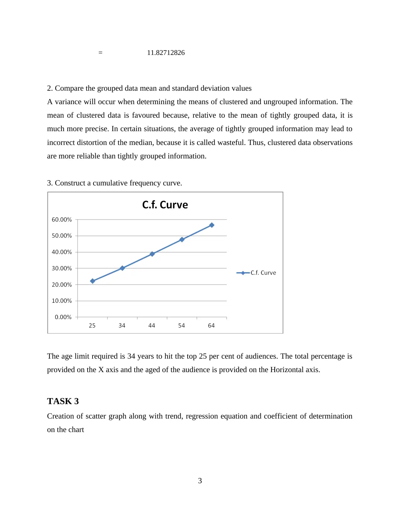
= 11.82712826
2. Compare the grouped data mean and standard deviation values
A variance will occur when determining the means of clustered and ungrouped information. The
mean of clustered data is favoured because, relative to the mean of tightly grouped data, it is
much more precise. In certain situations, the average of tightly grouped information may lead to
incorrect distortion of the median, because it is called wasteful. Thus, clustered data observations
are more reliable than tightly grouped information.
3. Construct a cumulative frequency curve.
The age limit required is 34 years to hit the top 25 per cent of audiences. The total percentage is
provided on the X axis and the aged of the audience is provided on the Horizontal axis.
TASK 3
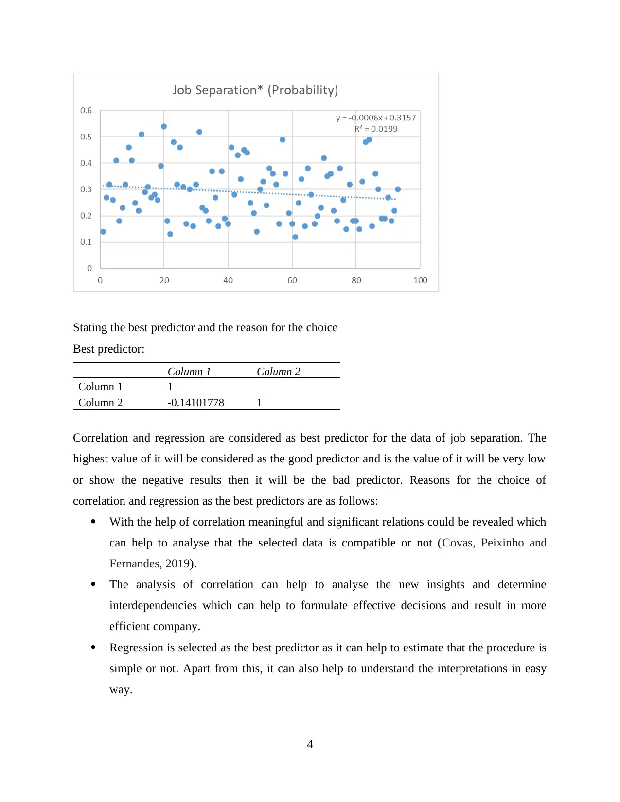
Creation of scatter graph along with trend, regression equation and coefficient of determination
on the chart
3
Stating the best predictor and the reason for the choice
Best predictor:
Column 1 Column 2
Column 1 1
Column 2 -0.14101778 1
Correlation and regression are considered as best predictor for the data of job separation. The
highest value of it will be considered as the good predictor and is the value of it will be very low
or show the negative results then it will be the bad predictor. Reasons for the choice of
correlation and regression as the best predictors are as follows:
With the help of correlation meaningful and significant relations could be revealed which
can help to analyse that the selected data is compatible or not (Covas, Peixinho and
Fernandes, 2019).
The analysis of correlation can help to analyse the new insights and determine
interdependencies which can help to formulate effective decisions and result in more
efficient company.
Regression is selected as the best predictor as it can help to estimate that the procedure is
simple or not. Apart from this, it can also help to understand the interpretations in easy
way.
4
⊘ This is a preview!⊘
Do you want full access?
Subscribe today to unlock all pages.

Trusted by 1+ million students worldwide
With the help of regression analysis, it will be easy for the entities to make better
decisions for the business to grow it in present and in future.
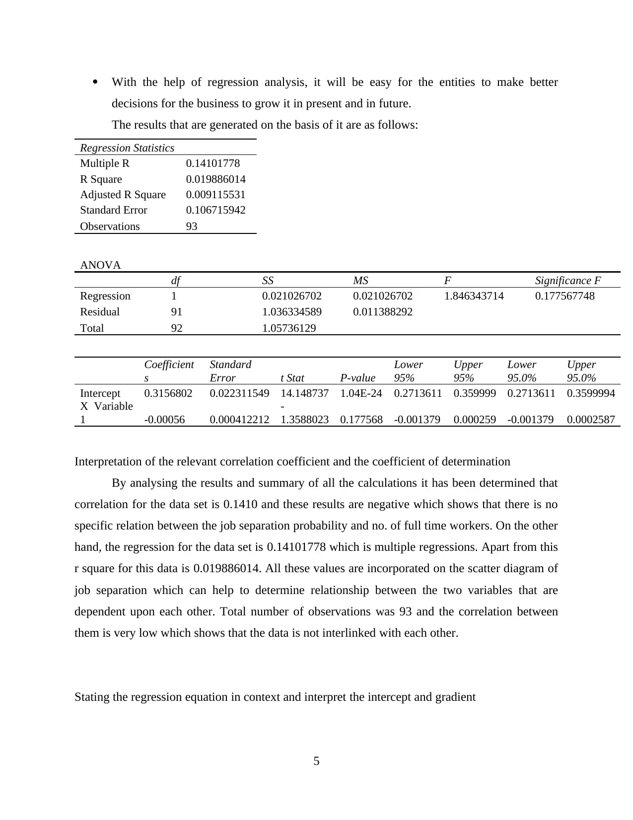
The results that are generated on the basis of it are as follows:
Regression Statistics
Multiple R 0.14101778
R Square 0.019886014
Adjusted R Square 0.009115531
Standard Error 0.106715942
Observations 93
ANOVA
df SS MS F Significance F
Regression 1 0.021026702 0.021026702 1.846343714 0.177567748
Residual 91 1.036334589 0.011388292
Total 92 1.05736129
Coefficient
s
Standard
Error t Stat P-value
Lower
95%
Upper
95%
Lower
95.0%
Upper
95.0%
Intercept 0.3156802 0.022311549 14.148737 1.04E-24 0.2713611 0.359999 0.2713611 0.3599994
X Variable
1 -0.00056 0.000412212
-
1.3588023 0.177568 -0.001379 0.000259 -0.001379 0.0002587
Interpretation of the relevant correlation coefficient and the coefficient of determination
By analysing the results and summary of all the calculations it has been determined that
correlation for the data set is 0.1410 and these results are negative which shows that there is no
specific relation between the job separation probability and no. of full time workers. On the other
hand, the regression for the data set is 0.14101778 which is multiple regressions. Apart from this
r square for this data is 0.019886014. All these values are incorporated on the scatter diagram of
job separation which can help to determine relationship between the two variables that are
dependent upon each other. Total number of observations was 93 and the correlation between
them is very low which shows that the data is not interlinked with each other.
Stating the regression equation in context and interpret the intercept and gradient
5
Paraphrase This Document
Need a fresh take? Get an instant paraphrase of this document with our AI Paraphraser
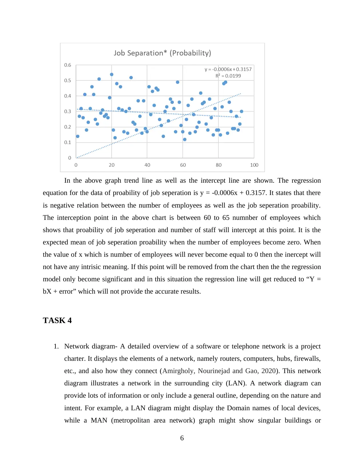
In the above graph trend line as well as the intercept line are shown. The regression
equation for the data of proability of job seperation is y = -0.0006x + 0.3157. It states that there
is negative relation between the number of employees as well as the job seperation proability.
The interception point in the above chart is between 60 to 65 numnber of employees which
shows that proability of job seperation and number of staff will intercept at this point. It is the
expected mean of job seperation proability when the number of employees become zero. When
the value of x which is number of employees will never become equal to 0 then the inercept will
not have any intrisic meaning. If this point will be removed from the chart then the the regression
model only become significant and in this situation the regression line will get reduced to “Y =
bX + error” which will not provide the accurate results.
TASK 4
1. Network diagram- A detailed overview of a software or telephone network is a project
charter. It displays the elements of a network, namely routers, computers, hubs, firewalls,
etc., and also how they connect (Amirgholy, Nourinejad and Gao, 2020). This network
diagram illustrates a network in the surrounding city (LAN). A network diagram can
provide lots of information or only include a general outline, depending on the nature and
intent. For example, a LAN diagram might display the Domain names of local devices,
while a MAN (metropolitan area network) graph might show singular buildings or
6
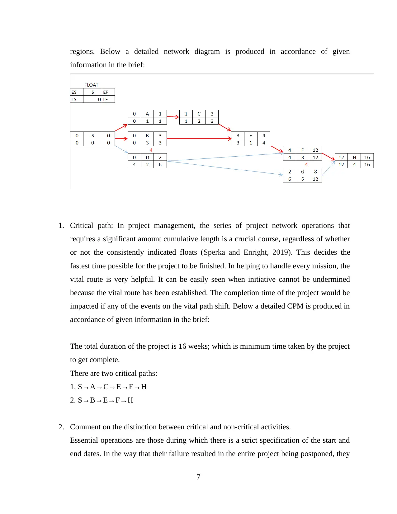
regions. Below a detailed network diagram is produced in accordance of given
information in the brief:
1. Critical path: In project management, the series of project network operations that
requires a significant amount cumulative length is a crucial course, regardless of whether
or not the consistently indicated floats (Sperka and Enright, 2019). This decides the
fastest time possible for the project to be finished. In helping to handle every mission, the
vital route is very helpful. It can be easily seen when initiative cannot be undermined
because the vital route has been established. The completion time of the project would be
impacted if any of the events on the vital path shift. Below a detailed CPM is produced in
accordance of given information in the brief:
The total duration of the project is 16 weeks; which is minimum time taken by the project
to get complete.
There are two critical paths:
1. S→A→C→E→F→H
2. S→B→E→F→H
2. Comment on the distinction between critical and non-critical activities.
Essential operations are those during which there is a strict specification of the start and
end dates. In the way that their failure resulted in the entire project being postponed, they
7
⊘ This is a preview!⊘
Do you want full access?
Subscribe today to unlock all pages.

Trusted by 1+ million students worldwide

are important. To a certain level, the start time for non-critical operations should be freely
chosen. D G H is non-critical operations in the above diagram which can be put on⁇ ⁇
hold if required.
TASK 5
1. What do you think you did particularly well in this assignment?
In this assignment, there was a range of tasks and activities. Each of them containing
detailed information of requirement. As per my personal experience, I would like to
choose task 4 in which I prepared a network diagram as well as identified critical path
and duration of project. In this task I performed well because it was quite easier for me to
produce a diagram by help of Microsoft project tool.
2. What was the most challenging aspect of this coursework and why was this case?
For me, the task 3 was challenging because under this I have to perform a range of
requirements as per the brief need. I found this task quite challenging and difficult due to
complexity of data set as well as it was quite tough for me to find out best predictor. So
due to such reasons, this task was challenging for me in such project.
3. What would you do differently next time?
In the next time, I will clear my concepts on which I faced issues and difficulties. For this
purpose, I will strengthen my learning on how to find out best predictor as well as I will
focus on analysing of data so that complexity of data set can be minimized in an effective
manner.
8
Paraphrase This Document
Need a fresh take? Get an instant paraphrase of this document with our AI Paraphraser
REFERENCES
Sperka, L. and Enright, E., 2019. Network ethnography applied: Understanding the evolving
health and physical education knowledge landscape. Sport, Education and Society, 24(2),
pp.168-181.
Amirgholy, M., Nourinejad, M. and Gao, H.O., 2020. Optimal traffic control at smart
intersections: Automated network fundamental diagram. Transportation Research Part
B: Methodological, 137, pp.2-18.
Covas, E., Peixinho, N. and Fernandes, J., 2019. Neural network forecast of the sunspot butterfly
diagram. Solar Physics, 294(3), p.24.
9
1 out of 11
Related Documents
Your All-in-One AI-Powered Toolkit for Academic Success.
+13062052269
info@desklib.com
Available 24*7 on WhatsApp / Email
![[object Object]](/_next/static/media/star-bottom.7253800d.svg)
Unlock your academic potential
© 2024 | Zucol Services PVT LTD | All rights reserved.


