Data Visualization Project: Health, Shares, Tennis, Crime
VerifiedAdded on 2020/09/22
|8
|1511
|187
Project
AI Summary
This project is a comprehensive visual analytics assignment that explores diverse datasets, including Australian health conditions, stock performance of major companies, tennis player statistics, and crime analysis in Houston. The project utilizes various visualization techniques such as bar charts, line charts, and box plots to analyze and compare data effectively. The analysis of health data compares health conditions over time, while the stock data analysis focuses on share performance comparisons. The tennis data analysis examines top players and tournament wins. Finally, the crime analysis utilizes an interactive shiny web interface to visualize crime density across Houston. The project demonstrates the application of visual analytics to extract meaningful insights from complex datasets. This assignment showcases the student's ability to analyze data using diverse visualization methods.
ASSIGNMENT 2-VISUAL ANALYTICS
Table of Contents
Task 1A: bar chart on health condition........................................................................................................1
Task 1B: line chart for increased and decreased health condition..........................................................2
TASK 2A: line chart for comparison of share performance..........................................................................3
Task 2B: Box plot to show highest median value.....................................................................................4
Task 3A bar chart for the top 10 players.....................................................................................................5
Task 3B: bar chart on player who won on four tournments....................................................................6
Task 4: crime analysis over houston............................................................................................................7
Paraphrase This Document
Need a fresh take? Get an instant paraphrase of this document with our AI Paraphraser
Task 1A: bar chart on health condition
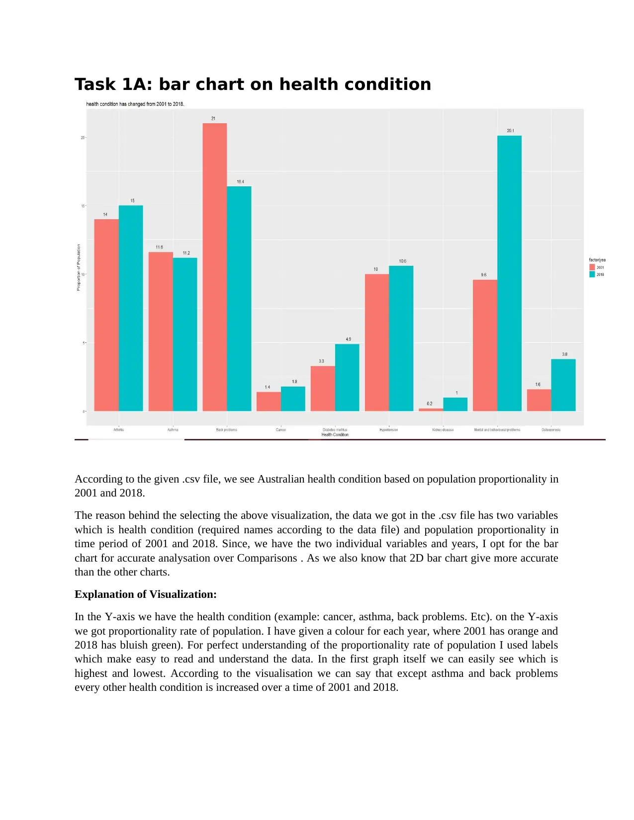
According to the given .csv file, we see Australian health condition based on population proportionality in
2001 and 2018.
The reason behind the selecting the above visualization, the data we got in the .csv file has two variables
which is health condition (required names according to the data file) and population proportionality in
time period of 2001 and 2018. Since, we have the two individual variables and years, I opt for the bar
chart for accurate analysation over Comparisons . As we also know that 2D bar chart give more accurate
than the other charts.
Explanation of Visualization:
In the Y-axis we have the health condition (example: cancer, asthma, back problems. Etc). on the Y-axis
we got proportionality rate of population. I have given a colour for each year, where 2001 has orange and
2018 has bluish green). For perfect understanding of the proportionality rate of population I used labels
which make easy to read and understand the data. In the first graph itself we can easily see which is
highest and lowest. According to the visualisation we can say that except asthma and back problems
every other health condition is increased over a time of 2001 and 2018.
Task 1B: line chart for increased and decreased health
condition
Image(1.2)
From the given .csv file, in the above task 1 visualization we have seen the health conditions by the
population proportionality.
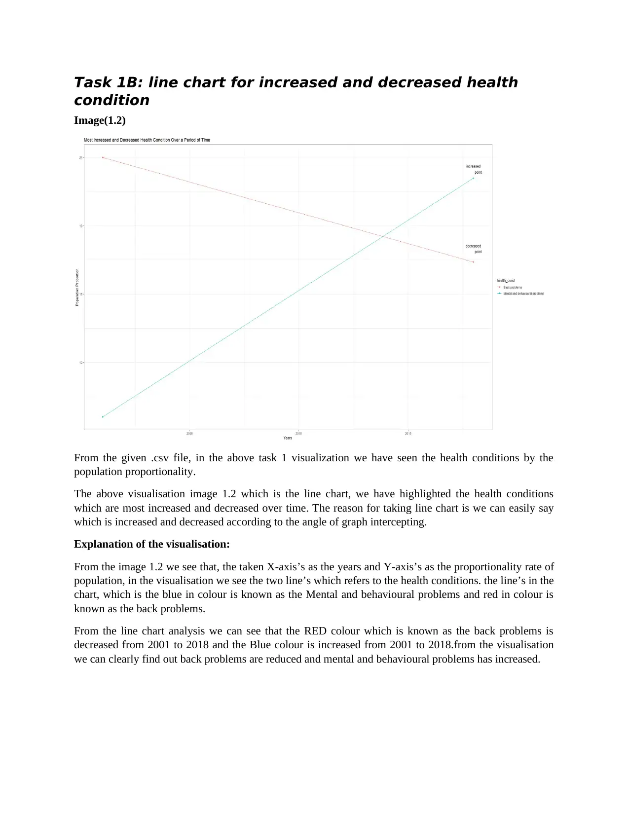
The above visualisation image 1.2 which is the line chart, we have highlighted the health conditions
which are most increased and decreased over time. The reason for taking line chart is we can easily say
which is increased and decreased according to the angle of graph intercepting.
Explanation of the visualisation:
From the image 1.2 we see that, the taken X-axis’s as the years and Y-axis’s as the proportionality rate of
population, in the visualisation we see the two line’s which refers to the health conditions. the line’s in the
chart, which is the blue in colour is known as the Mental and behavioural problems and red in colour is
known as the back problems.
From the line chart analysis we can see that the RED colour which is known as the back problems is
decreased from 2001 to 2018 and the Blue colour is increased from 2001 to 2018.from the visualisation
we can clearly find out back problems are reduced and mental and behavioural problems has increased.
⊘ This is a preview!⊘
Do you want full access?
Subscribe today to unlock all pages.

Trusted by 1+ million students worldwide
TASK 2A: line chart for comparison of share
performance
Image (2.1)
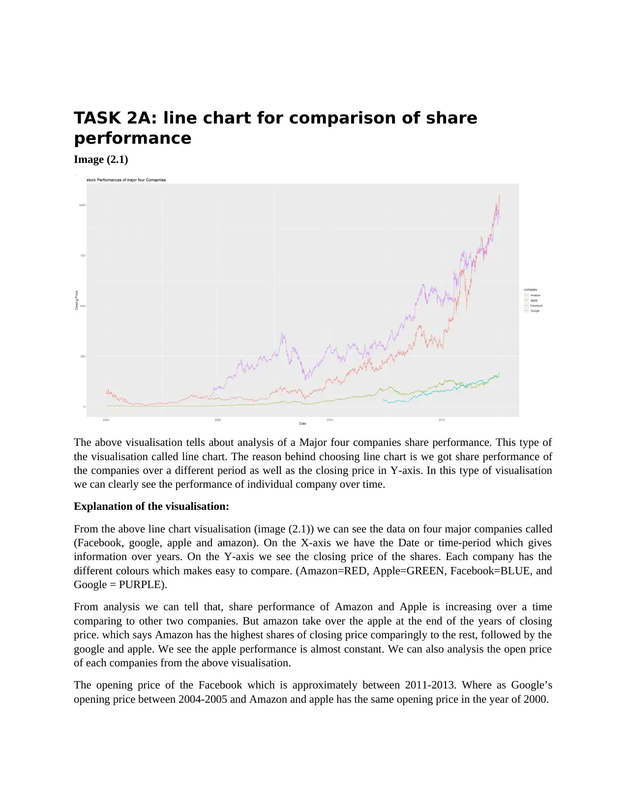
The above visualisation tells about analysis of a Major four companies share performance. This type of
the visualisation called line chart. The reason behind choosing line chart is we got share performance of
the companies over a different period as well as the closing price in Y-axis. In this type of visualisation
we can clearly see the performance of individual company over time.
Explanation of the visualisation:
From the above line chart visualisation (image (2.1)) we can see the data on four major companies called
(Facebook, google, apple and amazon). On the X-axis we have the Date or time-period which gives
information over years. On the Y-axis we see the closing price of the shares. Each company has the
different colours which makes easy to compare. (Amazon=RED, Apple=GREEN, Facebook=BLUE, and
Google = PURPLE).
From analysis we can tell that, share performance of Amazon and Apple is increasing over a time
comparing to other two companies. But amazon take over the apple at the end of the years of closing
price. which says Amazon has the highest shares of closing price comparingly to the rest, followed by the
google and apple. We see the apple performance is almost constant. We can also analysis the open price
of each companies from the above visualisation.
The opening price of the Facebook which is approximately between 2011-2013. Where as Google’s
opening price between 2004-2005 and Amazon and apple has the same opening price in the year of 2000.
Paraphrase This Document
Need a fresh take? Get an instant paraphrase of this document with our AI Paraphraser
Task 2B: Box plot to show highest median value
Image (2.2)
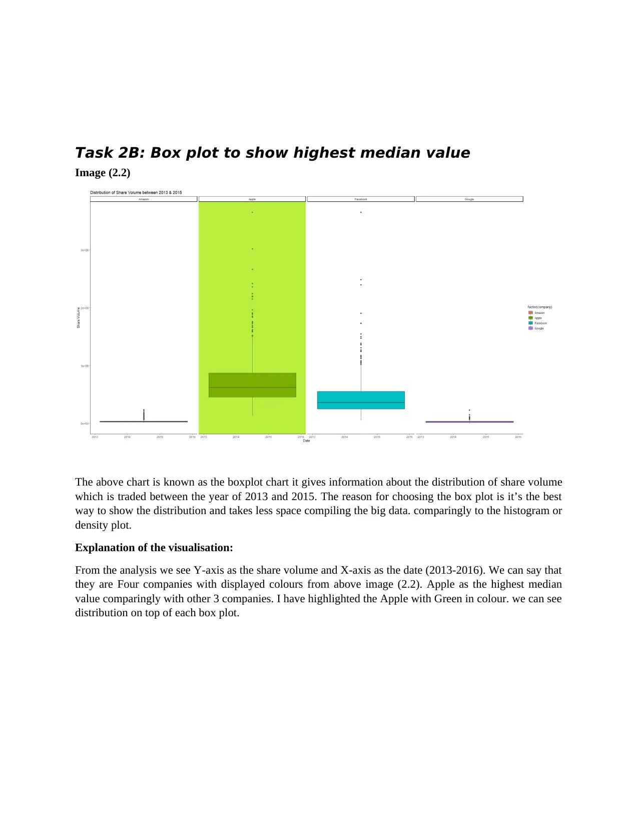
The above chart is known as the boxplot chart it gives information about the distribution of share volume
which is traded between the year of 2013 and 2015. The reason for choosing the box plot is it’s the best
way to show the distribution and takes less space compiling the big data. comparingly to the histogram or
density plot.
Explanation of the visualisation:
From the analysis we see Y-axis as the share volume and X-axis as the date (2013-2016). We can say that
they are Four companies with displayed colours from above image (2.2). Apple as the highest median
value comparingly with other 3 companies. I have highlighted the Apple with Green in colour. we can see
distribution on top of each box plot.
Task 3A bar chart for the top 10 players
Image (3.1)
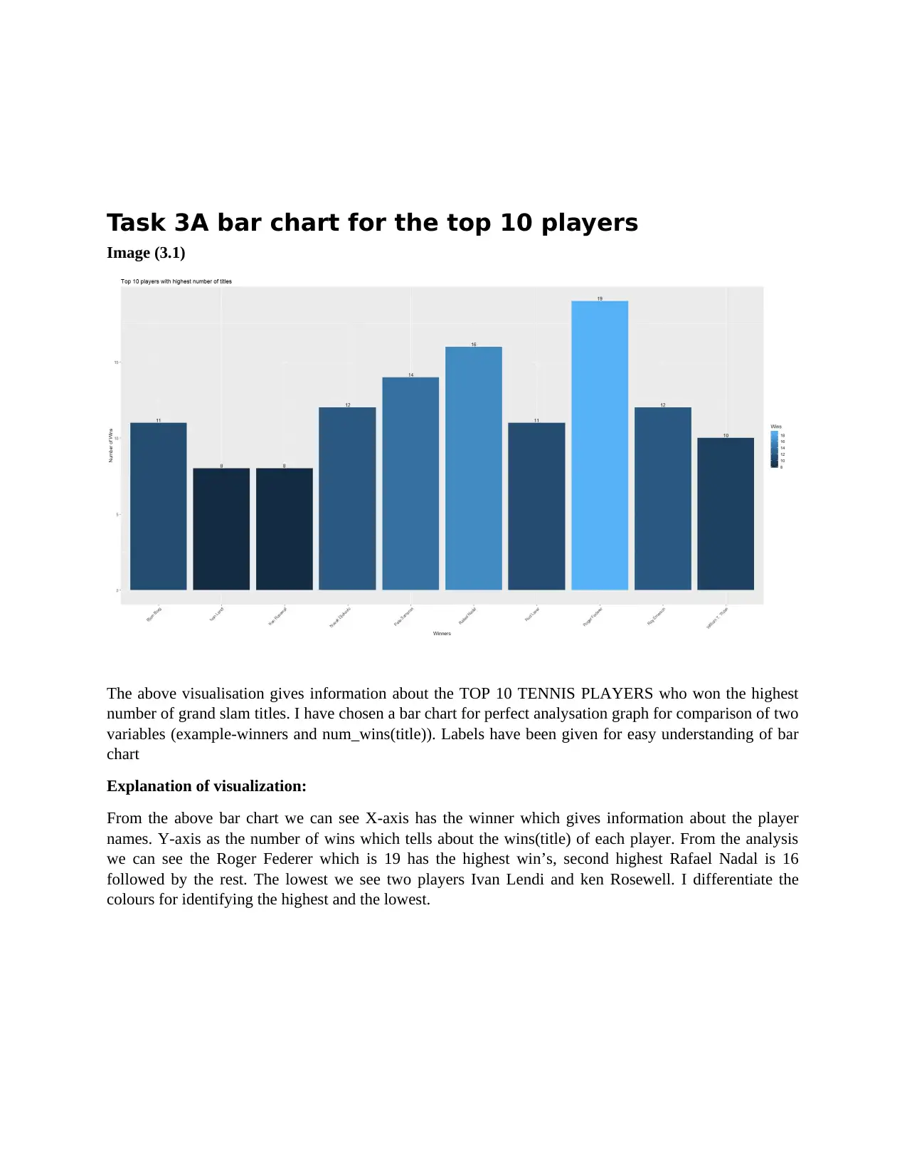
The above visualisation gives information about the TOP 10 TENNIS PLAYERS who won the highest
number of grand slam titles. I have chosen a bar chart for perfect analysation graph for comparison of two
variables (example-winners and num_wins(title)). Labels have been given for easy understanding of bar
chart
Explanation of visualization:
From the above bar chart we can see X-axis has the winner which gives information about the player
names. Y-axis as the number of wins which tells about the wins(title) of each player. From the analysis
we can see the Roger Federer which is 19 has the highest win’s, second highest Rafael Nadal is 16
followed by the rest. The lowest we see two players Ivan Lendi and ken Rosewell. I differentiate the
colours for identifying the highest and the lowest.
⊘ This is a preview!⊘
Do you want full access?
Subscribe today to unlock all pages.

Trusted by 1+ million students worldwide
Task 3B: bar chart on player who won on four tournments
Image (3.2)
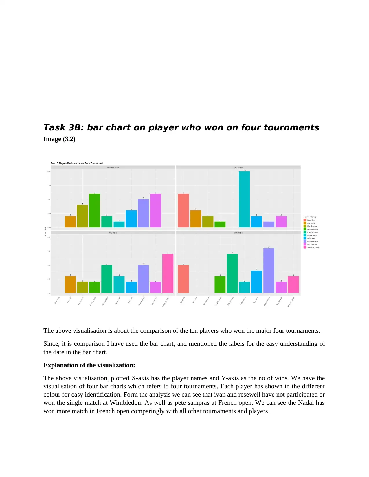
The above visualisation is about the comparison of the ten players who won the major four tournaments.
Since, it is comparison I have used the bar chart, and mentioned the labels for the easy understanding of
the date in the bar chart.
Explanation of the visualization:
The above visualisation, plotted X-axis has the player names and Y-axis as the no of wins. We have the
visualisation of four bar charts which refers to four tournaments. Each player has shown in the different
colour for easy identification. Form the analysis we can see that ivan and resewell have not participated or
won the single match at Wimbledon. As well as pete sampras at French open. We can see the Nadal has
won more match in French open comparingly with all other tournaments and players.
Paraphrase This Document
Need a fresh take? Get an instant paraphrase of this document with our AI Paraphraser
Task 4: crime analysis over houston
Image (4.0)
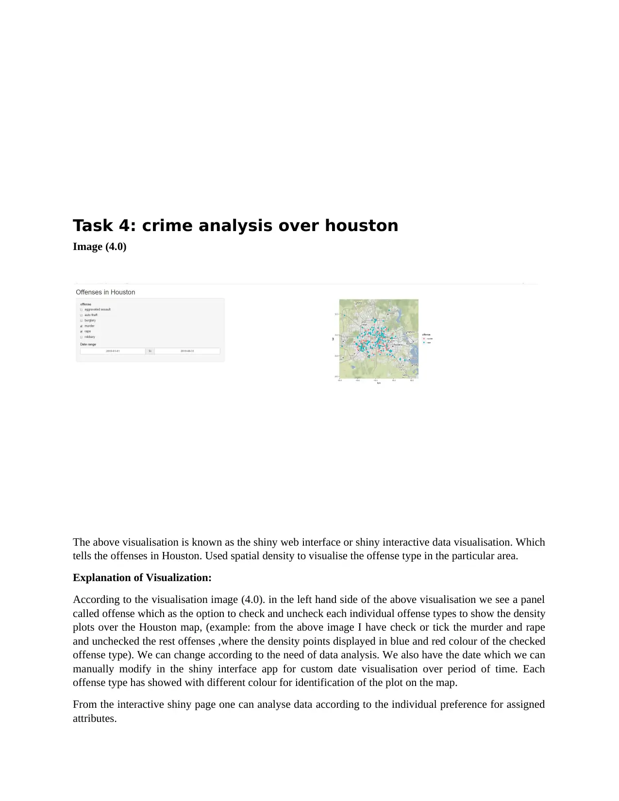
The above visualisation is known as the shiny web interface or shiny interactive data visualisation. Which
tells the offenses in Houston. Used spatial density to visualise the offense type in the particular area.
Explanation of Visualization:
According to the visualisation image (4.0). in the left hand side of the above visualisation we see a panel
called offense which as the option to check and uncheck each individual offense types to show the density
plots over the Houston map, (example: from the above image I have check or tick the murder and rape
and unchecked the rest offenses ,where the density points displayed in blue and red colour of the checked
offense type). We can change according to the need of data analysis. We also have the date which we can
manually modify in the shiny interface app for custom date visualisation over period of time. Each
offense type has showed with different colour for identification of the plot on the map.
From the interactive shiny page one can analyse data according to the individual preference for assigned
attributes.
1 out of 8
Your All-in-One AI-Powered Toolkit for Academic Success.
+13062052269
info@desklib.com
Available 24*7 on WhatsApp / Email
![[object Object]](/_next/static/media/star-bottom.7253800d.svg)
Unlock your academic potential
Copyright © 2020–2026 A2Z Services. All Rights Reserved. Developed and managed by ZUCOL.

