Comprehensive Analysis of Website Interface Design and Usability
VerifiedAdded on 2022/09/22
|11
|1428
|20
Report
AI Summary
This report analyzes the website interface design of Southern Cross University, focusing on usability and adherence to good design principles. The analysis covers various aspects, including website structure, typography, and the use of visual elements like contrast and color schemes. The report highlights both positive aspects, such as the use of clear headings and effective navigation, and areas for improvement, such as page loading time and the use of contrasting colors. Recommendations are provided to enhance the website's user interface, including suggestions for improving image optimization and color scheme choices. The report concludes by emphasizing the importance of a consistent and user-friendly interface for effective communication with the target audience. The report utilizes the work of Oulasvirta and Abowd, Qiu, and Vitiello as references.
Running head: WEBSITE INTERFACE DESIGN ANALYSIS
Website interface Design analysis
Name of the Student
Name of the University
Authors note
Website interface Design analysis
Name of the Student
Name of the University
Authors note
Paraphrase This Document
Need a fresh take? Get an instant paraphrase of this document with our AI Paraphraser
1WEBSITE INTERFACE DESIGN ANALYSIS
Table of Contents
Introduction......................................................................................................................................2
Website Structure.............................................................................................................................2
Analysis of the Interface..................................................................................................................2
Screen dumps of good and bad interface Design.............................................................................5
Recommendation.............................................................................................................................8
Conclusion.......................................................................................................................................9
References......................................................................................................................................10
2WEBSITE INTERFACE DESIGN ANALYSIS
Introduction
In this project the website of the Southern Cross University is analyzed in terms of the
good interface design principles and usability. For a good interface it is important to make sure
that all the text and pictures used on the pages are properly readable through the use of proper
contrast (Oulasvirta and Abowd 2016). In order to improve the readability, it is important to use
different color, space between the texts and images as well as the size of the texts. Along with
this, other features are also analyzed for the selected website of Southern Cross University
(https://www.scu.edu.au/).
Website Structure
While analyzing the website, we tried more than twelve web pages and navigated
between the different pages of the website. In our analysis it is found that the website utilizes
appropriate URLs throughout the website. This is considered as one of the best practices that
help the users as well as the search engine ranking improvement for the website. While
analyzing the interface it is found that there is proper use of typography which crucial to clearly
connect the users through deliver the intent and purpose of the interface to users (Qiu 2019). In
order to communicate the idea or information the text is used. This is the reason for which the
effective interface design always requires good typography on the pages. It in turn helps in
improving overall user experience while using the application or web page. In other words, it can
be stated that the optimized typography on the webpages consequently improves UI (user
interface).
Analysis of the Interface
Some of the good and bad interface design principles includes the following;
⊘ This is a preview!⊘
Do you want full access?
Subscribe today to unlock all pages.

Trusted by 1+ million students worldwide
3WEBSITE INTERFACE DESIGN ANALYSIS
Good contrast among the visual elements and texts on the pages;
In this way it is possible to make better contrast and high readability of the content on
the page. In addition to that the proper use of typography also helps in highlighting the
important information with the different font sizes such as headings.
For the selected site of www.scu.edu.au every page had well defined headings. Use of
these headings are also considered as excellent as they are important in search engines
optimization and summarize content of the related pages faster. With properly defined headings
it aids in accessibility.
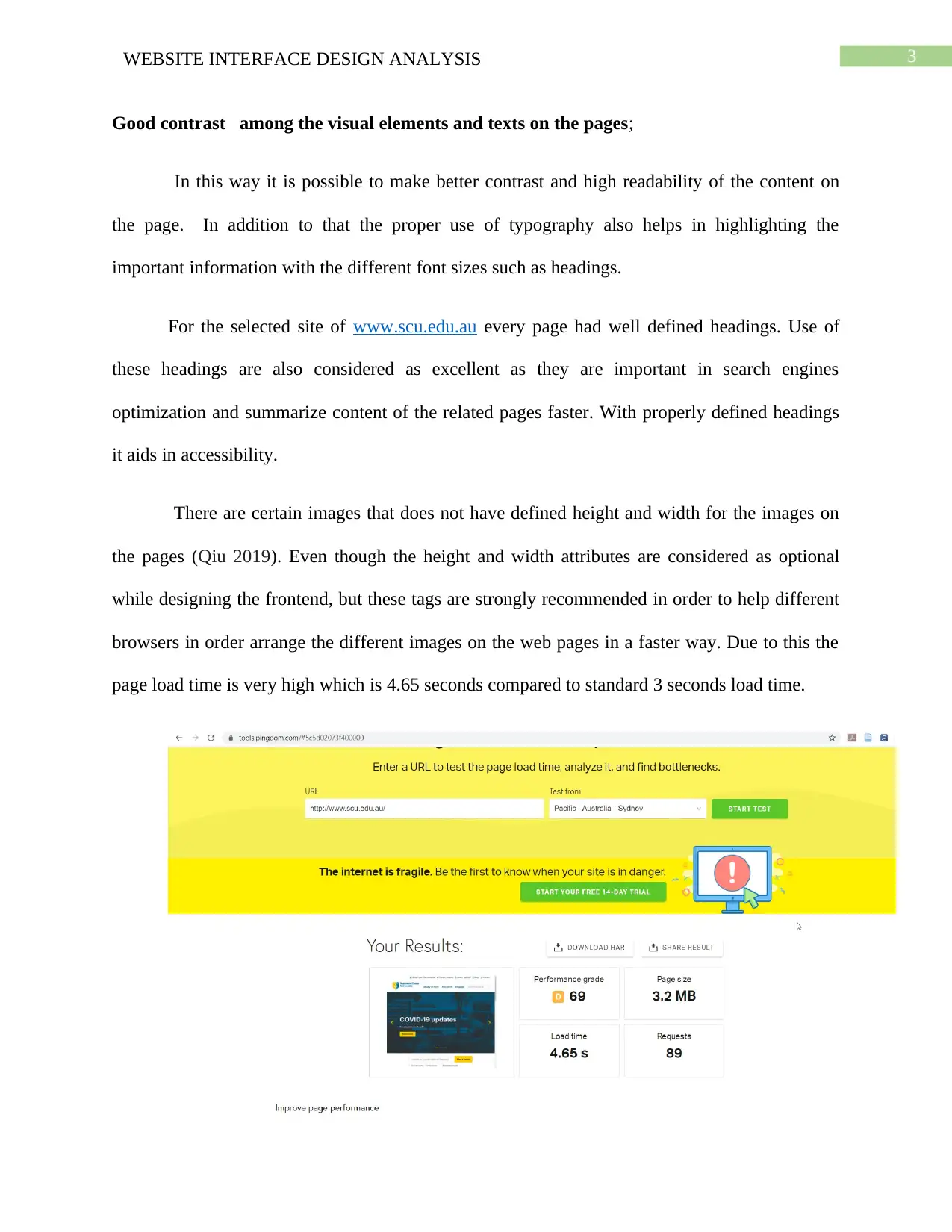
There are certain images that does not have defined height and width for the images on
the pages (Qiu 2019). Even though the height and width attributes are considered as optional
while designing the frontend, but these tags are strongly recommended in order to help different
browsers in order arrange the different images on the web pages in a faster way. Due to this the
page load time is very high which is 4.65 seconds compared to standard 3 seconds load time.
Paraphrase This Document
Need a fresh take? Get an instant paraphrase of this document with our AI Paraphraser
4WEBSITE INTERFACE DESIGN ANALYSIS
Responsiveness of the website
One of the most important aspects of the web site is the responsiveness of the website
that can help the intended users to use the site on the go with the use of the different devices with
varying screen sizes.
Navigability between the pages of the website
For any good website in order to make it usable for the intended users it is important to
create easy-to-navigate interface between the different pages. With the good user interface, it is
possible to put the users in comfort zone by letting them know about where they are in the
complete website and which pages or section they can reach in next steps.
Maintaining consistency
As the selected color for the pages by the developers or designer might not be liked as
good color layout to others (Vitiello 2016). Therefore, it is important to make sure the selected
color schemes colors fit well with the text and other elements on the page in order to maintain
consistency. Here it can be stated that the following are the good practices in a good user
interface;
Highlighting the primary information on the pages whenever required.
Use of proper color combination that can make contrast with each other.
minimalistic use of colors whenever possible.
Use of better typography on the pages
5WEBSITE INTERFACE DESIGN ANALYSIS
In the design an interface of an application the typography is very vital in improving the
design quality
With the better typography, it can be stated that the it is possible to maximize the
accessibility, readability of the information as well as graphic balance on the interfaces., the most
important factor is still usability. With the efficient use of the typography, it is possible to draw
the reader/user to contents on the page.
Screen dumps of good and bad interface Design
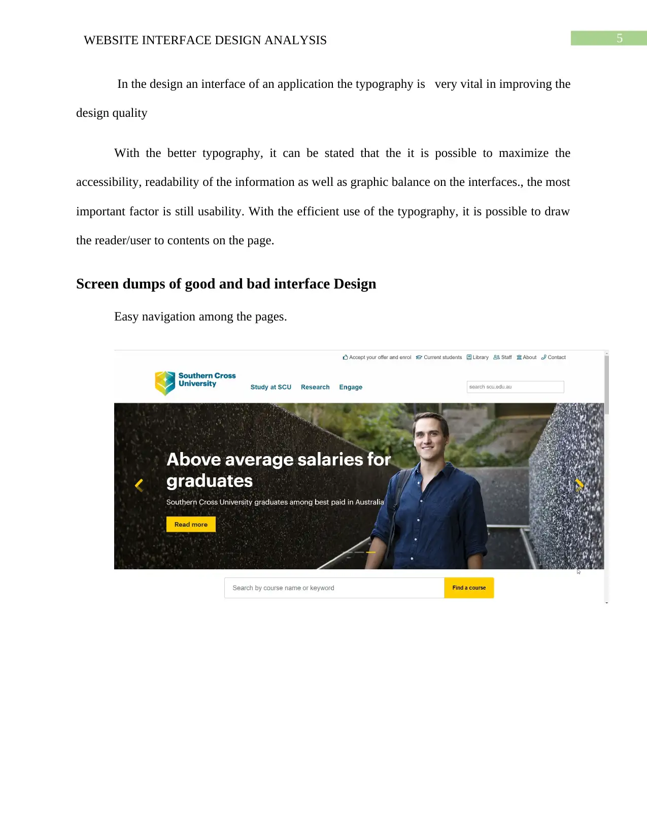
Easy navigation among the pages.
⊘ This is a preview!⊘
Do you want full access?
Subscribe today to unlock all pages.

Trusted by 1+ million students worldwide
6WEBSITE INTERFACE DESIGN ANALYSIS
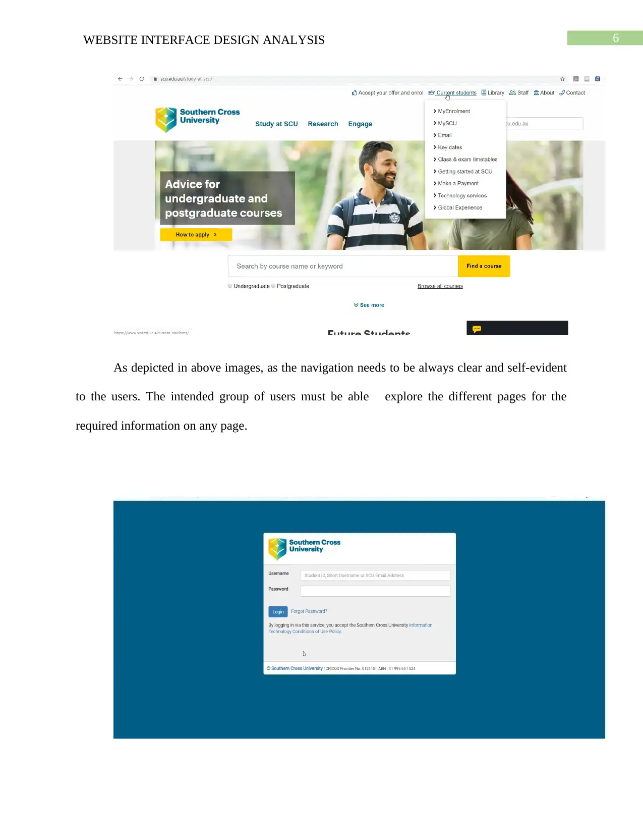
As depicted in above images, as the navigation needs to be always clear and self-evident
to the users. The intended group of users must be able explore the different pages for the
required information on any page.
As depicted in above images, as the navigation needs to be always clear and self-evident
to the users. The intended group of users must be able explore the different pages for the
required information on any page.
Paraphrase This Document
Need a fresh take? Get an instant paraphrase of this document with our AI Paraphraser
7WEBSITE INTERFACE DESIGN ANALYSIS
The login form looks simple but yet effective.
Proper use of typography
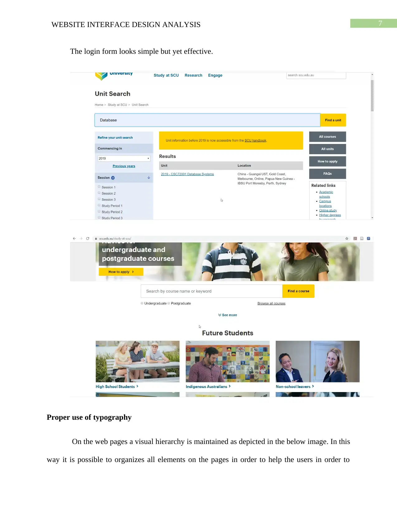
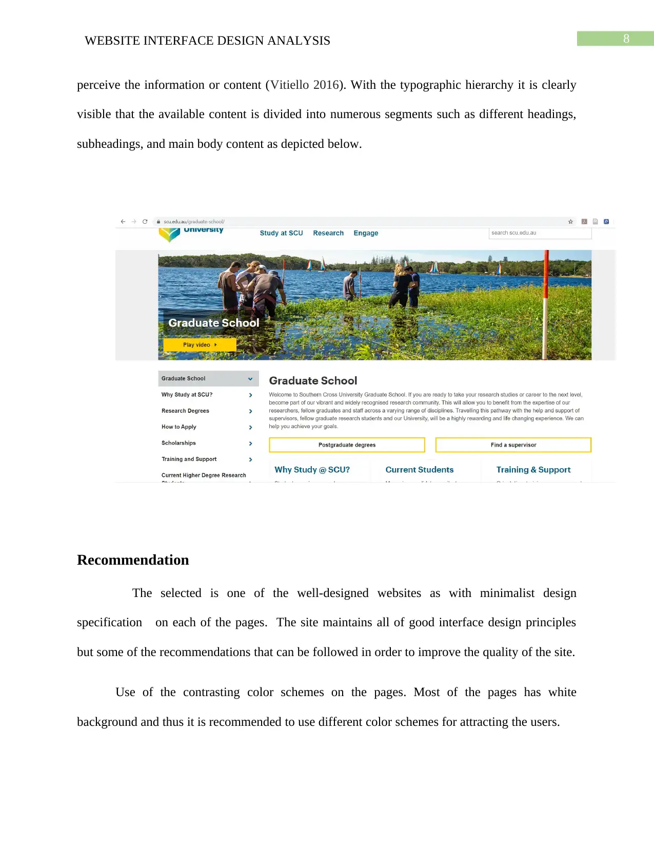
On the web pages a visual hierarchy is maintained as depicted in the below image. In this
way it is possible to organizes all elements on the pages in order to help the users in order to
The login form looks simple but yet effective.
Proper use of typography
On the web pages a visual hierarchy is maintained as depicted in the below image. In this
way it is possible to organizes all elements on the pages in order to help the users in order to
8WEBSITE INTERFACE DESIGN ANALYSIS
perceive the information or content (Vitiello 2016). With the typographic hierarchy it is clearly
visible that the available content is divided into numerous segments such as different headings,
subheadings, and main body content as depicted below.
Recommendation
The selected is one of the well-designed websites as with minimalist design
specification on each of the pages. The site maintains all of good interface design principles
but some of the recommendations that can be followed in order to improve the quality of the site.
Use of the contrasting color schemes on the pages. Most of the pages has white
background and thus it is recommended to use different color schemes for attracting the users.
⊘ This is a preview!⊘
Do you want full access?
Subscribe today to unlock all pages.

Trusted by 1+ million students worldwide
9WEBSITE INTERFACE DESIGN ANALYSIS
In your analysis it is found that, the page loading time is 4.65 seconds due to lack of use
of height and width for the images and high-quality images on the pages. With the use proper
HTML tags, it will be possible to reduce the load time.
Conclusion
It is important that the users of the website or application can scan or go through the
pages of a website and able to understand whether or not the information they required is on the
page. For this it is very important to maintain the color scheme over all the pages are consistent.
In addition to that different other features also helped the website in order easily connect with the
intended targeted audience.
Paraphrase This Document
Need a fresh take? Get an instant paraphrase of this document with our AI Paraphraser
10WEBSITE INTERFACE DESIGN ANALYSIS
References
Kamaruddin, N. and Sulaiman, S., 2018. Understanding interface design principles and elements
guidelines: A content analysis of established scholars. In Proceedings of the Art and Design
International Conference (AnDIC 2016) (pp. 89-100). Springer, Singapore.
Kamaruzaman, M.F., Rani, N.M., Nor, H.M. and Azahari, M.H.H., 2016. Developing user
interface design application for children with autism. Procedia-Social and Behavioral
Sciences, 217, pp.887-894.
Oulasvirta, A. and Abowd, G.D., 2016. User Interface Design in the 21st
Century. Computer, 49(7), pp.11-13.
Qiu, Y., 2019, April. Research on the Application of Information Graphization and Gray Level
Analysis in Web Visual Communication Design. In 2019 11th International Conference on
Measuring Technology and Mechatronics Automation (ICMTMA) (pp. 99-102). IEEE.
Vitiello, G., Tortora, G., Di Giovanni, P. and Sebillo, M., 2016. Practicing Mobile Interface
Design Principles Through the Use of HCI Design Patterns—A Training Strategy.
In Empowering Organizations (pp. 187-198). Springer, Cham.
1 out of 11
Related Documents
Your All-in-One AI-Powered Toolkit for Academic Success.
+13062052269
info@desklib.com
Available 24*7 on WhatsApp / Email
![[object Object]](/_next/static/media/star-bottom.7253800d.svg)
Unlock your academic potential
Copyright © 2020–2026 A2Z Services. All Rights Reserved. Developed and managed by ZUCOL.


