Business Analytics: Healthcare Data Visualization and Analysis
VerifiedAdded on 2023/01/23
|11
|1693
|85
Case Study
AI Summary
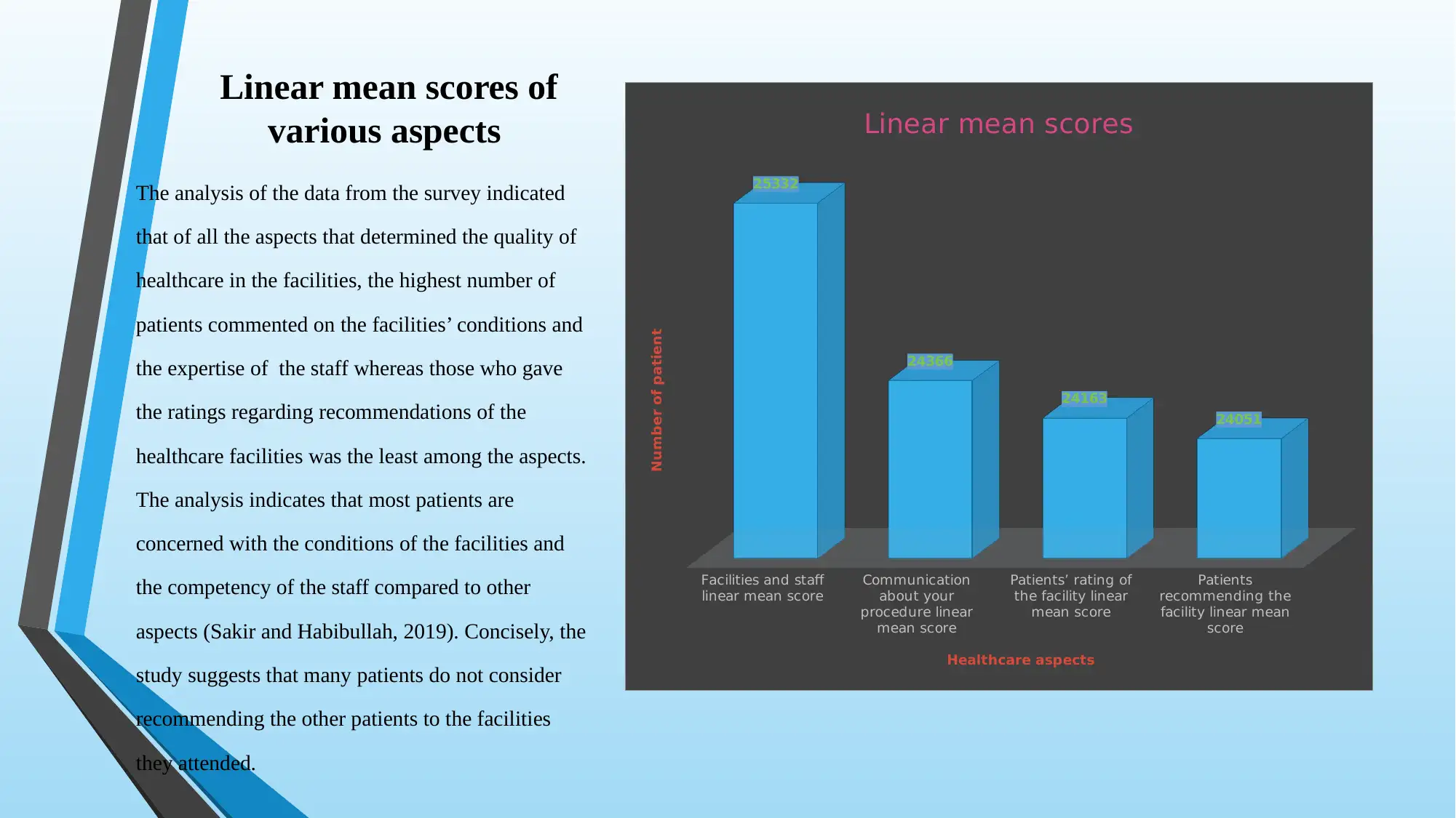
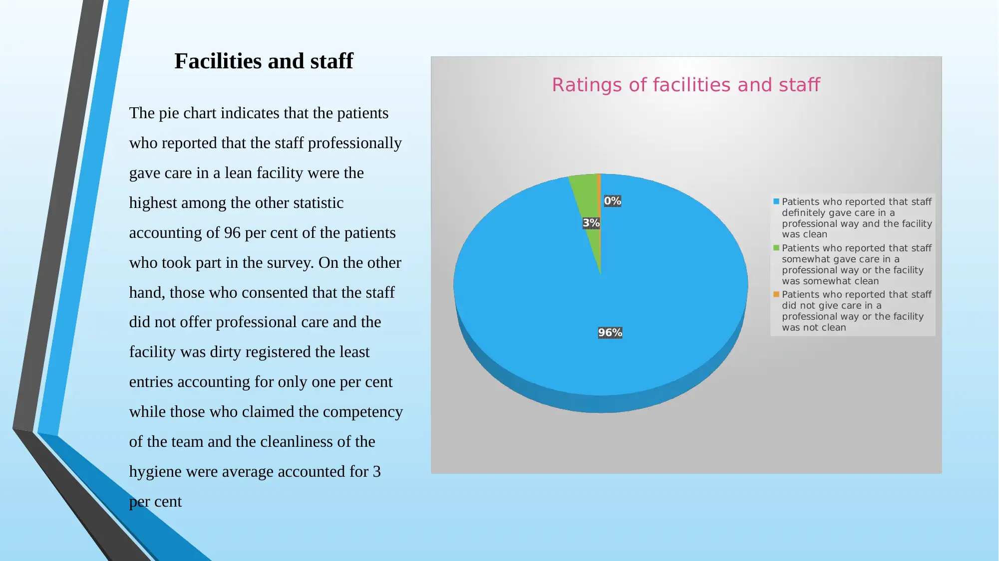
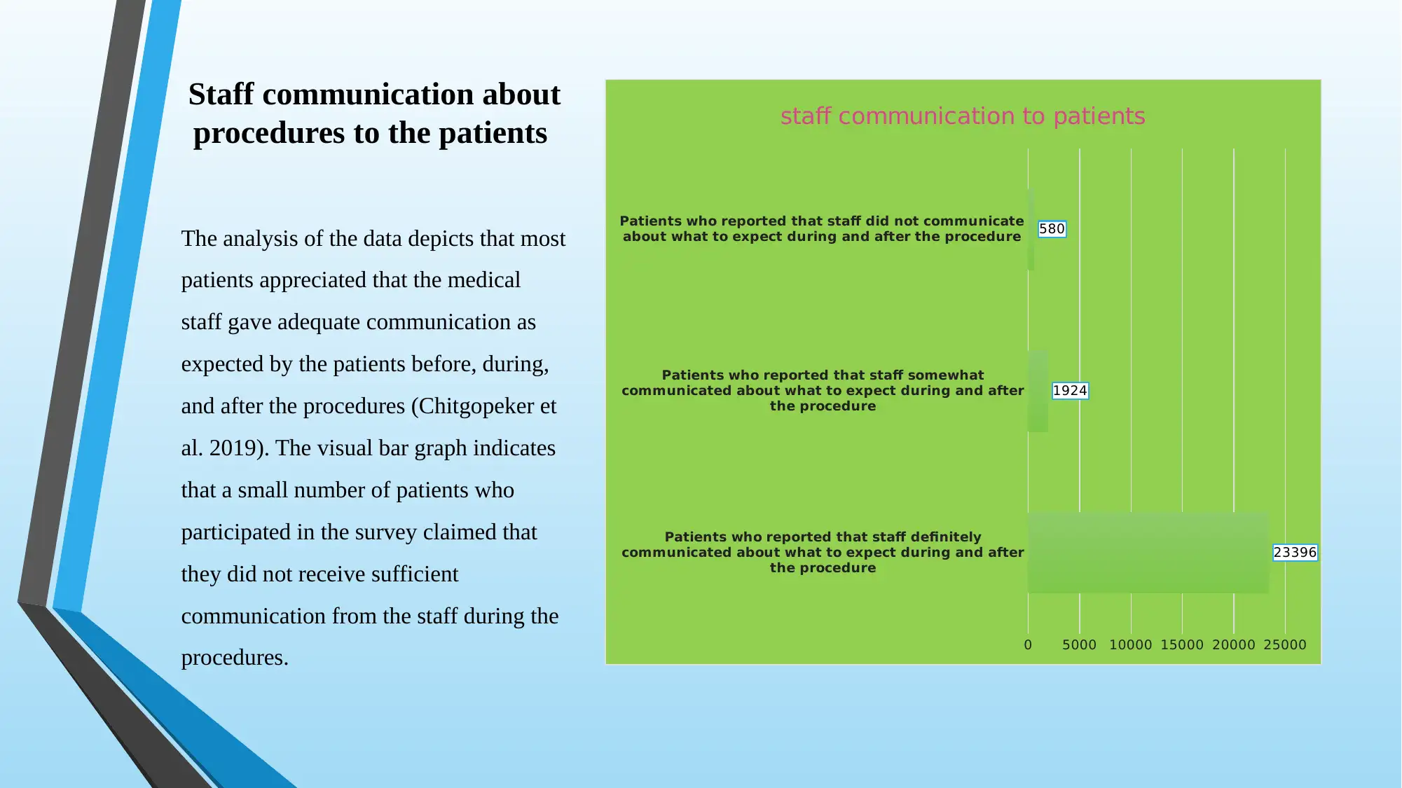
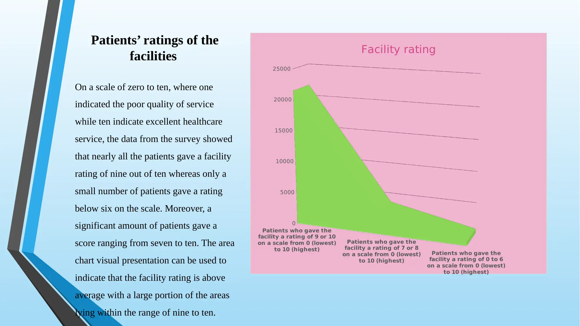
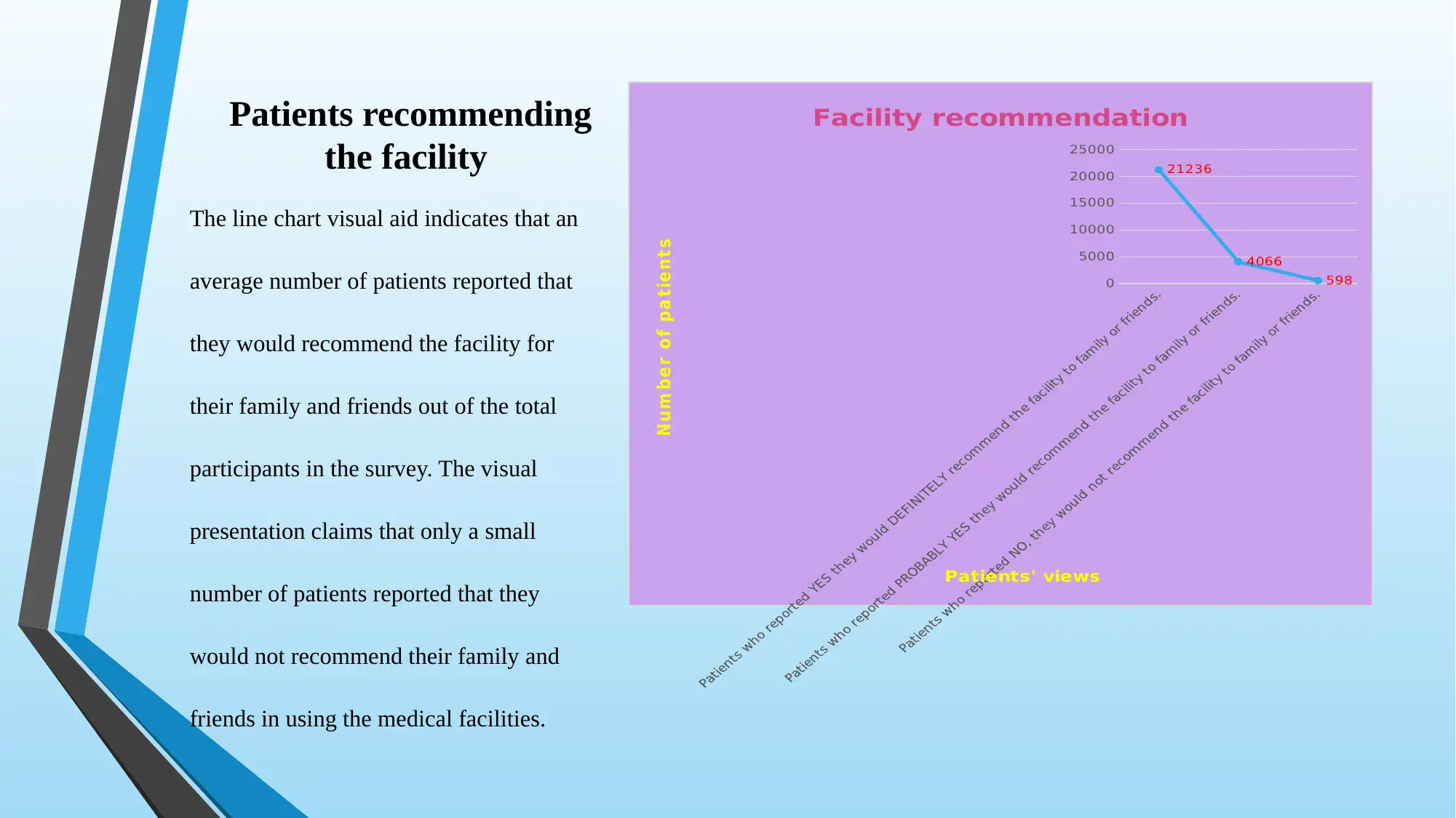
This case study focuses on the analysis and visualization of healthcare data obtained from the Medicare database. The assignment explores the quality of services provided at different medical facilities, with a specific emphasis on patient satisfaction. The study utilizes at least five visualizations, including pie charts, bar graphs, area charts, and line charts, to present complex data in a clear and concise manner. Key aspects of healthcare quality, such as staff communication, facility conditions, and patient recommendations, are analyzed through linear mean scores and visual representations. The analysis reveals patient perceptions regarding staff professionalism, facility cleanliness, and the overall quality of care, with a significant portion of patients giving high ratings. The study also examines the number of patients surveyed, completed questionnaires, and the response rate, highlighting the importance of data integrity and potential limitations due to participant opt-out rates. References to relevant research papers are provided to support the findings and methodologies used in the analysis.

Business Analytics
Case study, Visualization,
and Presentation
Student’s Name
Institutional Affiliation
Professor’s Name
Date
Case study, Visualization,
and Presentation
Student’s Name
Institutional Affiliation
Professor’s Name
Date
Paraphrase This Document
Need a fresh take? Get an instant paraphrase of this document with our AI Paraphraser

Case study, Visualization, and Presentation
Visualisation of data is a primary aspect of the presentation that enables the readers
and the audience to understand complex data sets in a simple way (Healy and Moody,
2014). In most scenarios, the viewers are never concerned with the complexity exhibited in
the data sets but somewhat interested in understanding the results or implications of the
subject being presented. The data analysts in various sectors that rely on large data sets such
as financial markets, healthcare, airlines, and other businesses are always tasked with data
mining of which entails multiple variables that make the data collected difficult for the
viewer to comprehend (Hu, Wen, Chua, and Li, 2014). Therefore, their mandate is present
the data in the simplest way possible through visual aids for easier and faster understanding
of the information by the report consumers.

Therefore, the report is based on the healthcare data obtained from the Medicare
database, which is owned by the US government (Medicare, 2018). The case study on
healthcare would focus on the quality of services given at different medical facilities
across the country, which is centred on patient satisfaction as illustrated in the data.
Concisely, the report would attempt to present the complex data through the most
straightforward means possible using at least five visualisations to give insightful
meaning in the data. The visuals would also enable obtaining of inferences that define
the data variables thus contributing to the meaningful information in the data through
the charts, graphs, and tables among others (Srinivasan, Drucker, Endert, and Stasko,
2019). The various visuals that were obtained from the data set are presented below.
⊘ This is a preview!⊘
Do you want full access?
Subscribe today to unlock all pages.

Trusted by 1+ million students worldwide

Data presentation and visualisation
The healthcare data obtained presents the number of patients who gave their views regarding various
aspects that determine the quality of care in hospital facilities. Due to the complexity and wide range of
factors that determine the quality of service in health, a few aspects such as effective communication
between the staff and the patients, and the hygienic conditions and professionalism of the team, the
patients’ ratings on a scale of 1 – 10. Additionally, the patients’ views on recommendations of the facilities
in future were considered measures and parameters that determine the quality of healthcare service in the
visual presentation of the data. Concisely, the data entailed the survey from different facilities and states
across the United States. However, those facilities that had missing data due to the unaccomplished survey
were omitted from the analysis and interpretation (Brandt and De Herdt, 2019). The Source of data
https://data.medicare.gov/data/archives/hospital-compare.
Paraphrase This Document
Need a fresh take? Get an instant paraphrase of this document with our AI Paraphraser

Linear mean scores of
various aspects
The analysis of the data from the survey indicated
that of all the aspects that determined the quality of
healthcare in the facilities, the highest number of
patients commented on the facilities’ conditions and
the expertise of the staff whereas those who gave
the ratings regarding recommendations of the
healthcare facilities was the least among the aspects.
The analysis indicates that most patients are
concerned with the conditions of the facilities and
the competency of the staff compared to other
aspects (Sakir and Habibullah, 2019). Concisely, the
study suggests that many patients do not consider
recommending the other patients to the facilities
they attended.
Facilities and staff
linear mean score
Communication
about your
procedure linear
mean score
Patients’ rating of
the facility linear
mean score
Patients
recommending the
facility linear mean
score
25332
24366
24163
24051
Linear mean scores
Healthcare aspects
Number of patient

Facilities and staff
The pie chart indicates that the patients
who reported that the staff professionally
gave care in a lean facility were the
highest among the other statistic
accounting of 96 per cent of the patients
who took part in the survey. On the other
hand, those who consented that the staff
did not offer professional care and the
facility was dirty registered the least
entries accounting for only one per cent
while those who claimed the competency
of the team and the cleanliness of the
hygiene were average accounted for 3
per cent
96%
3%
0%
Ratings of facilities and staff
Patients who reported that staff
definitely gave care in a
professional way and the facility
was clean
Patients who reported that staff
somewhat gave care in a
professional way or the facility
was somewhat clean
Patients who reported that staff
did not give care in a
professional way or the facility
was not clean
⊘ This is a preview!⊘
Do you want full access?
Subscribe today to unlock all pages.

Trusted by 1+ million students worldwide

Staff communication about
procedures to the patients
The analysis of the data depicts that most
patients appreciated that the medical
staff gave adequate communication as
expected by the patients before, during,
and after the procedures (Chitgopeker et
al. 2019). The visual bar graph indicates
that a small number of patients who
participated in the survey claimed that
they did not receive sufficient
communication from the staff during the
procedures.
Patients who reported that staff definitely
communicated about what to expect during and after
the procedure
Patients who reported that staff somewhat
communicated about what to expect during and after
the procedure
Patients who reported that staff did not communicate
about what to expect during and after the procedure
0 5000 10000 15000 20000 25000
23396
1924
580
staff communication to patients
Paraphrase This Document
Need a fresh take? Get an instant paraphrase of this document with our AI Paraphraser

Patients’ ratings of the
facilities
On a scale of zero to ten, where one
indicated the poor quality of service
while ten indicate excellent healthcare
service, the data from the survey showed
that nearly all the patients gave a facility
rating of nine out of ten whereas only a
small number of patients gave a rating
below six on the scale. Moreover, a
significant amount of patients gave a
score ranging from seven to ten. The area
chart visual presentation can be used to
indicate that the facility rating is above
average with a large portion of the areas
lying within the range of nine to ten.
Patients who gave the
facility a rating of 9 or 10
on a scale from 0 (lowest)
to 10 (highest)
Patients who gave the
facility a rating of 7 or 8
on a scale from 0 (lowest)
to 10 (highest)
Patients who gave the
facility a rating of 0 to 6
on a scale from 0 (lowest)
to 10 (highest)
0
5000
10000
15000
20000
25000
Facility rating

Patients recommending
the facility
The line chart visual aid indicates that an
average number of patients reported that
they would recommend the facility for
their family and friends out of the total
participants in the survey. The visual
presentation claims that only a small
number of patients reported that they
would not recommend their family and
friends in using the medical facilities.
0
5000
10000
15000
20000
25000
21236
4066
598
Facility recommendation
Patients' views
N um be r o f pa t ie nts
⊘ This is a preview!⊘
Do you want full access?
Subscribe today to unlock all pages.

Trusted by 1+ million students worldwide

Statistics showing patient
participation in the surveyThe data graph indicates the number of
participants who were sampled for the
survey, those who completed the
questionnaires, and the response rate in
percentage. The presentation stated in
the graph implies that most of the
participants opted out of the study which
could limit the research due to internal
validity during the survey period
(Podsakoff and Podsakoff, 2019).
0
100000
200000
300000
400000
500000
600000
Number of Sampled Patients;
500335
Number of Completed
Surveys; 135235
Survey Response Rate
Percent; 7222
Participation in the survey
Paraphrase This Document
Need a fresh take? Get an instant paraphrase of this document with our AI Paraphraser

References
Brandt, C., & De Herdt, T. (2019). On the Political Economy of Data Collection: Lessons from the Unaccomplished Population Census (DR Congo,
2006-2018). Secure Livelihoods Research Consortium Working Papers, 72.
Chitgopeker, P., Sidey, K., Aronson, A., Hammel, J., Noe, M. H., Auh, S., & Ferguson, N. (2019). Factors Associated With Patient-Initiated
Communication After Mohs Micrographic Surgery. Dermatologic Surgery, 45(2), 234-243.
Healy, K., & Moody, J. (2014). Data visualization in sociology. Annual review of sociology, 40, 105-128.
Hu, H., Wen, Y., Chua, T. S., & Li, X. (2014). Toward scalable systems for big data analytics: A technology tutorial. IEEE access, 2, 652-687.
Koutkias, V. (2019). From Data Silos to Standardized, Linked, and FAIR Data for Pharmacovigilance: Current Advances and Challenges with
Observational Healthcare Data. Drug safety, 1-4.
Medicare . (2018). Hospital Compare data archive. Retrieved from Medicare : https://data.medicare.gov/data/archives/hospital-compare
Podsakoff, P. M., & Podsakoff, N. P. (2019). Experimental designs in management and leadership research: Strengths, limitations, and recommendations
for improving publishability. The Leadership Quarterly, 30(1), 11-33.
Sakir, S., & Habibullah, A. (2019). Quality of Healthcare Services in the Tengger Tribe Community of Ranu Pane Village. Journal of Governance and
Public Policy, 6(1), 1-14.
Srinivasan, A., Drucker, S. M., Endert, A., & Stasko, J. (2019). Augmenting visualizations with interactive data facts to facilitate interpretation and
communication. IEEE transactions on visualization and computer graphics, 25(1), 672-681.
1 out of 11

Your All-in-One AI-Powered Toolkit for Academic Success.
+13062052269
info@desklib.com
Available 24*7 on WhatsApp / Email
Unlock your academic potential
Copyright © 2020–2025 A2Z Services. All Rights Reserved. Developed and managed by ZUCOL.