Producing Graphs and Charts for Pictorial Representation
Verified
Added on 2023/03/21
|12
|618
|37
Presentation
AI Summary
This presentation focuses on producing graphs and charts for pictorial representation. It includes column and pie charts on student marks and satisfaction levels, as well as trend line graphs. The interpretation highlights the direct relationship between student marks and satisfaction levels.
Contribute Materials
Your contribution can guide someone’s learning journey. Share your
documents today.
BDM
Secure Best Marks with AI Grader
Need help grading? Try our AI Grader for instant feedback on your assignments.
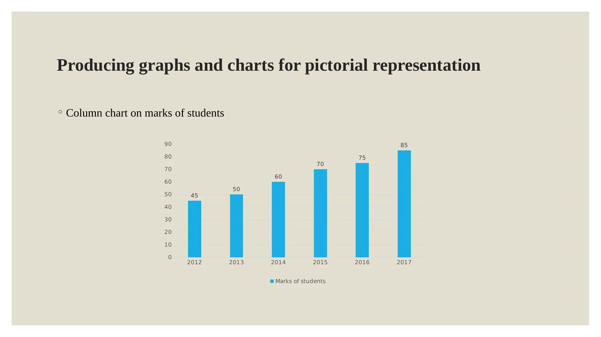
Producing graphs and charts for pictorial representation ◦Column chart on marks of students 201220132014201520162017 0 10 20 30 40 50 60 70 80 90 45 50 60 70 75 85 Marks of students
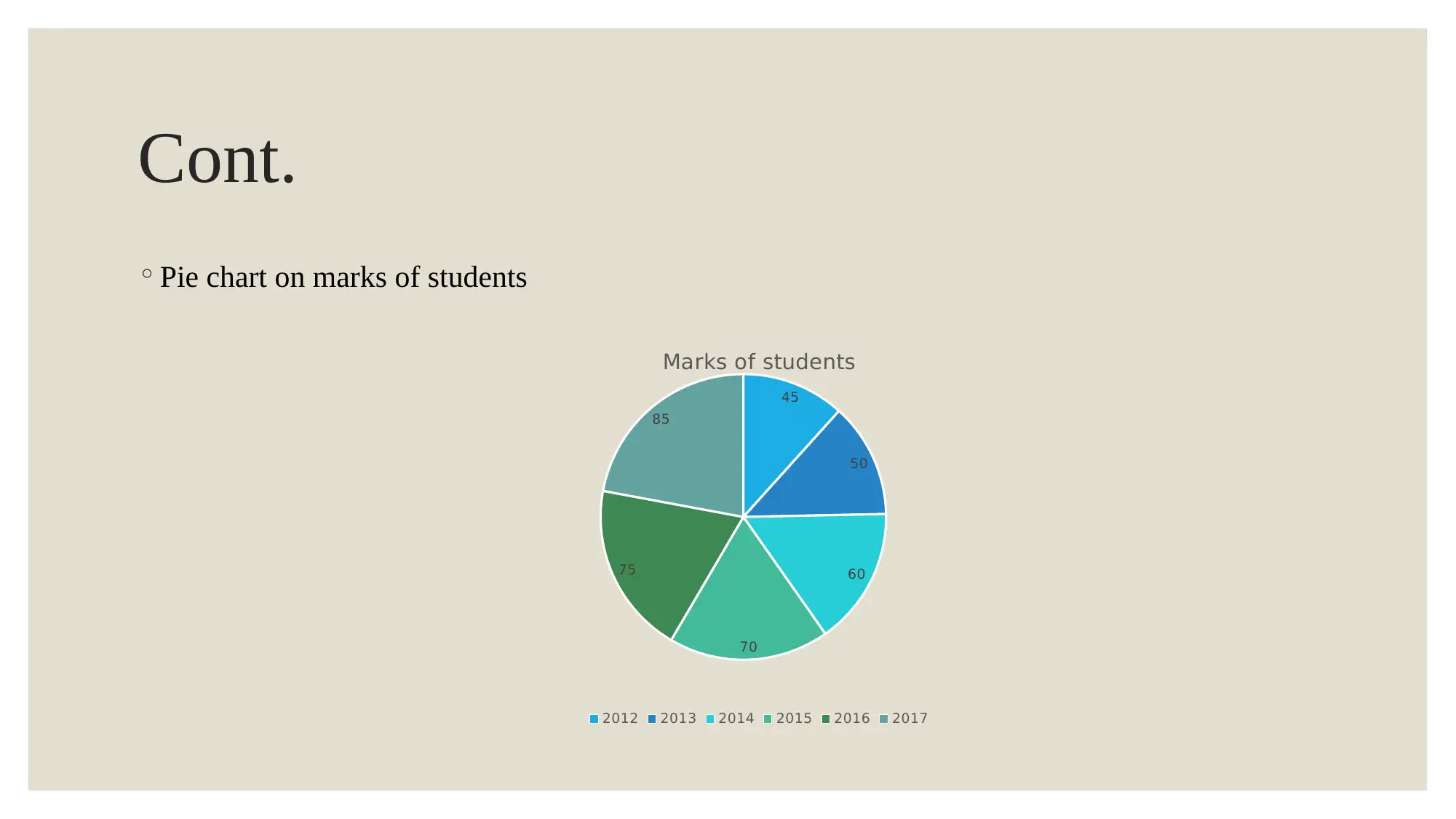
Cont. ◦Pie chart on marks of students 45 50 60 70 75 85 Marks of students 201220132014201520162017
Interpretation ◦It can be analyzed that marks of students and level of their satisfaction is carried out. This is extracted with the help of pie and column chart. ◦It can be interpreted that students marks are in direct relation with their level of satisfaction. ◦This is evident from the fact that marks of students in 2012 were 45 and in 2017 were 85, which means that performance is increased up to high extent and more marks have been obtained. ◦On the other hand, level of satisfaction is also increased in relation to marks of students.
Paraphrase This Document
Need a fresh take? Get an instant paraphrase of this document with our AI Paraphraser
Cont. ◦Column chart on level of satisfaction 201220132014201520162017 0 1 2 3 4 5 6 7 8 9 3 4 5 6 7 8 Level of satisfaction
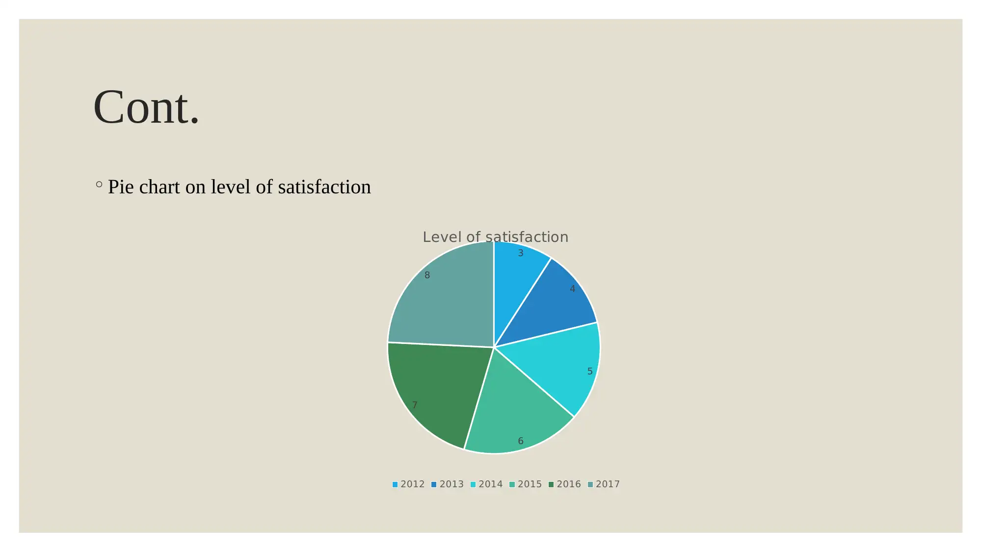
Cont. ◦Pie chart on level of satisfaction 3 4 5 6 7 8 Level of satisfaction 201220132014201520162017
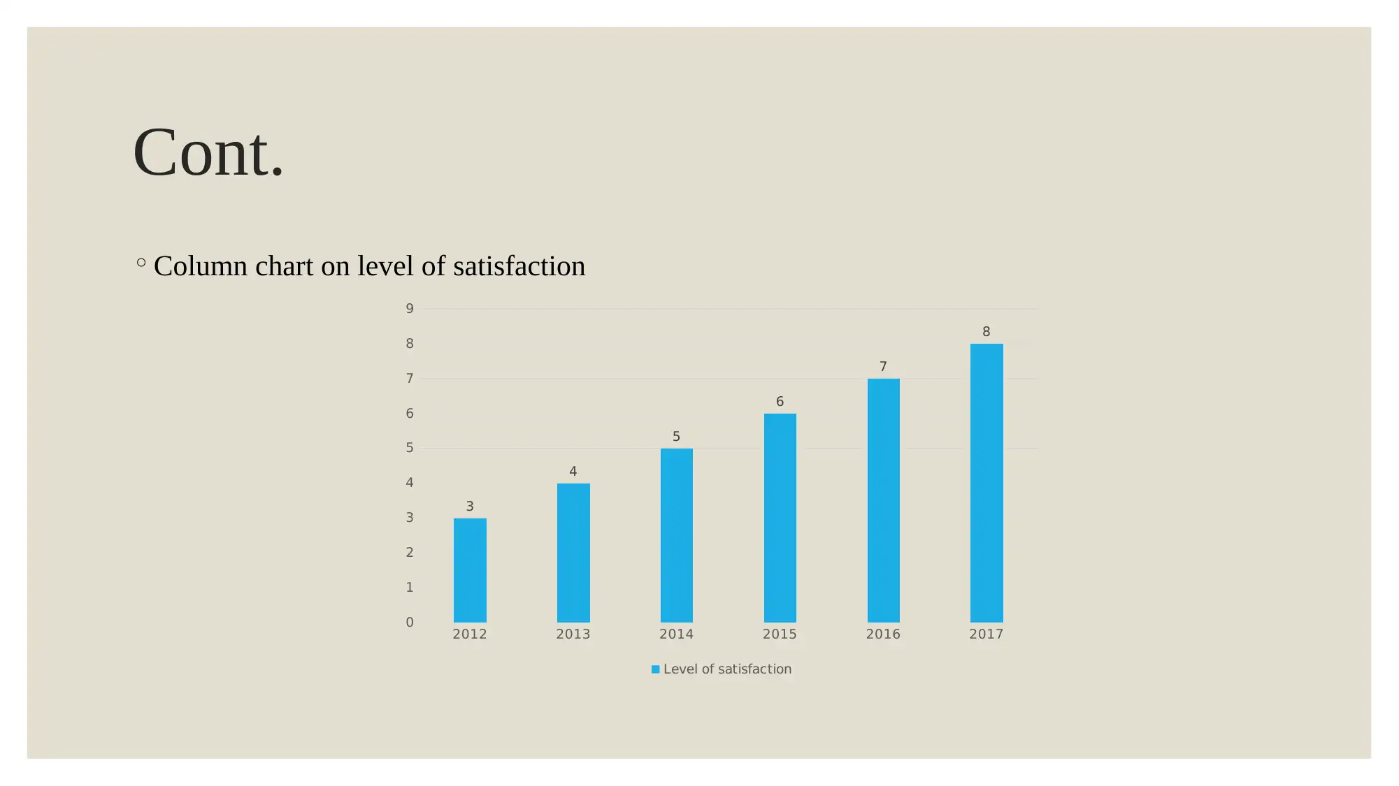
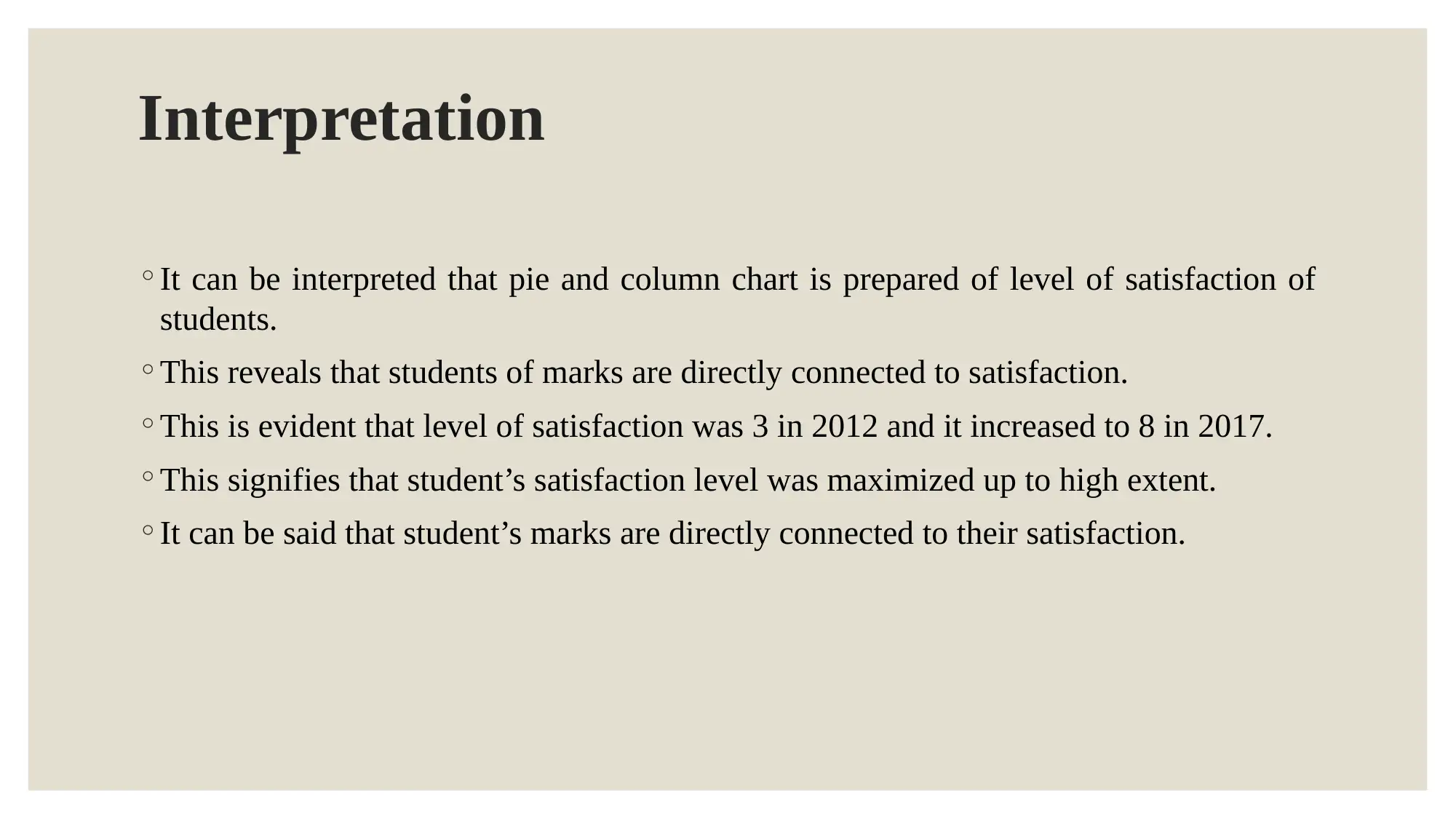
Interpretation ◦It can be interpreted that pie and column chart is prepared of level of satisfaction of students. ◦This reveals that students of marks are directly connected to satisfaction. ◦This is evident that level of satisfaction was 3 in 2012 and it increased to 8 in 2017. ◦This signifies that student’s satisfaction level was maximized up to high extent. ◦It can be said that student’s marks are directly connected to their satisfaction.
Secure Best Marks with AI Grader
Need help grading? Try our AI Grader for instant feedback on your assignments.
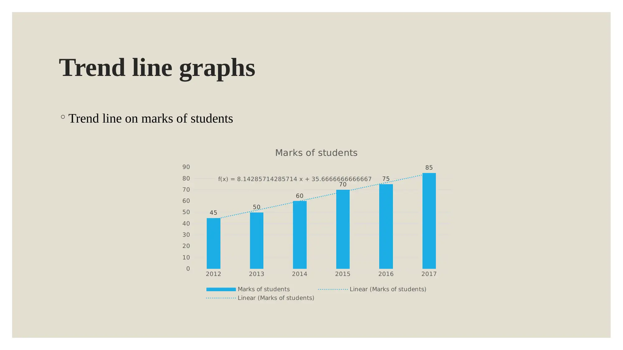
Trend line graphs ◦Trend line on marks of students 201220132014201520162017 0 10 20 30 40 50 60 70 80 90 4550 60 7075 85 f(x) = 8.14285714285714 x + 35.6666666666667 Marks of students Marks of studentsLinear (Marks of students) Linear (Marks of students)
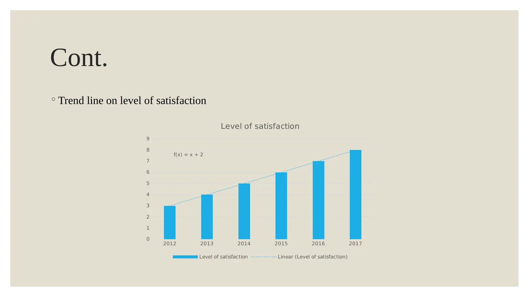
Cont. ◦Trend line on level of satisfaction 201220132014201520162017 0 1 2 3 4 5 6 7 8 9 f(x) = x + 2 Level of satisfaction Level of satisfactionLinear (Level of satisfaction)
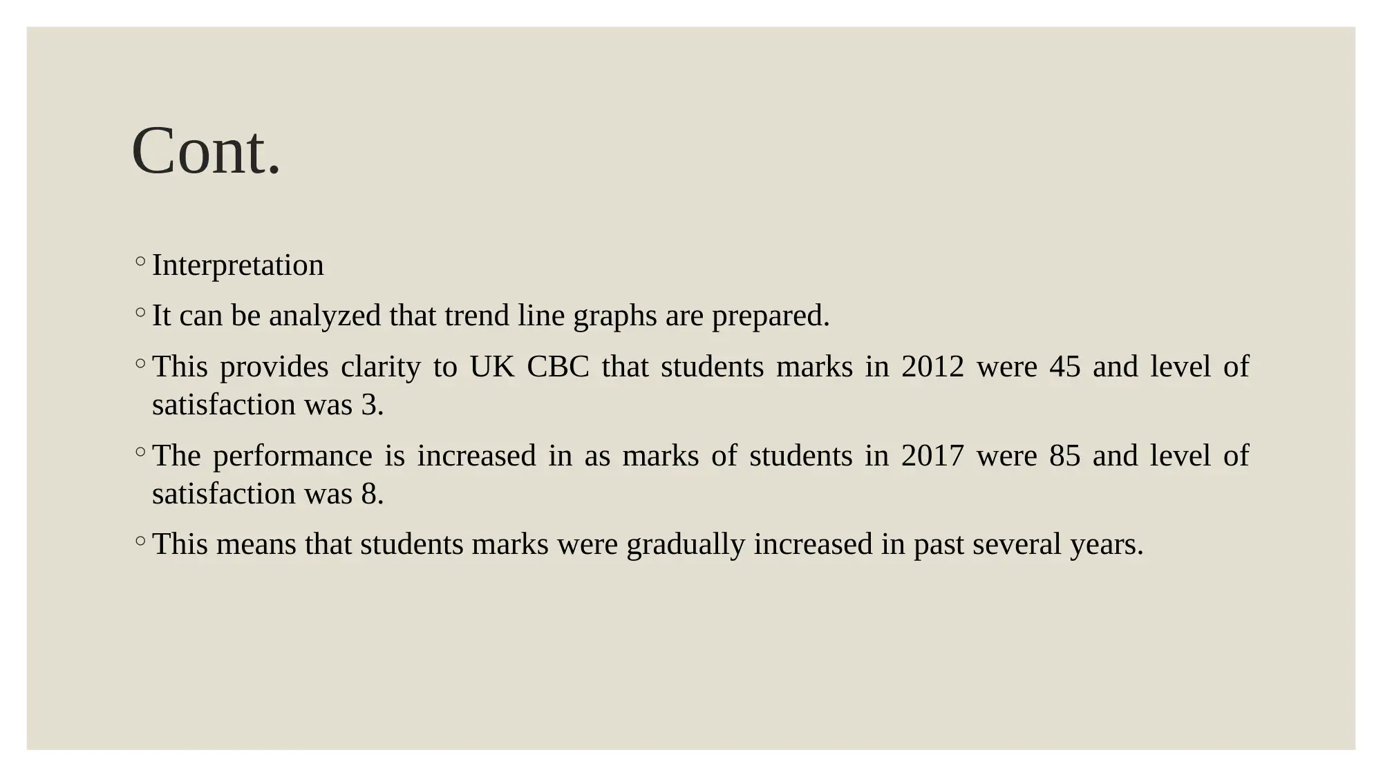
Cont. ◦Interpretation ◦It can be analyzed that trend line graphs are prepared. ◦This provides clarity to UK CBC that students marks in 2012 were 45 and level of satisfaction was 3. ◦The performance is increased in as marks of students in 2017 were 85 and level of satisfaction was 8. ◦This means that students marks were gradually increased in past several years.
Paraphrase This Document
Need a fresh take? Get an instant paraphrase of this document with our AI Paraphraser
REFERENCES ◦Beach, L. R. and Lipshitz, R., 2017. Why classical decision theory is an inappropriate standard for evaluating and aiding most human decision making.Decision Making in Aviation. p.85. ◦Yuniningsih, Y., Widodo, S. and Wajdi, M.B.N., 2017. An analysis of Decision Making in the Stock Investment.Economic: Journal of Economic and Islamic Law. 8(2). pp.122-128. ◦Zavadskas, E. K., Antucheviciene, J., Turskis, Z. and Adeli, H., 2016. Hybrid multiple-criteria decision-making methods: A review of applications in engineering.Scientia Iranica. Transaction A, Civil Engineering. 23(1). p.1.