STAT102: Business Data Analysis - Time Series and Correlation Analysis
VerifiedAdded on 2023/06/03
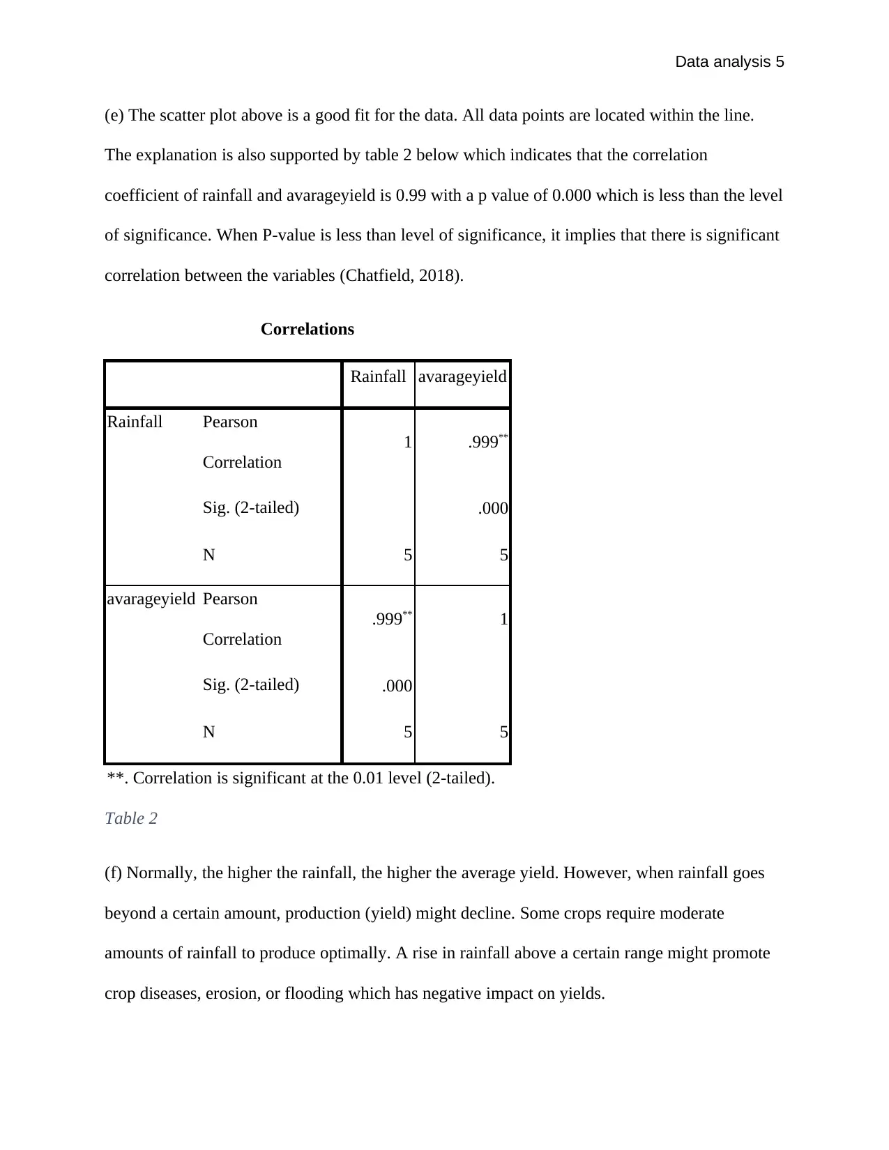
|6
|663
|329
Homework Assignment
AI Summary
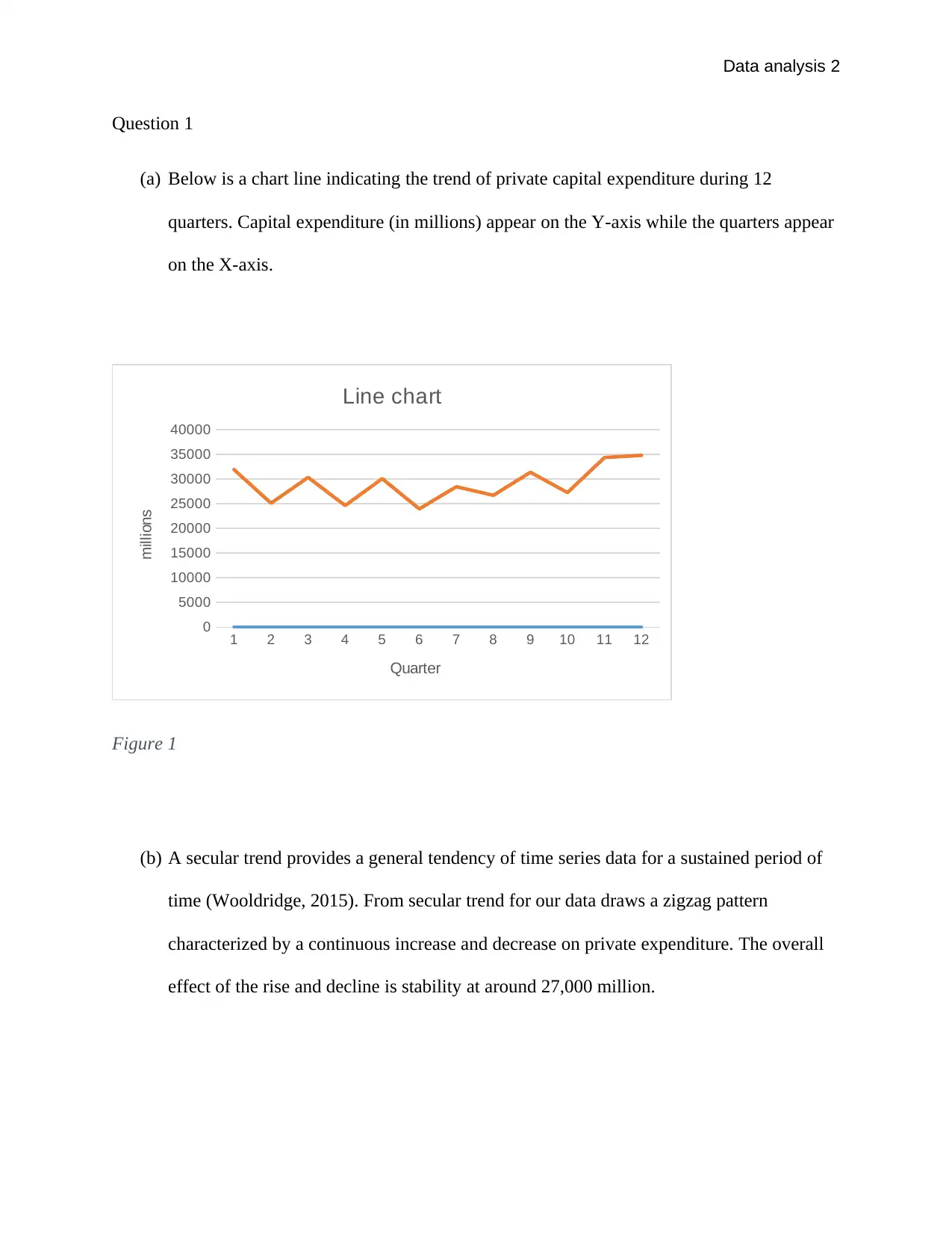
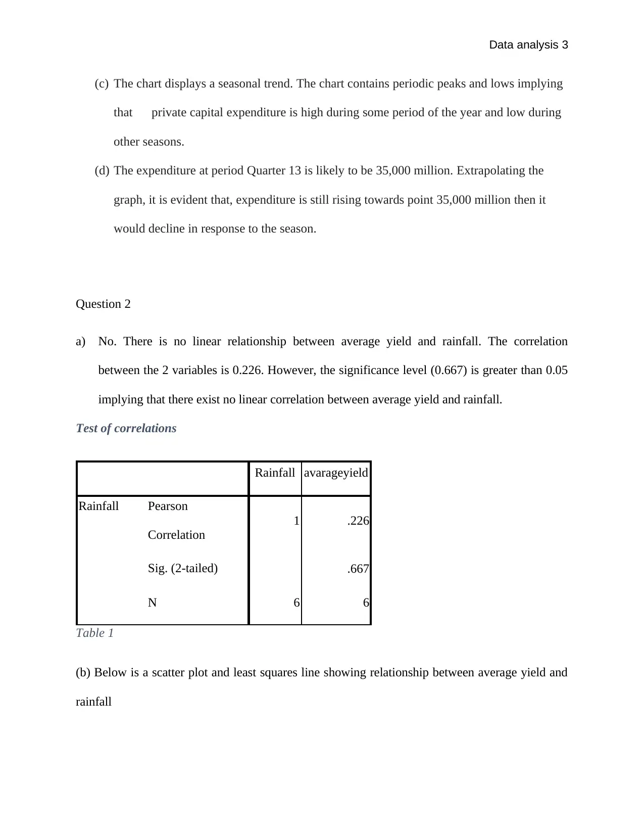
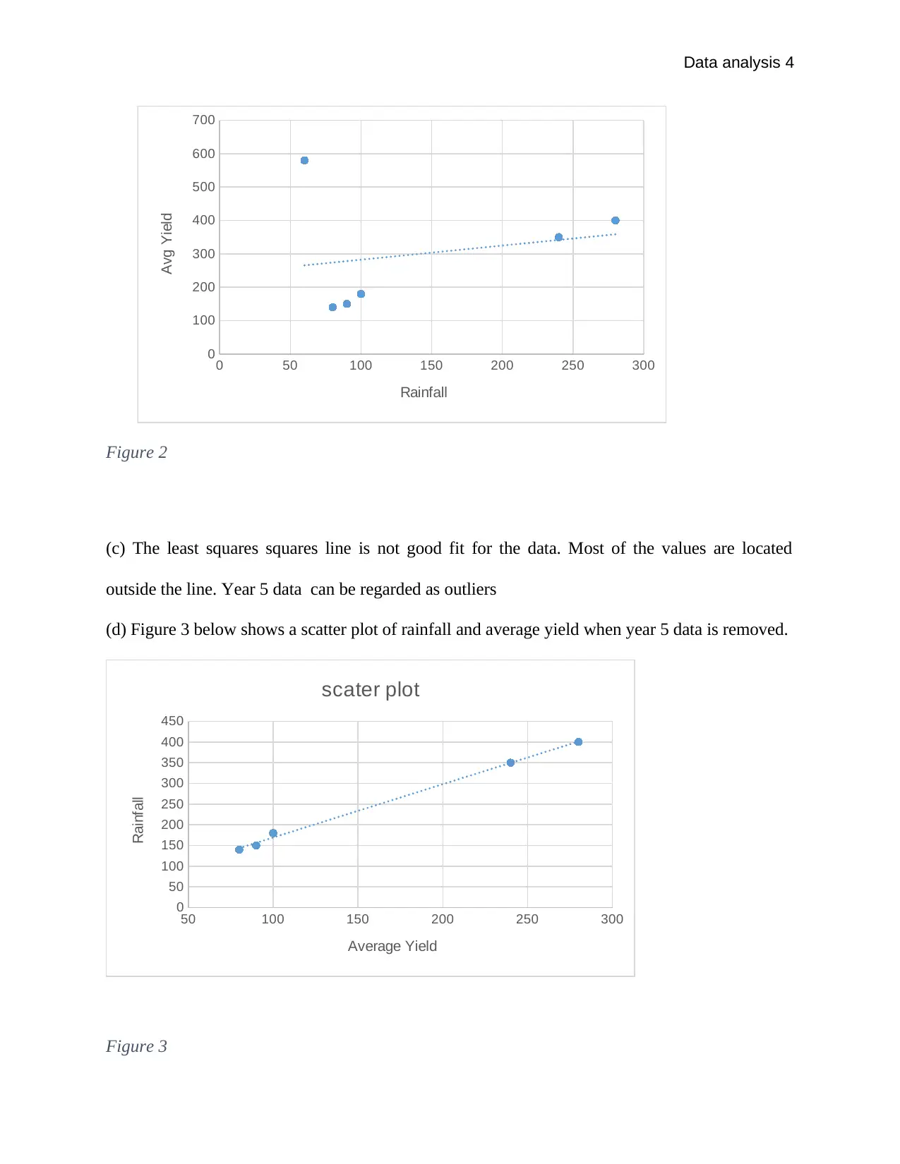
This assignment provides a detailed analysis of private capital expenditure using time series data over 12 quarters, including the creation of a line chart and commentary on secular and seasonal trends, with a prediction for Quarter 13. It further explores the relationship between average yield and rainfall, employing scatter plots and correlation analysis, and discusses the impact of outliers on the data. The assignment concludes that while there is no linear correlation between average yield and rainfall, the correlation becomes significant after removing outlier data, indicating that yield increases with rainfall up to a certain point beyond which it may decline. Desklib offers similar solved assignments and study resources for students.
1 out of 6
Your All-in-One AI-Powered Toolkit for Academic Success.
+13062052269
info@desklib.com
Available 24*7 on WhatsApp / Email
![[object Object]](/_next/static/media/star-bottom.7253800d.svg)
Copyright © 2020–2025 A2Z Services. All Rights Reserved. Developed and managed by ZUCOL.