Detailed Report on Data Analysis and Visualisation Techniques
VerifiedAdded on 2023/06/18
|7
|1591
|199
Report
AI Summary
This report provides an analysis of data visualisation, primarily focusing on an infographic related to the impact of COVID-19 on the print industry. It identifies the infographic's features, opportunities, and problems, suggesting improvements for clarity and logical presentation. The report also examines death rate trends in 2020 and 2021, highlighting regional differences and causes of death. The analysis underscores the importance of data presentation skills and the potential for innovation in business, while also pointing out the need for detailed information in visual representations. Desklib provides access to this and other student-contributed assignments.
DATA ANALYSIS AND
VISUALISATION
VISUALISATION
Paraphrase This Document
Need a fresh take? Get an instant paraphrase of this document with our AI Paraphraser
Table of Contents
TASK-1............................................................................................................................................3
Infographics.................................................................................................................................3
Features........................................................................................................................................3
Opportunities...............................................................................................................................4
Problems......................................................................................................................................4
Solution in the context of problem..............................................................................................5
TASK-2............................................................................................................................................5
REFERENCES................................................................................................................................1
TASK-1
Infographics
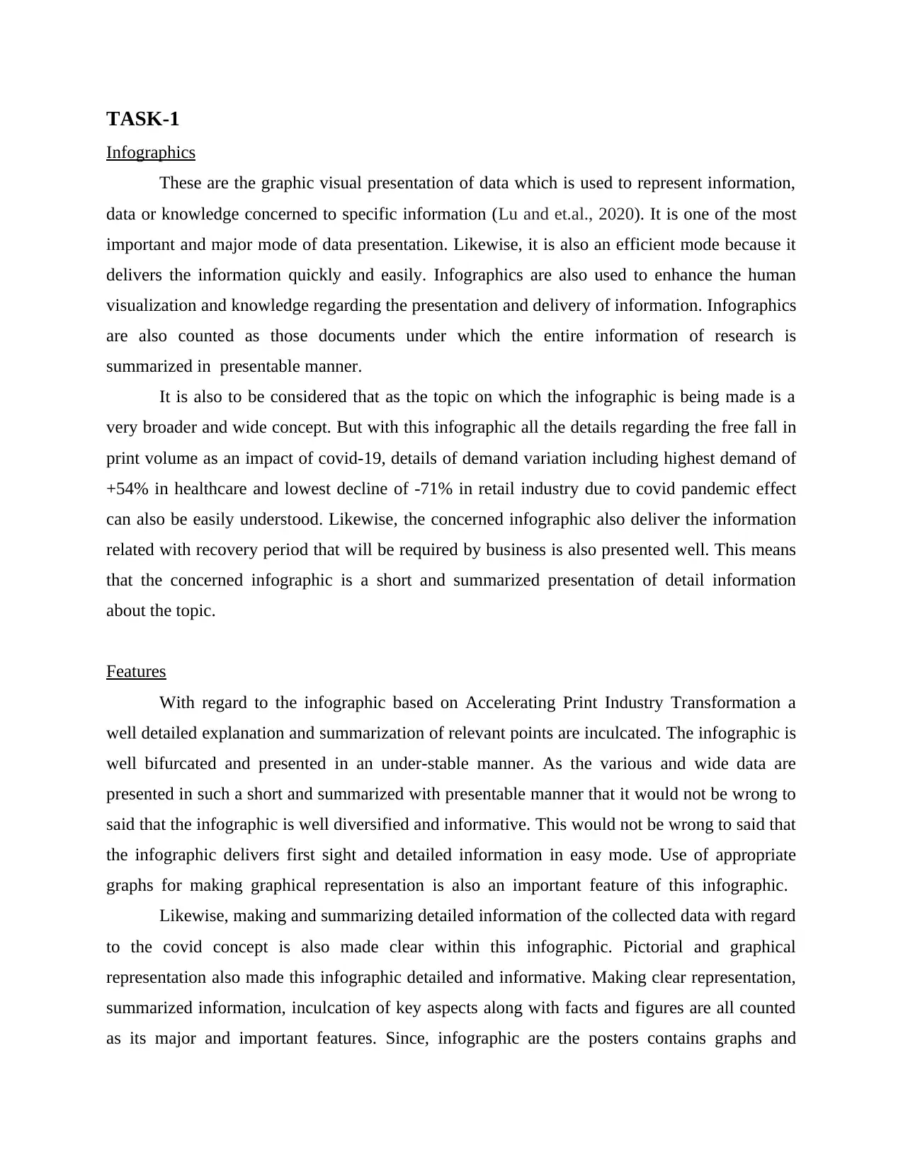
These are the graphic visual presentation of data which is used to represent information,
data or knowledge concerned to specific information (Lu and et.al., 2020). It is one of the most
important and major mode of data presentation. Likewise, it is also an efficient mode because it
delivers the information quickly and easily. Infographics are also used to enhance the human
visualization and knowledge regarding the presentation and delivery of information. Infographics
are also counted as those documents under which the entire information of research is
summarized in presentable manner.
It is also to be considered that as the topic on which the infographic is being made is a
very broader and wide concept. But with this infographic all the details regarding the free fall in
print volume as an impact of covid-19, details of demand variation including highest demand of
+54% in healthcare and lowest decline of -71% in retail industry due to covid pandemic effect
can also be easily understood. Likewise, the concerned infographic also deliver the information
related with recovery period that will be required by business is also presented well. This means
that the concerned infographic is a short and summarized presentation of detail information
about the topic.
Features
With regard to the infographic based on Accelerating Print Industry Transformation a
well detailed explanation and summarization of relevant points are inculcated. The infographic is
well bifurcated and presented in an under-stable manner. As the various and wide data are
presented in such a short and summarized with presentable manner that it would not be wrong to
said that the infographic is well diversified and informative. This would not be wrong to said that
the infographic delivers first sight and detailed information in easy mode. Use of appropriate
graphs for making graphical representation is also an important feature of this infographic.
Likewise, making and summarizing detailed information of the collected data with regard
to the covid concept is also made clear within this infographic. Pictorial and graphical
representation also made this infographic detailed and informative. Making clear representation,
summarized information, inculcation of key aspects along with facts and figures are all counted
as its major and important features. Since, infographic are the posters contains graphs and
⊘ This is a preview!⊘
Do you want full access?
Subscribe today to unlock all pages.

Trusted by 1+ million students worldwide
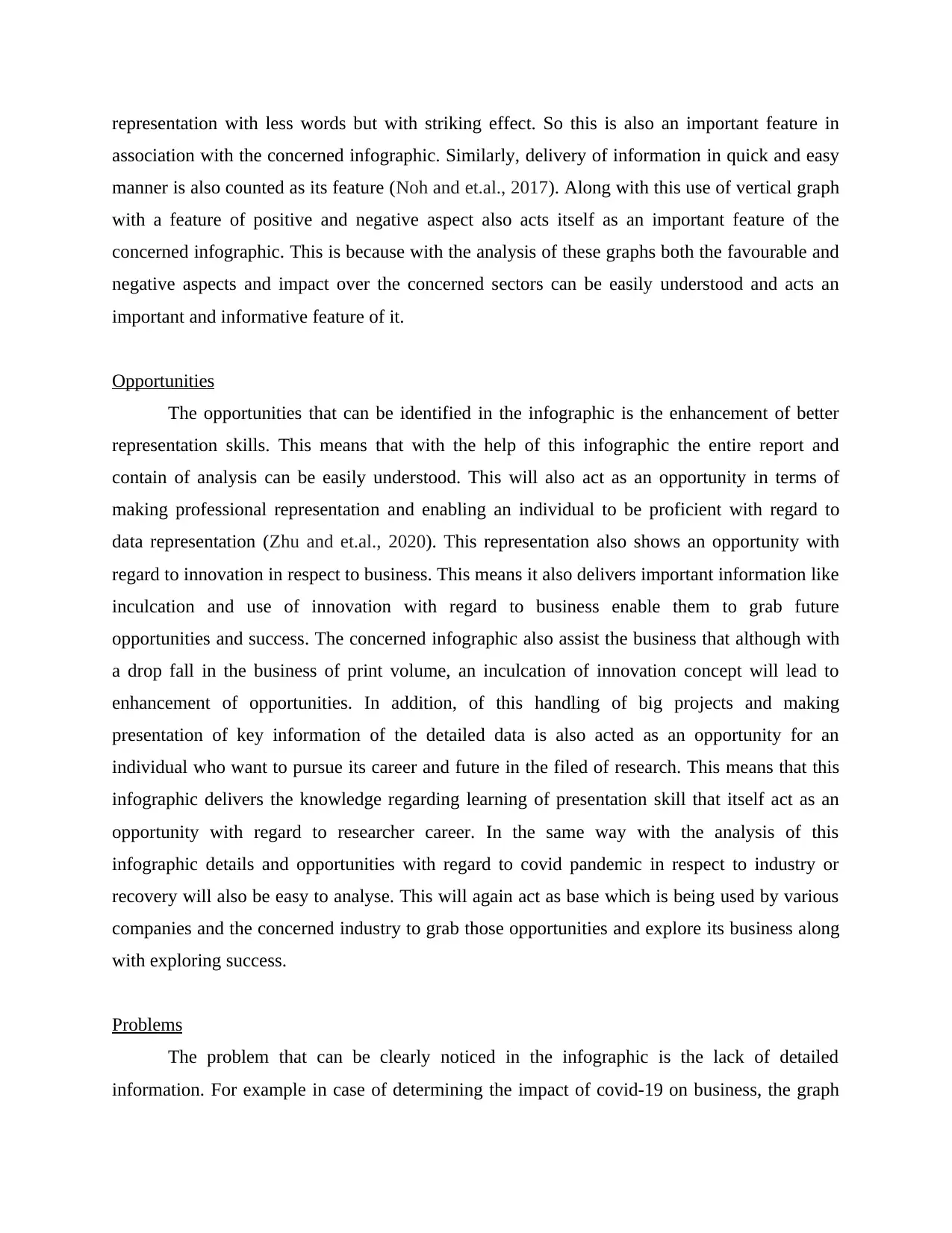
representation with less words but with striking effect. So this is also an important feature in
association with the concerned infographic. Similarly, delivery of information in quick and easy
manner is also counted as its feature (Noh and et.al., 2017). Along with this use of vertical graph
with a feature of positive and negative aspect also acts itself as an important feature of the
concerned infographic. This is because with the analysis of these graphs both the favourable and
negative aspects and impact over the concerned sectors can be easily understood and acts an
important and informative feature of it.
Opportunities
The opportunities that can be identified in the infographic is the enhancement of better
representation skills. This means that with the help of this infographic the entire report and
contain of analysis can be easily understood. This will also act as an opportunity in terms of
making professional representation and enabling an individual to be proficient with regard to
data representation (Zhu and et.al., 2020). This representation also shows an opportunity with
regard to innovation in respect to business. This means it also delivers important information like
inculcation and use of innovation with regard to business enable them to grab future
opportunities and success. The concerned infographic also assist the business that although with
a drop fall in the business of print volume, an inculcation of innovation concept will lead to
enhancement of opportunities. In addition, of this handling of big projects and making
presentation of key information of the detailed data is also acted as an opportunity for an
individual who want to pursue its career and future in the filed of research. This means that this
infographic delivers the knowledge regarding learning of presentation skill that itself act as an
opportunity with regard to researcher career. In the same way with the analysis of this
infographic details and opportunities with regard to covid pandemic in respect to industry or
recovery will also be easy to analyse. This will again act as base which is being used by various
companies and the concerned industry to grab those opportunities and explore its business along
with exploring success.
Problems
The problem that can be clearly noticed in the infographic is the lack of detailed
information. For example in case of determining the impact of covid-19 on business, the graph
Paraphrase This Document
Need a fresh take? Get an instant paraphrase of this document with our AI Paraphraser
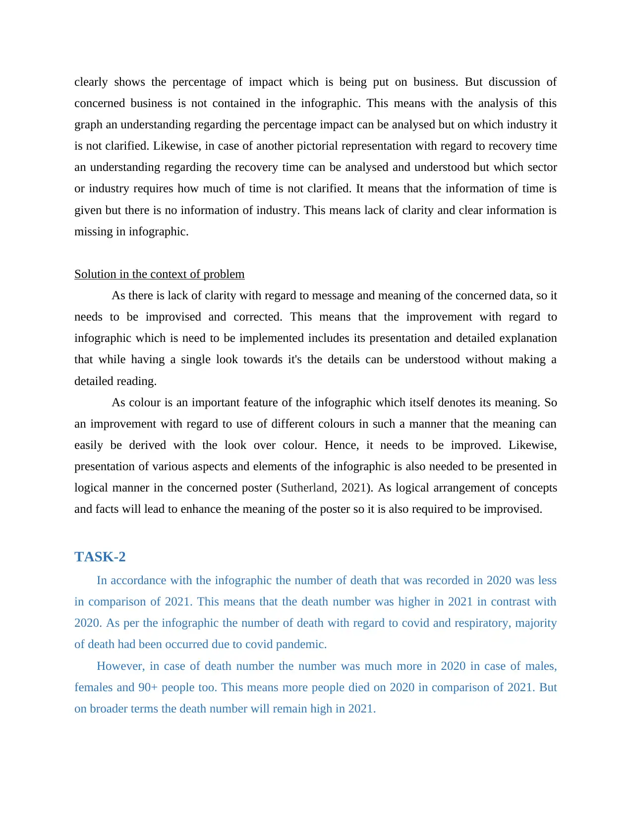
clearly shows the percentage of impact which is being put on business. But discussion of
concerned business is not contained in the infographic. This means with the analysis of this
graph an understanding regarding the percentage impact can be analysed but on which industry it
is not clarified. Likewise, in case of another pictorial representation with regard to recovery time
an understanding regarding the recovery time can be analysed and understood but which sector
or industry requires how much of time is not clarified. It means that the information of time is
given but there is no information of industry. This means lack of clarity and clear information is
missing in infographic.
Solution in the context of problem
As there is lack of clarity with regard to message and meaning of the concerned data, so it
needs to be improvised and corrected. This means that the improvement with regard to
infographic which is need to be implemented includes its presentation and detailed explanation
that while having a single look towards it's the details can be understood without making a
detailed reading.
As colour is an important feature of the infographic which itself denotes its meaning. So
an improvement with regard to use of different colours in such a manner that the meaning can
easily be derived with the look over colour. Hence, it needs to be improved. Likewise,
presentation of various aspects and elements of the infographic is also needed to be presented in
logical manner in the concerned poster (Sutherland, 2021). As logical arrangement of concepts
and facts will lead to enhance the meaning of the poster so it is also required to be improvised.
TASK-2
In accordance with the infographic the number of death that was recorded in 2020 was less
in comparison of 2021. This means that the death number was higher in 2021 in contrast with
2020. As per the infographic the number of death with regard to covid and respiratory, majority
of death had been occurred due to covid pandemic.
However, in case of death number the number was much more in 2020 in case of males,
females and 90+ people too. This means more people died on 2020 in comparison of 2021. But
on broader terms the death number will remain high in 2021.
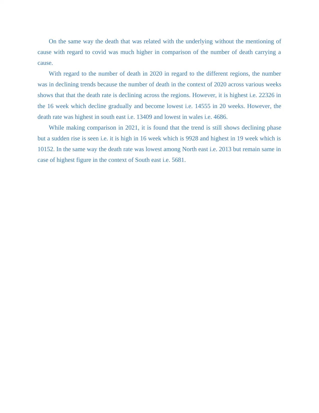
On the same way the death that was related with the underlying without the mentioning of
cause with regard to covid was much higher in comparison of the number of death carrying a
cause.
With regard to the number of death in 2020 in regard to the different regions, the number
was in declining trends because the number of death in the context of 2020 across various weeks
shows that that the death rate is declining across the regions. However, it is highest i.e. 22326 in
the 16 week which decline gradually and become lowest i.e. 14555 in 20 weeks. However, the
death rate was highest in south east i.e. 13409 and lowest in wales i.e. 4686.
While making comparison in 2021, it is found that the trend is still shows declining phase
but a sudden rise is seen i.e. it is high in 16 week which is 9928 and highest in 19 week which is
10152. In the same way the death rate was lowest among North east i.e. 2013 but remain same in
case of highest figure in the context of South east i.e. 5681.
⊘ This is a preview!⊘
Do you want full access?
Subscribe today to unlock all pages.

Trusted by 1+ million students worldwide
REFERENCES
Books and journals
Lu, and et.al., 2020, April. Exploring visual information flows in infographics. In Proceedings of
the 2020 CHI Conference on Human Factors in Computing Systems (pp. 1-12).
Noh, and et.al., 2017. Infographics: teaching and learning tool. Malaysian Online Journal of
Education. 1(1). pp.58-63.
Sutherland, K.E., 2021. Creating Compelling Images, Graphics, Memes and Infographics.
In Strategic Social Media Management (pp. 325-358). Palgrave Macmillan, Singapore.
Zhu, and et.al., 2020. A survey on automatic infographics and visualization
recommendations. Visual Informatics. 4(3). pp.24-40.
1
1 out of 7
Related Documents
Your All-in-One AI-Powered Toolkit for Academic Success.
+13062052269
info@desklib.com
Available 24*7 on WhatsApp / Email
![[object Object]](/_next/static/media/star-bottom.7253800d.svg)
Unlock your academic potential
Copyright © 2020–2026 A2Z Services. All Rights Reserved. Developed and managed by ZUCOL.


