Data Analytics and Visualisation Report: Tools and Techniques
VerifiedAdded on 2021/04/21
|10
|2089
|70
Report
AI Summary
This report provides a comprehensive overview of data analytics and visualization techniques, focusing on tools like R, Tableau, Qlikview, and MS Excel. It delves into the importance of data visualization in business decision-making, highlighting the significance of transforming data into visual representations for gaining insights. The report discusses various visualization methods, including graphs, charts, and diagrams, while also exploring the key features of big data analysis, such as volume, variety, and velocity. It offers a comparative analysis of the strengths and weaknesses of each tool, covering topics like data manipulation, modeling, and communication. The report also examines the practical applications of these tools in diverse business contexts, such as financial dashboard creation and business intelligence. It emphasizes the importance of choosing the right tool based on the specific needs of the data analysis tasks. Ultimately, this report helps readers understand the data analytics and visualization landscape and make informed decisions about the best tools for their needs.

Running head: DATA ANALYTICS AND VISUALISATION
Data Analytics and Visualisation
Name of the Student:
Name of the University:
Author’s Note:
Data Analytics and Visualisation
Name of the Student:
Name of the University:
Author’s Note:
Paraphrase This Document
Need a fresh take? Get an instant paraphrase of this document with our AI Paraphraser
1DATA ANALYTICS AND VISUALISATION
Table of Contents
Introduction:...............................................................................................................................2
Discussion:.................................................................................................................................2
Conclusion:................................................................................................................................6
References:.................................................................................................................................7
2DATA ANALYTICS AND VISUALISATION
Introduction:
A picture is worthier than thousand words, especially while some one is attempting to
understand and gain insights from the data. For data analysis and decision making, some
factors are very crucial. These are data visualization, transformation of data, information and
knowledge into visual representations. Data visualization is very crucial to the users as it
could suggest comprehensive insights for various analytical purpose. Commercial firms, non-
governmental public sectors and other individual private companies require data visualisation
with the help of graphs and figures. The big data analytics has been spread in a large domains
alike marketing, finance, economy, politics and many others.
The corporate houses utilize different types of software tools and packages such as R,
Excel, Tableau and Qlikview for business decision making. The report aims to present
explorations and enhancement in knowledge for comparing the cutting edges of techniques of
information visualization. For supporting effective decision making, the data visualization
technique is necessary. Sophisticated analyses and more effective decision making can be
performed by exploring data set.
Big data quality relies up on three types of categories that are data quality
categorization, data manager and big data handling.
Discussion:
It is the conventional method to generate graphs like Histogram, pie-chart, scatter
plots, line-bar-bubble charts as well as trend charts. Sometimes data flow diagrams, entity
relationship (ER) diagrams and Venn diagrams are also used to be taken into consideration.
However, in this era, the mainstream analytical visualisations are word/ text/ tag clouds,
network diagrams, parallel coordinates, tree mapping, semantic networks and cone trees.
The data visualization effectively increasing the solution for challenges as the ability
effectively supporting to visualize the data set. Volume, variety and velocity are the three key
features of big data analysis. The proper categorization of created, provoked, transactional,
compiled, experimental or captured data is necessary for authentic visualization. The quality
of data effectively considers outliers and data outcomes. The factors that are pretty much
needed for data visualization and interpretation are relevance, reliability, appropriateness and
accessibility. The advanced software such as Hadoop, Splunk, Python and D3 are the most
⊘ This is a preview!⊘
Do you want full access?
Subscribe today to unlock all pages.

Trusted by 1+ million students worldwide
3DATA ANALYTICS AND VISUALISATION
beneficial big data platform tools. With the help of these software, exploratory data analysis
is executed.
(Source: Business-science.io., 2018)
R software is used by a large number of academic statistician. R is platform
independent software that easily enables digging of dataset, comparison of data sets and
contrast of profiling (Miller, 2017). Beyond the sophisticated modelling techniques, R
supports the requirement of performing summary tables for determining data groupings. The
typical tasks that fulfil data visualization are – identifying the fields of the data, enlisting of
field attributes and statistics, reviewing field value distributions, null ratios, reporting
minimum, maximum, averages and scatter ness of time series data. In R-programming
language, the clearer outcomes and complexities are being easily visualised. Financial dash
board making is easy in R. R software controls data science for both computer and non-
computer scientists. Communication relates the involvement of both the presence of business
and finance. Report formation, dashboard making, interactive web applications could be
successfully apprehended by this tool (Source: Classycareergirl.com., 2018). Tactically, R
tool explores inherent relationships within the data that lead to look through new and good
ideas.
Paraphrase This Document
Need a fresh take? Get an instant paraphrase of this document with our AI Paraphraser
4DATA ANALYTICS AND VISUALISATION
In the big data world, Tableau helps to connect directly to local and cloud data
resources for importing fast in-memory performance. Another target of Tableau is to perceive
the self-service analytics and to mine big data with intuition. Effectively the data analytics
uses point-and-click analytics in Tableau for analysing Real-time drag-and-drop cluster
analysis, cross data source joining, mobile enabling, powerful data connectors and real-time
regional data exploration. The internet-based data companies accumulate massive data sets
for visualization with the help of Tableau. Small enterprises and retail sector uses Tableau as
it provides the essential information. This software easily accomplishes the quick-iterative
analysis and become an essential aspect of business information systems. Visualization in
Tableau is more vibrant than MS excel. Scatter plots, altitude plots, dashboard plotting or
heat mapping visualisation is easily available in Tableau. In Tableau, a business analyst can
analyse spreadsheets, public data tools, analytic data packages with a larger variety of
general-purpose databases and data cubes. Tableau unlike basic data software MS Excel can
perform three tasks that are public domain data sets, commercial data services and cloud
database platforms. Tableau connects several connectors such as Google Big Query, Open
Data Protocol, Salesforce, Amazon Redshift, Google Analytics and Windows Azure
Marketplace (Murray, 2013). Creation of data blends, network organization, colourful
presentation of basic statistical graphs and trend charts have made Tableau more popular.
Bullet graphs, packed bubble graphs, Histograms and Gantt charts are the most promising
plots that could be executed as per Tableau. Framing and taming of data set in Tableau server
can solve many technical problems of small industrial industry. Web-Tablet authorisation
facility is readily available as a supplementary tool in Tableau. Dashboard making may
provide a more robust environment for making a day-to-day decision. Embed java script
code, iFrame, pathway analysis in Tableau provides effective analysis and action.
MS-Excel helps to find comparisons, contrasts, tendencies and dispersion of the
common and traditional analysis technique. The complete profiling method in excel is
displayed as-
(Source: 6 Ways Tableau Can Transform The Way You Do Business., 2018)
5DATA ANALYTICS AND VISUALISATION
Data analysis package and solver add ins help to analyse data in the advanced method. The
3D graphs and Maps could be executed in MS Excel. Power view Ribbon and data filtering
help to analyse the data more specifically. All types of files such as .xlsx, .csv or .txt are
accessible in MS excel. Data cleansing and data transformation are very easy to carry out by
MS Excel. For visualization, excel also permits to manually create the cross-charts, graphs
and charts too. Analysts can analyse the text ribbon, the context menu, text modifier, thematic
reporting, glowing back ground and maps in power view with the help of data. Small
enterprises shape and split the databases in excel. KPI descriptions and views in Navigator
prospect the more authentic visualization in MS Excel (Aspin, 2016)). With the help of
context filtration, Text filtration and merging, formatting of trend data, Management of
perspectives and power pivot handling, data modelling is framed. Google Publisher and
PowerBI in MS excel support the service sectors and business intelligence by making
Dashboard presentations (Pileggi et al., 2012).
Qlikview is a trending business intelligence tools that helps to explore and visualize
the data such as MS Excel and Tableau. Operational intelligence, Investigation and
adjudication are the influential factors of data visualization. For business Case, data
modelling, data load scripting and creating visualisation, Qlikview is a worthy tool to the
analysts. Small companies may generate visualisation of their profitability analysis, inventory
analysis and project management with the help of Qlikview tools. The software is capable to
solve any kind of business related current and potential problems. In case of business
intelligence, the software helps a company to comprehend on time and easily interpretable
outcomes to the customers.
⊘ This is a preview!⊘
Do you want full access?
Subscribe today to unlock all pages.

Trusted by 1+ million students worldwide
6DATA ANALYTICS AND VISUALISATION
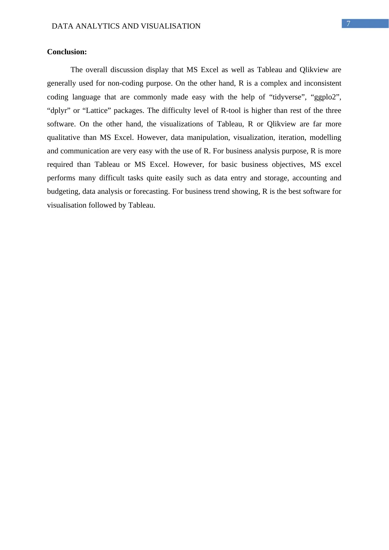
(Source: Qlik.com., 2018)
Qlikview application in the right way used to specify any kind of parameters. The associative
logic of Qlikview offers the capability for conducting direct and indirect associative searches
either within a single field or whole data set. Qlikview helps to load the data set quickly and
create quick visualisation. The responsive deign and touch-sensitive visualization develop the
data load script for sales analysis. Real values of sales, product promotions and allowances
are easily visualised in this analysis. Creating dynamic expressions and dynamic dimensions
are utilised for profitability analysis in Qlikview. The combo charts, waterfall charts, Mekko
charts, heat maps and block charts are accomplished in Qlikview. Coding and looping could
also be done with this tool. In this software, business-driven data discoveries with guided
paths of analysis are highly customizable and tightly governed. Qlikview customises scripting
and extend development with workbench. Therefore, for a business analyst, Qlikview is
exclusively a system management and business application software that naturally intends to
navigate complex information for accelerating discovery. The special feature that one
researcher can observe in Qlikview but not in Tableau or Excel is its enterprise-level
governance of data. The attractive aspects include Qlik NPrinting, Qlik Market, Qlik
DataMarket, Qlik Connectors or Qlik GeoAnalytics (Troyansky, Gibson & Leichtweis,
2015). Its executive dashboard helps to create business analysis model for senior managers
for monitoring performance in business. It helps analysts to drill down into the microscopic
details of the business. As a result, a corporate organization becomes capable of
manufacturing fast moving consumables using a reseller model for delivering its products
across multiple local or global regions.
Paraphrase This Document
Need a fresh take? Get an instant paraphrase of this document with our AI Paraphraser
7DATA ANALYTICS AND VISUALISATION
Conclusion:
The overall discussion display that MS Excel as well as Tableau and Qlikview are
generally used for non-coding purpose. On the other hand, R is a complex and inconsistent
coding language that are commonly made easy with the help of “tidyverse”, “ggplo2”,
“dplyr” or “Lattice” packages. The difficulty level of R-tool is higher than rest of the three
software. On the other hand, the visualizations of Tableau, R or Qlikview are far more
qualitative than MS Excel. However, data manipulation, visualization, iteration, modelling
and communication are very easy with the use of R. For business analysis purpose, R is more
required than Tableau or MS Excel. However, for basic business objectives, MS excel
performs many difficult tasks quite easily such as data entry and storage, accounting and
budgeting, data analysis or forecasting. For business trend showing, R is the best software for
visualisation followed by Tableau.
8DATA ANALYTICS AND VISUALISATION
References:
6 Ways Tableau Can Transform The Way You Do Business. (2018). Hacker Noon. Retrieved
19 April 2018, from https://hackernoon.com/6-ways-tableau-can-transform-the-way-
you-do-business-d44e2ba3e964
Aspin, A. (2016). High Impact Data Visualization in Excel with Power View, 3d Maps, Get
& Transform and Power Bi. Apress.
Business-science.io. (2018). SIX REASONS TO LEARN R FOR BUSINESS.
http://www.business-science.io/assets/ds4b_rating.pngwww.business-science.io/
business/2017/12/27/six-reasons-to-use-R-for-business.html
Classycareergirl.com. (2018). http://www.classycareergirl.com/2016/05/business-uses-for-
microsoft-excel/
Miller, James D. (2017), Big Data Visualization, Packt Publishing Ltd.
Murray, D. G. (2013). Tableau your data!: fast and easy visual analysis with tableau
software. John Wiley & Sons.
Pileggi, H., Stolper, C. D., Boyle, J. M., & Stasko, J. T. (2012). Snapshot: Visualization to
propel ice hockey analytics. IEEE Transactions on Visualization and Computer
Graphics, 18(12), 2819-2828.
Qlik.com. (2018). Retrieved from https://www.qlik.com/us/products/qlikview
Troyansky, O., Gibson, T., & Leichtweis, C. (2015). QlikView Your Business: An Expert
Guide to Business Discovery with QlikView and Qlik Sense. John Wiley & Sons.
⊘ This is a preview!⊘
Do you want full access?
Subscribe today to unlock all pages.

Trusted by 1+ million students worldwide
9DATA ANALYTICS AND VISUALISATION
1 out of 10
Related Documents
Your All-in-One AI-Powered Toolkit for Academic Success.
+13062052269
info@desklib.com
Available 24*7 on WhatsApp / Email
![[object Object]](/_next/static/media/star-bottom.7253800d.svg)
Unlock your academic potential
Copyright © 2020–2026 A2Z Services. All Rights Reserved. Developed and managed by ZUCOL.


