MBA504 Data Analysis: Case Study on Enabling Data-Driven Decisions
VerifiedAdded on 2023/06/11
|14
|2899
|171
Case Study
AI Summary
This case study analyzes the Woolworths Group's data analytics practices, focusing on the challenges of managing large datasets and the inefficiencies of using traditional methods like spreadsheets for data visualization. It proposes the implementation of Tableau for improved data visualization, highlighting its ability to create CFO dashboards, track KPIs, and offer interactive analysis. The study emphasizes the benefits of effective data visualization, including better business information assimilation, quicker access to insights, rapid identification of trends, and enhanced user interaction with data. The conclusion advocates for embracing data visualization techniques to enable faster decision-making, adapt to market changes, and identify financial irregularities, ensuring business sustainability and market competitiveness. Desklib provides access to similar solved assignments and past papers for students.
1
Data Analytics Case Study
The Name of the Student
The Name of the Course
The Name of the Professor
The Name of the School
The City and State where it is located
Date
Data Analytics Case Study
The Name of the Student
The Name of the Course
The Name of the Professor
The Name of the School
The City and State where it is located
Date
Paraphrase This Document
Need a fresh take? Get an instant paraphrase of this document with our AI Paraphraser
2
Data Analytics Case Study
Introduction
In this case study, we focused on the Woolworths Group of Companies with its Head
offices in Bella Vista, New South Wales 2153 in Australia. The company deals in a huge range
of products including clothing and accessories, foodie gifts, meal ideas, brands, homeware,
beauty accessories, among many other things. With all these staffs they deal in, the company has
a wide range of data that it stores on its database for retrieval, analysis, and visualization.
(Appelbaum et al., 2017, pp.29-44) acknowledges that this processes can be very tedious if
suitable measures are not put in place to enable efficient decision-making or it can end up
making the data collected less helpful in decision making processes.
The purpose of this case study was to determine the mode of operation that is in place
with regard to data analytics of the company annual reports which include financial reports
among others. The case study is also anticipated to find out the possible challenges encountered
by the company in its analysis processes and examine better modes of operation that could
enable the company to handle its data in the most effective visualization ways (Kim et al., 2017,
pp.491-500). Moreover, the study further intends to determine the type of data collected and used
by the company in its daily operations that are used for the annual report.
The current mode of operation
The company has numerous customer outlets both on the online platform and physical
outlets that lead to the generation of large amount data on the company’s database. The study
shows that the data is which is segmented in different tables and spreadsheets which way much
confusing for the IT experts in carrying out the data analysis (Storey and Veda, 2017, pp.50-67).
3
This can be the way a big trouble to an expert who has recently joined the company as tracking
the trends in data is almost impossible. This is due to the availability of different categories of
data for customers’ accounts, storage data, available products in stock data, the sold products and
services data, the employees’ data, the stockholders’ data, discontinued operations, non-financial
assets data, onerous leases, and the shareholder’s data. Compiling all these categories to identify
the trends in the operation of the company has created a number of inefficiencies or created a
room for possible inefficiencies in the near future as reiterated by (Geng et al., 2017, p.12). For
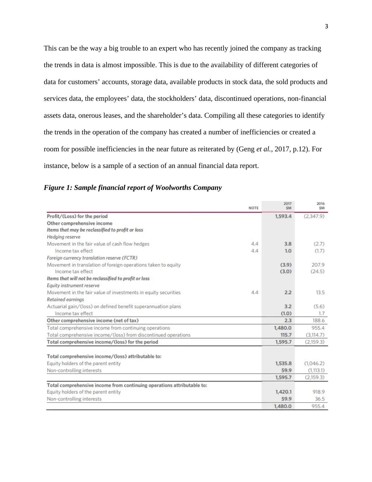
instance, below is a sample of a section of an annual financial data report.
Figure 1: Sample financial report of Woolworths Company
⊘ This is a preview!⊘
Do you want full access?
Subscribe today to unlock all pages.

Trusted by 1+ million students worldwide
4
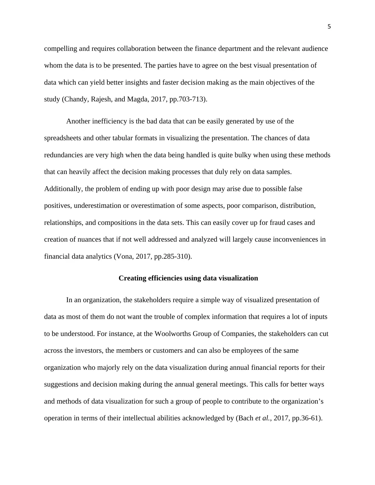
From the above, consolidated statement of the other comprehensive income must be read in
conjunction with other notes accompanying notes to the consolidated financial statement in order
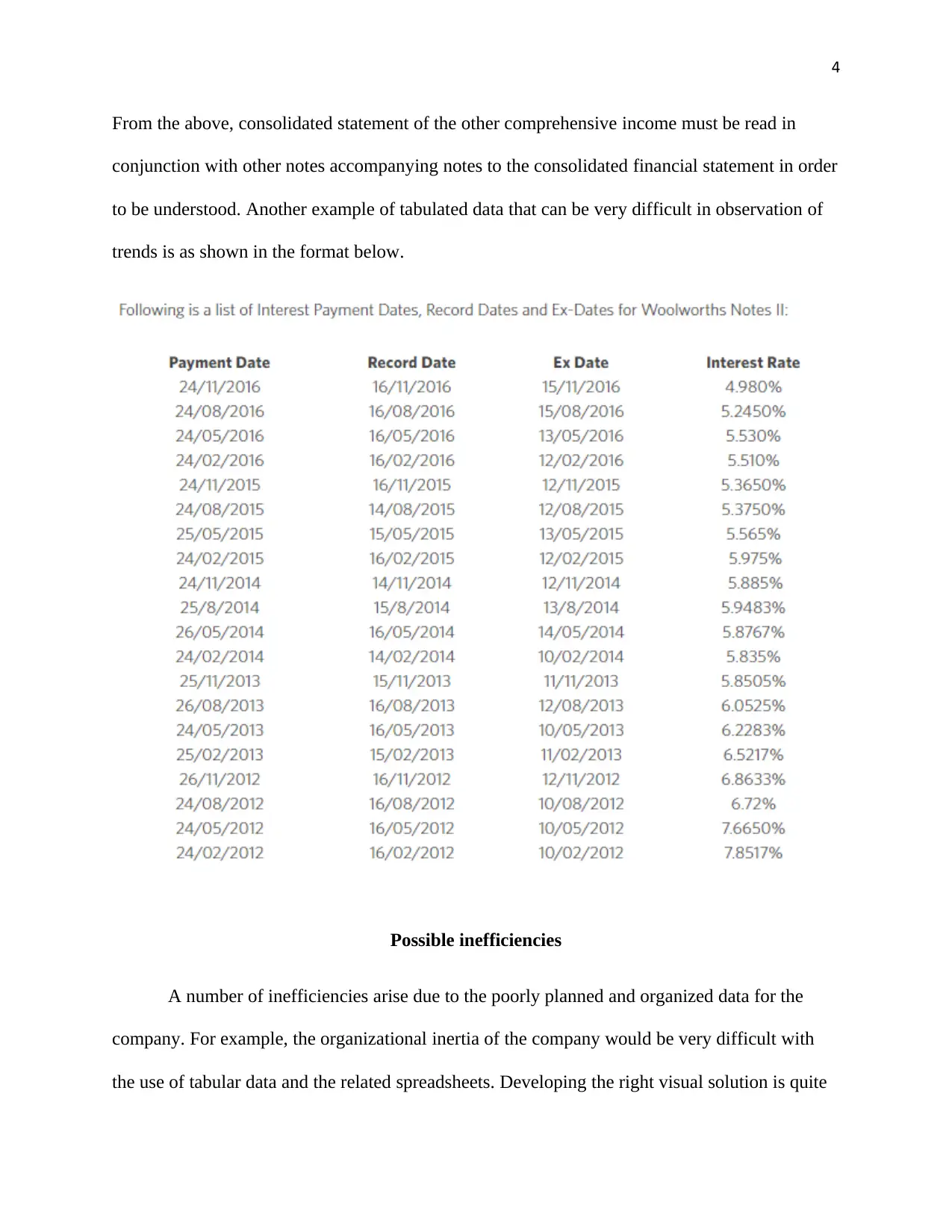
to be understood. Another example of tabulated data that can be very difficult in observation of
trends is as shown in the format below.
Possible inefficiencies
A number of inefficiencies arise due to the poorly planned and organized data for the
company. For example, the organizational inertia of the company would be very difficult with
the use of tabular data and the related spreadsheets. Developing the right visual solution is quite
Paraphrase This Document
Need a fresh take? Get an instant paraphrase of this document with our AI Paraphraser
5
compelling and requires collaboration between the finance department and the relevant audience
whom the data is to be presented. The parties have to agree on the best visual presentation of
data which can yield better insights and faster decision making as the main objectives of the
study (Chandy, Rajesh, and Magda, 2017, pp.703-713).
Another inefficiency is the bad data that can be easily generated by use of the
spreadsheets and other tabular formats in visualizing the presentation. The chances of data
redundancies are very high when the data being handled is quite bulky when using these methods
that can heavily affect the decision making processes that duly rely on data samples.
Additionally, the problem of ending up with poor design may arise due to possible false
positives, underestimation or overestimation of some aspects, poor comparison, distribution,
relationships, and compositions in the data sets. This can easily cover up for fraud cases and
creation of nuances that if not well addressed and analyzed will largely cause inconveniences in
financial data analytics (Vona, 2017, pp.285-310).
Creating efficiencies using data visualization
In an organization, the stakeholders require a simple way of visualized presentation of
data as most of them do not want the trouble of complex information that requires a lot of inputs
to be understood. For instance, at the Woolworths Group of Companies, the stakeholders can cut
across the investors, the members or customers and can also be employees of the same
organization who majorly rely on the data visualization during annual financial reports for their
suggestions and decision making during the annual general meetings. This calls for better ways
and methods of data visualization for such a group of people to contribute to the organization’s
operation in terms of their intellectual abilities acknowledged by (Bach et al., 2017, pp.36-61).
6
For one to propose a suitable means that would create efficiencies to the company, the
factors to be considered among many include; who the audience is, what the data is needed for,
and what data-savvy they are. Another aspect to consider is the various users’ needs in terms of
interactivity with the data, the mobile device usage, the design and interface requirements, and
the level of details required. The desired outcome of the data visualization is also another
important item to consider, how it will facilitate decision-making process, user education, or
drive better discussions (Alharthi, 2017). For the Woolworths case study, the use tableau
visualization method was chosen as the best method to eradicate the inefficiencies brought about
by the prior methods of visual presentation.
The study findings identified that the use of the tableau software could enhance quality
financial reports and operations as the tableau software has the capabilities to create CFO
dashboards (Chief Financial Officers dashboard), financial ratios and Key Performance
Indicators (KPI) from the given raw data with the best ways to visualize and present financial
data. The data visualization using this method is relatively inexpensive and can also offer great
speeds in the operations of the organization. With the use of tableau, data is unified and all of it
is analyzed without leaving out some sets of data or basing on assumptions whereby the
repeating and scaling of data in the analysis in faster than the prior methods. Additionally, the
method is more appealing and it has been proved by those organizations that have already
implemented it to be of more insights with interactive analysis and improved communication of
insights within the organisation (Jiang, 2017).
The use of Tableau in achieving financial analytics efficiencies
The Tableau software visualizes data in a manner that can be understood by even non-
analysts. It employs the use of features like colours, labels, different dimensions, and can create
⊘ This is a preview!⊘
Do you want full access?
Subscribe today to unlock all pages.

Trusted by 1+ million students worldwide
7
visual masterpieces thus revealing business insights which help in making informed decisions
(Huber et al., 2018, pp.1-6).
As the size of data keeps growing due to the increase of new customers and at the Woolworths
Company, the tableau software will enable the managers/ directors to effectively manage the
trends without the risk of getting overwhelmed with the bulkiness of information. This is
possible as the method is able to assemble and connect the various sources of data such as excel
files, word documents, texts, database queries among others. The software outlines the data
blending, connection using cubes, join types, custom SQL, and the Google Analytics.
There are multiple options of data representation in different views with the application
of filters, the drill downs, formatting, the creation of sets or groupings, generation of trend lines,
and forecasting performances as illustrated by (Szewranski et al., 2017, pp.337-349). However,
the software enables the financial analysts to perform the above by simple clicks and selection of
the desired presentation without the trouble of single entry data to generate a chart or a graph for
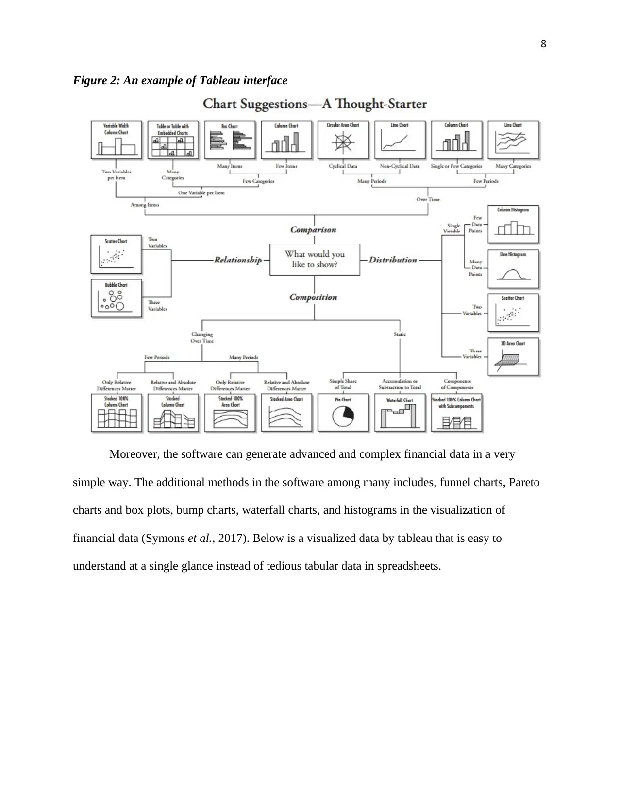
example. The figure below is a snapshot sample of the tableau that enables the analyst to choose
and decide the desirable visualization type of their preference. This automatically activates the
best views for different measures and dimensions making it very simple to use.
Paraphrase This Document
Need a fresh take? Get an instant paraphrase of this document with our AI Paraphraser
8
Figure 2: An example of Tableau interface
Moreover, the software can generate advanced and complex financial data in a very
simple way. The additional methods in the software among many includes, funnel charts, Pareto
charts and box plots, bump charts, waterfall charts, and histograms in the visualization of
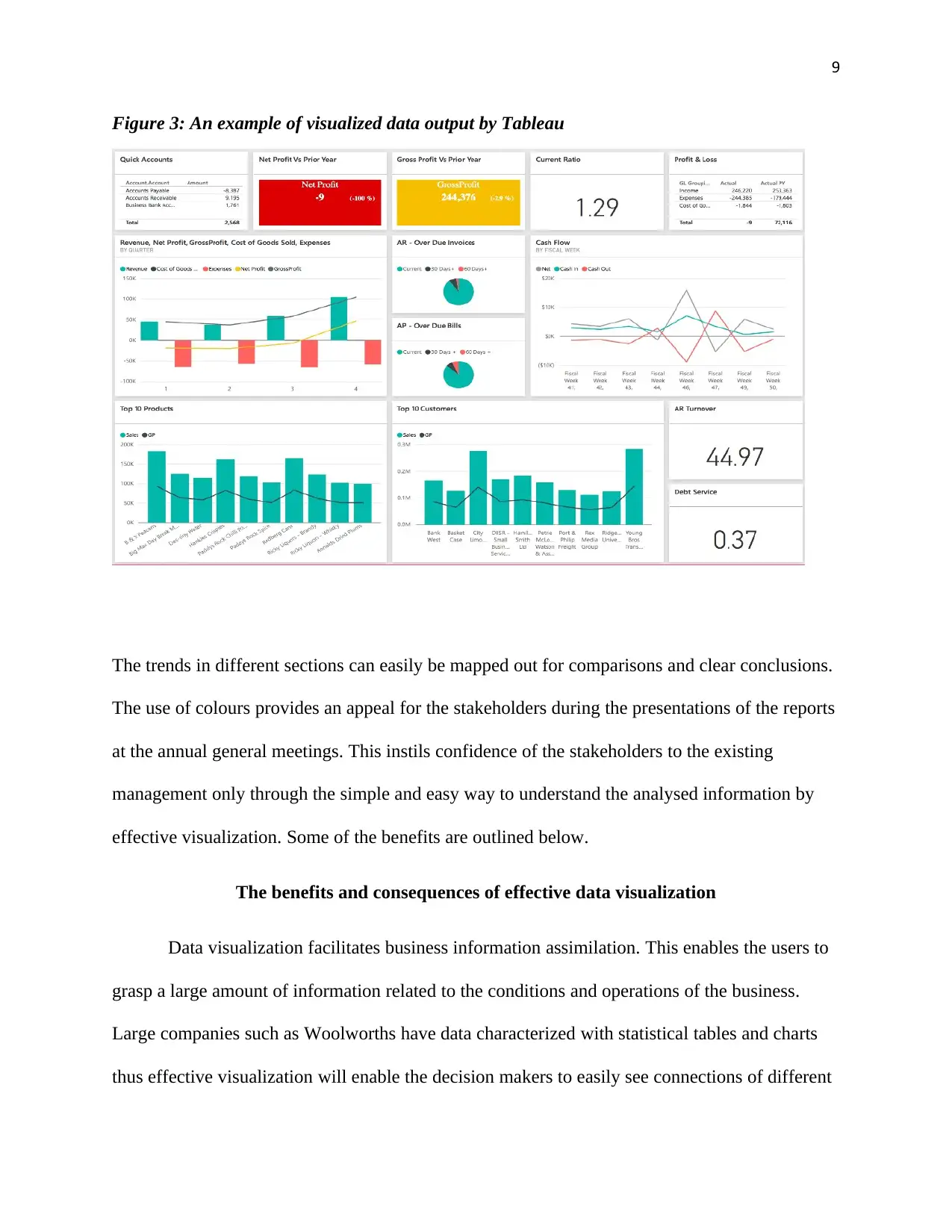
financial data (Symons et al., 2017). Below is a visualized data by tableau that is easy to
understand at a single glance instead of tedious tabular data in spreadsheets.
9
Figure 3: An example of visualized data output by Tableau
The trends in different sections can easily be mapped out for comparisons and clear conclusions.
The use of colours provides an appeal for the stakeholders during the presentations of the reports
at the annual general meetings. This instils confidence of the stakeholders to the existing
management only through the simple and easy way to understand the analysed information by
effective visualization. Some of the benefits are outlined below.
The benefits and consequences of effective data visualization
Data visualization facilitates business information assimilation. This enables the users to
grasp a large amount of information related to the conditions and operations of the business.
Large companies such as Woolworths have data characterized with statistical tables and charts
thus effective visualization will enable the decision makers to easily see connections of different
⊘ This is a preview!⊘
Do you want full access?
Subscribe today to unlock all pages.

Trusted by 1+ million students worldwide
10
information sets. Visualization also enables quick access to relevant insights in business.
Research has indicated that companies which apply the data visualization tools are 28 per cent
more likely to find the relevant information needed for business operation and sustainability than
those that do not make use of data visualization tools (Fezarudin et al., 2017, pp.593-604).
Another benefit that comes along with this method is the rapid identification of latest
trends. This enables the managers to pinpoint the opportunities that might arise for the company
in the volumes of data analyzed. The aspects such as the customer behaviours can be easily
identified which are essential for planning and strategizing purposes (Jun and Beung-Pyo, 2017,
pp.381-407). Moreover, the analysis of predictive sales is made easier with the aid of real-time
data visualization which is very vital for identification of reasons as to why some products are
underperforming or lagging. This can lead to the creation of new discussions that can be a
roadmap to unveil the development of the performance of the products over time in different
geographical locations which could enable the executives to drill down into these specified
locations to determine the products performing well and those underperforming in the market.
Lastly, (Lee et al., 2018, p.11) demonstrates how data visualization enables the users to
interact with data which helps to expose the changes in a very timely manner. This encourages
the analysts to further explore and manipulate the data in order to uncover other factors that
could not be identified easily. Moreover, it also helps to omit irrelevant data during presentation
making it easier to capture the attention of the executives and better communication.
Conclusion
In conclusion, the Woolworths Group of Companies and any other large or small
enterprises should embrace the use of data visualization techniques that would enable the
Paraphrase This Document
Need a fresh take? Get an instant paraphrase of this document with our AI Paraphraser
11
managers to execute fast decision-making processes and adapt quickly to the ever-changing
market dynamics. This will enable means for effective identification of the organisation setbacks
that are dragging the business into underperformance and therefore guide the managers in laying
in place effective future plans that would lead to business sustainability and winning of markets
for their products (Roberts et al., 2018, pp.791-801). In addition, the cases of financial frauds
could be identified easily during the organisation’s financial audits within the employees. All
these can be achieved through effective data visualization.
12
References
Alharthi, N. and Gutub, A., 2017. Data visualization to explore improving decision-making
within Hajj services. Sci Modell Res, 2(1), pp.9-18.
Appelbaum, D., Kogan, A., Vasarhelyi, M. and Yan, Z., 2017. Impact of business analytics and
enterprise systems on managerial accounting. International Journal of Accounting Information
Systems, 25, pp.29-44.
Bach, B., Dragicevic, P., Archambault, D., Hurter, C. and Carpendale, S., 2017, September. A
Descriptive Framework for Temporal Data Visualizations Based on Generalized Space‐Time
Cubes. In Computer Graphics Forum (Vol. 36, No. 6, pp. 36-61).
Chandy, R., Hassan, M. and Mukherji, P., 2017. Big data for good: insights from emerging
markets. Journal of Product Innovation Management, 34(5), pp.703-713.
Fezarudin, F.Z., Tan, M.I.I. and Saeed, F.A.Q., 2017, August. Data Visualization for Human
Capital and Halal Training in Halal Industry Using Tableau Desktop. In Asian Simulation
Conference (pp. 593-604). Springer, Singapore.
Geng, Y., Lin, Y., Ma, Y., Guo, Z., Gu, C. and Wang, M., 2017, January. Interactive
Visualization of DGA Data Based on Multiple Views. In Journal of Physics: Conference
Series (Vol. 787, No. 1, p. 012001). IOP Publishing.
Huber, T.C., Krishnaraj, A., Monaghan, D. and Gaskin, C.M., 2018. Developing an Interactive
Data Visualization Tool to Assess the Impact of Decision Support on Clinical
Operations. Journal of digital imaging, pp.1-6.
Jiang, F., 2017. Data Analytics Helps Business Decision Making.
⊘ This is a preview!⊘
Do you want full access?
Subscribe today to unlock all pages.

Trusted by 1+ million students worldwide
1 out of 14
Related Documents
Your All-in-One AI-Powered Toolkit for Academic Success.
+13062052269
info@desklib.com
Available 24*7 on WhatsApp / Email
![[object Object]](/_next/static/media/star-bottom.7253800d.svg)
Unlock your academic potential
Copyright © 2020–2025 A2Z Services. All Rights Reserved. Developed and managed by ZUCOL.


