Data Visualization Report: Analysis of ABC Weather Website
VerifiedAdded on 2022/09/12
|7
|1408
|17
Report
AI Summary
This report provides a comprehensive analysis of the data visualization techniques employed by the ABC weather website, focusing on both its graphical and text-based representations. The report delves into the website's use of spatial-temporal data, identifying the mapping technique as single static maps. It categorizes the data as continuous and ordinal, discussing the strengths and weaknesses of each visualization type, such as the advantages of clear communication in graphical visualization versus the ambiguity challenges of text-based visualization. The analysis further explores the website's use of context filters to enhance understanding. The report concludes by summarizing the key findings, highlighting the website's effective use of diverse visualization methods and context provision.
Running head: DATA VISUALIZATION
Data visualization
Name of the Student
Name of the University
Author Note
Data visualization
Name of the Student
Name of the University
Author Note
Paraphrase This Document
Need a fresh take? Get an instant paraphrase of this document with our AI Paraphraser
1DATA VISUALIZATION
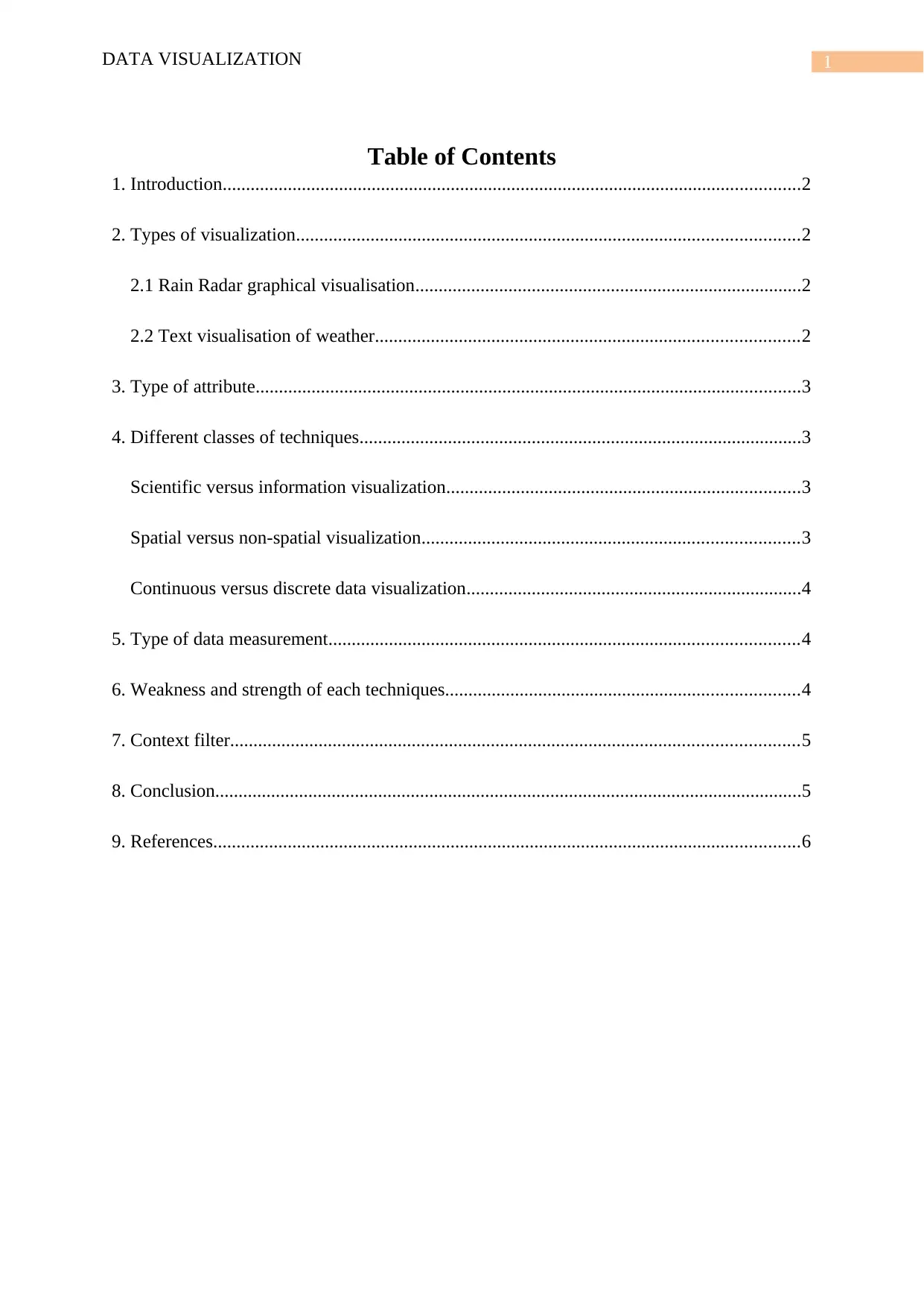
Table of Contents
1. Introduction............................................................................................................................2
2. Types of visualization............................................................................................................2
2.1 Rain Radar graphical visualisation...................................................................................2
2.2 Text visualisation of weather...........................................................................................2
3. Type of attribute.....................................................................................................................3
4. Different classes of techniques...............................................................................................3
Scientific versus information visualization............................................................................3
Spatial versus non-spatial visualization.................................................................................3
Continuous versus discrete data visualization........................................................................4
5. Type of data measurement.....................................................................................................4
6. Weakness and strength of each techniques............................................................................4
7. Context filter..........................................................................................................................5
8. Conclusion..............................................................................................................................5
9. References..............................................................................................................................6
2DATA VISUALIZATION
1. Introduction
The graphical representation of information and data is defined as data visualization.
Numerous visual elements are considered in this process such as graphs, charts and maps
(Dewey and Wakefield 2016). The outliers and the patterns of data can be understood using
data visualization. Web visualization is defined as the type of visualization which helps in
understanding the patterns of the information which are there in a website.
The prime objective of this report is to focus on the visualization designs of a website
based application. This report shall be analyzing the visualizations of a website, the attributes
of the two types of visualization shall be discussed in this report, along with these discussions
this report shall also identify the strength and the weakness of each technique. The ways of
providing the contexts to the visualization shall also be discussed in the concluding sections
of this report.
Selected website: https://www.abc.net.au/radio/sydney/weather/
2. Types of visualization
2.1 Rain Radar graphical visualisation
The weather radar of this website provides three-dimensional precipitation
information; some of the atmospheric processes is visually represented from this radar. The
real-time simultaneous visualization is directly related to the text-based data of this website.
2.2 Text visualisation of weather
On the other hand, the text visualization of this website is very much dynamic as well,
all the weather data can be visualized from this text-based visualization as well.
⊘ This is a preview!⊘
Do you want full access?
Subscribe today to unlock all pages.

Trusted by 1+ million students worldwide
3DATA VISUALIZATION
3. Type of attribute
The website has spatial-temporal data, as the data is collected from both spaces and
in time. There are diverse categories of mapping techniques that are usually considered in the
spatial-temporal data such as the single static maps, single dynamic maps, multiple dynamic
maps and multi-static maps (Woodburn, Yang and Marriott 2019). This website focuses
primarily on the mapping of time and spatiotemporal data. The mapping technique, which is
considered in this website is the single static maps.
4. Different classes of techniques
Scientific versus information visualization
Information visualization is defined as the type of visualization which visually
represents the abstract data to reinforce the human cognition (Tory and Setlur 2019). Spatial
representation is chosen in the information visualization, whereas in scientific visualization,
spatial representation is given. The scientific data are visually illustrated to understand the
key insights of the data. Physically-based data are visualized using scientific visualization,
whereas the non-physically based data are visualized using the information visualization.
Spatial versus non-spatial visualization
The data showing a kind of local, shape, size and orientation are visualized using the
special visualization technique (Kosmajac, Keselj and Milios 2017). All the spatial
relationships can be visually represented using the spatial visualization technique (Milo and
Somech 2016). The non-spatial data which are independent of the geometrical considerations
can be visually represented using the non-spatial visualization technique (Roberts, Ritsos and
Headleand 2017). The website which is being analyzed in this report is considering the
spatial visualization technique.
Paraphrase This Document
Need a fresh take? Get an instant paraphrase of this document with our AI Paraphraser
4DATA VISUALIZATION
Continuous versus discrete data visualization
The continuous visualization of the real time data is defined as the continuous data
visualization, on the other hand, the way of visualizing the discrete data of a business is
defined as the discrete data visualization (Fengjun and Xinzhe 2019). The data of this website
can be considered as the continuous data as these data can have any numeric value and can
also be subdivided into several categories.
5. Type of data measurement
The data of the website which is analyzed in this report is ordinal data, the data
contains parametric ordered variables which are ordered in a series.
6. Weakness and strength of each techniques
The strength and the weakness of each of the two categories of virtualization
technique is explained in the following table.
Types of virtualization Strength Weakness
Rain Radar graphical
visualization
Communication can be done
in a constructive manner
using graphical
visualization.
The introduction of the
artifacts is one of the prime
drawbacks of this
visualization technique.
Larger occupancy of display
space is the other weakness
of this visualization
technique. Edge crossing
and occlusion are the two
constraints of this
visualization technique as
well.
Text visualization This type of visualization is
very much useful to explore
the levels of a text such as
the lexical level, syntactic
level and the semantic level.
Ambiguousness is the most
significant limitation of this
data visualization technique,
ambiguity may occur due to
the intrinsic conciseness of
the data. The other
disadvantage of this
visualization technique is
5DATA VISUALIZATION
the visualization risks, this
risk occurs when the data is
distracted from its objective.
7. Context filter
There are diverse categories of tools such as Tableau, which play a leading role in the
functioning of the context filters (Buzzo and Jonas 2016). All the records which are present in
a data source can be accessed using Tableau. Thus, it can be said that context is provided to
the visualizations using the context filters.
8. Conclusion
The website which is analyzed in this report have both the graphical visualization and
text visualization. Spatial-temporal data is present in the website as data is collected from
both space and time, and the mapping technique of this website is single static maps. From
this report, it can be concluded that the data of this website is continuous, as it can have any
numeric value. The data of this website can also be considered as statistical data where the
variables have ordered categories. The context of the website is provided to the visualization
using a context filter.
⊘ This is a preview!⊘
Do you want full access?
Subscribe today to unlock all pages.

Trusted by 1+ million students worldwide
6DATA VISUALIZATION
9. References
Buzzo, D. and Jonas, D., 2016. Tracking the imperceptible: Designs to visualise time dilation.
Dewey, C. and Wakefield, J., 2016, May. Novel designs for the audio mixing interface based
on data visualization first principles. In Audio Engineering Society Convention 140. Audio
Engineering Society.
Fengjun, Y. and Xinzhe, S., 2019. Simulation and analysis system of sea echo based on
MATLAB. The Journal of Engineering, 2019(20), pp.6931-6934.
Kosmajac, D., Keselj, V. and Milios, E., 2017, March. EulerianGrapher: Text Visualisation at
the Level of Character N--grams based on Eulerian Graphs. In Proceedings of the 2017 ACM
Workshop on Exploratory Search and Interactive Data Analytics (pp. 59-63).
Milo, T. and Somech, A., 2016, June. React: Context-sensitive recommendations for data
analysis. In Proceedings of the 2016 International Conference on Management of Data (pp.
2137-2140).
Roberts, J.C., Ritsos, P.D. and Headleand, C., 2017. Experience and Guidance for the use of
Sketching and low-fidelity Visualisation-design in teaching.
Tory, M. and Setlur, V., 2019, October. Do What I Mean, Not What I Say! Design
Considerations for Supporting Intent and Context in Analytical Conversation. In 2019 IEEE
Conference on Visual Analytics Science and Technology (VAST) (pp. 93-103). IEEE.
Woodburn, L., Yang, Y. and Marriott, K., 2019, October. Interactive Visualisation of
Hierarchical Quantitative Data: An Evaluation. In 2019 IEEE Visualization Conference (VIS)
(pp. 96-100). IEEE.
1 out of 7
Related Documents
Your All-in-One AI-Powered Toolkit for Academic Success.
+13062052269
info@desklib.com
Available 24*7 on WhatsApp / Email
![[object Object]](/_next/static/media/star-bottom.7253800d.svg)
Unlock your academic potential
Copyright © 2020–2026 A2Z Services. All Rights Reserved. Developed and managed by ZUCOL.


