Data Visualization Analysis: RWE AG Full Year Report Evaluation
VerifiedAdded on 2022/10/09
|17
|2750
|24
Report
AI Summary
This report analyzes the effectiveness of data visualization techniques used in the RWE AG full year report, focusing on the application of charts, graphs, and tables. The report begins by establishing common criteria for data visualizations, including the need for captions, consistency in figures and measurement units, and source indications. Specific criteria for graphs and charts are then detailed, such as the use of titles, scaled and labeled axes, color-coding for multiple variables, legends, and the inclusion of measurement units. Criteria for tables are also defined, emphasizing the importance of column and row names, visible grids, and group indicators. The evaluation section assesses the quality of several figures and tables from the RWE AG report against these criteria, identifying strengths and weaknesses in terms of common criteria, graph/chart criteria, and table criteria. The analysis provides specific feedback on each visualization, suggesting improvements such as the addition of captions, sources, and axis labels. The report highlights the importance of clear, consistent, and informative data presentation for effective communication of information.

FSDA
FSDA
1
FSDA
1
Paraphrase This Document
Need a fresh take? Get an instant paraphrase of this document with our AI Paraphraser
FSDA
Contents
Introduction.................................................................................................................................................3
Part A: Criteria............................................................................................................................................3
Common Criteria.....................................................................................................................................3
Graphs and Charts Criteria......................................................................................................................4
Tables Criteria.........................................................................................................................................5
Part B: Evaluation.......................................................................................................................................6
Conclusion.................................................................................................................................................15
References.................................................................................................................................................16
2
FSDA
Introduction
Data visualization can be referred to the use of graphs and tables in the representation of aspects
of a dataset or the results of the data analysis processes (O'Neil & Schutt, 2013; Vicenc, 2017).
This paper focuses on identifying possible criteria that can be used for guiding the preparation
and presentation of data visualizations using Schmitz, Kebber & Grieve (2019) as a case study
for the Full Year report for the German based RWE AG company.
Part A: Criteria
Common Criteria
1. Data visualizations should have captions. The captions are important in presenting a brief
summarization about what the visualizations present (Hastie, Tibshir & Jerome 2009).
2. Data visualizations should have consistency in terms of the figures with respect to
significant figures and/or decimal points. This consistency in the nature of the figures
enhances the comparative ability of data visualizations (Howitt & Cramer, 2010).
3. Data visualizations should have the source(s) indicated. The sources in the case of
visualizations can either imply another report being referenced to or the data used for the
analysis that produced visualizations (Vicenc, 2017).
4. The data visualization should also have consistency in terms of the measurement units.
This is however a very specific criterion, for data visualizations, that applies to instances
where a single aspect is being observed for different categories. The value of the aspect in
all the categories should be in the same measurement unit. Similarly, this consistency
enhances the comparative ability of data visualizations (Howitt & Cramer, 2010).
3
⊘ This is a preview!⊘
Do you want full access?
Subscribe today to unlock all pages.
Trusted by 1+ million students worldwide
FSDA
Graphs and Charts Criteria
5. Graphs and charts should have titles. The title provides the end-user with information on
what the graph or chart is about and is expected to be detailed enough yet not too detailed
so as to retain the end-user’s interest (Hastie, Tibshir & Jerome 2009).
6. The axes for the graphs and charts should be scaled. The scales are important in the
indication of the magnitude and hence informs the interpretation of the chart (Roles,
Baeten & Signer 2016).
7. The axes for the graphs and charts should be labelled. The labelling of the axes provides
information on the variable being placed on the given axis (Horova, Kolacek & Zelinka,
2012).
8. The dependent variable(s) in a research should be placed on the y-axis while the
independent variable should be placed on the x-axis (O'Neil & Schutt, 2013).
9. In trend analysis and time series analysis in general, the time is placed on the x-axis of
the graph with the variable of interest (such as share prices or asset returns) placed on the
y-axis (Kabacoff, 2017).
10. In instances where the multiple variables are observed and plotted on the plane of a line
graph, the lines representing the variables should use different colors or different shades
(Horova, Kolacek & Zelinka, 2012).
11. The grouped variables plotted using cumulative bar graphs should have different colors
for each of the groups (Roles, Baeten & Signer 2016).
12. Charts and graphs on categorical or multiple variables should have legends. The legends
would give information on which color represent which group (Martinez, Martinez &
Solka 2010).
4
Paraphrase This Document
Need a fresh take? Get an instant paraphrase of this document with our AI Paraphraser
FSDA
13. Graphs and charts that incorporate two or more types of plots (say histogram and line
graph) should use different colors for the different types of plots (Kirk, 2016).
14. Pie charts and donut chart should have either the actual value or the percentage indicated
on each of the components represented (Martinez, Martinez & Solka 2010).
15. The measurement units should be indicated for the variables represented in the charts and
graphs. In bar graphs, line graphs and histograms this can be included in the axes labels
while in the pie charts and donut charts it can be included in the title (Kirk, 2016).
Tables Criteria
16. The columns of the tables should be named depending on the type of information to be
presented in the columns (Barbara & Susan, 2014).
17. The rows of the tables should also be named. In cases where the rows represent
observations, the observation number should be included as the row name (Barbara &
Susan, 2014).
18. The tables should have visible grids with each cell in the grid representing the interaction
between a row component and a column component (O'Neil & Schutt, 2013).
19. In cases where columns are in the same category or group, the group name should be
indicated as well in a new column for the groups (Smith, et al., 2014).
20. In tables where the rows are in the same category or group, the group is indicated in the
row immediately preceding the rows falling in the group (Smith, et al., 2014).
5
FSDA
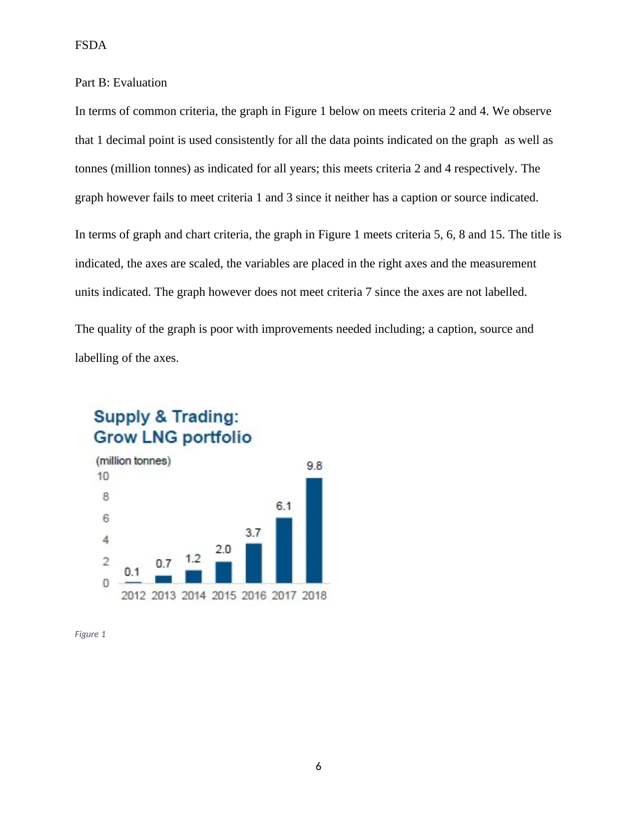
Part B: Evaluation
In terms of common criteria, the graph in Figure 1 below on meets criteria 2 and 4. We observe
that 1 decimal point is used consistently for all the data points indicated on the graph as well as
tonnes (million tonnes) as indicated for all years; this meets criteria 2 and 4 respectively. The
graph however fails to meet criteria 1 and 3 since it neither has a caption or source indicated.
In terms of graph and chart criteria, the graph in Figure 1 meets criteria 5, 6, 8 and 15. The title is
indicated, the axes are scaled, the variables are placed in the right axes and the measurement
units indicated. The graph however does not meet criteria 7 since the axes are not labelled.
The quality of the graph is poor with improvements needed including; a caption, source and
labelling of the axes.
Figure 1
6
⊘ This is a preview!⊘
Do you want full access?
Subscribe today to unlock all pages.
Trusted by 1+ million students worldwide
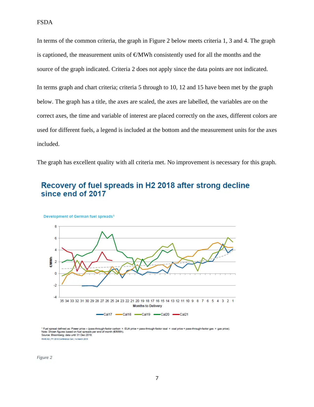
FSDA
In terms of the common criteria, the graph in Figure 2 below meets criteria 1, 3 and 4. The graph
is captioned, the measurement units of €/MWh consistently used for all the months and the
source of the graph indicated. Criteria 2 does not apply since the data points are not indicated.
In terms graph and chart criteria; criteria 5 through to 10, 12 and 15 have been met by the graph
below. The graph has a title, the axes are scaled, the axes are labelled, the variables are on the
correct axes, the time and variable of interest are placed correctly on the axes, different colors are
used for different fuels, a legend is included at the bottom and the measurement units for the axes
included.
The graph has excellent quality with all criteria met. No improvement is necessary for this graph.
Figure 2
7
Paraphrase This Document
Need a fresh take? Get an instant paraphrase of this document with our AI Paraphraser
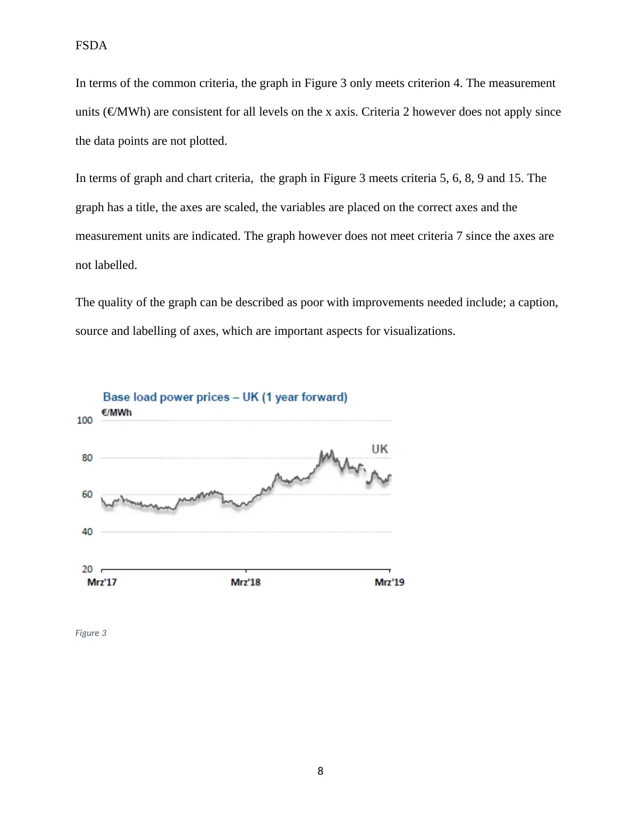
FSDA
In terms of the common criteria, the graph in Figure 3 only meets criterion 4. The measurement
units (€/MWh) are consistent for all levels on the x axis. Criteria 2 however does not apply since
the data points are not plotted.
In terms of graph and chart criteria, the graph in Figure 3 meets criteria 5, 6, 8, 9 and 15. The
graph has a title, the axes are scaled, the variables are placed on the correct axes and the
measurement units are indicated. The graph however does not meet criteria 7 since the axes are
not labelled.
The quality of the graph can be described as poor with improvements needed include; a caption,
source and labelling of axes, which are important aspects for visualizations.
Figure 3
8
FSDA
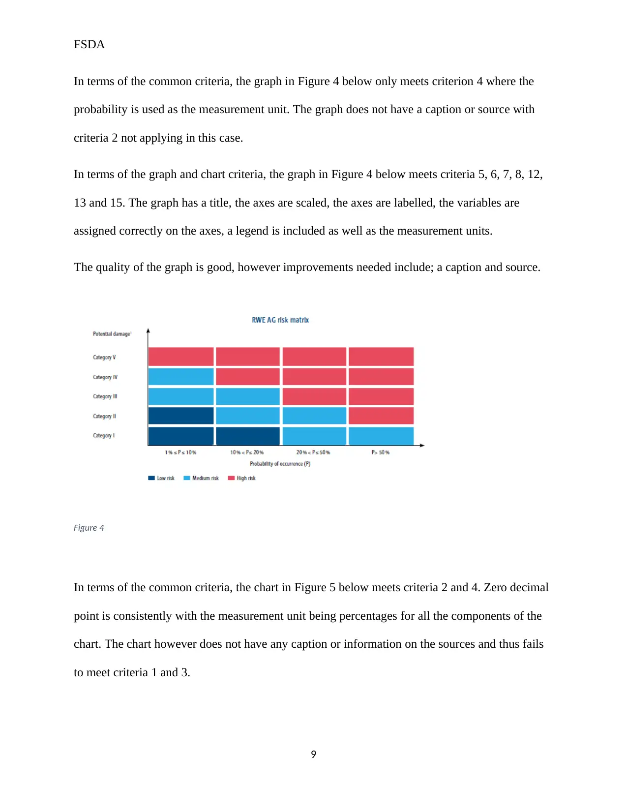
In terms of the common criteria, the graph in Figure 4 below only meets criterion 4 where the
probability is used as the measurement unit. The graph does not have a caption or source with
criteria 2 not applying in this case.
In terms of the graph and chart criteria, the graph in Figure 4 below meets criteria 5, 6, 7, 8, 12,
13 and 15. The graph has a title, the axes are scaled, the axes are labelled, the variables are
assigned correctly on the axes, a legend is included as well as the measurement units.
The quality of the graph is good, however improvements needed include; a caption and source.
Figure 4
In terms of the common criteria, the chart in Figure 5 below meets criteria 2 and 4. Zero decimal
point is consistently with the measurement unit being percentages for all the components of the
chart. The chart however does not have any caption or information on the sources and thus fails
to meet criteria 1 and 3.
9
⊘ This is a preview!⊘
Do you want full access?
Subscribe today to unlock all pages.
Trusted by 1+ million students worldwide
FSDA
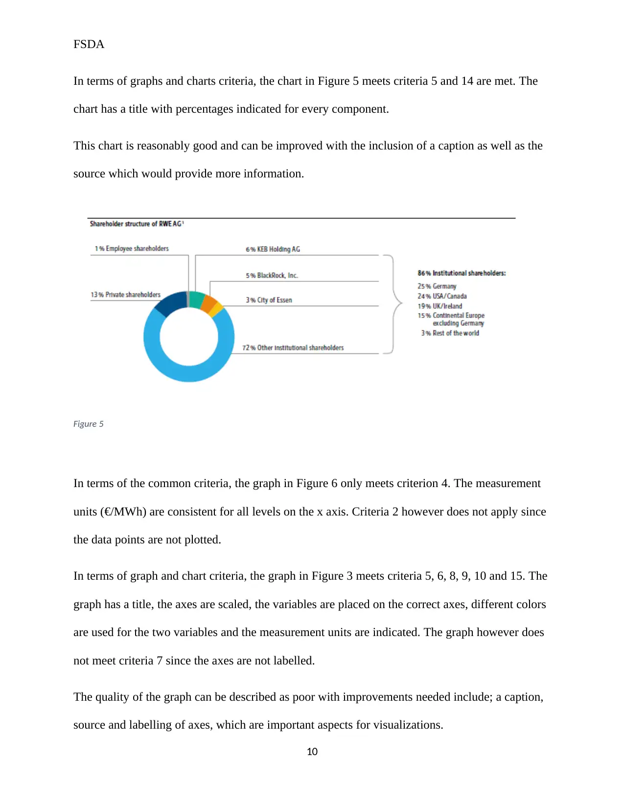
In terms of graphs and charts criteria, the chart in Figure 5 meets criteria 5 and 14 are met. The
chart has a title with percentages indicated for every component.
This chart is reasonably good and can be improved with the inclusion of a caption as well as the
source which would provide more information.
Figure 5
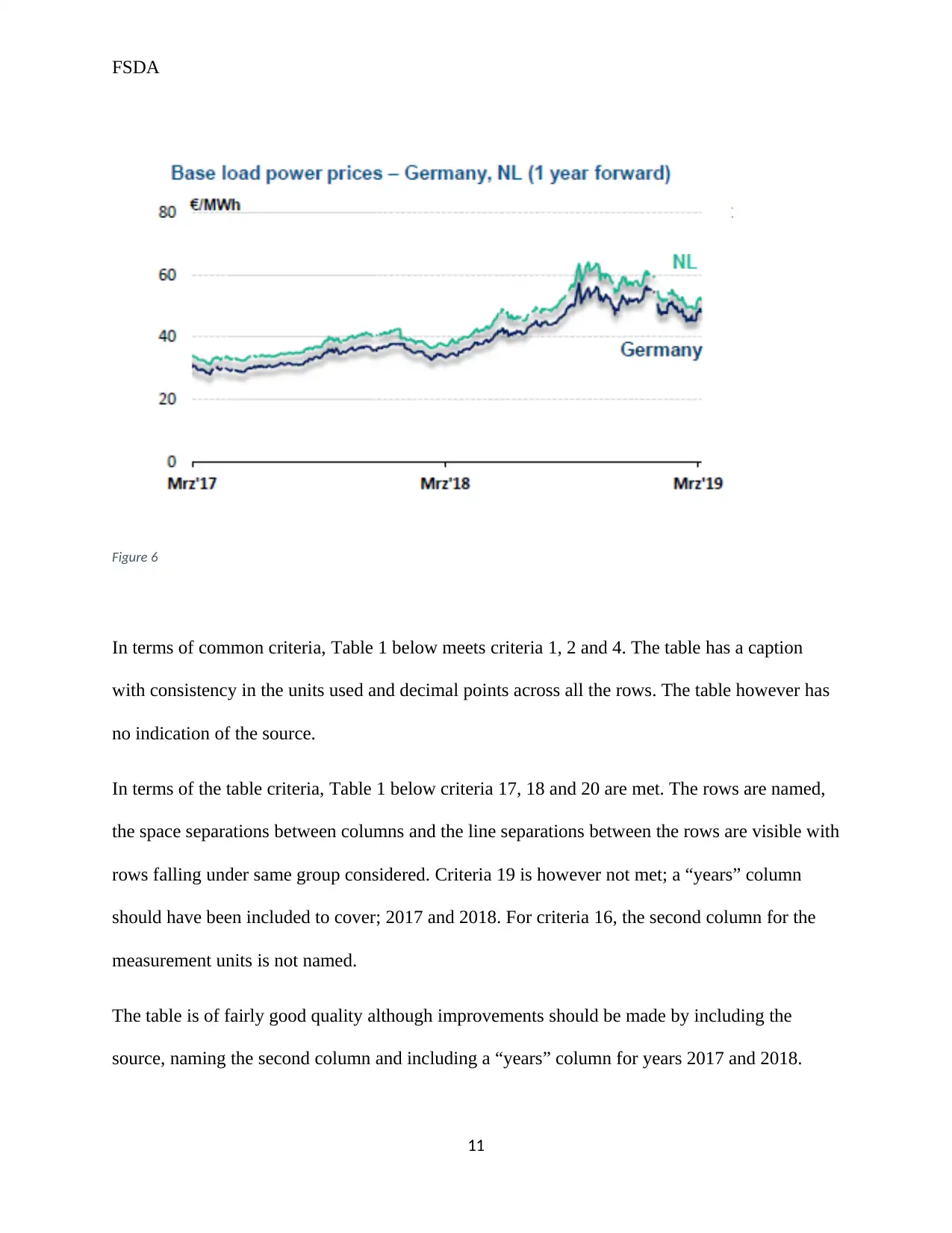
In terms of the common criteria, the graph in Figure 6 only meets criterion 4. The measurement
units (€/MWh) are consistent for all levels on the x axis. Criteria 2 however does not apply since
the data points are not plotted.
In terms of graph and chart criteria, the graph in Figure 3 meets criteria 5, 6, 8, 9, 10 and 15. The
graph has a title, the axes are scaled, the variables are placed on the correct axes, different colors
are used for the two variables and the measurement units are indicated. The graph however does
not meet criteria 7 since the axes are not labelled.
The quality of the graph can be described as poor with improvements needed include; a caption,
source and labelling of axes, which are important aspects for visualizations.
10
In terms of graphs and charts criteria, the chart in Figure 5 meets criteria 5 and 14 are met. The
chart has a title with percentages indicated for every component.
This chart is reasonably good and can be improved with the inclusion of a caption as well as the
source which would provide more information.
Figure 5
In terms of the common criteria, the graph in Figure 6 only meets criterion 4. The measurement
units (€/MWh) are consistent for all levels on the x axis. Criteria 2 however does not apply since
the data points are not plotted.
In terms of graph and chart criteria, the graph in Figure 3 meets criteria 5, 6, 8, 9, 10 and 15. The
graph has a title, the axes are scaled, the variables are placed on the correct axes, different colors
are used for the two variables and the measurement units are indicated. The graph however does
not meet criteria 7 since the axes are not labelled.
The quality of the graph can be described as poor with improvements needed include; a caption,
source and labelling of axes, which are important aspects for visualizations.
10
Paraphrase This Document
Need a fresh take? Get an instant paraphrase of this document with our AI Paraphraser
FSDA
Figure 6
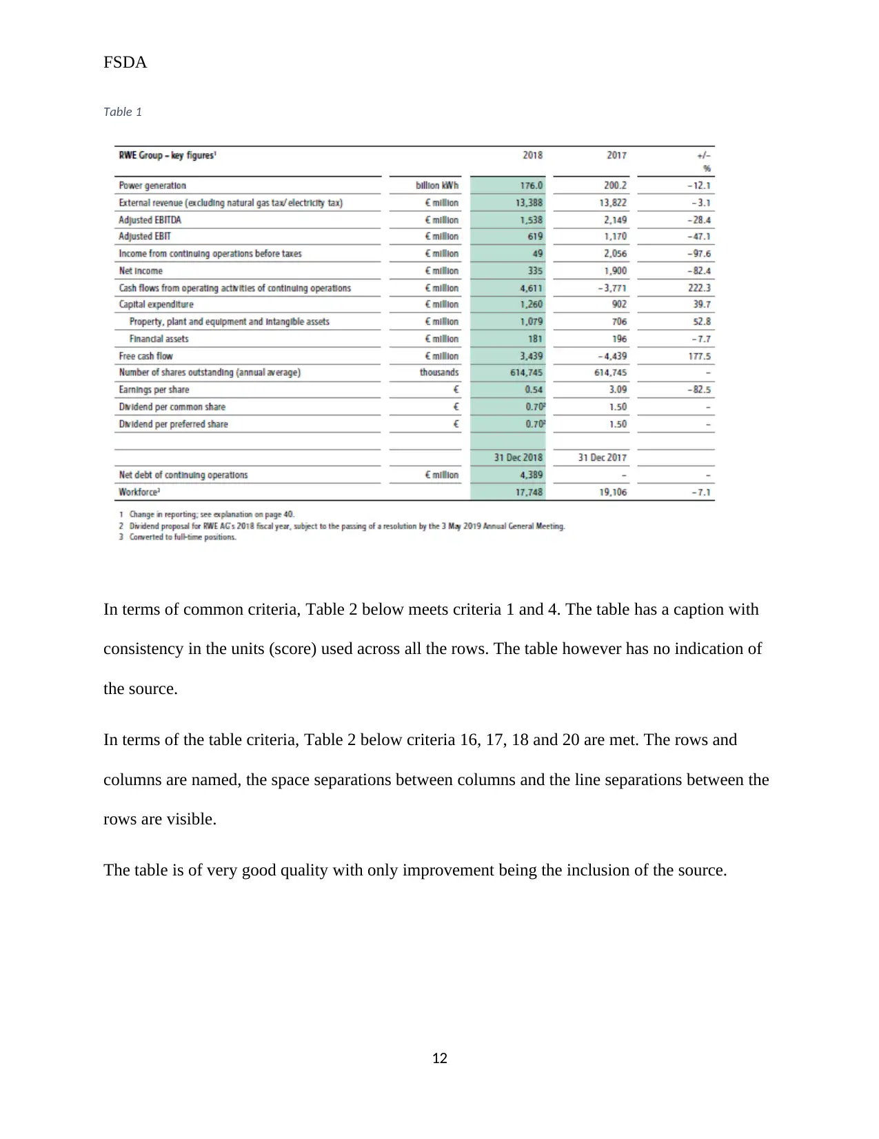
In terms of common criteria, Table 1 below meets criteria 1, 2 and 4. The table has a caption
with consistency in the units used and decimal points across all the rows. The table however has
no indication of the source.
In terms of the table criteria, Table 1 below criteria 17, 18 and 20 are met. The rows are named,
the space separations between columns and the line separations between the rows are visible with
rows falling under same group considered. Criteria 19 is however not met; a “years” column
should have been included to cover; 2017 and 2018. For criteria 16, the second column for the
measurement units is not named.
The table is of fairly good quality although improvements should be made by including the
source, naming the second column and including a “years” column for years 2017 and 2018.
11
Figure 6
In terms of common criteria, Table 1 below meets criteria 1, 2 and 4. The table has a caption
with consistency in the units used and decimal points across all the rows. The table however has
no indication of the source.
In terms of the table criteria, Table 1 below criteria 17, 18 and 20 are met. The rows are named,
the space separations between columns and the line separations between the rows are visible with
rows falling under same group considered. Criteria 19 is however not met; a “years” column
should have been included to cover; 2017 and 2018. For criteria 16, the second column for the
measurement units is not named.
The table is of fairly good quality although improvements should be made by including the
source, naming the second column and including a “years” column for years 2017 and 2018.
11
FSDA
Table 1
In terms of common criteria, Table 2 below meets criteria 1 and 4. The table has a caption with
consistency in the units (score) used across all the rows. The table however has no indication of
the source.
In terms of the table criteria, Table 2 below criteria 16, 17, 18 and 20 are met. The rows and
columns are named, the space separations between columns and the line separations between the
rows are visible.
The table is of very good quality with only improvement being the inclusion of the source.
12
⊘ This is a preview!⊘
Do you want full access?
Subscribe today to unlock all pages.
Trusted by 1+ million students worldwide
1 out of 17


Your All-in-One AI-Powered Toolkit for Academic Success.
+13062052269
info@desklib.com
Available 24*7 on WhatsApp / Email
![[object Object]](/_next/static/media/star-bottom.7253800d.svg)
Unlock your academic potential
Copyright © 2020–2026 A2Z Services. All Rights Reserved. Developed and managed by ZUCOL.