In-depth Analysis of Data Visualization Methods and Applications
VerifiedAdded on 2023/06/11
|9
|2162
|236
Report
AI Summary
This report provides a comprehensive overview of data visualization methods, highlighting their importance in understanding complex data. It discusses various techniques used to visually represent data, emphasizing the advantages such as time-saving, effective communication, and easy modification. The report also addresses the disadvantages, including challenges in scalability and dynamics. Analysis results are presented using data from the NSW Police Force related to domestic violence, illustrating how visualization can reveal patterns in age and gender of offenders and victims. The discussion extends to other aspects of visualization, such as handling large and unstructured data, and the need for efficient indexing and parallelization. The conclusion underscores the significance of data visualization in the age of big data for uncovering interesting patterns and relationships.
Data Analytics
Name of the student
Name of the university
Author Note
Name of the student
Name of the university
Author Note
Paraphrase This Document
Need a fresh take? Get an instant paraphrase of this document with our AI Paraphraser

Table of Contents
Introduction...........................................................................................................................................3
Technical Details of Visualisation methods...........................................................................................3
Advantages and Disadvantages of visualisation methods.....................................................................4
Discussion on analysis results................................................................................................................5
Discussion on other aspect of visualisation...........................................................................................7
Conclusion.............................................................................................................................................7
References.............................................................................................................................................8
Introduction
Data Visualisation is a nonexclusive term utilized which depicts any endeavour to
help comprehension of information by giving visual portrayal. Visualisation of
information makes it considerably less demanding to examine and comprehend the
literary and numeric information (Ward, Grinstein and Keim, 2015). Aside from
sparing time, expanded utilized of information for basic leadership additionally adds
to the significance and need of information perception.
Any organisation which keeps a record intentionally or unwittingly is managing
information in view of which choices are impacted. These can be identified with
deals, buy or stock building. At the point when the information accessible is
extensive it winds up difficult to make utilization of it (Murray, 2017). Huge volume
of information should be prepared by different information handling techniques to
comprehend the gathered information. Once the information is gathered and
handled it can be additionally improved by utilization of diagrams, charts, tables,
maps and so on. Pictorial or visual portrayal of content and numeric information in
type of diagrams and outlines is the thing that information representation is about
(Cardno et al. 2018). This paper explains about data visualization methods, its
importance, software and tools, techniques that are used to visualise data.
Technical Details of Visualisation methods
Data visualisation opens the possibility to give your information a totally new
importance and uncovering some concealed patterns and data which generally
would go unnoticed. All divisions going from instruction to inquire about, publicizing
and promoting, all business setups, production lines, saving money part, medicinal
services makes utilization of information widely (Luo et al. 2017). In the present
situation approaching right information is like sitting on a gold mine however unless
you know how to utilize it adequately it remains unutilized or underutilized. Hence
understanding and acknowledging what is Data visualisation and knowing the data
representation strategies is fundamental for any individual.
Understanding digits is troublesome, elucidation of multidimensional information is
troublesome unless it is displayed seriously. This is the place data visualisation
becomes an integral factor. It turns out to be straightforward tables when they are
spoken to pictorially by pie diagrams, line and reference charts (Marcengo and Rapp,
2016). Data covered up in numbers is plainly reflected and comprehended utilizing
diagrams and charts. Human personality can't hold and appreciate quite a bit of
authentic information particularly when it comprise of numbers. Numbers should be
arranged before any important surmising can be drawn. Having crude information
makes it difficult to comprehend the criticalness of information.
⊘ This is a preview!⊘
Do you want full access?
Subscribe today to unlock all pages.
Trusted by 1+ million students worldwide
For instance a table demonstrating deals for a specific result of most recent 10 years
is given. It will require investment to peruse every one of the numbers, at that point
contrast offers of every year and the previous year or some base year. This will at
that point be finished by contrasting and each other year and if the information is
basic then you will understand some example or pattern (Telea, 2014). In any case, in
the event that the deals changes throughout the year then it will be extremely hard
to comprehend it. Presently consider diagram comprising of a line speaking to deals
plotted against deals in finished the year on one hub and deals on another hub. This
line will simply take seconds to mirror the deals (Pastizzo et al. 2002). Doing this and
any comparative thing which gives a visual portrayal of information is information
representation.
On the other hand if anyone consider more unpredictable circumstance which
includes information gathered from decades on month to month or regular schedule.
Every one of the reports and papers which you run over have utilized information
perception strategy to pass on their message successfully (Ward, 2002). Passing on
your message in least difficult shape is accomplished by methods for data
visualisation. It spares everybody's chance and makes the data much simple to
understand.
Advantages and Disadvantages of visualisation
methods
Data visualisation is vital as it spares time required for perusing long reports. It
encourages you in conveying much successful and fresh introductions in this way
sparing everybody time and expanding efficiency. Likewise, rolling out improvements
to the diagrams and charts is substantially less demanding as the data visualisation
virtual products gives adaptability to change over one outline to another and roll out
improvements to particular information which should be altered (Eidenzon and
Pilipczuk, 2015). A portion of the points of interest which information representation
gives are:
By planning data visualisation you will get a thought which item to put where
a data visualisation instrument can foresee the business, plot patterns and
along these lines help in basic leadership;
By utilizing the best data visualisation programming, it is very straightforward
the elements that impact clients conduct a major information perception
instrument additionally comprehends the zones that need change;
Draws out the relationships and key subtle elements from information which
regularly goes unnoticed;
Paraphrase This Document
Need a fresh take? Get an instant paraphrase of this document with our AI Paraphraser
By utilizing information representation the information designers or
researchers can track their information sources and influence an investigation
to report.
Approaching information is an additional preferred standpoint over contender
however understanding the information precisely is the thing that the genuine
power is. Information representation devices empowers you to utilize information in
most proficient way therefore expanding profitability, benefits and deals. In the
meantime it helps in cost cutting, sparing worker hours and settling on the total basic
leadership process quick (Dzemyda et al. 2012).
Data visualisation can be useful from various perspectives and in the event of some
unforeseen issue on the off chance that you are pondering where it is being utilized.
At that point are a portion of the well-known parts:
By data visualisation perception it wound up less demanding for
entrepreneurs to comprehend their extensive information in a straightforward
arrangement. The perception strategy is additionally efficient so business does
not need to invest much energy to make a report or fathom a question. They
can without much of a stretch do it in a less time and in an additionally
engaging manner.
Visual investigation offers a story to the watchers. By utilizing outlines and
diagrams or pictures a man can without much of a stretch introduction the
entire idea. Too the watchers will have the capacity to comprehend the entire
thing in a simple way.
The most convoluted information will look simple when it overcomes the
procedure of perception. Confused information report gets changed over into
a straightforward configuration. What's more, it causes individuals to
comprehend the idea in a simple way.
With the representation procedure, it gets simpler to the entrepreneurs to
comprehend their item development. The perception apparatuses can be extremely
useful to screen an email battle (Green, 1998). Or on the other hand organizations
own drive with respect to something. However, when talk about its disadvantages,
Scalability and dynamics are considered as two major challenges in visual analytics.
Discussion on analysis results
Violence at home is an issue that saturates all levels of society. It is hard to precisely
assess the genuine occurrence of abusive behaviour at home in the public eye as
most episodes are not answered to police and a few casualties may endeavour to
deny or shroud its world. Access
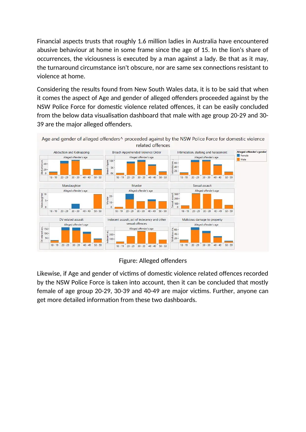
Financial aspects trusts that roughly 1.6 million ladies in Australia have encountered
abusive behaviour at home in some frame since the age of 15. In the lion's share of
occurrences, the viciousness is executed by a man against a lady. Be that as it may,
the turnaround circumstance isn't obscure, nor are same sex connections resistant to
violence at home.
Considering the results found from New South Wales data, it is to be said that when
it comes the aspect of Age and gender of alleged offenders proceeded against by the
NSW Police Force for domestic violence related offences, it can be easily concluded
from the below data visualisation dashboard that male with age group 20-29 and 30-
39 are the major alleged offenders.
Figure: Alleged offenders
Likewise, if Age and gender of victims of domestic violence related offences recorded
by the NSW Police Force is taken into account, then it can be concluded that mostly
female of age group 20-29, 30-39 and 40-49 are major victims. Further, anyone can
get more detailed information from these two dashboards.
⊘ This is a preview!⊘
Do you want full access?
Subscribe today to unlock all pages.
Trusted by 1+ million students worldwide
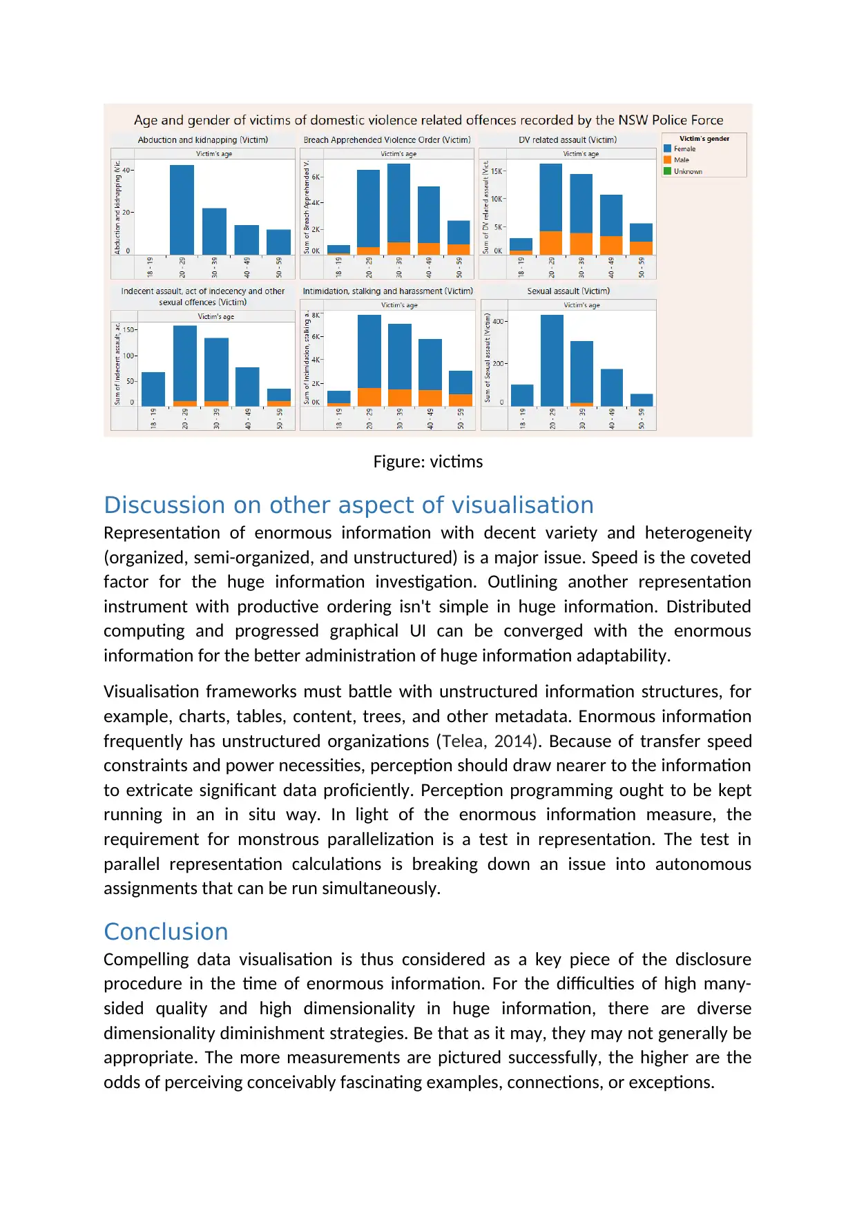
Figure: victims
Discussion on other aspect of visualisation
Representation of enormous information with decent variety and heterogeneity
(organized, semi-organized, and unstructured) is a major issue. Speed is the coveted
factor for the huge information investigation. Outlining another representation
instrument with productive ordering isn't simple in huge information. Distributed
computing and progressed graphical UI can be converged with the enormous
information for the better administration of huge information adaptability.
Visualisation frameworks must battle with unstructured information structures, for
example, charts, tables, content, trees, and other metadata. Enormous information
frequently has unstructured organizations (Telea, 2014). Because of transfer speed
constraints and power necessities, perception should draw nearer to the information
to extricate significant data proficiently. Perception programming ought to be kept
running in an in situ way. In light of the enormous information measure, the
requirement for monstrous parallelization is a test in representation. The test in
parallel representation calculations is breaking down an issue into autonomous
assignments that can be run simultaneously.
Conclusion
Compelling data visualisation is thus considered as a key piece of the disclosure
procedure in the time of enormous information. For the difficulties of high many-
sided quality and high dimensionality in huge information, there are diverse
dimensionality diminishment strategies. Be that as it may, they may not generally be
appropriate. The more measurements are pictured successfully, the higher are the
odds of perceiving conceivably fascinating examples, connections, or exceptions.
Paraphrase This Document
Need a fresh take? Get an instant paraphrase of this document with our AI Paraphraser

References
Cardno, A.J., Ingham, P.S., Lewin, B.A. and Singh, A.K., New BIS Safe Luxco SARL,
2018. Methods, apparatus and systems for data visualization and related
applications. U.S. Patent 9,870,629.
Dzemyda, G., Kurasova, O. and Zilinskas, J., 2012. Multidimensional Data
Visualization.
Eidenzon, D. and Pilipczuk, O., 2015. Multidimensional data visualization.
In Encyclopedia of Information Science and Technology, Third Edition (pp. 1600-
1610). IGI Global.
Green, M., 1998. Toward a perceptual science of multidimensional data visualization:
Bertin and beyond. ERGO/GERO Human Factors Science, 8.
Luo, W., Pant, G., Bhavnasi, Y.K., Blanchard Jr, S.G. and Brouwer, C., 2017. Pathview
Web: user friendly pathway visualization and data integration. Nucleic acids
research, 45(W1), pp.W501-W508.
Marcengo, A. and Rapp, A., 2016. Visualization of human behavior data: the
quantified self. In Big Data: Concepts, Methodologies, Tools, and Applications (pp.
1582-1612). IGI Global.
Murray, S., 2017. Interactive Data Visualization for the Web: An Introduction to
Designing with. " O'Reilly Media, Inc.".
Pastizzo, M.J., Erbacher, R.F. and Feldman, L.B., 2002. Multidimensional data
visualization. Behavior Research Methods, Instruments, & Computers, 34(2), pp.158-
162.
Telea, A.C., 2014. Data visualization: principles and practice. CRC Press.
Ward, M.O., 2002. A taxonomy of glyph placement strategies for multidimensional
data visualization. Information Visualization, 1(3-4), pp.194-210.
Ward, M.O., Grinstein, G. and Keim, D., 2015. Interactive data visualization:
foundations, techniques, and applications. AK Peters/CRC Press.
⊘ This is a preview!⊘
Do you want full access?
Subscribe today to unlock all pages.
Trusted by 1+ million students worldwide
1 out of 9
Related Documents


Your All-in-One AI-Powered Toolkit for Academic Success.
+13062052269
info@desklib.com
Available 24*7 on WhatsApp / Email
![[object Object]](/_next/static/media/star-bottom.7253800d.svg)
Unlock your academic potential
Copyright © 2020–2026 A2Z Services. All Rights Reserved. Developed and managed by ZUCOL.