Design Principles for Desklib: Enhancing User Experience
VerifiedAdded on 2023/06/03
|5
|1213
|432
AI Summary
This article discusses the factors that influenced the design of Desklib, including requirements and audience, and how the design meets user requirements and enhances user experience through consistency, navigation, graphics, textual styles, and colors. It also explores similar interfaces and the reasoning behind the design, which aims to provide a great solution that comprehends the many-sided quality and complexities of an online library.
Contribute Materials
Your contribution can guide someone’s learning journey. Share your
documents today.

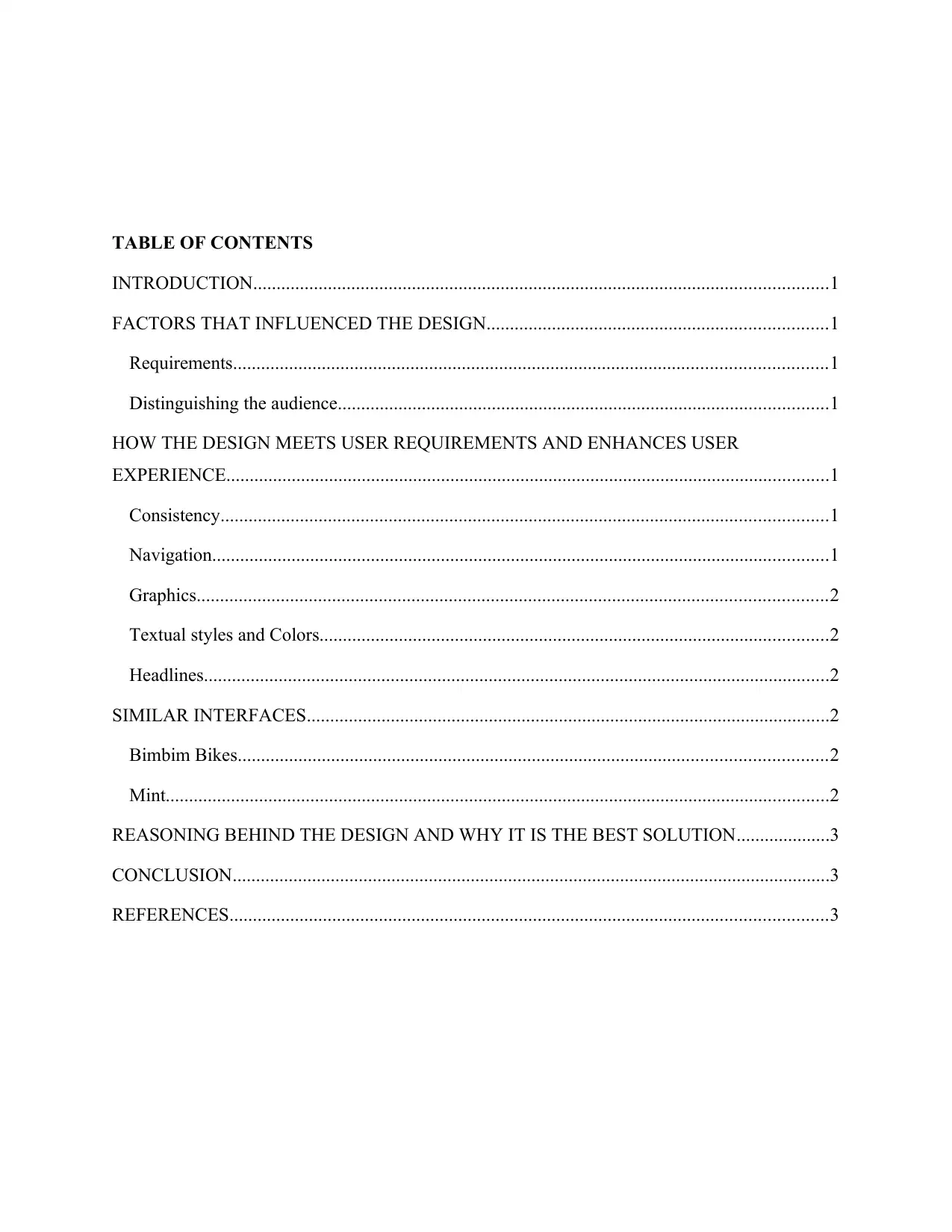
TABLE OF CONTENTS
INTRODUCTION...........................................................................................................................1
FACTORS THAT INFLUENCED THE DESIGN.........................................................................1
Requirements...............................................................................................................................1
Distinguishing the audience.........................................................................................................1
HOW THE DESIGN MEETS USER REQUIREMENTS AND ENHANCES USER
EXPERIENCE.................................................................................................................................1
Consistency..................................................................................................................................1
Navigation....................................................................................................................................1
Graphics.......................................................................................................................................2
Textual styles and Colors.............................................................................................................2
Headlines......................................................................................................................................2
SIMILAR INTERFACES................................................................................................................2
Bimbim Bikes..............................................................................................................................2
Mint..............................................................................................................................................2
REASONING BEHIND THE DESIGN AND WHY IT IS THE BEST SOLUTION....................3
CONCLUSION................................................................................................................................3
REFERENCES................................................................................................................................3
Secure Best Marks with AI Grader
Need help grading? Try our AI Grader for instant feedback on your assignments.

INTRODUCTION
Sites and Web applications have turned out to be dynamically more perplexing as our industry's
advances and procedures advance. What used to be a restricted static medium has advanced into
an extremely rich and intelligent experience. Nevertheless, paying little attention to what amount
has changed in the production procedure; a site's prosperity still relies on only a certain thing,
how clients perceive it. "Does this site give me value? Is it simple to utilize? Is it lovely to
utilize?" These thoughts go through the minds of guests as they interface with our items, and
they shape their choices on whether to become regular clients.
FACTORS THAT INFLUENCED THE DESIGN
Requirements
Some of the requirements that influenced the design included the information endeavored to be
provided, what had to be placed on each page e.g. Images, connections and text. These had to be
considered before to ensure that they fit and work effectively. Having a clearer thought of
precisely what the pages ought to do made it far much simpler to make the designs (Deviant,
2018).
Distinguishing the audience
Having had to know the users endeavoring to reach, the bikers, helped in outlining the
application design. This also helped show data in an appropriate way as there is no point, for
instance, in making designs in a way which individuals would not understand it.
HOW THE DESIGN MEETS USER REQUIREMENTS AND ENHANCES USER
EXPERIENCE
Consistency
There is use of consistent visual elements throughout the application. The UI components,
content, backgrounds, textual styles and colors are in agreement and steady at each touch point.
The application clung to particular conventions that exist as HTML5 and CSS3 is one way to
maintain consistency (Deviant, 2018).
1

Navigation
One of the biggest dissatisfactions for visitors to a site is not having the ability to find what they
are hunting down. Most visitors need the ability to find content effortlessly. Keeping that at the
top of the priority list, the application design considered how clients would explore around the
site. Menus, buttons, search boxes and hyperlinks have been used to help the users to
undoubtedly get around the site with ease and get job done (Lee & Koubek, 2010).
Graphics
Graphics have been used sparingly and in an appropriate organization of the mostly known
types, JPEG and GIF. For embedding shapes, lines, backgrounds and buttons, GIF was ideal.
JPEG documents were most appropriate for pictures. They have been used sparingly so that the
pages are not slow (Lee & Koubek, 2010).
Textual styles and Colors
These have been founded on how best the colors and size of texts would help present the
message to the target group. Dark color of the text fonts were user particularly because the
background colors were brighter to make them legible (Easyspace.com, 2018).
Headlines
An essential factor while picking a format is headlines as they catch the eye. The headlines used
were chosen in all probability that they are the principal thing the users would see and is
pervasively what they would use to develop what content is on the page (Easyspace.com, 2018).
SIMILAR INTERFACES
Bimbim Bikes
This is a quick and online bike-renting platform. The site uses soft pleasant colors for the texts
and the backgrounds. It is easy to navigate around and easily get to rent a bike without
necessarily having to go through a documentation or be trained on the same. This site inspire the
choice of colors used in the application.
Mint
This site is a super straightforward plan with a design, no-jargon features. The landing page
radiates a protected yet nice vibe, or, in other words an item that handles monetary data. It
likewise contains straightforward, coordinate, and convincing invitation to take action duplicate:
2

"Join free." The CTA configuration is additionally splendid; the anchored bolt symbol hits home
the security message by and by. This inspired how to call users to action in the pages.
REASONING BEHIND THE DESIGN AND WHY IT IS THE BEST SOLUTION
The idea behind the application was to provide a great solution that comprehends the many-sided
quality and complexities of bicycle rentals. It covers the business needs of handling bookings
and rentals. It also ensures positive customer experience from the choice of visual elements to
the feedback features. The application is also easy to customize and expand to accommodate
more functionality as need arises. Support system is also in place and users can always have a
platform to get help.
CONCLUSION
Making things more straightforward for clients suggests not driving them to learn new depictions
or toolsets for every task. Reducing the length of the thinking method by taking out disarray is
similarly a without question bet concerning upgrading client experience (Law, Roto, Hassenzahl,
Vermeeren & Kort, 2009). The application has sought to fulfill this by implementing various
design principles and thus a success.
REFERENCES
1. Deviant, G. (2018). Principle of Consistency and Standards in User Interface Design.
Retrieved from https://www.interaction-design.org/literature/article/principle-of-
consistency-and-standards-in-user-interface-design
2. Law, E. L. C., Roto, V., Hassenzahl, M., Vermeeren, A. P., & Kort, J. (2009, April).
Understanding, scoping and defining user experience: a survey approach. In Proceedings
of the SIGCHI conference on human factors in computing systems(pp. 719-728). ACM.
3. Koyani, S. J., Bailey, R. W., Nall, J. R., Susan. Allison, Conrad. Mulligan, Kent. Bailey,
& Mark. Tolson. (2004). based web design & usability guidelines (p. 232). Bethesda,
MD: Computer Psychology.
4. Easyspace.com. (2018). 7 factors to consider when creating better web pages. [online]
Available at: https://www.easyspace.com/blog/2009/06/24/7-factors-to-consider-when-
creating-better-web-pages/ [Accessed 11 Oct. 2018].
5. Lee, S., & Koubek, R. J. (2010). The effects of usability and web design attributes on
user preference for e-commerce web sites. Computers in Industry, 61(4), 329-341.
3
Paraphrase This Document
Need a fresh take? Get an instant paraphrase of this document with our AI Paraphraser

4
1 out of 5
Related Documents
Your All-in-One AI-Powered Toolkit for Academic Success.
+13062052269
info@desklib.com
Available 24*7 on WhatsApp / Email
![[object Object]](/_next/static/media/star-bottom.7253800d.svg)
Unlock your academic potential
© 2024 | Zucol Services PVT LTD | All rights reserved.


