Evaluation Criteria for Commonwealth Bank's Annual Report Analysis
VerifiedAdded on 2019/10/01
|15
|2906
|251
Report
AI Summary
This report focuses on developing and evaluating criteria for assessing financial reports, using the Commonwealth Bank's annual report as a case study. It identifies 20 evaluation criteria related to the presentation of graphs, charts, and qualitative data within the report. The report analyzes the strengths and weaknesses of the data presentation, including aspects like presentation style, variance of data, graph selection, use of tables, axis markup, data sequence, relevancy, and creativity. The evaluation highlights specific issues, such as the lack of proper references, variance, and logical presentation. The report then provides an evaluation of each criterion, offering insights into how the presentation could be improved. The report emphasizes the importance of clear data visualization, logical data presentation, and the use of proper references to enhance the understanding and effectiveness of financial reports for stakeholders.
Running Head: Develop Evaluation Criteria
Develop Evaluation Criteria
Develop Evaluation Criteria
Paraphrase This Document
Need a fresh take? Get an instant paraphrase of this document with our AI Paraphraser
Develop Evaluation Criteria
Table of Contents
Develop Evaluation Criteria.........................................................................................................................1
Introduction.................................................................................................................................................3
Part- A: Develop Evaluation Criteria........................................................................................................3
Evaluation of the criteria.............................................................................................................................5
Conclusion...................................................................................................................................................8
References...................................................................................................................................................9
2
Develop Evaluation Criteria
Introduction
This report emphasis upon the developing the evaluation criteria which could be used to
identify strengthen and weakness of the presentation report. This report reveals the possible
issues and effectiveness of the quantitative and qualitative data presented in the annual report of
company. In this assignment, annual report of Common Wealth Bank has been selected and
evaluated. There has been identified 20 evaluation Criteria which will divulges the effectiveness
of the graphs, lines and other qualitative data used in the presentation. This evaluation Criteria
has been developed with a view to identify the possible issues in the presentation and what better
methods and implications could be developed to strengthen the presentation in the best interest of
the readers or stakeholders.
Part- A: Develop Evaluation Criteria
There are several evaluation criteria which could be used to assess and evaluate the graphs and
Charts shown in the annual report of Common Wealth bank (Tsang, 2018).
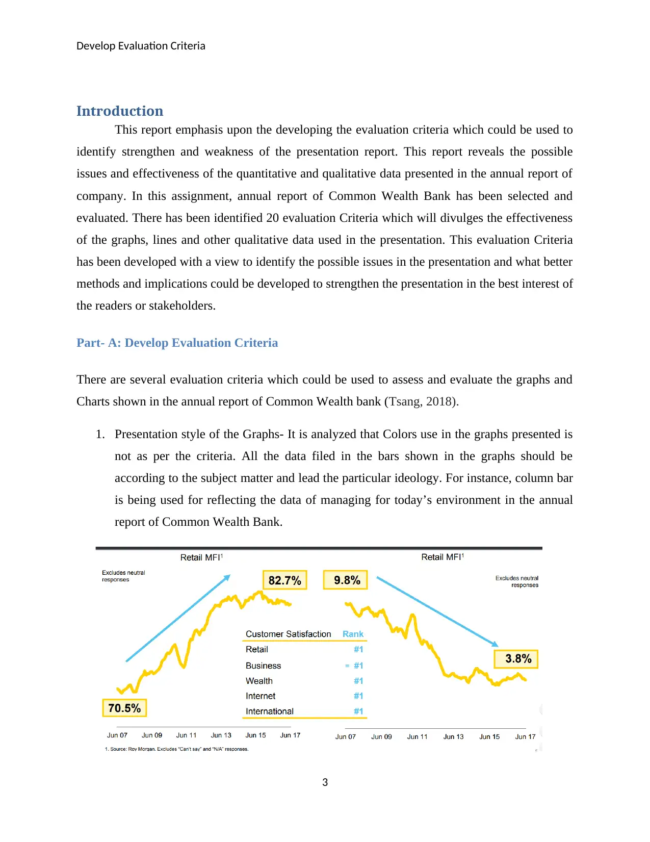
1. Presentation style of the Graphs- It is analyzed that Colors use in the graphs presented is
not as per the criteria. All the data filed in the bars shown in the graphs should be
according to the subject matter and lead the particular ideology. For instance, column bar
is being used for reflecting the data of managing for today’s environment in the annual
report of Common Wealth Bank.
3
Introduction
This report emphasis upon the developing the evaluation criteria which could be used to
identify strengthen and weakness of the presentation report. This report reveals the possible
issues and effectiveness of the quantitative and qualitative data presented in the annual report of
company. In this assignment, annual report of Common Wealth Bank has been selected and
evaluated. There has been identified 20 evaluation Criteria which will divulges the effectiveness
of the graphs, lines and other qualitative data used in the presentation. This evaluation Criteria
has been developed with a view to identify the possible issues in the presentation and what better
methods and implications could be developed to strengthen the presentation in the best interest of
the readers or stakeholders.
Part- A: Develop Evaluation Criteria
There are several evaluation criteria which could be used to assess and evaluate the graphs and
Charts shown in the annual report of Common Wealth bank (Tsang, 2018).
1. Presentation style of the Graphs- It is analyzed that Colors use in the graphs presented is
not as per the criteria. All the data filed in the bars shown in the graphs should be
according to the subject matter and lead the particular ideology. For instance, column bar
is being used for reflecting the data of managing for today’s environment in the annual
report of Common Wealth Bank.
3
⊘ This is a preview!⊘
Do you want full access?
Subscribe today to unlock all pages.
Trusted by 1+ million students worldwide
Develop Evaluation Criteria
It is not up to the mark. All the presented data should differentiate with each other and % of
each subject matter should be differentiate with other (Sekhon, et al. 2015).
2. Variance of the data- It is analyzed that in the chart given of delivering of for all
stakeholders should be shown by using the different variance. It is considered that
different variances should be used in the different paragraph in the report in order to get
clear idea about the presentation and shown quantitative data.
3. Ups and down marked with bullet points in column Graphs- The column graphs is used
to showcase the data of delivering for customers. However, the graphs shown reflects that
there is no single point to mark the ups and down (Fecher, & Lévesque, 2015).
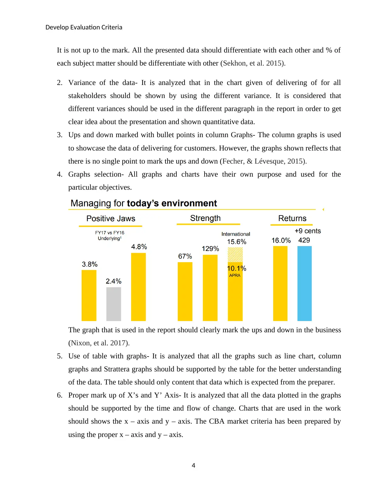
4. Graphs selection- All graphs and charts have their own purpose and used for the
particular objectives.
The graph that is used in the report should clearly mark the ups and down in the business
(Nixon, et al. 2017).
5. Use of table with graphs- It is analyzed that all the graphs such as line chart, column
graphs and Strattera graphs should be supported by the table for the better understanding
of the data. The table should only content that data which is expected from the preparer.
6. Proper mark up of X’s and Y’ Axis- It is analyzed that all the data plotted in the graphs
should be supported by the time and flow of change. Charts that are used in the work
should shows the x – axis and y – axis. The CBA market criteria has been prepared by
using the proper x – axis and y – axis.
4
It is not up to the mark. All the presented data should differentiate with each other and % of
each subject matter should be differentiate with other (Sekhon, et al. 2015).
2. Variance of the data- It is analyzed that in the chart given of delivering of for all
stakeholders should be shown by using the different variance. It is considered that
different variances should be used in the different paragraph in the report in order to get
clear idea about the presentation and shown quantitative data.
3. Ups and down marked with bullet points in column Graphs- The column graphs is used
to showcase the data of delivering for customers. However, the graphs shown reflects that
there is no single point to mark the ups and down (Fecher, & Lévesque, 2015).
4. Graphs selection- All graphs and charts have their own purpose and used for the
particular objectives.
The graph that is used in the report should clearly mark the ups and down in the business
(Nixon, et al. 2017).
5. Use of table with graphs- It is analyzed that all the graphs such as line chart, column
graphs and Strattera graphs should be supported by the table for the better understanding
of the data. The table should only content that data which is expected from the preparer.
6. Proper mark up of X’s and Y’ Axis- It is analyzed that all the data plotted in the graphs
should be supported by the time and flow of change. Charts that are used in the work
should shows the x – axis and y – axis. The CBA market criteria has been prepared by
using the proper x – axis and y – axis.
4
Paraphrase This Document
Need a fresh take? Get an instant paraphrase of this document with our AI Paraphraser
Develop Evaluation Criteria
7. Sequence number in the plotted data- The potation of the sequence number in graphs and
charts shown in the annual report of Common Wealth bank is accurate and given in
sequence. The documents that are used in the report should be sequence number.
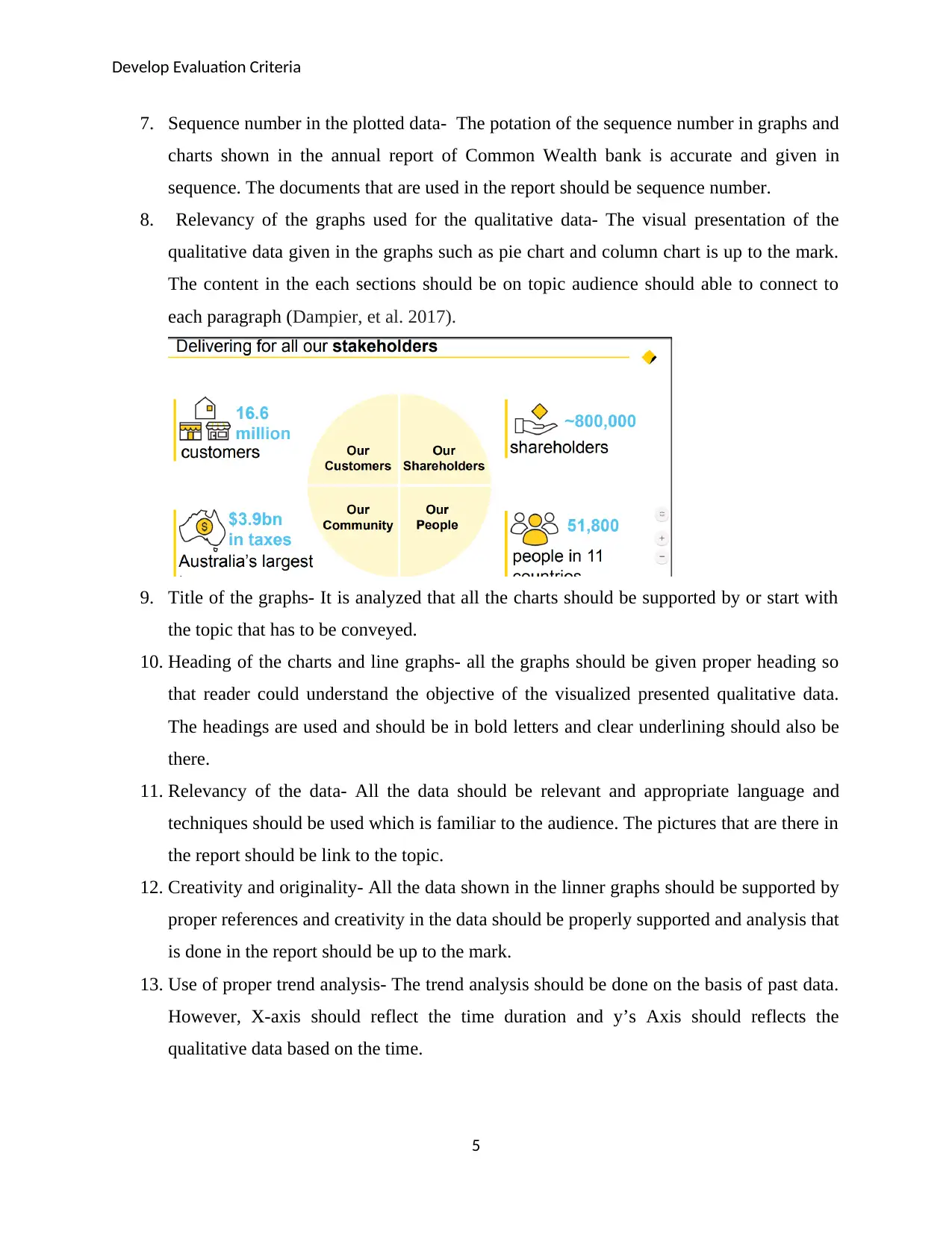
8. Relevancy of the graphs used for the qualitative data- The visual presentation of the
qualitative data given in the graphs such as pie chart and column chart is up to the mark.
The content in the each sections should be on topic audience should able to connect to
each paragraph (Dampier, et al. 2017).
9. Title of the graphs- It is analyzed that all the charts should be supported by or start with
the topic that has to be conveyed.
10. Heading of the charts and line graphs- all the graphs should be given proper heading so
that reader could understand the objective of the visualized presented qualitative data.
The headings are used and should be in bold letters and clear underlining should also be
there.
11. Relevancy of the data- All the data should be relevant and appropriate language and
techniques should be used which is familiar to the audience. The pictures that are there in
the report should be link to the topic.
12. Creativity and originality- All the data shown in the linner graphs should be supported by
proper references and creativity in the data should be properly supported and analysis that
is done in the report should be up to the mark.
13. Use of proper trend analysis- The trend analysis should be done on the basis of past data.
However, X-axis should reflect the time duration and y’s Axis should reflects the
qualitative data based on the time.
5
7. Sequence number in the plotted data- The potation of the sequence number in graphs and
charts shown in the annual report of Common Wealth bank is accurate and given in
sequence. The documents that are used in the report should be sequence number.
8. Relevancy of the graphs used for the qualitative data- The visual presentation of the
qualitative data given in the graphs such as pie chart and column chart is up to the mark.
The content in the each sections should be on topic audience should able to connect to
each paragraph (Dampier, et al. 2017).
9. Title of the graphs- It is analyzed that all the charts should be supported by or start with
the topic that has to be conveyed.
10. Heading of the charts and line graphs- all the graphs should be given proper heading so
that reader could understand the objective of the visualized presented qualitative data.
The headings are used and should be in bold letters and clear underlining should also be
there.
11. Relevancy of the data- All the data should be relevant and appropriate language and
techniques should be used which is familiar to the audience. The pictures that are there in
the report should be link to the topic.
12. Creativity and originality- All the data shown in the linner graphs should be supported by
proper references and creativity in the data should be properly supported and analysis that
is done in the report should be up to the mark.
13. Use of proper trend analysis- The trend analysis should be done on the basis of past data.
However, X-axis should reflect the time duration and y’s Axis should reflects the
qualitative data based on the time.
5
Develop Evaluation Criteria
14. Pie Chart- This chart should be used to make comparison in the same factors. The
comparison that is done in chart should be based on the properly referenced data.
15. Presentation of the data shown in graphs and charts- The references need to be mentioned
in the report for the data that is been explained. However, scatter graphs should be used
to showcase one variable affection with another variable plotted X-axis for time duration
and y’s Axis for qualitative data based on the time (Angus, et al. (2016).
16. Use of % instead of big data- It is analyzed that data shown in the presentation should be
properly illustrated. All the data should be supported with % and big amounted data
should be avoided,
17. Properly supported material- The data reflected in the presentation either in the graphs
and written should be properly referenced with the supported material.
18. Logical presentation of data- The data shown in PPT should be logically co-related with
each and should be presented in chronological order. It makes easy for the readers to
understand the complicated.
19. Easiness of the complication- there should be proper methods and diagram should be
used when data is complicated and hard to understand. It will make easy to interpretive
report by the reader (Noor-up-Wahab, et al. 2014).
20. Proper Intro and conclusion- It is analyzed that all the qualitative and quantitative data
given in the PPT should be supported with the proper intro and conclusion (Hirsch, et al.
2017).
Part-2 Evaluation of the criteria.
Presentation style of the Graphs-The diagram that has been used in the presentation of the annual
report of Common Wealth bank need not to be supported by the proper tables and references.
There is no figure has been marked for the graphs and chart numbers.
6
⊘ This is a preview!⊘
Do you want full access?
Subscribe today to unlock all pages.
Trusted by 1+ million students worldwide
Develop Evaluation Criteria
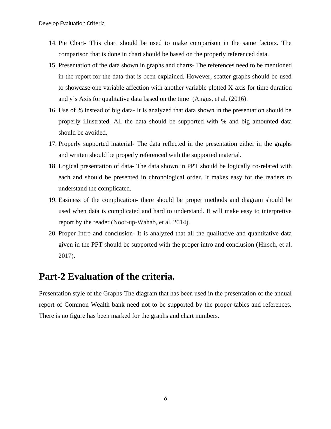
Variance of Data- Due to the high variance in its net profit and annual turnover. it might lead to
cumbersome as more graphs create more complication while referencing the one. If particular
figure is used then it might be chances that presentation may be visible to the audiences based on
the qualitative numbers.
7
Paraphrase This Document
Need a fresh take? Get an instant paraphrase of this document with our AI Paraphraser
Develop Evaluation Criteria
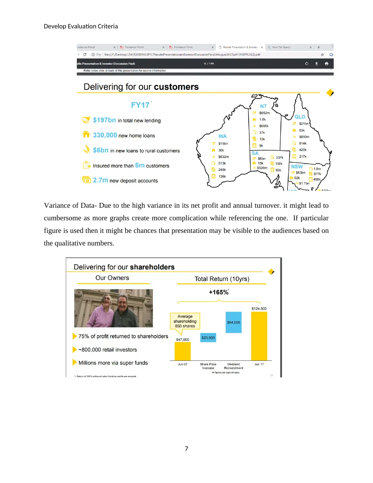
Ups and down marked with bullet points in column Graphs- All the ups and down in the
paragraph are not mark in market capitalization of how then it might lead to confusion and reader
may find issue in understand the fall of the work that is been perform (Flocard, Ierodiacono &
Coghlan, 2016).
Graphs selection- All the graphs selected for the qualitative data of Common Wealth are
complicated and less effective. There is no use of pie charts and tabular form of graphs.
Mark up of X’s and Y’ Axis- Charts that are used are proper but only some of the graphs have
used the x – axis and y – axis. The CBA market criteria Graphs has been prepared by using the
proper x – axis and y – axis.
8
Develop Evaluation Criteria
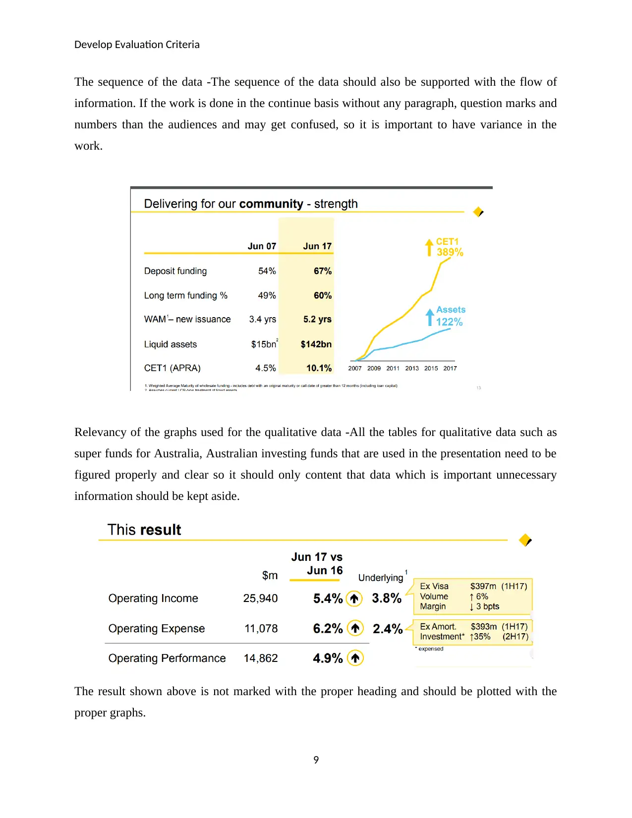
The sequence of the data -The sequence of the data should also be supported with the flow of
information. If the work is done in the continue basis without any paragraph, question marks and
numbers than the audiences and may get confused, so it is important to have variance in the
work.
Relevancy of the graphs used for the qualitative data -All the tables for qualitative data such as
super funds for Australia, Australian investing funds that are used in the presentation need to be
figured properly and clear so it should only content that data which is important unnecessary
information should be kept aside.
The result shown above is not marked with the proper heading and should be plotted with the
proper graphs.
9
⊘ This is a preview!⊘
Do you want full access?
Subscribe today to unlock all pages.
Trusted by 1+ million students worldwide
Develop Evaluation Criteria
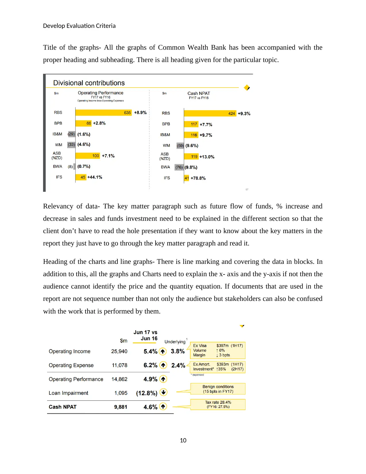
Title of the graphs- All the graphs of Common Wealth Bank has been accompanied with the
proper heading and subheading. There is all heading given for the particular topic.
Relevancy of data- The key matter paragraph such as future flow of funds, % increase and
decrease in sales and funds investment need to be explained in the different section so that the
client don’t have to read the hole presentation if they want to know about the key matters in the
report they just have to go through the key matter paragraph and read it.
Heading of the charts and line graphs- There is line marking and covering the data in blocks. In
addition to this, all the graphs and Charts need to explain the x- axis and the y-axis if not then the
audience cannot identify the price and the quantity equation. If documents that are used in the
report are not sequence number than not only the audience but stakeholders can also be confused
with the work that is performed by them.
10
Paraphrase This Document
Need a fresh take? Get an instant paraphrase of this document with our AI Paraphraser
Develop Evaluation Criteria
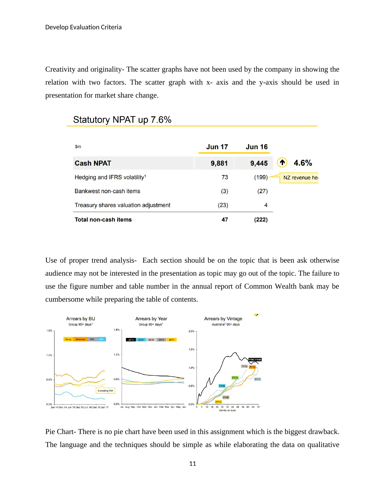
Creativity and originality- The scatter graphs have not been used by the company in showing the
relation with two factors. The scatter graph with x- axis and the y-axis should be used in
presentation for market share change.
Use of proper trend analysis- Each section should be on the topic that is been ask otherwise
audience may not be interested in the presentation as topic may go out of the topic. The failure to
use the figure number and table number in the annual report of Common Wealth bank may be
cumbersome while preparing the table of contents.
Pie Chart- There is no pie chart have been used in this assignment which is the biggest drawback.
The language and the techniques should be simple as while elaborating the data on qualitative
11
Develop Evaluation Criteria
information is not with the fluent flow which may lead to cumbersome data to understand. There
is no future outflow and inflow data has been predicated which could have been done by using
the existing past data and trend analysis (Ahmed, 2015).
Presentation of the data shown in graphs and charts- There should have been given proper table
of content to catch the direct required material in first instance for the reader. The format that is
used in the report should be same throughout the report it should not change with each paragraph
because than the client while become confuse
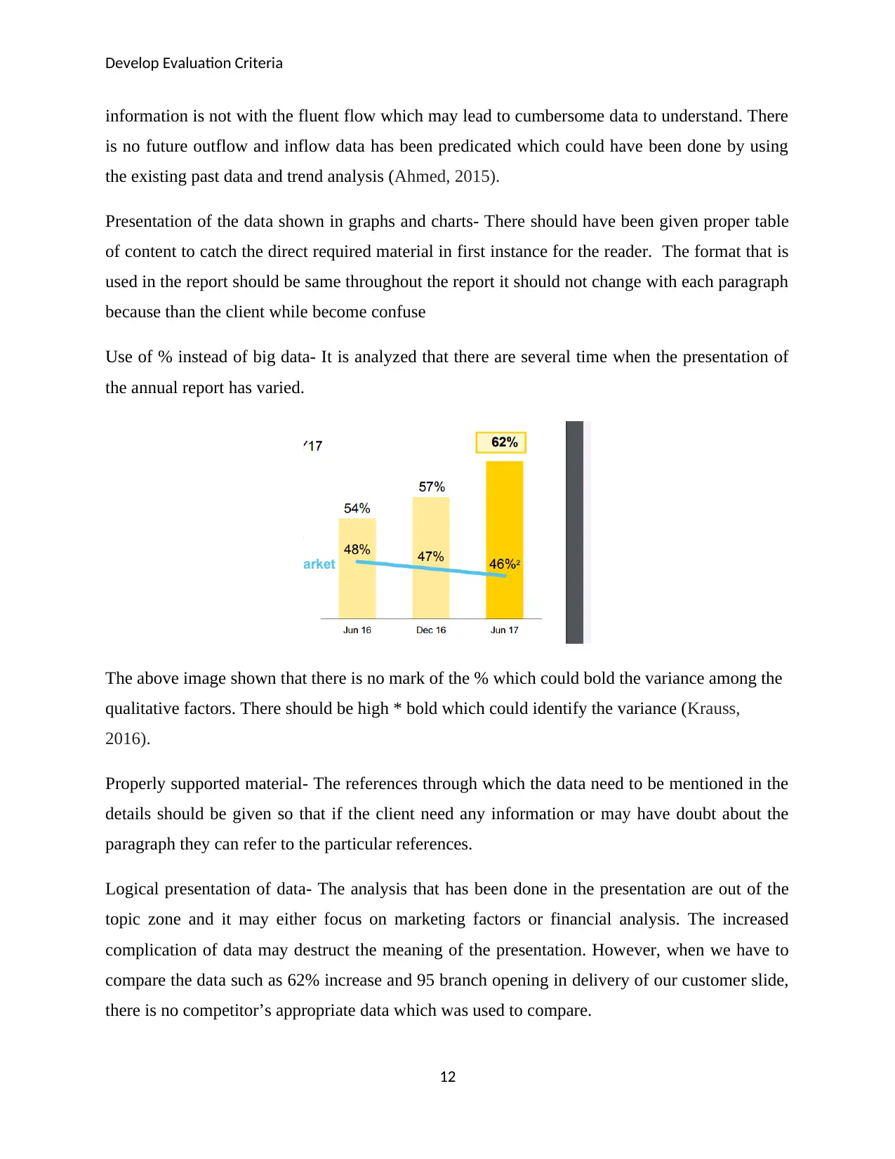
Use of % instead of big data- It is analyzed that there are several time when the presentation of
the annual report has varied.
The above image shown that there is no mark of the % which could bold the variance among the
qualitative factors. There should be high * bold which could identify the variance (Krauss,
2016).
Properly supported material- The references through which the data need to be mentioned in the
details should be given so that if the client need any information or may have doubt about the
paragraph they can refer to the particular references.
Logical presentation of data- The analysis that has been done in the presentation are out of the
topic zone and it may either focus on marketing factors or financial analysis. The increased
complication of data may destruct the meaning of the presentation. However, when we have to
compare the data such as 62% increase and 95 branch opening in delivery of our customer slide,
there is no competitor’s appropriate data which was used to compare.
12
information is not with the fluent flow which may lead to cumbersome data to understand. There
is no future outflow and inflow data has been predicated which could have been done by using
the existing past data and trend analysis (Ahmed, 2015).
Presentation of the data shown in graphs and charts- There should have been given proper table
of content to catch the direct required material in first instance for the reader. The format that is
used in the report should be same throughout the report it should not change with each paragraph
because than the client while become confuse
Use of % instead of big data- It is analyzed that there are several time when the presentation of
the annual report has varied.
The above image shown that there is no mark of the % which could bold the variance among the
qualitative factors. There should be high * bold which could identify the variance (Krauss,
2016).
Properly supported material- The references through which the data need to be mentioned in the
details should be given so that if the client need any information or may have doubt about the
paragraph they can refer to the particular references.
Logical presentation of data- The analysis that has been done in the presentation are out of the
topic zone and it may either focus on marketing factors or financial analysis. The increased
complication of data may destruct the meaning of the presentation. However, when we have to
compare the data such as 62% increase and 95 branch opening in delivery of our customer slide,
there is no competitor’s appropriate data which was used to compare.
12
⊘ This is a preview!⊘
Do you want full access?
Subscribe today to unlock all pages.
Trusted by 1+ million students worldwide
1 out of 15
Related Documents


Your All-in-One AI-Powered Toolkit for Academic Success.
+13062052269
info@desklib.com
Available 24*7 on WhatsApp / Email
![[object Object]](/_next/static/media/star-bottom.7253800d.svg)
Unlock your academic potential
Copyright © 2020–2026 A2Z Services. All Rights Reserved. Developed and managed by ZUCOL.