Eco Green Car Website: Testing, Evaluation, Multimedia Formats, CSS3, Aspects
VerifiedAdded on 2023/06/15
|25
|1743
|285
AI Summary
This article provides a critical evaluation of the Eco Green Car Website, including testing, multimedia formats, CSS3, and website aspects. It also includes a testing report and recommendations for future improvements.
Contribute Materials
Your contribution can guide someone’s learning journey. Share your
documents today.
Running head: ECO GREEN CAR WEBSITE
Eco Green Car Website
Name of the student:
Name of the University:
Author note:
Eco Green Car Website
Name of the student:
Name of the University:
Author note:
Secure Best Marks with AI Grader
Need help grading? Try our AI Grader for instant feedback on your assignments.
1
ECO GREEN CAR WEBSITE
Table of Contents
Testing.............................................................................................................................................2
Google Chrome (Desktop resolution 1366*768).........................................................................2
Microsoft Edge Browser (Desktop resolution)............................................................................8
Mobile Browser testing (1080*1920)........................................................................................12
Testing Report...........................................................................................................................16
Critical Evaluation.........................................................................................................................20
Multimedia Formats...................................................................................................................20
CSS3..........................................................................................................................................22
Website Aspects.........................................................................................................................23
2
ECO GREEN CAR WEBSITE
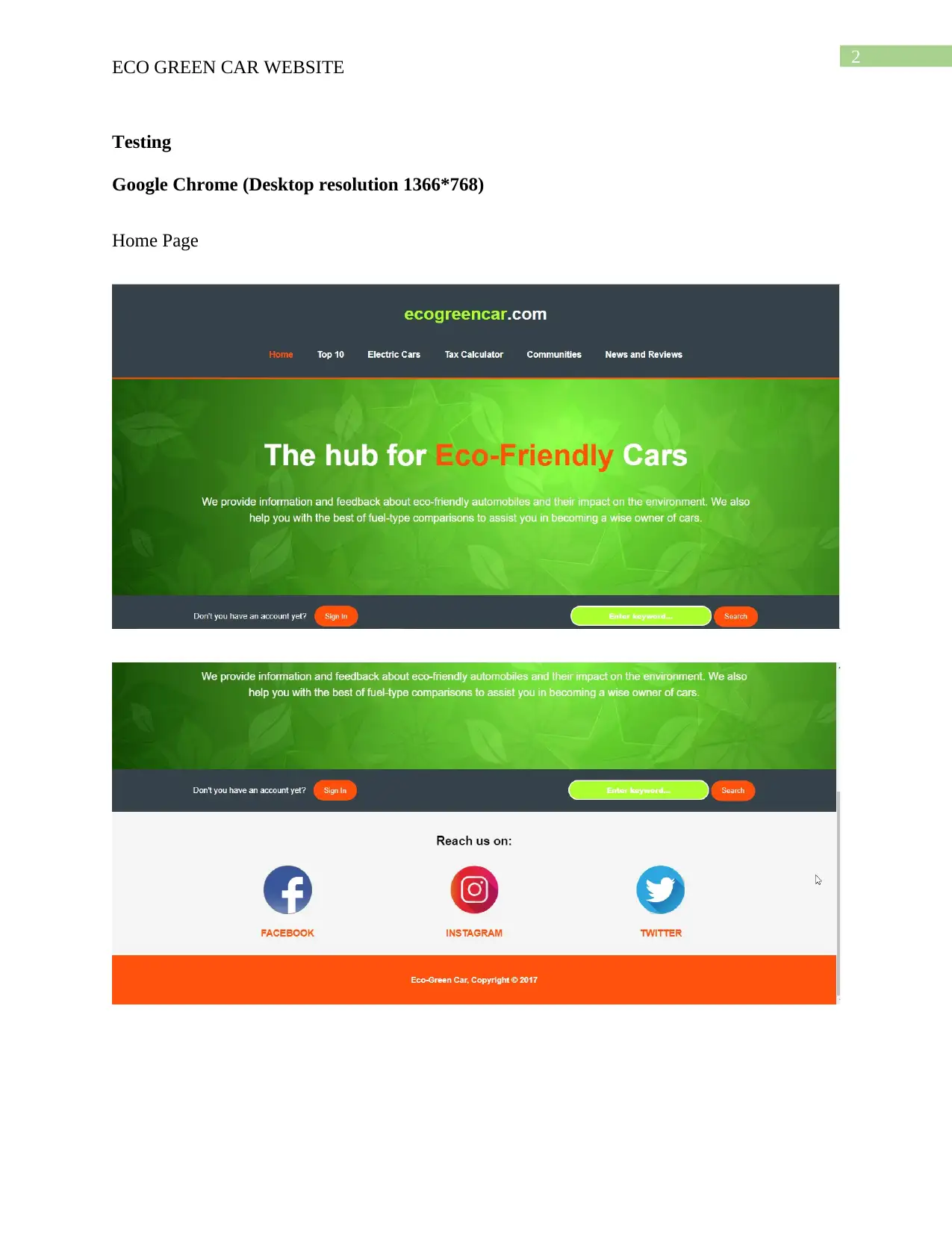
Testing
Google Chrome (Desktop resolution 1366*768)
Home Page
ECO GREEN CAR WEBSITE
Testing
Google Chrome (Desktop resolution 1366*768)
Home Page
3
ECO GREEN CAR WEBSITE
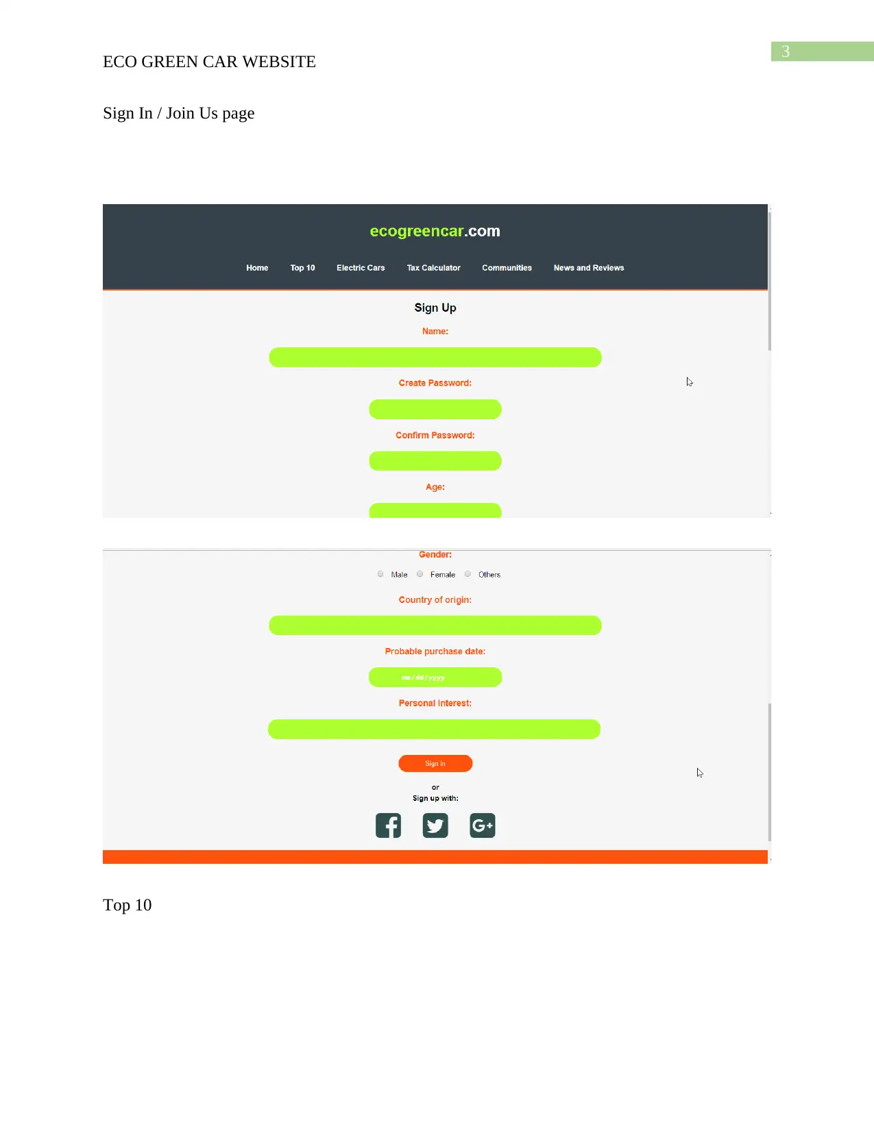
Sign In / Join Us page
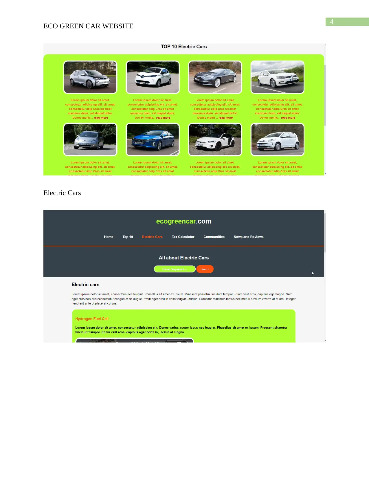
Top 10
ECO GREEN CAR WEBSITE
Sign In / Join Us page
Top 10
Secure Best Marks with AI Grader
Need help grading? Try our AI Grader for instant feedback on your assignments.
4
ECO GREEN CAR WEBSITE
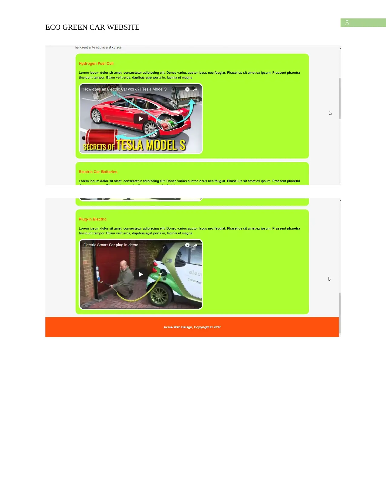
Electric Cars
ECO GREEN CAR WEBSITE
Electric Cars
5
ECO GREEN CAR WEBSITE
6
ECO GREEN CAR WEBSITE
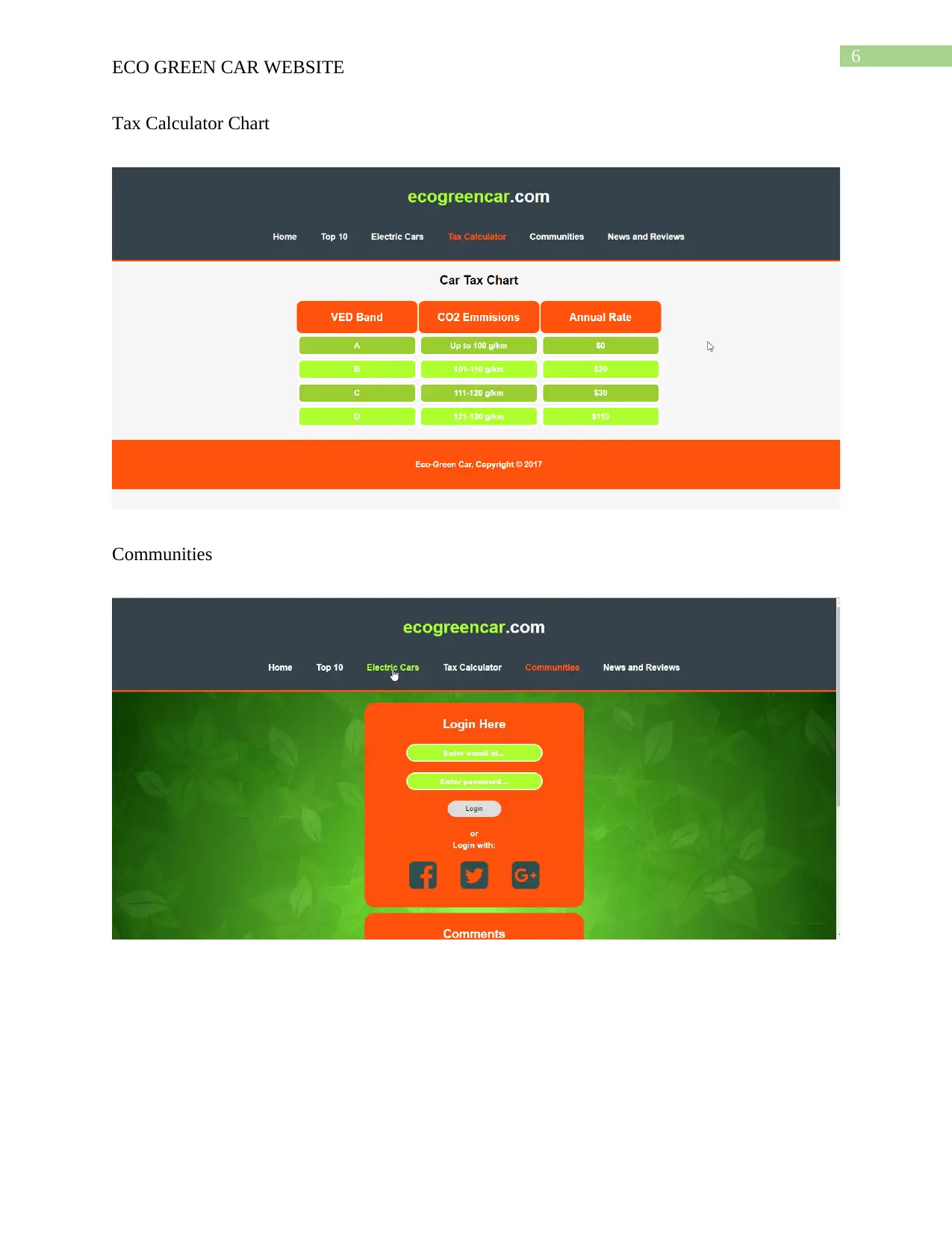
Tax Calculator Chart
Communities
ECO GREEN CAR WEBSITE
Tax Calculator Chart
Communities
Paraphrase This Document
Need a fresh take? Get an instant paraphrase of this document with our AI Paraphraser
7
ECO GREEN CAR WEBSITE
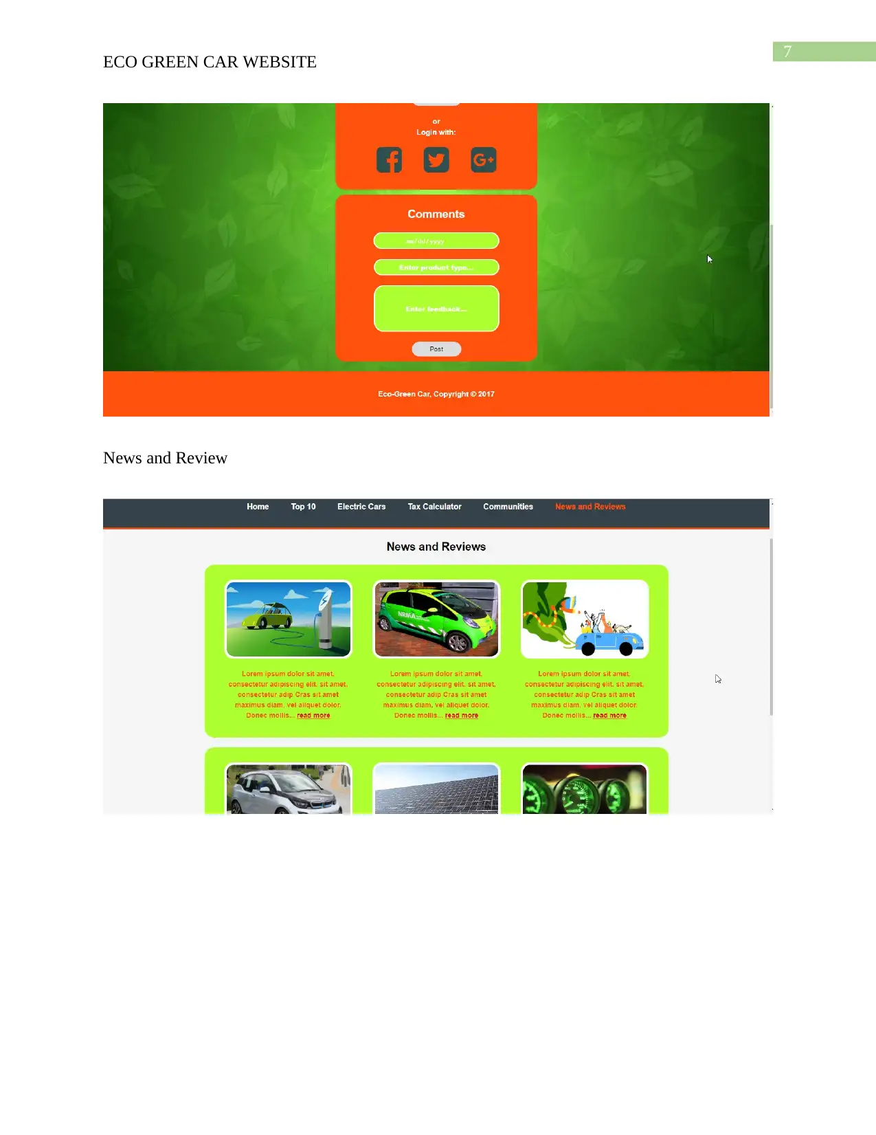
News and Review
ECO GREEN CAR WEBSITE
News and Review
8
ECO GREEN CAR WEBSITE
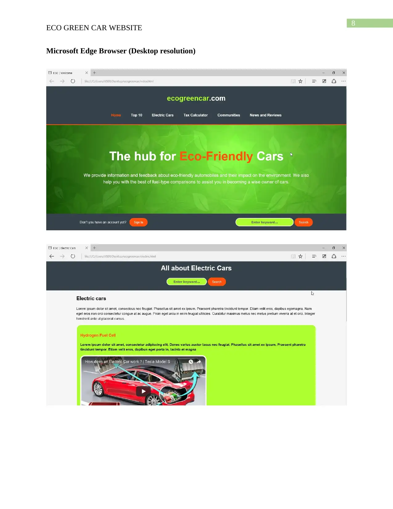
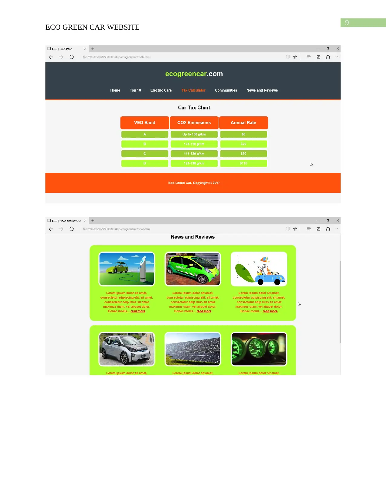
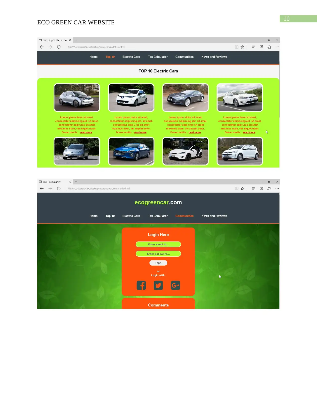
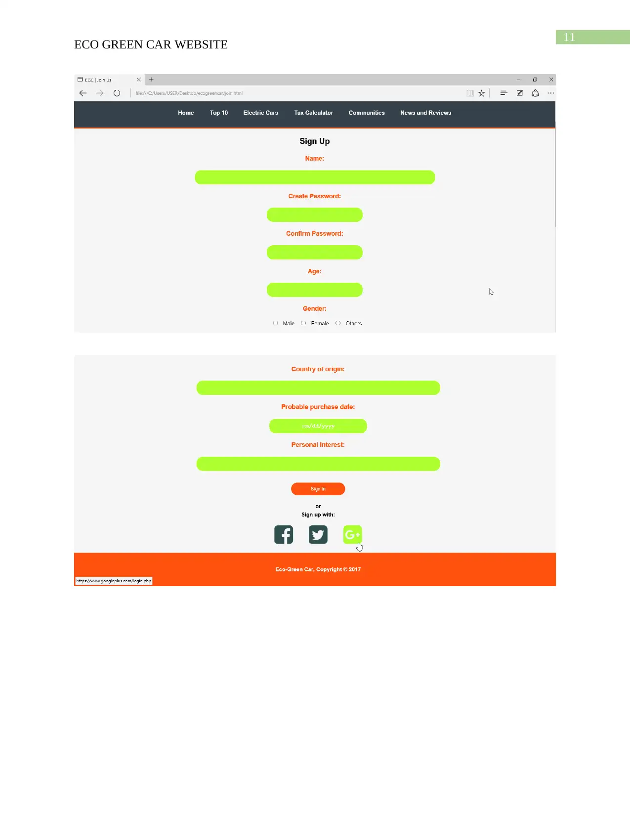
Microsoft Edge Browser (Desktop resolution)
ECO GREEN CAR WEBSITE
Microsoft Edge Browser (Desktop resolution)
9
ECO GREEN CAR WEBSITE
Secure Best Marks with AI Grader
Need help grading? Try our AI Grader for instant feedback on your assignments.
10
ECO GREEN CAR WEBSITE
11
ECO GREEN CAR WEBSITE
12
ECO GREEN CAR WEBSITE
Mobile Browser testing (1080*1920)
ECO GREEN CAR WEBSITE
Mobile Browser testing (1080*1920)
Paraphrase This Document
Need a fresh take? Get an instant paraphrase of this document with our AI Paraphraser
13
ECO GREEN CAR WEBSITE
14
ECO GREEN CAR WEBSITE
15
ECO GREEN CAR WEBSITE
Secure Best Marks with AI Grader
Need help grading? Try our AI Grader for instant feedback on your assignments.
16
ECO GREEN CAR WEBSITE
Testing Report
As it can be seen from the website testing screenshots, it is clear that the website
perfectly outlays a responsive design. The website scales up and down properly on every
resolution. The desktop version is more attractive than the mobile layout as it uses a lots of other
features to grab the user’s attention. The hover effect is something that adds immensely to the
website’s look and feel. The change of colors on the icons or the hyperlinks on hovering or
clicking is perfectly operational on all browsers.
A slight change is observed in the placeholder texts of the various input tabs in the
website when they are opened in two different browsers. It can be seen that the Google Chrome
version of the website successfully uses the #FFFFFF or white color as the placeholder text, just
as it was styled to do in the CSS codes, however, the Edge and Explorer (Mobile browser) adapts
the native grey color for placeholder texts. This highlights the point that not all CSS codes are
browser independent.
17
ECO GREEN CAR WEBSITE
As for the resolution testing, the responsive website performs properly in both the mobile
and desktop. However, in the Communities page, one small flaw can be identified while the
website is tested for mobile compatibility. Fig. 1 below shows that the social media login icons
layout is being distorted. For mending this flaw, the three icons must be crippled as one single
DIV element and this DIV must be given a 100% width, when the media query condition is met.
Fig. 1
From mobile testing fig. 2 shows that the navigation bar takes up quite a large ratio of the
screen. This can be modified using further fragmentation using the @mediaq uery technique with
max and min resolution settings provided. The NAV bar font size should be decreased on
crossing the mobile resolution threshold. Java Script can also be used to easily couple up the nav
bar into a single drop down icon while being accessed on a mobile.
18
ECO GREEN CAR WEBSITE
Fig. 2
The website also performs smoothly and hold on to its layout in the landscape mode for a
mobile version, as well. Below are some landscape testing screenshots.
ECO GREEN CAR WEBSITE
Fig. 2
The website also performs smoothly and hold on to its layout in the landscape mode for a
mobile version, as well. Below are some landscape testing screenshots.
Paraphrase This Document
Need a fresh take? Get an instant paraphrase of this document with our AI Paraphraser
19
ECO GREEN CAR WEBSITE
20
ECO GREEN CAR WEBSITE
Critical Evaluation
Multimedia Formats
A variety of multimedia contents and formats has been used in the designing process of
the website. The advantages of using these are mentioned below:
Advantages
According to image format analysis by Hartig (2013), images of the .jpeg and .png
formats have been used widely in this project. These provide a high definition images to
be represented on the websites. The jpeg images provide multiple cross-platform
flexibility.
.jpeg or Joint Photographic Experts Group images are also easy to compress. The quality
of these images do not get affected much and still the storage size diminishes.
The .png images provides the best quality of images that a website must sustain. Further,
this format (Portable Network Graphics) provides the transparent background feature.
These images also allow various levels of transparency.
GIF or Graphics Interchange Format images provide the animated images to be used in
the website. The gif format images helps in the quick transferring of images over the
internet. The animated images are a necessary set of features that gives an attractive look
to the website’s design. This grabs the viewer’s attention and conveys short messages in a
moving media format.
These formats support images of all 256 color palate colors.
Flash content has been utilized as well. The embedded YouTube links take the help of
flash to run and thus provide audio-visual content on the website.
21
ECO GREEN CAR WEBSITE
Disadvantages
PNG images are generally larger. Therefore, they require more time to load when the
respective webpages are opened.
Certain older versions of Inter Explorer browser and Netscape do not support .png
images.
JPEG images however cannot be have transparent backgrounds. Therefore, there is no
point in making .jpeg images for logos, banners or figures.
When jpeg images are modified repeatedly, they tend to lose their quality.
Flash must be installed on the viewers system as an integrated part of the respective web
browser.
Multimedia Elements
The website is based on a theme that relates to cars and greenery. Therefore, a wide range
of car images, animations and videos has been used. The analysis of the uses of these multimedia
elements are as follows:
Advantages
The still images used in the website are to highlight the design and make of various eco-
friendly automobiles from all over the globe.
The animations used in this website, provides a fun and attractive environment for the
viewers. The use of colorful animations helps to easily convey the message that the topic
or the particular content is trying to highlight.
Secure Best Marks with AI Grader
Need help grading? Try our AI Grader for instant feedback on your assignments.
22
ECO GREEN CAR WEBSITE
YouTube links have been used as video providers for the website. The links are
embedded into the html tags on the website. Visitors on the website can view them and
learn more about the respective context.
Disadvantages
In the News and Reviews page, a variety of multimedia contents have been used, like gif,
jpeg and png as well. This makes the website loaded with graphical information and it
can be seen that the gif images are loaded faster than others are, however, the loading up
of jpeg and png images are delayed.
The use of flash content slows down the process as well. A preliminary instance of the
video is needed to be loaded first, until then the frame remains dark and empty.
Due to the embedded YouTube links, the viewers must have a stable internet connection
in order to view the content. A cheap internet might affect the quality and streaming
quality of the video.
The YouTube links used, may get removed from their source, thus creating a void in the
frame within the website.
CSS3
CSS or Cascading Style Sheet provides the actual look and feel to the websites.
Advantages
Unlike CSS2, CSS3 is simple and independent. Selectors and box-model are some the
most important modules of this technology.
23
ECO GREEN CAR WEBSITE
The use of a CSS3 style sheet is always helpful as one common set of style patterns can
be used throughout all pages of the website and there is no need to individually attend to
each page. This also provides a professional look to the website (McFarland 2012).
Proper styling using CSS3 improves website speed and boosts up the development.
Disadvantages
Browser compatibility and fragmentation are among the major issues with CSS styling.
It is required to test the codes for their compatibility in different browsers.
Website Aspects
The ecogreencar.com website designed for this assignment, provides a very healthy user
interface. The look of the website has been made rich and attractive using the CSS3 modules.
The use of a Greenish-yellow tone enriches the environmental awareness that the website
promotes. The website has also been made browser independent. Most importantly, the website
offers a responsive layout, that is compatible for all mobile and desktop/laptop screens.
In the future, the website should use a back-end data storage structure like SQL Server to
store user information (Xu 2012). Security features must also be integrated into the system
(Stallings et al 2012). The loading time of multimedia should be made faster using improved
compression techniques.
24
ECO GREEN CAR WEBSITE
References
Bryant, J. and Jones, M., 2012. Responsive web design. In Pro HTML5 Performance (pp. 37-
49). Apress, Berkeley, CA.
Frain, B., 2012. Responsive web design with HTML5 and CSS3. Packt Publishing Ltd.
Hartig, S.M., 2013. Basic image analysis and manipulation in ImageJ. Current protocols in
molecular biology, pp.14-15.
McFarland, D.S., 2012. CSS3: the missing manual. " O'Reilly Media, Inc.".
Stallings, W., Brown, L., Bauer, M.D. and Bhattacharjee, A.K., 2012. Computer security:
principles and practice (pp. 978-0). Pearson Education.
Xu, Y.A.N., 2012. Research of the Characteristics and Basic Functions of the SQL Server
Database [J]. Value Engineering, 22, p.110.
1 out of 25
Your All-in-One AI-Powered Toolkit for Academic Success.
+13062052269
info@desklib.com
Available 24*7 on WhatsApp / Email
Unlock your academic potential
© 2024 | Zucol Services PVT LTD | All rights reserved.