HTML5 Website Evaluation Report: Project Analysis and Recommendations
VerifiedAdded on 2023/06/05
|6
|1416
|404
Report
AI Summary
This evaluation report details a student's first coding project, a static website built using HTML5, CSS3, and JavaScript. The report begins with an introduction to the project, discussing the choice of technologies and the decision to avoid server-side languages. It then explores the research phase, explaining the selection of HTML5 and its semantic tags, as well as the website's layout and content structure. The report also analyzes the usability and accessibility of the website, focusing on the navigational system, footer design, page length, and the absence of page headers and breadcrumbs. Finally, the report concludes with a discussion of the project's outcomes, the student's learning experiences, and plans for future development, including incorporating more advanced design principles and coding practices, with references to the resources used.

al ation reportEv u
t dent ame[S u N ]
t dent o[S u N ]
t dent ame[S u N ]
t dent o[S u N ]
Paraphrase This Document
Need a fresh take? Get an instant paraphrase of this document with our AI Paraphraser
Table of Contentsntrod ction
I u .......................................................................................................................2
e earc
R s h............................................................................................................................2
a ilit and Acce i ilit
Us b y
ss b y...................................................................................................3
oncl ion and t re or
C us s fu u w k..............................................................................................3
e erence
R f s.........................................................................................................................5
1
Introduction
This project was first ever coding project of my life till date. The website was a static site
made up of HTML5 and CSS3. Along with these two languages, I also tried hands on the
JavaScript. Since HTML is a mark-up language, I did not use the Object Oriented
programming concepts here. But to begin with the site development, I had to decide over the
languages to be used. I intended to make a website with no database connectivity. Hence,
server-side languages like PHP, Java, JSP, etc. were ruled out.
Research
Since, I am beginner in coding, I cannot imagine to use Ruby on Rails or Scala. And also, my
website is a simple platform for the users, so I decided to use mark-up language - HTML.
This language works proficiently without any need of any server (Fèorster, 2012). However,
the underlying browser needs to support the language. With various enhancements recently,
HTML has come up with many new features which were not present earlier. Today’s HTML
is known by name HTML5. Once, I decided with the language, next step was to use simple
HTML or latest HTML5 (West, 2013). I found that HTML5 provides in-built semantic tags
such as <header>, <footer>, <section>, etc. Also, unlike, simple HTML, it has also come up
with new attributes of form elements - number, date, time and range. In absence of these, I
had to implement them using JavaScript which would have been a new challenge for me
(Weyl, 2014).
To begin with, I need to decide over the layout of the website. A normal website consists of
header, body and footer. Then the challenge was to decide the content of the website. I
intended to use <Table> tag but then due to its rigid feature, I decided to use <div> tags. As a
beginner, I decided to make basic pages like any other site: home page, about page, contact
page and FAQ page. Till this moment, I found that My decision to use HTML5 is not wrong
as it was providing full flexibility to my site and very simple to learn. I wanted to make my
home page look attractive with videos and audios. To make it, I found that HTML5 provides
<video> and <audio> tags. I just embed <video> tag and provided the video link. The video
was up and running on page loading. The page was perfectly got divided using <header> and
<footer> tags (Weyl, 2014). I did use some CSS also but that was limited to colours and
mouse effects like hovering. While developing the site, I felt that selection of layout and
languages were fair as it is the only mark-up language which provides low-learning curve and
2
⊘ This is a preview!⊘
Do you want full access?
Subscribe today to unlock all pages.

Trusted by 1+ million students worldwide
had proven success for my site. They simplified my work and also facilitates the speed of
development of code. Also, implementing new tags were simple to use. I intend to use similar
tags in future whenever I would be creating any application. I will definitely be trying to
work on server-side language as HTML would give required confidence by then
(Wooldridge, 2011).
Usability and Accessibility
Among the most important elements of a website is the navigational system. The navigational
system typically ends up breaking or making the site. As a result, unnecessary design
aesthetics or an unplanned navigational system will compromise the site. In a standard
website, the main navigational system is usually at the top and a secondary system is
sometimes used which allows for local navigation. In my website, i chose simpler
navigational system owing to the fact that, complicated system could end up breaking the
site. I chose to incorporate both global and local navigation system within the top level menu
bar so as to simplify my development. I could've designed the navigational system better and
made the navigation more interactive and appealing. Next, the footer of the site also turned
out to be uninspiring in terms of design and the overall use of it. It only contains sitemap and
social links.
Another issue, that I did not foresee earlier was the fact that the pages ended up being short
vertically. This is both good and bad. The reason, short vertical pages are considered good is
because, the audience can glance at all the information at one go. This makes it easier for the
reader to engage with the content effortlessly. However, in my case, it is essentially bad
because this ends up distorting the look, feel and the presentation of the site. It makes it more
appealing and has limited ability to engage the users within the content. Apart from that,
another design consideration is to include page headers and titles on all pages irrespective of
the type of page. In my case, this is not done effectively which is yet another thing that I had
not foreseen. The breadcrumbs are also missing from the website. All of these features and
design changes that have been missed, should be incorporated to give a significant boost to
the company.
Conclusions and future work
3
Paraphrase This Document
Need a fresh take? Get an instant paraphrase of this document with our AI Paraphraser
The output of the application was similar to an older system of coding and it worked on
foundational principles of programming. However, in near future I would like to make the
applications on more advanced principles, techniques and coding practices. Apart from this, i
would like to incorporate several design principles in my user interface and also use these
principles to craft the overall user experience of the system being developed. I also learned
that the overall interface has simpler learning curve and easily understandable, however, still
the overall design was uninspiring and dull. Being a student and an inexperienced one too at
programming, I ended up opting for simpler design in comparison to advanced interfaces. I
practiced rather simple design and coding elements, to make sure that the system could be
developed with minimal overheads on programming while also ensuring the system being
usable. I could've, improvised upon the design of the navigational menu, given that it's the
main way to access the website. In my future endeavours, I would first would prefer to learn
and practice coding more as well as get practical exposure web designing from the
perspective of usability. With the combined efforts of my learning and practicing, i would be
able to design and develop better websites and applications. As a result, i plan to gain more
knowledge on both design and development, so that I'll be able to enhance my output and bu
build better applications the next time I'm developing.
4
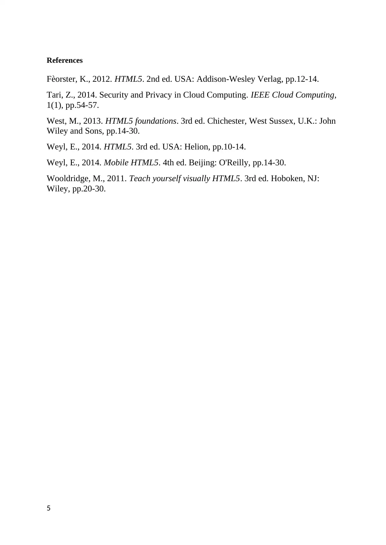
References
Fèorster, K., 2012. HTML5. 2nd ed. USA: Addison-Wesley Verlag, pp.12-14.
Tari, Z., 2014. Security and Privacy in Cloud Computing. IEEE Cloud Computing,
1(1), pp.54-57.
West, M., 2013. HTML5 foundations. 3rd ed. Chichester, West Sussex, U.K.: John
Wiley and Sons, pp.14-30.
Weyl, E., 2014. HTML5. 3rd ed. USA: Helion, pp.10-14.
Weyl, E., 2014. Mobile HTML5. 4th ed. Beijing: O'Reilly, pp.14-30.
Wooldridge, M., 2011. Teach yourself visually HTML5. 3rd ed. Hoboken, NJ:
Wiley, pp.20-30.
5
⊘ This is a preview!⊘
Do you want full access?
Subscribe today to unlock all pages.

Trusted by 1+ million students worldwide
1 out of 6
Related Documents
Your All-in-One AI-Powered Toolkit for Academic Success.
+13062052269
info@desklib.com
Available 24*7 on WhatsApp / Email
![[object Object]](/_next/static/media/star-bottom.7253800d.svg)
Unlock your academic potential
Copyright © 2020–2025 A2Z Services. All Rights Reserved. Developed and managed by ZUCOL.


