First Impressions Matter: Why Great Visual Design Is Essential
VerifiedAdded on 2022/01/17
|10
|3614
|26
AI Summary
Contribute Materials
Your contribution can guide someone’s learning journey. Share your
documents today.
First Impression - Introduction
In this document we are going to answer the questions related to the topic of “First
Impression” which focus on the production of a design document. In first Question we have
defined the “First Impression” and all its related features. What factors and components of the
website will help us to rate , review and analyse the “First Impression”. There are a few
general predefined standards to calculate the “First Impression” of our website. Further going
to answer the next question we will consider the five criteria Provided to us in this assignment
as following , We will use these criteria to and observe the University of South Wales Student
Union Web USW SU portal.
1) Type of visitors and Guests (Who are visiting the site)
2) Reviews, rating, feedback and comments of visitors , registered users and design experts.
3) History of site views , Repeated visitors , Return registered users , Number of subscribers,
No of unsubscribe users.
Q1 : If you have visited the USW Students Union website, make a note of why you
visited it. If you haven’t visited it, make a note of why you haven’t visited it.
Answer : The main purpose of visiting the University of South Wales Student Union USW SU
Website last week was to gain the following information and to gain target requirements and
goals.
a) Identify Key User Groups, point out prominent Personas for their related Roles and to write
different Scenarios for the Personas.
b) Create a detailed website structured chart of USW SU. This chart had a complete
workflow of the whole website.
c) Generate a Persona Moodboard and then Application Moodboard of the Website to
produce a good design impression expressing different moods at different departments in the
University
So point c) related to Application Moodboard is much more specific and related to this
document which helps us to create First Impression in terms of design and theme of our
website.
Aslo task a) can give us a list of users related to different design pattern we recognized in this
website.
So following the website structure chart we can navigate each page and recognize different
design patterns then note down our observations. Looking at all the pages in the website and
getting the first impression will be documented here. We will also observe how potential the
current impression is to make sure that every new visitor will take interest and decide to stay
on the visiting page of our website. The First impression the user perceives at a glance can
Secure Best Marks with AI Grader
Need help grading? Try our AI Grader for instant feedback on your assignments.
only be calculated if we experience the same impression through different mind visions.
Getting a complete visual Appeal evaluations related profoundly starting with one stage then
onto the next, as did relationships between the 50 milliseconds and 500 milliseconds
conditions. Accordingly, visual attraction can be observed inside 50 milliseconds, suggesting
that it takes about 50 milliseconds to get a good first impression with any web portal.
To a set different parameters and measure First Impression of our website we can consider
following key factors as well
i) Design Structure of our website
ii) Colors used in the website Theme
iii) Spacing includes Margins and Paddings, the line spacing image spacing etc.
Iv) Webpage content symmetry including the content alignment and text /Image justification.
v) The quantity of text balancing the webpage look and feels.
vii) The fonts styles, different font types, font sizing, font colors etc.
Q2 Visit each of the following websites in turn. For each website make a note of your
first impression.
* https://www.cardiffstudents.com/
* https://www.uswsu.com/
* https://www.undebbangor.com/
* https://www.swansea-union.co.uk/
Answer :
Let us start my first impression with the very first website i visited
* https://www.cardiffstudents.com/
I observed at the very first glance that
1) Everything is very large , The images , The menu fonts, the links. The borders and spacing
the titles.
2) The second things is i realize that the focus of the home page is to show us the Voting of
some union and emphasize to take part in union elections that’s what the large banner says .
Also, i saw the first word is some event announcement. Now both of these two are prominent
key user groups of a Student Union website
3) Scrolling down further I found a very attractive News Feed section. and then a series of
large banners showing latest events coming up. The background colors of these banners are
really attractive and very good fonts combination.
4) Reading these interesting banners we can simply find our favorite Sports events ,
entertainment and refreshment events , music and non-curricular events.
*https://www.uswsu.com/
This is our main website we need to work on. This is “University of South Wales Student
Union”. The First Impression when we open the site is not that much impressive as
www.cardiffstudents.com. Following points are the observations at the first glance once you
open the home page of USW SU website.
1) The logo seems to be very simple and may not seem to represent a student Union website
plus it does not have any University name letter e.g the South Wales also the logo sign is more
like a Chat Icon and much more resembles the online chat application insignia.
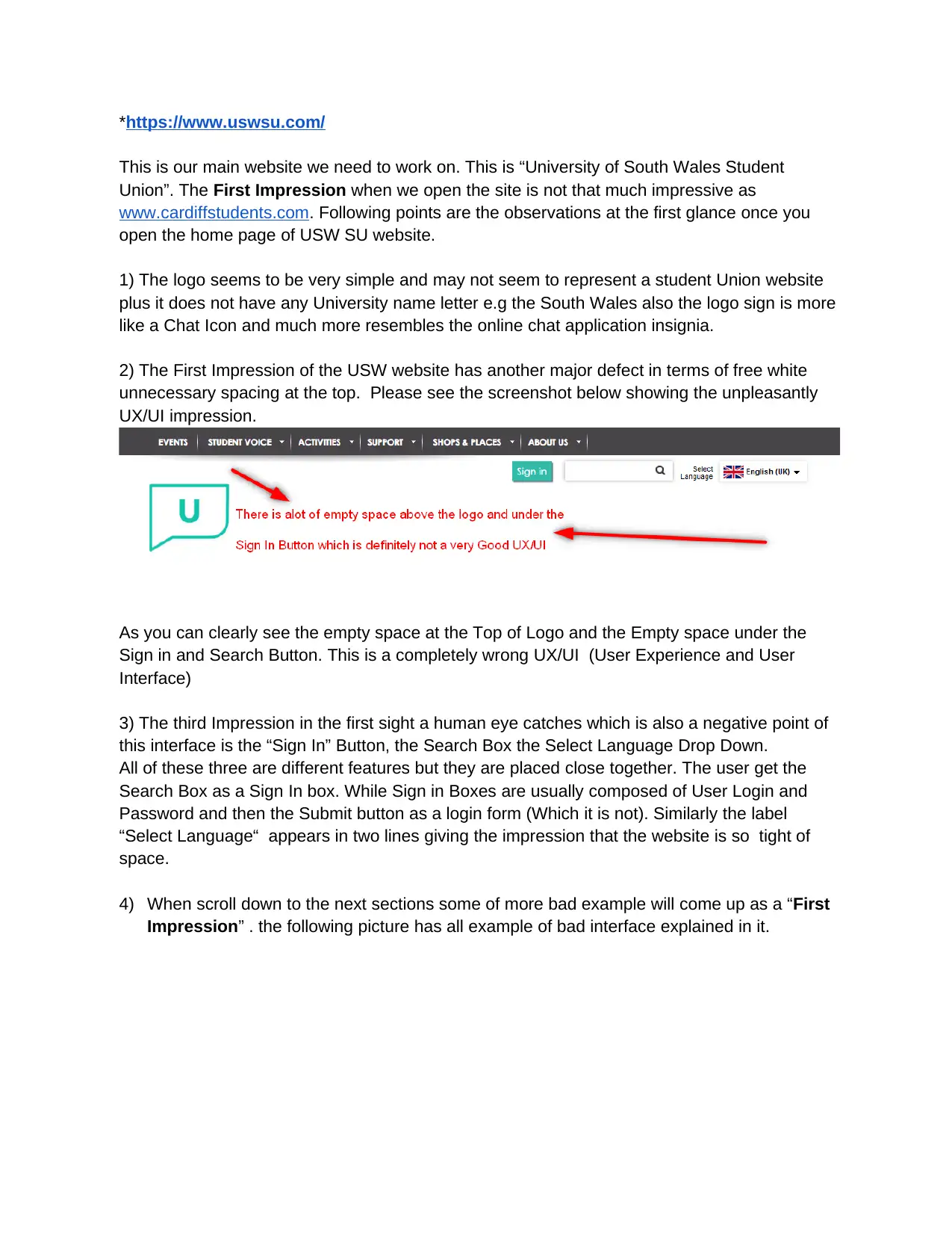
2) The First Impression of the USW website has another major defect in terms of free white
unnecessary spacing at the top. Please see the screenshot below showing the unpleasantly
UX/UI impression.
As you can clearly see the empty space at the Top of Logo and the Empty space under the
Sign in and Search Button. This is a completely wrong UX/UI (User Experience and User
Interface)
3) The third Impression in the first sight a human eye catches which is also a negative point of
this interface is the “Sign In” Button, the Search Box the Select Language Drop Down.
All of these three are different features but they are placed close together. The user get the
Search Box as a Sign In box. While Sign in Boxes are usually composed of User Login and
Password and then the Submit button as a login form (Which it is not). Similarly the label
“Select Language“ appears in two lines giving the impression that the website is so tight of
space.
4) When scroll down to the next sections some of more bad example will come up as a “First
Impression” . the following picture has all example of bad interface explained in it.
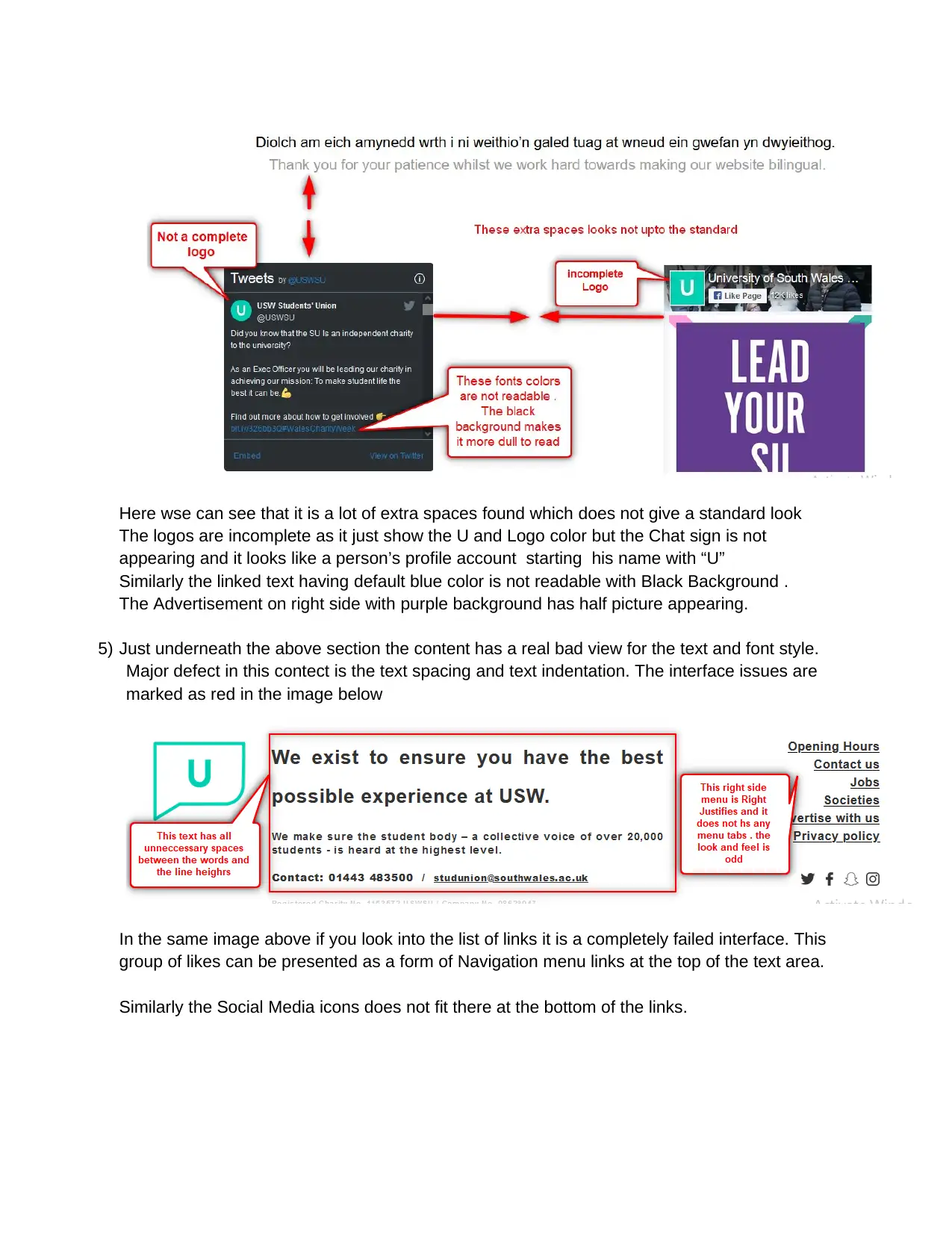
Here wse can see that it is a lot of extra spaces found which does not give a standard look
The logos are incomplete as it just show the U and Logo color but the Chat sign is not
appearing and it looks like a person’s profile account starting his name with “U”
Similarly the linked text having default blue color is not readable with Black Background .
The Advertisement on right side with purple background has half picture appearing.
5) Just underneath the above section the content has a real bad view for the text and font style.
Major defect in this contect is the text spacing and text indentation. The interface issues are
marked as red in the image below
In the same image above if you look into the list of links it is a completely failed interface. This
group of likes can be presented as a form of Navigation menu links at the top of the text area.
Similarly the Social Media icons does not fit there at the bottom of the links.
Secure Best Marks with AI Grader
Need help grading? Try our AI Grader for instant feedback on your assignments.
*https://www.undebbangor.com/
Now looking at the third website when I open the home page it looks like an incomplete or still
underdevelopment work to me. Most of the feature items still seems to incomplete.
The User gets an impression that the developers are still working on this website.
Following is the list of my observations
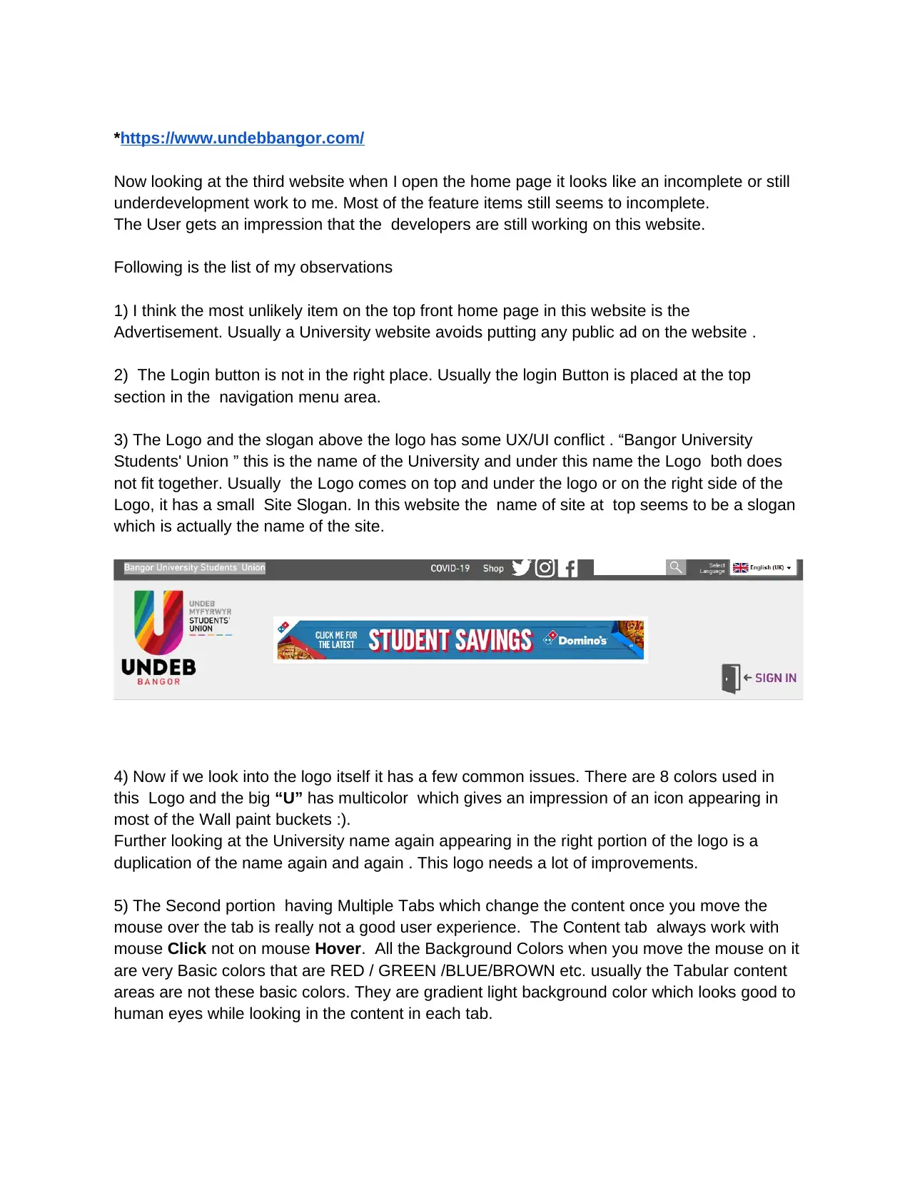
1) I think the most unlikely item on the top front home page in this website is the
Advertisement. Usually a University website avoids putting any public ad on the website .
2) The Login button is not in the right place. Usually the login Button is placed at the top
section in the navigation menu area.
3) The Logo and the slogan above the logo has some UX/UI conflict . “Bangor University
Students' Union ” this is the name of the University and under this name the Logo both does
not fit together. Usually the Logo comes on top and under the logo or on the right side of the
Logo, it has a small Site Slogan. In this website the name of site at top seems to be a slogan
which is actually the name of the site.
4) Now if we look into the logo itself it has a few common issues. There are 8 colors used in
this Logo and the big “U” has multicolor which gives an impression of an icon appearing in
most of the Wall paint buckets :).
Further looking at the University name again appearing in the right portion of the logo is a
duplication of the name again and again . This logo needs a lot of improvements.
5) The Second portion having Multiple Tabs which change the content once you move the
mouse over the tab is really not a good user experience. The Content tab always work with
mouse Click not on mouse Hover. All the Background Colors when you move the mouse on it
are very Basic colors that are RED / GREEN /BLUE/BROWN etc. usually the Tabular content
areas are not these basic colors. They are gradient light background color which looks good to
human eyes while looking in the content in each tab.
*https://www.swansea-union.co.uk/#
Comparing to the design of the last website the design of this website is relatively better but
their are quit a few interface mistakes appear which definitely does not appeal te user . Most of
these interface issues are catchy and make an impression to the users that the site design is
imperfect.
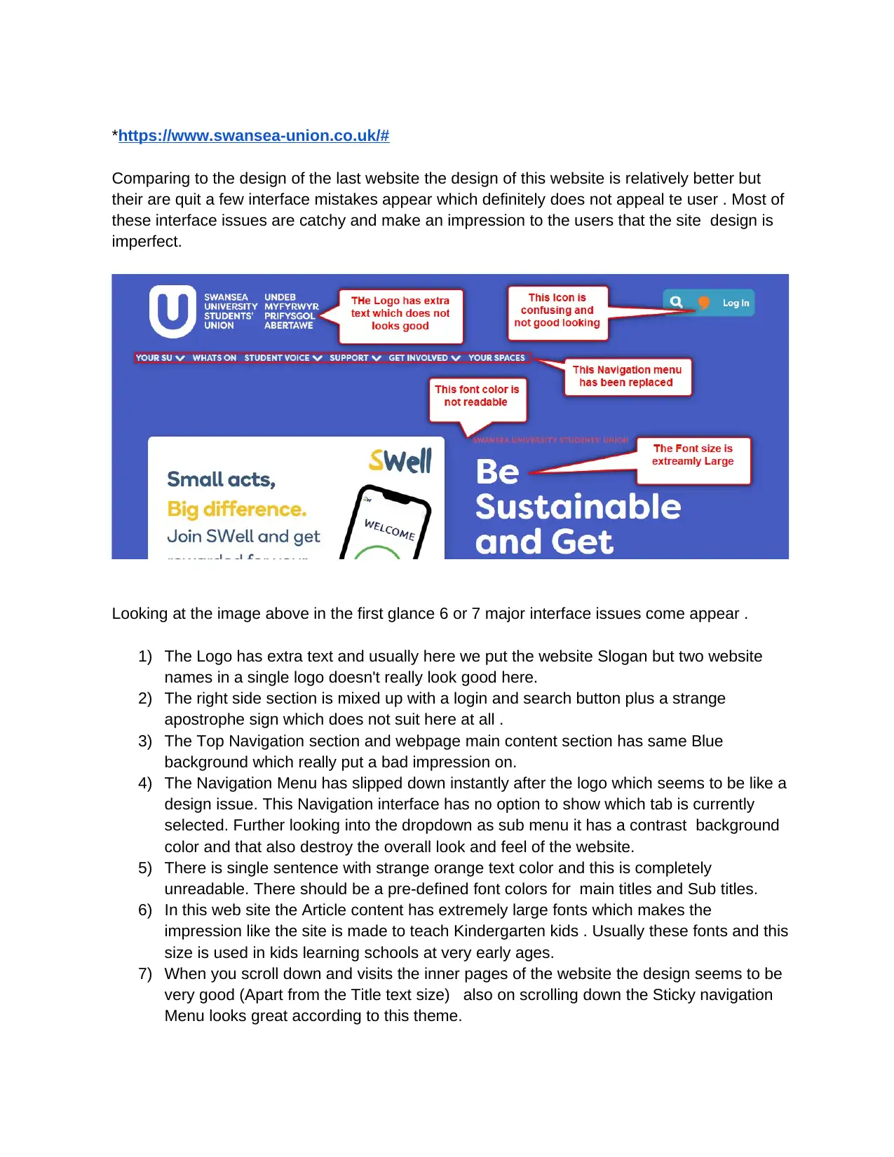
Looking at the image above in the first glance 6 or 7 major interface issues come appear .
1) The Logo has extra text and usually here we put the website Slogan but two website
names in a single logo doesn't really look good here.
2) The right side section is mixed up with a login and search button plus a strange
apostrophe sign which does not suit here at all .
3) The Top Navigation section and webpage main content section has same Blue
background which really put a bad impression on.
4) The Navigation Menu has slipped down instantly after the logo which seems to be like a
design issue. This Navigation interface has no option to show which tab is currently
selected. Further looking into the dropdown as sub menu it has a contrast background
color and that also destroy the overall look and feel of the website.
5) There is single sentence with strange orange text color and this is completely
unreadable. There should be a pre-defined font colors for main titles and Sub titles.
6) In this web site the Article content has extremely large fonts which makes the
impression like the site is made to teach Kindergarten kids . Usually these fonts and this
size is used in kids learning schools at very early ages.
7) When you scroll down and visits the inner pages of the website the design seems to be
very good (Apart from the Title text size) also on scrolling down the Sticky navigation
Menu looks great according to this theme.
The USW Students Union is planning to revamp their web presence
(https://www.uswsu.com/) to meet the following objectives:
* To increase active membership and make the SU more attractive to students.
* To encourage students to visit the site more regularly.
* To encourage involvement in Student Politics.
* To make students aware of Union activities, sports and social clubs.
* To increase attendance at Union social events.
Q :Examine the existing USW Students Union website. Considering each of the
five objectives for the revamped site, what does the current site do to meet these
objectives, and how well does it meet each objective? Priorities the development
work needed for each objective.
Answer:
Let me explain each of the above points in detail with a proper strategy and actionable
items.
*To increase active membership and make the SU more attractive to students
1) In order to attract the serious members and acceptable candidates we can add the
membership application form along with invitation email.So those member who are
seriously wants to join the Student membership union they will seriously fill up the
application form with all required details in the first go and thus we will have no chance
of retention later.
2) Usually the new interesting members are expecting sme dynamic content which can
easily motivate them to join . Mostly don't go into the inner pages details content and
articles so the best alternative would be to add a very attractive , Motivational colorfull
video at the front page website which will keep the user eyes busy involving and
visualizing the upcoming events he/she wish to see inside the campus after joining.
The video can also serve as a good tutorial to new visitors to teach them how to
navigate through our website and what they will find inside this portal. THe attractive
features provided by USW and the things of their interest can be highlighted here. You
can show them in the video how they will find an easy help desk support in case they
have any frequent queries running in their minds right now. The video can guide new
members to quickly engage with us by clicking a specific highlighted button etc.
3) Another good approach the USW needs to implement on the home page is to add a
quick contact button or link. This will be a prominent button appearing on the page
Paraphrase This Document
Need a fresh take? Get an instant paraphrase of this document with our AI Paraphraser
which will be used to give opportunity to new users to approach one to one directly to
related administrative staff.
The link or button can lead the new users to following different methods of contacts.
● Give easy access to new visitors to call directly on an international number to talk to
one of the staff members and start a good level of communication before or after new
registration. \
● Provide users a email client interface so that they can write a direct email in the first go
to communicate with one of the admin staff members and break the Ice.
● You can send a group conference invitation to the new visitors and arrange a meeting
to introduce all new visitors with a detailed feature list of the website. This can be a
Screenshared demonstration or Presentation to help then convenience and answer the
questions at the end of the online meeting.
● The admin staff or Union heads can schedule and announce a live Webinar on some
weekends. The participant can get quickly registered by following the link provided on
the home page of the website. A very good, presentable and motivational expert head
of the union can record this webinar on the stage.
● The USW SU website will need to provide all the social media links not only to get
connected but also can start messaging and get response instantly from the university
social media team on the spot.
● The Union can establish an attractive discussion forum or different community
/department discussion rooms on the web portal. This will allow the new users to enter
and take interest in discussing several topics. We have seen that online search and
Search engine optimization techniques can bring a lot of external users directly these
forums and once they find these discussion rooms while searching specific topic they
are interested to join and register through these forums.
* To encourage students to visit the site more regularly.
● On the off chance that you prescribe any items or administrations to your individuals,
contact their providers and check whether they will offer your individuals a restrictive
rebate or advantage. Realizing that they will lose admittance to unique proposals from
different organizations if they drop their enrollment membership assists with
empowering them to keep a functioning membership to your participation site.
● Perhaps the most ideal method to avoid user retention is to expand certain course
fulfillment rates and part commitment in an internet-based course. You can allow your
new users to keep a progress record on their development through your center
substance. At the point when a member can outwardly see their improvement towards
an end goal, it makes them more persuaded to arrive at the end goal and appear as a
good achiever.
● While it may be the case that with a membership website that there is always new
content added, consider providing a completion certificate to your members when they
complete a course or core module. Knowing that they will receive a completion
certificate provides an incentive for members to complete the training that you provide
to them
● Most of the member along with their academic curriculum wants to achieve extra
certifications so this is really good advertisement to attract new members by providing
them regardful badges and achievement certificates. An enrollment features in USW
SU site that there is in every case new substance added, consider giving a culmination
endorsement to your individuals when they complete a course or center module.
Realizing that they will get a finishing authentication gives a motivating force to
individuals to finish the preparation that you give to them.
* To encourage involvement in Student Politics.
● Enable students by teaching them about leadership campaigns for Change. This
section can easily be added by adding a Blog section in the website which will help to
motivate the users and members to be reading these articles. The best way is to add a
Testimonial section in the website and add positive good participant’s and members
with their good Quotes and nice pictures in it.
● Give some good interface for grading and review platforms to create a competition
environment. It takes part in Extracurricular activities and executes the campaigns and
movements. The Rating and Review using 5 Star Rating and POsitive / Negative
Comments will encourage the participants to get involved.
* To increase attendance at Union social events.
● There is no enhanced equation for content promoting achievement, in spite of what
some would have you accept. Therefore, shift the length and arrangement of your
substance to make it as engaging as conceivable to various types of members. The
news-based blog entries with content just as video, infographics and information driven
pieces for greatest impact can be a great Incentive for Extracurricular activities to be
established.
● Publish your Union Leaders interview and Success stories frequently. It will boost the
traffic of visitors and will also help to increase the attenders.
● Make a frequent analysis of the visitors and keep statistics of the number of new
visitors. Returning visitors. registered users and un-subscribers etc. These numbers
will help to find out the weak areas of the union site and help to improve the process of
new feature development required for the web portal.
Here I have also observed that the SWU SU website loading speed is very slow. It needs to
boost up by changing the development technology. We can adopt modern good technology to
speed up the web site.
Another factor usually involved at the back of the good website is a sophisticated SEO
strategy. SEO is Search Engine Optimization who really brings up the site on the top most
searchable pages and can be easily available to the visitors who are searching these sites in
local and remote areas.
To increase the first Impression the Navigation Design the Content Area and the Footer section
needs to be responsive and to make sure it is correctly visible in all type modern devices and
all resolutions. Most members tend to quickly visit these pages from their digital handy devices;
some have androids, others have IOS and may be Symbian. We just need to make sure the
new design appears correctly in all the resolutions.
1 out of 10
Your All-in-One AI-Powered Toolkit for Academic Success.
+13062052269
info@desklib.com
Available 24*7 on WhatsApp / Email
![[object Object]](/_next/static/media/star-bottom.7253800d.svg)
Unlock your academic potential
© 2024 | Zucol Services PVT LTD | All rights reserved.