Heuristic Evaluation: System Checklist Review and Analysis for EducApp
VerifiedAdded on 2022/09/23
|32
|9722
|26
Homework Assignment
AI Summary
This homework assignment presents a heuristic evaluation of a system, likely an application or software interface, using a comprehensive checklist. The evaluation covers various aspects of usability, including visibility of system status, match between system and the real world, and user control and freedom. The analysis examines each criterion within the checklist, providing 'Yes,' 'No,' or 'N/A' responses along with detailed comments explaining the rationale behind each assessment. The evaluation provides feedback on the design aspects like icon design, menu instructions, feedback mechanisms, and navigation, and assesses the system's adherence to established usability principles. It also reviews aspects of feedback mechanisms, response times, and terminology consistency. The assessment also includes the review of the system's features like file uploading and messaging and the system's ability to provide user control and freedom in task execution.
Heuristic Evalualtion - A System Checklist
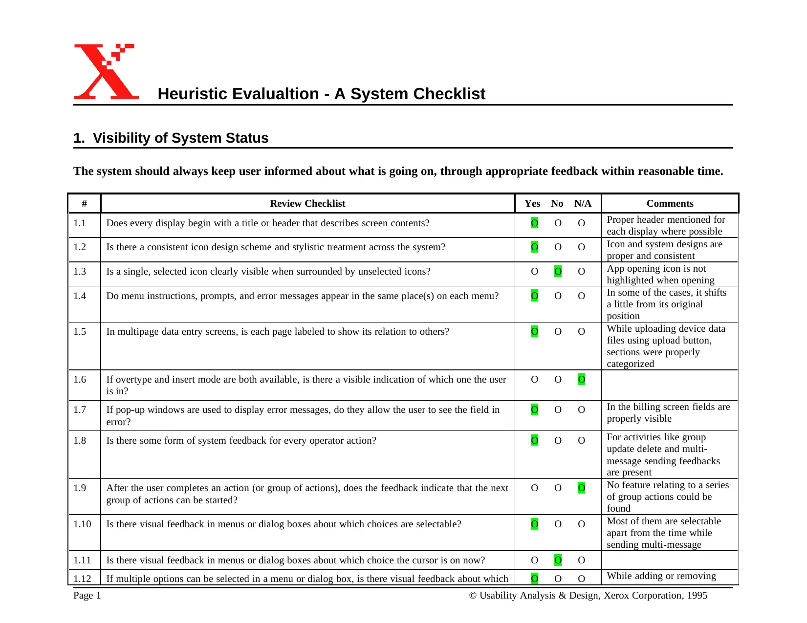
1. Visibility of System Status
The system should always keep user informed about what is going on, through appropriate feedback within reasonable time.
# Review Checklist Yes No N/A Comments
1.1 Does every display begin with a title or header that describes screen contents? O O O Proper header mentioned for
each display where possible
1.2 Is there a consistent icon design scheme and stylistic treatment across the system? O O O Icon and system designs are
proper and consistent
1.3 Is a single, selected icon clearly visible when surrounded by unselected icons? O O O App opening icon is not
highlighted when opening
1.4 Do menu instructions, prompts, and error messages appear in the same place(s) on each menu? O O O In some of the cases, it shifts
a little from its original
position
1.5 In multipage data entry screens, is each page labeled to show its relation to others? O O O While uploading device data
files using upload button,
sections were properly
categorized
1.6 If overtype and insert mode are both available, is there a visible indication of which one the user
is in?
O O O
1.7 If pop-up windows are used to display error messages, do they allow the user to see the field in
error?
O O O In the billing screen fields are
properly visible
1.8 Is there some form of system feedback for every operator action? O O O For activities like group
update delete and multi-
message sending feedbacks
are present
1.9 After the user completes an action (or group of actions), does the feedback indicate that the next
group of actions can be started?
O O O No feature relating to a series
of group actions could be
found
1.10 Is there visual feedback in menus or dialog boxes about which choices are selectable? O O O Most of them are selectable
apart from the time while
sending multi-message
1.11 Is there visual feedback in menus or dialog boxes about which choice the cursor is on now? O O O
1.12 If multiple options can be selected in a menu or dialog box, is there visual feedback about which O O O While adding or removing
Page 1 © Usability Analysis & Design, Xerox Corporation, 1995
Paraphrase This Document
Need a fresh take? Get an instant paraphrase of this document with our AI Paraphraser
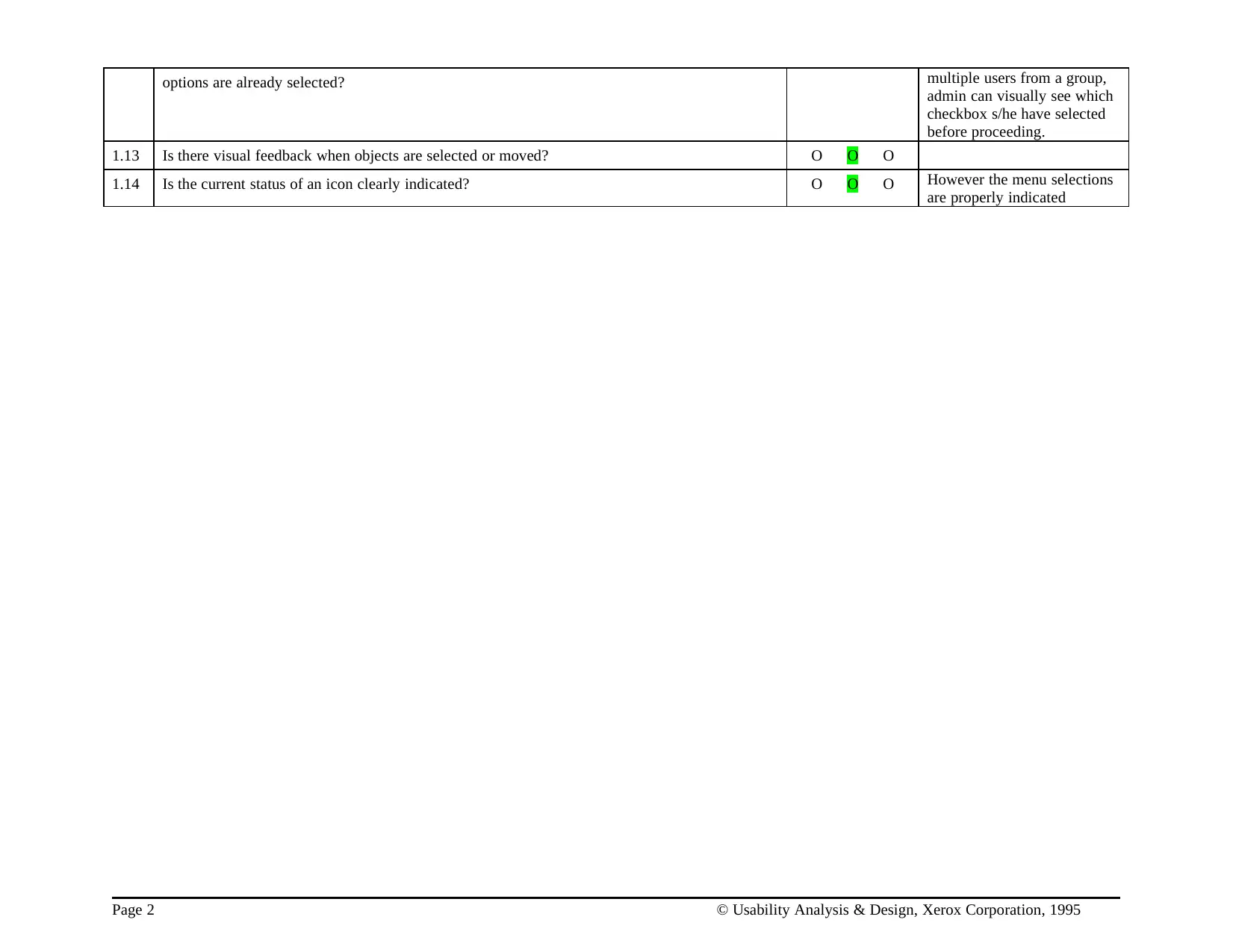
options are already selected? multiple users from a group,
admin can visually see which
checkbox s/he have selected
before proceeding.
1.13 Is there visual feedback when objects are selected or moved? O O O
1.14 Is the current status of an icon clearly indicated? O O O However the menu selections
are properly indicated
Page 2 © Usability Analysis & Design, Xerox Corporation, 1995
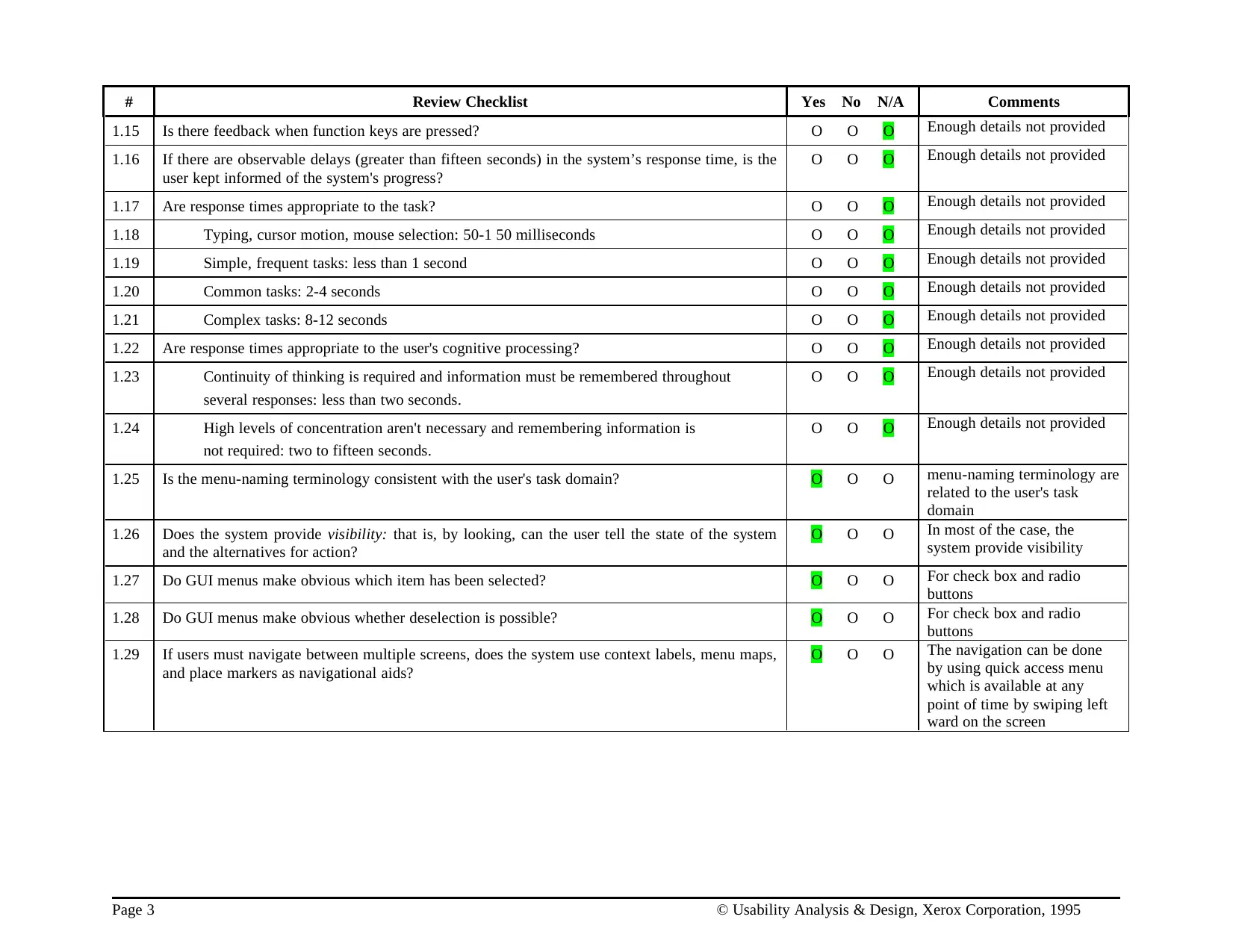
# Review Checklist Yes No N/A Comments
1.15 Is there feedback when function keys are pressed? O O O Enough details not provided
1.16 If there are observable delays (greater than fifteen seconds) in the system’s response time, is the
user kept informed of the system's progress?
O O O Enough details not provided
1.17 Are response times appropriate to the task? O O O Enough details not provided
1.18 Typing, cursor motion, mouse selection: 50-1 50 milliseconds O O O Enough details not provided
1.19 Simple, frequent tasks: less than 1 second O O O Enough details not provided
1.20 Common tasks: 2-4 seconds O O O Enough details not provided
1.21 Complex tasks: 8-12 seconds O O O Enough details not provided
1.22 Are response times appropriate to the user's cognitive processing? O O O Enough details not provided
1.23 Continuity of thinking is required and information must be remembered throughout
several responses: less than two seconds.
O O O Enough details not provided
1.24 High levels of concentration aren't necessary and remembering information is
not required: two to fifteen seconds.
O O O Enough details not provided
1.25 Is the menu-naming terminology consistent with the user's task domain? O O O menu-naming terminology are
related to the user's task
domain
1.26 Does the system provide visibility: that is, by looking, can the user tell the state of the system
and the alternatives for action?
O O O In most of the case, the
system provide visibility
1.27 Do GUI menus make obvious which item has been selected? O O O For check box and radio
buttons
1.28 Do GUI menus make obvious whether deselection is possible? O O O For check box and radio
buttons
1.29 If users must navigate between multiple screens, does the system use context labels, menu maps,
and place markers as navigational aids?
O O O The navigation can be done
by using quick access menu
which is available at any
point of time by swiping left
ward on the screen
Page 3 © Usability Analysis & Design, Xerox Corporation, 1995
⊘ This is a preview!⊘
Do you want full access?
Subscribe today to unlock all pages.
Trusted by 1+ million students worldwide
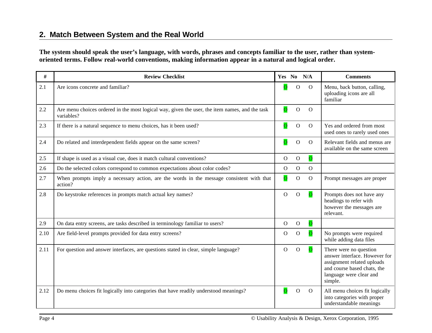
2. Match Between System and the Real World
The system should speak the user’s language, with words, phrases and concepts familiar to the user, rather than system-
oriented terms. Follow real-world conventions, making information appear in a natural and logical order.
# Review Checklist Yes No N/A Comments
2.1 Are icons concrete and familiar? O O O Menu, back button, calling,
uploading icons are all
familiar
2.2 Are menu choices ordered in the most logical way, given the user, the item names, and the task
variables?
O O O
2.3 If there is a natural sequence to menu choices, has it been used? O O O Yes and ordered from most
used ones to rarely used ones
2.4 Do related and interdependent fields appear on the same screen? O O O Relevant fields and menus are
available on the same screen
2.5 If shape is used as a visual cue, does it match cultural conventions? O O O
2.6 Do the selected colors correspond to common expectations about color codes? O O O
2.7 When prompts imply a necessary action, are the words in the message consistent with that
action?
O O O Prompt messages are proper
2.8 Do keystroke references in prompts match actual key names? O O O Prompts does not have any
headings to refer with
however the messages are
relevant.
2.9 On data entry screens, are tasks described in terminology familiar to users? O O O
2.10 Are field-level prompts provided for data entry screens? O O O No prompts were required
while adding data files
2.11 For question and answer interfaces, are questions stated in clear, simple language? O O O There were no question
answer interface. However for
assignment related uploads
and course based chats, the
language were clear and
simple.
2.12 Do menu choices fit logically into categories that have readily understood meanings? O O O All menu choices fit logically
into categories with proper
understandable meanings
Page 4 © Usability Analysis & Design, Xerox Corporation, 1995
Paraphrase This Document
Need a fresh take? Get an instant paraphrase of this document with our AI Paraphraser
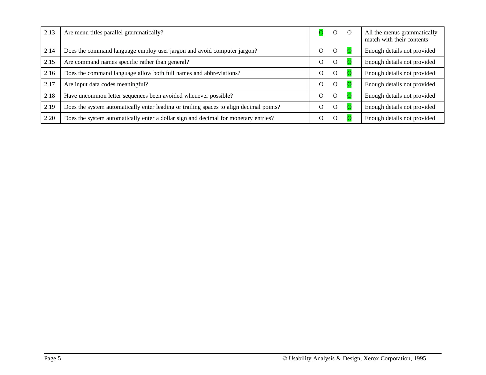
2.13 Are menu titles parallel grammatically? O O O All the menus grammatically
match with their contents
2.14 Does the command language employ user jargon and avoid computer jargon? O O O Enough details not provided
2.15 Are command names specific rather than general? O O O Enough details not provided
2.16 Does the command language allow both full names and abbreviations? O O O Enough details not provided
2.17 Are input data codes meaningful? O O O Enough details not provided
2.18 Have uncommon letter sequences been avoided whenever possible? O O O Enough details not provided
2.19 Does the system automatically enter leading or trailing spaces to align decimal points? O O O Enough details not provided
2.20 Does the system automatically enter a dollar sign and decimal for monetary entries? O O O Enough details not provided
Page 5 © Usability Analysis & Design, Xerox Corporation, 1995
# Review Checklist Yes No N/A Comments
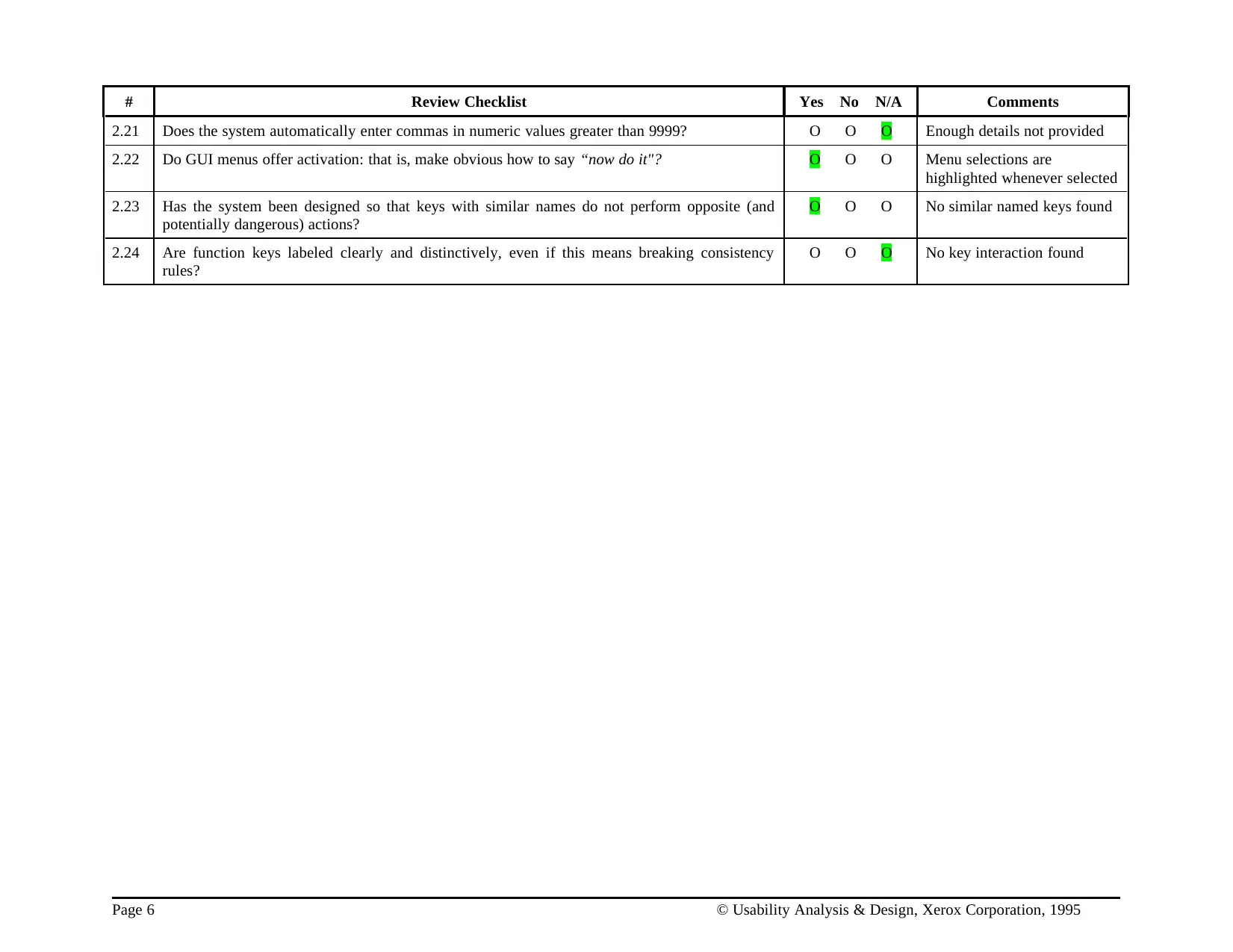
2.21 Does the system automatically enter commas in numeric values greater than 9999? O O O Enough details not provided
2.22 Do GUI menus offer activation: that is, make obvious how to say “now do it"? O O O Menu selections are
highlighted whenever selected
2.23 Has the system been designed so that keys with similar names do not perform opposite (and
potentially dangerous) actions?
O O O No similar named keys found
2.24 Are function keys labeled clearly and distinctively, even if this means breaking consistency
rules?
O O O No key interaction found
Page 6 © Usability Analysis & Design, Xerox Corporation, 1995
⊘ This is a preview!⊘
Do you want full access?
Subscribe today to unlock all pages.
Trusted by 1+ million students worldwide
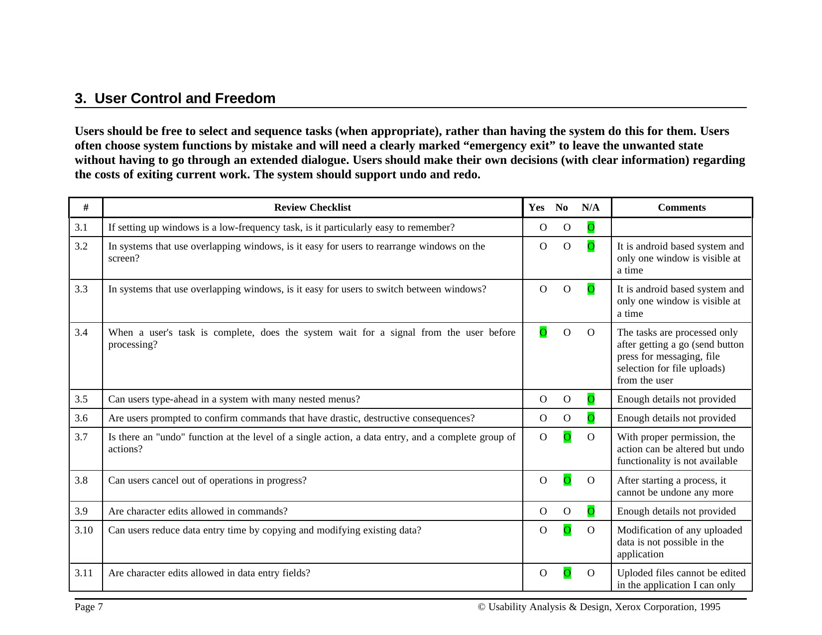
3. User Control and Freedom
Users should be free to select and sequence tasks (when appropriate), rather than having the system do this for them. Users
often choose system functions by mistake and will need a clearly marked “emergency exit” to leave the unwanted state
without having to go through an extended dialogue. Users should make their own decisions (with clear information) regarding
the costs of exiting current work. The system should support undo and redo.
# Review Checklist Yes No N/A Comments
3.1 If setting up windows is a low-frequency task, is it particularly easy to remember? O O O
3.2 In systems that use overlapping windows, is it easy for users to rearrange windows on the
screen?
O O O It is android based system and
only one window is visible at
a time
3.3 In systems that use overlapping windows, is it easy for users to switch between windows? O O O It is android based system and
only one window is visible at
a time
3.4 When a user's task is complete, does the system wait for a signal from the user before
processing?
O O O The tasks are processed only
after getting a go (send button
press for messaging, file
selection for file uploads)
from the user
3.5 Can users type-ahead in a system with many nested menus? O O O Enough details not provided
3.6 Are users prompted to confirm commands that have drastic, destructive consequences? O O O Enough details not provided
3.7 Is there an "undo" function at the level of a single action, a data entry, and a complete group of
actions?
O O O With proper permission, the
action can be altered but undo
functionality is not available
3.8 Can users cancel out of operations in progress? O O O After starting a process, it
cannot be undone any more
3.9 Are character edits allowed in commands? O O O Enough details not provided
3.10 Can users reduce data entry time by copying and modifying existing data? O O O Modification of any uploaded
data is not possible in the
application
3.11 Are character edits allowed in data entry fields? O O O Uploded files cannot be edited
in the application I can only
Page 7 © Usability Analysis & Design, Xerox Corporation, 1995
Paraphrase This Document
Need a fresh take? Get an instant paraphrase of this document with our AI Paraphraser
be downloaded
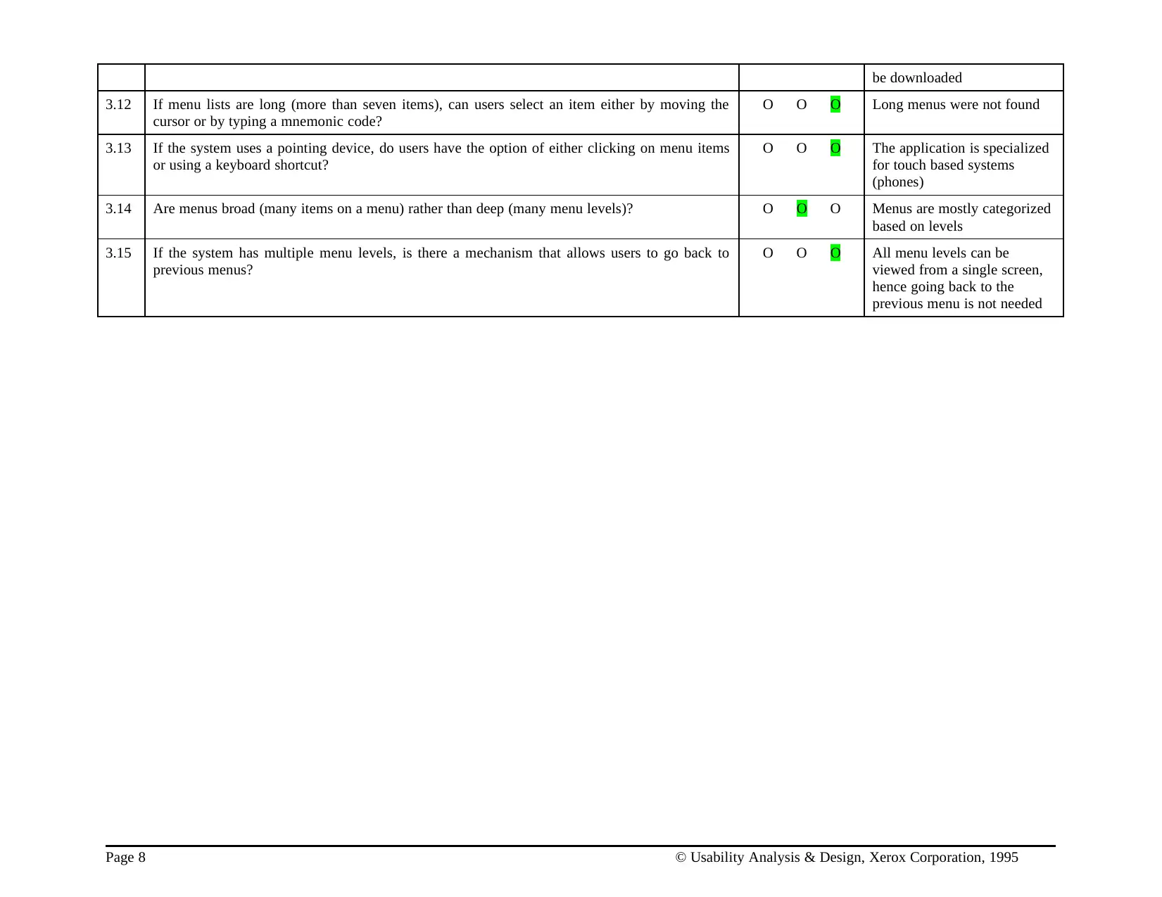
3.12 If menu lists are long (more than seven items), can users select an item either by moving the
cursor or by typing a mnemonic code?
O O O Long menus were not found
3.13 If the system uses a pointing device, do users have the option of either clicking on menu items
or using a keyboard shortcut?
O O O The application is specialized
for touch based systems
(phones)
3.14 Are menus broad (many items on a menu) rather than deep (many menu levels)? O O O Menus are mostly categorized
based on levels
3.15 If the system has multiple menu levels, is there a mechanism that allows users to go back to
previous menus?
O O O All menu levels can be
viewed from a single screen,
hence going back to the
previous menu is not needed
Page 8 © Usability Analysis & Design, Xerox Corporation, 1995
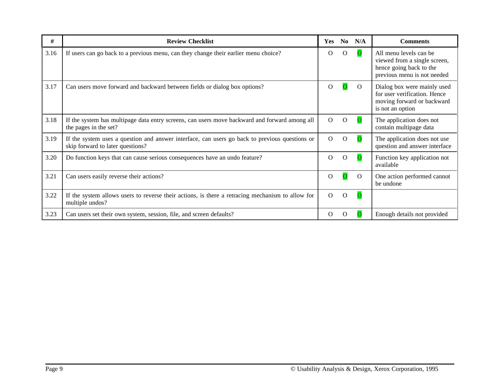
# Review Checklist Yes No N/A Comments
3.16 If users can go back to a previous menu, can they change their earlier menu choice? O O O All menu levels can be
viewed from a single screen,
hence going back to the
previous menu is not needed
3.17 Can users move forward and backward between fields or dialog box options? O O O Dialog box were mainly used
for user verification. Hence
moving forward or backward
is not an option
3.18 If the system has multipage data entry screens, can users move backward and forward among all
the pages in the set?
O O O The application does not
contain multipage data
3.19 If the system uses a question and answer interface, can users go back to previous questions or
skip forward to later questions?
O O O The application does not use
question and answer interface
3.20 Do function keys that can cause serious consequences have an undo feature? O O O Function key application not
available
3.21 Can users easily reverse their actions? O O O One action performed cannot
be undone
3.22 If the system allows users to reverse their actions, is there a retracing mechanism to allow for
multiple undos?
O O O
3.23 Can users set their own system, session, file, and screen defaults? O O O Enough details not provided
Page 9 © Usability Analysis & Design, Xerox Corporation, 1995
⊘ This is a preview!⊘
Do you want full access?
Subscribe today to unlock all pages.
Trusted by 1+ million students worldwide
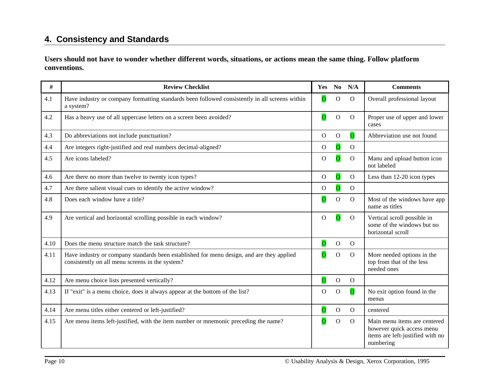
4. Consistency and Standards
Users should not have to wonder whether different words, situations, or actions mean the same thing. Follow platform
conventions.
# Review Checklist Yes No N/A Comments
4.1 Have industry or company formatting standards been followed consistently in all screens within
a system?
O O O Overall professional layout
4.2 Has a heavy use of all uppercase letters on a screen been avoided? O O O Proper use of upper and lower
cases
4.3 Do abbreviations not include punctuation? O O O Abbreviation use not found
4.4 Are integers right-justified and real numbers decimal-aligned? O O O
4.5 Are icons labeled? O O O Manu and upload button icon
not labeled
4.6 Are there no more than twelve to twenty icon types? O O O Less than 12-20 icon types
4.7 Are there salient visual cues to identify the active window? O O O
4.8 Does each window have a title? O O O Most of the windows have app
name as titles
4.9 Are vertical and horizontal scrolling possible in each window? O O O Vertical scroll possible in
some of the windows but no
horizontal scroll
4.10 Does the menu structure match the task structure? O O O
4.11 Have industry or company standards been established for menu design, and are they applied
consistently on all menu screens in the system?
O O O More needed options in the
top from that of the less
needed ones
4.12 Are menu choice lists presented vertically? O O O
4.13 If "exit" is a menu choice, does it always appear at the bottom of the list? O O O No exit option found in the
menus
4.14 Are menu titles either centered or left-justified? O O O centered
4.15 Are menu items left-justified, with the item number or mnemonic preceding the name? O O O Main menu items are centered
however quick access menu
items are left-justified with no
numbering
Page 10 © Usability Analysis & Design, Xerox Corporation, 1995
Paraphrase This Document
Need a fresh take? Get an instant paraphrase of this document with our AI Paraphraser
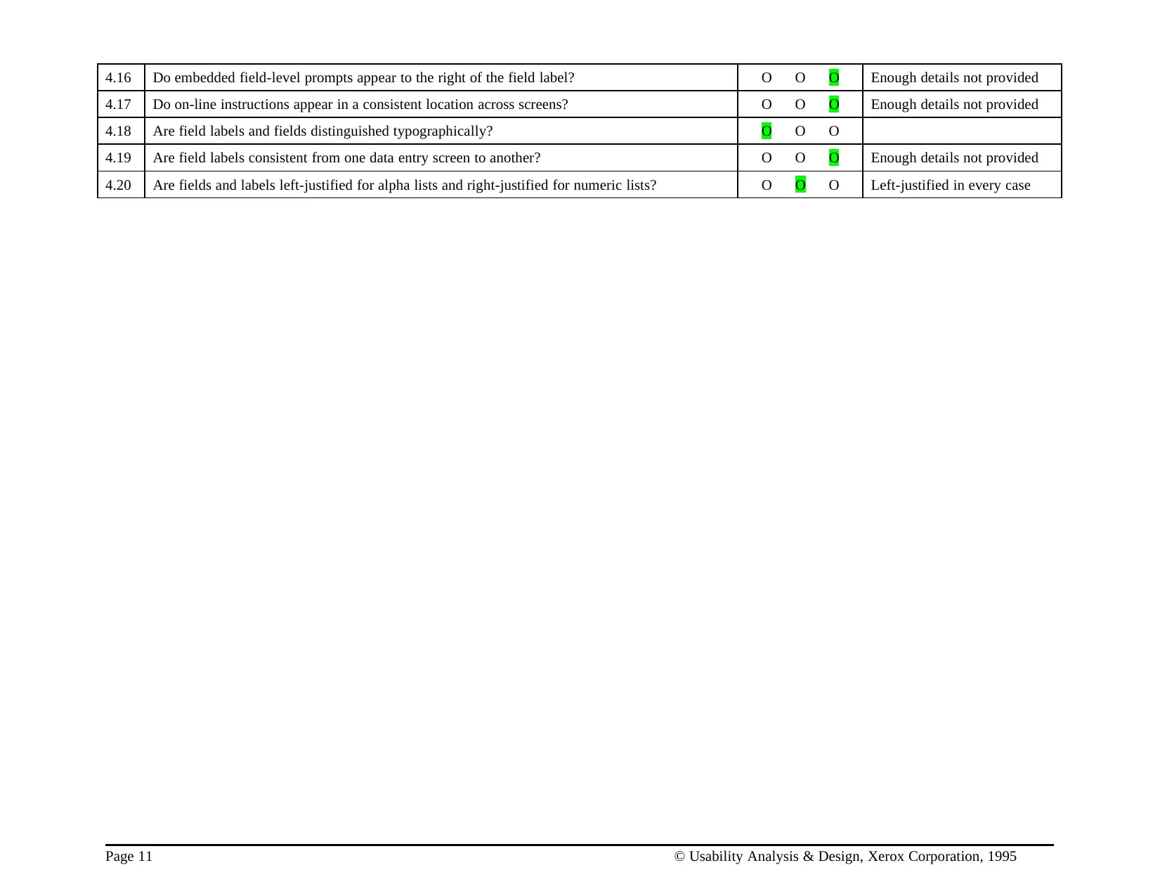
4.16 Do embedded field-level prompts appear to the right of the field label? O O O Enough details not provided
4.17 Do on-line instructions appear in a consistent location across screens? O O O Enough details not provided
4.18 Are field labels and fields distinguished typographically? O O O
4.19 Are field labels consistent from one data entry screen to another? O O O Enough details not provided
4.20 Are fields and labels left-justified for alpha lists and right-justified for numeric lists? O O O Left-justified in every case
Page 11 © Usability Analysis & Design, Xerox Corporation, 1995
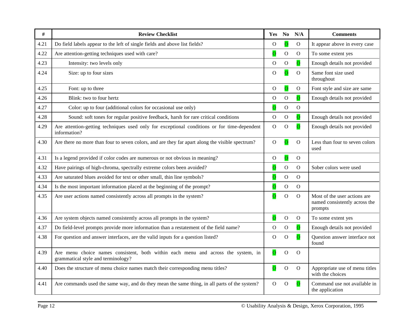
# Review Checklist Yes No N/A Comments
4.21 Do field labels appear to the left of single fields and above list fields? O O O It appear above in every case
4.22 Are attention-getting techniques used with care? O O O To some extent yes
4.23 Intensity: two levels only O O O Enough details not provided
4.24 Size: up to four sizes O O O Same font size used
throughout
4.25 Font: up to three O O O Font style and size are same
4.26 Blink: two to four hertz O O O Enough details not provided
4.27 Color: up to four (additional colors for occasional use only) O O O
4.28 Sound: soft tones for regular positive feedback, harsh for rare critical conditions O O O Enough details not provided
4.29 Are attention-getting techniques used only for exceptional conditions or for time-dependent
information?
O O O Enough details not provided
4.30 Are there no more than four to seven colors, and are they far apart along the visible spectrum? O O O Less than four to seven colors
used
4.31 Is a legend provided if color codes are numerous or not obvious in meaning? O O O
4.32 Have pairings of high-chroma, spectrally extreme colors been avoided? O O O Sober colors were used
4.33 Are saturated blues avoided for text or other small, thin line symbols? O O O
4.34 Is the most important information placed at the beginning of the prompt? O O O
4.35 Are user actions named consistently across all prompts in the system? O O O Most of the user actions are
named consistently across the
prompts
4.36 Are system objects named consistently across all prompts in the system? O O O To some extent yes
4.37 Do field-level prompts provide more information than a restatement of the field name? O O O Enough details not provided
4.38 For question and answer interfaces, are the valid inputs for a question listed? O O O Question answer interface not
found
4.39 Are menu choice names consistent, both within each menu and across the system, in
grammatical style and terminology?
O O O
4.40 Does the structure of menu choice names match their corresponding menu titles? O O O Appropriate use of menu titles
with the choices
4.41 Are commands used the same way, and do they mean the same thing, in all parts of the system? O O O Command use not available in
the application
Page 12 © Usability Analysis & Design, Xerox Corporation, 1995
⊘ This is a preview!⊘
Do you want full access?
Subscribe today to unlock all pages.
Trusted by 1+ million students worldwide
1 out of 32

Your All-in-One AI-Powered Toolkit for Academic Success.
+13062052269
info@desklib.com
Available 24*7 on WhatsApp / Email
![[object Object]](/_next/static/media/star-bottom.7253800d.svg)
Unlock your academic potential
Copyright © 2020–2026 A2Z Services. All Rights Reserved. Developed and managed by ZUCOL.