COIT20268 - Responsive Web Design: House of Cards Website
VerifiedAdded on 2023/06/11
|13
|1148
|185
Practical Assignment
AI Summary
This portfolio details the development of the House of Cards website, a project focused on providing information to customers about a physical shop. The report includes mock-ups of the homepage, section pages, and article pages, demonstrating the website's design and layout. It also covers the website's compatibility across different browsers, the navigation flow, and specific features like the Business Hours and Feedback pages. The document further outlines the testing process, including test cases and results from user testing, along with recommendations for future enhancements such as a news section and social media integration. The report summarizes the project's functionality, features, and the technologies used, providing a comprehensive overview of the House of Cards website development.
Paraphrase This Document
Need a fresh take? Get an instant paraphrase of this document with our AI Paraphraser
Contents
Portfolio 2.1....................................................................................................................3
Portfolio 2.2....................................................................................................................8
Portfolio 2.3....................................................................................................................9
Portfolio 2.4..................................................................................................................10
Portfolio 2.5..................................................................................................................10
Portfolio 2.6..................................................................................................................11
Summary......................................................................................................................12
References....................................................................................................................13
2 | P a g e
Report
Portfolio 2.1
Home Page Mock-up
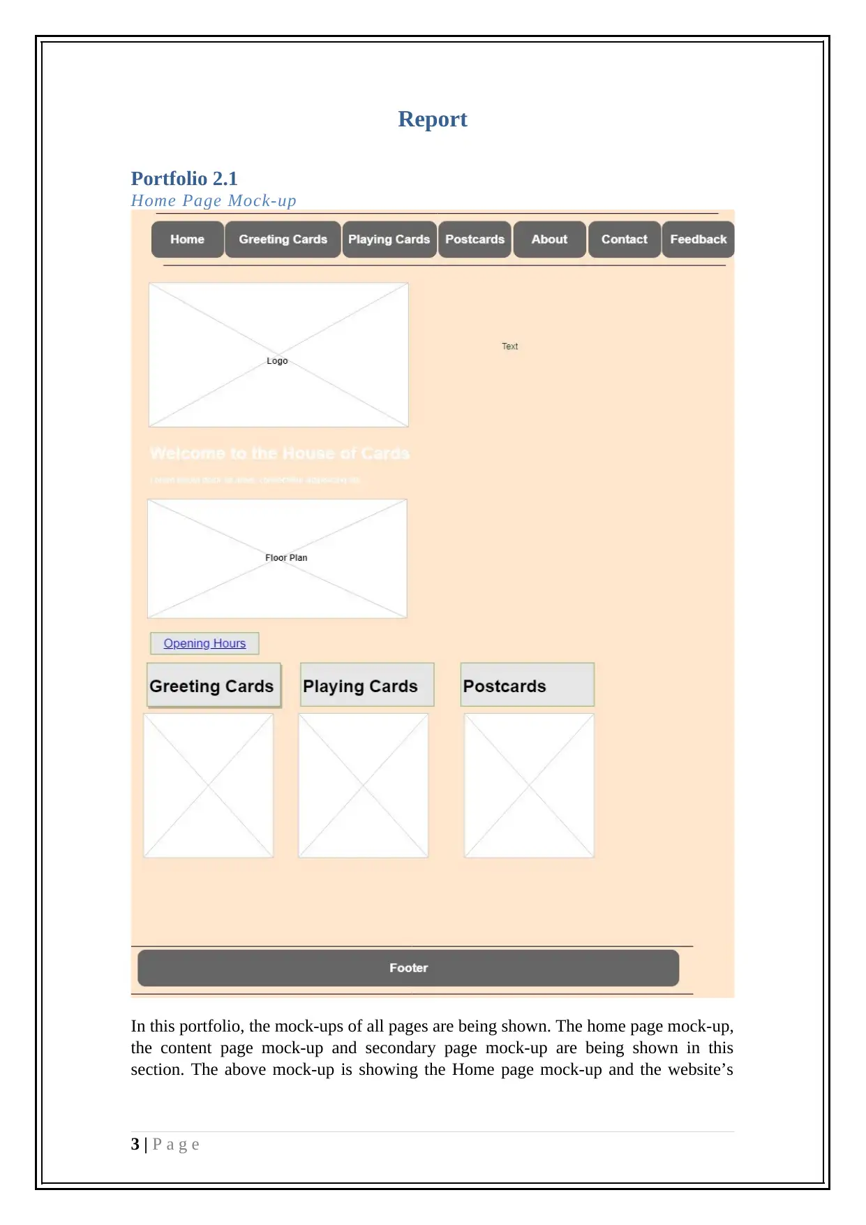
In this portfolio, the mock-ups of all pages are being shown. The home page mock-up,
the content page mock-up and secondary page mock-up are being shown in this
section. The above mock-up is showing the Home page mock-up and the website’s
3 | P a g e
Portfolio 2.1
Home Page Mock-up
In this portfolio, the mock-ups of all pages are being shown. The home page mock-up,
the content page mock-up and secondary page mock-up are being shown in this
section. The above mock-up is showing the Home page mock-up and the website’s
3 | P a g e
⊘ This is a preview!⊘
Do you want full access?
Subscribe today to unlock all pages.

Trusted by 1+ million students worldwide
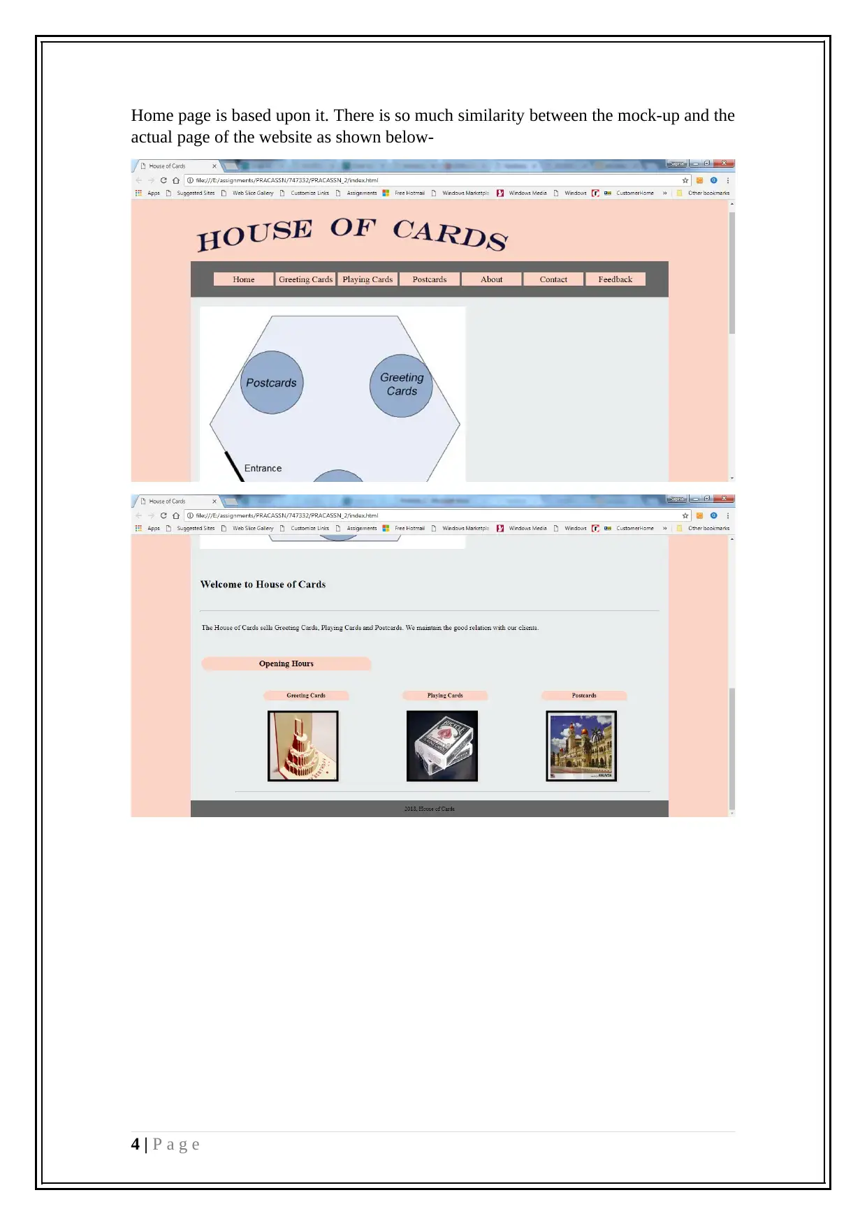
Home page is based upon it. There is so much similarity between the mock-up and the
actual page of the website as shown below-
4 | P a g e
actual page of the website as shown below-
4 | P a g e
Paraphrase This Document
Need a fresh take? Get an instant paraphrase of this document with our AI Paraphraser
Section Page Mock-up
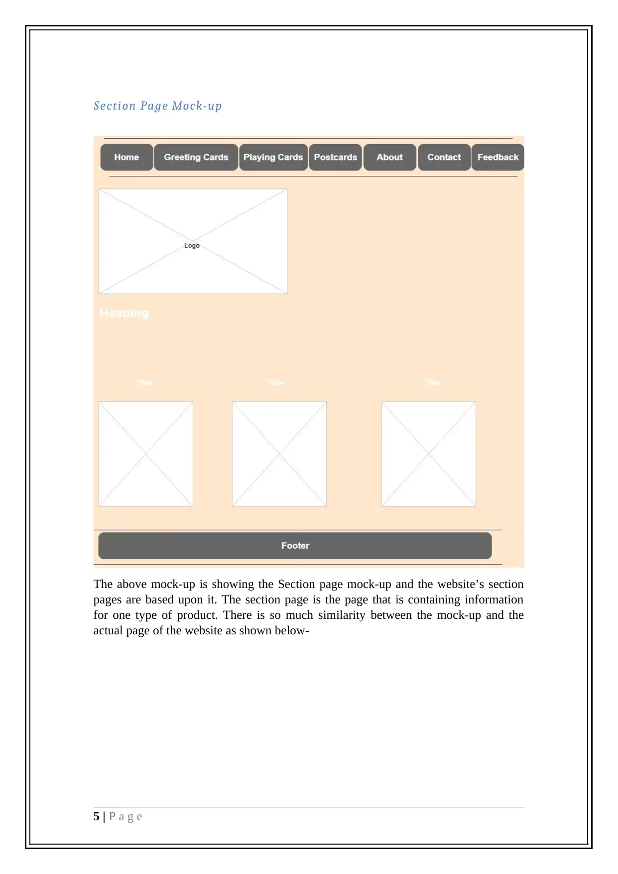
The above mock-up is showing the Section page mock-up and the website’s section
pages are based upon it. The section page is the page that is containing information
for one type of product. There is so much similarity between the mock-up and the
actual page of the website as shown below-
5 | P a g e
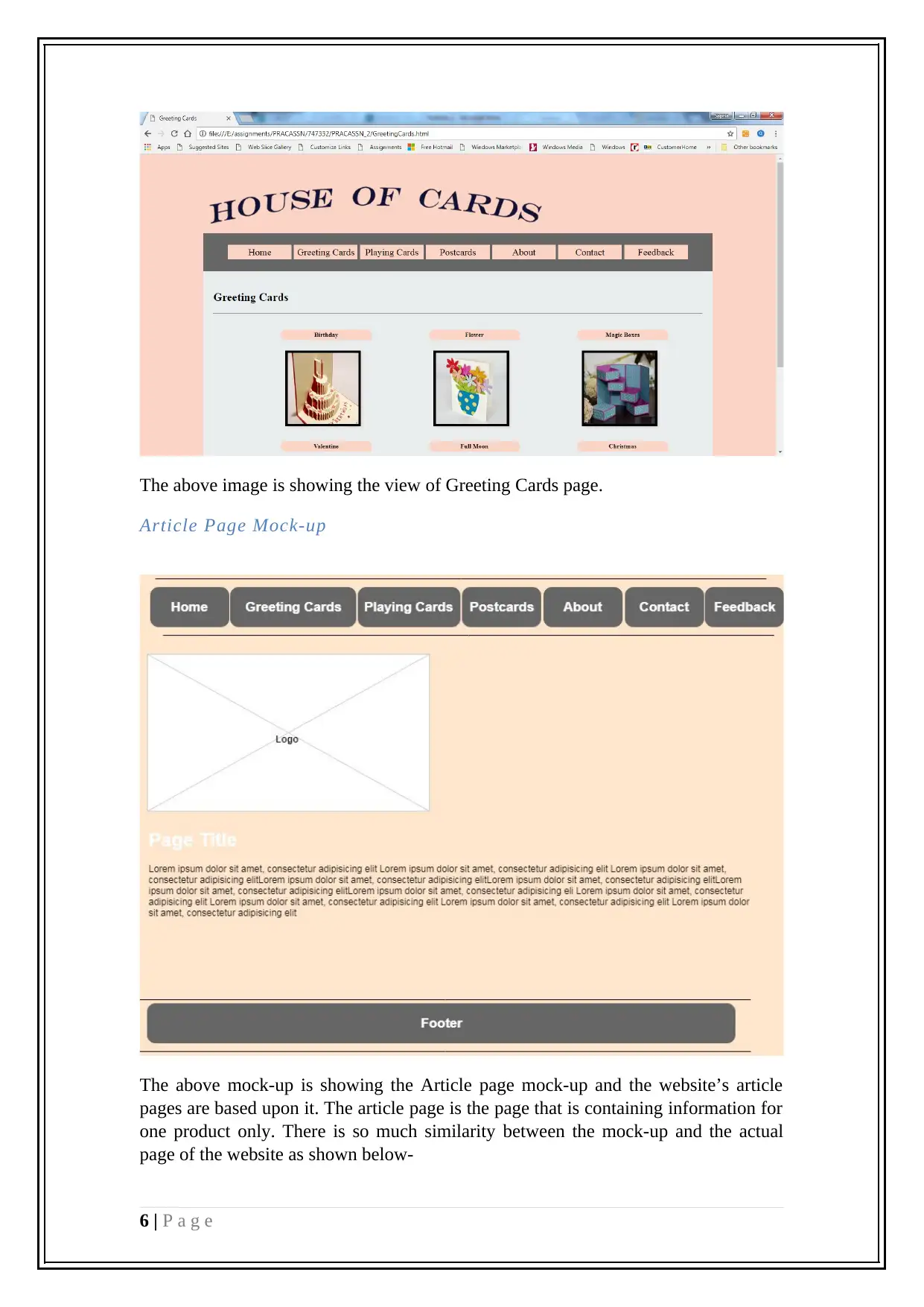
The above image is showing the view of Greeting Cards page.
Article Page Mock-up
The above mock-up is showing the Article page mock-up and the website’s article
pages are based upon it. The article page is the page that is containing information for
one product only. There is so much similarity between the mock-up and the actual
page of the website as shown below-
6 | P a g e
⊘ This is a preview!⊘
Do you want full access?
Subscribe today to unlock all pages.

Trusted by 1+ million students worldwide
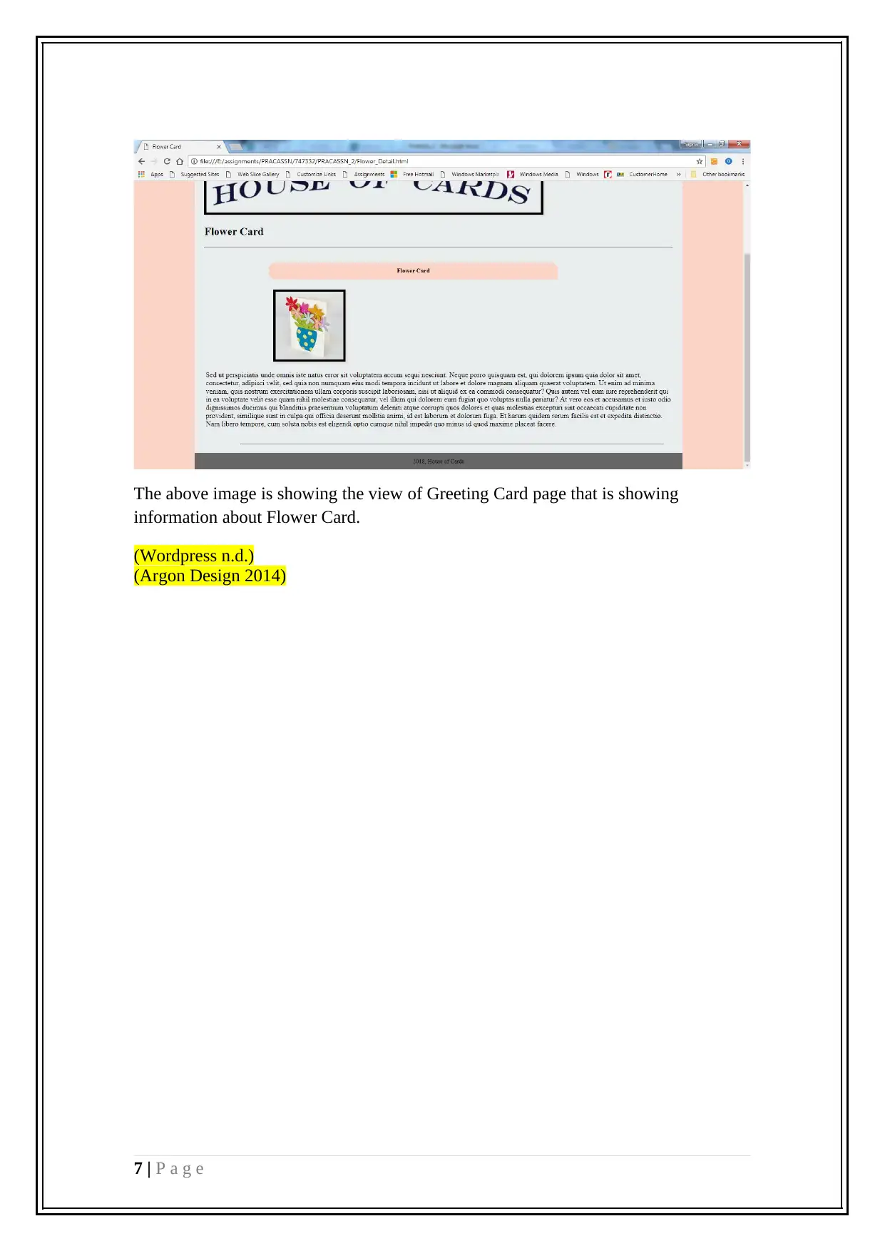
The above image is showing the view of Greeting Card page that is showing
information about Flower Card.
(Wordpress n.d.)
(Argon Design 2014)
7 | P a g e
information about Flower Card.
(Wordpress n.d.)
(Argon Design 2014)
7 | P a g e
Paraphrase This Document
Need a fresh take? Get an instant paraphrase of this document with our AI Paraphraser
Portfolio 2.2
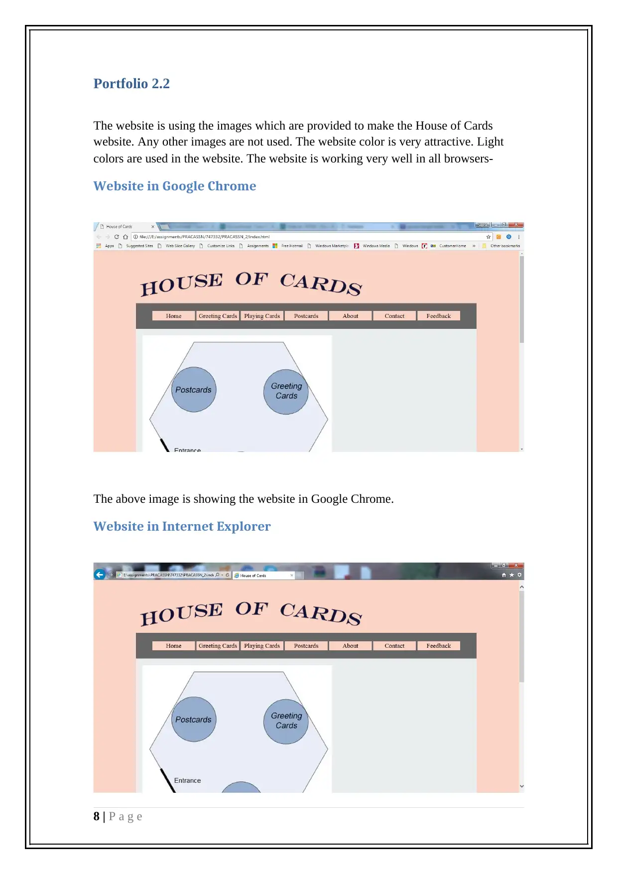
The website is using the images which are provided to make the House of Cards
website. Any other images are not used. The website color is very attractive. Light
colors are used in the website. The website is working very well in all browsers-
Website in Google Chrome
The above image is showing the website in Google Chrome.
Website in Internet Explorer
8 | P a g e
The above image is showing the website in internet explorer and working very well
just like Google Chrome. It is working well in all browsers. The website layout is
built in a way that is compatible to all browsers. The same navigation is being used in
all pages.
The images are having black border and all tags like src, alt, title etc. there is
transition on all images through CSS.
Portfolio 2.3
Flowchart
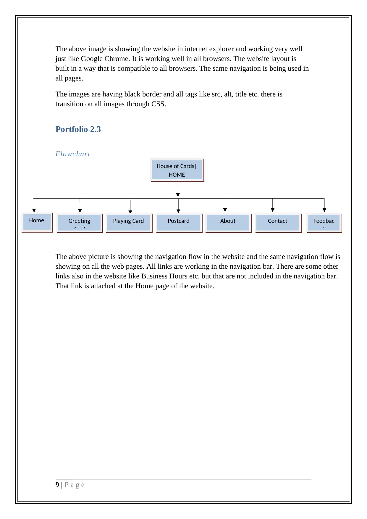
The above picture is showing the navigation flow in the website and the same navigation flow is
showing on all the web pages. All links are working in the navigation bar. There are some other
links also in the website like Business Hours etc. but that are not included in the navigation bar.
That link is attached at the Home page of the website.
9 | P a g e
House of Cards|
HOME
Home Greeting
Card
Playing Card Postcard About Contact Feedbac
k
⊘ This is a preview!⊘
Do you want full access?
Subscribe today to unlock all pages.

Trusted by 1+ million students worldwide
Portfolio 2.4
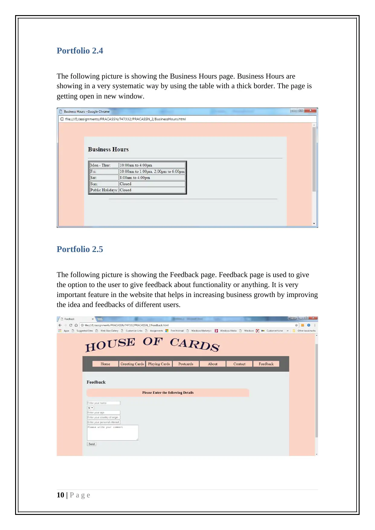
The following picture is showing the Business Hours page. Business Hours are
showing in a very systematic way by using the table with a thick border. The page is
getting open in new window.
Portfolio 2.5
The following picture is showing the Feedback page. Feedback page is used to give
the option to the user to give feedback about functionality or anything. It is very
important feature in the website that helps in increasing business growth by improving
the idea and feedbacks of different users.
10 | P a g e
Paraphrase This Document
Need a fresh take? Get an instant paraphrase of this document with our AI Paraphraser
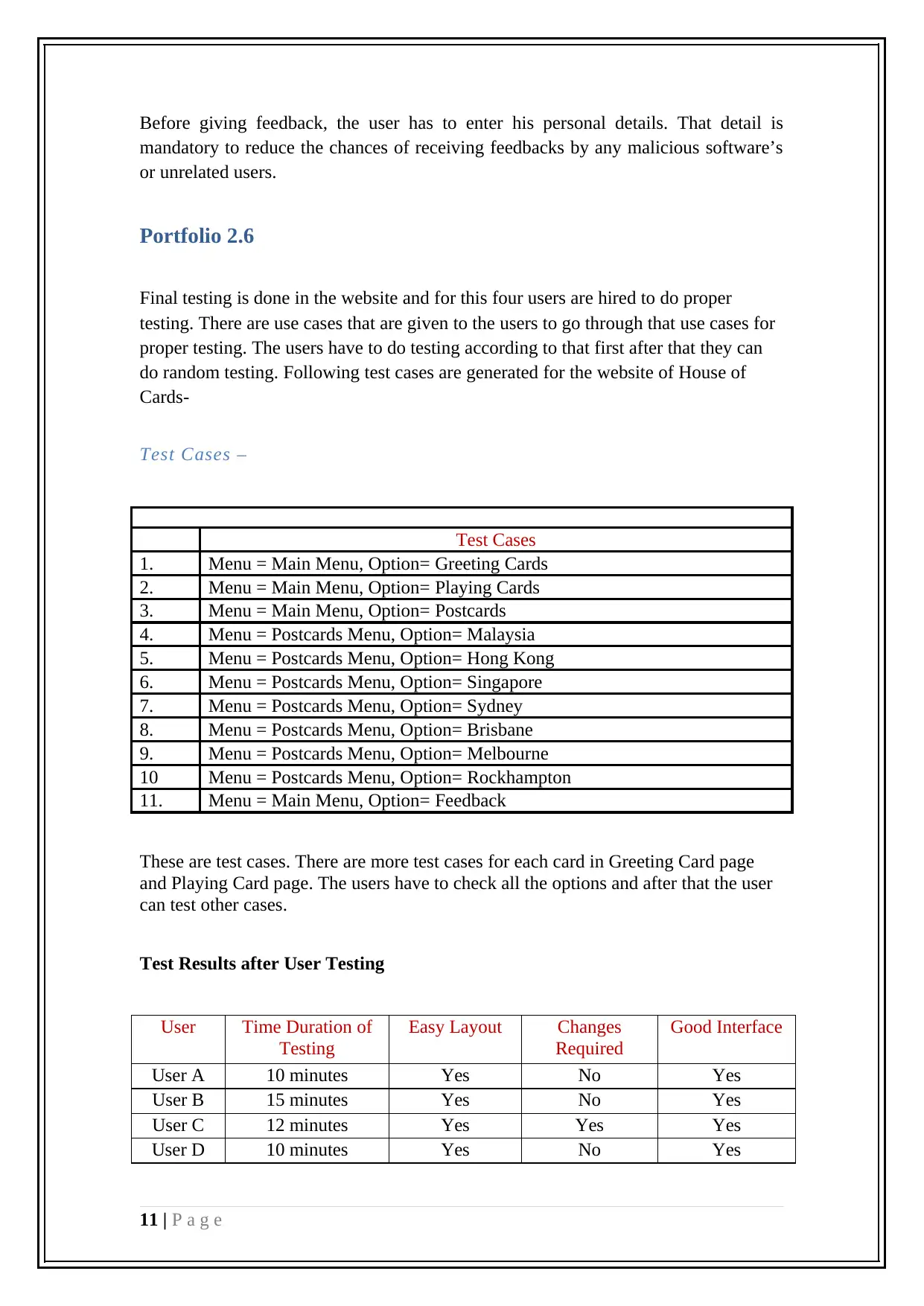
Before giving feedback, the user has to enter his personal details. That detail is
mandatory to reduce the chances of receiving feedbacks by any malicious software’s
or unrelated users.
Portfolio 2.6
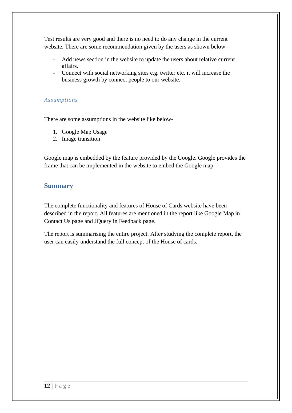
Final testing is done in the website and for this four users are hired to do proper
testing. There are use cases that are given to the users to go through that use cases for
proper testing. The users have to do testing according to that first after that they can
do random testing. Following test cases are generated for the website of House of
Cards-
Test Cases –
Test Cases
1. Menu = Main Menu, Option= Greeting Cards
2. Menu = Main Menu, Option= Playing Cards
3. Menu = Main Menu, Option= Postcards
4. Menu = Postcards Menu, Option= Malaysia
5. Menu = Postcards Menu, Option= Hong Kong
6. Menu = Postcards Menu, Option= Singapore
7. Menu = Postcards Menu, Option= Sydney
8. Menu = Postcards Menu, Option= Brisbane
9. Menu = Postcards Menu, Option= Melbourne
10 Menu = Postcards Menu, Option= Rockhampton
11. Menu = Main Menu, Option= Feedback
These are test cases. There are more test cases for each card in Greeting Card page
and Playing Card page. The users have to check all the options and after that the user
can test other cases.
Test Results after User Testing
User Time Duration of
Testing
Easy Layout Changes
Required
Good Interface
User A 10 minutes Yes No Yes
User B 15 minutes Yes No Yes
User C 12 minutes Yes Yes Yes
User D 10 minutes Yes No Yes
11 | P a g e
Test results are very good and there is no need to do any change in the current
website. There are some recommendation given by the users as shown below-
- Add news section in the website to update the users about relative current
affairs.
- Connect with social networking sites e.g. twitter etc. it will increase the
business growth by connect people to our website.
Assumptions
There are some assumptions in the website like below-
1. Google Map Usage
2. Image transition
Google map is embedded by the feature provided by the Google. Google provides the
frame that can be implemented in the website to embed the Google map.
Summary
The complete functionality and features of House of Cards website have been
described in the report. All features are mentioned in the report like Google Map in
Contact Us page and JQuery in Feedback page.
The report is summarising the entire project. After studying the complete report, the
user can easily understand the full concept of the House of cards.
12 | P a g e
⊘ This is a preview!⊘
Do you want full access?
Subscribe today to unlock all pages.

Trusted by 1+ million students worldwide
1 out of 13
Related Documents
Your All-in-One AI-Powered Toolkit for Academic Success.
+13062052269
info@desklib.com
Available 24*7 on WhatsApp / Email
![[object Object]](/_next/static/media/star-bottom.7253800d.svg)
Unlock your academic potential
Copyright © 2020–2025 A2Z Services. All Rights Reserved. Developed and managed by ZUCOL.


