Human Factors in System Design: Usability of Phone App Detecting Health Fall Risk Detection System for Adult Users
VerifiedAdded on 2023/04/11
|26
|4938
|345
AI Summary
This paper discusses the implementation of a structured HCD methodology for the development of a smartphone interface for a fall risk detection system. It explores the usability and human factors considerations for older adult users. The paper also presents the use cases, evaluation methodology, and expert analysis of the system design.
Contribute Materials
Your contribution can guide someone’s learning journey. Share your
documents today.
Running head: HUMAN FACTORS IN SYSTEM DESIGN
Human Factors in System Design: Usability of Phone App Detecting Health
Fall Risk Detection System for Adult Users
Name of Student-
Name of University-
Author’s Note-
Human Factors in System Design: Usability of Phone App Detecting Health
Fall Risk Detection System for Adult Users
Name of Student-
Name of University-
Author’s Note-
Secure Best Marks with AI Grader
Need help grading? Try our AI Grader for instant feedback on your assignments.
1HUMAN FACTORS IN SYSTEM DESIGN
Part One: Interactive System and its Users
Utilizing a human-centered design (HCD) approach, such as that outlined in the
International Standards Organization (ISO) 9241-210, during the design of connected health
devices ensures that the needs and requirements of the user are taken into consideration
throughout the design process. HCD is a multi-stage process that allows for various iterations of
a design and subsequent update to the requirements. The importance of involving end users in
the design process of health products is recognized, and different approaches have been
demonstrated in literature. In this paper, the implementation of a structured HCD methodology is
demonstrated, based on ISO-9241-210, which utilized standard, established techniques to assess
and develop the usability and human factors of a smartphone interface with the full involvement
of end users and stakeholders. The smartphone interface that was developed and tested is a
component of the wireless insole for independent and safe elderly living (WIISEL) system, a
system designed to continuously assess fall risk by measuring gait and balance parameters
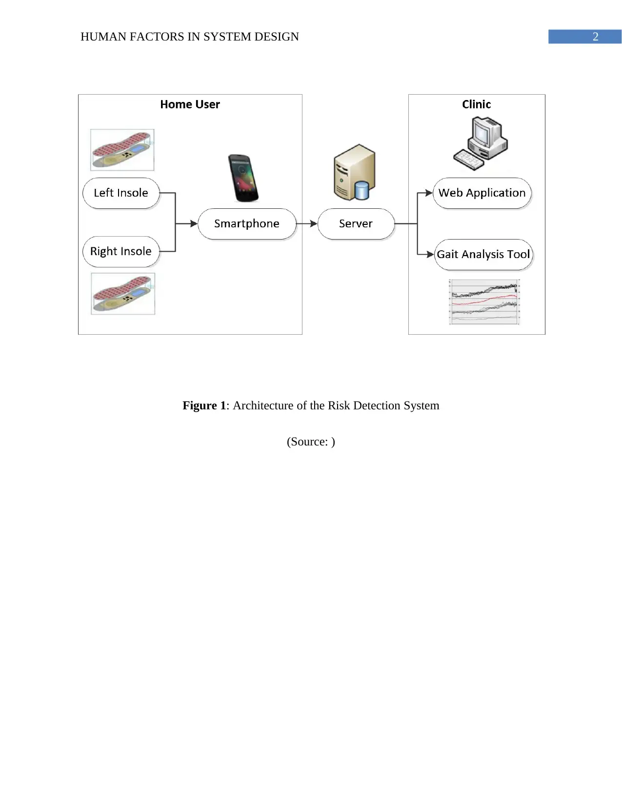
associated with fall risk. The system is also designed to detect falls. The architecture of the
system is illustrated in Figure 1. It is proposed that the system can be worn at home by a user for
a period of time in order to identify specific gait and balance patterns that may be affecting a
user’s fall risk. The system is targeted at older adults who represent a high fall risk group. The
system consists of a pair of instrumented insoles and a smartphone that are worn by the user.
Data collected by embedded sensors in the insoles are sent to the smartphone, where they are
then uploaded to a server in a clinic for processing and analysis. The smartphone represents a
major interface in the system as this is how the home user will primarily interact with the
WIISEL system with the WIISEL app, allowing the user to check the system status, sync with
the insoles, send data to their local clinic, and monitor their daily activity.
2HUMAN FACTORS IN SYSTEM DESIGN
Figure 1: Architecture of the Risk Detection System
(Source: )
Figure 1: Architecture of the Risk Detection System
(Source: )
3HUMAN FACTORS IN SYSTEM DESIGN
The acquisition and comprehension of information from interfaces can become more
difficult as a person progresses into older age. Interfaces in electronic health or medical apps can
often be crowded with text and characters, have poor contrast, contain many different colors, and
may not present adequate haptic or audio feedback. In terms of visual perception, age-related
declines in acuity, contrast sensitivity, and ability to discriminate colors can affect reading rates,
character and symbol identification, and button striking accuracy, even with optimal corrections
in place. Age-related cognitive decline in domains such as reasoning and memory can affect the
ability of the user to comprehend the process they are perceiving on the interface. Deterioration
of psychomotor processes such as fine motor control and dexterity can cause problems for users
attempting to interact with the physical hardware of the interface. Typically between the ages of
60 and 80 years, individuals can expect up to a 50% decline in visual acuity (particularly in low
luminance, low contrast, and glare environments), a reduction in hearing sensitivity by 20dBs, a
14% decline in short-term memory, and a 30% decline in power grip strength, all of which
impact how one interacts with computer interfaces. In addition to these physical considerations,
older adults can also present a complex user group in terms of attitude toward and previous
experience with technology.
Part Two: Use Cases
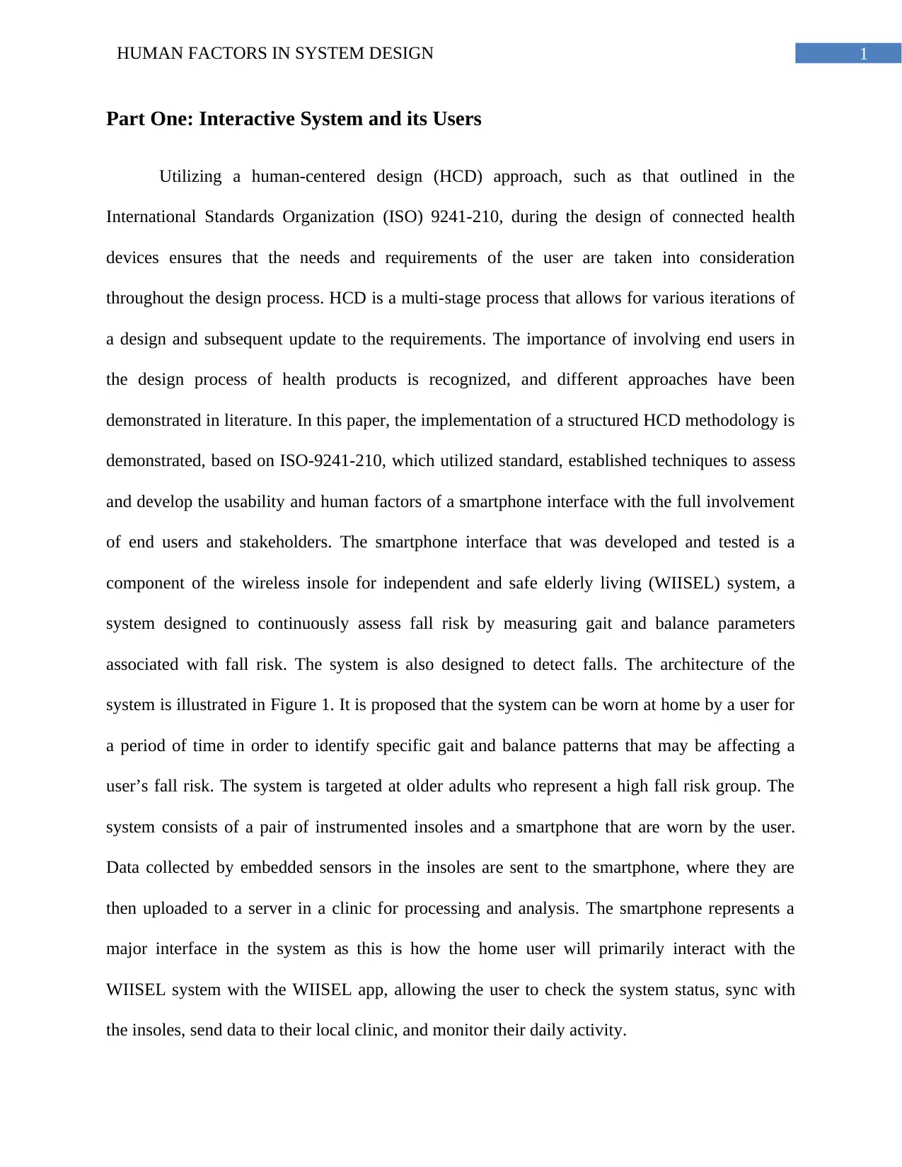
The use case document outlined 7 scenarios where the user must directly interact with the
smartphone interface. These scenarios were (1) the user logs in to the app, (2) the user syncs the
app to the insoles, (3) the user checks the system status, (4) the user uploads the data, (5) the user
minimizes the app, (6) the user resets the app, and (7) the user triggers a fall alarm. The use case,
which was termed paper prototype version 1, was exposed to 2 groups of stakeholders in the
form of structured analysis in order to illicit their feedback.
Paraphrase This Document
Need a fresh take? Get an instant paraphrase of this document with our AI Paraphraser
4HUMAN FACTORS IN SYSTEM DESIGN
Figure 2: Use Case of Clinical Decision Support Tool
(Source: Created by Author)
Part Three: The Usability Requirement
Expert Use Case Analysis
A total of 10 experts were selected to analyze the use case. The experts were selected
from National University of Ireland (NUI), Galway based on their involvement with work related
to the use of technology by older adults. There were multi-disciplinary perspectives, as advised
in ISO-92410, and therefore the group consisted of nurses, occupational therapists,
physiotherapists, general practitioners, gerontologists, and engineers. The precise expertise of
5HUMAN FACTORS IN SYSTEM DESIGN
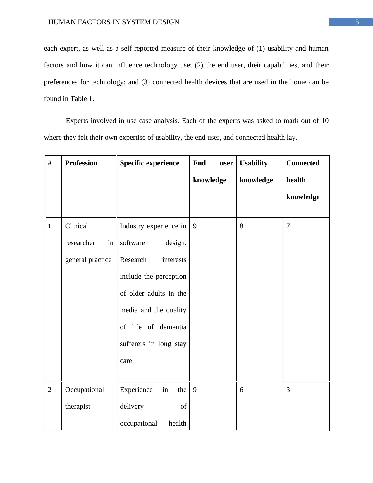
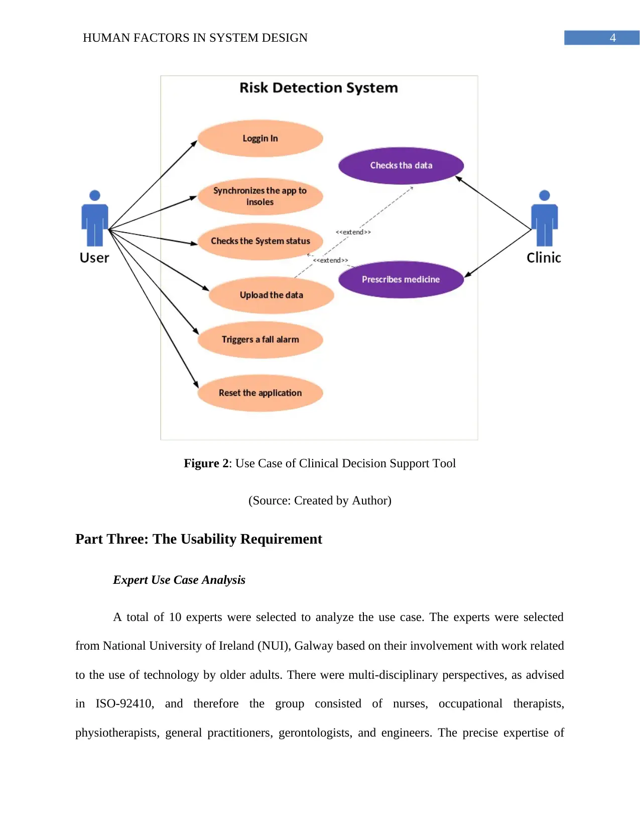
each expert, as well as a self-reported measure of their knowledge of (1) usability and human
factors and how it can influence technology use; (2) the end user, their capabilities, and their
preferences for technology; and (3) connected health devices that are used in the home can be
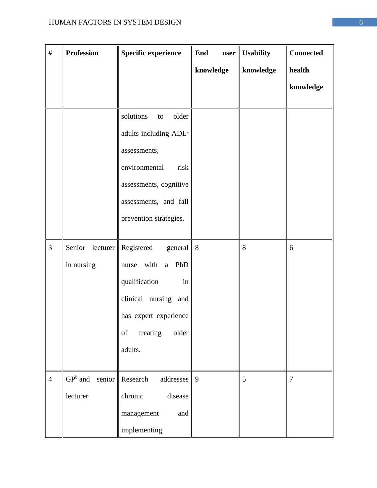
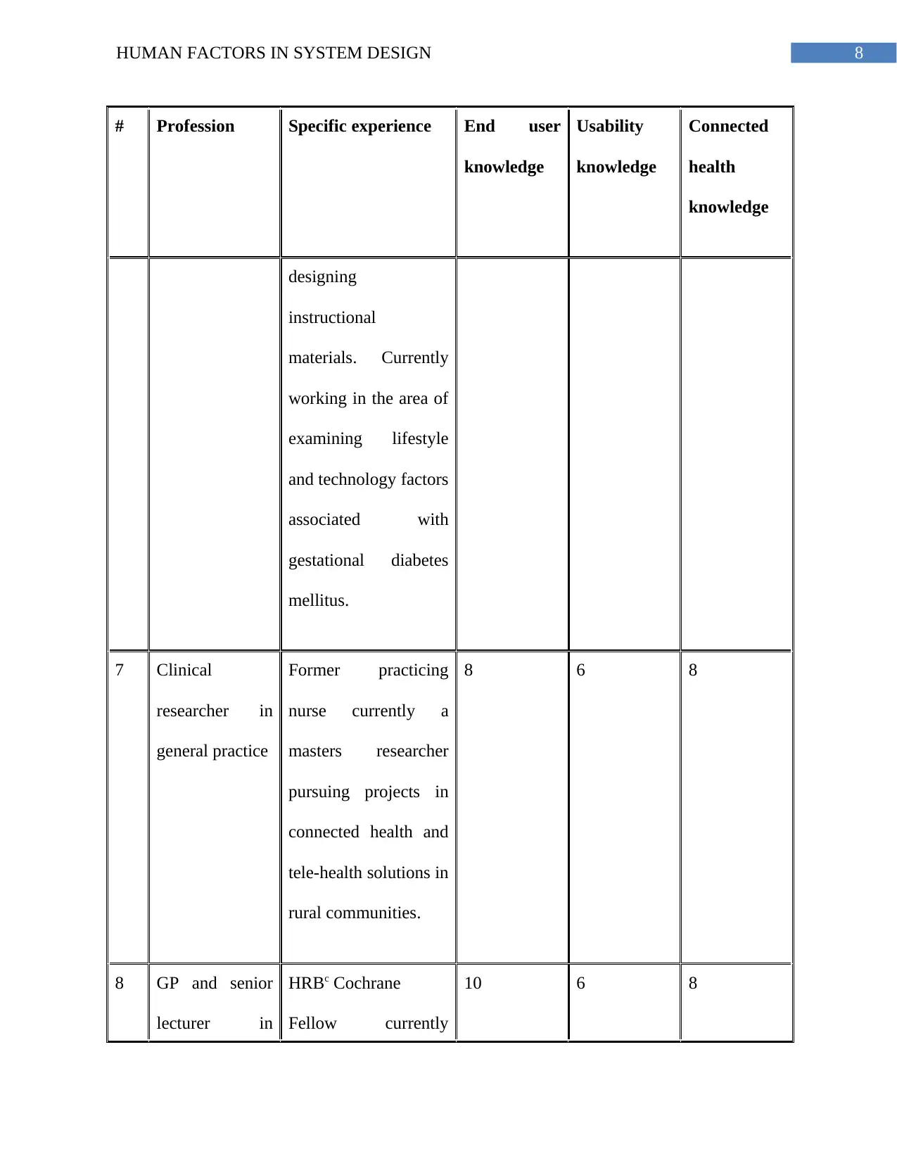
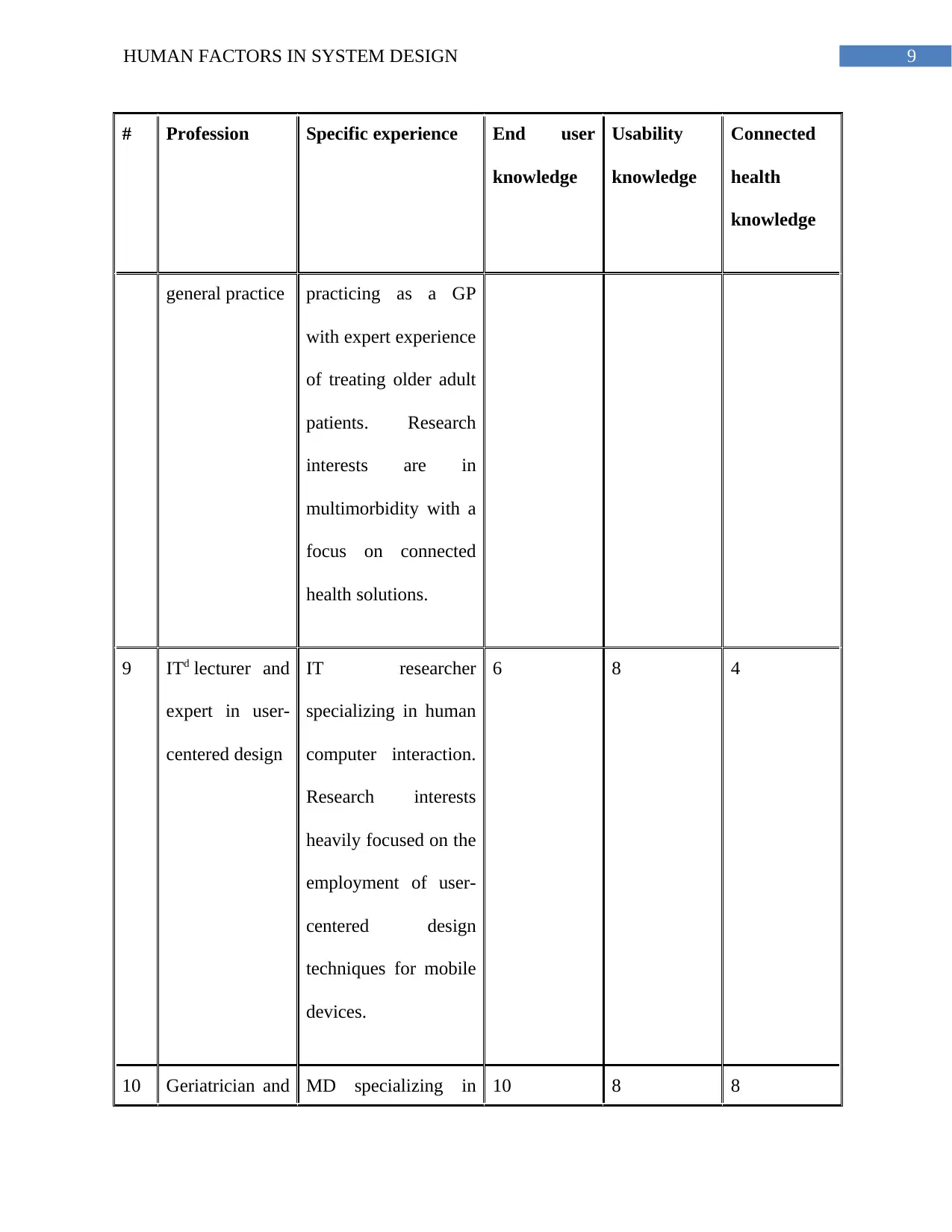
found in Table 1.
Experts involved in use case analysis. Each of the experts was asked to mark out of 10
where they felt their own expertise of usability, the end user, and connected health lay.
# Profession Specific experience End user
knowledge
Usability
knowledge
Connected
health
knowledge
1 Clinical
researcher in
general practice
Industry experience in
software design.
Research interests
include the perception
of older adults in the
media and the quality
of life of dementia
sufferers in long stay
care.
9 8 7
2 Occupational
therapist
Experience in the
delivery of
occupational health
9 6 3
6HUMAN FACTORS IN SYSTEM DESIGN
# Profession Specific experience End user
knowledge
Usability
knowledge
Connected
health
knowledge
solutions to older
adults including ADLa
assessments,
environmental risk
assessments, cognitive
assessments, and fall
prevention strategies.
3 Senior lecturer
in nursing
Registered general
nurse with a PhD
qualification in
clinical nursing and
has expert experience
of treating older
adults.
8 8 6
4 GPb and senior
lecturer
Research addresses
chronic disease
management and
implementing
9 5 7
Secure Best Marks with AI Grader
Need help grading? Try our AI Grader for instant feedback on your assignments.
7HUMAN FACTORS IN SYSTEM DESIGN
# Profession Specific experience End user
knowledge
Usability
knowledge
Connected
health
knowledge
connected health
solutions for the
management of
chronic diseases.
5 GP and head of
general practice
department
Senior lecturer of
general practice and
lead researcher in
clinical training or
teaching practices and
methods, as well as
workplace learning
and development.
9 6 4
6 Psychology
researcher
Holds a PhD in
psychology with
research interest in
team situation
awareness in critical
environments and
7 8 7
8HUMAN FACTORS IN SYSTEM DESIGN
# Profession Specific experience End user
knowledge
Usability
knowledge
Connected
health
knowledge
designing
instructional
materials. Currently
working in the area of
examining lifestyle
and technology factors
associated with
gestational diabetes
mellitus.
7 Clinical
researcher in
general practice
Former practicing
nurse currently a
masters researcher
pursuing projects in
connected health and
tele-health solutions in
rural communities.
8 6 8
8 GP and senior
lecturer in
HRBc Cochrane
Fellow currently
10 6 8
9HUMAN FACTORS IN SYSTEM DESIGN
# Profession Specific experience End user
knowledge
Usability
knowledge
Connected
health
knowledge
general practice practicing as a GP
with expert experience
of treating older adult
patients. Research
interests are in
multimorbidity with a
focus on connected
health solutions.
9 ITd lecturer and
expert in user-
centered design
IT researcher
specializing in human
computer interaction.
Research interests
heavily focused on the
employment of user-
centered design
techniques for mobile
devices.
6 8 4
10 Geriatrician and MD specializing in 10 8 8
Paraphrase This Document
Need a fresh take? Get an instant paraphrase of this document with our AI Paraphraser
10HUMAN FACTORS IN SYSTEM DESIGN
# Profession Specific experience End user
knowledge
Usability
knowledge
Connected
health
knowledge
professor of
geron-
technology
geriatrics and PhD
qualification in
preventive medicine
and public health. Has
expert experience of
treating older adults as
well as specific
research interests in
epidemiology, geron-
technology, and tele-
health care.
Average expert group
knowledge of key
areas.
8.4 7 6.4
Table 1: Experts involved in use case analysis
(Source: )
aADL: activities of daily living.
11HUMAN FACTORS IN SYSTEM DESIGN
bGP: general practitioner.
cHRB: health research board.
dIT: information technology.
In addition to filling out the Likert statements at the end of each scenario, the expert was
instructed to engage in a think-aloud protocol as they walked through each scenario. All
feedback was captured by an audio recorder.
Part Four: The Evaluation Methodology
Phase 1
Use Case Development
The use case document outlined 7 scenarios where the user must directly interact with the
smartphone interface. These scenarios were (1) the user logs in to the app, (2) the user syncs the
app to the insoles, (3) the user checks the system status, (4) the user uploads the data, (5) the user
minimizes the app, (6) the user resets the app, and (7) the user triggers a fall alarm. The use case,
which was termed paper prototype version 1, was exposed to 2 groups of stakeholders in the
form of structured analysis in order to illicit their feedback.
End User Representatives Use Case Analysis
A total of 12 older adults were recruited using a typical purposive sample (Inclusion: age
65+ years, community dwelling; Exclusion: profound hearing or vision loss, psychiatric
morbidities, and severe neurological impairments) to analyze the use case. The same protocol
and interview structure was used to expose the use case document to the older adults and was
carried out in the home of the participant. Ethical approval to carry out the interviews and
12HUMAN FACTORS IN SYSTEM DESIGN
assessments was approved by University Hospital Galway (UHG) research ethics committee. For
this analysis, the capabilities a user would call upon to successfully use an interface was
measured, so that the test participants were representative of the target end-user population.
High contrast acuity (HCA) was measured using a Snellen chart at a distance of 3m. Low
contrast acuity (LCA) was measured for 5% and 25% contrast using SLOAN letter charts at a
distance of 3m. Standardized illumination was provided for these 2 tests using a light box from
Precision Vision (precision-vision.com). Constrast sensitivity (CS) was measured using a MARS
chart at a distance of 40cm, whereas low contrast acuity in low luminance (LCALL) was
measured with a SKI chart at a distance of 40cm. Color discrimination (CD) was measured using
a Farnsboro D-15 test. Reading acuity (RA) was measured using a Jaeger chart at a distance of
40cm. Each participant also completed 2 cognitive performance tests based on the Whitehall
study. Spatial reasoning was assessed using the Alice Heim 4-I (AH4-I). The AH4-I tests
inductive reasoning, measuring one’s ability to identify patterns, and to infer principles and rules.
Short-term memory was assessed with a 20-word free recall test.
Identification and Categorization of Usability Problems
The audio feedback acquired during the analysis of the use case document by the experts
and end users was “intelligently” transcribed and clearly defined usability problems were
extracted from the transcript. All of the problems identified by each expert, and end user were
collated for each scenario. All problems were documented and illustrated in a structured usability
and human factors problems report and were accompanied by selected testimony from a
corresponding expert or end user who elaborated on the nature of the problem for the purpose of
the design team. This report was analyzed by system designers who provided potential solutions
to each problem where possible.
Secure Best Marks with AI Grader
Need help grading? Try our AI Grader for instant feedback on your assignments.
13HUMAN FACTORS IN SYSTEM DESIGN
Phase 2
In response to the feedback from phase 1, a new paper prototype was developed (paper
prototype version 2) and made available for expert inspection. A working version of the app with
accompanying user manuals was also developed on a Google Nexus 5 smartphone (working
prototype version 1) and made available for expert walkthrough. The original experts was
returned and carried out a 2-part usability inspection. First, the experts inspected the solutions to
the problems they had identified in phase 1 using a new version of the use case (paper prototype
version 2) as a guide. This use case only presented the problems that the experts identified in
their original analysis and showed how the problems had been addressed. Second, they inspected
the prototype app (working prototype version 1) utilizing a cognitive and contextual walkthrough
methodology.
Phase 3
The new manuals and updated interface (working prototype version 2) were exposed to
the 10 older adults who had previously analyzed the use case (2 of the 12 subjects who had
originally analyzed the use case were unavailable in phase 3 testing). After measuring the time
taken to complete each task and the number of errors made, the after scenario questionnaire
(ASQ) and the NASA Task Load Index (NASA-TLX) were administered to the participant after
the task was completed. The ASQ is a Likert scale that interrogates a user’s perception of
efficiency, ease of use, and satisfaction with manual support. The NASA-TLX is a multi-
dimensional rating procedure that provides an overall workload score based on a weighted
average of ratings on 6 subscales: (1) mental demands, (2) physical demands, (3) temporal
demands, (4) own performance, (5) effort, and (6) frustration.
14HUMAN FACTORS IN SYSTEM DESIGN
Part Five: Evaluation
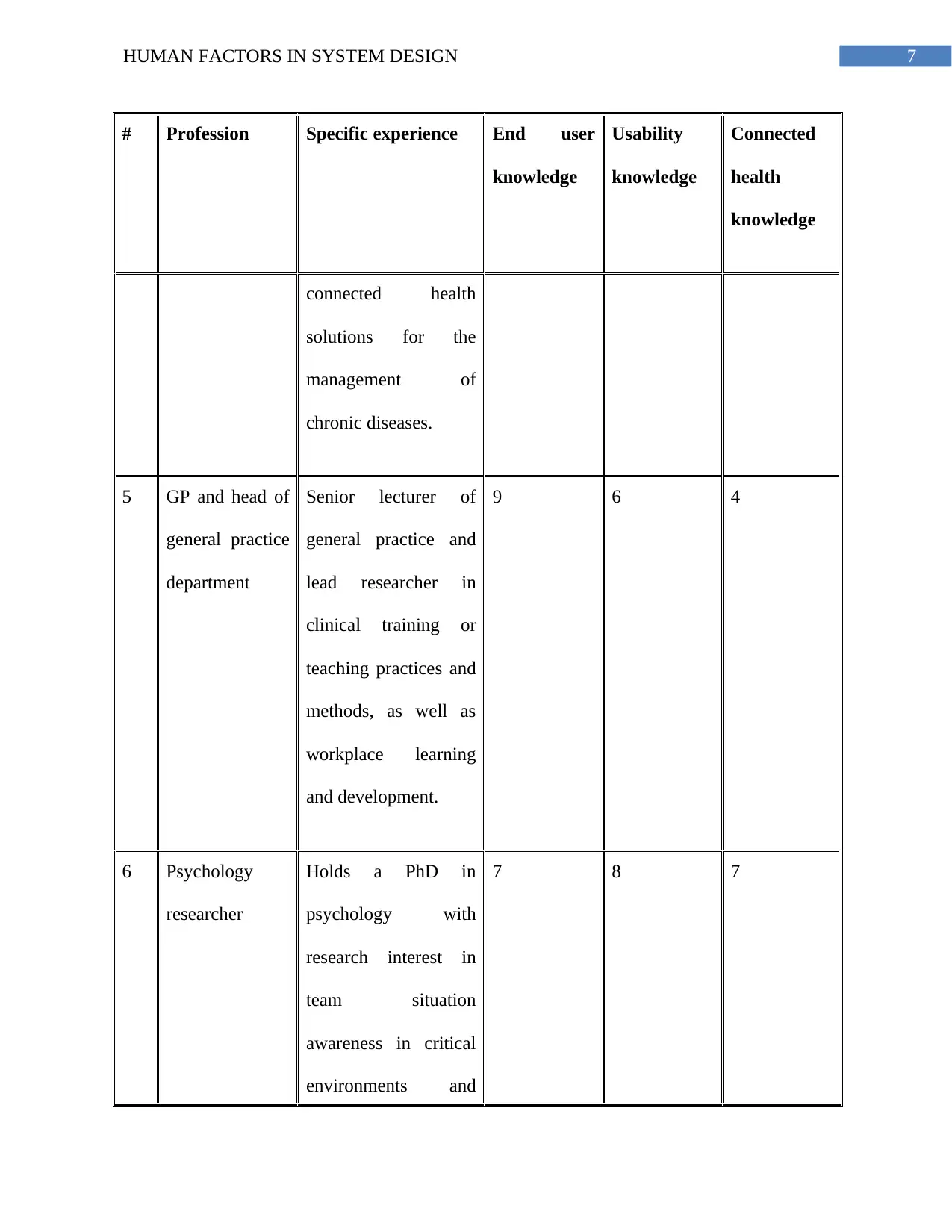
The combined expert analysis and end user analysis identified 21 problems. 13 examples
of problems is presented, which are presented in Table 2. These 13 problems were chosen for
illustration because they represent unique problems, the other 8 problems were considered
repetitions or derivatives of the other 13, and therefore, it was not important to describe them.
The problem ID number assigned to each problem was used for the remainder of the design
process to allow for easier problem tracking throughout the process.
The problems from Table 2 are presented in Table 3 in order of severity rating based on
the mean Likert scores assigned by the experts. The maximum individual score that was given by
the 10 experts is also included to highlight the fact that some experts may have given a more
severe rating than what the mean or standard deviation indicates. The heuristic category to which
each problem belongs is also included.
Problem ID
number
Problem description (use case scenario)
1 The difference in operation between the home button and back button is not clear
(user minimizes app)
2 Overall login sequence (user must log in to the app)
3 Buttons on keypad are too small for this population (user must log in to the app)
4 WIISELaicon not prominent enough on app menu (user must check the system status)
15HUMAN FACTORS IN SYSTEM DESIGN
Problem ID
number
Problem description (use case scenario)
5 Having to upload the data will be too hard to remember to do (uploading data by
exiting app)
6 Feedback during the process is not clear or may cause anxiety (uploading data by
exiting app)
7 No prompt to indicate to the user that a manual connection is now required (user must
connect to the insoles)
8 Colors are too similar in places (uploading data by exiting app)
9 Feedback regarding connection status is unclear (user connects to insoles using app)
10 Homescreen information is not clear (user must check the system status)
11 Options presented are not clear (fall alarm or notification)
12 App text is too small (user must check the system status)
13 Buttons on exit screen need to be bigger (uploading data by exiting app)
Paraphrase This Document
Need a fresh take? Get an instant paraphrase of this document with our AI Paraphraser
16HUMAN FACTORS IN SYSTEM DESIGN
Table 2: List of identified problems and which use case scenario it was identified in
(Source: )
aWIISEL: wireless insole for independent and safe elderly living.
Problem ID
number
Heuristic category Severity
rating
(0-4) (σ)
Max severity rating
given
(0-4)
1 Cognitive directness 2.5 (1.2) 4
2 Consistency and compliance of task
structure
2.4 (1.1) 4
3 Discernibility (button size) 2.2 (1.3) 4
4 Discernibility (icons) 2.2 (1.3) 4
5 Consistency and compliance of task
structure
2.1 (0.9) 3
6 Completeness and sufficiency of
meaning
2.1 (1) 4
17HUMAN FACTORS IN SYSTEM DESIGN
Problem ID
number
Heuristic category Severity
rating
(0-4) (σ)
Max severity rating
given
(0-4)
7 Consistency and compliance of task
structure
1.9 (0.6) 4
8 Discernibility (color tone and
contrast)
1.9 (1.2) 4
9 Completeness and sufficiency of
meaning
1.7 (0.9) 4
10 Completeness and sufficiency of
meaning
1.5 (0.8) 4
11 Consistency and compliance of task
structure
1.4 (1) 3
12 Discernibility (text size) 1.3 (0.75) 3
13 Button size (discernibility) 1.2 (0.9) 4
Table 3: Problems uncovered by experts and rated based on mean Likert scores
18HUMAN FACTORS IN SYSTEM DESIGN
(Source: )
The results of the expert analysis and the end user analysis were compiled separately and
then were presented in a problem report for system developers, with all problems listed with
severity ratings and related testimony. The developers returned a proposal on how each problem
could be solved, which were then reviewed by the usability engineering team. Examples of
proposals that were accepted by the usability engineers are shown in Table 4.
Problem
ID
number
System developer comments
2 The login will be a once off action carried out at the clinic to simply match the
data coming through to the patient who is using the app. The app was debugged so
that any crashes should not mean the user has to log back into the app (login
cookie is stored on phone cache). We will also make it so that the user can see the
password as they are typing to decrease the chance of error, as suggested by the
experts.
4 We will change this to a more prominent symbol that will be slightly bigger
although is constrained by the operating system. We will make this symbol the
same icon as the app icon.
6 We will change the feedback text to “Are you sure you want to close this
application? After closing, the data will be sent to the server.” We will also change
Secure Best Marks with AI Grader
Need help grading? Try our AI Grader for instant feedback on your assignments.
19HUMAN FACTORS IN SYSTEM DESIGN
Problem
ID
number
System developer comments
the caution symbol to an Information symbol based on your suggestion.
8 Contrast has been increased and text size increased to make it more prominent
against the dark background.
9 We will remove the text “connect in 10 seconds pop-up” and just have “auto
connection started” and “an everything is ok” pop-up once sequence is complete.
10 The “timer” text has been removed. We will also introduce colors for the symbols,
red when the symbol is not in the ideal state, and green when it is.
11 We will introduce a green and red button choice with related symbols.
12 Text size will be increased and some redundant components will be removed from
the interface to make more space.
Table 3: Problems that were directly addressed by system developers
(Source: )
Part Six: Findings of Evaluation
Overview
20HUMAN FACTORS IN SYSTEM DESIGN
We have presented a multi-phase, mixed-method HCD approach to improve the user
experience of a smartphone interface, which forms part of a connected health system. Our
approach was designed to uncover and mitigate any usability problems as early as possible,
before they were exposed to end users during usability testing and in formal clinical trials. This
paper presents one full cycle of our HCD process, with each phase representing an iteration
where a design update or refinement took place. Our approach has met the specific
recommendations for a HCD process. We have adopted the input of multi-disciplinary skills and
perspectives by eliciting the feedback of both an end-user group and an appropriately
experienced expert group throughout the process. We have sought to gain an explicit
understanding of users, tasks, and environments and consideration of the whole user experience
through the adoption of a use case that provided context of use for system tasks and scenarios
and through the examination of the perceptual and cognitive needs of the target end user. We
utilized a user-centered evaluation driven design using standard usability evaluation metrics at
each point in the cycle. We involved users throughout the design process, at both early and later
stages. Finally, we employed an iterative process, split into 3 stages or phases that allowed for
user feedback to be worked into design updates.
Principal Findings
From our observation of older adults’ interactions with smartphone interfaces, there were
some recurring themes. Clear and relevant feedback as the user attempts to complete a task is
critical (in line with contemporary literature). Feedback should include pop-ups, sound tones,
color or texture changes or icon changes to indicate that a function has been completed
successfully, such as for the connection sequence (problem ID# 9). For text feedback, clear and
unambiguous language should be used so as not to create anxiety, particularly when it comes to
21HUMAN FACTORS IN SYSTEM DESIGN
saving data such as in the data upload sequence (problem ID# 6). Older adults not familiar with
technology are often afraid that they might delete something by accident or fail to save important
data properly. Warning tones or symbols, such as a caution symbol, should only be used if
absolutely necessary. For audio feedback, clear and low frequency tones should be used. Login
sequences where the user is required to input text with a QWERTY keyboard should be avoided
(problem ID 2), particularly for those who have no previous touchscreen experience. If a login
sequence is considered necessary for security or identification purposes, it should be ensured that
a login process is made as simple as possible (do not hide password, be clear about what
username is required, supply ample support documentation for process). For simple interface
elements, text sizes should be at least 10pts (Didot system), whereas button sizes should have a
surface area of no less than approximately 200mm2.
In terms of metrics, we used 4 different subjective measurement systems (Likert scales,
ASQ, NASA-TLX, and SUS) to assess the usability of the interface at different stages. The
Likert scales allowed for quick satisfaction ratings of the perceived ease of use of each task in
the use case and of the suitability of interface elements such as text and button size. The ASQ
was more suitable for postscenario ratings when the user had actually completed the task,
whereas the NASA-TLX was used to supplement the ASQ to provide further details on what
kind of burden, be it physical or cognitive, the task placed on the user. The SUS was utilized
when the user had completed a full use of the system and carried out all tasks. We observed that
all of these metrics are providing the similar information, just in slightly different resolutions,
and that a mixture of metrics allows us different insights into user perceptions of usability. For
example, in phase 3, from looking at the ASQ scores of the login sequence, we could conclude
that the user was satisfied with the ease of the task. However, when we looked at the NASA-
Paraphrase This Document
Need a fresh take? Get an instant paraphrase of this document with our AI Paraphraser
22HUMAN FACTORS IN SYSTEM DESIGN
TLX scores, we observed that the task was creating a large mental demand on them. These 2
metrics, whereas showing us seemingly conflicting pieces of information, may be telling us that
the user judged the task as being easy simply because they completed it successfully, regardless
of the difficulty they encountered or the time it had taken them. It is only when they think about
the task in terms of the NASA metrics that they become honest about what kind of burden the
task placed on them. The SUS was a useful general indicator of overall usability but its wide
variability suggests that it is best used with larger sample sizes. High SUS scores do not
guarantee the system will not suffer usability problems in the field. These metrics are probably
best used to supplement more objective metrics such as task times and error rates.
Procedural Observations
In terms of efficiency, our methodology proved to be successful. The utilization of the
use case analysis activities during phase 1 provided a focus for all stakeholders on the context of
and the intended use of the system. The time it took for each individual to analyze and provide
feedback was on average 1 h. Within this hour, the individual was experiencing and commenting
on context, was being formally interviewed, was filling out questionnaires, and was providing
opinions on interface concepts. Therefore in one session the use case analysis provides multiple
streams of data, whereas in previous literature, this kind of feedback would need to be gathered
across multiple activities, such as surveys, interviews, and ethnographic observations. In phase 2,
the use of expert inspection groups also proved highly efficient. We recommend that research
groups and design teams maintain an inspection group who can carry out on hand inspections of
new system versions. This group, which can comprise 4-6 members, need not necessarily be
qualified usability engineers but can be trained in techniques such as heuristic evaluations and
cognitive walkthroughs. In terms of how long it took to complete each phase, as this was a case
23HUMAN FACTORS IN SYSTEM DESIGN
study as part of a research project, the amount of time spent on each phase was probably drawn
out longer than it would be in a more industrial setting. In all, the 3 phases together took
approximately 12 months, with phase 1 taking the bulk of the time (approximately 6 months) as
use cases were developed and redeveloped and end users were interviewed and tested. After the
app was developed and testable, the phases became shorter, with phase 2 and 3 taking
approximately 3-4 months each. As the methodology is applied in future, it will become more
refined, allowing for quicker development cycles.
Limitations
Time and technology constraints meant that not all design requirements could be
implemented. For example, the replacement of the manual data upload with an automatic
periodic data upload could not be implemented in time by the engineering team. Similarly, the
structure of the Android OS meant that some user and expert recommendations could not be
implemented, particularly regarding the positioning of pop-ups or the nature of data storage.
Some design changes led to a decrease in user experience, particularly for the fall alarm
sequence (problem ID# 11). It became clear during user testing that the use of red and green in
an emergency situation may not be the best practice, with some users confusing the red
emergency button for a cancel button, like it may be presented on a phone call screen (red for
“hang-up”). In this case, the design team failed to take into account the recommendation of one
expert who predicted that a red or green option may cause confusion. We can conclude from this
that taking on board opinions from different stakeholders can present a challenge for designers.
However, the nature of our iterative methodology meant that this problem was identified and
addressed between phase 2 and 3.
24HUMAN FACTORS IN SYSTEM DESIGN
In phase 1, the older adult end users tended to be very optimistic about how they would
handle the system and the smartphone interface, overall giving higher scores in response to
Likert statements and for the overall SUS score. Experts tended to be more pessimistic but this
was probably due to their vast experience with older adults and technology. Most experts
conceded that the use case analysis was a hypothetical one and that the capabilities of the older
adult population are extremely variable, however, they felt that it was an extremely useful
exercise in identifying major potential problems and addressing them early in the design process.
Despite the difference in outlook between the experts and older adults, both groups reached
agreement on most problems, particularly about the perceived difficulty of the login process and
the lack of clear feedback when checking the system status and during the data upload process.
We can conclude from this that utilizing multiple perspectives from different groups is an
important feature of a good human-centered design process.
Conclusions
The HCD Methodology we have designed and implemented based on the principles of
ISO 9241-210 has produced a functional app interface that is now suitable for exposure to older
adults in long term clinical trials. We have applied appropriate testing techniques given the
context of the interface being assessed. We would consider this a thorough and robust method for
testing and informing design changes of all types of interactive connected health systems.
Secure Best Marks with AI Grader
Need help grading? Try our AI Grader for instant feedback on your assignments.
25HUMAN FACTORS IN SYSTEM DESIGN
Bibliography
Aromaa, S. and Väänänen, K., 2016. Suitability of virtual prototypes to support human
factors/ergonomics evaluation during the design. Applied ergonomics, 56, pp.11-18.
Aykin, N. ed., 2016. Usability and internationalization of information technology. CRC Press.
Czaja, S.J., Zarcadoolas, C., Vaughon, W.L., Lee, C.C., Rockoff, M.L. and Levy, J., 2015. The
usability of electronic personal health record systems for an underserved adult
population. Human factors, 57(3), pp.491-506.
Fisk, A.D., Czaja, S.J., Rogers, W.A., Charness, N. and Sharit, J., 2018. Designing for older
adults: Principles and creative human factors approaches. CRC press.
Harte, R., Quinlan, L.R., Glynn, L., Rodríguez-Molinero, A., Baker, P.M., Scharf, T. and
ÓLaighin, G., 2017. Human-centered design study: enhancing the usability of a mobile phone
app in an integrated falls risk detection system for use by older adult users. JMIR mHealth and
uHealth, 5(5).
Orfanou, K., Tselios, N. and Katsanos, C., 2015. Perceived usability evaluation of learning
management systems: Empirical evaluation of the System Usability Scale. The International
Review of Research in Open and Distributed Learning, 16(2).
Proctor, R.W. and Van Zandt, T., 2018. Human factors in simple and complex systems. CRC
press.
1 out of 26
Related Documents
Your All-in-One AI-Powered Toolkit for Academic Success.
+13062052269
info@desklib.com
Available 24*7 on WhatsApp / Email
Unlock your academic potential
© 2024 | Zucol Services PVT LTD | All rights reserved.