Interface Usability Analysis Report: Farm Shop Mobile Application
VerifiedAdded on 2021/06/15
|6
|980
|23
Report
AI Summary
This report presents an interface usability analysis of the Farm Shop mobile application, utilizing Nielsen's Heuristics as a framework for evaluation. The analysis identifies several design issues, including the lack of visibility of system status in the restaurant booking feature and the absence of product images in the cart page. The report also points out inconsistencies in the presentation of offers and the absence of a back button. The report provides detailed recommendations to address these usability problems, such as adding party booking information to the restaurant page, incorporating a back button, and displaying product images in the cart. The analysis aims to improve the overall user experience and efficiency of the Farm Shop application.
Running head: INTERFACE USABILITY ANALYSIS
Interface Usability Analysis
Name of the student:
Name of the University:
Author note:
Interface Usability Analysis
Name of the student:
Name of the University:
Author note:
Paraphrase This Document
Need a fresh take? Get an instant paraphrase of this document with our AI Paraphraser
2
INTERFACE USABILITY ANALYSIS
Nielsen’s Heuristics
The Nielsen’s Heuristics analysis shall be adapted to analyze and evaluate the user
interface of the concerned mobile application. The Nielsen’s Heuristics is one of the most
commonly used approaches in the field of User Interface design analysis. It represents a list
of ten general principles for designing interactive platforms.
The reason behind choosing this approach is that the Nielsen’s Heuristics provides
almost every possible aspect in which a user interface must be tested before delivering to the
client or making a platform go live before the users.
In order to evaluate the interface design, the following principles from the Nielsen’s
Heuristics are to be weighed against the usability features provided by the concerned
application interface. The principles are as follows:
Visibility of system status
Match between system and the real world
User control and freedom
Consistency and standards
Error prevention
Recognition rather than recall
Flexibility and efficiency of use
Aesthetic and minimalist design
Help users recognize, diagnose, and recover from errors
Help and documentation
This report will cover all the necessary principles from those that are listed above
and evaluate the pros and cons of the interface designs that have been created for the Farm
Shop mobile application.
3
INTERFACE USABILITY ANALYSIS
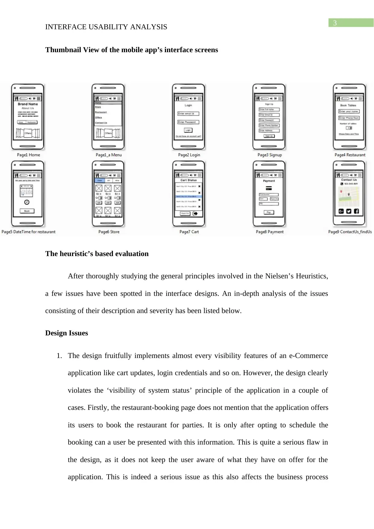
Thumbnail View of the mobile app’s interface screens
The heuristic’s based evaluation
After thoroughly studying the general principles involved in the Nielsen’s Heuristics,
a few issues have been spotted in the interface designs. An in-depth analysis of the issues
consisting of their description and severity has been listed below.
Design Issues
1. The design fruitfully implements almost every visibility features of an e-Commerce
application like cart updates, login credentials and so on. However, the design clearly
violates the ‘visibility of system status’ principle of the application in a couple of
cases. Firstly, the restaurant-booking page does not mention that the application offers
its users to book the restaurant for parties. It is only after opting to schedule the
booking can a user be presented with this information. This is quite a serious flaw in
the design, as it does not keep the user aware of what they have on offer for the
application. This is indeed a serious issue as this also affects the business process
⊘ This is a preview!⊘
Do you want full access?
Subscribe today to unlock all pages.

Trusted by 1+ million students worldwide
4
INTERFACE USABILITY ANALYSIS
directly. Another visibility status flaw in the system is that the offers section is only
visible in the home page. The users are not presented with the offers section for every
section that they are navigating.
2. The design has quite a handsome set of basic features, however there is no option put
into the application that will allow the users to view the application in their preferred
language. This can however be listed as a minor issue.
3. It is understandable that opting to leave out the graphical back button from the
interface screens was one of the ideas that enhanced screen space usability for the
designers and also that the designers has diligently fulfilled the principle for design
consistency and standards. Nevertheless, it is recommendable that the users should
have the on screen back key in order to navigate back to the previous page. This
provides novice users with much more flexibility. This may lead the novice users into
keying in wrong buttons and causing the application to perform with errors.
4. Recognition rather than recall is one field from the heuristic where the design fails to
meet the right standards in one situation. The carts page does not show the image of
the products added. This can be considered as a serious design flaw and should be
mended with utter precision. The restaurant booking feature also violates this
principle as when the user moves onto the scheduling page, the users are not
presented with the table details that they have booked.
5. Nowhere in the restaurant booking section is the price of the booking presented. This
is another serious flaw in the application and one that should be mended at once. It is
poor designing principles to encourage the user to take help of contact methods to get
information about such necessities.
Paraphrase This Document
Need a fresh take? Get an instant paraphrase of this document with our AI Paraphraser
5
INTERFACE USABILITY ANALYSIS
Recommendations
The following remedies can be adapted to improve the overall quality of the design
and fix the above mentioned issues:
1. The party booking information should be added in the restaurant page at the very top
alongside making amendments to accommodate price information in the same page as
the scheduler.
2. A simple back button should be presented on the top menu bar by adjusting the size
and location of the existing options. The search bar can be made to contract and
expand depending on user’s click. This will save up space for the back button to be
placed in the top left corner.
3. The images of the items put into the cart shall be presented in the carts page, so that
the users are allowed full flexibility in rethinking what they are buying.

6
INTERFACE USABILITY ANALYSIS
References
Hermawati, S., & Lawson, G. (2016). Establishing usability heuristics for heuristics
evaluation in a specific domain: Is there a consensus?. Applied ergonomics, 56, 34-51.
Hussain, A., & Mkpojiogu, E. O. (2016, August). Usability evaluation techniques in mobile
commerce applications: a systematic review. In AIP Conference Proceedings (Vol.
1761, No. 1, p. 020049). AIP Publishing.
⊘ This is a preview!⊘
Do you want full access?
Subscribe today to unlock all pages.

Trusted by 1+ million students worldwide
1 out of 6
Related Documents
Your All-in-One AI-Powered Toolkit for Academic Success.
+13062052269
info@desklib.com
Available 24*7 on WhatsApp / Email
![[object Object]](/_next/static/media/star-bottom.7253800d.svg)
Unlock your academic potential
Copyright © 2020–2026 A2Z Services. All Rights Reserved. Developed and managed by ZUCOL.


