Interface Usability Report for Local Farm Shop Application Design
VerifiedAdded on 2021/06/17
|23
|2543
|28
Report
AI Summary
This report details the interface usability of the 'Local Farm Shop' mobile application, presenting a comprehensive analysis of its design and user experience. The report is structured around ten interface designs, each featuring a wireframe, design decisions, and recommendations for improvement. The designs cover key aspects of the app, including the home page, login and registration pages, user profile, product display, order and cart pages, payment, location tracking, and restaurant booking. Each section includes recommendations from both the author's group and another group, along with justifications for accepting these suggestions. The report emphasizes user-friendliness, ease of navigation, and features like real-time location tracking, and the ability to book restaurants. The goal is to enhance customer satisfaction and improve the overall functionality of the app. The report concludes by synthesizing the recommendations, aiming to create a more intuitive and efficient user experience. The document is contributed by a student and is available on Desklib, a platform providing AI-based study tools for students.
Subject Code
Interface Usability Group
Name
1
Interface Usability
Group Name
Local Farm Shop
Group Name:
Student Id:
Student Name:
Date:
Student ID Student Name
Interface Usability Group
Name
1
Interface Usability
Group Name
Local Farm Shop
Group Name:
Student Id:
Student Name:
Date:
Student ID Student Name
Paraphrase This Document
Need a fresh take? Get an instant paraphrase of this document with our AI Paraphraser
Subject Code
Interface Usability Group
Name
2
Table of Contents
For Interface Design 1.....................................................................................................................3
For Interface Design 2.....................................................................................................................4
For Interface Design 3.....................................................................................................................6
For Interface Design 4.....................................................................................................................8
For Interface Design 5...................................................................................................................10
For Interface Design 6...................................................................................................................12
For Interface Design 7...................................................................................................................14
For Interface Design 8...................................................................................................................16
For Interface Design 9...................................................................................................................18
For Interface Design 10.................................................................................................................20
Bibliography..................................................................................................................................23
Student ID Student Name
Subject Code
Interface Usability Group
Name
3
For Interface Design 1
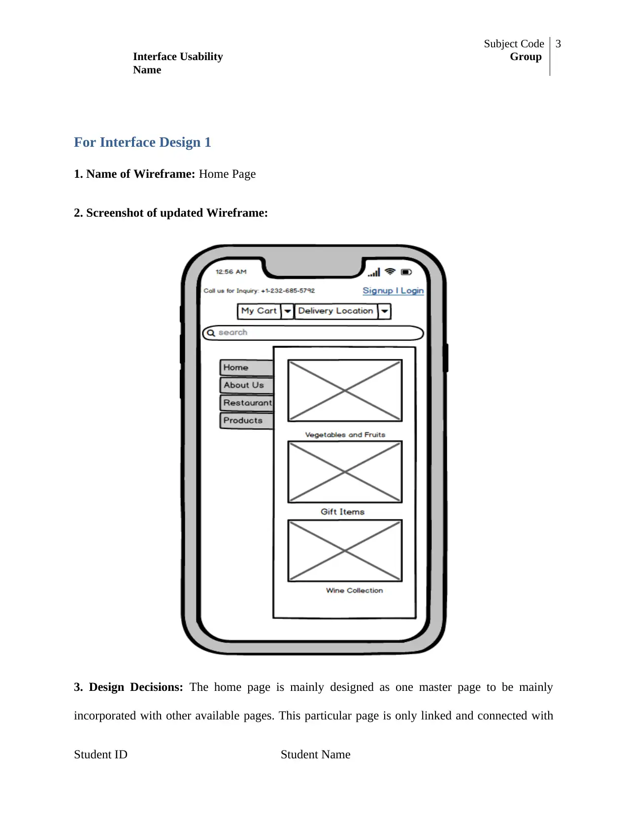
1. Name of Wireframe: Home Page
2. Screenshot of updated Wireframe:
3. Design Decisions: The home page is mainly designed as one master page to be mainly
incorporated with other available pages. This particular page is only linked and connected with
Student ID Student Name
⊘ This is a preview!⊘
Do you want full access?
Subscribe today to unlock all pages.

Trusted by 1+ million students worldwide
Subject Code
Interface Usability Group
Name
4
all various pages available in the Local Farm Shop application. The module of this particular
page is all same whereas there will be easy travelling to other pages from this particular page. All
pages updates and important information will be visible on the home page along all exiting offers
and different flash deals messages which helps to attract more customers in this particular page.
4. Recommendations of the Design: Some of the recommendations from the updated design of
Local Farm Shop app are discussed below:
From this updated design, it becomes easy to operate all available pages as all the pages
are inter-linked with home page.
In this updated design of home page, the less detail of all pages are available so that it
gives the clear idea of all pages which helps the visitor to get clear idea and navigation as
per their needs.
5. Justification of the recommendations: It is identified that the above design of this home
page will be accepted as it is clearly serving all options of home page. From the home page, any
customer can create/login their account, access their cart, set their exact location and also get to
know about the options of available item varieties.
For Interface Design 2
1. Name of Wireframe: Login Page
2. Screenshot of updated Wireframe:
Student ID Student Name
Paraphrase This Document
Need a fresh take? Get an instant paraphrase of this document with our AI Paraphraser
Subject Code
Interface Usability Group
Name
5
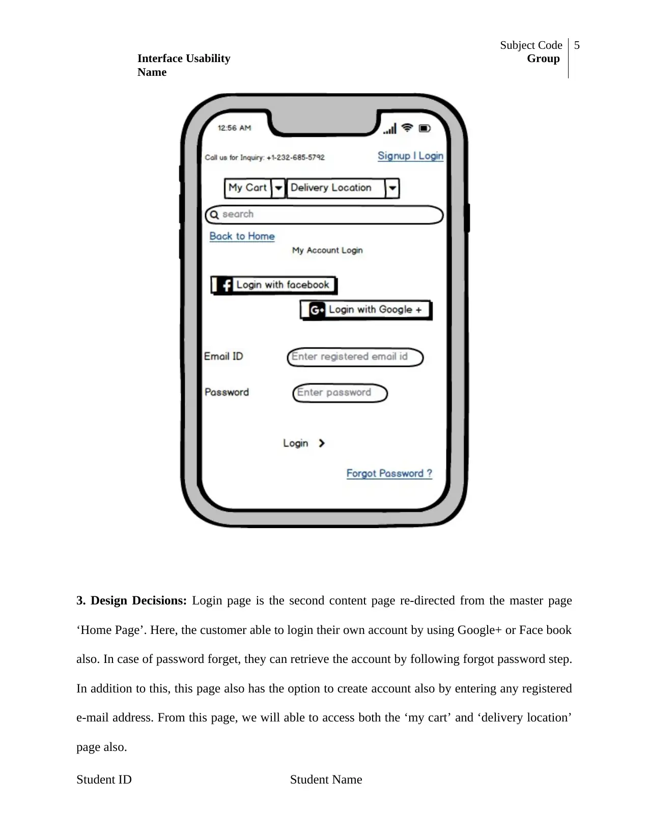
3. Design Decisions: Login page is the second content page re-directed from the master page
‘Home Page’. Here, the customer able to login their own account by using Google+ or Face book
also. In case of password forget, they can retrieve the account by following forgot password step.
In addition to this, this page also has the option to create account also by entering any registered
e-mail address. From this page, we will able to access both the ‘my cart’ and ‘delivery location’
page also.
Student ID Student Name
Subject Code
Interface Usability Group
Name
6
4. Recommendations of the Design: The recommendations from this updated login page of
Local Farm Shop Design are listed below:
From the other groups, it is recommended that the cart page should not be accessible
before doing sign up/registration of a new account. One can also only surf the products
but cannot store and proceed further after viewing any products.
From your group, the login page should have more options to login like to login using
customer’s valid phone number except any e-mail address.
5. Justification of the recommendations: After analyzing the above recommendations based on
the above updated interface design; it is identified that these recommendations should be
accepted for better co-operation with visiting customers from our end.
For Interface Design 3
1. Name of Wireframe: Registration Page
2. Screenshot of updated Wireframe:
Student ID Student Name
⊘ This is a preview!⊘
Do you want full access?
Subscribe today to unlock all pages.

Trusted by 1+ million students worldwide
Subject Code
Interface Usability Group
Name
7
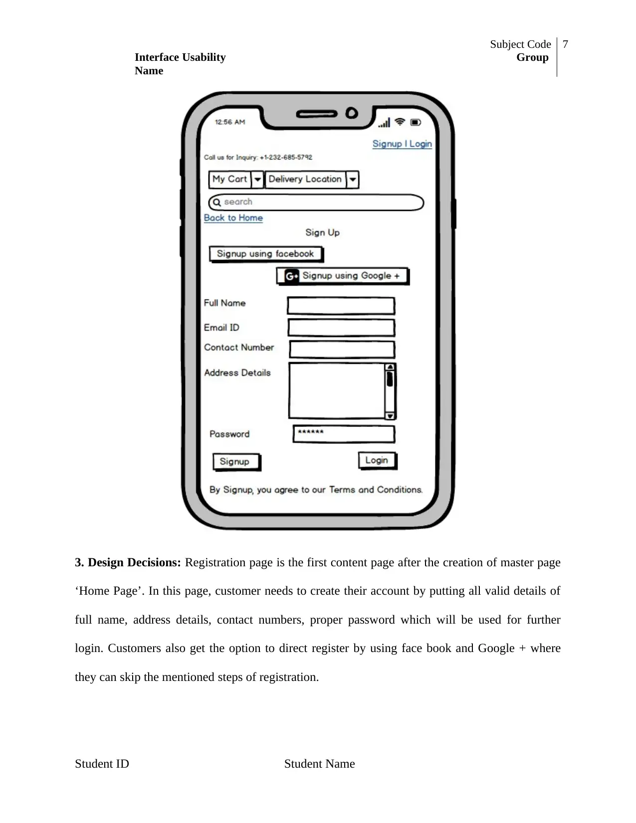
3. Design Decisions: Registration page is the first content page after the creation of master page
‘Home Page’. In this page, customer needs to create their account by putting all valid details of
full name, address details, contact numbers, proper password which will be used for further
login. Customers also get the option to direct register by using face book and Google + where
they can skip the mentioned steps of registration.
Student ID Student Name
Paraphrase This Document
Need a fresh take? Get an instant paraphrase of this document with our AI Paraphraser
Subject Code
Interface Usability Group
Name
8
4. Recommendations of the Design: Some of recommendations for the above mentioned
registration design page are given below:
From other group, in address details space, there should be the limit of putting details so
that customers just put their exact address in short and proper way. In addition, in contact
number, there should be the option to choose the country before entering the number so
that country code gets automatically generated.
From my own group, the full terms and condition should require to be viewed to the
customer before signing up so that they have clear idea about the website and its
accessibility.
5. Justification of the recommendations: From the above recommendations of the modified
design, it analyzed that all these needed to be implemented then this will surely helps in the
better performance of this mobile app.
For Interface Design 4
1. Name of Wireframe: User Profile Page
2. Screenshot of updated Wireframe:
Student ID Student Name
Subject Code
Interface Usability Group
Name
9
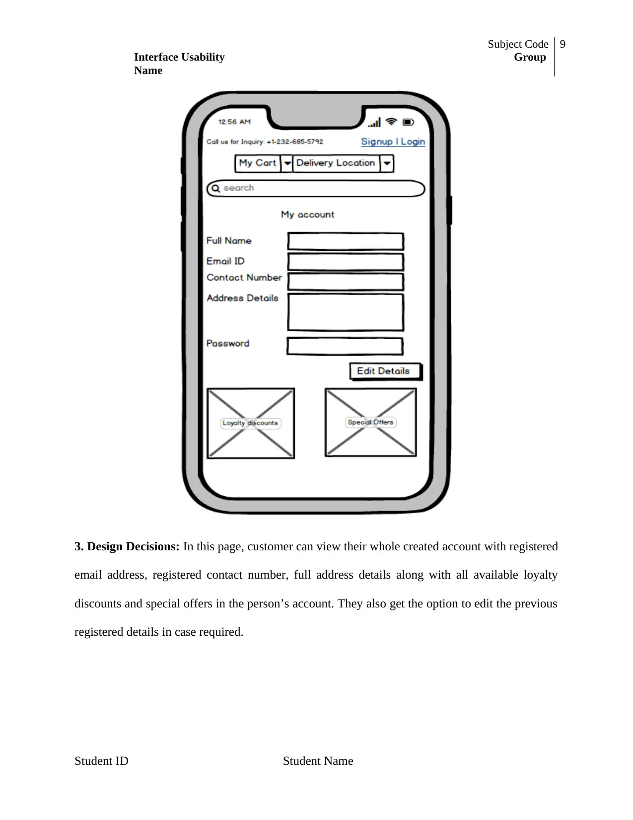
3. Design Decisions: In this page, customer can view their whole created account with registered
email address, registered contact number, full address details along with all available loyalty
discounts and special offers in the person’s account. They also get the option to edit the previous
registered details in case required.
Student ID Student Name
⊘ This is a preview!⊘
Do you want full access?
Subscribe today to unlock all pages.

Trusted by 1+ million students worldwide
Subject Code
Interface Usability Group
Name
10
4. Recommendations of the Design: Following of the recommendations based on the above
design of profile page is given below:
From the other group, there should be the option of subscribe of any special prime
membership and wish list from where customer get some more facilities and stored any
selected items in wish list for future assistance .
From my own group, the delivery location should be connected with the GPS system so
that real-time location details can be fetched.
5. Justification of the recommendations: From the above recommendations, it is identified
that all these are needed to be implement in the modified interface design. It will really helps to
make the mobile app more convenient to use and user-friendly.
For Interface Design 5
1. Name of Wireframe: Product Page
2. Screenshot of updated Wireframe:
Student ID Student Name
Paraphrase This Document
Need a fresh take? Get an instant paraphrase of this document with our AI Paraphraser
Subject Code
Interface Usability Group
Name
11
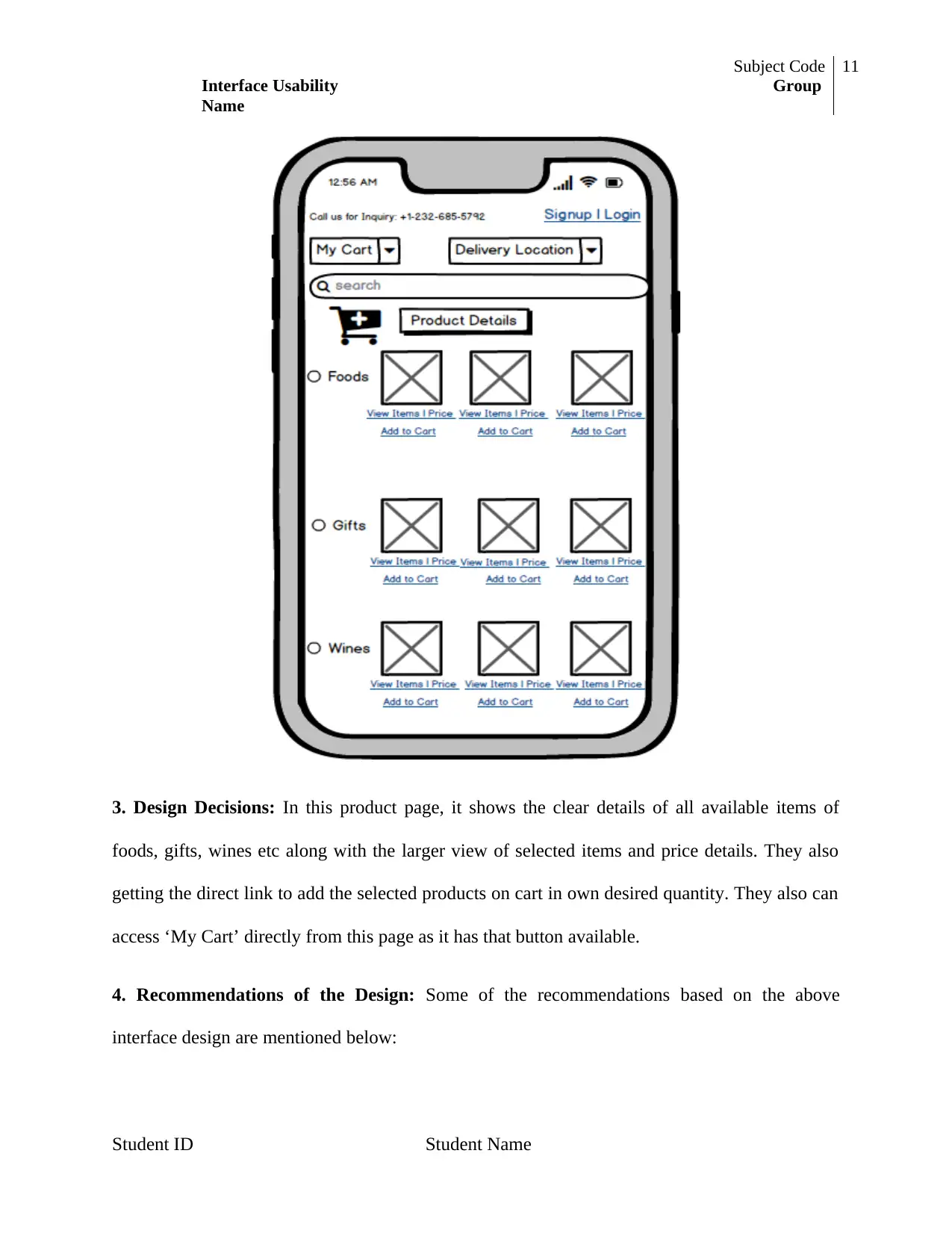
3. Design Decisions: In this product page, it shows the clear details of all available items of
foods, gifts, wines etc along with the larger view of selected items and price details. They also
getting the direct link to add the selected products on cart in own desired quantity. They also can
access ‘My Cart’ directly from this page as it has that button available.
4. Recommendations of the Design: Some of the recommendations based on the above
interface design are mentioned below:
Student ID Student Name
Subject Code
Interface Usability Group
Name
12
From the other group, under the each selected items there should the option of direct
payment ‘Buy Now’ option so that customer need not required to visit cart page incase of
one item at a time.
From my own group, there should be an option of quantity number option of all items
after selection. There should be the option of buying any products using prime
membership which reduces any types of available extra changes like delivery charge,
route-assistance, and delayed delivery.
5. Justification of the recommendations: From the above all recommendations, it is getting
clear by implementing all these points, it will surely improve the customer satisfaction and
customer visit.
For Interface Design 6
1. Name of Wireframe: Order Page
2. Screenshot of updated Wireframe:
Student ID Student Name
⊘ This is a preview!⊘
Do you want full access?
Subscribe today to unlock all pages.

Trusted by 1+ million students worldwide
1 out of 23
Related Documents
Your All-in-One AI-Powered Toolkit for Academic Success.
+13062052269
info@desklib.com
Available 24*7 on WhatsApp / Email
![[object Object]](/_next/static/media/star-bottom.7253800d.svg)
Unlock your academic potential
Copyright © 2020–2026 A2Z Services. All Rights Reserved. Developed and managed by ZUCOL.


