ITC 504 Assessment 1: Bike Share Application Design Alternatives
VerifiedAdded on 2024/06/28
|39
|1546
|194
AI Summary
Contribute Materials
Your contribution can guide someone’s learning journey. Share your
documents today.

ITC 504 Assessment 1
Student name: Raja Marneni
Student ID: 11611918
Student name: Raja Marneni
Student ID: 11611918
Secure Best Marks with AI Grader
Need help grading? Try our AI Grader for instant feedback on your assignments.
Alternative 1/screen 1
Alternative 1/screen 1
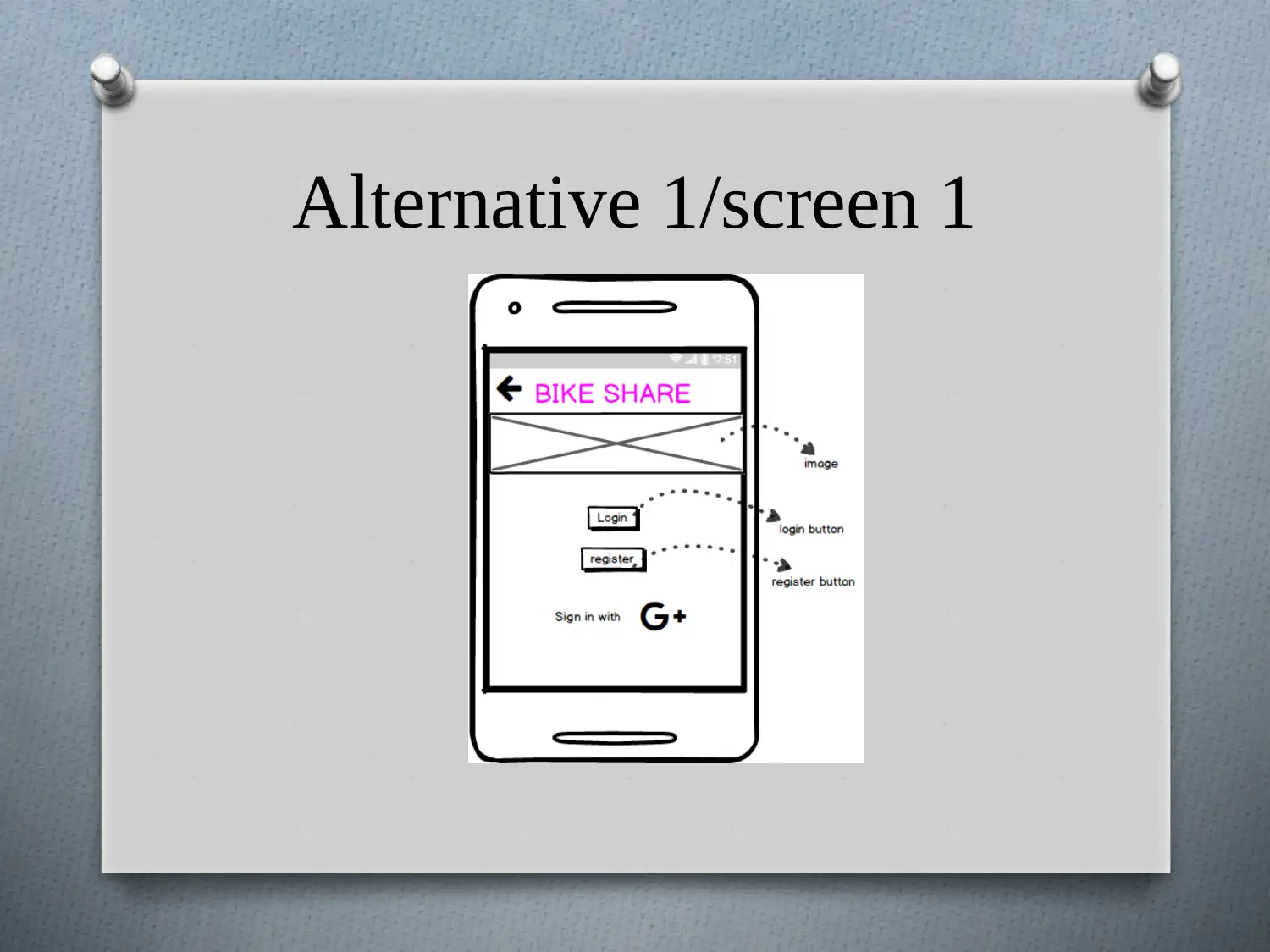
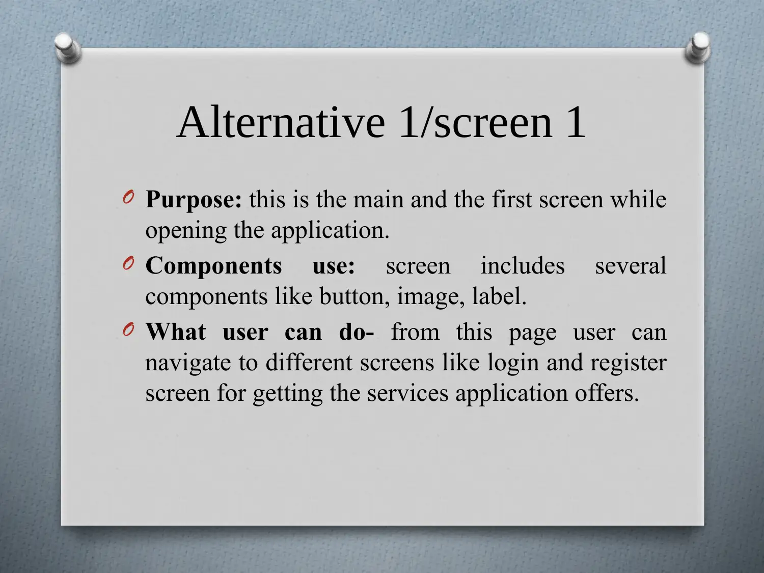
O Purpose: this is the main and the first screen while
opening the application.
O Components use: screen includes several
components like button, image, label.
O What user can do- from this page user can
navigate to different screens like login and register
screen for getting the services application offers.
Alternative 1/screen 2
Secure Best Marks with AI Grader
Need help grading? Try our AI Grader for instant feedback on your assignments.
Alternative 1/screen 2
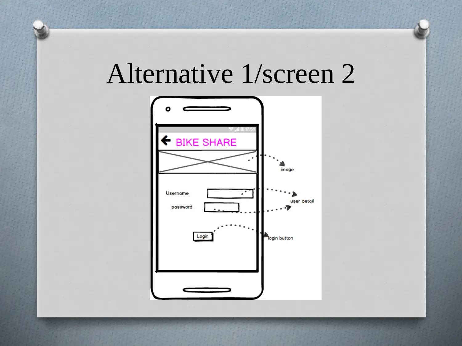
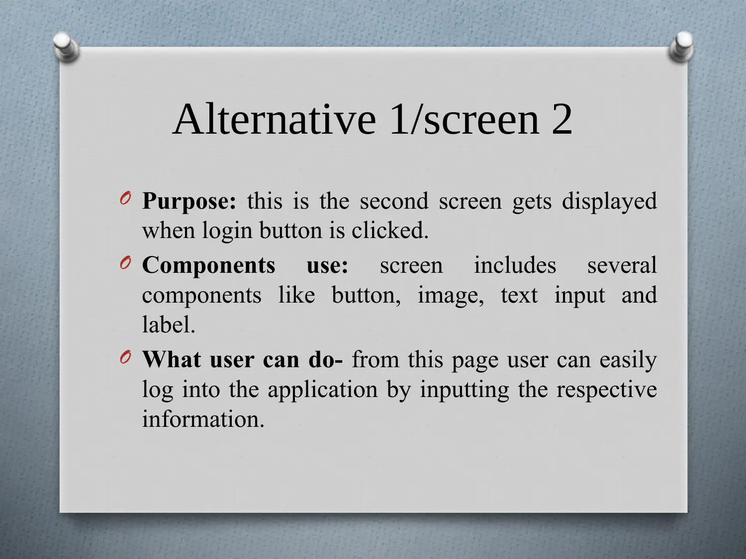
O Purpose: this is the second screen gets displayed
when login button is clicked.
O Components use: screen includes several
components like button, image, text input and
label.
O What user can do- from this page user can easily
log into the application by inputting the respective
information.
O Purpose: this is the second screen gets displayed
when login button is clicked.
O Components use: screen includes several
components like button, image, text input and
label.
O What user can do- from this page user can easily
log into the application by inputting the respective
information.
Alternative 1/screen 3
Alternative 1/screen 3
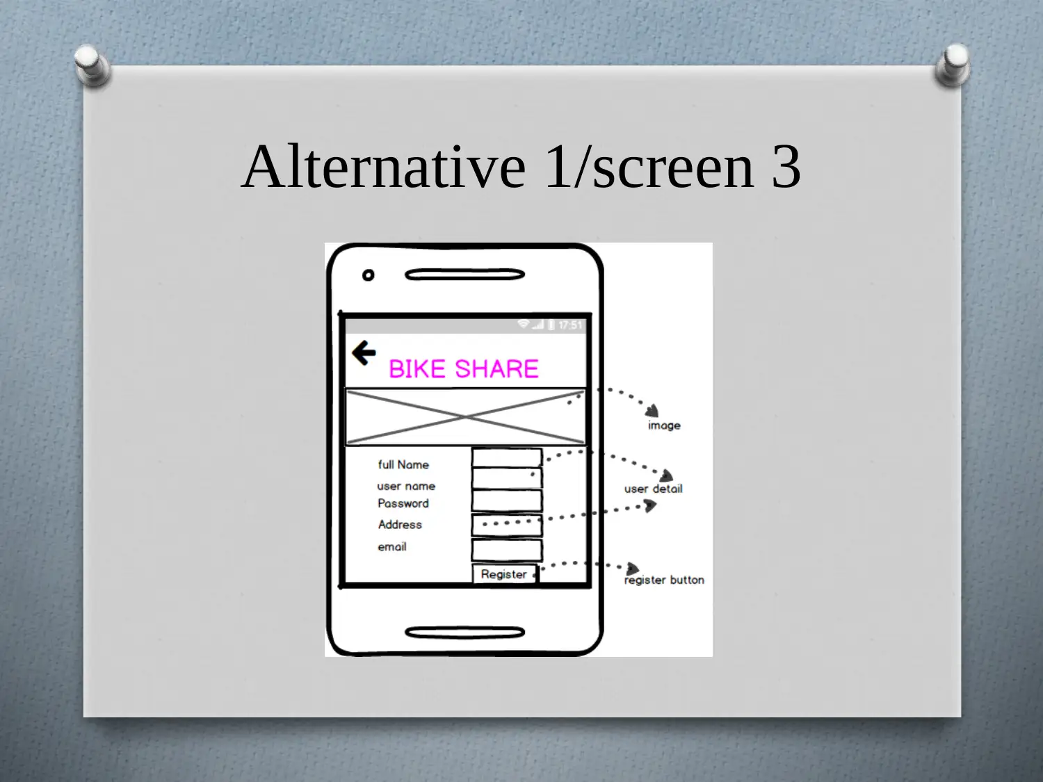
O Purpose: this is the screen gets displayed when
register button is clicked.
O Components use: screen includes several
components like button, image, text input and
label.
O What user can do- from this page user can easily
get register into the application by inputting the
respective information.
O Purpose: this is the screen gets displayed when
register button is clicked.
O Components use: screen includes several
components like button, image, text input and
label.
O What user can do- from this page user can easily
get register into the application by inputting the
respective information.
Paraphrase This Document
Need a fresh take? Get an instant paraphrase of this document with our AI Paraphraser
Alternative 1/screen 4
Alternative 1/screen 4
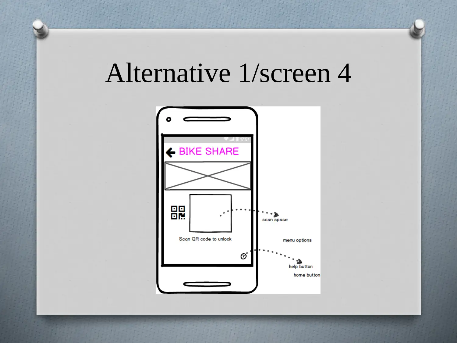
O Purpose: this is the unlock or scan screen.
O Components use: screen includes several
components like image, rectangle, symbols and
label.
O What user can do- from this page user can
unlock the bike by scanning the QR code present
on the bike they are hiring.
O Purpose: this is the unlock or scan screen.
O Components use: screen includes several
components like image, rectangle, symbols and
label.
O What user can do- from this page user can
unlock the bike by scanning the QR code present
on the bike they are hiring.
Alternative 1/screen 5
Secure Best Marks with AI Grader
Need help grading? Try our AI Grader for instant feedback on your assignments.
Alternative 1/screen 5
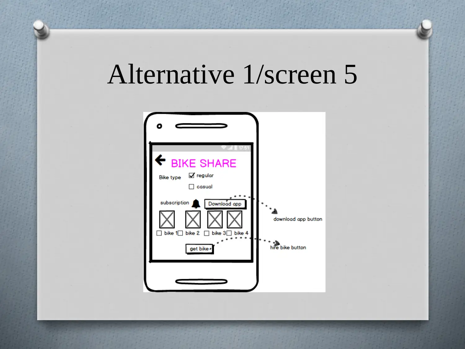
O Purpose: this is the type of customer subscription
screen.
O Components use: screen includes several
components like button, symbols, check box and
label.
O What user can do- this page is designed for the
user subscription based on the temporary and
permanent basis that is regular or casual
respectively and can select the desired bike.
Alternative 1/screen 6
Alternative 1/screen 6
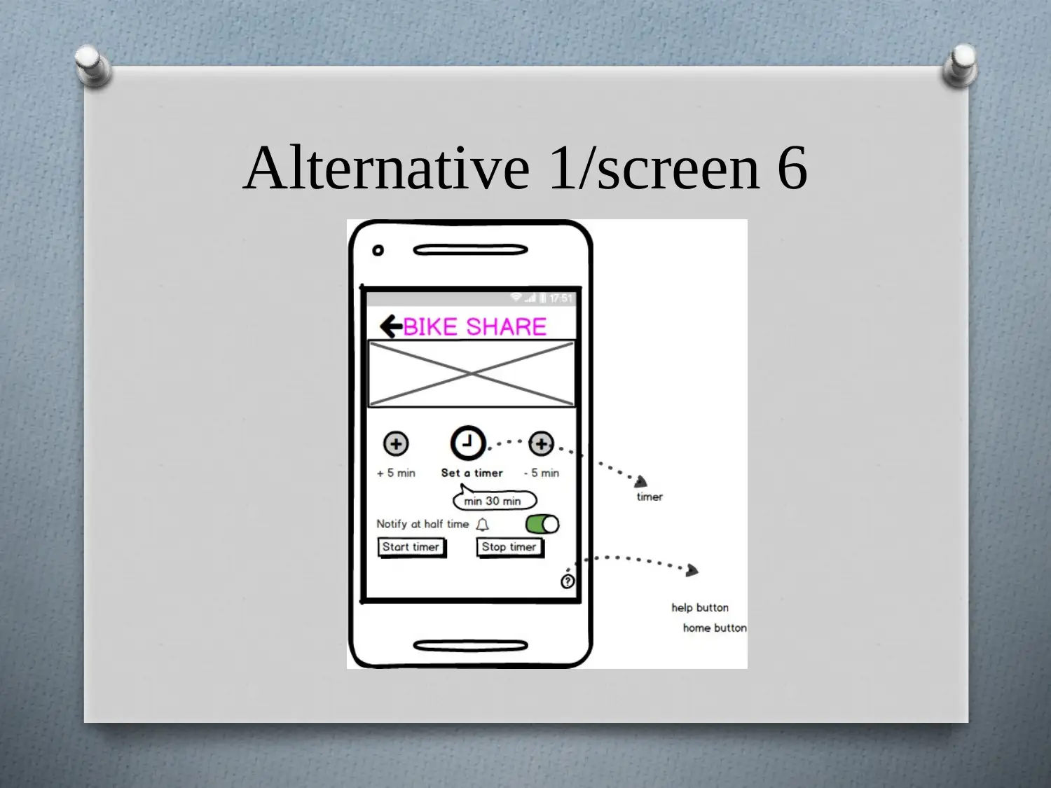
O Purpose: this is the timer screen.
O Components use: screen includes several
components like image, buttons, symbols,
tooltip, label and on/off switch.
O What user can do- from this page user can set
the timer for the duration he wants to hire the
bike, minimum duration is 30 min and
maximum is 8 hours.
Paraphrase This Document
Need a fresh take? Get an instant paraphrase of this document with our AI Paraphraser
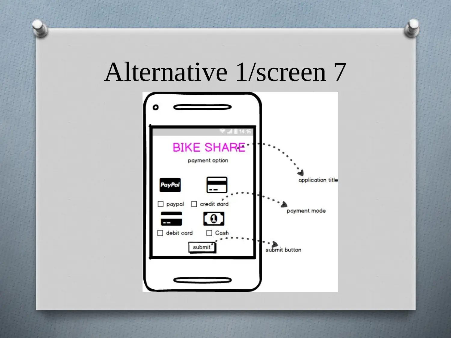
Alternative 1/screen 7
Alternative 1/screen 7
O Purpose: this is the payment screen.
O Components use: screen includes several
components like button, symbols, check box, and
label.
O What user can do- from this page user can pay
for bike hired by choosing the payment mode
and inputting the required information.
O Purpose: this is the payment screen.
O Components use: screen includes several
components like button, symbols, check box, and
label.
O What user can do- from this page user can pay
for bike hired by choosing the payment mode
and inputting the required information.
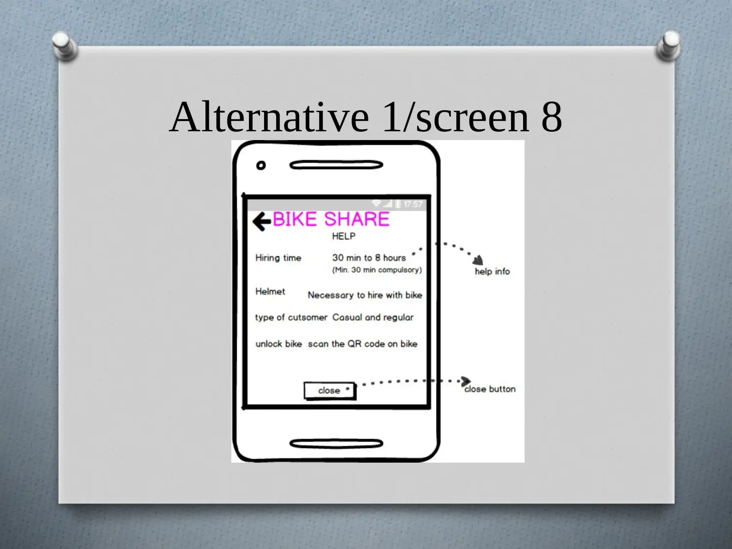
Alternative 1/screen 8
Secure Best Marks with AI Grader
Need help grading? Try our AI Grader for instant feedback on your assignments.
Alternative 1/screen 8
O Purpose: this is the help screen.
O Components use: screen includes several
components like button and labels.
O What user can do- from this page user can
take help and get their queries solved related to
different issues and services.
O Purpose: this is the help screen.
O Components use: screen includes several
components like button and labels.
O What user can do- from this page user can
take help and get their queries solved related to
different issues and services.
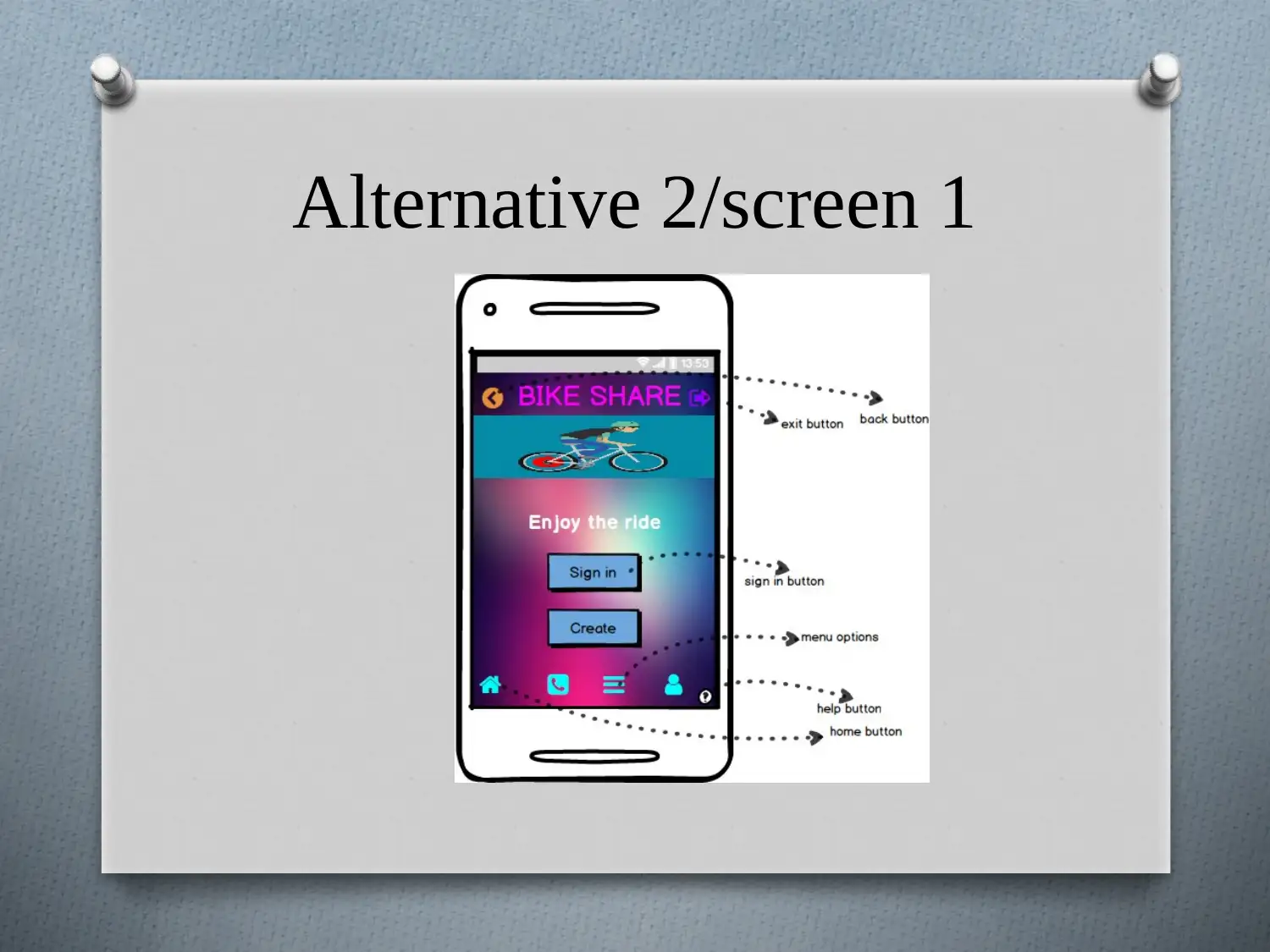
Alternative 2/screen 1
Alternative 2/screen 1
O Purpose: this is the main and the first screen
while opening the application.
O Components use: screen includes several
components like button, image, label and
different symbols.
O What user can do- from this page user can
navigate to different screens like login, register,
and help screen for getting the services
application offers.
Paraphrase This Document
Need a fresh take? Get an instant paraphrase of this document with our AI Paraphraser
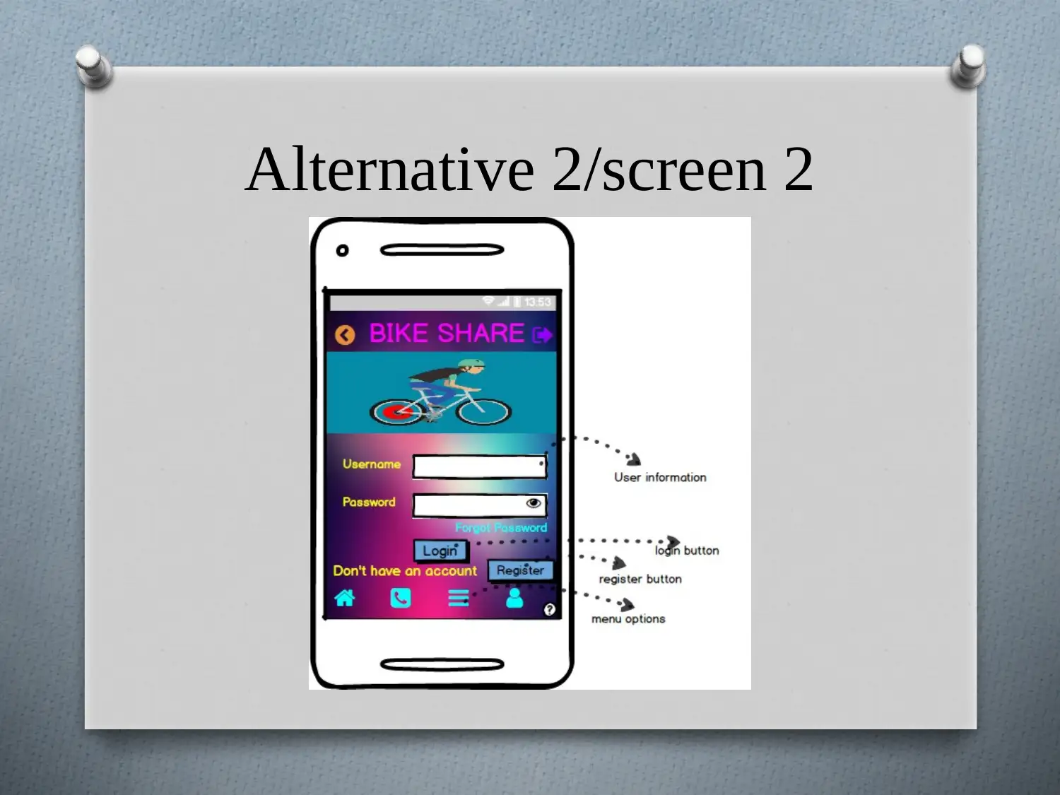
Alternative 2/screen 2
Alternative 2/screen 2
O Purpose: this is the second screen gets
displayed when login button is clicked.
O Components use: screen includes several
components like symbols, button, image, text
input and label.
O What user can do- from this page user can
easily log into the application by inputting the
respective information.
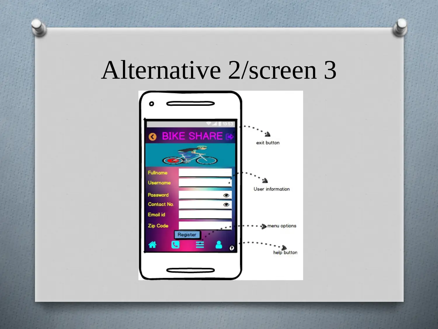
Alternative 2/screen 3
Secure Best Marks with AI Grader
Need help grading? Try our AI Grader for instant feedback on your assignments.
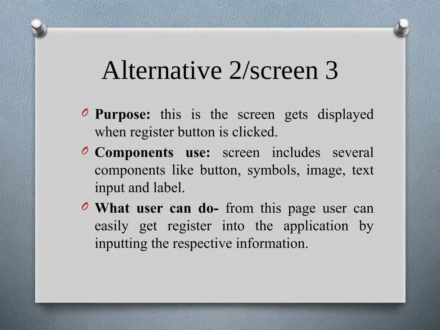
Alternative 2/screen 3
O Purpose: this is the screen gets displayed
when register button is clicked.
O Components use: screen includes several
components like button, symbols, image, text
input and label.
O What user can do- from this page user can
easily get register into the application by
inputting the respective information.
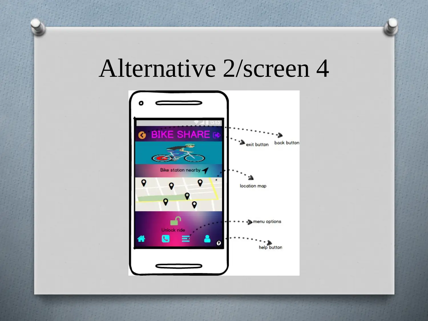
Alternative 2/screen 4
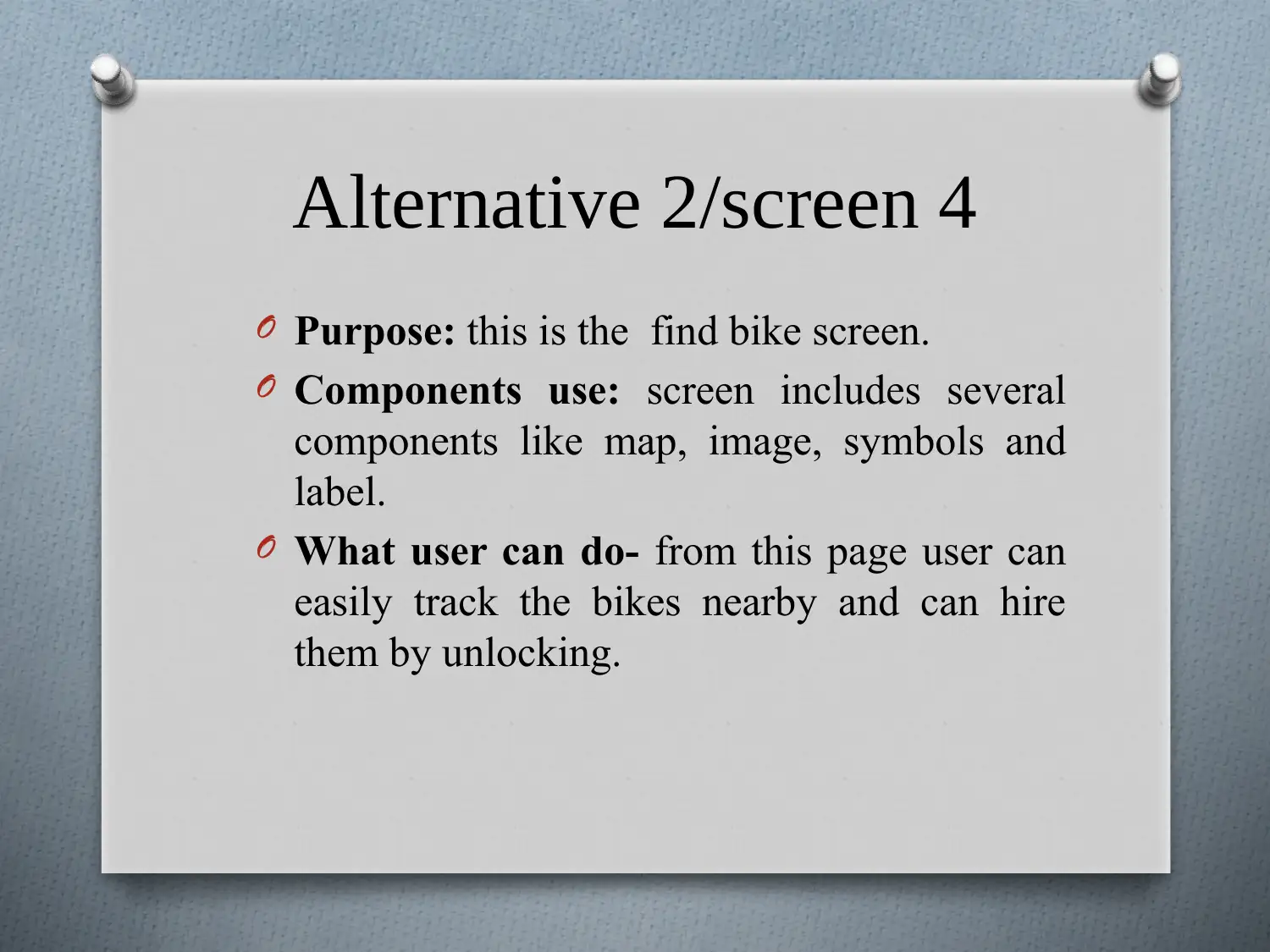
Alternative 2/screen 4
O Purpose: this is the find bike screen.
O Components use: screen includes several
components like map, image, symbols and
label.
O What user can do- from this page user can
easily track the bikes nearby and can hire
them by unlocking.
O Purpose: this is the find bike screen.
O Components use: screen includes several
components like map, image, symbols and
label.
O What user can do- from this page user can
easily track the bikes nearby and can hire
them by unlocking.
Paraphrase This Document
Need a fresh take? Get an instant paraphrase of this document with our AI Paraphraser
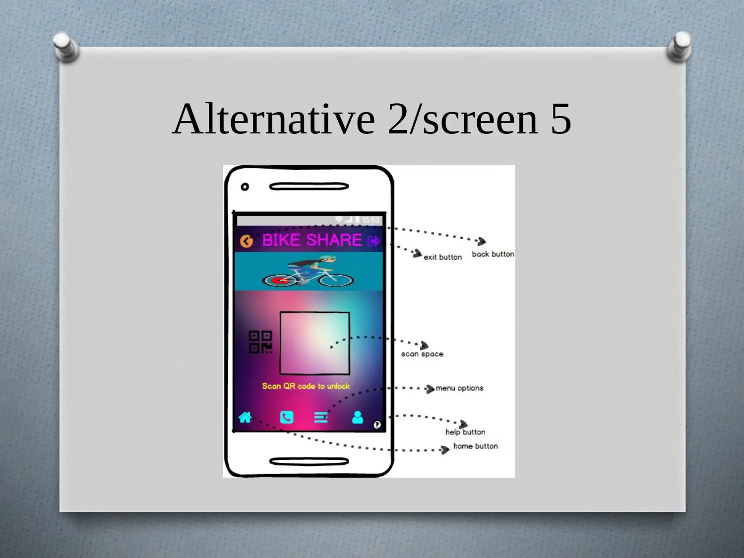
Alternative 2/screen 5
Alternative 2/screen 5
O Purpose: this is the unlock or scan screen.
O Components use: screen includes several
components like image, rectangle, symbols
and label.
O What user can do- from this page user can
unlock the bike by scanning the QR code
present on the bike they are hiring.
O Purpose: this is the unlock or scan screen.
O Components use: screen includes several
components like image, rectangle, symbols
and label.
O What user can do- from this page user can
unlock the bike by scanning the QR code
present on the bike they are hiring.
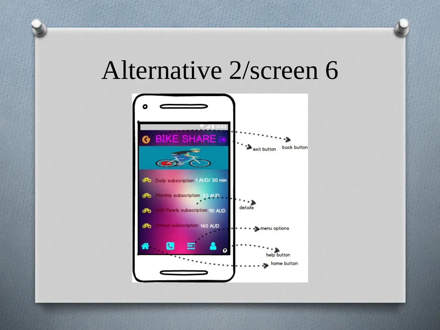
Alternative 2/screen 6
Secure Best Marks with AI Grader
Need help grading? Try our AI Grader for instant feedback on your assignments.
Alternative 2/screen 6
O Purpose: this is the subscription detail
screen.
O Components use: screen includes several
components like image, symbols and label.
O What user can do- from this page user can
get the different information about
subscription type and cost of the subscription.
O Purpose: this is the subscription detail
screen.
O Components use: screen includes several
components like image, symbols and label.
O What user can do- from this page user can
get the different information about
subscription type and cost of the subscription.
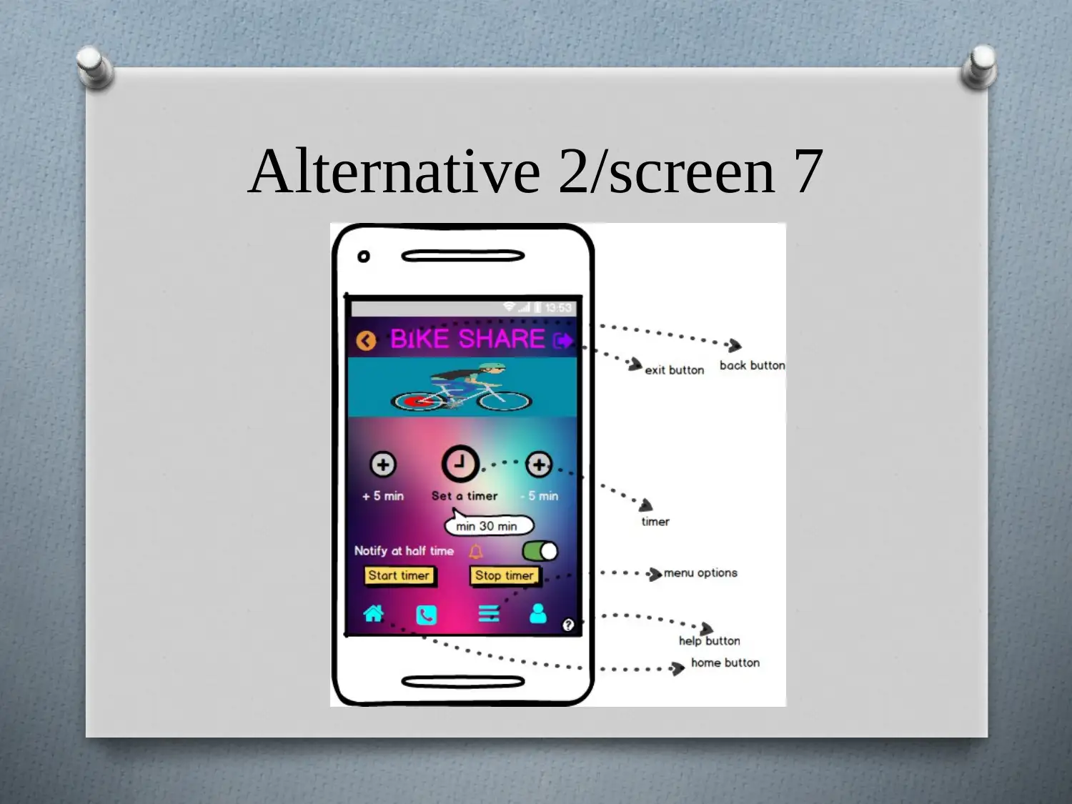
Alternative 2/screen 7
Alternative 2/screen 7
O Purpose: this is the timer screen.
O Components use: screen includes several
components like image, buttons, symbols, tooltip,
label and on/off switch.
O What user can do- from this page user can set the
timer for the duration he wants to hire the bike,
minimum duration is 30 min and maximum is 8
hours.
Paraphrase This Document
Need a fresh take? Get an instant paraphrase of this document with our AI Paraphraser
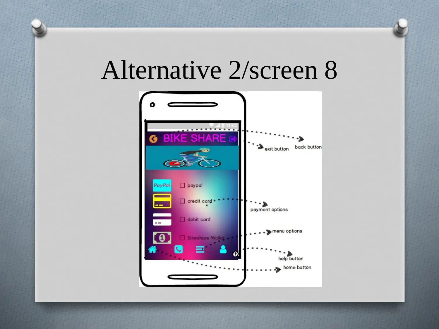
Alternative 2/screen 8
Alternative 2/screen 8
O Purpose: this is the payment screen.
O Components use: screen includes several
components like image, symbols, check box,
and label.
O What user can do- from this page user can
pay for bike hired by choosing the payment
mode and inputting the required information.
O Purpose: this is the payment screen.
O Components use: screen includes several
components like image, symbols, check box,
and label.
O What user can do- from this page user can
pay for bike hired by choosing the payment
mode and inputting the required information.
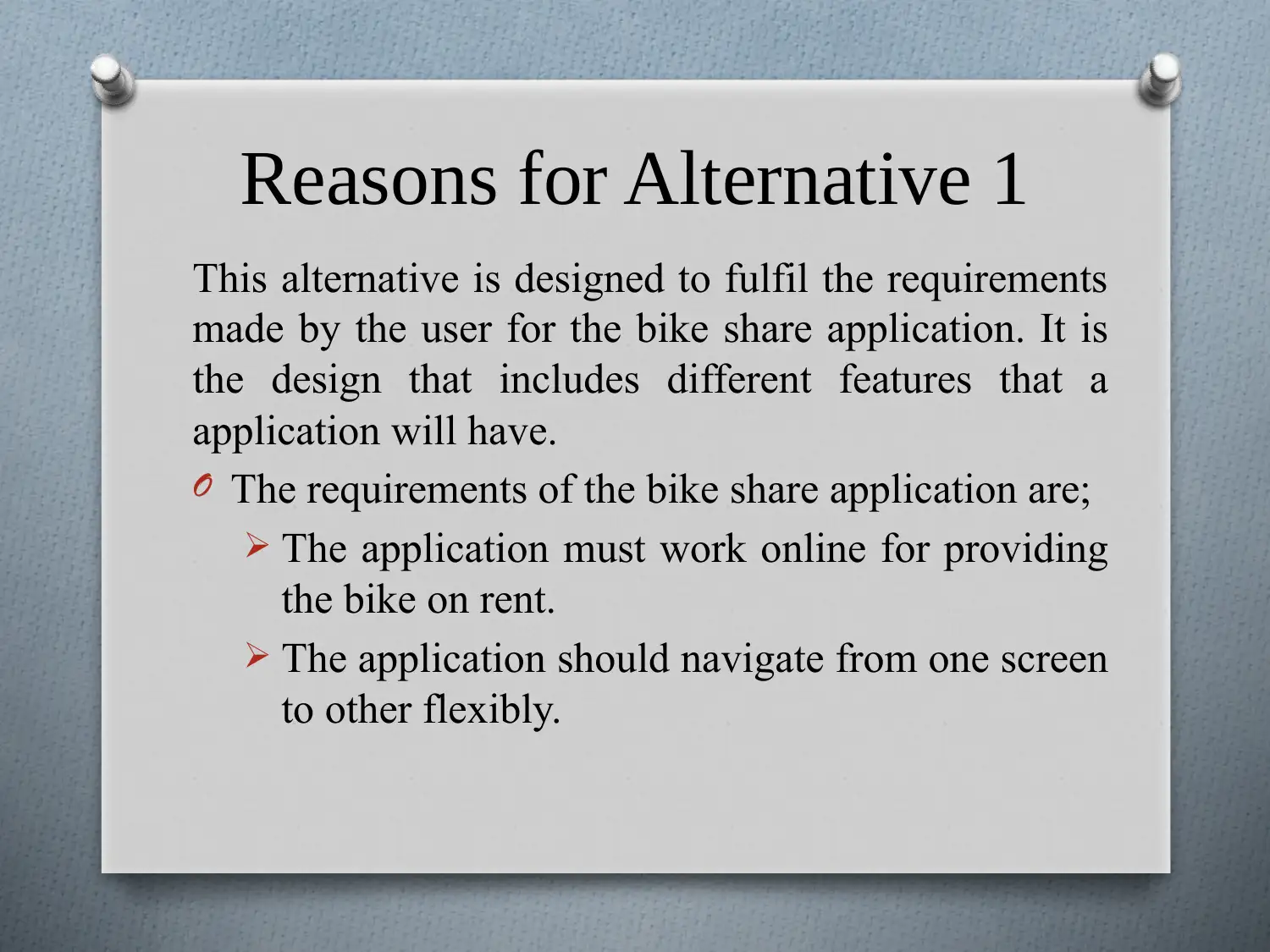
Reasons for Alternative 1
This alternative is designed to fulfil the requirements
made by the user for the bike share application. It is
the design that includes different features that a
application will have.
O The requirements of the bike share application are;
The application must work online for providing
the bike on rent.
The application should navigate from one screen
to other flexibly.
Secure Best Marks with AI Grader
Need help grading? Try our AI Grader for instant feedback on your assignments.
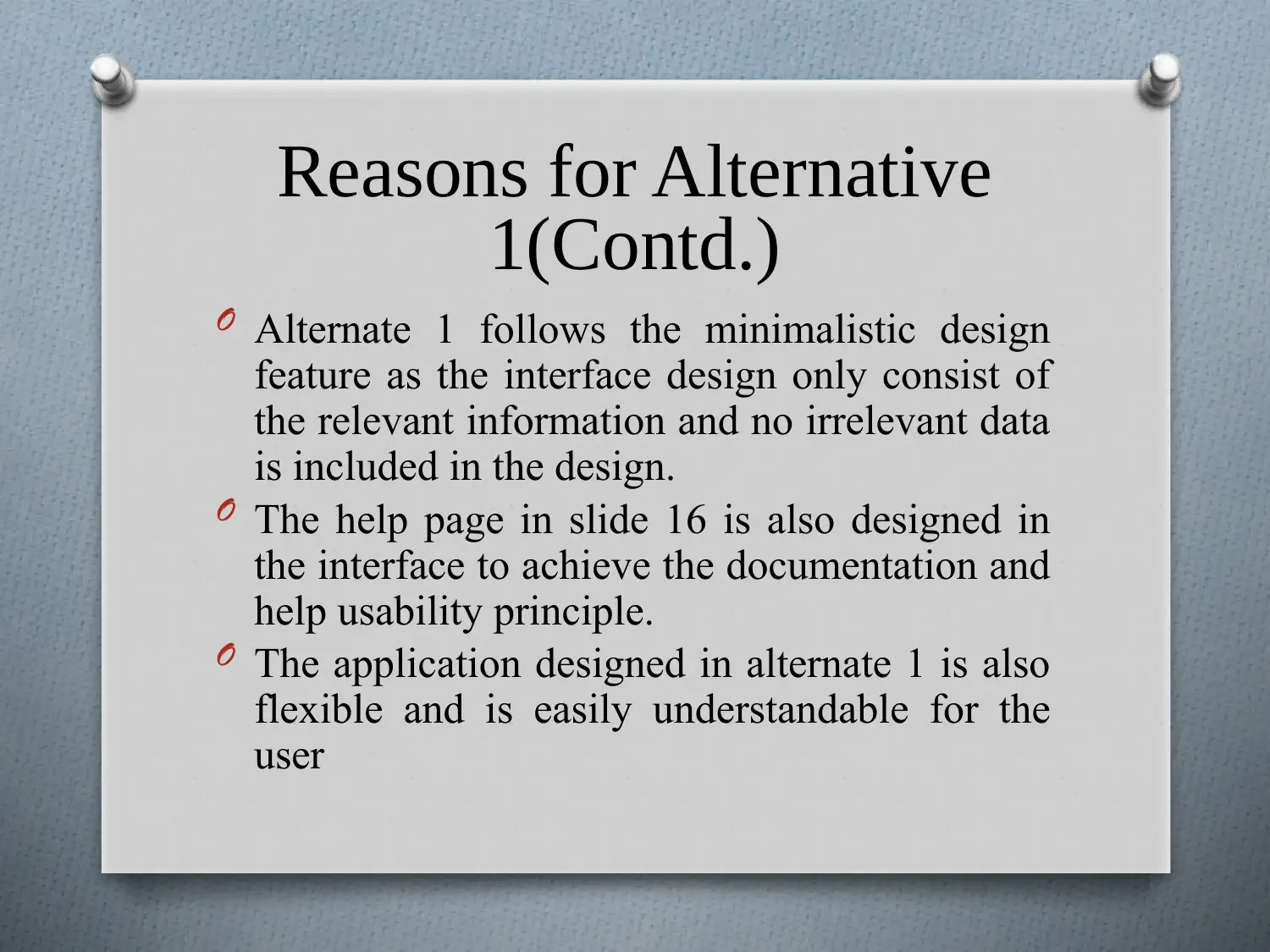
Reasons for Alternative
1(Contd.)
O Alternate 1 follows the minimalistic design
feature as the interface design only consist of
the relevant information and no irrelevant data
is included in the design.
O The help page in slide 16 is also designed in
the interface to achieve the documentation and
help usability principle.
O The application designed in alternate 1 is also
flexible and is easily understandable for the
user
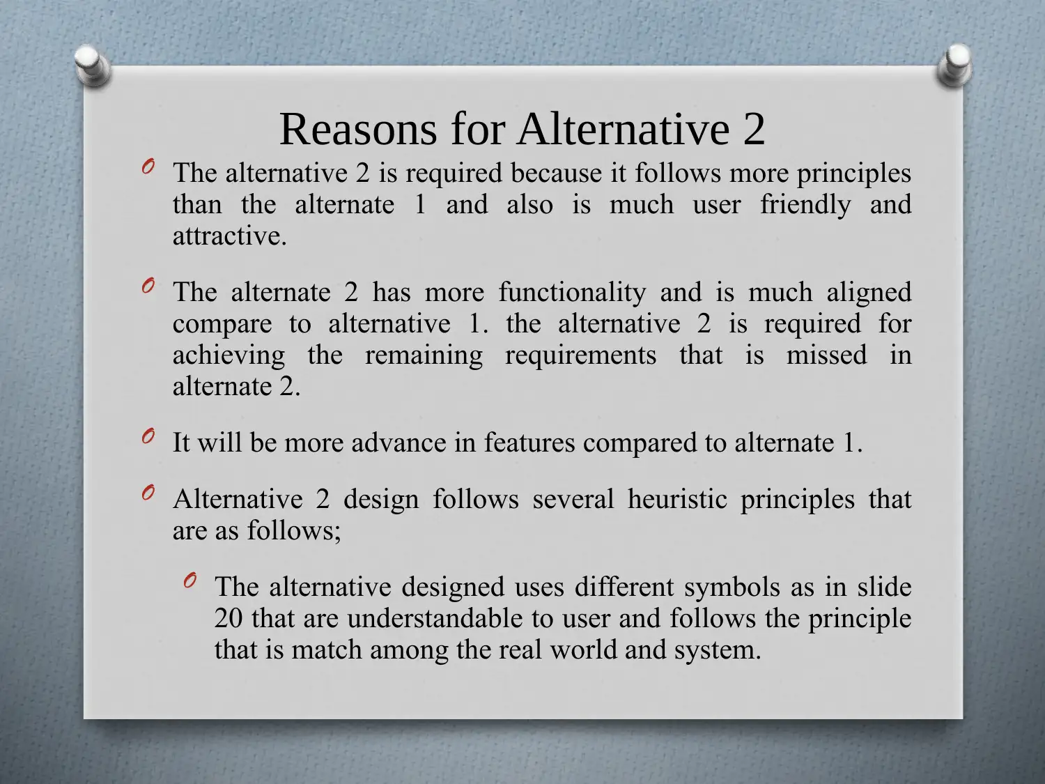
Reasons for Alternative 2
O The alternative 2 is required because it follows more principles
than the alternate 1 and also is much user friendly and
attractive.
O The alternate 2 has more functionality and is much aligned
compare to alternative 1. the alternative 2 is required for
achieving the remaining requirements that is missed in
alternate 2.
O It will be more advance in features compared to alternate 1.
O Alternative 2 design follows several heuristic principles that
are as follows;
O The alternative designed uses different symbols as in slide
20 that are understandable to user and follows the principle
that is match among the real world and system.
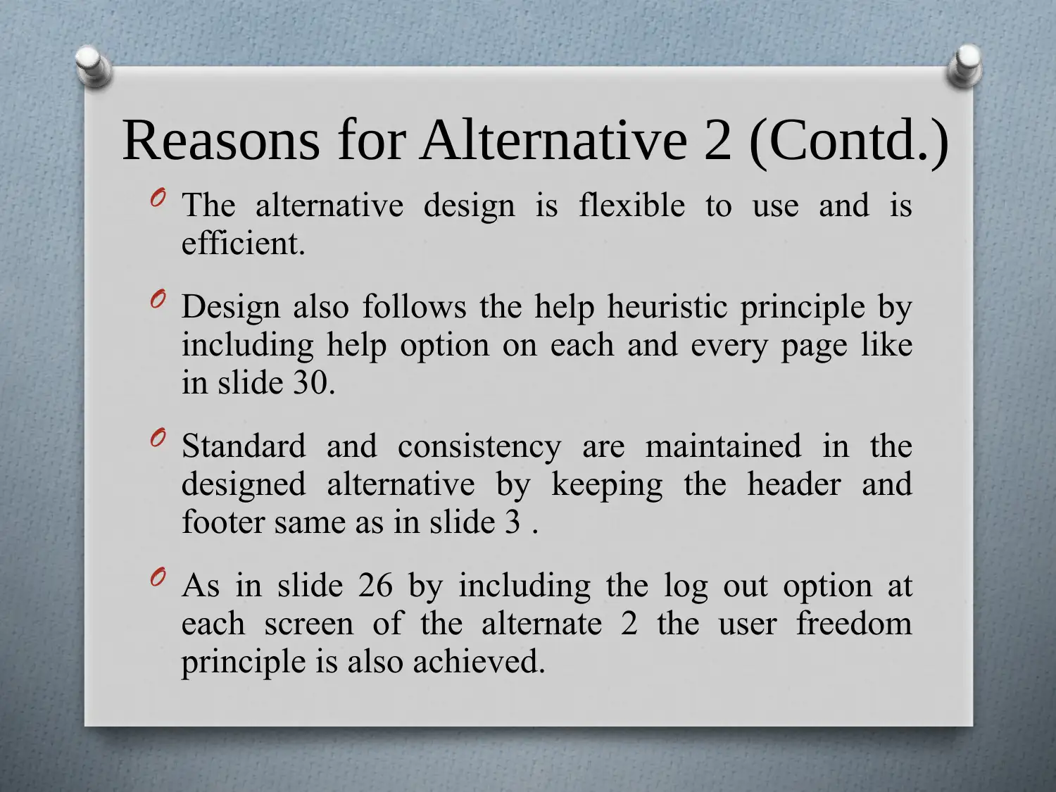
Reasons for Alternative 2 (Contd.)
O The alternative design is flexible to use and is
efficient.
O Design also follows the help heuristic principle by
including help option on each and every page like
in slide 30.
O Standard and consistency are maintained in the
designed alternative by keeping the header and
footer same as in slide 3 .
O As in slide 26 by including the log out option at
each screen of the alternate 2 the user freedom
principle is also achieved.
Paraphrase This Document
Need a fresh take? Get an instant paraphrase of this document with our AI Paraphraser

Recommendations
It is recommended to go with alternate 2 because the
alternate 1 has several issues that are resolved in
alternate 2. following are reasons for using alternative
2;
O Alternative 2 is made attractive and have better
GUI.
O Alternative 2 follows more heuristic principles than
alternative 1.
O Alternative 2 is more aligned compared to 1.
O Consistency is achieved in the alternative 2.
O Navigation is more easy in alternative 2.
References
O Nielsen, J. (2013). 10 Usability Heuristics for User Interface Design |
Design Principles FTW. Designprinciplesftw. Retrieved 6 March 2018,
from https://www.designprinciplesftw.com/collections/10-usability-
heuristics-for-user-interface-design.
O LORENC, K. (2017). How to design a mobile app? The importance of
wireframes and mockups - Blog Ready4s.com. Retrieved from
https://www.ready4s.com/blog/how-to-design-a-mobile-app-the-
importance-of-wireframes-and-mockups/
O Odysseos, A. (2016). 10 Indispensible App Prototyping Tips from
Successful Designers | Proto.io Blog. Retrieved from
https://blog.proto.io/10-indispensible-app-prototyping-tips-from-
successful-designers/
O Support.balsamiq. (2017). Creating a Mobile Application - Balsamiq
Support Portal. Retrieved from
https://support.balsamiq.com/tutorials/mobileapplication/
1 out of 39
Related Documents
Your All-in-One AI-Powered Toolkit for Academic Success.
+13062052269
info@desklib.com
Available 24*7 on WhatsApp / Email
![[object Object]](/_next/static/media/star-bottom.7253800d.svg)
Unlock your academic potential
© 2024 | Zucol Services PVT LTD | All rights reserved.


