ITC504 Assignment-1: Let's Ride App Design Alternatives
VerifiedAdded on 2024/06/27
|45
|1503
|322
AI Summary
Contribute Materials
Your contribution can guide someone’s learning journey. Share your
documents today.
ITC504 Assignment-1
Assignment Name
Your Name
Student No
Assignment Name
Your Name
Student No
Secure Best Marks with AI Grader
Need help grading? Try our AI Grader for instant feedback on your assignments.
Alternative -1 / Screen-1
Alternative -1 / Screen-1
Description
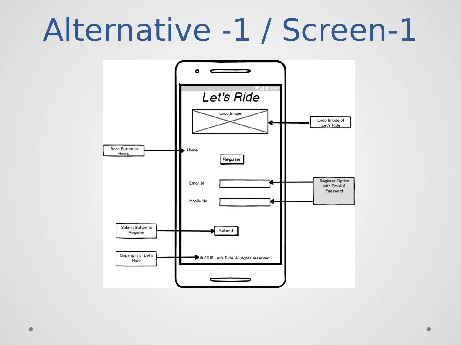
• Purpose: Create the register page for providing
the portal to make the new user.
• Components: Use the components like image,
text, text input and buttons with the title.
• User can do: The user can create a new account
by using this screen.
Description
• Purpose: Create the register page for providing
the portal to make the new user.
• Components: Use the components like image,
text, text input and buttons with the title.
• User can do: The user can create a new account
by using this screen.
Alternative -1 / Screen-2
Paraphrase This Document
Need a fresh take? Get an instant paraphrase of this document with our AI Paraphraser
Alternative -1 / Screen-2
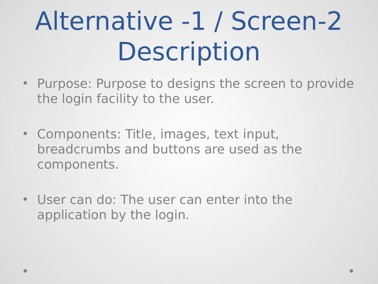
Description
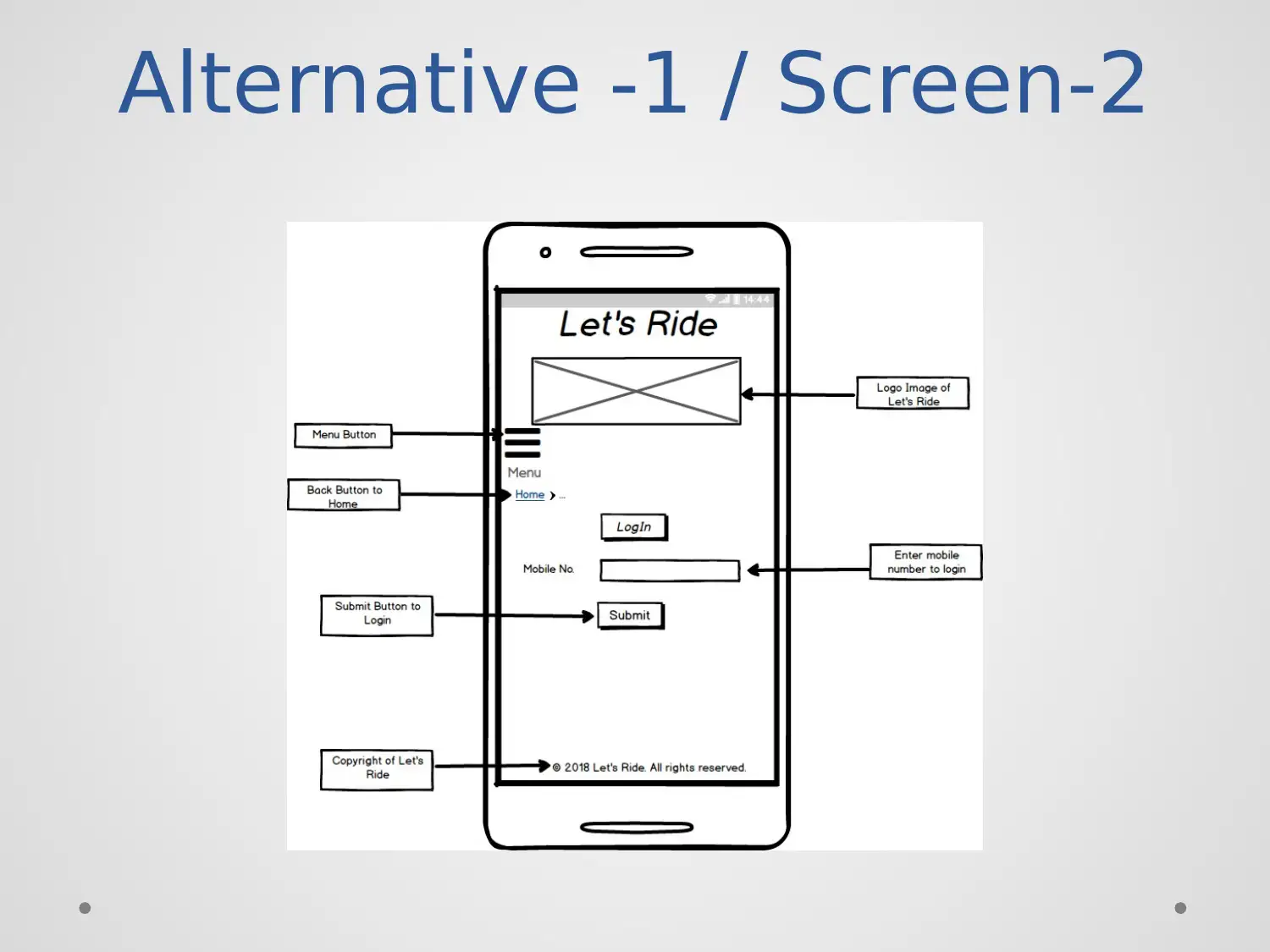
• Purpose: Purpose to designs the screen to provide
the login facility to the user.
• Components: Title, images, text input,
breadcrumbs and buttons are used as the
components.
• User can do: The user can enter into the
application by the login.
Description
• Purpose: Purpose to designs the screen to provide
the login facility to the user.
• Components: Title, images, text input,
breadcrumbs and buttons are used as the
components.
• User can do: The user can enter into the
application by the login.
Alternative -1 / Screen-3
Alternative -1 / Screen-3
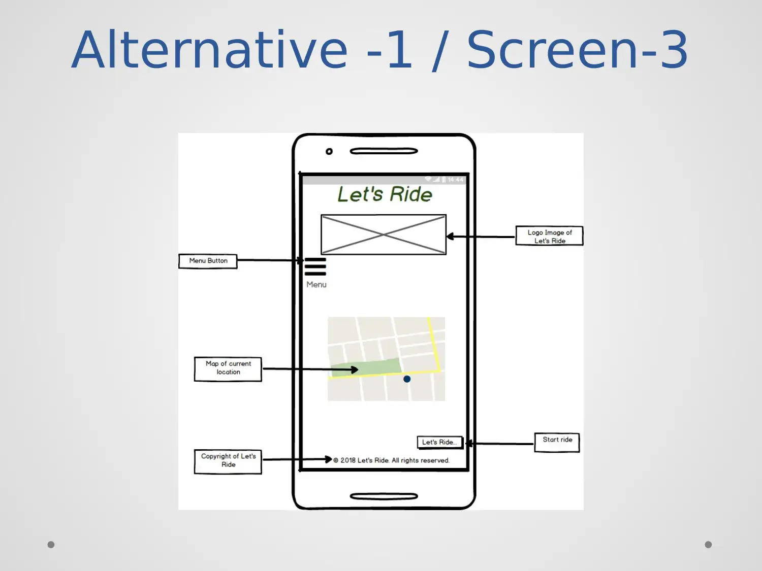
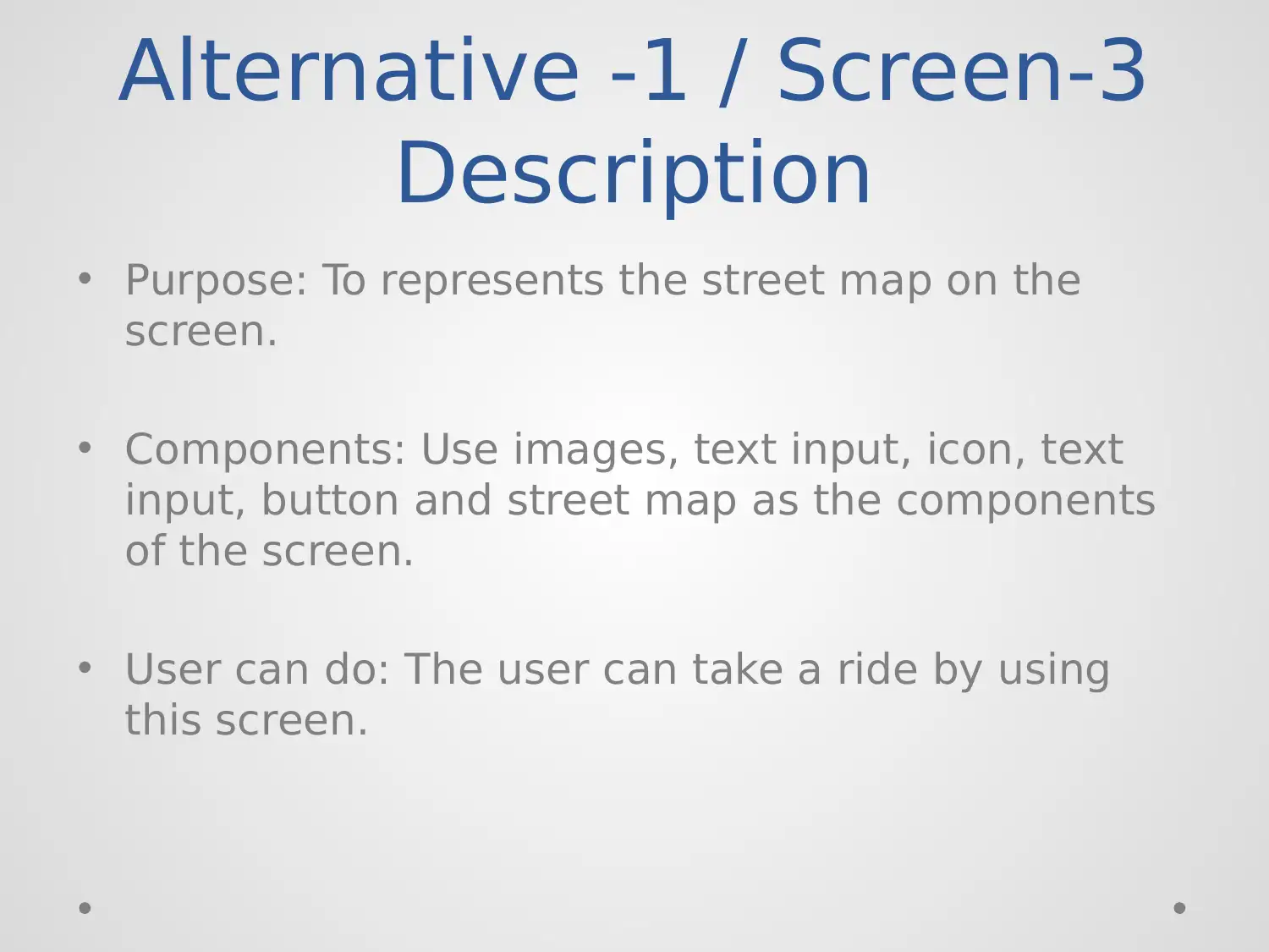
Description
• Purpose: To represents the street map on the
screen.
• Components: Use images, text input, icon, text
input, button and street map as the components
of the screen.
• User can do: The user can take a ride by using
this screen.
Description
• Purpose: To represents the street map on the
screen.
• Components: Use images, text input, icon, text
input, button and street map as the components
of the screen.
• User can do: The user can take a ride by using
this screen.
Secure Best Marks with AI Grader
Need help grading? Try our AI Grader for instant feedback on your assignments.
Alternative -1 / Screen-4
Alternative -1 / Screen-4
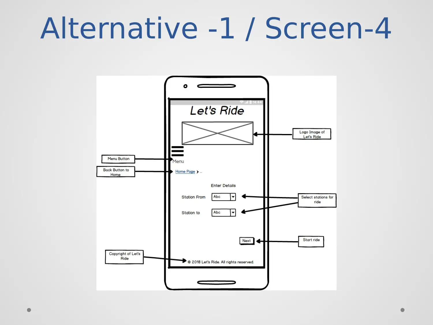
Description
• Purpose: Purpose to design the screen to select
the ride stations.
• Components: Use the component like title,
images, button, and text area.
• User can do: The user can select the ride station.
Description
• Purpose: Purpose to design the screen to select
the ride stations.
• Components: Use the component like title,
images, button, and text area.
• User can do: The user can select the ride station.
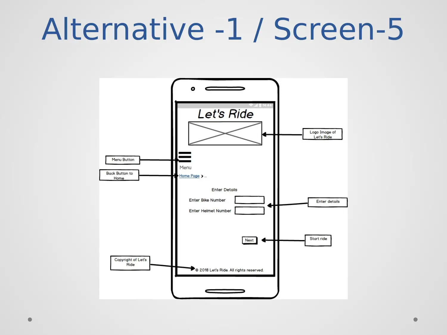
Alternative -1 / Screen-5
Paraphrase This Document
Need a fresh take? Get an instant paraphrase of this document with our AI Paraphraser
Alternative -1 / Screen-5
Description
• Purpose: Purpose of this screen is to enter the
bike details that take for a ride.
• Components: Use the components like title,
image, icon, text area, text input and buttons.
• User can do: The user can check menu and back
to the home button.
Description
• Purpose: Purpose of this screen is to enter the
bike details that take for a ride.
• Components: Use the components like title,
image, icon, text area, text input and buttons.
• User can do: The user can check menu and back
to the home button.

Alternative -1 / Screen-6
Alternative -1 / Screen-6
Description
• Purpose: Purpose to design the screen is to enter
the credit card number of the user.
• Components: Components are images, title, text
input, level and buttons.
• User can do: The user can back to the homepage
and make payment to take the ride.
Description
• Purpose: Purpose to design the screen is to enter
the credit card number of the user.
• Components: Components are images, title, text
input, level and buttons.
• User can do: The user can back to the homepage
and make payment to take the ride.
Secure Best Marks with AI Grader
Need help grading? Try our AI Grader for instant feedback on your assignments.
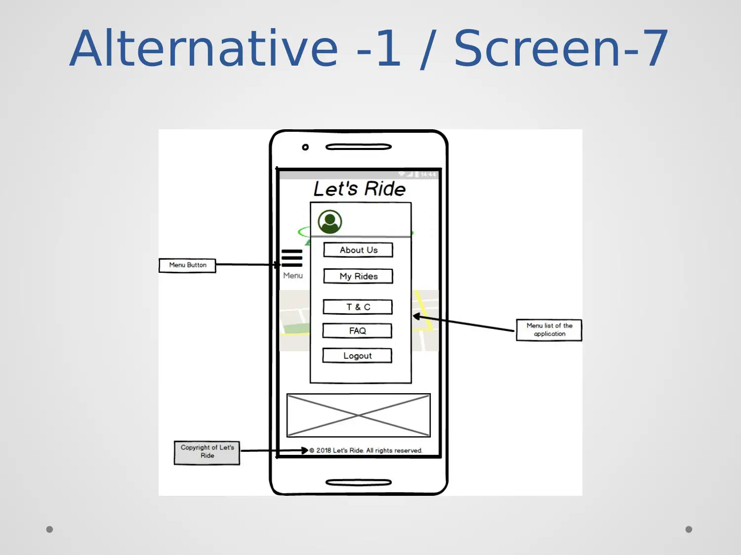
Alternative -1 / Screen-7
Alternative -1 / Screen-7
Description
• Purpose: The purpose of this screen is to
represent the menu of the application.
• Components: Use components like title, image,
rectangle, text input.
• User can do: The user can select any menu.
Description
• Purpose: The purpose of this screen is to
represent the menu of the application.
• Components: Use components like title, image,
rectangle, text input.
• User can do: The user can select any menu.
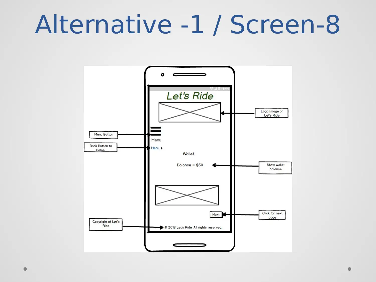
Alternative -1 / Screen-8
Paraphrase This Document
Need a fresh take? Get an instant paraphrase of this document with our AI Paraphraser
Alternative -1 / Screen-8
Description
• Purpose: The purpose is to show the balance that
uses for the ride of the user.
• Components: Components like, title, image, icon,
buttons.
• User can do: The user can check the balance and
go to next menu of the application.
Description
• Purpose: The purpose is to show the balance that
uses for the ride of the user.
• Components: Components like, title, image, icon,
buttons.
• User can do: The user can check the balance and
go to next menu of the application.
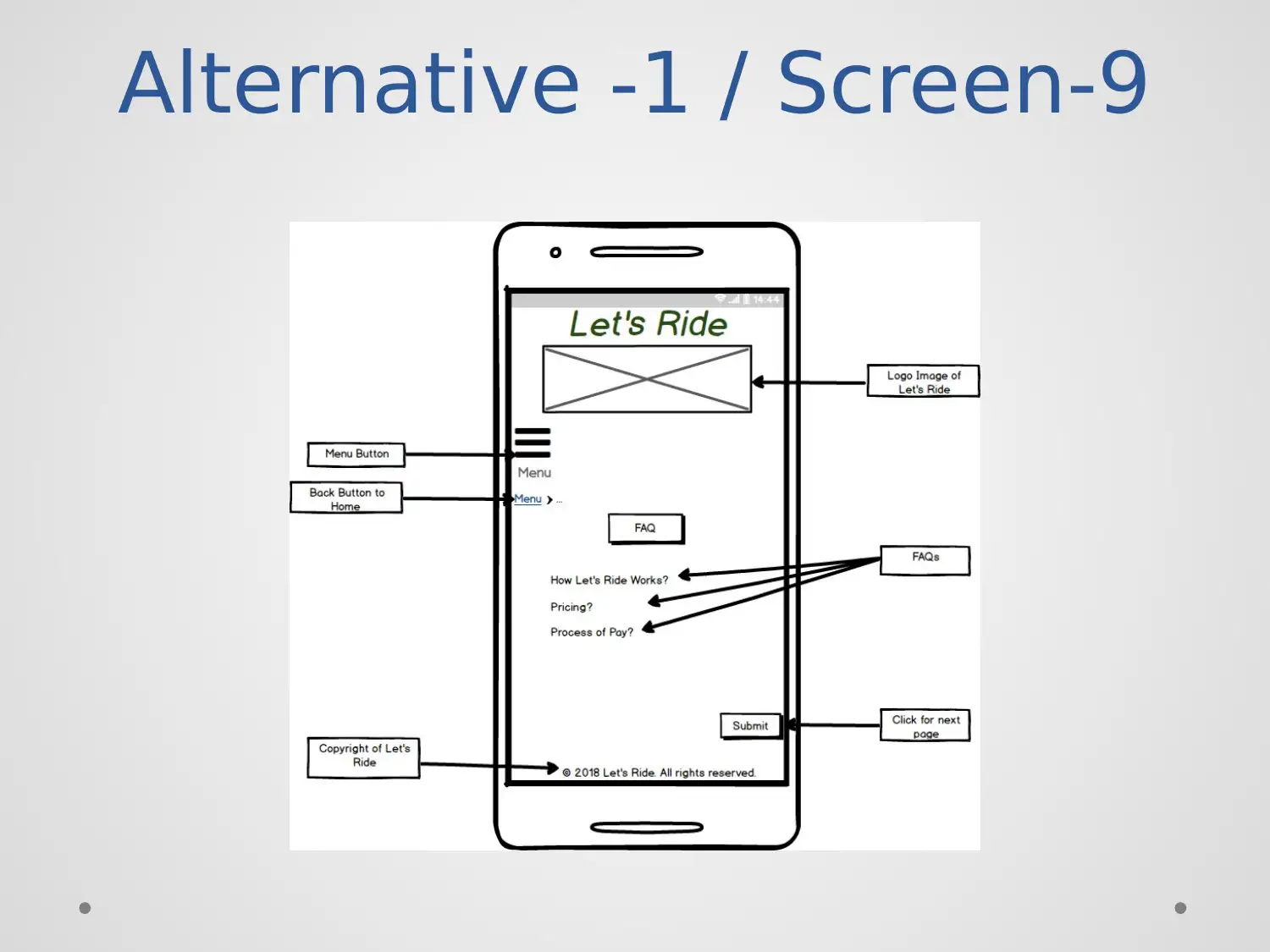
Alternative -1 / Screen-9
Alternative -1 / Screen-9
Description
• Purpose: The purpose of this screen is to provide
the answers to some common issues of the user.
• Components: Use components like images, title,
buttons, and text area.
• User can do: The user can select any query and
get the answer by click over it.
Description
• Purpose: The purpose of this screen is to provide
the answers to some common issues of the user.
• Components: Use components like images, title,
buttons, and text area.
• User can do: The user can select any query and
get the answer by click over it.
Secure Best Marks with AI Grader
Need help grading? Try our AI Grader for instant feedback on your assignments.
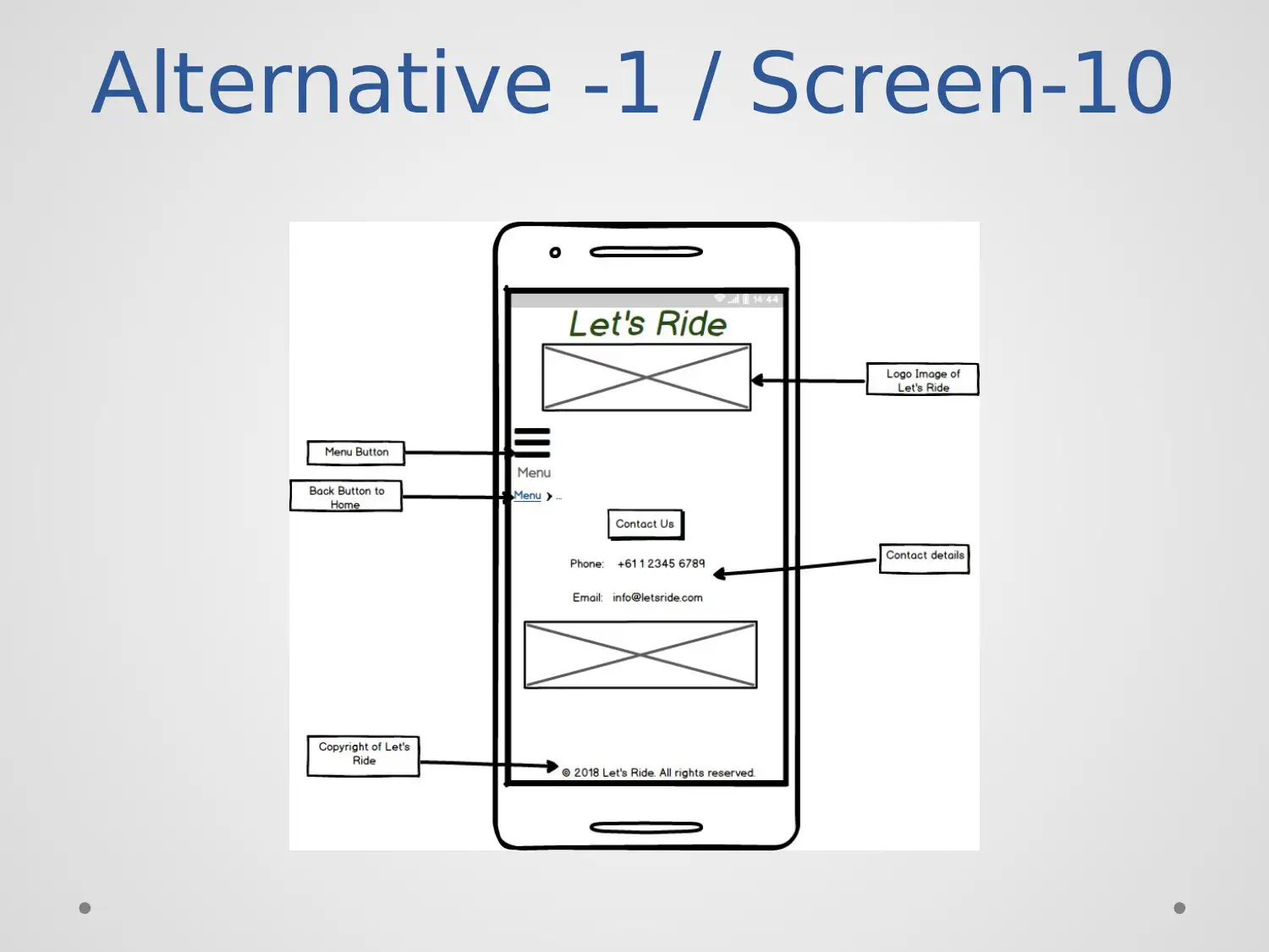
Alternative -1 / Screen-10
Alternative -1 / Screen-10
Description
• Purpose: The purpose to design this screen is to
provide the facility to get connect with the
company.
• Components: Use the components like title,
image icon, and button.
• User can do: The user can contact the company
to get any further details.
Description
• Purpose: The purpose to design this screen is to
provide the facility to get connect with the
company.
• Components: Use the components like title,
image icon, and button.
• User can do: The user can contact the company
to get any further details.
Alternative -2 / Screen-1
Paraphrase This Document
Need a fresh take? Get an instant paraphrase of this document with our AI Paraphraser
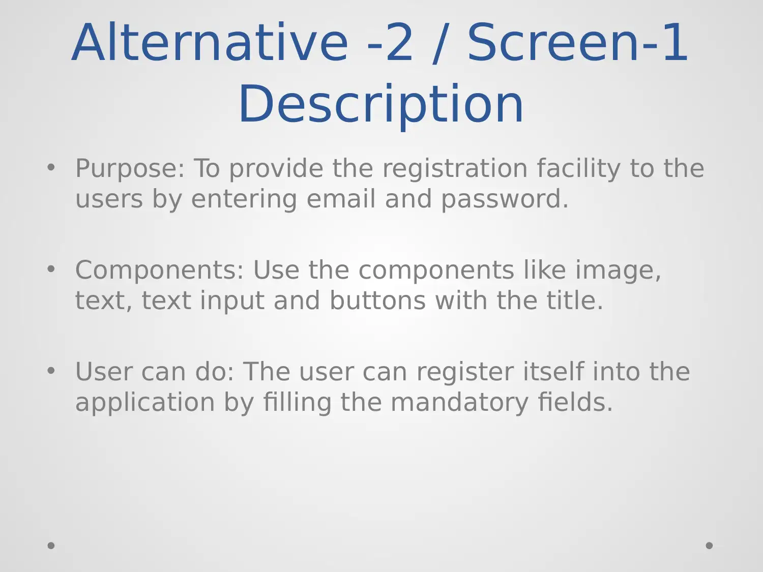
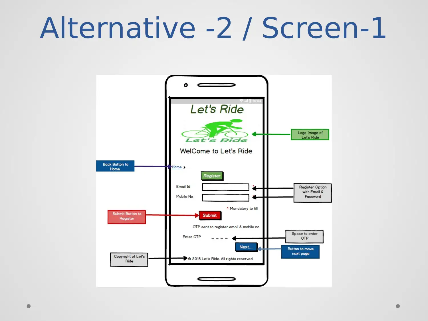
Alternative -2 / Screen-1
Description
• Purpose: To provide the registration facility to the
users by entering email and password.
• Components: Use the components like image,
text, text input and buttons with the title.
• User can do: The user can register itself into the
application by filling the mandatory fields.
Description
• Purpose: To provide the registration facility to the
users by entering email and password.
• Components: Use the components like image,
text, text input and buttons with the title.
• User can do: The user can register itself into the
application by filling the mandatory fields.
Alternative -2 / Screen-2
Alternative -2 / Screen-2
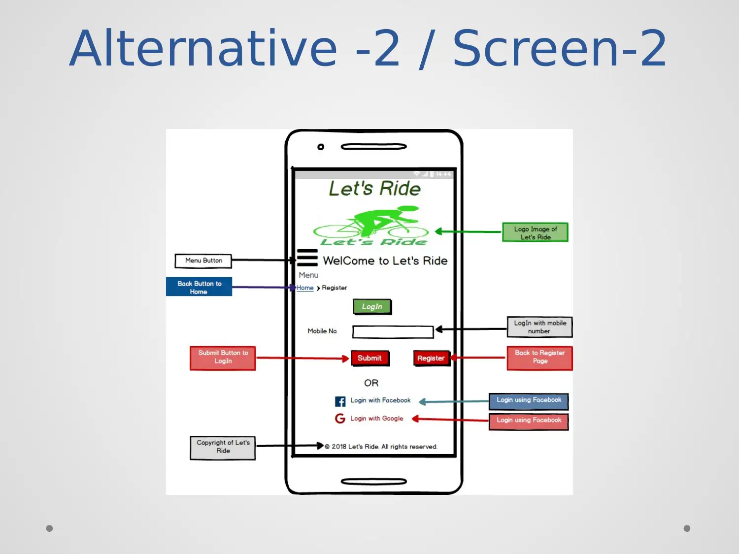
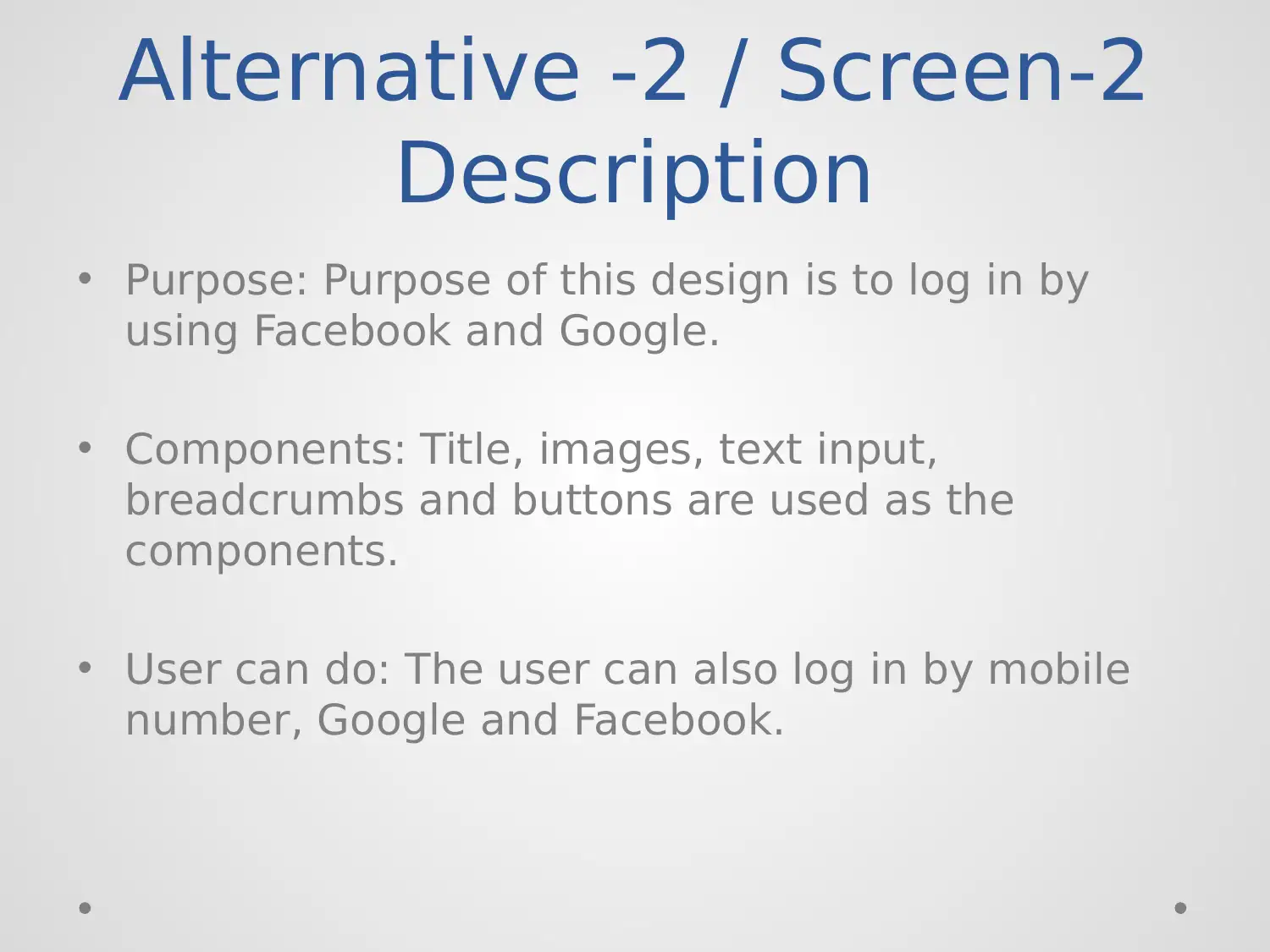
Description
• Purpose: Purpose of this design is to log in by
using Facebook and Google.
• Components: Title, images, text input,
breadcrumbs and buttons are used as the
components.
• User can do: The user can also log in by mobile
number, Google and Facebook.
Description
• Purpose: Purpose of this design is to log in by
using Facebook and Google.
• Components: Title, images, text input,
breadcrumbs and buttons are used as the
components.
• User can do: The user can also log in by mobile
number, Google and Facebook.
Secure Best Marks with AI Grader
Need help grading? Try our AI Grader for instant feedback on your assignments.
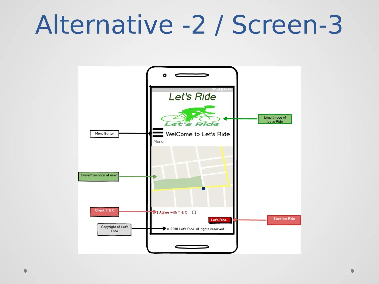
Alternative -2 / Screen-3
Alternative -2 / Screen-3
Description
• Purpose: Purpose to takes the ride by track the
location.
• Components: Use the components like images,
text input, icon, text input, button and street
map.
• User can do: The user can also go to check the
menu and T & C.
Description
• Purpose: Purpose to takes the ride by track the
location.
• Components: Use the components like images,
text input, icon, text input, button and street
map.
• User can do: The user can also go to check the
menu and T & C.
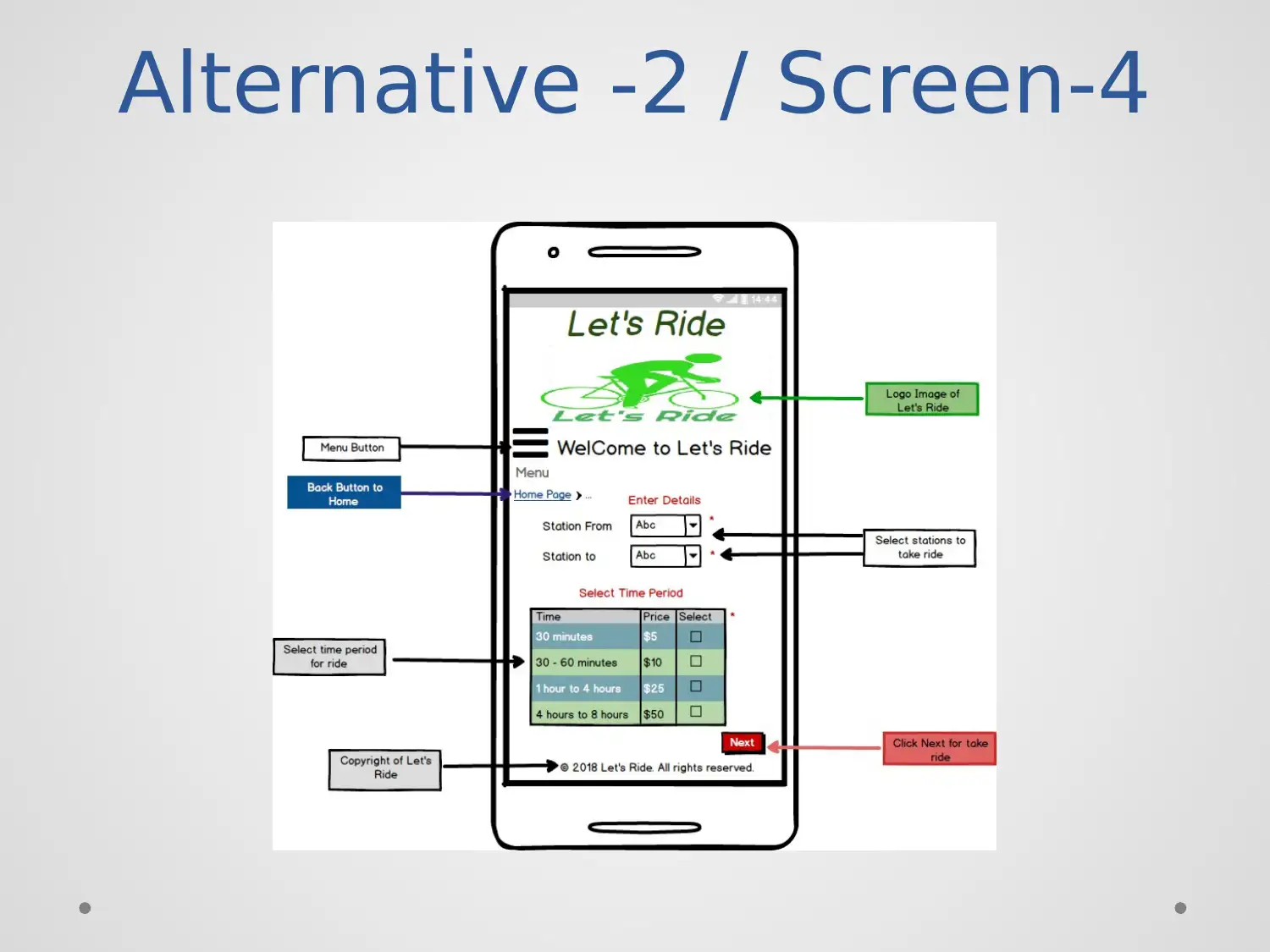
Alternative -2 / Screen-4
Paraphrase This Document
Need a fresh take? Get an instant paraphrase of this document with our AI Paraphraser
Alternative -2 / Screen-4
Description
• Purpose: Purpose to this screen is to represent
the basic details about the let’s ride.
• Components: Use the components like images,
icon, text input, breadcrumbs, text area, combo
box and data grid with buttons.
• User can do: The user can select a time for a ride
with stations.
Description
• Purpose: Purpose to this screen is to represent
the basic details about the let’s ride.
• Components: Use the components like images,
icon, text input, breadcrumbs, text area, combo
box and data grid with buttons.
• User can do: The user can select a time for a ride
with stations.
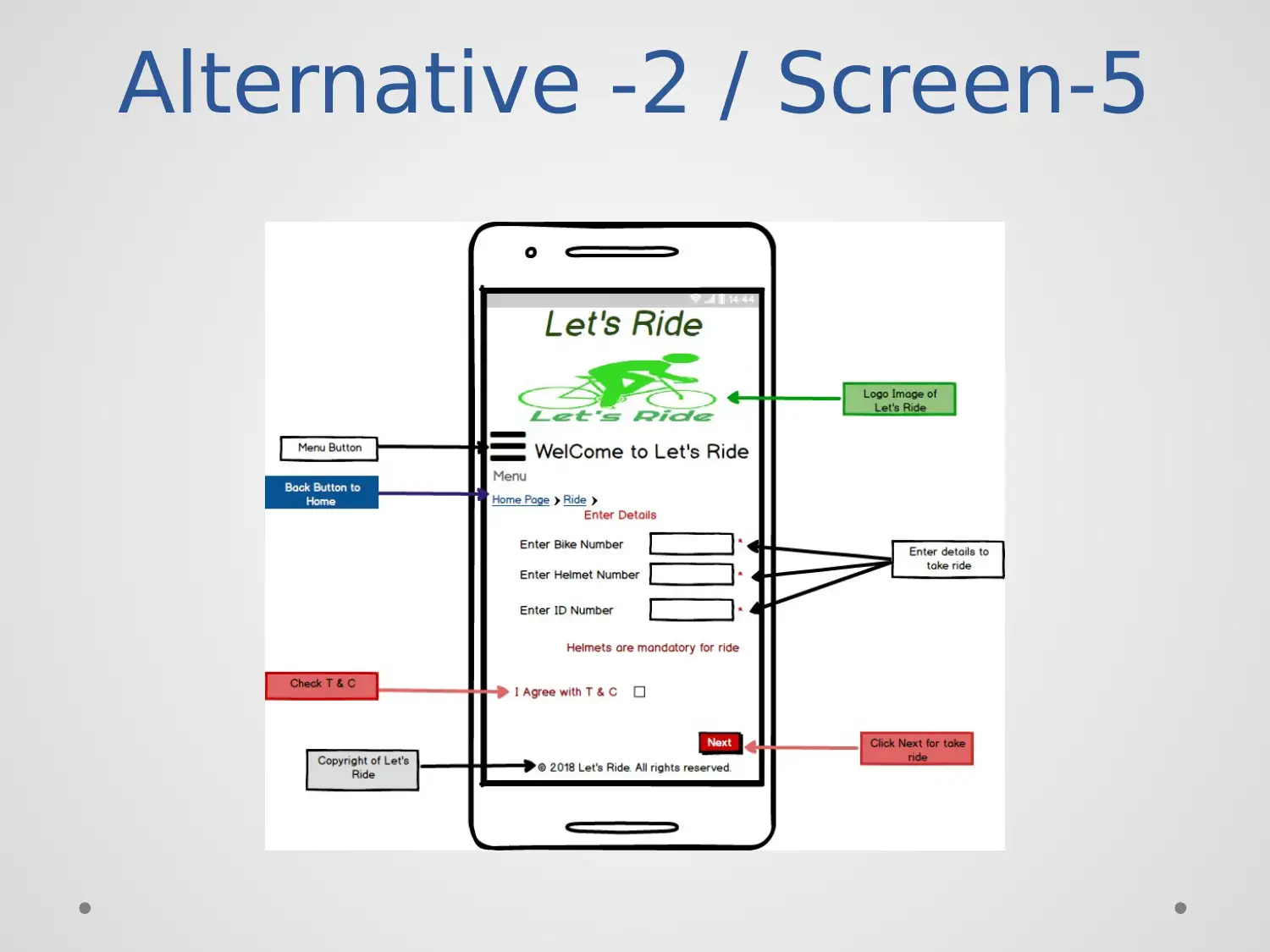
Alternative -2 / Screen-5
Alternative -2 / Screen-5
Description
• Purpose: Purpose of the screen is to save the
details of the bike that take by the user.
• Components: Using components like title, image,
icon, text area, text input, buttons, text and
checkbox.
• User can do: The user can check the terms and
conditions of the ride.
Description
• Purpose: Purpose of the screen is to save the
details of the bike that take by the user.
• Components: Using components like title, image,
icon, text area, text input, buttons, text and
checkbox.
• User can do: The user can check the terms and
conditions of the ride.
Secure Best Marks with AI Grader
Need help grading? Try our AI Grader for instant feedback on your assignments.
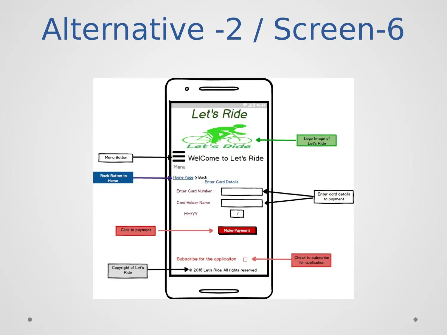
Alternative -2 / Screen-6
Alternative -2 / Screen-6
Description
• Purpose: Design this screen for initializing the
payment functionality.
• Components: Use components like title, text
input, level, breadcrumbs, and checkbox.
• User can do: The user can make payment with
subscribing to the application.
Description
• Purpose: Design this screen for initializing the
payment functionality.
• Components: Use components like title, text
input, level, breadcrumbs, and checkbox.
• User can do: The user can make payment with
subscribing to the application.
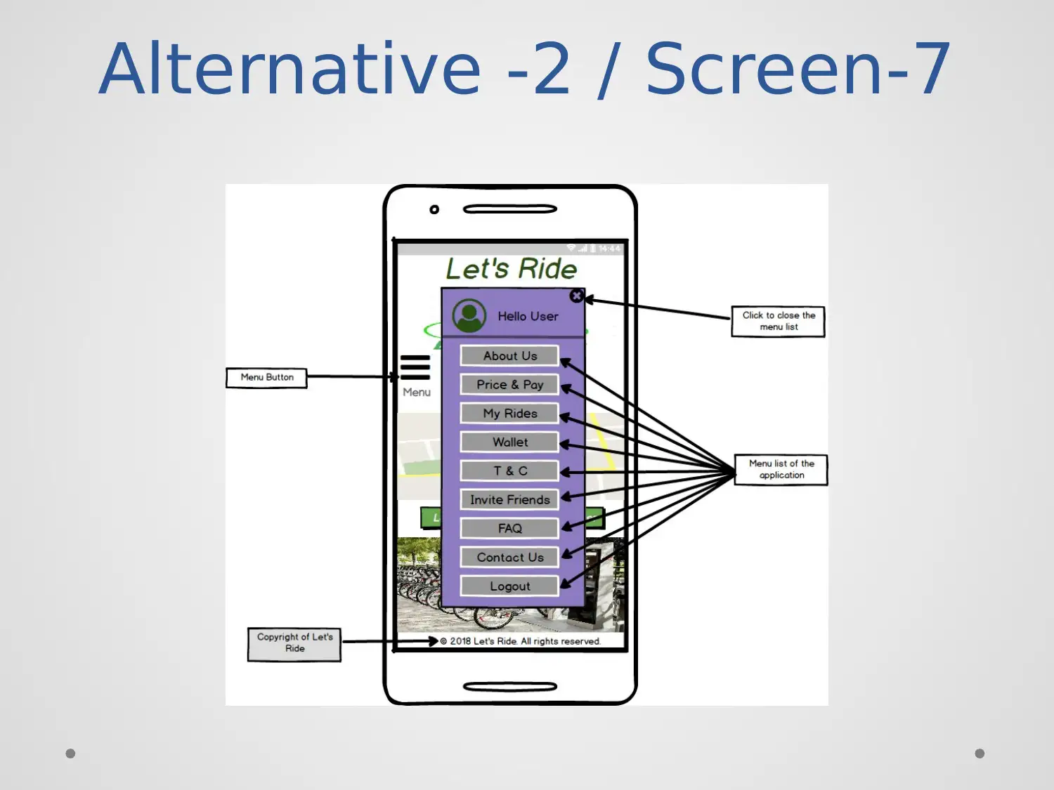
Alternative -2 / Screen-7
Paraphrase This Document
Need a fresh take? Get an instant paraphrase of this document with our AI Paraphraser
Alternative -2 / Screen-7
Description
• Purpose: Purpose to shows the various
functionality of the application in the form of
menu.
• Components: Components like, title, image,
rectangle, text input, icons and text areas
• User can do: The user can move to any page by
selecting any menu from the list.
Description
• Purpose: Purpose to shows the various
functionality of the application in the form of
menu.
• Components: Components like, title, image,
rectangle, text input, icons and text areas
• User can do: The user can move to any page by
selecting any menu from the list.
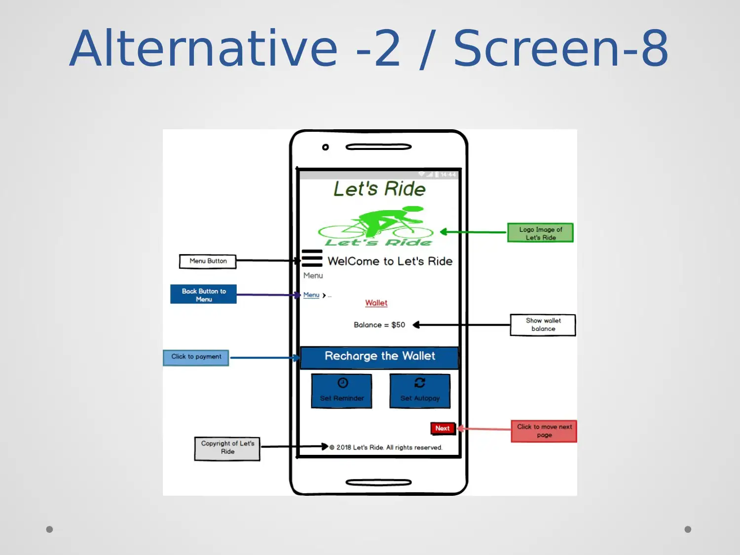
Alternative -2 / Screen-8
Alternative -2 / Screen-8
Description
• Purpose: The purpose is to check the wallet
balance of application by the user.
• Components: Use components like title, image,
icon, buttons, text area, text input, rectangle and
buttons.
• User can do: The user can recharge the wallet
and go back and next page by using the buttons.
Description
• Purpose: The purpose is to check the wallet
balance of application by the user.
• Components: Use components like title, image,
icon, buttons, text area, text input, rectangle and
buttons.
• User can do: The user can recharge the wallet
and go back and next page by using the buttons.
Secure Best Marks with AI Grader
Need help grading? Try our AI Grader for instant feedback on your assignments.
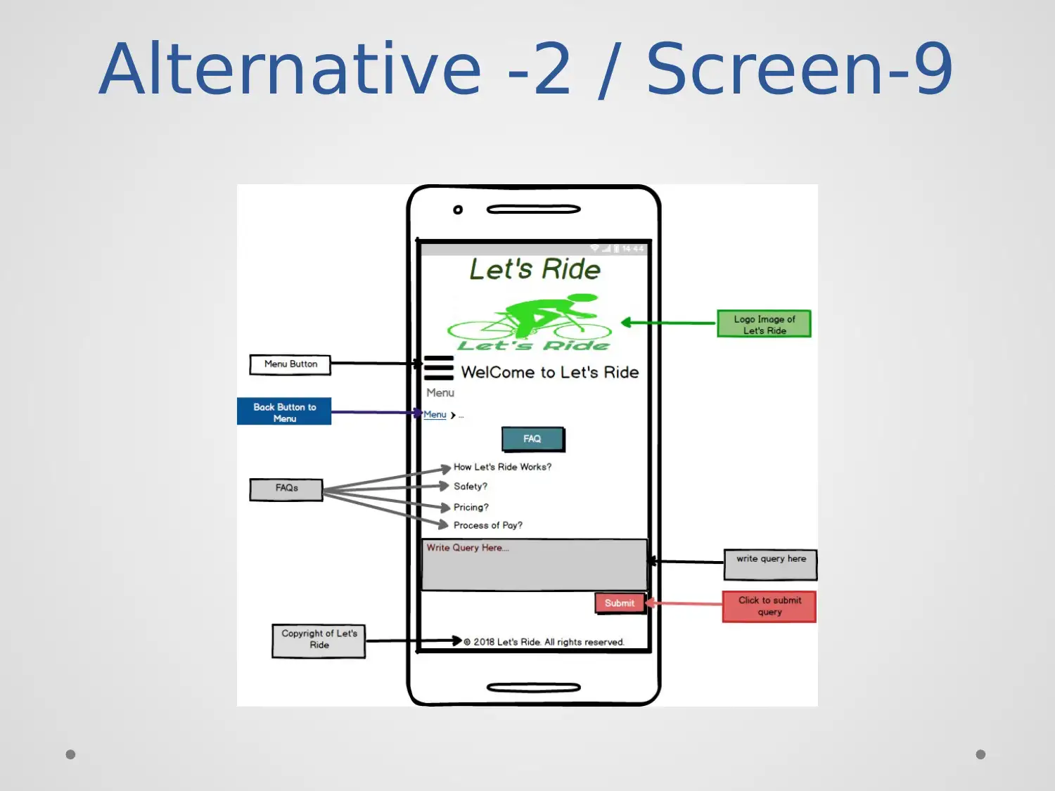
Alternative -2 / Screen-9
Alternative -2 / Screen-9
Description
• Purpose: The purpose of the design is to provide
the guidelines for using the application by giving
some questions.
• Components: Use components like images, title,
buttons, icons, breadcrumbs and text area.
• User can do: The user can resolve any doubt by
click any given query and submit another query
related to the application.
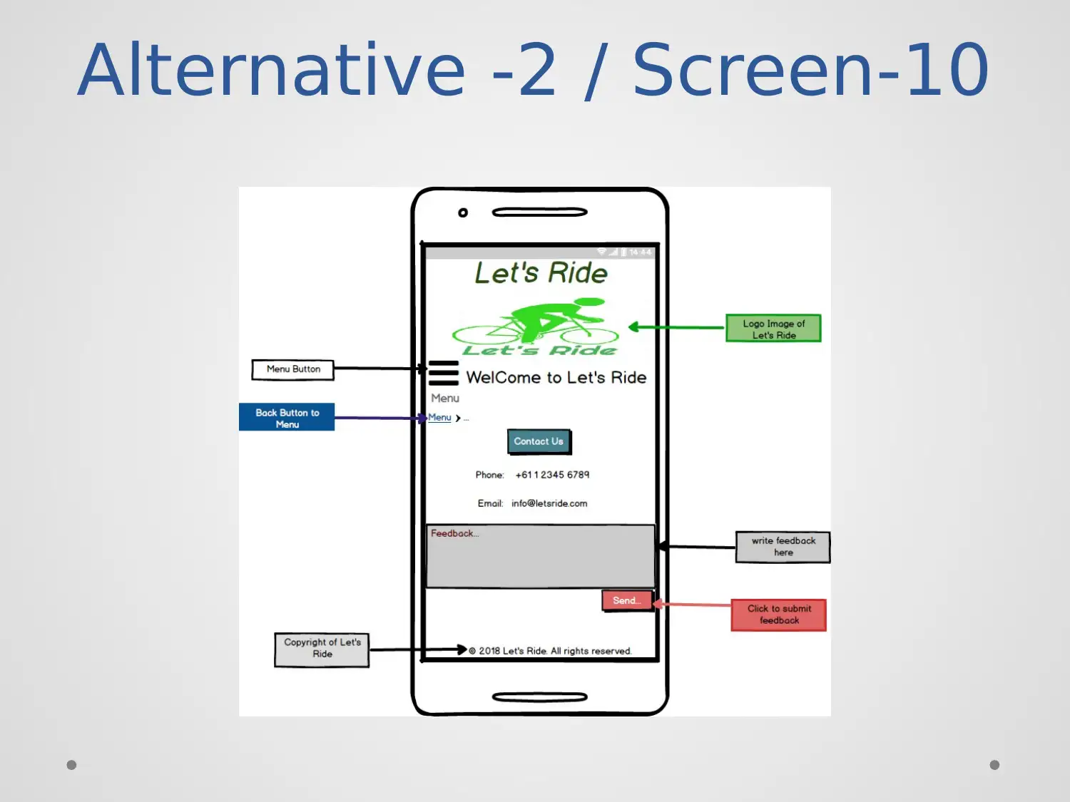
Alternative -2 / Screen-10
Paraphrase This Document
Need a fresh take? Get an instant paraphrase of this document with our AI Paraphraser
Alternative -2 / Screen-10
Description
• Purpose: Purpose to design this screen is provided
contact details with the email id and phone
number to resolve any other query.
• Components: Use components like title, image
icon, breadcrumbs, button, and text area.
• User can do: The user can submit the ride
feedback by write in the blank and click over
submit.
Reasons for Alternative-1
• Complete the user requirements like login,
register, payment method, menu, wallets.
• The alternative fulfil the user and customer
requirements.
• The usability principles of interface, visibility, user
control are included in alternative 1.
• Complete the user requirements like login,
register, payment method, menu, wallets.
• The alternative fulfil the user and customer
requirements.
• The usability principles of interface, visibility, user
control are included in alternative 1.
Reasons for Alternative-2
• Follow the heuristic principles to complete the
user requirement and initializing the functions like
register, login, better interface, and consistency,
the standard of header and footer part.
• The user requirements like a mandatory helmet
pay by cards, within a particular time and
distance are fulfilled in the design.
Secure Best Marks with AI Grader
Need help grading? Try our AI Grader for instant feedback on your assignments.
Recommendation
• I recommend the alternative 2 for the further
design.
• The alternative two follows the complete user
requirements and heuristic.
• Alternative two has better interface, functionality,
query and feedback platform and other many
things more than an alternative one.
• I recommend the alternative 2 for the further
design.
• The alternative two follows the complete user
requirements and heuristic.
• Alternative two has better interface, functionality,
query and feedback platform and other many
things more than an alternative one.
References
• Nielsen, j. (2013). 10 Usability Heuristics for User
Interface Design | Design Principles FTW.
Retrieved from
https://www.designprinciplesftw.com/collections/1
0-usability-heuristics-for-user-interface-design
• ofo (2018) Retrieved from
https://www.ofo.com/au/en
• Campbell J. (2017) . Dzone. Retrieved from
https://dzone.com/articles/6-best-ui-design-
principles-to-develop-mobile-apps
1 out of 45
![[object Object]](/_next/static/media/star-bottom.7253800d.svg)


