ITC504 Assignment 3: Usability Evaluation of Helios Solar Interface
VerifiedAdded on 2020/04/01
|10
|2031
|487
Report
AI Summary
This report presents a usability evaluation of the "Helios Solar Home Management System" interface, conducted as part of an ITC504 assignment. The evaluation employs Nielsen and Molich heuristics to assess various aspects of the interface, including visibility of system status, match with the real world, user control and freedom, consistency, error prevention, recognition over recall, flexibility, aesthetic design, and help features. The report identifies specific usability issues within the interface, such as the lack of instant notifications, missing cancel options, inadequate error messages, and insufficient help documentation. Following the identification of these issues, the report proposes detailed remedial actions to address each problem, including the implementation of notification features, cancel options, enhanced error messages, and a comprehensive help page. Furthermore, the report outlines a usability strategy, integrating the suggested remedies to improve the overall user experience and achieve specific usability goals. The report concludes with a bibliography of relevant sources used in the evaluation process.
Running head: ITC504 ASSIGNMENT 3
ITC504 Assignment 3: Interface Usability
Name of the Student
Name of the University
Author’s Note
ITC504 Assignment 3: Interface Usability
Name of the Student
Name of the University
Author’s Note
Paraphrase This Document
Need a fresh take? Get an instant paraphrase of this document with our AI Paraphraser
1ITC504 ASSIGNMENT 3
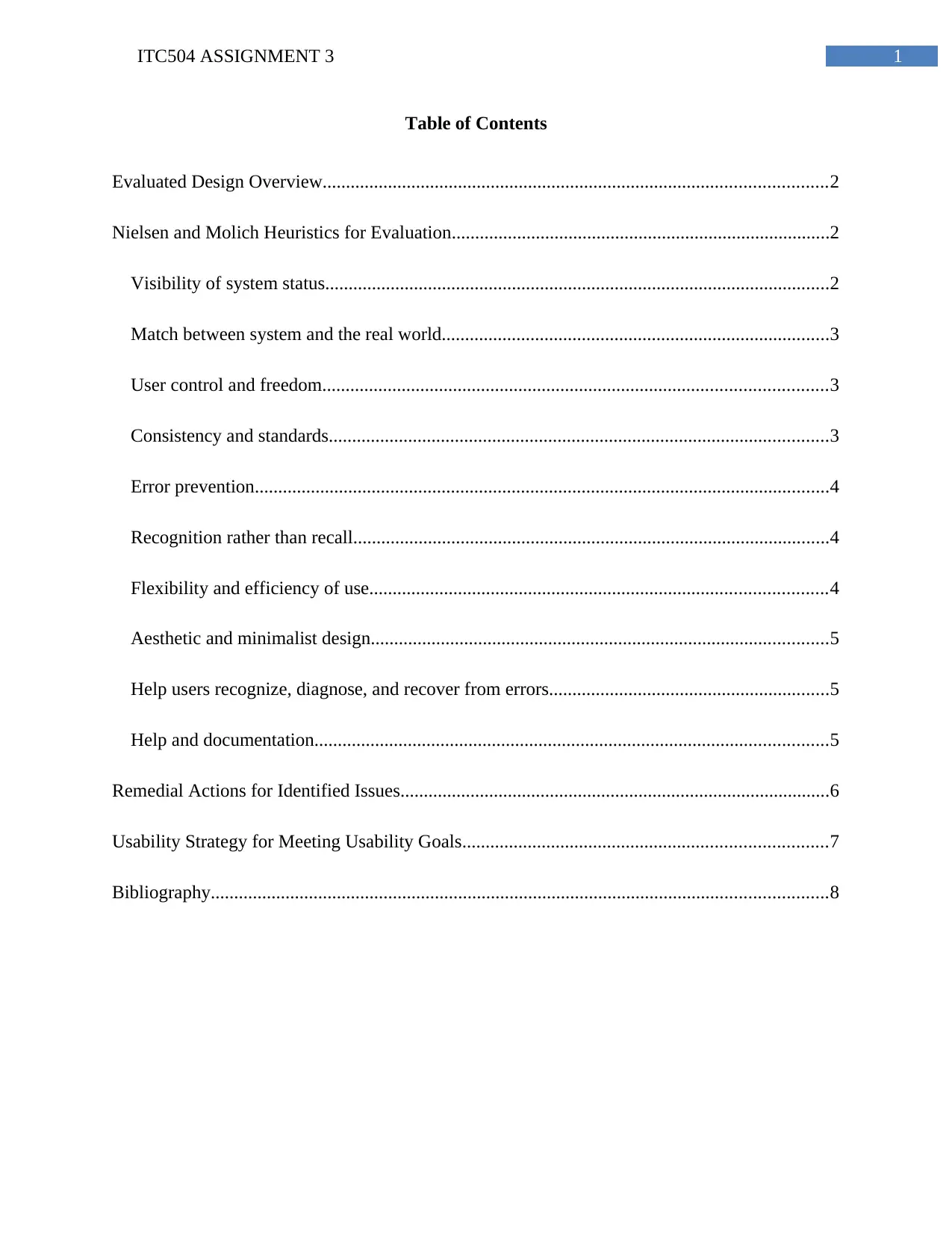
Table of Contents
Evaluated Design Overview............................................................................................................2
Nielsen and Molich Heuristics for Evaluation.................................................................................2
Visibility of system status............................................................................................................2
Match between system and the real world...................................................................................3
User control and freedom............................................................................................................3
Consistency and standards...........................................................................................................3
Error prevention...........................................................................................................................4
Recognition rather than recall......................................................................................................4
Flexibility and efficiency of use..................................................................................................4
Aesthetic and minimalist design..................................................................................................5
Help users recognize, diagnose, and recover from errors............................................................5
Help and documentation..............................................................................................................5
Remedial Actions for Identified Issues............................................................................................6
Usability Strategy for Meeting Usability Goals..............................................................................7
Bibliography....................................................................................................................................8
2ITC504 ASSIGNMENT 3
Evaluated Design Overview
The evaluation of the design process requires one particular framework or heuristics
method along with considering heuristics and framework parts. Therefore, Nielson and Molich
Heuristics is considered to perform user interface design evaluation in this assessment. The
heuristics contains ten individual heuristics aspects that should be properly emphasized in the
evaluation process. The evaluation process considers identification of the issue, location of issue,
whether is making any problem with usability or not, and whether it is significant or minor. This
evaluation process identifies the issue in details so that later, the issue can be resolved with
appropriate remedial actions. The remedial actions are included in further section so that
usability evaluation can be formulated in form of strategy. The usability strategy considers
appropriate activities with proper priorities so that intermediate designs can resolve the existing
issues in the design. In short, to adhere proper remedial actions for design this evaluation is
conducted; remedies are listed with strategy.
Nielsen and Molich Heuristics for Evaluation
Visibility of system status
This heuristics aspect considers that user should have continuous notification about the
system activities and within reasonable time, the system will provide appropriate feedback. The
user interface design clearly shows that each tab views solar panel details, battery details, power
production information, consumption information, battery panel information, grid panel
information, equivalence and chat-box feature. However, the issue stays that the user should
have instant notification about system status such as whether charging needed for battery or not,
⊘ This is a preview!⊘
Do you want full access?
Subscribe today to unlock all pages.

Trusted by 1+ million students worldwide
3ITC504 ASSIGNMENT 3
how much power is consumed, how much longer any battery can stay without charge and other
information.
Match between system and the real world
This particular aspect considers user-spoken language, words, phrases, and concepts
without showing system-related information. Real world conventions show information that
appeared to be in natural and logical order. This user interface follows matched criteria between
system and real world aspect of the system. The user can view system details by inputting key
information such as usage, amount of power, consumed power, weather details, and others.
Therefore, in this aspect, there is no such issue regarding real world and user interaction.
User control and freedom
User should be provided undo and redo option, clear form, emergency exit, and cancel
option in each function in the user interface. There is a tendency of user to select options without
knowing how to operate them and therefore, the user will be locked into the function when it is
not properly operated. In this “Helios Solar Home Management System”, user control aspect
should be addressed. In each tab, there should be ‘confirm form submission’ and ‘cancel’ option
for either going with function or cancelling the function immediately. This aspect cause major
problem as user feels system cannot operate as per request when malfunctioning occurs.
Consistency and standards
Platform conventions are to be followed as user should not worry about different words,
situations, and actions. The consistency in design should address platform independency of the
Paraphrase This Document
Need a fresh take? Get an instant paraphrase of this document with our AI Paraphraser
4ITC504 ASSIGNMENT 3
application with systematic means of design and operation. This particular user interface should
consider platform independency with following conventions.
Error prevention
Proper error message acts as better way to make user understand about identified problem
and how to prevent the problem in the first attempt. The best practice of making error prevention
is to handle error-prone situations by eliminating them or checking for them and provide a
confirmation option before the user commit to the action. Prevention of user error can be
performed either internally or externally. Internally the exception can be devised so that handling
exception can prevent the error to happen. Externally, a detailed message can be provided in the
user interface so that user can learn about the error and he or she can easily avoid the error easily
later.
Recognition rather than recall
The user interface should not expect user to recall the system operation by themselves,
rather the user interface should make user remember about the part of the dialogue from one
another. Instructions for using system should be visible and those instructions should be provided
whenever required. This particular user interface requires full description and help page where
every function should be included with details for new user to learn about it. Any
nonprofessional or user, who is not using the system for long, can easily learn about all the
functions from the help page.
Flexibility and efficiency of use
5ITC504 ASSIGNMENT 3
The system should incorporate accelerators for speeding up inexperienced and
experienced user interactions. The user should be tailored with frequent actions in the system. In
this particular system, the user interface is easier for usage already; therefore, this aspect is
maintained and no issue is found regarding the same.
Aesthetic and minimalist design
Dialogue box, message box, error message, and other pop-ups from the system should
contain compact and relevant information only. This aspect is known as minimalist yet effective
way to serve information for better visibility to each user. This particular user interface should
consider the same for minimal yet aesthetic design for operating each function in the system.
Therefore, the information is to be served with relevance and details in the system generated
tabs.
Help users recognize, diagnose, and recover from errors
User interface should provide error message, cause of error, and suggestions for avoiding
such errors. Again, in this particular system, the error message should contain all the details
informatively to help each user properly.
Help and documentation
Help and documentation is not necessary; though the system should include feedback
section so that user can freely interact with the administration authority. The chat-box feature in
the system considers messaging the individuals without serving feedback to the operating
administration. Therefore, feedback section should be implemented in the current system.
⊘ This is a preview!⊘
Do you want full access?
Subscribe today to unlock all pages.

Trusted by 1+ million students worldwide
6ITC504 ASSIGNMENT 3
Remedial Actions for Identified Issues
Remedial actions in the system can help user to operate the system with better aspects of
the functionalities and viewing the information to be served. The remedial actions in this section,
are provided to counter the identified issues as per “Nielsen and Molich heuristics” aspects. The
actions are listed as following:
1. Notification feature: The user interface should generate instant notification
feature regarding whether charging needed for battery or not, how much power is
consumed, how much longer any battery can stay without charge and other
information.
2. Cancel option: Each function should consider cancel option; the page where user
need to input, there should be ‘clear’ or ‘reset’ button for clearing out all inputted
information. The page where user need to confirm something, there should be
‘cancel’ or ‘exit’ button to heading back to home or previous page.
3. Detailed error messages: The error message should contain three essential parts.
The parts are error message (which error happened), cause of error, and
suggestions for avoiding such errors.
4. Help page design: The help page should be incorporated as last part of the use
interface. It should contain detailed instructions as how to operate the system.
5. Relevant information: Relevant information should include minimal detail about
error, dialogues, and message that user need to know.
6. Feedback page design: The user interface should consider feedback page so that
user can suggest new function suggestions or other errors that should be adhered
with remedies.
Paraphrase This Document
Need a fresh take? Get an instant paraphrase of this document with our AI Paraphraser
7ITC504 ASSIGNMENT 3
Usability Strategy for Meeting Usability Goals
Usability strategy should be formulated with above-mentioned remedies so that these
usability flaws can be fixed easily. The remedies are discussed in details so that developers can
address to them with the existing design of user interface. The strategy should consider changing
parts of the user interface so that these remedies can be included.
8ITC504 ASSIGNMENT 3
Bibliography
Hearst, M. A., Laskowski, P., & Silva, L. (2016, May). Evaluating information visualization via
the interplay of heuristic evaluation and question-based scoring. In Proceedings of the
2016 CHI Conference on Human Factors in Computing Systems (pp. 5028-5033). ACM.
Jimenez, C., Lozada, P., & Rosas, P. (2016, September). Usability heuristics: A systematic
review. In Computing Conference (CCC), 2016 IEEE 11th Colombian (pp. 1-8). IEEE.
Kölling, M., & McKay, F. (2016). Heuristic evaluation for novice programming systems. ACM
Transactions on Computing Education (TOCE), 16(3), 12.
McNamara, L. A., Berg, L., Butler, K., & Klein, L. (2017, May). Does this interface make my
sensor look bad? Basic principles for designing usable, useful interfaces for sensor
technology operators. In SPIE Defense+ Security(pp. 101900O-101900O). International
Society for Optics and Photonics.
Nejatimoharrami, F., Faina, A., Jovanovic, A., St-Cyr, O., Chignell, M., & Stoy, K. (2017,
April). UI Design for an Engineering Process: Programming Experiments on a Liquid
Handling Robot. In Robotic Computing (IRC), IEEE International Conference on (pp.
196-203). IEEE.
Reolon, M., Lacerda, T. C., Krone, C., von Wangenheim, C. G., Xafranski, J., Nunes, J. V., &
von Wangenheim, A. (2016). Usability Heuristics for Evaluating Health-care
Applications for Smartphones: A Systematic Literature Review.
⊘ This is a preview!⊘
Do you want full access?
Subscribe today to unlock all pages.

Trusted by 1+ million students worldwide
9ITC504 ASSIGNMENT 3
Santos, B. S., Silva, S., Ferreira, B. Q., & Dias, P. (2017, July). An Exploratory Study on the
Predictive Capacity of Heuristic Evaluation in Visualization Applications.
In International Conference on Human-Computer Interaction (pp. 369-383). Springer,
Cham.
Schnall, R., Rojas, M., Bakken, S., Brown, W., Carballo-Dieguez, A., Carry, M., ... & Travers, J.
(2016). A user-centered model for designing consumer mobile health (mHealth)
applications (apps). Journal of biomedical informatics, 60, 243-251.
Swaid, S., Maat, M., Krishnan, H., Ghoshal, D., & Ramakrishnan, L. (2017, July). Usability
Heuristic Evaluation of Scientific Data Analysis and Visualization Tools. In International
Conference on Applied Human Factors and Ergonomics (pp. 471-482). Springer, Cham.
Yun, H., Israel, J. H., Fortenbacher, A., Rott, H., & Metzler, D. (2017). User-Centric Approach
to the Design of a Mobile Learning Companion. Mensch und Computer 2017-
Workshopband.
1 out of 10
Related Documents
Your All-in-One AI-Powered Toolkit for Academic Success.
+13062052269
info@desklib.com
Available 24*7 on WhatsApp / Email
![[object Object]](/_next/static/media/star-bottom.7253800d.svg)
Unlock your academic potential
Copyright © 2020–2026 A2Z Services. All Rights Reserved. Developed and managed by ZUCOL.


