ITC504 Interface Usability Assignment 3: Team Evaluation - Local Farm Shop App Usability Analysis
VerifiedAdded on 2024/05/23
|15
|1734
|308
AI Summary
Contribute Materials
Your contribution can guide someone’s learning journey. Share your
documents today.
1
ITC504
INTERFACE USABILITY
ASSIGNMENT 3: TEAM EVALUATION
Team members
Nayankumar Kantilal Thakkar
Vishal Kamboj
ITC504
INTERFACE USABILITY
ASSIGNMENT 3: TEAM EVALUATION
Team members
Nayankumar Kantilal Thakkar
Vishal Kamboj
Secure Best Marks with AI Grader
Need help grading? Try our AI Grader for instant feedback on your assignments.
2
Table of Contents
Design evaluation:.................................................................................................................................3
Remediation of the usability issues........................................................................................................7
Usability Strategy..................................................................................................................................8
References.............................................................................................................................................9
Appendix.............................................................................................................................................10
3
Design evaluation:
For doing the evaluation of design the Nielsen’s heuristic principles will be used. The Nielsen
proposed ten heuristic principles for design evaluation. These principles work as guidelines for design
and treated as thumb rules. In this assessment, the issues will be detected in design and solutions will
be proposed. The first five issues are detected by NayankumarKantilal and the next five issues are
found by Vishal Kamboj.
Issues found by Nayankumar Kantilal:
1. Visibility of system status:
When an application is a design it should be capable of keeping the users informed about the
actions performed in the background giving the feedback in a reasonable amount of time.
Issue and its location: Every screen uses the heuristic principle “visibility of system
status” no issue found.
The reason of issue: No issue detected in this design
Issue classification: No issue found.
Action to resolve the issue: Every screen of application properly use the heuristic
principle “visibility of system status” like when user login, register or booking an
acknowledge screen display to inform the user that action is completed.
2. The match between system and the real world:
This heuristic principle explains that the system or application should speak users language in
simple language rather than using any system language.
Issue and its location: None of the screens follow the use the heuristic principle
“match between system and the real world”.
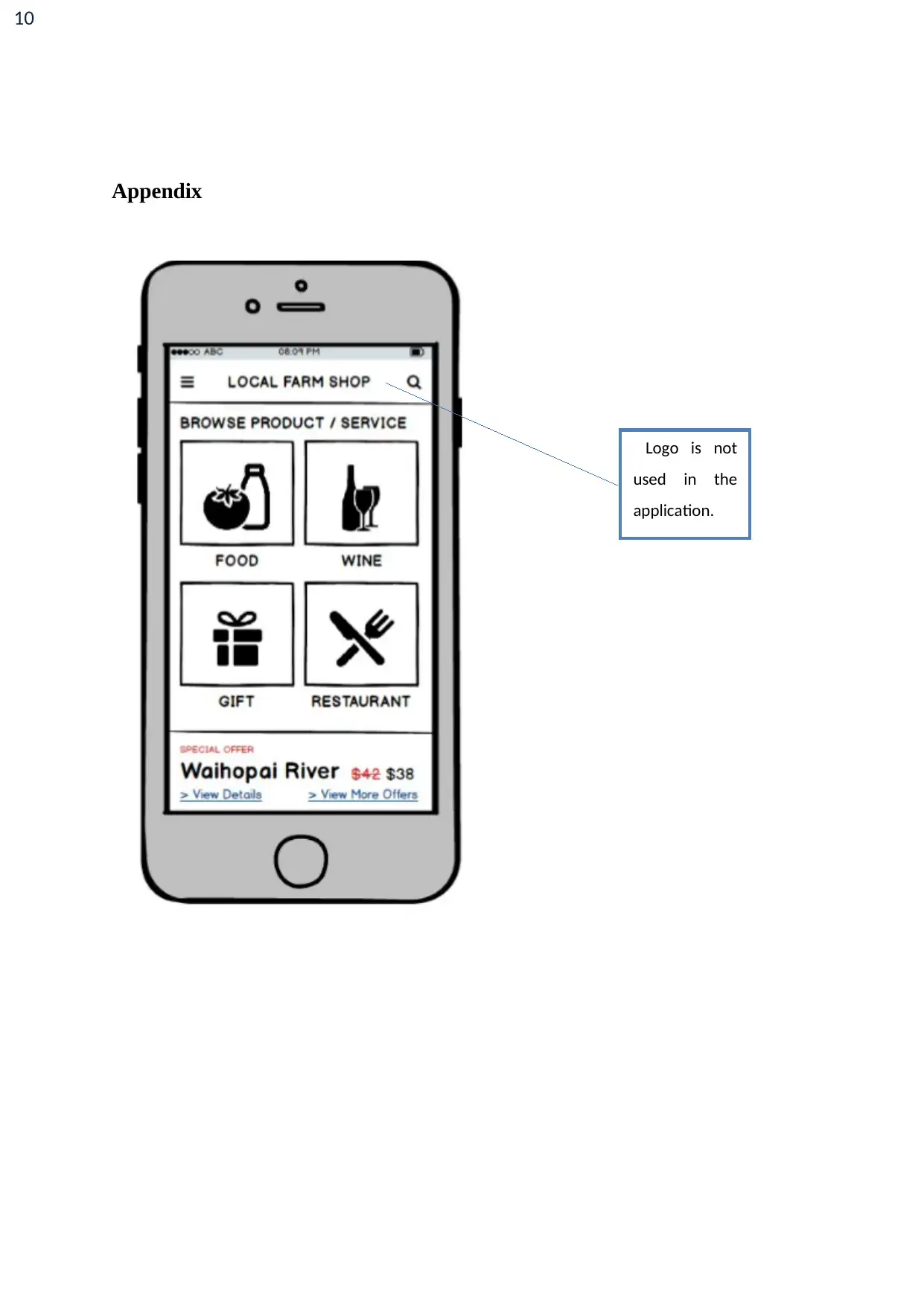
Reason for issue: The logo for application “Local farm shop” is not used in any
screen of application which creates confusion to the user that application is of which
type.
Issue classification: It can be a major issue as it can create confusion in user mind.
Action to resolve the issue: In application, the logo should be used to make the
application more user-friendly.
3. User control and freedom:
Sometimes it happens that user clicks on something accidentally and he might want to undo
that action and move out from that situation. So, there should be an emergency button for the
user.
4
Issue and its location: In this design of group 14 none of the screens implemented
the heuristic principle “user control and freedom”.
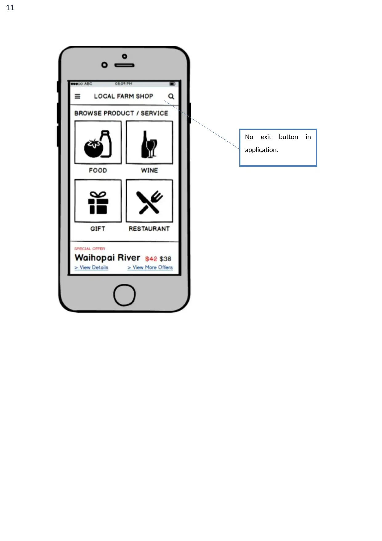
The reason for the issue: No exit button is present on any screen to help the user to
exit the application and no back button is present to move to the previous screen.
Issue classification: It is classified as a major issue.
Action to resolve the issue: A logout button should be present on each screen of
application and a back button should be also placed so that user can navigate between
the application.
4. Consistency and standards:
This heuristic principle explains that in an application the consistency should be maintained.
It should not create problem to the user when different platform conventions are used in the
application.
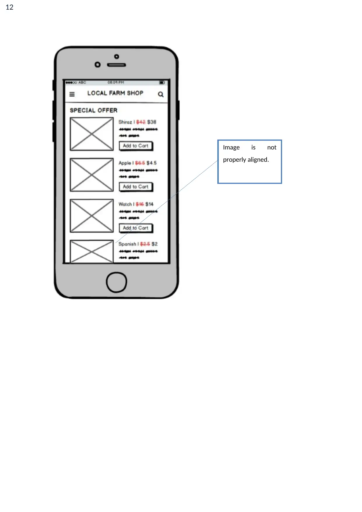
Issue and its location: Some screens do not use proper alignment like in screen
special offer, search product display screen.
Reason for issue: The image icon in special offer screen is merging with the lower
boundary of phone screen which creates confusion that there are more products left
on the screen.
Issue classification: It is a minor issue but needs to be improved.
Action to resolve the issue: The image icon should be placed above the lower
boundary of the screen so that user knows the screen ends here.
5. Error Prevention:
Sometimes, the user clicks on any button which does an undesired action so a confirmation
message should be there for such buttons and option on the screen.
Issue and its location: The restaurant booking screen should ask for final
confirmation before booking of the restaurant.
The reason for the issue: The booking is directly done and no confirmation page
occurs before booking done.
Issue classification: It is a major issue as sometimes button can be accidentally
clicked.
Action to resolve the issue: A confirmation screen should be displayed before
booking confirmation.
Secure Best Marks with AI Grader
Need help grading? Try our AI Grader for instant feedback on your assignments.
5
Issues found by Vishal Kamboj:
6. Recognition rather than recall:
The buttons, options, and details on the screen should be clearly visible to users. The
information should be relevant and the user should not face any problem to retrieve
information.
Issue and its location: This issue does not occur in any of the screens in the design of
group 14.
Reason for issue: Every screen displays all relevant details which are needed for the
user to use the application.
Issue classification: No issues are detected.
Action to resolve the issue: As no issue occurred no actions are needed.
7. Flexibility and efficiency of use: Whenever any application is to design the background
theme, color is important for design.
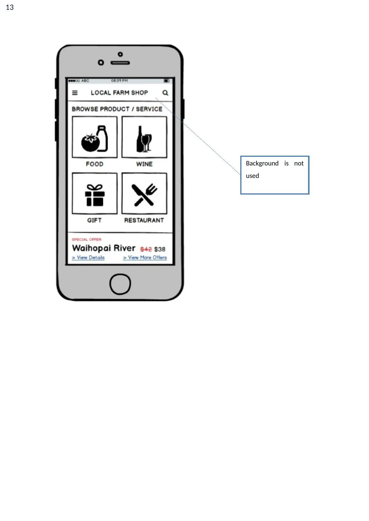
Issue and its location: Background theme is not used on the screen which makes it
design inappropriate.
Reason for issue: As the background is black and white it does not make application
user interactive.
Issue classification: It is a major issue.
Action to resolve the issue: The background theme should be used to make the
application user interactive.
8. Aesthetic and minimalist design: This heuristic principle explains that there should not be
any irrelevant information which creates confusion for the user to use the application.
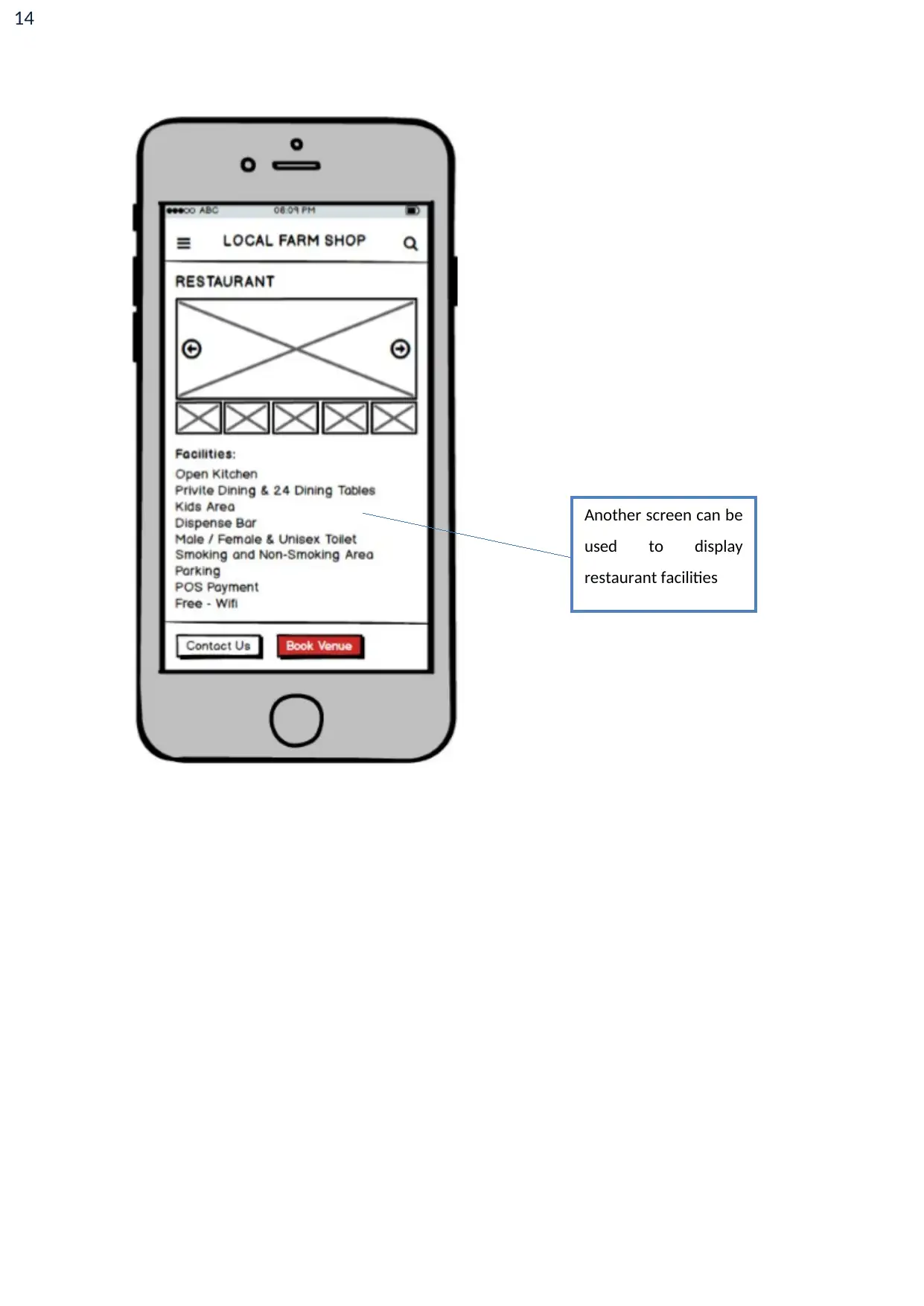
Issue and its location: In local farm application, the restaurant screen faces this
issue. The facilities of the restaurant merged in this screen.
Reason for issue: The facilities can be placed on another screen. The page does not
look user interactive.
Issue classification: It is considered is a minor issue.
Action to resolve the issue: The another screen can be used to place the facilities of
the restaurant.
6
9. Help users diagnose, recognize and recover from errors: Whenever any messages
occurred on the screen the messages should contain easy message so that user can understand
the error.
Issue and its location: Some screens like register screen faces the issue.
The reason of issue: If some information is entered in registered screen and it is
wrong then it does not display error.
Issue classification: This issue is a major issue as system accepts wrong information.
Action to resolve the issue: The application should generate an error if the user
entered wrong information.
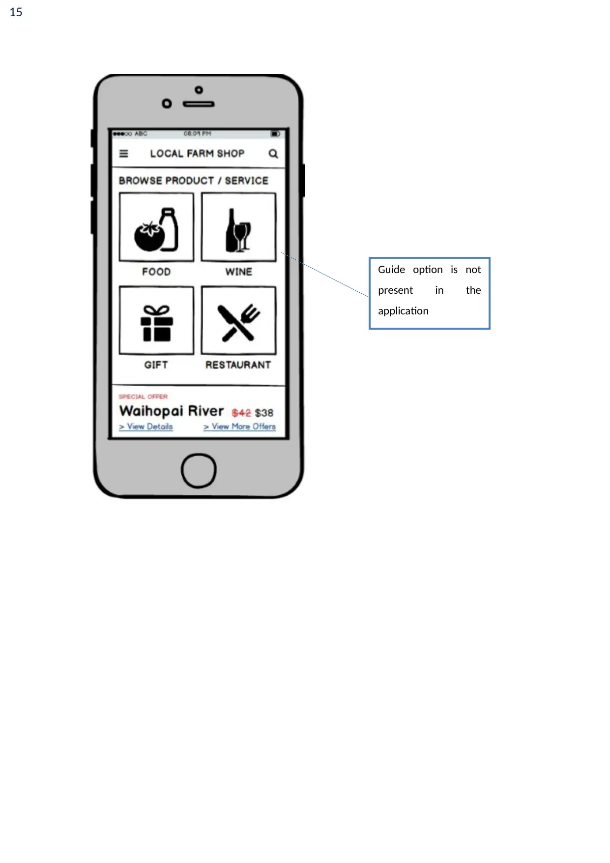
10. Help and documentation: For using any application the guide is necessary to use the
application. It can help the user to better use the application (Uxness, 2015).
Issue and its location: In application, no screen use this heuristic principle.
Reason for issue: Instructions are not mentioned in this application.
Issue classification: It is not classified as a major issue.
Action to resolve the issue: A guide should be there to guide the users to use the
application.
7
Remediation of the usability issues
In previous section issues related to the design of group 14 are discussed. In this section, the
suggestions for improvement of group 14 are discussed by
Remediation by NayankumarKantilal
The logo is not placed in the application which should be there to describe the type of
application.
The exit button is not there in the application which creates a problem for the user to exit
from the application.
In a special offer, the screen image is not properly aligned which create a problem for the
user.
At the time of booking final confirmation should be asked by the user before booking.
Remediation gave by Vishal Kamboj
The background is not set which should be used.
Another screen should be used to display facilities of the restaurant.
The application should generate an error if the user enters wrong information.
The guide should be supplied to the user to use the application “Local farm shop”.
Paraphrase This Document
Need a fresh take? Get an instant paraphrase of this document with our AI Paraphraser
8
Usability Strategy
Usability strategy means to design an application so that the application can be easily used by the
user. The application should be easy and simple to use. There are various suggestions proposed for
group 14 design. If these suggestions are imposed in their design it can make their application better
and easy to use. There are some positive points in group 14 like “visibility of system status” and
“recognition rather than recall” heuristic principles are used. Proper messages are displayed after
every action which informs users about the background process. The options provide complete
information to the user so that user can easily use the application without facing any problem
(Nielsen, 2012).

9
References
Uxness. (2015). 10 Heuristic Principles – Jakob Nielsen’s (Usability Heuristics). Uxness. Retrieved
from http://www.uxness.in/2015/02/10-heuristic-principles-jakob-nielsens.html.
Nielsen, J. (2012). Usability 101: Introduction to Usability. Nielsen Norman Group. Retrieved from
https://www.nngroup.com/articles/usability-101-introduction-to-usability/
10
Appendix
Logo is not
used in the
application.
Appendix
Logo is not
used in the
application.
Secure Best Marks with AI Grader
Need help grading? Try our AI Grader for instant feedback on your assignments.
11
No exit button in
application.
No exit button in
application.
12
Image is not
properly aligned.
Image is not
properly aligned.
13
Background is not
used
Background is not
used
Paraphrase This Document
Need a fresh take? Get an instant paraphrase of this document with our AI Paraphraser
14
Another screen can be
used to display
restaurant facilities
Another screen can be
used to display
restaurant facilities
15
Guide option is not
present in the
application
Guide option is not
present in the
application
1 out of 15
Related Documents
Your All-in-One AI-Powered Toolkit for Academic Success.
+13062052269
info@desklib.com
Available 24*7 on WhatsApp / Email
![[object Object]](/_next/static/media/star-bottom.7253800d.svg)
Unlock your academic potential
© 2024 | Zucol Services PVT LTD | All rights reserved.


