Local Firm Shopping Application
VerifiedAdded on 2023/06/11
|7
|1166
|427
AI Summary
This article discusses the design principles, usability goals, and user experience goals of a local firm shopping application. It also provides recommendations for using the application effectively.
Contribute Materials
Your contribution can guide someone’s learning journey. Share your
documents today.
Local firm shopping application
Name
Institution
Professor
Course
Date
Name
Institution
Professor
Course
Date
Secure Best Marks with AI Grader
Need help grading? Try our AI Grader for instant feedback on your assignments.
Table of Contents
Introduction.................................................................................................................................................3
Target users.................................................................................................................................................3
Design principles.........................................................................................................................................3
Usability goals.............................................................................................................................................4
Users experience goals................................................................................................................................4
Positive and negative design influences......................................................................................................5
Recommendations.......................................................................................................................................6
Conclusion...................................................................................................................................................6
References...................................................................................................................................................6
Introduction
The proposed application focuses on local firm shop services which have been on request
by the several customers. Several customers have been placing request over the phone call or
short messages which has been prone to some human errors. To solve clients’ issues, the shop
management decided to come up with application where customers can place requests and get
exactly that. The system has been designed in such a way that, customers can register with the
shop by availing all the details, place an order and make payment using the same system. The
main requirements of the system are; capturing customer’s location for ease of delivery upon
request, view available services, make an order and make payment successfully.
Target users
First, it targets to make life simple for the elderly who cannot make it cook on their own
when relatives are away. Next, it target working group who do not want to waste time moving to
the shop and back to the office again. Finally, it also targets customers who want get some fruits,
toothpastes, shoe polish, late night drinks and already prepared mails on timely manner.
Design principles
Some of the design principles that guided the design of the interface are; efficiency which
focuses on the ability of customers to go through the entire ordering process in an efficient
manner (Law & Sun, 2012). The next principle is familiarity of the content and images which
translate to the entire interface design. Thirdly, the principle of flexibility was of great help when
coming up with the interface that looks good in all situations. Finally, the clarity of the interface
which focuses on presenting simple and understandable content (Hutchison, Beschorner &
Schmidt‐Crawford, 2012). To demonstrate applicability of the principle, the interface can be
seen to very simple and easy to use.
Usability goals
The application interface depicts clearly usability goals such as effectiveness of using the
system by all customers. According to Arnab et al., (2015), next goal is efficiency of using the
system to achieve organizational set goals. In the system, it is possible to search content from
various points as system offers such capability (Brien, 2011). Finally, the search is placed almost
in all interface instances so that customers do not move from page to another while looking for
search option.
Users experience goals
The design of the interface makes it easier for system users to navigate from one page to
the other. Submission of data from one page results to pop up of the next page and customers can
also move to the desired page by click of a menu option. Similarly, system users do not take
much time to enter required data because interface interaction is well explained (Roth, 2015).
Finally, system flow from the start of the process to the end shows user interaction with the
system is very efficient.
Positive and negative design influences
The system offers ability to navigate from one page to the other very fast. It also avails
faster search criterion at any point of system use. It is very clear and simple to use the application
(DeShazo et al., 2010). Next, there is availability of system interaction by generating pop up
messages such as success or failure alerts. Lastly, the application offers map navigation
capability to guide on delivery. The application has following negative aspects; lack of menu bar
Paraphrase This Document
Need a fresh take? Get an instant paraphrase of this document with our AI Paraphraser
in the system which is available in almost all other system. Next, homepage do not have firm
shop profile features such as vision and services offered. Lastly, firm shop offers discount but it
is not clear at which point is it given to customers.
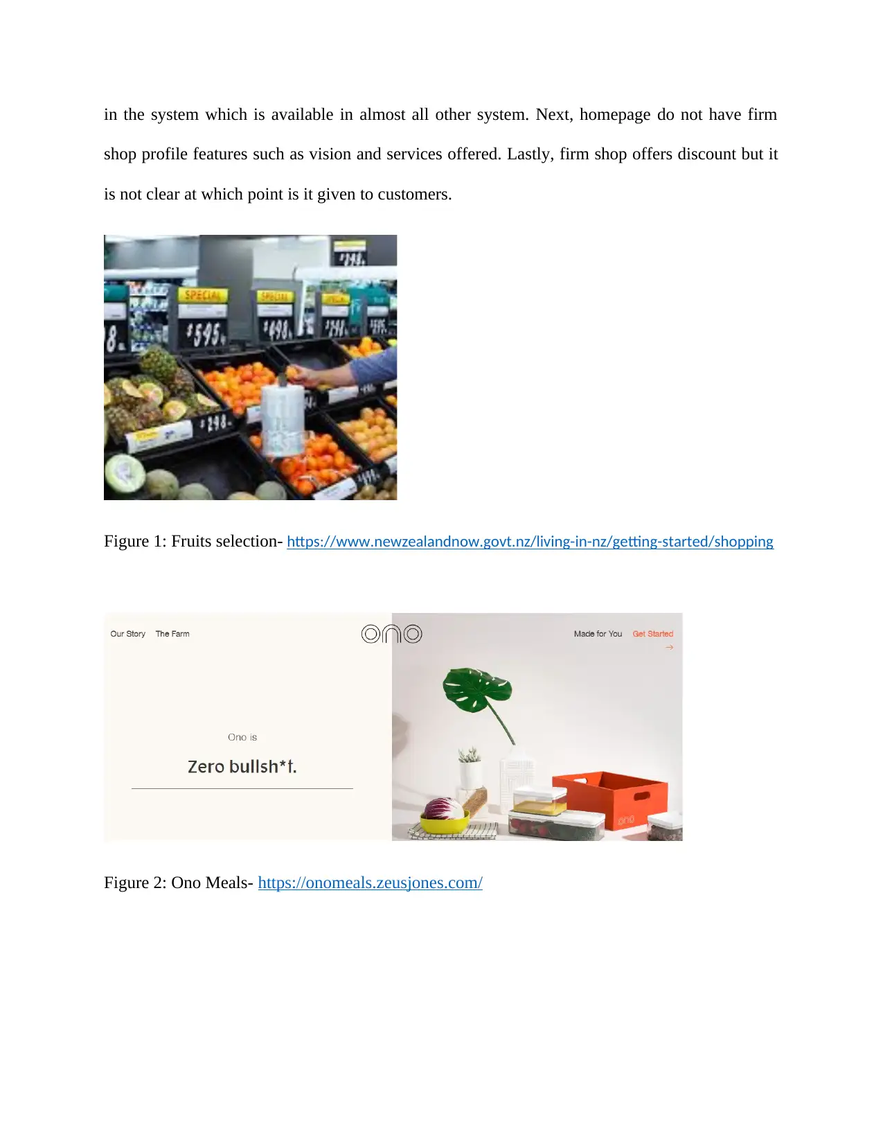
Figure 1: Fruits selection- https://www.newzealandnow.govt.nz/living-in-nz/getting-started/shopping
Figure 2: Ono Meals- https://onomeals.zeusjones.com/
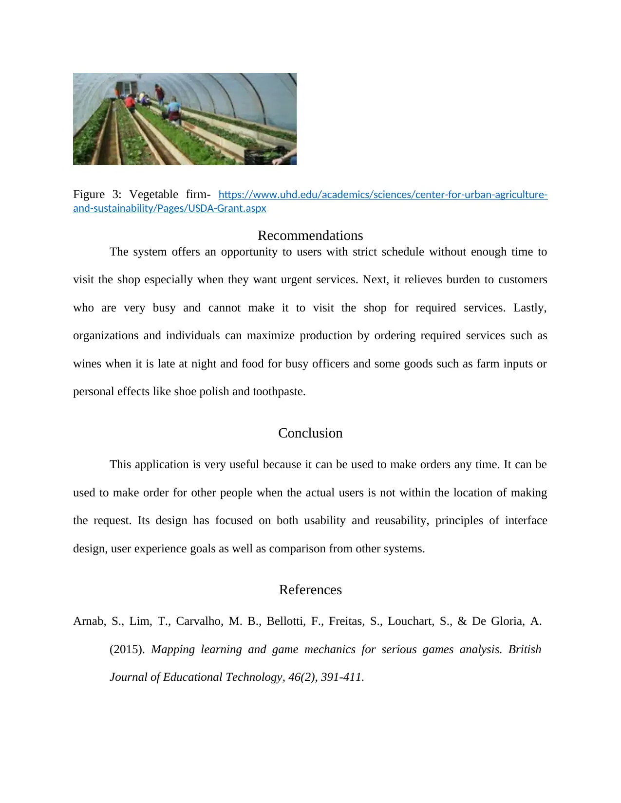
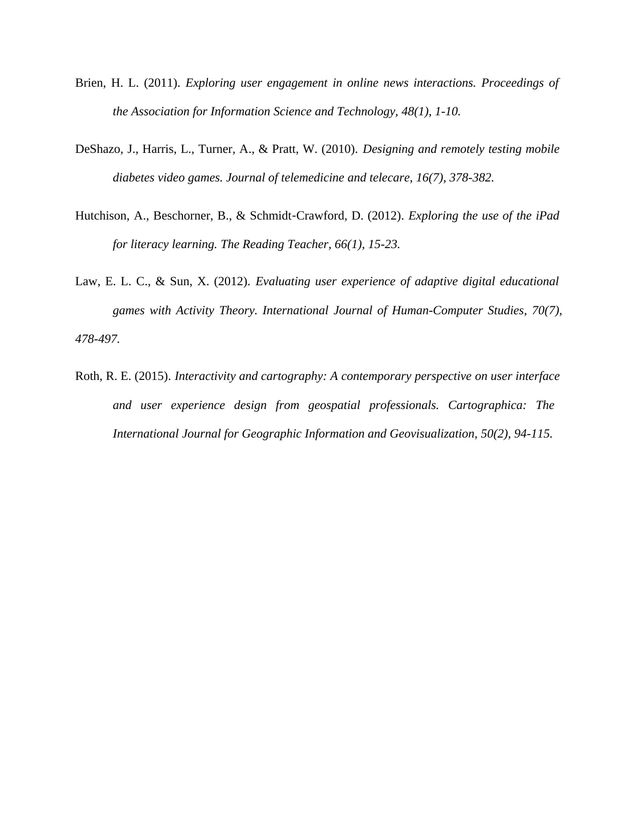
Figure 3: Vegetable firm- https://www.uhd.edu/academics/sciences/center-for-urban-agriculture-
and-sustainability/Pages/USDA-Grant.aspx
Recommendations
The system offers an opportunity to users with strict schedule without enough time to
visit the shop especially when they want urgent services. Next, it relieves burden to customers
who are very busy and cannot make it to visit the shop for required services. Lastly,
organizations and individuals can maximize production by ordering required services such as
wines when it is late at night and food for busy officers and some goods such as farm inputs or
personal effects like shoe polish and toothpaste.
Conclusion
This application is very useful because it can be used to make orders any time. It can be
used to make order for other people when the actual users is not within the location of making
the request. Its design has focused on both usability and reusability, principles of interface
design, user experience goals as well as comparison from other systems.
References
Arnab, S., Lim, T., Carvalho, M. B., Bellotti, F., Freitas, S., Louchart, S., & De Gloria, A.
(2015). Mapping learning and game mechanics for serious games analysis. British
Journal of Educational Technology, 46(2), 391-411.
Brien, H. L. (2011). Exploring user engagement in online news interactions. Proceedings of
the Association for Information Science and Technology, 48(1), 1-10.
DeShazo, J., Harris, L., Turner, A., & Pratt, W. (2010). Designing and remotely testing mobile
diabetes video games. Journal of telemedicine and telecare, 16(7), 378-382.
Hutchison, A., Beschorner, B., & Schmidt‐Crawford, D. (2012). Exploring the use of the iPad
for literacy learning. The Reading Teacher, 66(1), 15-23.
Law, E. L. C., & Sun, X. (2012). Evaluating user experience of adaptive digital educational
games with Activity Theory. International Journal of Human-Computer Studies, 70(7),
478-497.
Roth, R. E. (2015). Interactivity and cartography: A contemporary perspective on user interface
and user experience design from geospatial professionals. Cartographica: The
International Journal for Geographic Information and Geovisualization, 50(2), 94-115.
1 out of 7
![[object Object]](/_next/static/media/star-bottom.7253800d.svg)


