COIT20268 Responsive Web Design: National Geographic AU Evaluation
VerifiedAdded on 2023/06/12
|17
|3325
|392
Report
AI Summary
This report critically evaluates the Australian version of the National Geographic website, focusing on its responsive web design and interactive aspects. The evaluation, conducted using Google Chrome's device simulator, assesses the website against key design principles such as purpose, communication, color, typefaces, media, navigation, pattern design, and load time across large, medium, and small display devices. The report identifies strengths in content communication, color usage, and media integration, while also pointing out potential areas for improvement to enhance user experience across different devices. The analysis considers the website's header, body, and footer sections, and its ability to adapt to varying screen sizes, ultimately providing recommendations for optimizing the website's responsiveness and overall design.

COVER PAGE
Paraphrase This Document
Need a fresh take? Get an instant paraphrase of this document with our AI Paraphraser
Contents
1 Introduction..............................................................................................................................................4
2 Discussion.................................................................................................................................................4
2.0 Website overview..............................................................................................................................4
2.1 Website features...............................................................................................................................4
2.1.1 Header section............................................................................................................................4
2.1.2 Body section...................................................................................................................................5
2.1.3 Footer section.................................................................................................................................5
2.2 Evaluation..........................................................................................................................................5
2.2.1 Large display devices..................................................................................................................6
2.2.2 Medium display devices..............................................................................................................8
2.2.3 Small display devices................................................................................................................12
2.2.4 Other reviewers........................................................................................................................15
3 Recommendation...................................................................................................................................15
3.1 Advantages developer tools............................................................................................................16
3.2 Disadvantages of developer tools....................................................................................................16
4 Conclusion..............................................................................................................................................16
5 References..............................................................................................................................................16
Table of figures
Figure 1: Large display devices 1280x768 pixels..........................................................................................7
Figure 2: Large display devices 1920x768 pixels..........................................................................................7
Figure 3: Medium display devices 480x640 pixels portrait orientation.......................................................9
Figure 4: Medium display devices 480x640 pixels landscape orientation.................................................10
Figure 5: Medium display devices 700x960 pixels portrait orientation.....................................................11
Figure 6: Medium display devices 700x960 pixels landscape orientation.................................................12
Figure 7: tiny display 200x230pixels portrait orientation..........................................................................13
Figure 8: tiny display 200x230pixels landscape orientation......................................................................13
Figure 9: Tiny display 400x460 pixels portrait orientation.........................................................................14
Figure 10: Tiny display 400x460 pixels landscape orientation...................................................................15
⊘ This is a preview!⊘
Do you want full access?
Subscribe today to unlock all pages.

Trusted by 1+ million students worldwide
1 Introduction
This report presents a discussion of the evaluation of the design of Australian version of the National
Geographic website found at http://www.nationalgeographic.com.au/. The evaluation is based on two
aspects; design and responsiveness. The report discusses how the two aspects have been used together to
achieve a high quality design that is usable across various platforms or devices. The evaluation of the
website is done using Google Chrome’s device simulator to achieve consistency for all type of devices
that will be considered in this report.
2 Discussion
2.0 Website overview
http://www.nationalgeographic.com.au/ is the online version of the National Geographic which is a
satellite television network and digital cable television network in America. National Geographic.
National Geographic aims at exploring various events that happened or at happening and then show them
through their television network. The channel is divided into three types;
National Geographic Channel- This channel brings content of exploration of the universe.
Nat Geo people- This channel is focused on exploration of people around the world.
Nat Geo Wild- This channel is aimed at exploring different type of species in various places in
the world.
The website in review is the online where viewers can explore different types of content that National
Geographic is show casing in their different channels. http://www.nationalgeographic.com.au/ is the
Australian version the website and puts an emphasis on the Australian content but this does not mean it
does not show other explorations happening around the world. With the main goal of the organization
being television, the website has a lot of media including high definition pictures and videos. When a user
visits the website, they are basically exploring archives of National Geographic all in one platform. To
improve this experience, the website has a registration feature where users can create an account and then
choose their preferred type of content so that the website can filter the content based on the preferences of
the visitor. For a first time visitor, the landing page enables the visitor to select different types of content
even without registration. Registration helps a visitor to carry their preferences across various devices, for
example if a user is signed on their computer and laptop, the user is likely to see the same content as
compared to a user who is not signed in.
2.1 Website features
The layout of the website uses a common design to achieve consistency in all the pages. The layout of the
website is divided into the following sections.
2.1.1 Header section
The header section is the top most section of the website. It contains the following elements;
Navigation menu- This is the navigation menu used to navigate the different sections and pages
making up the website.
Logo- The logo appears after the navigation menu. In most websites, the logo is made to appear
first and then the navigation menu but for this website, the Logo appears after the navigation.
Search bar- The search bar is used by users to search through the content of the website.
Sign in link- This link is used by users to sign in to their accounts.
Paraphrase This Document
Need a fresh take? Get an instant paraphrase of this document with our AI Paraphraser
Social media links- this is the last section of the header and contains a drop down menu
containing links to various social media platforms.
The header section of the website does not change and remains the same throughout the website.
2.1.2 Body section
The body section contains content that is relevant to the page. For example for the home page, the body
section contains a slideshow and then different types of content filtered according to the visitors
preferences. The visitor has the option of loading even more content at this section
2.1.3 Footer section
This is the last section of every page making up this website. The footer section contains the copyright
information and links to various social media platforms.
2.2 Evaluation
There are various web design principles that are considered when if the website designer wants to achieve
a good website design. To evaluate the National Geographic website, the design of the website will be
evaluated against these principles;
Purpose- A good website design should be able to achieve its initial purpose. For the National
Geographic website, the purpose of the website is to showcase different content allowing the user
to explore through the content thus the design of the website should be able to achieve this
purpose (Friedman, 2018).
Communication- A good website should be able to communicate effectively with the user i.e. the
user should be able to find what they are looking for within a very short period of surfing through
the content. The design should make it easy for the user by organizing the content in sections and
using appropriate images and headers to caption the images. This makes it easy for the user
especially for a website like this which has a large database of content for the user to explore. The
organization of the content should be consisted across various devices with different screen sizes
to avoid a scenario where the content is only organized properly for devices with large screens.
Colors- A good color section is crucial to achieving a good design. A good design should use
colors consistently to make sure that text is visible and the user is able to distinguish different
sections of the website based on the color schemes (Laja, 2012). The font color and background
color on which the text lies on should be selected carefully to make sure there is a high contrast
which will make it easy for the user to read the text.
Typefaces- Typefaces refers to the selection of the font used to write the content of the website.
Considering this website has a lot of reading content, the font selected should be readable across
all platform of devices. The font size should be set to a size that brings out a good design and
makes it easy for the user to see but not too big to bring a cluttering effect to the website. The size
of the font should be different for different types of headings to make the content of the website
more organized.
Media- Use of media for any website is highly encouraged as media help achieve a high quality
design and also speak a lot about the type of website to the visitor without the visitor having to
read through the content to get information about what the website is about. Media can be of
different types including images, animations and videos. A good website should be able to
incorporate all this types of media effectively without affecting the load time of the website. The
media used in a website should be viewable across all type of devices thus the size of the media
should be able to adjust depending on the size of the design it is being viewed on (McAshan,
2016).
Navigation- Navigation is a very crucial factor to consider when designing a cross platform
website. A good website is supposed to achieve a high degree of navigability to make sure that
the visitor of the website is able to navigate through the various pages making the website and is
able to trace their steps to avoid confusing the visitor. The navigation menu should be designed to
adapt according to the type of device the visitor is viewing the website on.
Pattern design- Pattern design is the appearance of text in a website. The national geographic
website has a lot of content in text format thus the pattern design used should make it easy for the
visitor. Different studies have shown that most readers read from left to right starting at the top
going downwards (Mahood, 2012). The national geographic website should adapt this design to
make it easy for the readers to read.
Load time – The load time of a website is the time it takes to load all elements and content of a
page. A good website should be designed in such a way that the loading time is very minimal and
it should always take the least amount of time to load all the content of the page including all
types of media used by the website. This should apply across all types of devices. The National
Geographic website has a lot of media thus it is expected that all the media used should be
optimized to increase the loading time of the website.
These design principles will be the basis on which the National Geographic website will be evaluated
across various types of devices. The type of devices on which the evaluation will be done are;
Large display devices
Medium display devices
Tiny/Small display devices.
Since the website has a lot of pages, a thorough analysis of the website showed that the website web page
to carry out the analysis on and to show the design for various screen sizes is the home page because it
has a lot of content and it is the landing page of the website thus if this page achieves a good design then
visitors can be motivated to access other pages.
2.2.1 Large display devices
Large display devices are devices with large displays with a resolution greater than 1280x768 pixels. The
resolution cannot be the basis of classifying large devices since current smartphones and tablets are able
to achieve very high resolutions thus for this evaluation, large screen devices will be devices with a large
display including desktops, notebooks or televisions that have a capability of opening web pages.
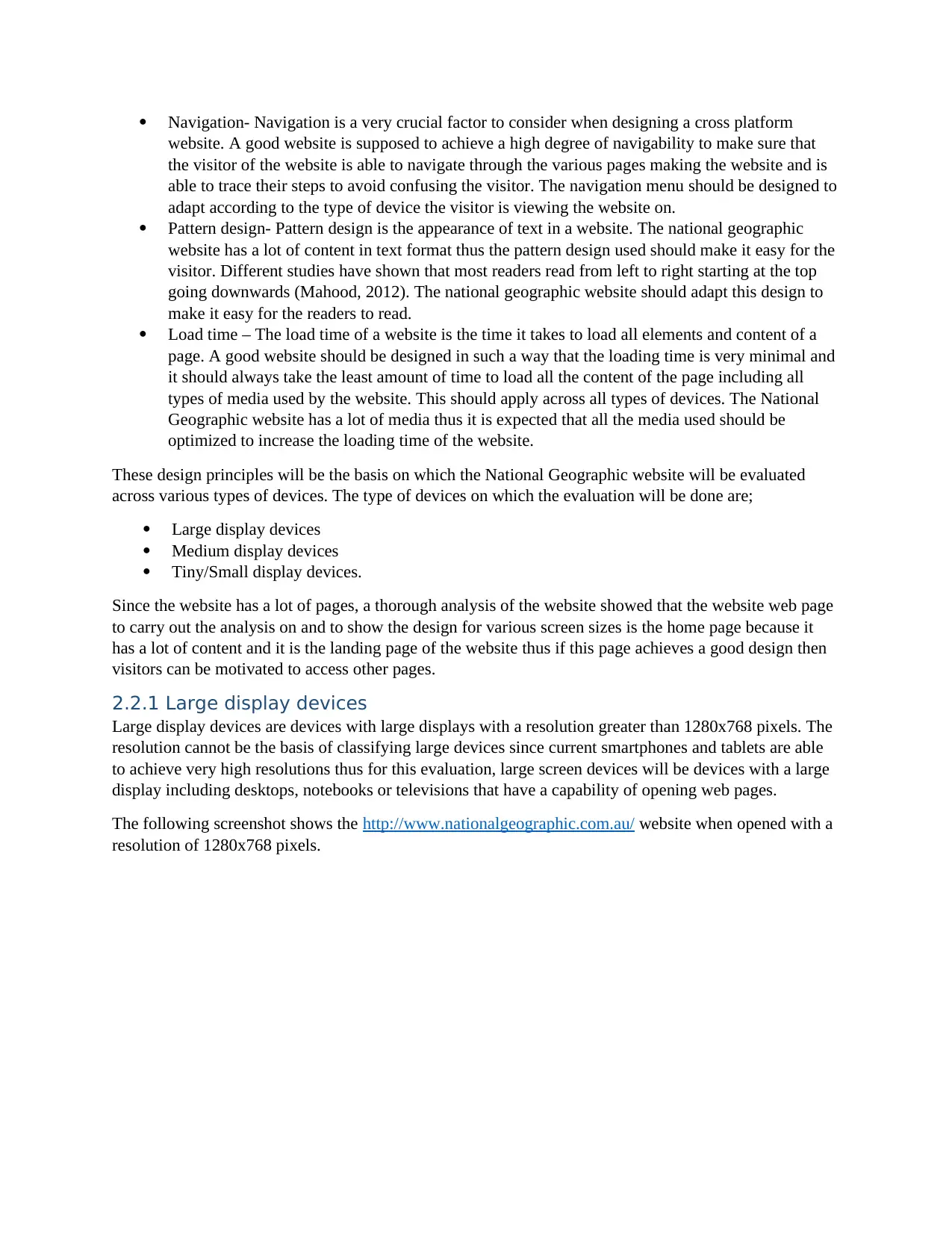
The following screenshot shows the http://www.nationalgeographic.com.au/ website when opened with a
resolution of 1280x768 pixels.
⊘ This is a preview!⊘
Do you want full access?
Subscribe today to unlock all pages.

Trusted by 1+ million students worldwide
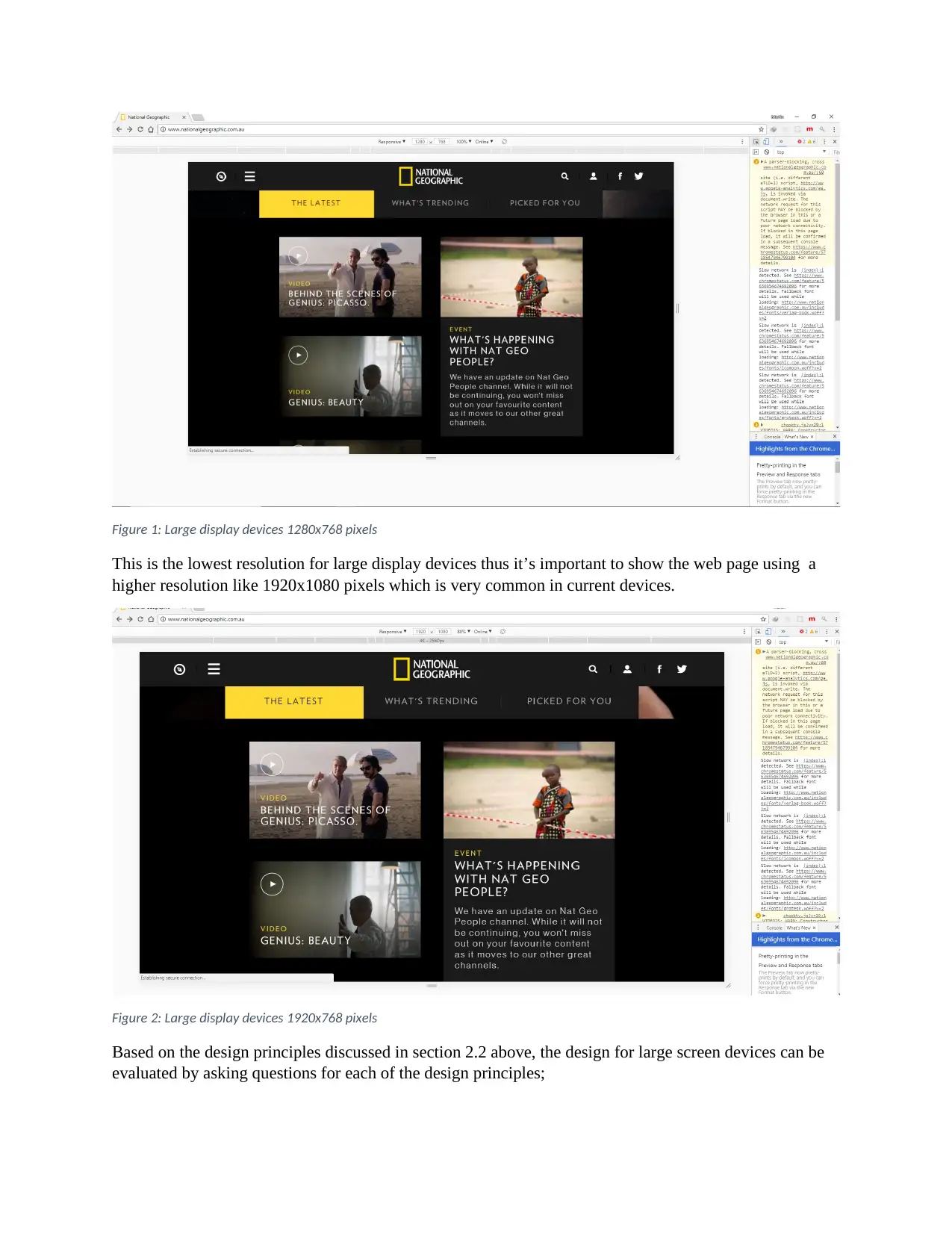
Figure 1: Large display devices 1280x768 pixels
This is the lowest resolution for large display devices thus it’s important to show the web page using a
higher resolution like 1920x1080 pixels which is very common in current devices.
Figure 2: Large display devices 1920x768 pixels
Based on the design principles discussed in section 2.2 above, the design for large screen devices can be
evaluated by asking questions for each of the design principles;
Paraphrase This Document
Need a fresh take? Get an instant paraphrase of this document with our AI Paraphraser
Purpose- Does the website meet its purpose for large display devices. The website meets its
purpose for large display devices as a visitor is able to explore different types of content on the
website
Communication- The website is able to communicate with the user effectively while using large
display devices as the content is well structured and organized thus the visitor is able to find what
they are looking for (Vitaly, 2008). The website also has a search feature that make it easy for the
user to filter content by searching.
Color- The website has adopted a dark background for most of its sections thus its expected the
font color should be a bright color like white or yellow (Stickler, 2016) which is the case for the
National Geographic website
Typefaces- The type of font and size for large display devices is selected properly thus all content
is readable.
Media- The national geographic website has a lot of media which significantly improves the
overall design of the website because the images have been optimized and used effectively in
different sections of the website. The images are able to adapt as shown through the transition
from 1280x768 pixels to 1920x1080 pixels
Navigation- The navigation menu of the website is responsive and adapts to the large display
devices thus it’s easy for the user to navigate through the website.
Pattern design- The pattern used for the large display devices is the F-pattern design which is the
recommended for most users.
Load time – The load time of the website is a bit long and this can be attributed to the large
amount of media used in the design (Woods, 2014)
2.2.2 Medium display devices
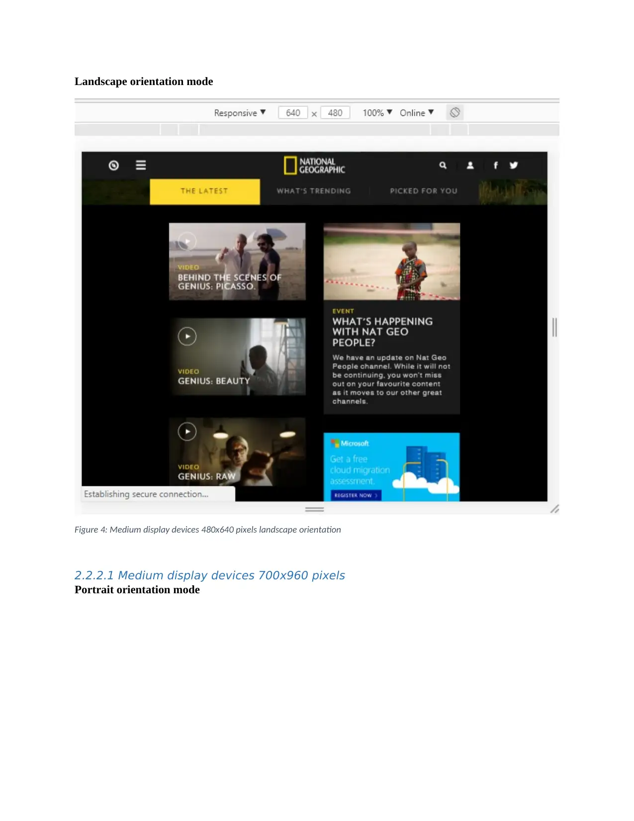
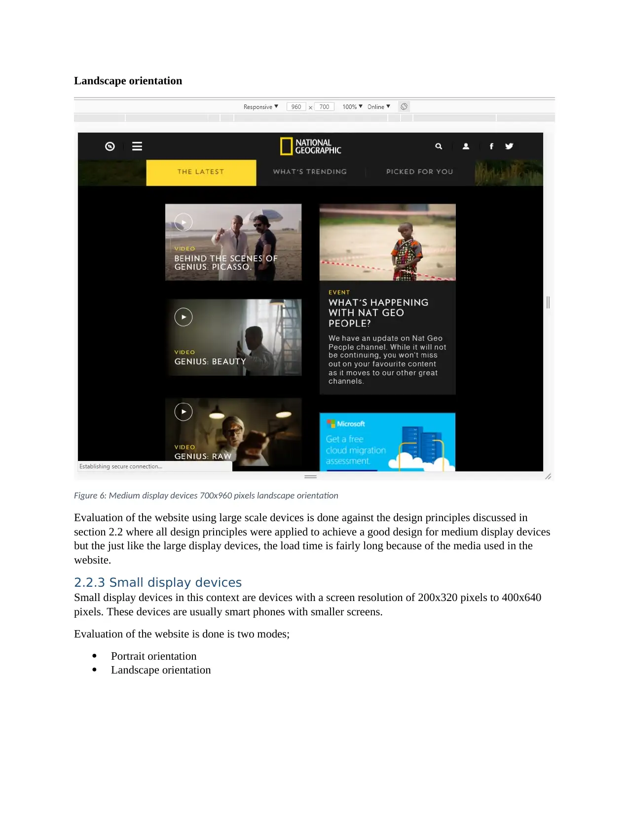
Medium display devices are devices with a medium displays usually having a resolution between
480x640pixels to 700x960 pixels. These devices include the tablets or IPad. Evaluation of the website
was done in two modes;
Portrait orientation mode
Landscape orientation mode
2.2.2.1 Medium display devices 480x640pixels
Portrait orientation
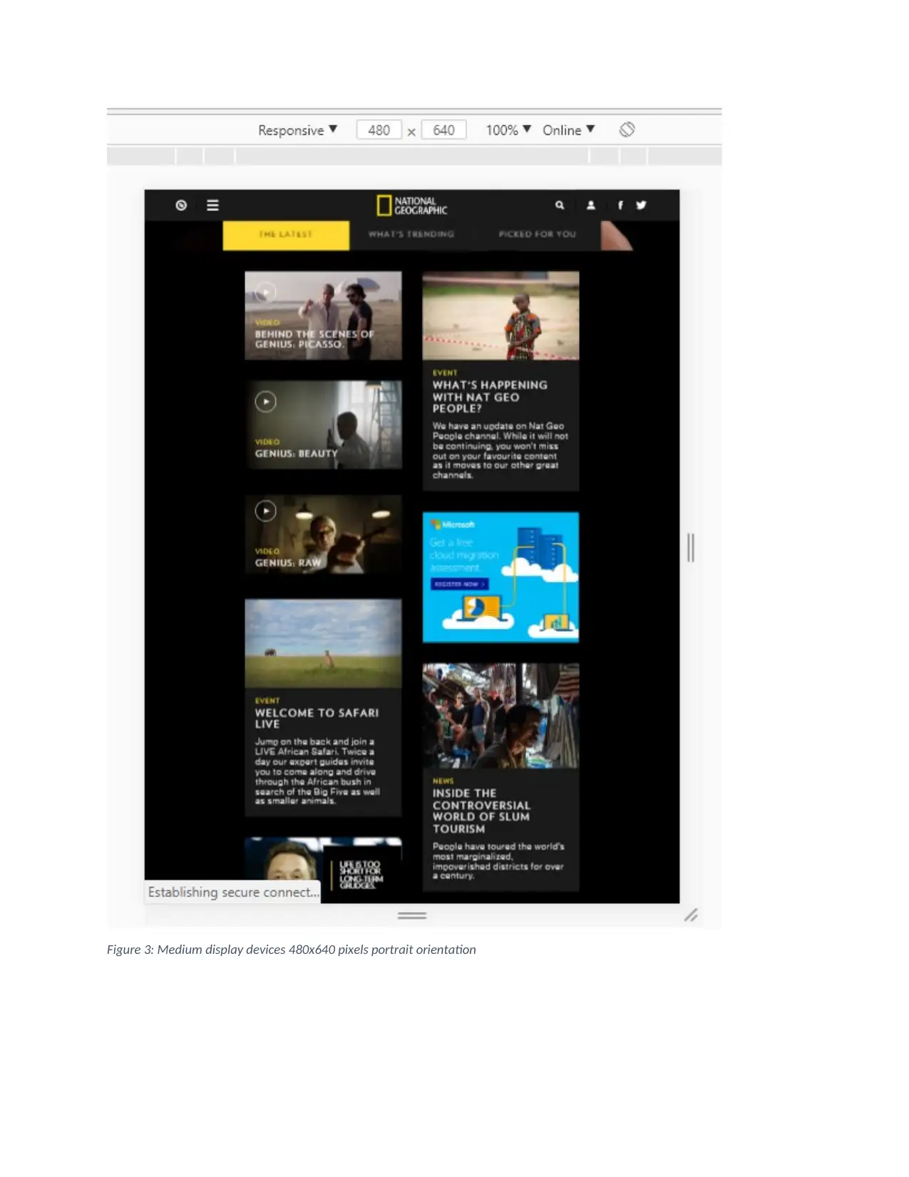
Figure 3: Medium display devices 480x640 pixels portrait orientation
⊘ This is a preview!⊘
Do you want full access?
Subscribe today to unlock all pages.

Trusted by 1+ million students worldwide
Landscape orientation mode
Figure 4: Medium display devices 480x640 pixels landscape orientation
2.2.2.1 Medium display devices 700x960 pixels
Portrait orientation mode
Figure 4: Medium display devices 480x640 pixels landscape orientation
2.2.2.1 Medium display devices 700x960 pixels
Portrait orientation mode
Paraphrase This Document
Need a fresh take? Get an instant paraphrase of this document with our AI Paraphraser
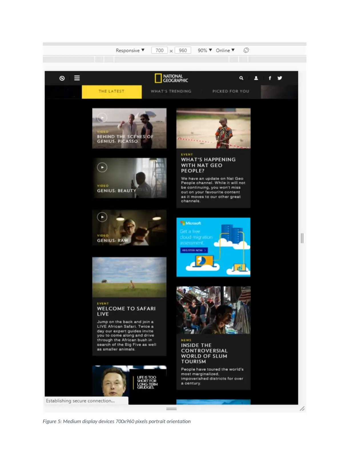
Figure 5: Medium display devices 700x960 pixels portrait orientation
Landscape orientation
Figure 6: Medium display devices 700x960 pixels landscape orientation
Evaluation of the website using large scale devices is done against the design principles discussed in
section 2.2 where all design principles were applied to achieve a good design for medium display devices
but the just like the large display devices, the load time is fairly long because of the media used in the
website.
2.2.3 Small display devices
Small display devices in this context are devices with a screen resolution of 200x320 pixels to 400x640
pixels. These devices are usually smart phones with smaller screens.
Evaluation of the website is done is two modes;
Portrait orientation
Landscape orientation
⊘ This is a preview!⊘
Do you want full access?
Subscribe today to unlock all pages.

Trusted by 1+ million students worldwide
1 out of 17