COIT 20268 (Term 1, 2019) Portfolio 2: Robot Expo Website Development
VerifiedAdded on 2023/03/31
|13
|1133
|304
Practical Assignment
AI Summary
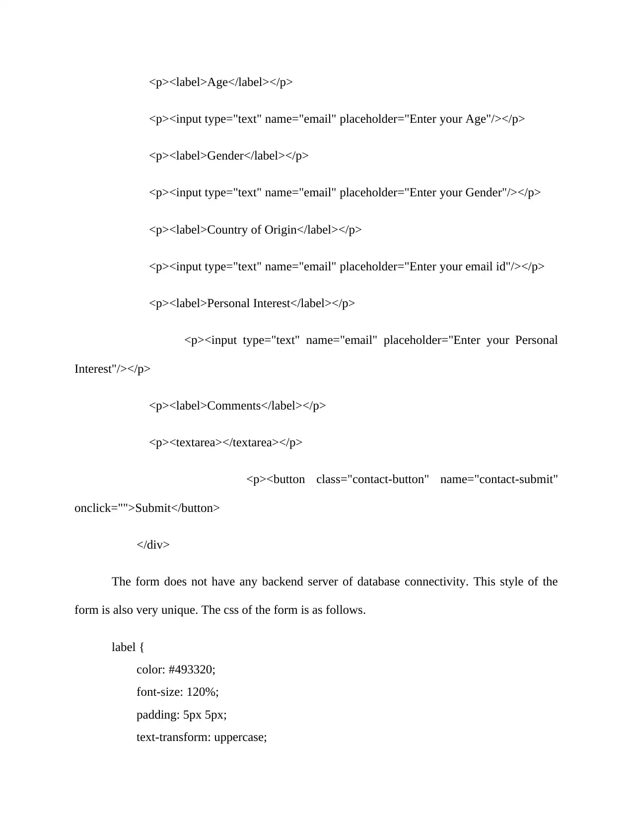
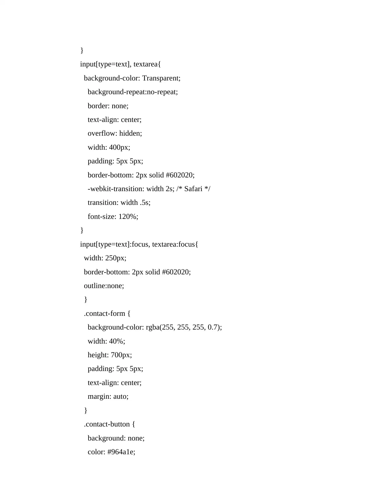
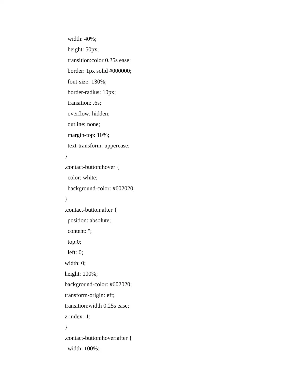
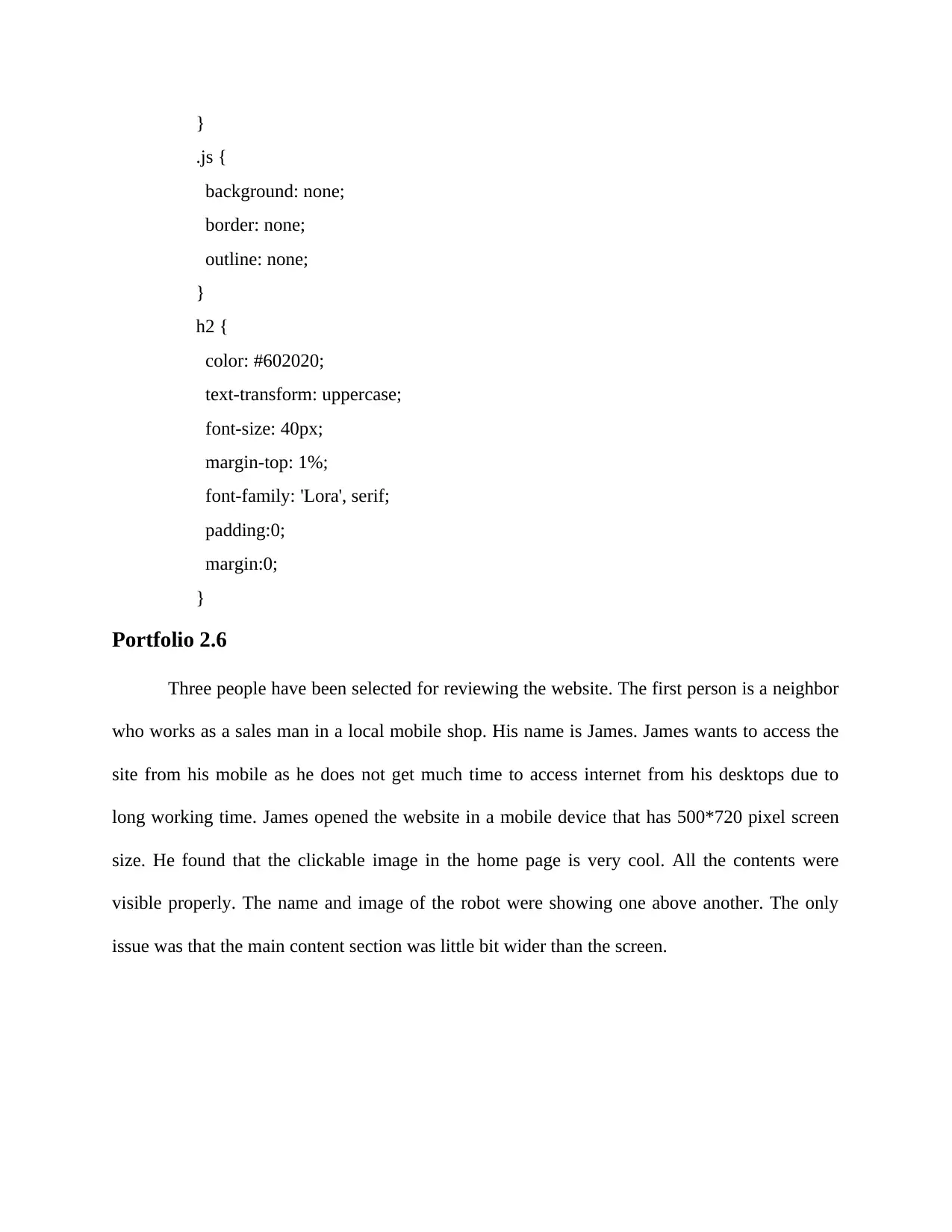
This document represents a practical assignment, Portfolio 2, for the COIT 20268 Responsive Web Design course. The assignment focuses on developing a website for the Robot Expo exhibition. The solution includes wireframes for the homepage, detailing the layout with a main menu, logo, heading, floor map, and robot descriptions. Navigation is implemented using HTML's , , and tags, with distinct pages for different robot categories. The CSS styling incorporates color schemes for headings, navigation, and text, ensuring clear visual hierarchy and mobile responsiveness. The document also provides HTML code for business hours, a contact form with unique styling, and a section on user testing and feedback. James, a neighbor, Alita, a website designer, and a batch mate reviewed the website's mobile responsiveness, design, and overall presentation, highlighting the importance of a user-friendly experience. The project showcases the integration of HTML, CSS, and JavaScript to achieve a responsive and user-friendly website design.
1 out of 13
Related Documents


Your All-in-One AI-Powered Toolkit for Academic Success.
+13062052269
info@desklib.com
Available 24*7 on WhatsApp / Email
![[object Object]](/_next/static/media/star-bottom.7253800d.svg)
Copyright © 2020–2026 A2Z Services. All Rights Reserved. Developed and managed by ZUCOL.