Statistical and Qualitative Approaches to Process Improvement
VerifiedAdded on 2020/04/21
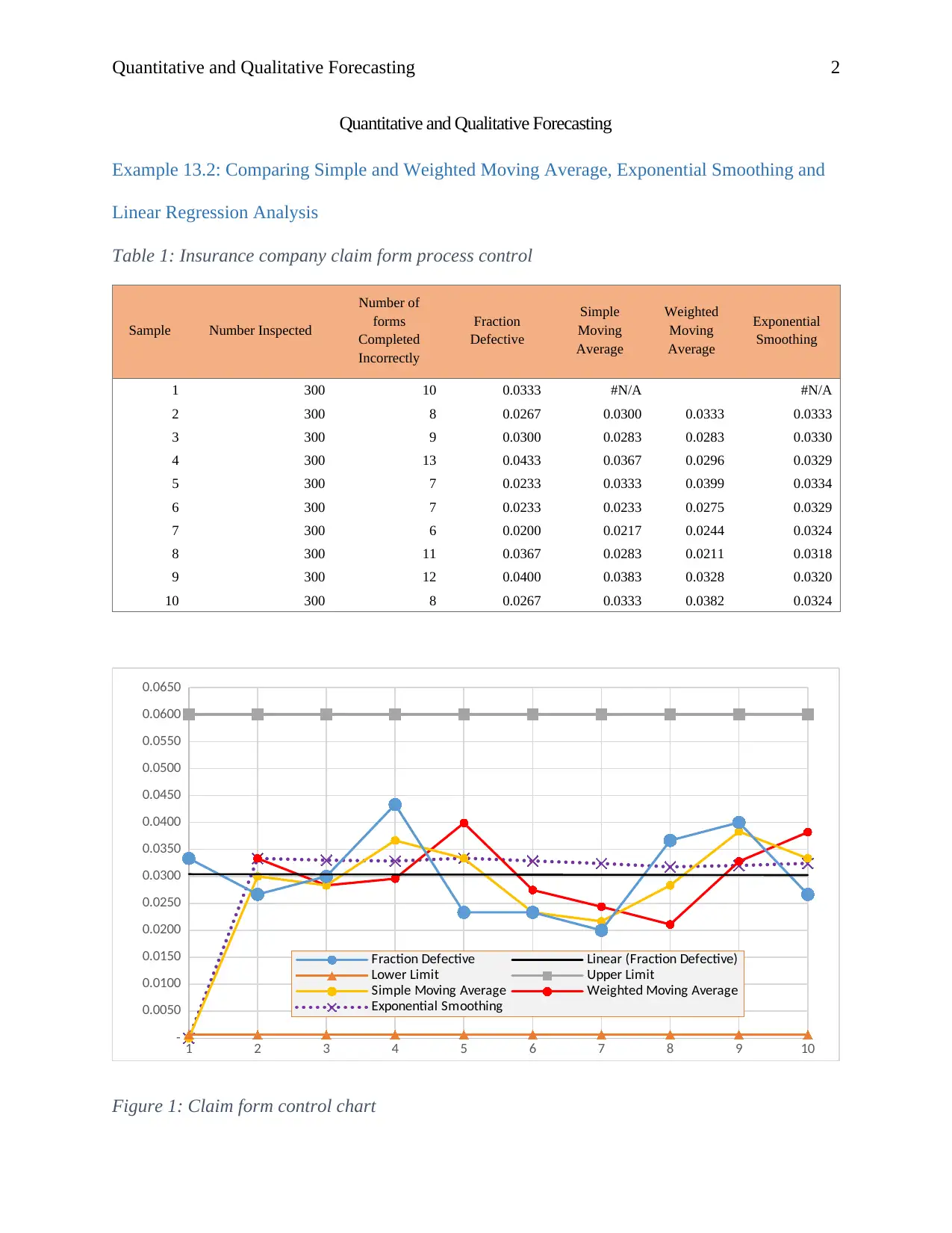
|9
|1195
|289
AI Summary
The analysis focuses on utilizing statistical control charts such as X-bar and R-bar charts to monitor variations in production processes. It evaluates how these charts ensure that the process stays within predefined limits by analyzing sample means and ranges, highlighting their role in maintaining quality standards. Additionally, the assignment explores qualitative forecasting methods like market research, panel consensus, historical analogies, and the Delphi method. These techniques help businesses anticipate future trends based on customer preferences and market changes, supporting strategic decision-making. By combining quantitative control measures with qualitative insights, organizations can enhance their production processes and improve overall performance.
1 out of 9
Your All-in-One AI-Powered Toolkit for Academic Success.
+13062052269
info@desklib.com
Available 24*7 on WhatsApp / Email
![[object Object]](/_next/static/media/star-bottom.7253800d.svg)
Copyright © 2020–2026 A2Z Services. All Rights Reserved. Developed and managed by ZUCOL.