Statistical Analysis of Property Market Data: Homework Assignment
VerifiedAdded on 2019/10/08
|9
|1994
|276
Homework Assignment
AI Summary
This statistics assignment analyzes property market data from various suburbs. It begins with identifying data types and constructing pie charts to compare bedroom distributions. The assignment then calculates and interprets measures of central tendency (mean, median, mode) for property prices, determining the most appropriate measure. It uses Excel to create scatterplots, calculate correlation coefficients, and predict property prices based on household income. Boxplots are created and compared to analyze selling prices across different suburbs, including outlier identification. The assignment also involves creating and interpreting a cross-tabulation to determine relationships between dwelling types and suburbs. Finally, it addresses an investment scenario, calculating required deposits, comparing investment accounts using effective interest rates, and determining investment timelines.
Question 1.
[Total 8 marks]
a) Name the data type and explain why for each of the following:
i. Number of Bedrooms
Ans: Ordinal, Data is discrete and ordered
(1 mark)
ii. Suburb
Ans: Nominal, Data is discrete but not ordered
(1 mark)
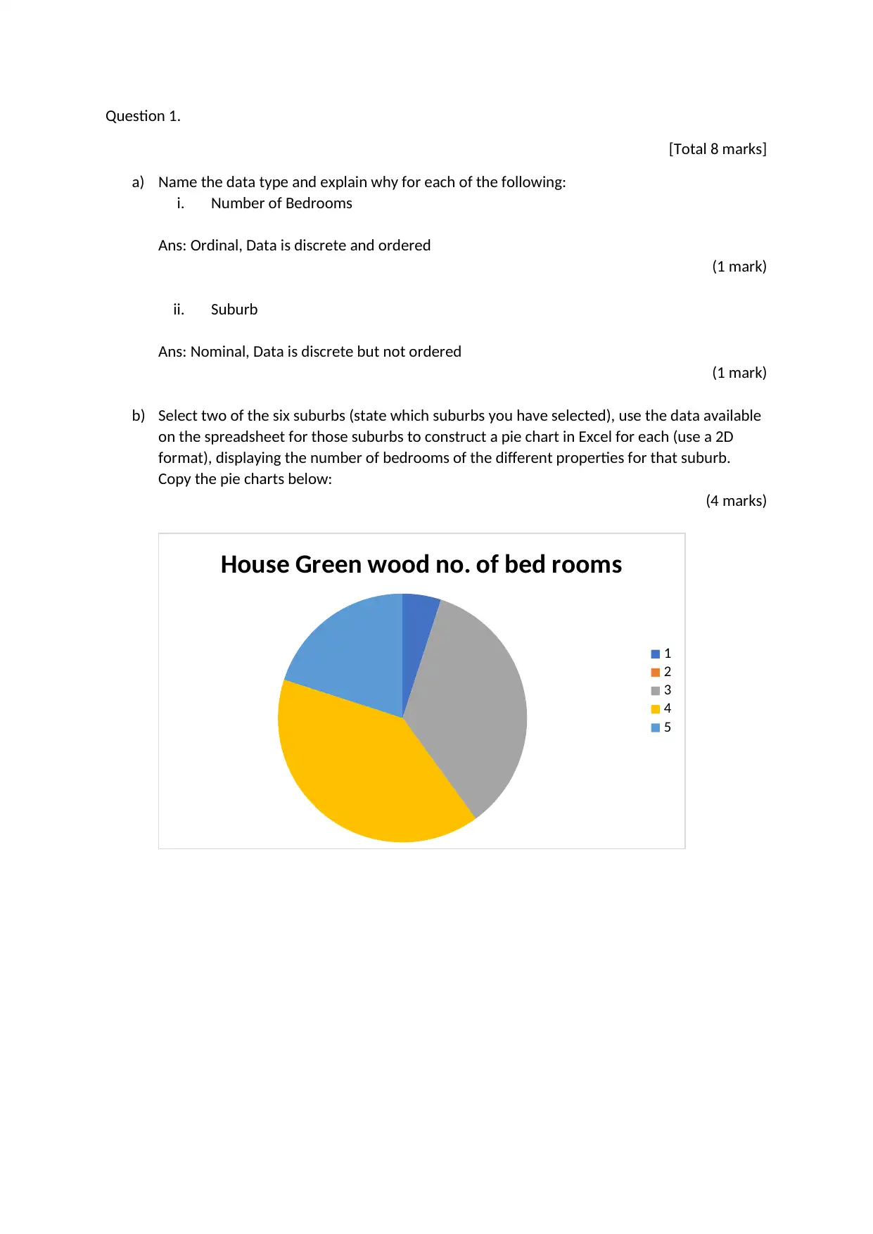
b) Select two of the six suburbs (state which suburbs you have selected), use the data available
on the spreadsheet for those suburbs to construct a pie chart in Excel for each (use a 2D
format), displaying the number of bedrooms of the different properties for that suburb.
Copy the pie charts below:
(4 marks)
House Green wood no. of bed rooms
1
2
3
4
5
[Total 8 marks]
a) Name the data type and explain why for each of the following:
i. Number of Bedrooms
Ans: Ordinal, Data is discrete and ordered
(1 mark)
ii. Suburb
Ans: Nominal, Data is discrete but not ordered
(1 mark)
b) Select two of the six suburbs (state which suburbs you have selected), use the data available
on the spreadsheet for those suburbs to construct a pie chart in Excel for each (use a 2D
format), displaying the number of bedrooms of the different properties for that suburb.
Copy the pie charts below:
(4 marks)
House Green wood no. of bed rooms
1
2
3
4
5
Paraphrase This Document
Need a fresh take? Get an instant paraphrase of this document with our AI Paraphraser
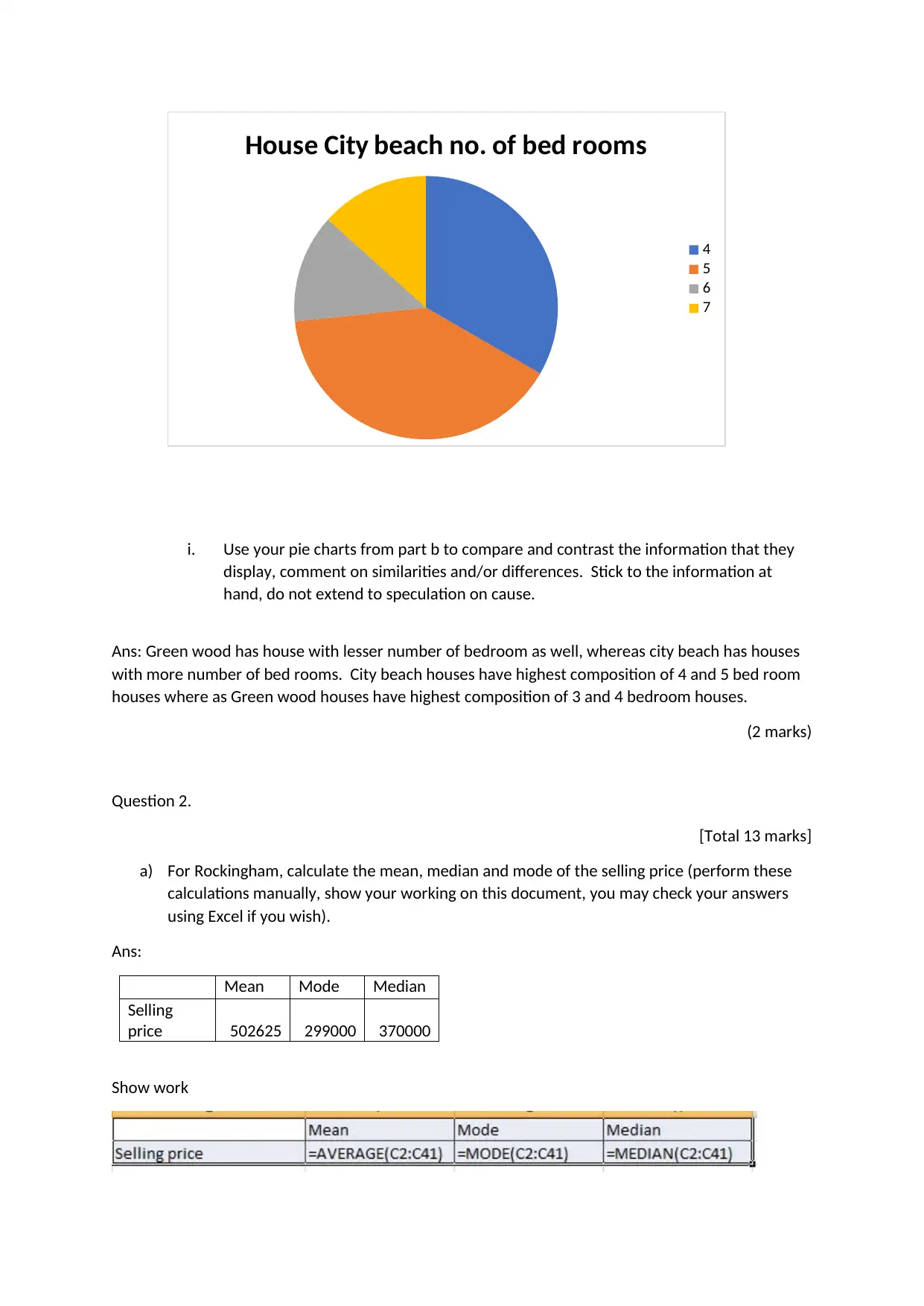
House City beach no. of bed rooms
4
5
6
7
i. Use your pie charts from part b to compare and contrast the information that they
display, comment on similarities and/or differences. Stick to the information at
hand, do not extend to speculation on cause.
Ans: Green wood has house with lesser number of bedroom as well, whereas city beach has houses
with more number of bed rooms. City beach houses have highest composition of 4 and 5 bed room
houses where as Green wood houses have highest composition of 3 and 4 bedroom houses.
(2 marks)
Question 2.
[Total 13 marks]
a) For Rockingham, calculate the mean, median and mode of the selling price (perform these
calculations manually, show your working on this document, you may check your answers
using Excel if you wish).
Ans:
Mean Mode Median
Selling
price 502625 299000 370000
Show work
(3 marks)
i. Use your answers calculated in part a to demonstrate and explain which is the most
appropriate measure of central tendency for property prices.
Ans: Mean is the most appropriate measure, since it is grouped data divided into various categories
of properties.
(2 marks)
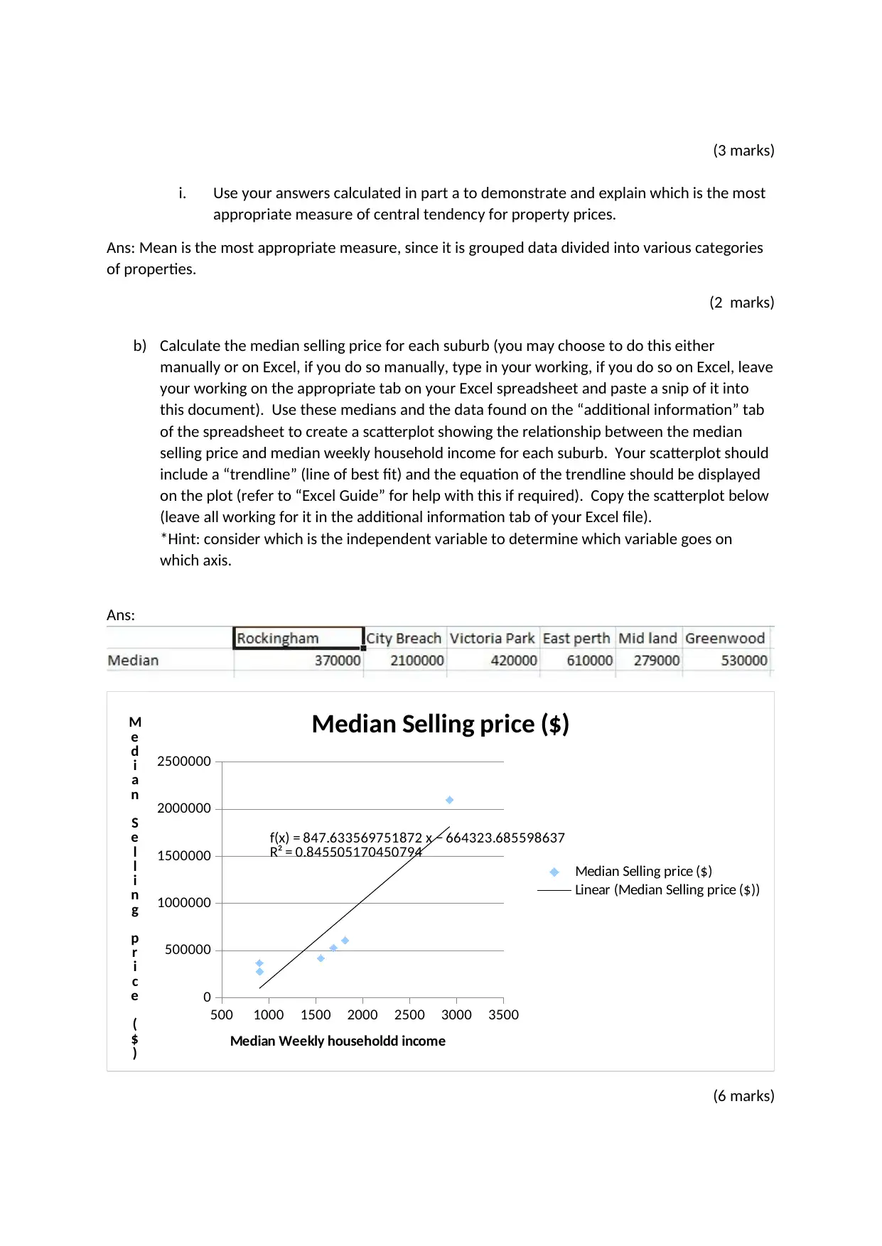
b) Calculate the median selling price for each suburb (you may choose to do this either
manually or on Excel, if you do so manually, type in your working, if you do so on Excel, leave
your working on the appropriate tab on your Excel spreadsheet and paste a snip of it into
this document). Use these medians and the data found on the “additional information” tab
of the spreadsheet to create a scatterplot showing the relationship between the median
selling price and median weekly household income for each suburb. Your scatterplot should
include a “trendline” (line of best fit) and the equation of the trendline should be displayed
on the plot (refer to “Excel Guide” for help with this if required). Copy the scatterplot below
(leave all working for it in the additional information tab of your Excel file).
*Hint: consider which is the independent variable to determine which variable goes on
which axis.
Ans:
500 1000 1500 2000 2500 3000 3500
0
500000
1000000
1500000
2000000
2500000
f(x) = 847.633569751872 x − 664323.685598637
R² = 0.845505170450794
Median Selling price ($)
Median Selling price ($)
Linear (Median Selling price ($))
Median Weekly householdd income
M
e
d
i
a
n
S
e
l
l
i
n
g
p
r
i
c
e
(
$
)
(6 marks)
i. Use your answers calculated in part a to demonstrate and explain which is the most
appropriate measure of central tendency for property prices.
Ans: Mean is the most appropriate measure, since it is grouped data divided into various categories
of properties.
(2 marks)
b) Calculate the median selling price for each suburb (you may choose to do this either
manually or on Excel, if you do so manually, type in your working, if you do so on Excel, leave
your working on the appropriate tab on your Excel spreadsheet and paste a snip of it into
this document). Use these medians and the data found on the “additional information” tab
of the spreadsheet to create a scatterplot showing the relationship between the median
selling price and median weekly household income for each suburb. Your scatterplot should
include a “trendline” (line of best fit) and the equation of the trendline should be displayed
on the plot (refer to “Excel Guide” for help with this if required). Copy the scatterplot below
(leave all working for it in the additional information tab of your Excel file).
*Hint: consider which is the independent variable to determine which variable goes on
which axis.
Ans:
500 1000 1500 2000 2500 3000 3500
0
500000
1000000
1500000
2000000
2500000
f(x) = 847.633569751872 x − 664323.685598637
R² = 0.845505170450794
Median Selling price ($)
Median Selling price ($)
Linear (Median Selling price ($))
Median Weekly householdd income
M
e
d
i
a
n
S
e
l
l
i
n
g
p
r
i
c
e
(
$
)
(6 marks)
⊘ This is a preview!⊘
Do you want full access?
Subscribe today to unlock all pages.
Trusted by 1+ million students worldwide
i. Use Excel to calculate the correlation coefficient between the median weekly
household income and median property selling price variables, enter your answer
below.
Ans:
Correlation coefficient between Median
weekly household income and Median selling
price 0.92
(1 mark)
ii. Use the correlation coefficient from part i to comment on the relationship between
the 2 variables.
Ans: Since correlation coefficient is 0.91, this indicates there is strong positive linear relation
between Median weekly household income and Median selling price
(1 mark)
Question 3.
[Total 11 marks]
For this question, you are required to manually create 2 boxplots by using the “Shapes” and “Text
Box” functions on the “Insert” tab within Word, or by drawing by hand and pasting an image (from a
photograph or scan) of the drawing into this document.
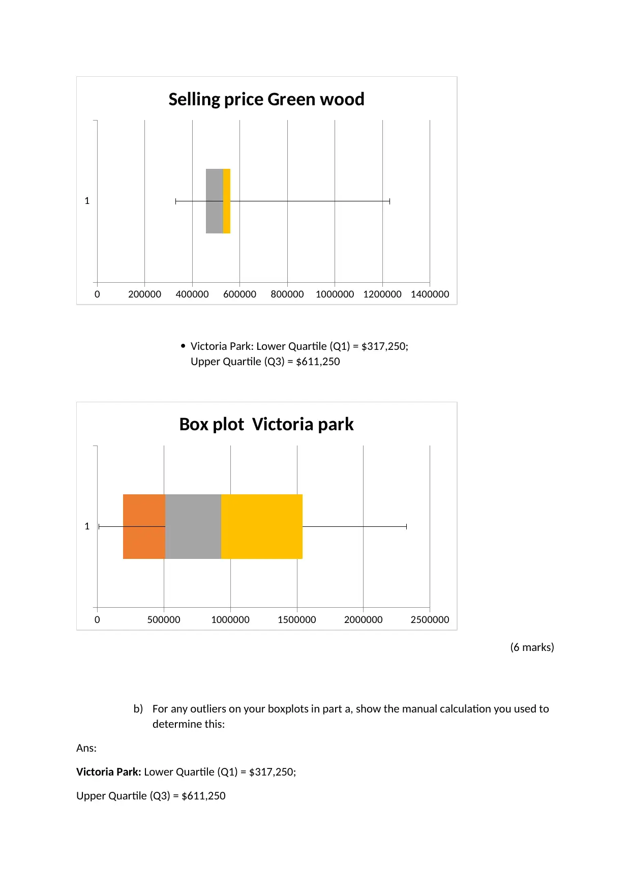
a) Side by side and using the same scale, create a boxplot for the selling prices in
Greenwood and a boxplot for the selling prices in Victoria Park. Label all features of
the boxplots, giving their respective values and include all other appropriate
information for boxplots. To help with your construction of the boxplots, you may
wish to use the following information, along with other calculations you have made
so far in this assignment:
Greenwood: Lower Quartile (Q1) = $456,250;
Upper Quartile (Q3) = $560,000
Ans:
household income and median property selling price variables, enter your answer
below.
Ans:
Correlation coefficient between Median
weekly household income and Median selling
price 0.92
(1 mark)
ii. Use the correlation coefficient from part i to comment on the relationship between
the 2 variables.
Ans: Since correlation coefficient is 0.91, this indicates there is strong positive linear relation
between Median weekly household income and Median selling price
(1 mark)
Question 3.
[Total 11 marks]
For this question, you are required to manually create 2 boxplots by using the “Shapes” and “Text
Box” functions on the “Insert” tab within Word, or by drawing by hand and pasting an image (from a
photograph or scan) of the drawing into this document.
a) Side by side and using the same scale, create a boxplot for the selling prices in
Greenwood and a boxplot for the selling prices in Victoria Park. Label all features of
the boxplots, giving their respective values and include all other appropriate
information for boxplots. To help with your construction of the boxplots, you may
wish to use the following information, along with other calculations you have made
so far in this assignment:
Greenwood: Lower Quartile (Q1) = $456,250;
Upper Quartile (Q3) = $560,000
Ans:
Paraphrase This Document
Need a fresh take? Get an instant paraphrase of this document with our AI Paraphraser
1
0 200000 400000 600000 800000 1000000 1200000 1400000
Selling price Green wood
Victoria Park: Lower Quartile (Q1) = $317,250;
Upper Quartile (Q3) = $611,250
1
0 500000 1000000 1500000 2000000 2500000
Box plot Victoria park
(6 marks)
b) For any outliers on your boxplots in part a, show the manual calculation you used to
determine this:
Ans:
Victoria Park: Lower Quartile (Q1) = $317,250;
Upper Quartile (Q3) = $611,250
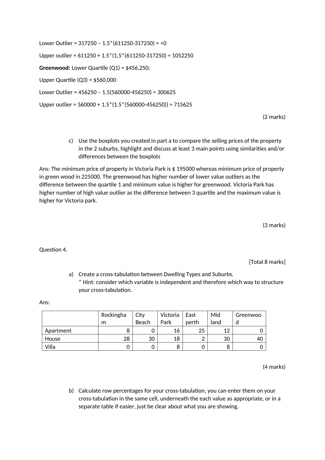
Lower Outlier = 317250 – 1.5*(611250-317250) = <0
Upper outlier = 611250 + 1.5*(1.5*(611250-317250) = 1052250
Greenwood: Lower Quartile (Q1) = $456,250;
Upper Quartile (Q3) = $560,000
Lower Outlier = 456250 – 1.5(560000-456250) = 300625
Upper outlier = 560000 + 1.5*(1.5*(560000-456250)) = 715625
(2 marks)
c) Use the boxplots you created in part a to compare the selling prices of the property
in the 2 suburbs, highlight and discuss at least 3 main points using similarities and/or
differences between the boxplots
Ans: The minimum price of property in Victoria Park is $ 195000 whereas minimum price of property
in green wood in 225000. The greenwood has higher number of lower value outliers as the
difference between the quartile 1 and minimum value is higher for greenwood. Victoria Park has
higher number of high value outlier as the difference between 3 quartile and the maximum value is
higher for Victoria park.
(3 marks)
Question 4.
[Total 8 marks]
a) Create a cross-tabulation between Dwelling Types and Suburbs.
* Hint: consider which variable is independent and therefore which way to structure
your cross-tabulation.
Ans:
Rockingha
m
City
Beach
Victoria
Park
East
perth
Mid
land
Greenwoo
d
Apartment 8 0 16 25 12 0
House 28 30 18 2 30 40
Villa 0 0 8 0 8 0
(4 marks)
b) Calculate row percentages for your cross-tabulation, you can enter them on your
cross-tabulation in the same cell, underneath the each value as appropriate, or in a
separate table if easier, just be clear about what you are showing.
⊘ This is a preview!⊘
Do you want full access?
Subscribe today to unlock all pages.
Trusted by 1+ million students worldwide
Ans:
Rockingha
m
City
Beach
Victoria
Park
East
perth
Mid
land
Greenwoo
d
Apartment 13.11% 0.00% 26.23% 40.98% 19.67% 0.00%
House 18.92% 20.27% 12.16% 1.35% 20.27% 27.03%
Villa 0.00% 0.00% 50.00% 0.00% 50.00% 0.00%
(2 marks)
c) Use your cross-tabulation row percentages to determine the presence or absence of
a relationship between the variables, explain how the percentages support your
answer.
Ans: There is relation between dwelling type and suburb region. It can be explained from the table
that premium segment that is Villa it is present only in 2 region, where as houses are present in all
regions.
(2 marks)
Question 5.
[Total 6 marks]
a) Use the equation for the trendline (line of best fit) on your scatterplot in Q2 part a to predict
the following:
i. The median property price for a suburb that has a median weekly household income
of $2,500?
Ans:
y = 847.6x – 66432
Y = 847.6*2500 – 66432
Y = $ 2052568
(2 marks)
ii. The weekly household income of a family purchasing a property in a suburb where
the median property price is $1,000,000, if that family’s income equals the median
for that suburb?
Ans:
y = 847.6x – 66432
1000000 = 847.6x – 66432
X = weekly household income of a family purchasing a property in a suburb = 1258.17
Paraphrase This Document
Need a fresh take? Get an instant paraphrase of this document with our AI Paraphraser
(3 marks)
b) Use the correlation coefficient for the scatterplot, which you found in Q2b), i. to comment
on how accurate you expect the values you predicted in part a of this question to be.
Ans: The valuation of correlation is 0.91, this indicate we can explain (0.91^2) = around 83% of
variation through the equation.
(1 mark)
Question 6.
[Total 14 marks]
Koby is working towards buying his first house, in Midland. He aims to be able to get a loan that will
allow him to spend $285,000. A bank will loan up to 80% of the price of a property without requiring
a guarantor or additional mortgage insurance, Koby has decided to get to this point before he makes
the purchase. He currently has $56,000 in savings.
a) Calculate the minimum total deposit Koby must have in order to obtain a mortgage on a
$285,000 property without using a guarantor or extra insurance.
Ans:
Minimum toatal deposit required = (1-80%)*285000 = $ 57000
(1 mark)
b) Koby has decided to invest his savings until he has accumulated enough for a 20% deposit.
There are 3 investment accounts he is considering:
Bank 1: 2.32% pa compounded annually
Bank 2: 2.15% pa compounded quarterly
Bank 3: 2.30% pa compounded 6 monthly
i. Write an equation for each bank, expressing the future value of the investment (y) in
terms of the number of years of investment (t). Show all working used to arrive at
each equation.
Ans:
FV = y*(1+ interest rate)^t
FV = y*(1+2.32%)^t = y*1.0232t annual compounding
FV = y*(1+2.15%/4)^4t = y*1.00544t quarterly compounding
FV = y*(1+2.30%/2)^2t = y*1.152t quarterly compounding
(5 marks)
ii. Determine the effective interest rate of each of the accounts and use this to identify
which is the best option. Show all working, explain your final answer.
Ans:
FV = y*(1+2.32%)^t = y*1.0232t annual compounding
FV = y*(1+2.15%/4)^4t = y*1.00544t quarterly compounding
FV = y*(1+2.15%/4)^4t = y*1.0217t quarterly compounding
FV = y*(1+2.30%/2)^2t = y*1.0231t Half yearly compounding
Annual rate = 2.32%
Effective annual rate quarterly compounding= 2.17%
Effective annual rate half yearly compounding= 2.31%
The best option is to go for Effective Annual rate = 2.32% which is to go for annual compounding
(5 marks)
iii. Assuming Koby invests with the best option, that you identified in part ii, use trial
and error to determine how long (to the nearest year) it will take before the value of
his account will reach the amount he is required to contribute (the sum that you
calculated in part b).
Ans:
Current value Time in month
Time in
year Future value = Cuurent value*(1+2.32%)^year
56000 1 0.083 56107.132
56000 2 0.167 56214.469
56000 3 0.250 56322.012
56000 4 0.333 56429.760
56000 5 0.417 56537.715
56000 6 0.500 56645.875
56000 7 0.583 56754.243
56000 8 0.667 56862.818
56000 9 0.750 56971.601
56000 10 0.833 57080.592
It will require him 10 months to collect the required amount
(3 marks)
⊘ This is a preview!⊘
Do you want full access?
Subscribe today to unlock all pages.
Trusted by 1+ million students worldwide
1 out of 9


Your All-in-One AI-Powered Toolkit for Academic Success.
+13062052269
info@desklib.com
Available 24*7 on WhatsApp / Email
![[object Object]](/_next/static/media/star-bottom.7253800d.svg)
Unlock your academic potential
Copyright © 2020–2026 A2Z Services. All Rights Reserved. Developed and managed by ZUCOL.