Statistics for Management: Earning, Growth, and Data Analysis Report
VerifiedAdded on 2020/06/06
Paraphrase This Document
INTRODUCTION...........................................................................................................................1
TASK 1............................................................................................................................................1
a): Determination of earning of both men and women from various organisation ...............1
b): Earning of men and women in private as well as public sectors......................................3
C): Time earning chart............................................................................................................5
d): Growth rate.......................................................................................................................6
TASK 2............................................................................................................................................8
Section A................................................................................................................................8
2.1:Representation of data .....................................................................................................8
2.2 (I):Strength and weakness of using measure....................................................................9
2.2 (II): Measure of dispersion.............................................................................................10
2.3 Preparation of report.......................................................................................................11
Section B..............................................................................................................................12
2.4 Line charts to determine relationship among age and weight........................................13
TASK 3..........................................................................................................................................14
Calculation: ..........................................................................................................................14
TASK 4..........................................................................................................................................16
4.1: I) Bar chart.....................................................................................................................16
4.1:(II) Pie-chart...................................................................................................................17
4.2: Consideration of two average price of bedroom houses...............................................18
CONCLUSION..............................................................................................................................19
REFERENCES..............................................................................................................................20
Statistics is a branch of numerical dealing with the collection, interpretation, analysis and
summarising of financial data. Under the process of statistic which consists of different steps that
is needed to be performed by an organisation. With the help of this information every outcomes
will be collected in order to attain business aims and objectives. It is important to have corrective
data by which positive results can be generated with the available resources. The primary
objectives of these data is to reach out a solution which is essential for making company's to
increase their outcomes (Factor Analysis, 2017). The project report consists of different task that
explains the nature and scope of numerical data from various sources. Several charts and graphs
is being used to evaluated data. Analysis of different techniques for perfect analysis. Use of
qualitative and quantitative information is also discussed under this project report. Few effective
tools are also explained in order to reached at perfect solution.
TASK 1
a): Determination of earning of both men and women from various organisation
Earning are the amount of gain that a company produce at particular period of time. It is
basically define as a quarter or annual. It has been seen in every organisation, that employees are
performing there work with the motive to earn maximum profit. In order to deliver their work
they get annual earning from the total earning generated by company during the year. Such
amount is earned at the end of financial year. Total gross income is the amount of fund an
individual or employees gain during the year of time. It is an total pay before accounting for
taxes or other essential deductions. At an organisational level, it is companies total revenue is
deducted out of COGS. It is more effective at the time of preparing an income tax return in an
accounting year. In identifying the total gross earning, the exact amount of income paid to
employees multiply it with hourly wages by total number of working hours in a weak (Curtis,
Kim and Yalagandula, 2011).
Gross annual earnings: Total sum of income generated in a financial year. It is the
amount of cash an individual earns in an accounting year. The mention earnings of men in both
public and private sectors is tested by making proper hypothesis on the earnings of men and
women.
1
⊘ This is a preview!⊘
Do you want full access?
Subscribe today to unlock all pages.
Trusted by 1+ million students worldwide
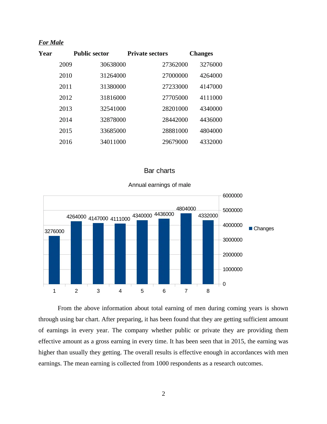
Year Public sector Private sectors Changes
2009 30638000 27362000 3276000
2010 31264000 27000000 4264000
2011 31380000 27233000 4147000
2012 31816000 27705000 4111000
2013 32541000 28201000 4340000
2014 32878000 28442000 4436000
2015 33685000 28881000 4804000
2016 34011000 29679000 4332000
1 2 3 4 5 6 7 8
0
1000000
2000000
3000000
4000000
5000000
6000000
3276000
4264000 4147000 4111000 4340000 4436000
4804000
4332000
Bar charts
Annual earnings of male
Changes
From the above information about total earning of men during coming years is shown
through using bar chart. After preparing, it has been found that they are getting sufficient amount
of earnings in every year. The company whether public or private they are providing them
effective amount as a gross earning in every time. It has been seen that in 2015, the earning was
higher than usually they getting. The overall results is effective enough in accordances with men
earnings. The mean earning is collected from 1000 respondents as a research outcomes.
2
Paraphrase This Document
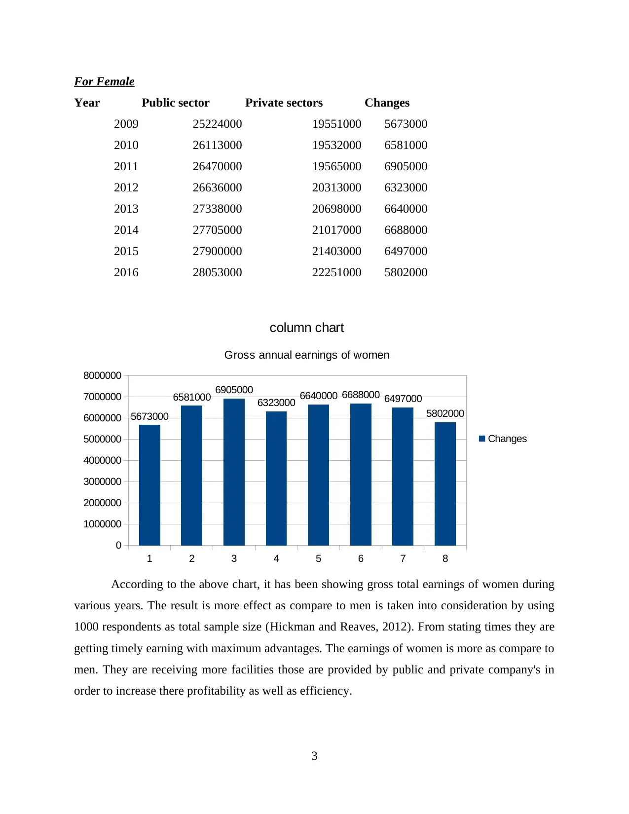
Year Public sector Private sectors Changes
2009 25224000 19551000 5673000
2010 26113000 19532000 6581000
2011 26470000 19565000 6905000
2012 26636000 20313000 6323000
2013 27338000 20698000 6640000
2014 27705000 21017000 6688000
2015 27900000 21403000 6497000
2016 28053000 22251000 5802000
1 2 3 4 5 6 7 8
0
1000000
2000000
3000000
4000000
5000000
6000000
7000000
8000000
5673000
6581000 6905000
6323000 6640000 6688000 6497000
5802000
column chart
Gross annual earnings of women
Changes
According to the above chart, it has been showing gross total earnings of women during
various years. The result is more effect as compare to men is taken into consideration by using
1000 respondents as total sample size (Hickman and Reaves, 2012). From stating times they are
getting timely earning with maximum advantages. The earnings of women is more as compare to
men. They are receiving more facilities those are provided by public and private company's in
order to increase there profitability as well as efficiency.
3
According to the information provided under the case, it has been found that earning
collected from public sector organisation is determine by testing hypothesis. Similarly, in case of
women in the private sectors they are receiving earnings are examine through using effective
research with the help of charts.
For Public sector
Year male female Difference
2009 30638000 25224000 5414000
2010 31264000 26113000 5151000
2011 31380000 26470000 4910000
2012 31816000 26636000 5180000
2013 32541000 27338000 5203000
2014 32878000 27705000 5173000
2015 33685000 27900000 5785000
2016 34011000 28053000 5958000
1 2 3 4 5 6 7 8
0
1000000
2000000
3000000
4000000
5000000
6000000
7000000
5414000 5151000 4910000 5180000 5203000 5173000
5785000 5958000
Line chart
Earnings of men and women from public sector
Difference
Linear (Difference)
From the above line chart, it has been seen that x-axis consists of years and on y-axis
consists of earnings which is received by men and women from public sectors organisation. The
outcomes are showing increasing growth in the earning of both men and women. The straight
4
⊘ This is a preview!⊘
Do you want full access?
Subscribe today to unlock all pages.
Trusted by 1+ million students worldwide

company is targeting to increase there operations by making extra amount so that early results
can be generated.
5
Paraphrase This Document
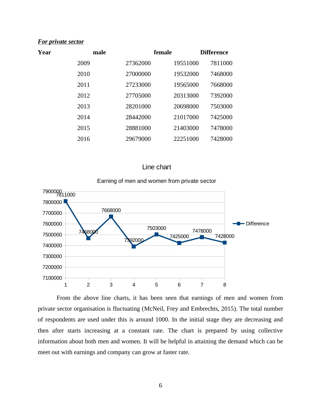
Year male female Difference
2009 27362000 19551000 7811000
2010 27000000 19532000 7468000
2011 27233000 19565000 7668000
2012 27705000 20313000 7392000
2013 28201000 20698000 7503000
2014 28442000 21017000 7425000
2015 28881000 21403000 7478000
2016 29679000 22251000 7428000
1 2 3 4 5 6 7 8
7100000
7200000
7300000
7400000
7500000
7600000
7700000
7800000
7900000
7811000
7468000
7668000
7392000
7503000
7425000
7478000
7428000
Line chart
Earning of men and women from private sector
Difference
From the above line charts, it has been seen that earnings of men and women from
private sector organisation is fluctuating (McNeil, Frey and Embrechts, 2015). The total number
of respondents are used under this is around 1000. In the initial stage they are decreasing and
then after starts increasing at a constant rate. The chart is prepared by using collective
information about both men and women. It will be helpful in attaining the demand which can be
meet out with earnings and company can grow at faster rate.
6

7
⊘ This is a preview!⊘
Do you want full access?
Subscribe today to unlock all pages.
Trusted by 1+ million students worldwide
1 2 3 4 5 6 7 8
0
5000000
10000000
15000000
20000000
25000000
30000000
35000000
40000000
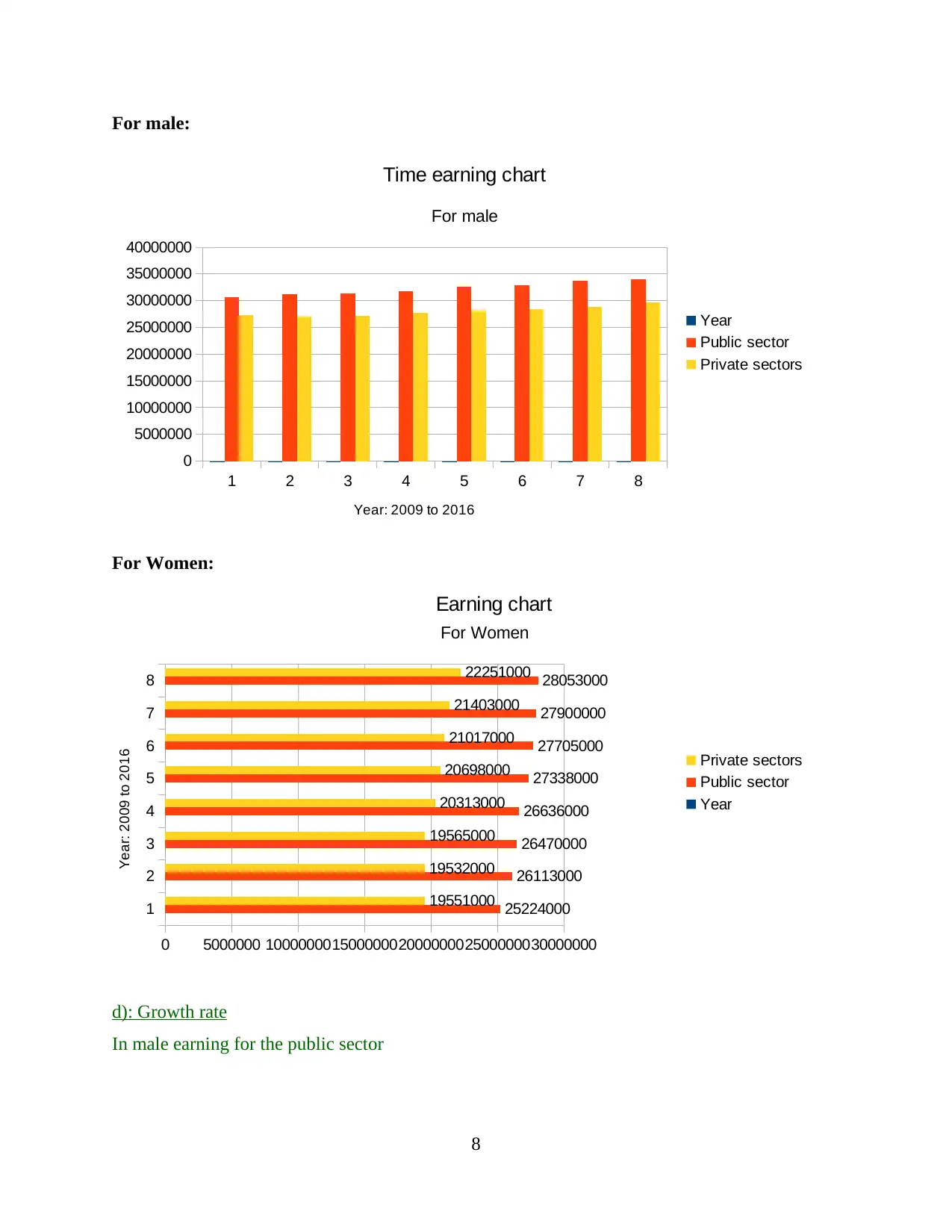
Time earning chart
For male
Year
Public sector
Private sectors
Year: 2009 to 2016
For Women:
1
2
3
4
5
6
7
8
0 5000000 1000000015000000200000002500000030000000
25224000
26113000
26470000
26636000
27338000
27705000
27900000
28053000
19551000
19532000
19565000
20313000
20698000
21017000
21403000
22251000
Earning chart
For Women
Private sectors
Public sector
Year
Year: 2009 to 2016
d): Growth rate
In male earning for the public sector
8
Paraphrase This Document
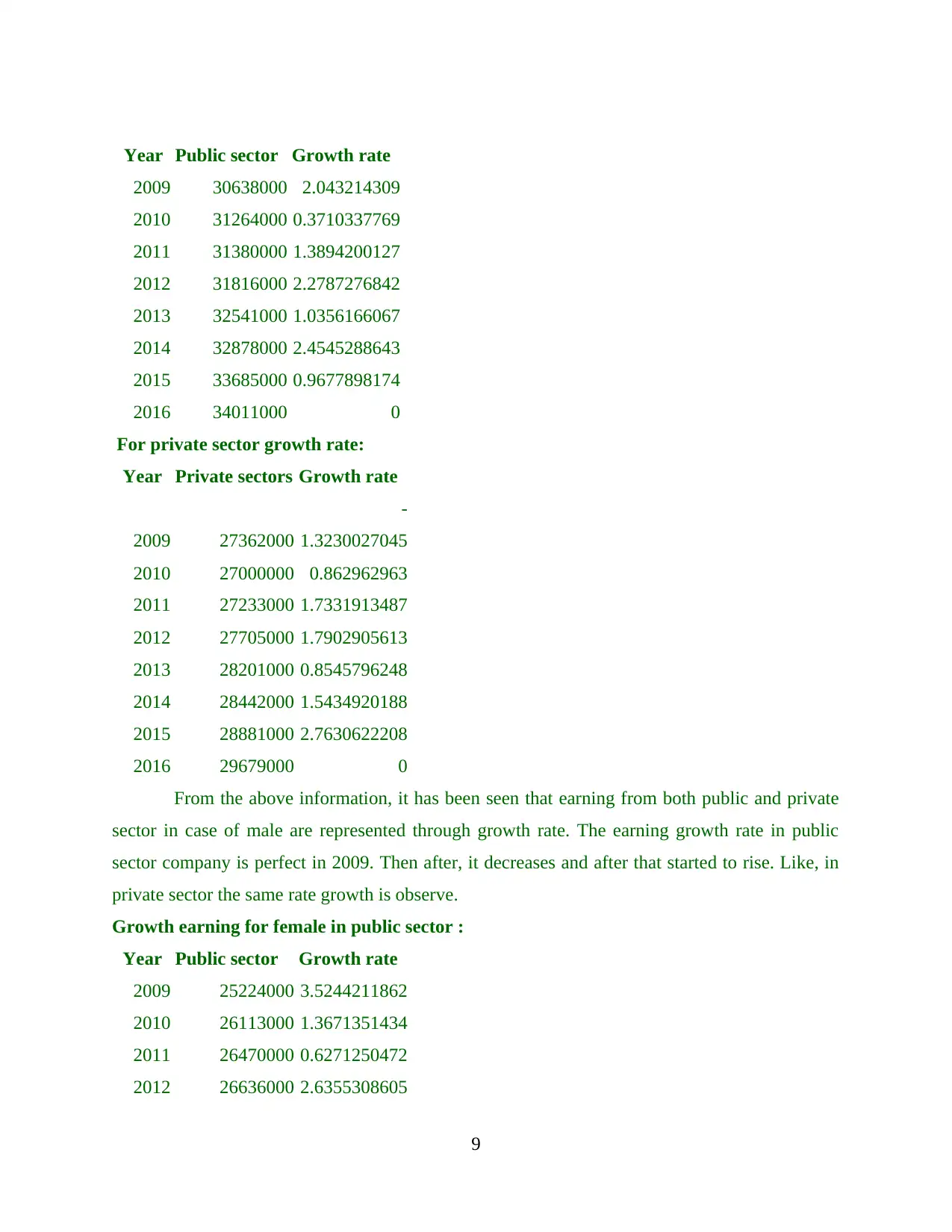
2009 30638000 2.043214309
2010 31264000 0.3710337769
2011 31380000 1.3894200127
2012 31816000 2.2787276842
2013 32541000 1.0356166067
2014 32878000 2.4545288643
2015 33685000 0.9677898174
2016 34011000 0
For private sector growth rate:
Year Private sectors Growth rate
2009 27362000
-
1.3230027045
2010 27000000 0.862962963
2011 27233000 1.7331913487
2012 27705000 1.7902905613
2013 28201000 0.8545796248
2014 28442000 1.5434920188
2015 28881000 2.7630622208
2016 29679000 0
From the above information, it has been seen that earning from both public and private
sector in case of male are represented through growth rate. The earning growth rate in public
sector company is perfect in 2009. Then after, it decreases and after that started to rise. Like, in
private sector the same rate growth is observe.
Growth earning for female in public sector :
Year Public sector Growth rate
2009 25224000 3.5244211862
2010 26113000 1.3671351434
2011 26470000 0.6271250472
2012 26636000 2.6355308605
9
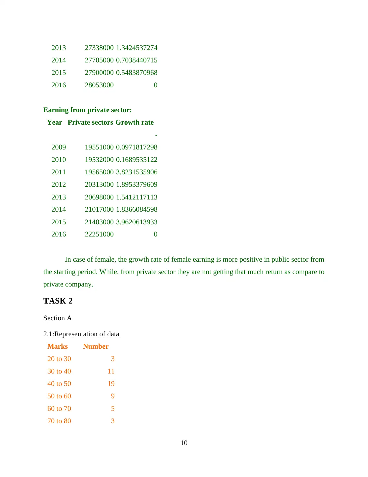
2014 27705000 0.7038440715
2015 27900000 0.5483870968
2016 28053000 0
Earning from private sector:
Year Private sectors Growth rate
2009 19551000
-
0.0971817298
2010 19532000 0.1689535122
2011 19565000 3.8231535906
2012 20313000 1.8953379609
2013 20698000 1.5412117113
2014 21017000 1.8366084598
2015 21403000 3.9620613933
2016 22251000 0
In case of female, the growth rate of female earning is more positive in public sector from
the starting period. While, from private sector they are not getting that much return as compare to
private company.
TASK 2
Section A
2.1:Representation of data
Marks Number
20 to 30 3
30 to 40 11
40 to 50 19
50 to 60 9
60 to 70 5
70 to 80 3
10
⊘ This is a preview!⊘
Do you want full access?
Subscribe today to unlock all pages.
Trusted by 1+ million students worldwide
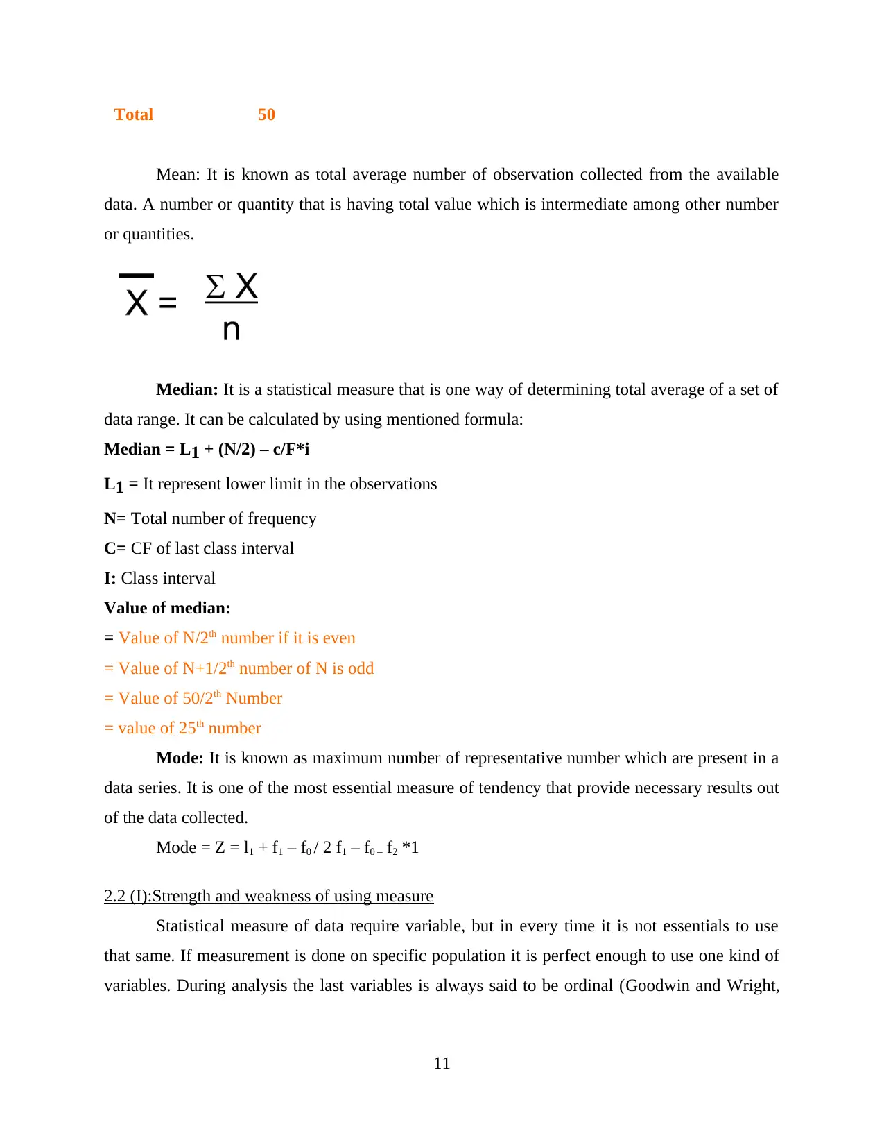
Mean: It is known as total average number of observation collected from the available
data. A number or quantity that is having total value which is intermediate among other number
or quantities.
Median: It is a statistical measure that is one way of determining total average of a set of
data range. It can be calculated by using mentioned formula:
Median = L1 + (N/2) – c/F*i
L1 = It represent lower limit in the observations
N= Total number of frequency
C= CF of last class interval
I: Class interval
Value of median:
= Value of N/2th number if it is even
= Value of N+1/2th number of N is odd
= Value of 50/2th Number
= value of 25th number
Mode: It is known as maximum number of representative number which are present in a
data series. It is one of the most essential measure of tendency that provide necessary results out
of the data collected.
Mode = Z = l1 + f1 – f0 / 2 f1 – f0 – f2 *1
2.2 (I):Strength and weakness of using measure
Statistical measure of data require variable, but in every time it is not essentials to use
that same. If measurement is done on specific population it is perfect enough to use one kind of
variables. During analysis the last variables is always said to be ordinal (Goodwin and Wright,
11
Paraphrase This Document
interval, ratio and other effective aspects.
Strength of using effective measures:
With the use of perfect tools to analyse the results it can provide more accurate and clear
image of final outcomes.
They are applied once applied to the responses once they are gathered to place the data
during research process.
The collected data is compared in order to reach at solid conclusion so that necessary
correction can be made (Venables and Ripley, 2013).
The major advantages of using ordinal measurement is to make ease of collected
information about total marks brought by plenty of students.
Weaknesses:
The responses are often very narrow in accordance to the information collected from
students.
They used to create bias that is not categories during the survey. The measure are
sometime not able to bring perfect solution to their questions.
It can lead the respondents to state their demerits regarding wrong entry of marks into the
register of students.
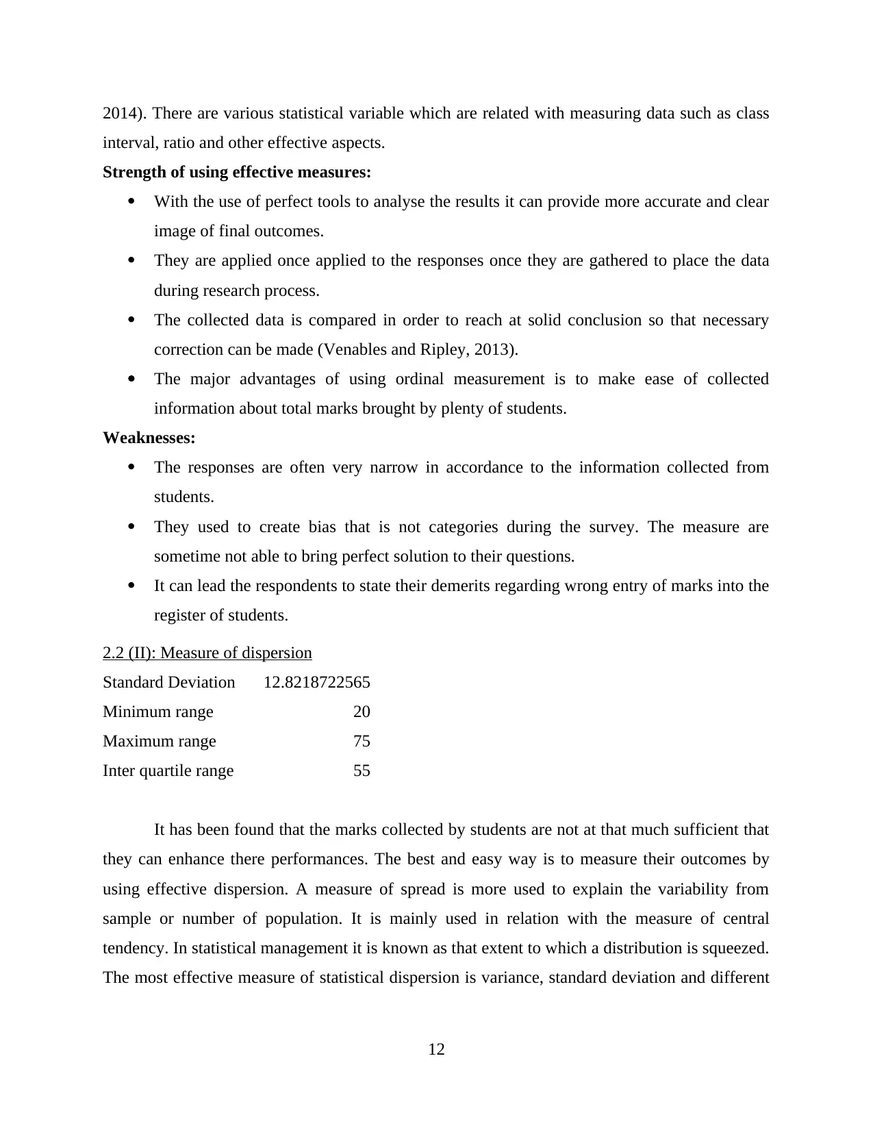
2.2 (II): Measure of dispersion
Standard Deviation 12.8218722565
Minimum range 20
Maximum range 75
Inter quartile range 55
It has been found that the marks collected by students are not at that much sufficient that
they can enhance there performances. The best and easy way is to measure their outcomes by
using effective dispersion. A measure of spread is more used to explain the variability from
sample or number of population. It is mainly used in relation with the measure of central
tendency. In statistical management it is known as that extent to which a distribution is squeezed.
The most effective measure of statistical dispersion is variance, standard deviation and different
12
entirely different. Hence, it describes one requirements to determine the exact variability.
According to the above information provided on the basis of marks. There measure of dispersion
is examine through using:
Standard deviation: It is known as that measure of dispersion which is collected from a
set of information from its total mean. It is determine by square root of variance by estimating
the deviation among every data associated with it. The results says that, it would be 12.8 % of
risk factors present under the data. However, small deviation means that values in statistical data
is more close to mean value. It is sub-divided into various parts:
Relative deviation: A relative standard deviation is special form of deviation that
provide regular deviation in small and large quantity at the time of data calculation.
Absolute deviation: It is the amount of deviation indicate the amount of variation which
occurs around total average outcomes. It can be calculated by dividing total sum of marks
with number of students appeared in that particular exam.
Range: It is the set of values that a specific function can be varies upon. Basically, they
are derived from difference among the lowest and highest values in the given observations. It can
also refers to be output value of a functions (Linoff and Berry, 2011). It is also divided into
various parts such as:
Minimum range: It refers to be the value which is very least in number of shown. From
the above information the minimum range of marks is 20.
Maximum range: The highest number of data collected from the given number of
observations is termed as maximum range. In the above data is would be 75.
Inter-quartile range: It is a measure of variability which is based on dividing a data set
into various quartile. The values that can divide every part are termed as the first quartile which
is represented by Q1, second quartile is shown through Q2 and Q3 is determine as quartile third.
According to the data provided with detail information about students marks are used for
evaluation inter-quartile range which was 55. It is generated by taking difference amount from
minimum and maximum range of total observations.
13
⊘ This is a preview!⊘
Do you want full access?
Subscribe today to unlock all pages.
Trusted by 1+ million students worldwide
This project report is based on various measurement tools which used by individual
during evaluation of marks collected by students during the year. In this various information is
gathered from number of population (Curtis and et. al., 2011).
The main objective of this project report is to explain data by using various measurement
tools and dispersion measures.
According to the above study, it is examine about various aspects that are affecting the
academic performances of students those are appear for the exam. The main objectives or
methodologies of data collection was based on semi-structured marks brought by students during
there academic. The specific objectives of study were to estimate proper objectives of research
were to examine every factors such as correct entry of marks and total number of students appear
for the exam.
This report also consists of various crucial measure of dispersion such as standard
deviation and interquartile range or variances that are collected from the given data. The use of
these measures in more effective manner can help in generating more effective results and reduce
less chance of mistakes. The evaluation of student performance is drastically defined in relation
of examination performances (Heizer, 2016). Under this study, performance was defined through
overall performance in every year. As per data collected from measuring performance of
students, various measure are used. Like standard deviation is being used to detect total risk
associated with the outcomes which is very minimum as 12.8%. likewise, various ranges are also
be the crucial part of this report. The inter-quartile ranges is also calculated in order to determine
total variances in the marks which comes to be 55.
The overall research is done by using useful data and tools in order to measure
performances of students those are appeared for that particular exam. There are some positive
outcomes as maximum number of students are passed. While, it do have some negative
implications on the results.
Section B
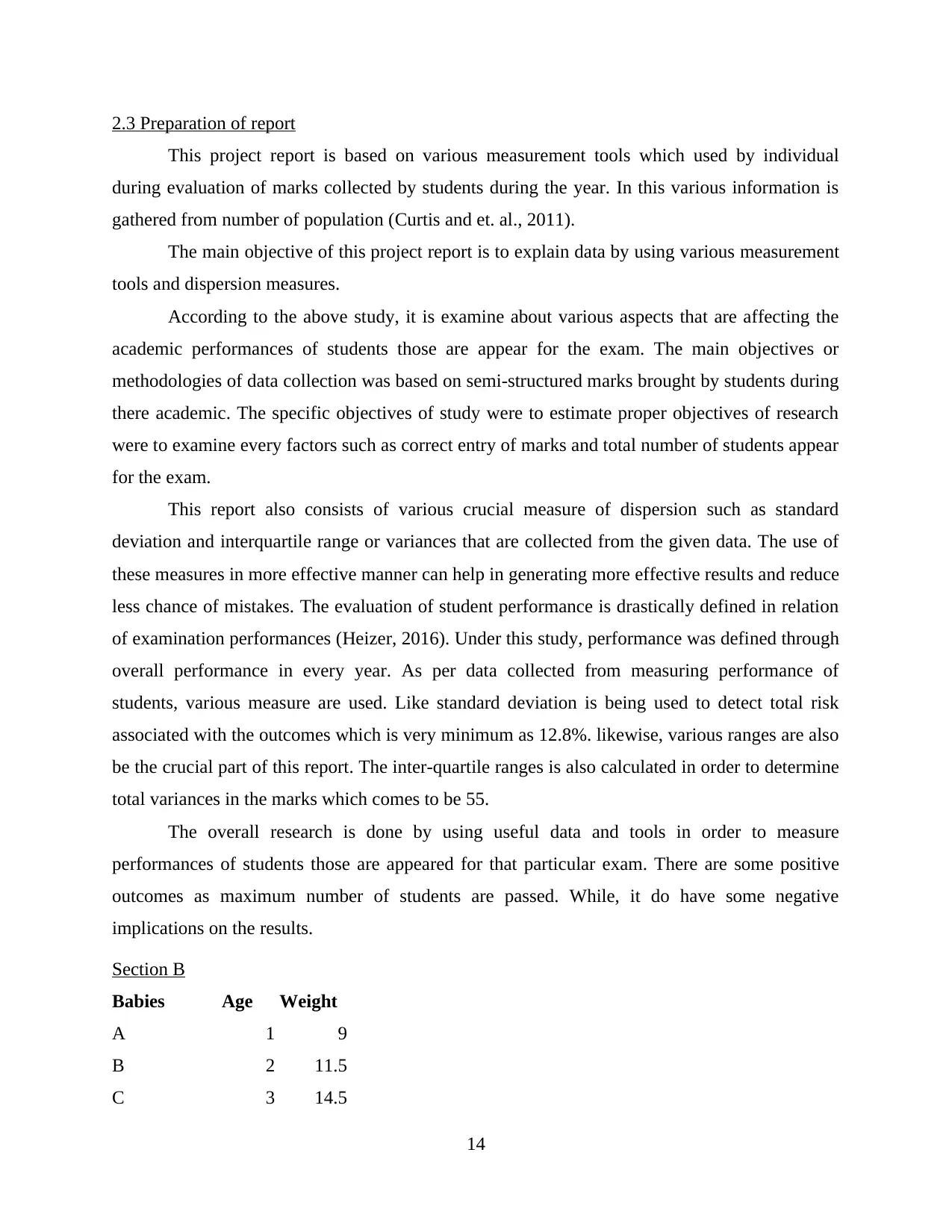
Babies Age Weight
A 1 9
B 2 11.5
C 3 14.5
14
Paraphrase This Document
E 4 16.5
F 4 17
G 5 18.5
H 6 19.5
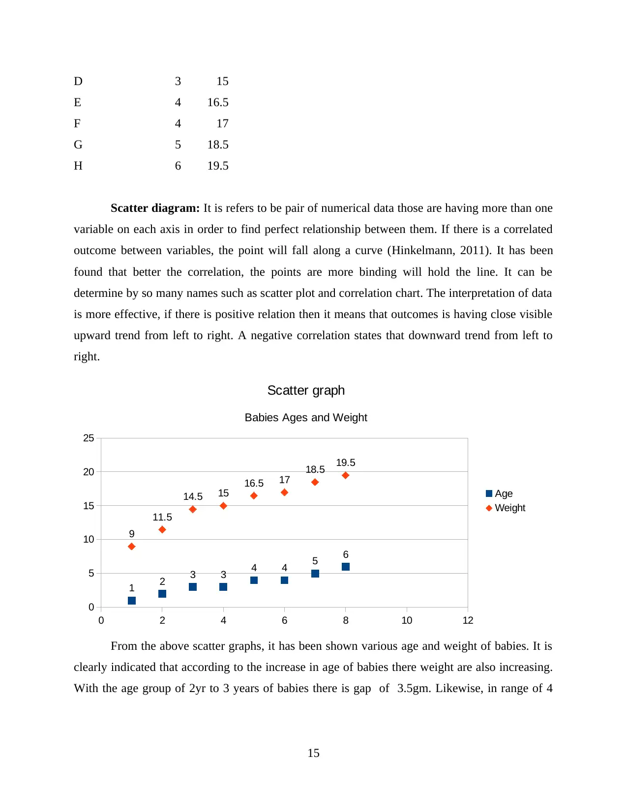
Scatter diagram: It is refers to be pair of numerical data those are having more than one
variable on each axis in order to find perfect relationship between them. If there is a correlated
outcome between variables, the point will fall along a curve (Hinkelmann, 2011). It has been
found that better the correlation, the points are more binding will hold the line. It can be
determine by so many names such as scatter plot and correlation chart. The interpretation of data
is more effective, if there is positive relation then it means that outcomes is having close visible
upward trend from left to right. A negative correlation states that downward trend from left to
right.
0 2 4 6 8 10 12
0
5
10
15
20
25
9
11.5
14.5 15 16.5 17 18.5 19.5
1 2 3 3 4 4 5 6
Scatter graph
Babies Ages and Weight
Age
Weight
From the above scatter graphs, it has been shown various age and weight of babies. It is
clearly indicated that according to the increase in age of babies there weight are also increasing.
With the age group of 2yr to 3 years of babies there is gap of 3.5gm. Likewise, in range of 4
15
weight of .5 gm.
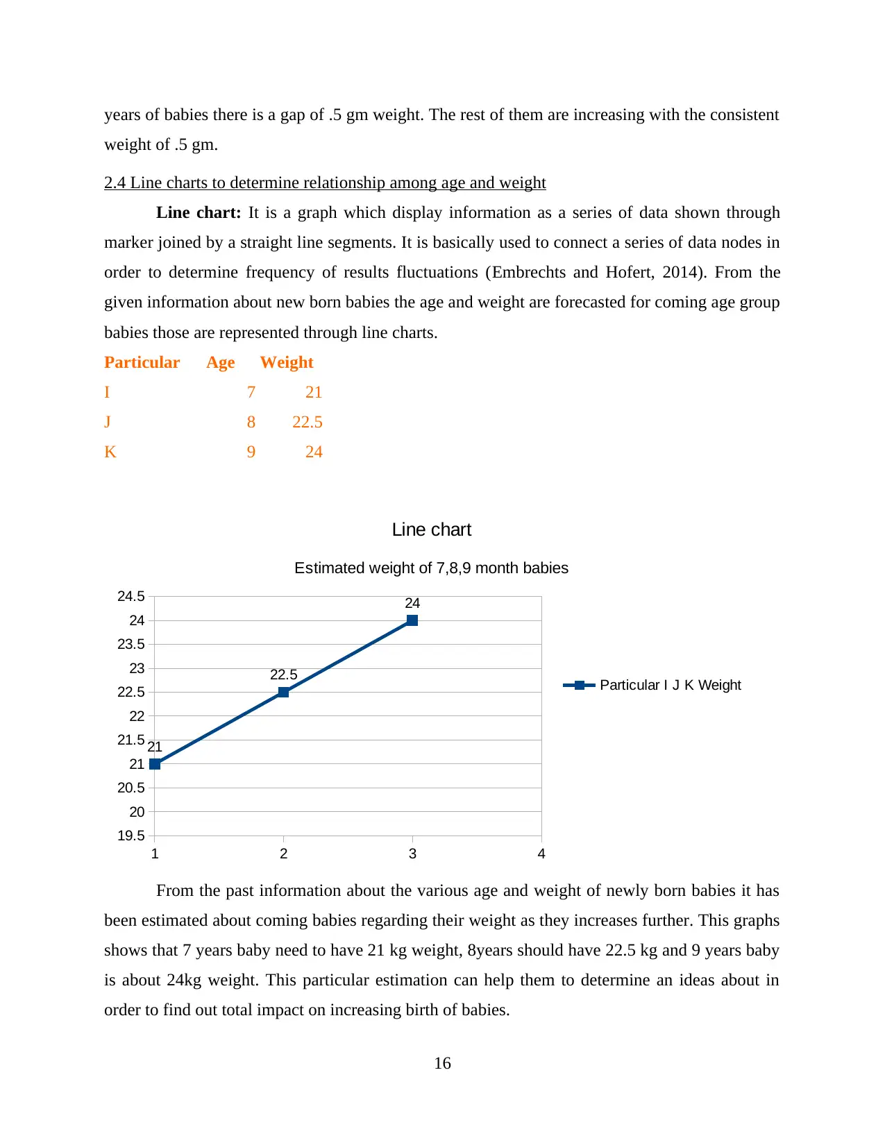
2.4 Line charts to determine relationship among age and weight
Line chart: It is a graph which display information as a series of data shown through
marker joined by a straight line segments. It is basically used to connect a series of data nodes in
order to determine frequency of results fluctuations (Embrechts and Hofert, 2014). From the
given information about new born babies the age and weight are forecasted for coming age group
babies those are represented through line charts.
Particular Age Weight
I 7 21
J 8 22.5
K 9 24
1 2 3 4
19.5
20
20.5
21
21.5
22
22.5
23
23.5
24
24.5
21
22.5
24
Line chart
Estimated weight of 7,8,9 month babies
Particular I J K Weight
From the past information about the various age and weight of newly born babies it has
been estimated about coming babies regarding their weight as they increases further. This graphs
shows that 7 years baby need to have 21 kg weight, 8years should have 22.5 kg and 9 years baby
is about 24kg weight. This particular estimation can help them to determine an ideas about in
order to find out total impact on increasing birth of babies.
16
⊘ This is a preview!⊘
Do you want full access?
Subscribe today to unlock all pages.
Trusted by 1+ million students worldwide
Calculation:
Total variable cost: It refers as all those expenses which are related with producing a
perfect or providing a better services that can change in direct proportion to the number quantity
produced by the company (Haimes, 2015). It include cost of material and labour those are used
during that process. It is total aggregate amount of all variable costs related with COGS(Cost of
good sold) in a reporting period.
a) The total number of delivery made in each year
Total days=365
No. of days not working=5 days
Total working days= 365-5 =360 days
one deliveries takes = 12 days time.
So, the total number of deliveries = 360/12= 30 times in one year
b) Total number of bottles of olive oil delivery in current times
The demand of total bottle of olive oils = 450,000
Total number of delivery : 30 deliveries
So, for per delivery = 450,000/30= 15000 bottles
c) EOQ:
The economic order quantity is said to be total number of unis that a company would add
to its stock with every order to control the total cost of stock available with the company. It
consists of holding costs, ordering costs and shortage costs. It is determine by using ordering cost
by evaluating total number of orders in an accounting year (Neave, 2013). It is said to be more
effective decision-making tools that can be used to estimated total cost of accounting. It is
designed in order to control ordering and carrying cost arises in an organization.
Cost of ordering= 20 pound
D= Annual demand
= 450000 bottles
Holding cost: 25%*price
: 25%*2= 0.50
EOQ=√2RO/C
17
Paraphrase This Document
=6000 bottles
d) For EOQ = 6000 bottles
= 120 of deliveries in 1 year
= 450000/6000= 75 times
Analysis and suggestion
From the above calculation, it has been evaluated that total cost is taken into account as
those cost which is related with production of products and services. It is made up with total
variable costs. It is basically, connected with the labour, material and other overhead costs those
are associated with manufacturing of products. Every expenses those are linked with formulation
of olive oil and its supply can changes as per the variation in the costs. As per the detailed
mention in the above about delivery of bottles. The single delivery takes about 12 days and
overall delivery is made in 30 time in an accounting year. With this much of time the company is
producing 15000 bottle of olive oil. It is not more than target. The level of stock available with
them is about 6000 bottles.
Suggestion:
They need to make planning for increasing the number of production capacity. It will
help them to increase profit as well as efficiency of an organisation.
According to production capacity they are not able to produce more outcomes.
The delivery time needed to be reduce so that maximum profits can be generated with the
extra products selling over per bottle (Roger and et. al., 2012).
With each units of delivery they are taking 12 days time. It is require some improvisation
by increasing the capacity of labour of other factors of production to produce more
bottles.
The EOQ level of stock is about 6000 which can be effective to help the company at any
critical situation.
TASK 4
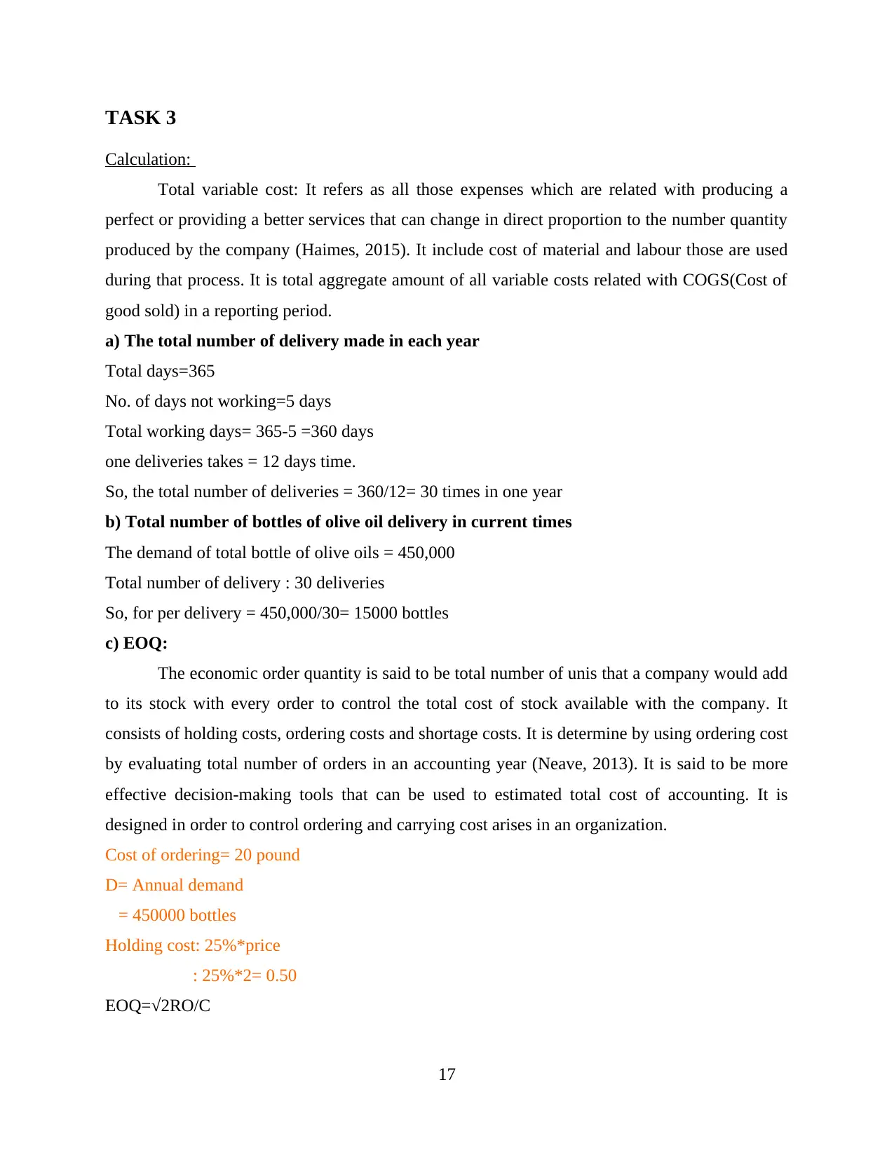
4.1: I) Bar chart
It is a diagram which is shown the numerical value of data those are represented by the
total length or lines. It is a chart that represents categories of information which is shown through
18
horizontally.
No. of Bedrooms Green street Church lane Eton Avenue
1 8 6 4
2 28 18 20
3 37 24 32
4 17 9 12
5 10 3 12
100 60 80
1
2
3
4
5
0 5 10 15 20 25 30 35 40
1
2
3
4
5
8
28
37
17
10
6
18
24
9
3
4
20
32
12
12
Bar chart
No. of Houses
Eton Avenue
Church lane
Green street
No. of Bedrooms
From the above information about number of houses is represented by using bar charts.
The number of bed rooms are indicated with blue bars and other houses are shown through
various colours. As Rosaline which is a estate agent has collected the above details about total
number of bedrooms of 100 houses in each of the major street in Wimbledon. The total number
of houses in green street is about 100. similarly, in church street it was about 60 and in Eton
avenue it is identified as 80. From the above bar chart, it has been found that 37 number of total
rooms are available from green street which is considered as highest number of best possible
results as compare to other (Dey, MüIler and Sinha, 2012). The minimum number of bed rooms
19
⊘ This is a preview!⊘
Do you want full access?
Subscribe today to unlock all pages.
Trusted by 1+ million students worldwide
having average number of room available in order to meet out the demand of customers.
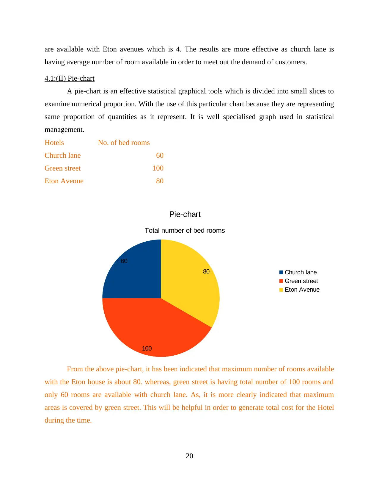
4.1:(II) Pie-chart
A pie-chart is an effective statistical graphical tools which is divided into small slices to
examine numerical proportion. With the use of this particular chart because they are representing
same proportion of quantities as it represent. It is well specialised graph used in statistical
management.
Hotels No. of bed rooms
Church lane 60
Green street 100
Eton Avenue 80
60
100
80
Pie-chart
Total number of bed rooms
Church lane
Green street
Eton Avenue
From the above pie-chart, it has been indicated that maximum number of rooms available
with the Eton house is about 80. whereas, green street is having total number of 100 rooms and
only 60 rooms are available with church lane. As, it is more clearly indicated that maximum
areas is covered by green street. This will be helpful in order to generate total cost for the Hotel
during the time.
20
Related Documents


Your All-in-One AI-Powered Toolkit for Academic Success.
+13062052269
info@desklib.com
Available 24*7 on WhatsApp / Email
![[object Object]](/_next/static/media/star-bottom.7253800d.svg)
© 2024 | Zucol Services PVT LTD | All rights reserved.