Evaluating the Visual Presentation of Financial Data in RBS Reports
VerifiedAdded on 2020/03/04
|20
|2175
|232
Report
AI Summary
This report provides a detailed analysis of the visual representations used in the RBS annual reports, focusing on the 2015 report. It examines the types of charts and graphs employed, including pie charts, bar graphs, and line graphs, and evaluates their effectiveness in presenting financial data. The report develops evaluation criteria based on the 360-degree segregation, percentage values, and data trends. It then applies these criteria to specific figures from the RBS annual report, such as diversified portfolios, probability rates, active mobile users, adjusted income, net income margin, and adjusted operating costs. The analysis assesses how well these visual aids communicate key financial information, including remuneration, cost reductions, and market indices, matching them against the developed criteria. The study concludes with a discussion on the advantages of graphical representations in conveying complex financial data and their utility in understanding the performance of RBS.
Running head: ANALYSING THE VISUAL REPRESENTATION OF RBS
Analysing the Visual Presentation of RBS
Name of the Student
Name of the University
Author’s Note
Analysing the Visual Presentation of RBS
Name of the Student
Name of the University
Author’s Note
Paraphrase This Document
Need a fresh take? Get an instant paraphrase of this document with our AI Paraphraser
1
ANALYSING THE VISUAL REPRESENTATION OF RBS
Table of Contents
Introduction:....................................................................................................................................3
Part A-Developing the Criteria of Evaluation:................................................................................3
1.360 degree segregation:................................................................................................................3
Part B – Report Evaluation..............................................................................................................6
References:....................................................................................................................................19
2
ANALYSING THE VISUAL REPRESENTATION OF RBS
List of Figures
Figure 1:Diversed Portfolio (Criteria1 and criteria 2).........................................................7
Figure 2: Probability rates (Criteria1 and criteria 2)...........................................................7
Figure 3: Active Mobile Users (Criteria 4 and criteria 5)...................................................8
Figure 4: Adjusted Income..................................................................................................8
Figure 5: Adjusted Income..................................................................................................9
Figure 6: Net income Margin..............................................................................................9
Figure 7: Adjusted Operating costs...................................................................................10
Figure 8: Adjusted Cost reductions...................................................................................11
Figure 9: Future LAC requirement....................................................................................11
Figure 10: Net interest margin...........................................................................................12
Figure 11: Graph for positive operating (Criteria 4, 5, 17)...............................................13
Figure 12: Bar graph for classification (Criteria 4, 5, 17)................................................14
Figure 13: Graph for retail banking(Criteria 4, 5, 17)......................................................15
⊘ This is a preview!⊘
Do you want full access?
Subscribe today to unlock all pages.

Trusted by 1+ million students worldwide
3
ANALYSING THE VISUAL REPRESENTATION OF RBS
Introduction:
The report aims to mention about the sustainability of graphs in the annual report of RBS.
The major information has been obtained from the report which is annually published. In this
connection the report of 2015 was used. There are two segments of the report. The first aims to
address useful details and the second states the relevant aspects of it associated with various
natures of information mentioned in the first section.
Part A-Developing the Criteria of Evaluation:
This part has been used to put forward several kinds of charts and graphs used in the
company’s annual reports. Pie chart, doughnut graph as well as bar graph constitute the major
kinds of graphs.
1.360 degree segregation:
Different variables of evaluation related to the 360 degrees segregation is considered in
case of pie chart. As an example it can be said that the STI index, LTI index and base
remuneration constitute the major types of variables. Pie charts are advantageous in the sense
that the exact contributing proportions of the different factors are clearly understood in this
pictorial form.
2. Percentage values:
In many occasions, the weightage of the variables are given depending on the specific
weightings percentage on the LTI index or the STI component (Bank 2017).
3. Simple representation of multiple classes:
Paraphrase This Document
Need a fresh take? Get an instant paraphrase of this document with our AI Paraphraser
4
ANALYSING THE VISUAL REPRESENTATION OF RBS
Pie charts are important in cases where the entire data can be viewed in terms of
proportions of the whole (Statistics How To. 2013).
4. Increase or decrease of variables in terms of currency:
Seen in case of few graphs including vertical bar graph as well as stacked graph.
5. Increase or decrease of variables in terms of percentage:
Usually found in case of stacked as well as vertical bar graph (Statistics How To. 2013).
6. Increasing or decrease in the values adding up to a final value:
In several forms of vertical graphs this particular technique is useful.
7. Specific range of information in terms of currency:
Some considerations are observed in case of vertical bar diagram assisted by the
histogram. X-data correspond to years and the Y-data correspond to frequency.
8. Effective variables used:
In case the bars are seen to decrease, time has to be depicted in ,sense of reducing trend in
the data. Identification is possible effectively in case of graphical representation.
9. Covering all trend points:
This particular representation has been observed in terms of vertical bar alongside the
histogram. Various types of variables have been observed based on STI the individuals receive.
Y-axis data have been viewed in terms of cash (Priebe et al. 2015).
10. Useful for depiction of over the time trends:
5
ANALYSING THE VISUAL REPRESENTATION OF RBS
X-data can be found to represent trend.
11. Varied variables range:
It is useful in case of identification of quantities in individual groups (Mathgoodies.com
2017).
12. Percentage-of-the-whole data for each group:
Various types of data are shown as percentage of the total group.
13. Covering multiple data sets in a single stacked information:
Stacked bar graphs indicate the information of individual groups as well these quantities.
X-axis can be plotted with variables from liability pricing, asset mix etc. Y-axis can help plot
different aspects of data in terms of relative proportions (Statistics.laerd.com. 2017).
14. Covering all data set points:
Line graphs illustrate this feature. X-axis denotes in terms of time period and y-axis
shows market indices.
15.Data fluctuations:
Graphs have been hugely useful in these cases.
16. Encoding Process:
Two types of data range is evident covering all the data points.
17. Integration and customization of Data:
⊘ This is a preview!⊘
Do you want full access?
Subscribe today to unlock all pages.

Trusted by 1+ million students worldwide
6
ANALYSING THE VISUAL REPRESENTATION OF RBS
Data integration has been done in several financial data segments and data has also been
customised to suit requirements.
18. Geometric Determinants:
They are already based on the segregation by 360 degrees.
19. Different information association:
There may be indication of data being related to more than two styles by instigation of
several nuances.
Part B – Report Evaluation
RBS use the pie chart usually in order to represent the short and long term incentives as
well as base remuneration. It has been found that the company is prompt enough to give an
insight to all the major remuneration of the individuals in top posts. The company has also been
found evaluating the executive risk.
Matching Criteria’s
All the significant information relating to the STI as well as LTI values have been shown
on the basis of the 360 degrees as well as percentage values.
Paraphrase This Document
Need a fresh take? Get an instant paraphrase of this document with our AI Paraphraser
7
ANALYSING THE VISUAL REPRESENTATION OF RBS
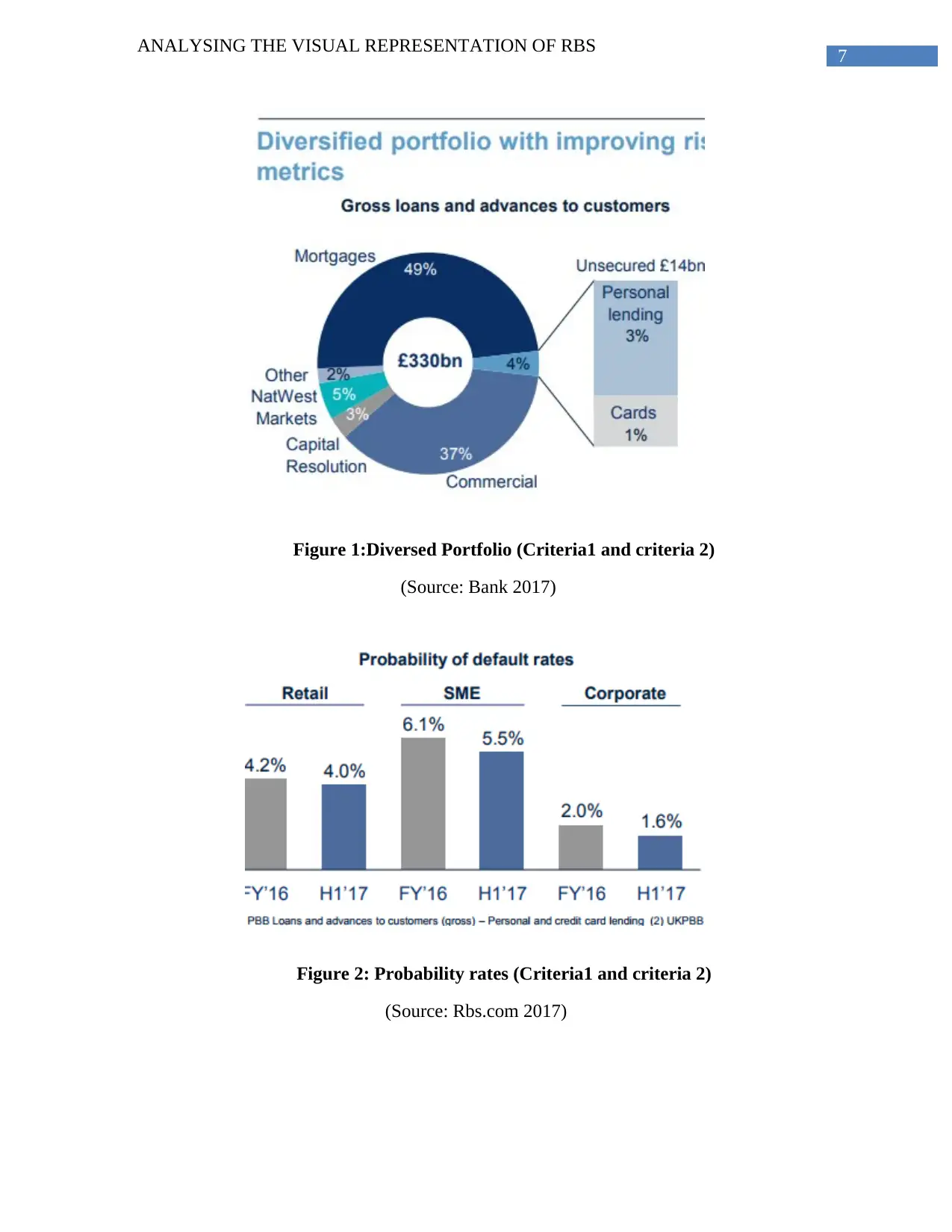
Figure 1:Diversed Portfolio (Criteria1 and criteria 2)
(Source: Bank 2017)
Figure 2: Probability rates (Criteria1 and criteria 2)
(Source: Rbs.com 2017)
ANALYSING THE VISUAL REPRESENTATION OF RBS
Figure 1:Diversed Portfolio (Criteria1 and criteria 2)
(Source: Bank 2017)
Figure 2: Probability rates (Criteria1 and criteria 2)
(Source: Rbs.com 2017)
8
ANALYSING THE VISUAL REPRESENTATION OF RBS
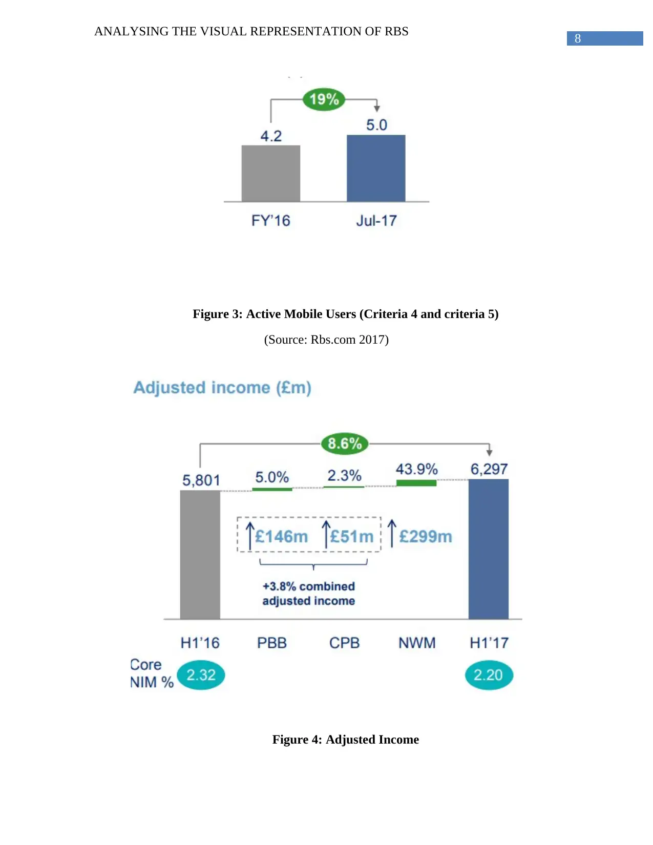
Figure 3: Active Mobile Users (Criteria 4 and criteria 5)
(Source: Rbs.com 2017)
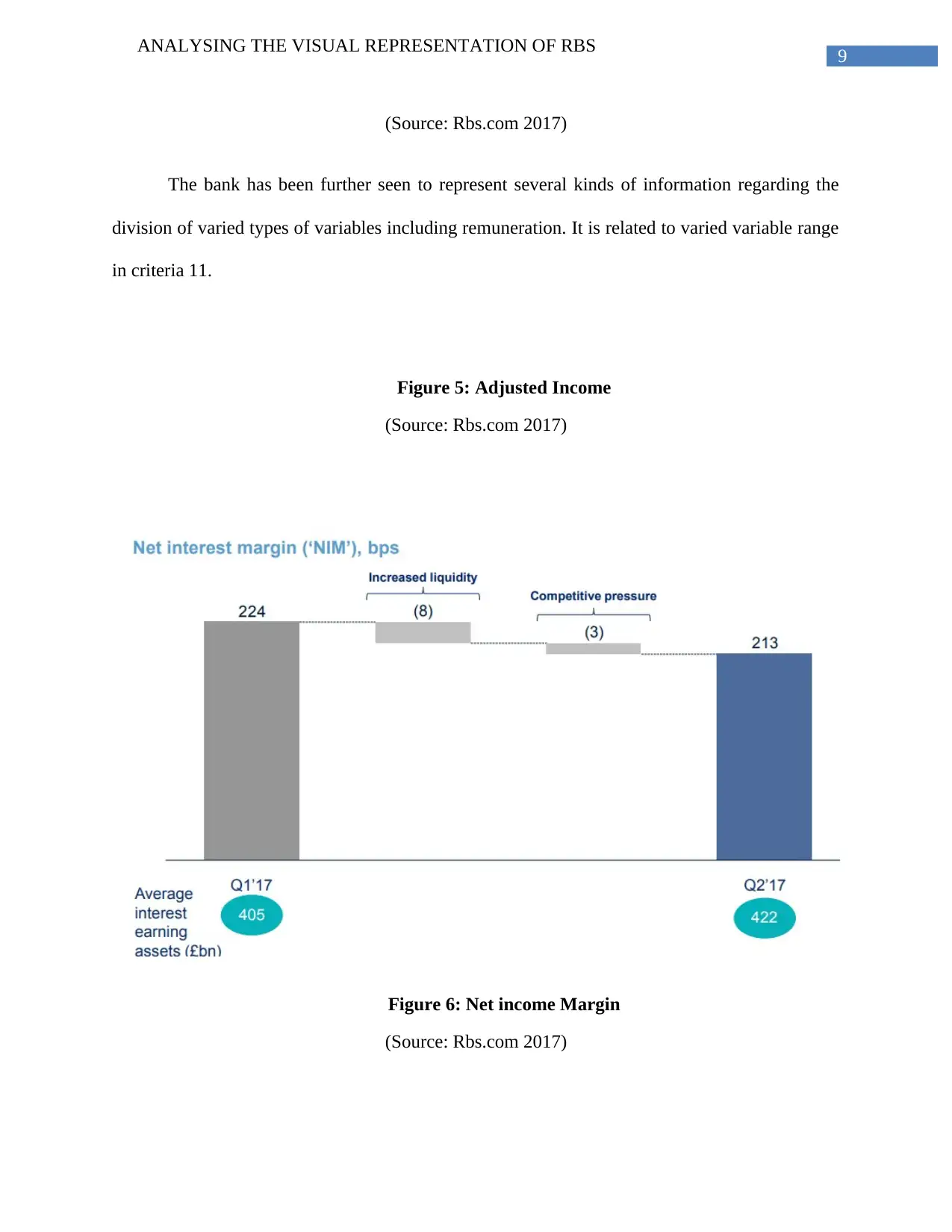
Figure 4: Adjusted Income
ANALYSING THE VISUAL REPRESENTATION OF RBS
Figure 3: Active Mobile Users (Criteria 4 and criteria 5)
(Source: Rbs.com 2017)
Figure 4: Adjusted Income
⊘ This is a preview!⊘
Do you want full access?
Subscribe today to unlock all pages.

Trusted by 1+ million students worldwide
9
ANALYSING THE VISUAL REPRESENTATION OF RBS
(Source: Rbs.com 2017)
The bank has been further seen to represent several kinds of information regarding the
division of varied types of variables including remuneration. It is related to varied variable range
in criteria 11.
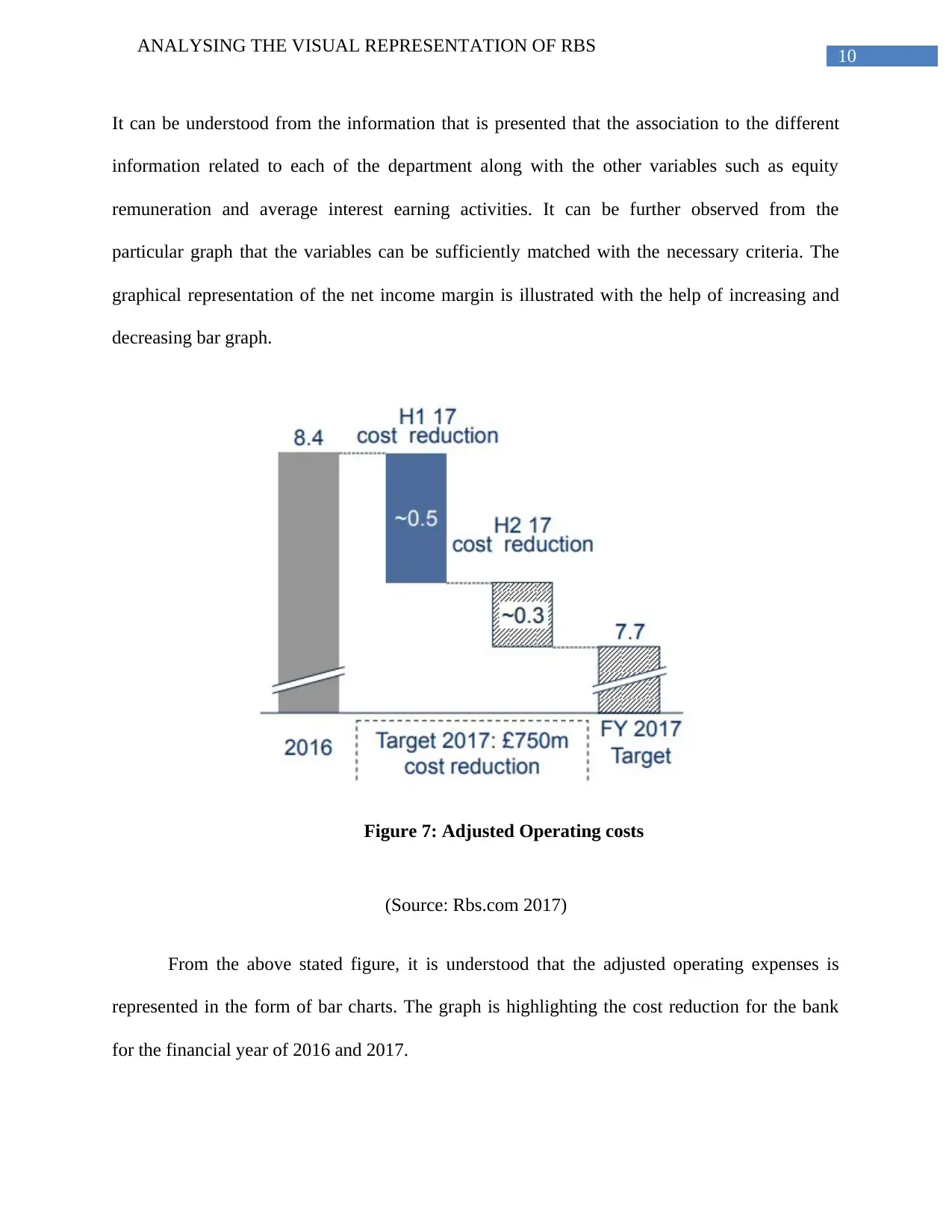
Figure 5: Adjusted Income
(Source: Rbs.com 2017)
Figure 6: Net income Margin
(Source: Rbs.com 2017)
Paraphrase This Document
Need a fresh take? Get an instant paraphrase of this document with our AI Paraphraser
10
ANALYSING THE VISUAL REPRESENTATION OF RBS
It can be understood from the information that is presented that the association to the different
information related to each of the department along with the other variables such as equity
remuneration and average interest earning activities. It can be further observed from the
particular graph that the variables can be sufficiently matched with the necessary criteria. The
graphical representation of the net income margin is illustrated with the help of increasing and
decreasing bar graph.
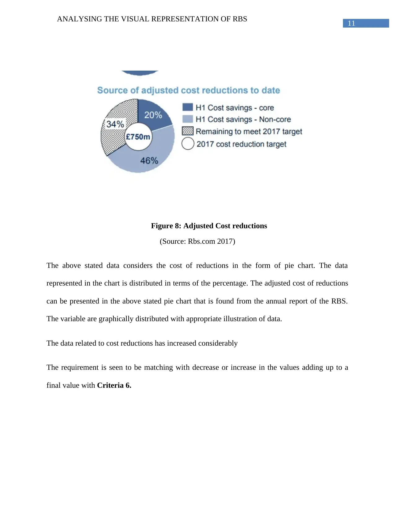
Figure 7: Adjusted Operating costs
(Source: Rbs.com 2017)
From the above stated figure, it is understood that the adjusted operating expenses is
represented in the form of bar charts. The graph is highlighting the cost reduction for the bank
for the financial year of 2016 and 2017.
11
ANALYSING THE VISUAL REPRESENTATION OF RBS
Figure 8: Adjusted Cost reductions
(Source: Rbs.com 2017)
The above stated data considers the cost of reductions in the form of pie chart. The data
represented in the chart is distributed in terms of the percentage. The adjusted cost of reductions
can be presented in the above stated pie chart that is found from the annual report of the RBS.
The variable are graphically distributed with appropriate illustration of data.
The data related to cost reductions has increased considerably
The requirement is seen to be matching with decrease or increase in the values adding up to a
final value with Criteria 6.
⊘ This is a preview!⊘
Do you want full access?
Subscribe today to unlock all pages.

Trusted by 1+ million students worldwide
1 out of 20