Responsive Web Design Report: Museum Website Design and Testing
VerifiedAdded on 2020/03/16
|17
|1051
|326
Report
AI Summary
This report details the design, development, and testing of a responsive website for a museum of art and craft. The website is designed to showcase artifacts from Chinese, Eastern, and European regions, with dedicated pages for each. The design phase includes mockups for various pages, such as the home page, artifact pages, about page, and contact page. The report highlights the importance of responsiveness across different devices, ensuring a consistent user experience. The testing phase involves two approaches: user testing with five subjects, gathering feedback on aesthetics and usability, and device simulator testing across various screen sizes (laptop, tablets, and smartphones) using Google Chrome's developer tools. The report concludes with a flowchart illustrating the website's navigation and recommendations for improvement, particularly regarding color schemes and element visibility on smaller devices. The report emphasizes the importance of responsive design for optimal user experience across different devices.

2017
RESPONSIVE WEB DESIGN
course
student name
RESPONSIVE WEB DESIGN
course
student name
Paraphrase This Document
Need a fresh take? Get an instant paraphrase of this document with our AI Paraphraser
Contents
1 Introduction..............................................................................................................................................2
2 Design.......................................................................................................................................................2
2.1 Home page........................................................................................................................................2
2.2 Chinese artifacts page........................................................................................................................4
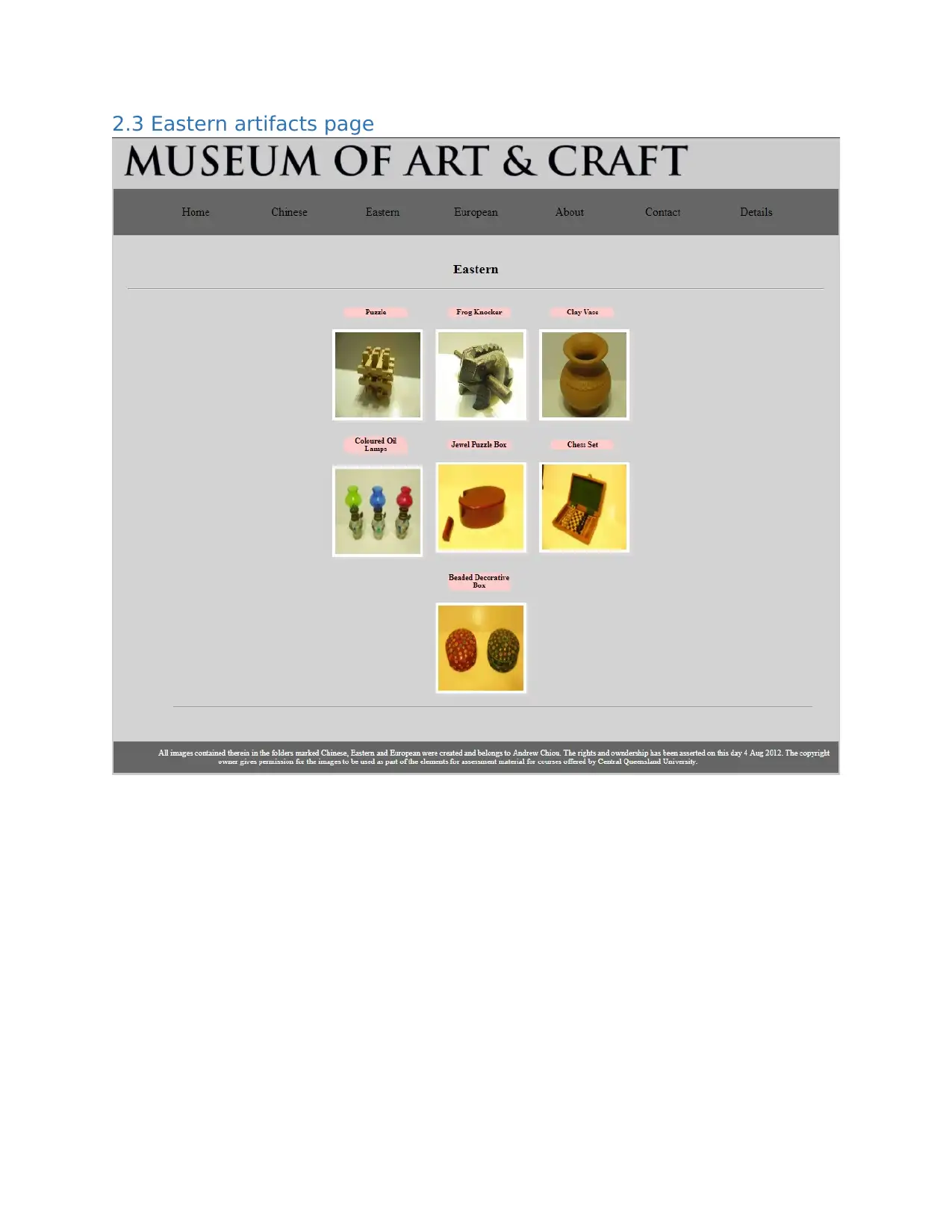
2.3 Eastern artifacts page........................................................................................................................5
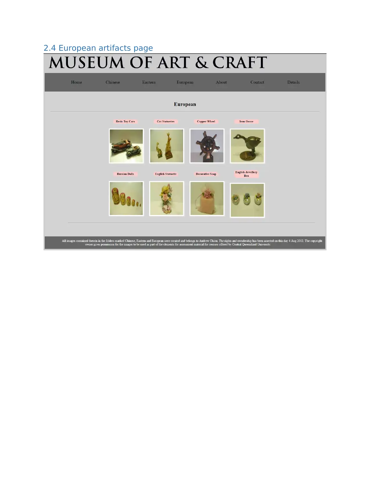
2.4 European artifacts page.....................................................................................................................6
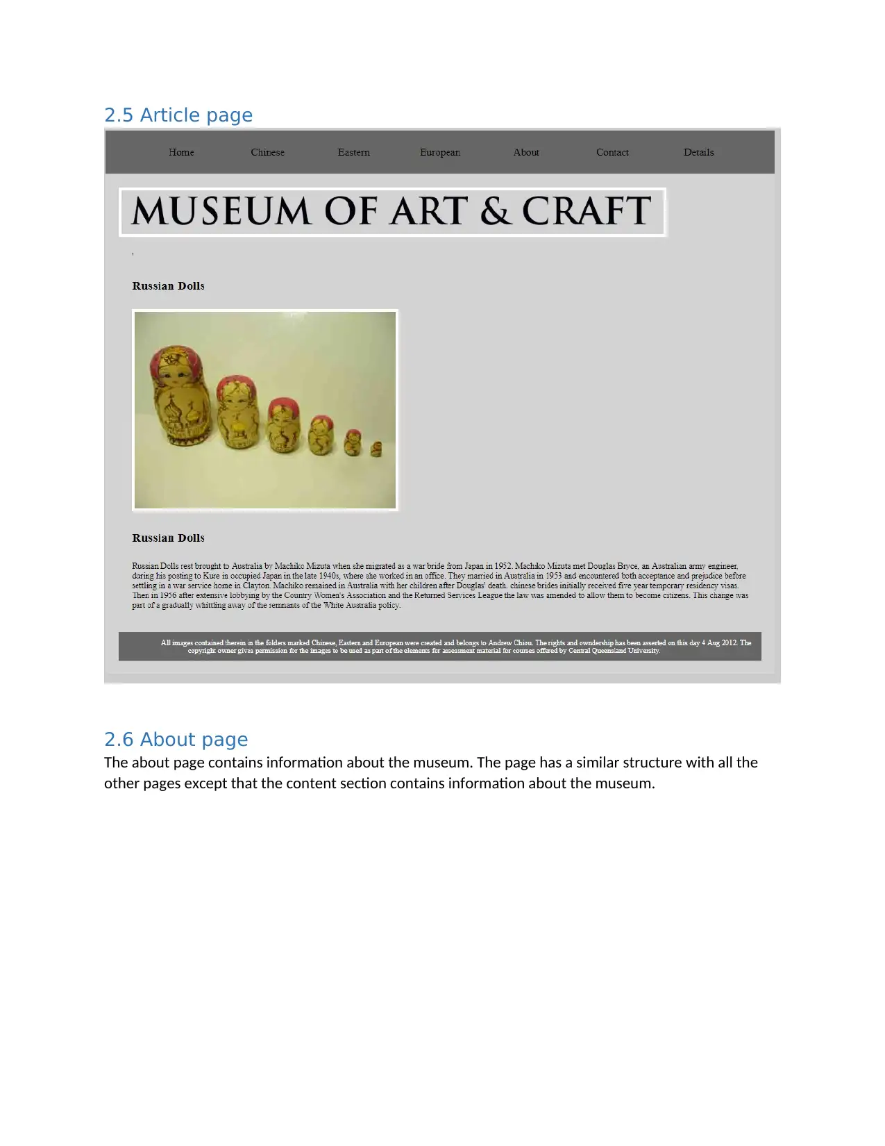
2.5 Article page........................................................................................................................................7
2.6 About page........................................................................................................................................7
2.7 Contact page......................................................................................................................................8
2.8 Details page.....................................................................................................................................10
3 Testing....................................................................................................................................................10
3.1 Testing using test subjects...............................................................................................................10
3.2 Testing using device simulators.......................................................................................................11
4 Flow chart...............................................................................................................................................16
5 Conclusion..............................................................................................................................................16
1 Introduction
The museum of art and craft is a museum that deals in exhibition of different types of arts and crafts
artefacts from three regions; Chinese, eastern and European regions. The main Museum building where
the exhibitions are shown is divided int three sections each for each region. Each section contains
artefacts that are relevant to region it covers for example the Chinese section of the museum only
contain Chinese artefacts. The Museum is in need of a website that will be used to act as a guide to
visitors before they visit the museum or even after they visit the museum in the case that they want to
get more details and information about a specific artefact. The website will contain information relevant
to the museum including the floor plan of the museum and information about all the artifacts contained
in the museum. The website has to be responsive for it to be usable across all types of devices meaning
a user can switch from viewing the website on a computer to viewing the website on a phone and still
get the same user experience and interactivity from the two devices.
2 Design
The design of the website can be demonstrated by use of mockups or prototypes that will show how the
actual pages will look like when the website is deployed to the public. The website consists of the
following pages;
Home page
Chinese artifacts page
Eastern artifacts page
European artifacts page
Article page
About page
Contact page
Details page
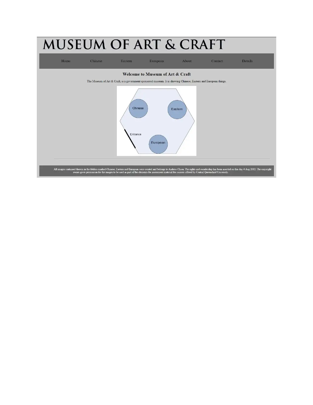
2.1 Home page
The home page is the first page that is seen by any visitor who visits the website. The home page is
basically the landing page of the website.
⊘ This is a preview!⊘
Do you want full access?
Subscribe today to unlock all pages.

Trusted by 1+ million students worldwide
Paraphrase This Document
Need a fresh take? Get an instant paraphrase of this document with our AI Paraphraser
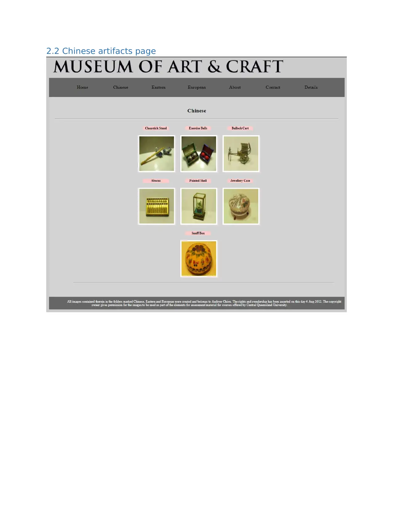
2.2 Chinese artifacts page
2.3 Eastern artifacts page
⊘ This is a preview!⊘
Do you want full access?
Subscribe today to unlock all pages.

Trusted by 1+ million students worldwide
2.4 European artifacts page
Paraphrase This Document
Need a fresh take? Get an instant paraphrase of this document with our AI Paraphraser
2.5 Article page
2.6 About page
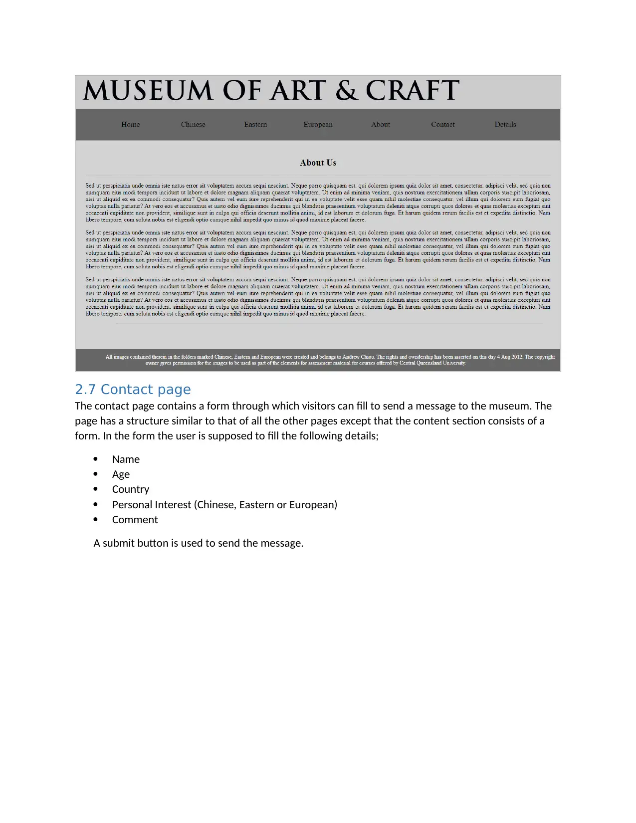
The about page contains information about the museum. The page has a similar structure with all the
other pages except that the content section contains information about the museum.
2.6 About page
The about page contains information about the museum. The page has a similar structure with all the
other pages except that the content section contains information about the museum.
2.7 Contact page
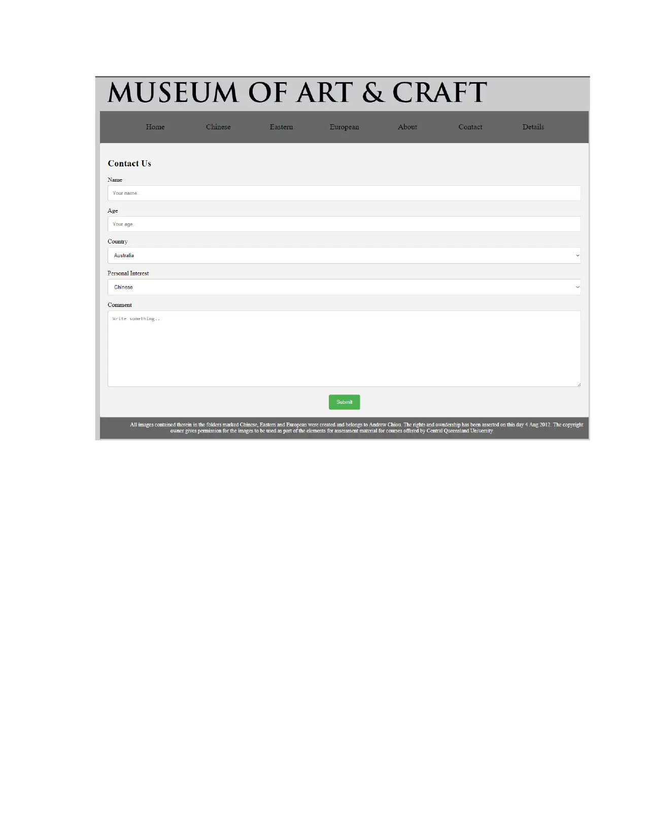
The contact page contains a form through which visitors can fill to send a message to the museum. The
page has a structure similar to that of all the other pages except that the content section consists of a
form. In the form the user is supposed to fill the following details;
Name
Age
Country
Personal Interest (Chinese, Eastern or European)
Comment
A submit button is used to send the message.
⊘ This is a preview!⊘
Do you want full access?
Subscribe today to unlock all pages.

Trusted by 1+ million students worldwide
Paraphrase This Document
Need a fresh take? Get an instant paraphrase of this document with our AI Paraphraser
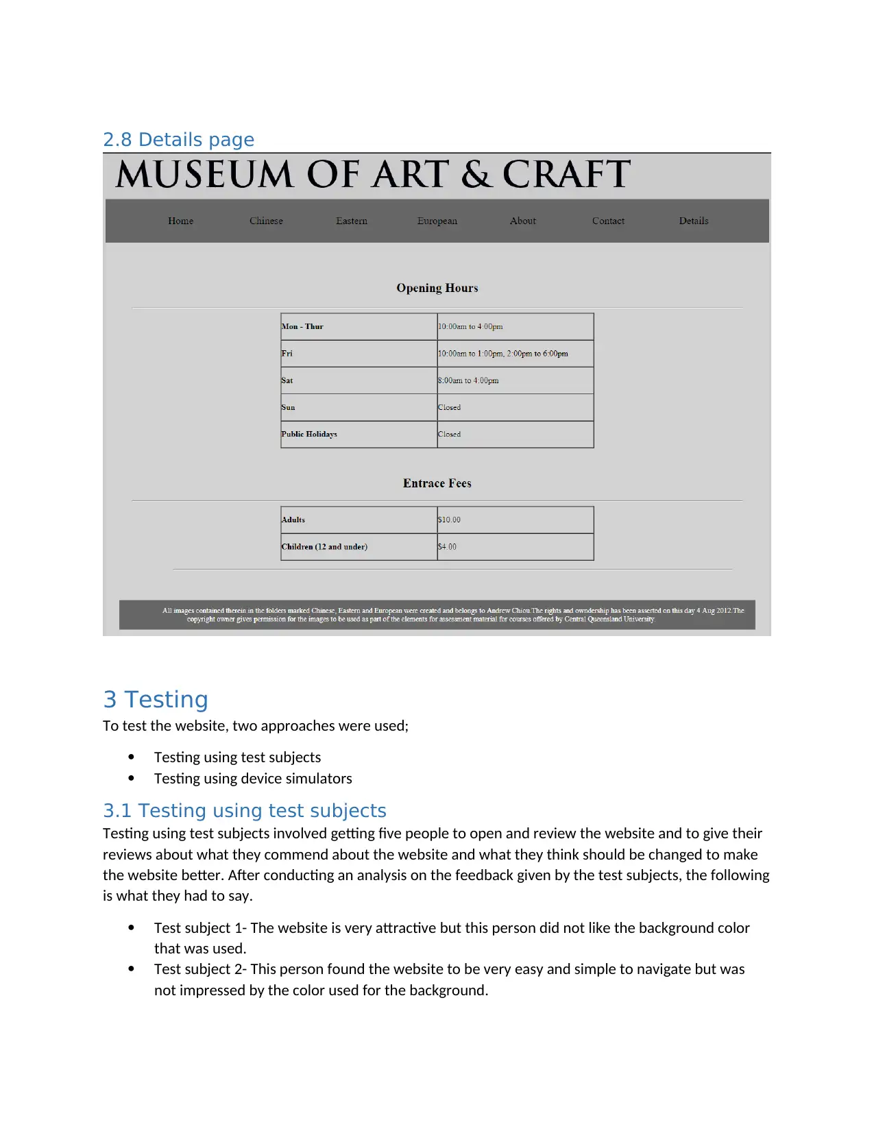
2.8 Details page
3 Testing
To test the website, two approaches were used;
Testing using test subjects
Testing using device simulators
3.1 Testing using test subjects
Testing using test subjects involved getting five people to open and review the website and to give their
reviews about what they commend about the website and what they think should be changed to make
the website better. After conducting an analysis on the feedback given by the test subjects, the following
is what they had to say.
Test subject 1- The website is very attractive but this person did not like the background color
that was used.
Test subject 2- This person found the website to be very easy and simple to navigate but was
not impressed by the color used for the background.
Test subject 3- this person found the artifacts pages to be very well designed especially the
effect where the images pop out when the mouse is hovered over it. The test subject felt
satisfied by the design of the website.
Test subject 4- this person found the design of the website to be commendable but stated that
he could not view some of the content while using a small device like a small display size
smartphone.
Test subject 5- this test subject was not pleased by the design of the website suggesting that
better colors should be used especially for the background. He was however pleased with the
image effects on the artifacts pages.
An analysis done on the feedback from the test subjects shows that better color could be used to make
the website even more attractive.
3.2 Testing using device simulators
Testing using device simulators involves opening the website from different devices to observe the look
and the responsiveness of the website across the various devices. To test the website, the website was
opened and viewed from 5 devices all which have different display sizes and resolutions. These devices
can be classified into three types;
Small display sized devices- includes smartphones for example iPhone 5
Medium display sized devices- Include tablets and iPads
Large display sized devices-Include laptops and desktop computers.
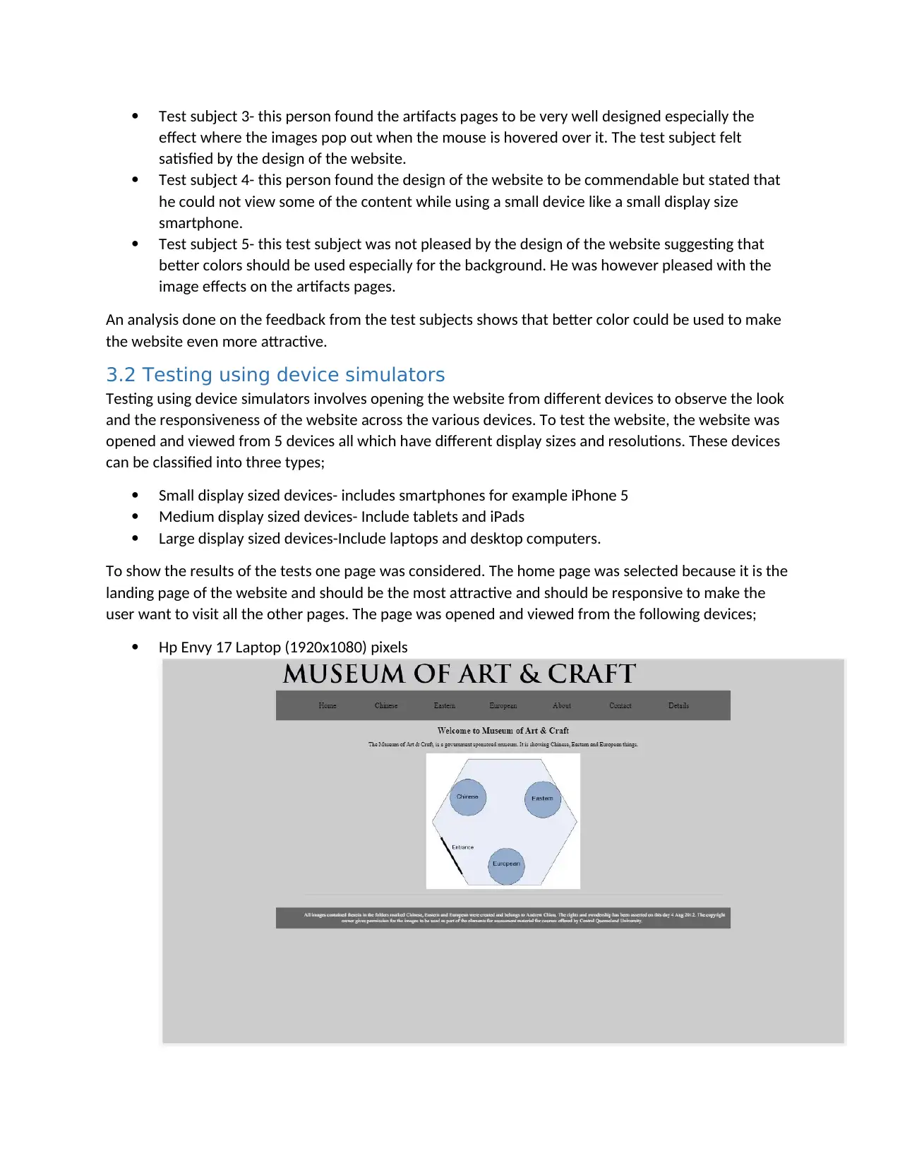
To show the results of the tests one page was considered. The home page was selected because it is the
landing page of the website and should be the most attractive and should be responsive to make the
user want to visit all the other pages. The page was opened and viewed from the following devices;
Hp Envy 17 Laptop (1920x1080) pixels
⊘ This is a preview!⊘
Do you want full access?
Subscribe today to unlock all pages.

Trusted by 1+ million students worldwide
1 out of 17
Related Documents
Your All-in-One AI-Powered Toolkit for Academic Success.
+13062052269
info@desklib.com
Available 24*7 on WhatsApp / Email
![[object Object]](/_next/static/media/star-bottom.7253800d.svg)
Unlock your academic potential
Copyright © 2020–2026 A2Z Services. All Rights Reserved. Developed and managed by ZUCOL.


