University Quantitative Analysis Homework: Statistical Problems
VerifiedAdded on 2023/01/18
|13
|1526
|30
Homework Assignment
AI Summary
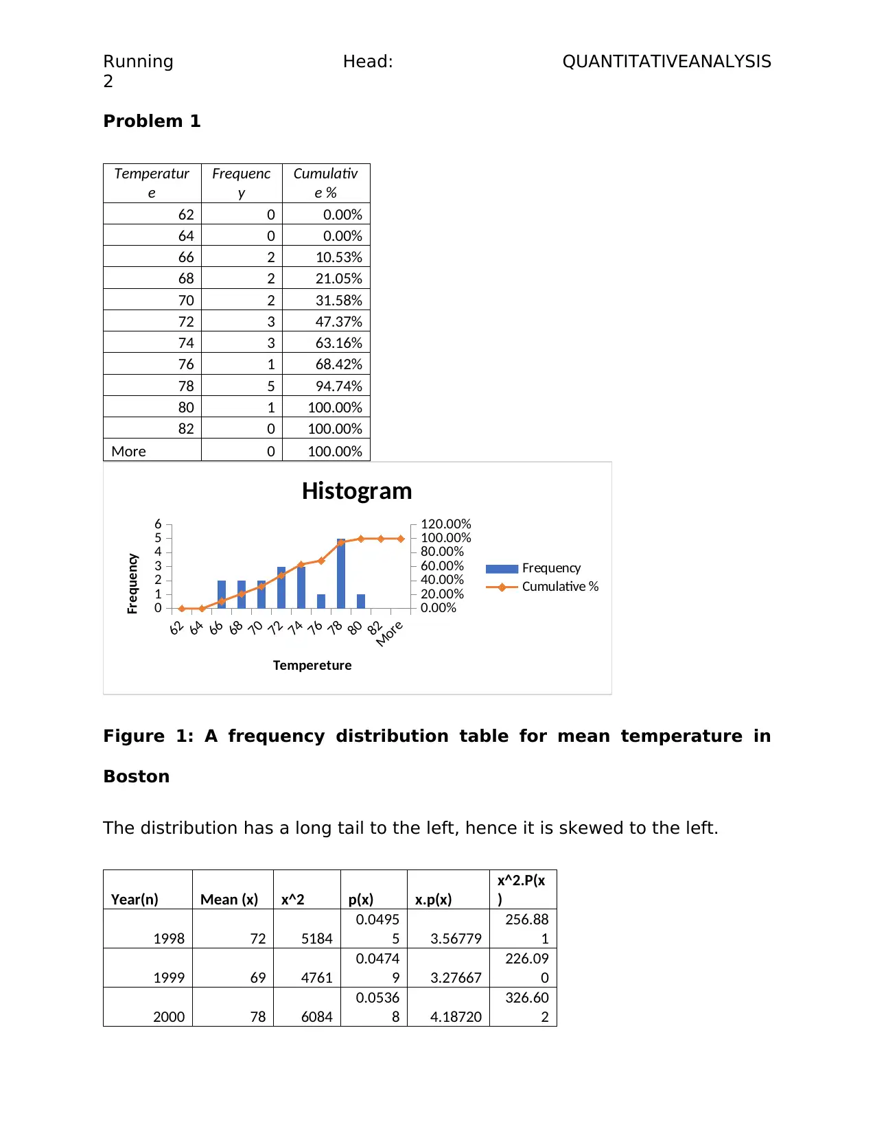
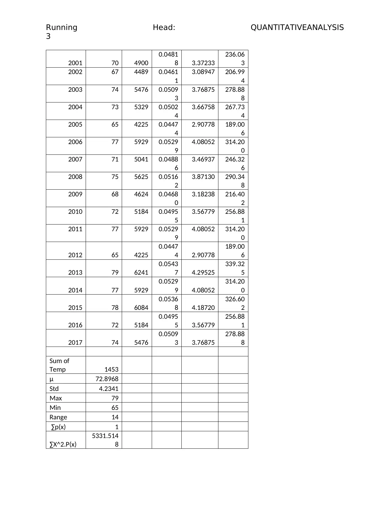
This document presents a comprehensive solution to a quantitative analysis homework assignment. The solution encompasses a frequency distribution table and histogram, identifying the skewness of the data. It includes the calculation of probabilities using z-scores, determining the probability of mean temperatures exceeding certain values. Furthermore, the assignment explores heatwave temperature analysis, calculating probabilities related to heatwave occurrences. The solution also delves into binomial distribution, analyzing customer purchasing behavior, and applies the concepts to a company case study, specifically Apple, where it suggests market analysis research using Poisson's distribution to understand customer buying trends, and average age. The document concludes with a discussion of the importance of data collection and analysis for business success and provides relevant references.

1 out of 13

Your All-in-One AI-Powered Toolkit for Academic Success.
+13062052269
info@desklib.com
Available 24*7 on WhatsApp / Email
![[object Object]](/_next/static/media/star-bottom.7253800d.svg)
Copyright © 2020–2026 A2Z Services. All Rights Reserved. Developed and managed by ZUCOL.