HI6007 Statistics & Research Methods for Business Decisions T2
VerifiedAdded on 2022/09/18
|6
|700
|35
Homework Assignment
AI Summary
This assignment solution provides a detailed analysis of statistical and research methods for business decisions. It includes the interpretation of column graphs exhibiting CO2 emissions, frequency distribution analysis, and the relationship between inflation and all-ordinary index using line graphs, scatter plots, and regression analysis. The solution calculates descriptive statistics such as mean, median, variance, and quartiles, and interprets the coefficient of correlation and determination. Furthermore, it assesses the significance of the regression model and discusses the standard error. Desklib offers a wide range of similar assignments and study tools for students.
1
Statistics and Research Methods for Business Decisions
By:
Instructor:
Course Title:
Institution:
Statistics and Research Methods for Business Decisions
By:
Instructor:
Course Title:
Institution:
Paraphrase This Document
Need a fresh take? Get an instant paraphrase of this document with our AI Paraphraser
2
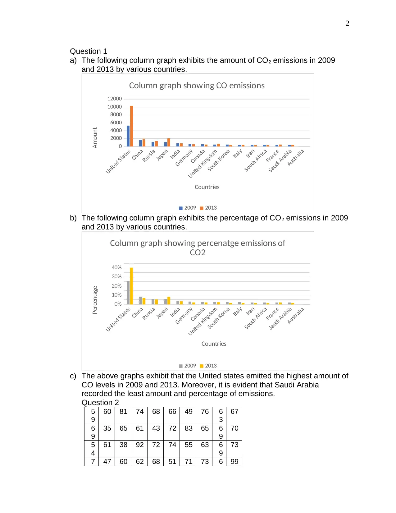
Question 1
a) The following column graph exhibits the amount of CO2 emissions in 2009
and 2013 by various countries.
United States
China
Russia
Japan
India
Germany
Canada
United Kingdom
South Korea
Italy
Iran
South Africa
France
Saudi Arabia
Australia
0
2000
4000
6000
8000
10000
12000
Column graph showing CO emissions
2009 2013
Countries
Amount
b) The following column graph exhibits the percentage of CO2 emissions in 2009
and 2013 by various countries.
United States
China
Russia
Japan
India
Germany
Canada
United Kingdom
South Korea
Italy
Iran
South Africa
France
Saudi Arabia
Australia
0%
10%
20%
30%
40%
Column graph showing percenatge emissions of
CO2
2009 2013
Countries
Percentage
c) The above graphs exhibit that the United states emitted the highest amount of
CO levels in 2009 and 2013. Moreover, it is evident that Saudi Arabia
recorded the least amount and percentage of emissions.
Question 2
5
9
60 81 74 68 66 49 76 6
3
67
6
9
35 65 61 43 72 83 65 6
9
70
5
4
61 38 92 72 74 55 63 6
9
73
7 47 60 62 68 51 71 73 6 99
3
5 8
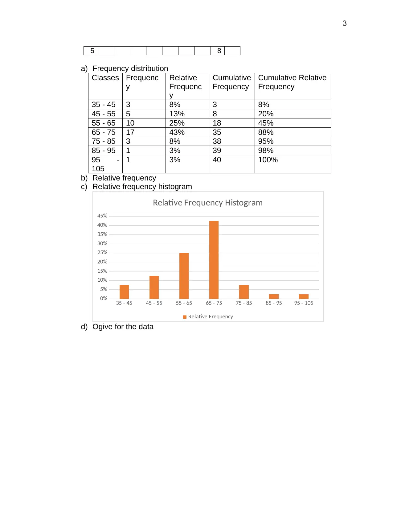
a) Frequency distribution
Classes Frequenc
y
Relative
Frequenc
y
Cumulative
Frequency
Cumulative Relative
Frequency
35 - 45 3 8% 3 8%
45 - 55 5 13% 8 20%
55 - 65 10 25% 18 45%
65 - 75 17 43% 35 88%
75 - 85 3 8% 38 95%
85 - 95 1 3% 39 98%
95 -
105
1 3% 40 100%
b) Relative frequency
c) Relative frequency histogram
35 - 45 45 - 55 55 - 65 65 - 75 75 - 85 85 - 95 95 - 105
0%
5%
10%
15%
20%
25%
30%
35%
40%
45%
Relative Frequency Histogram
Relative Frequency
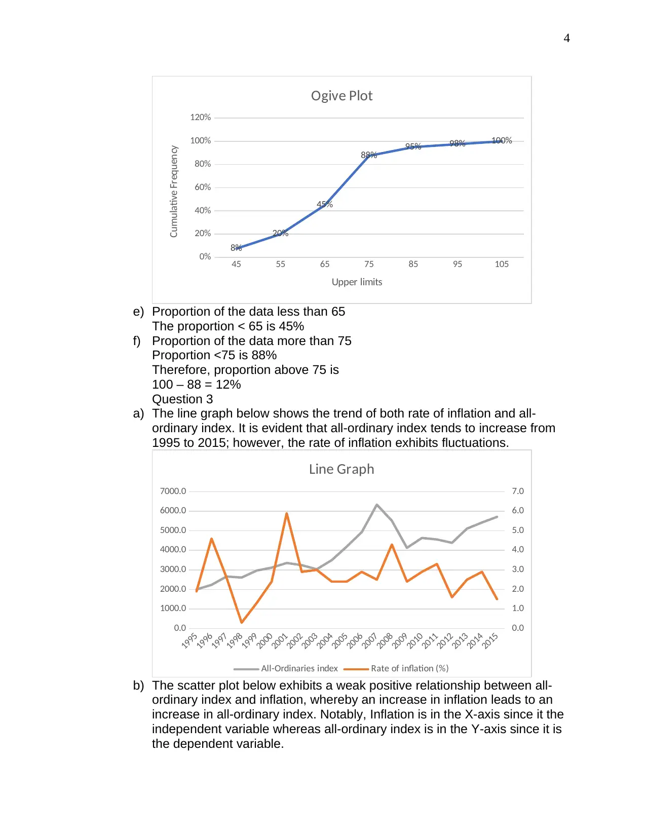
d) Ogive for the data
⊘ This is a preview!⊘
Do you want full access?
Subscribe today to unlock all pages.

Trusted by 1+ million students worldwide
4
45 55 65 75 85 95 105
0%
20%
40%
60%
80%
100%
120%
8%
20%
45%
88% 95% 98% 100%
Ogive Plot
Upper limits
Cumulative Frequency
e) Proportion of the data less than 65
The proportion < 65 is 45%
f) Proportion of the data more than 75
Proportion <75 is 88%
Therefore, proportion above 75 is
100 – 88 = 12%
Question 3
a) The line graph below shows the trend of both rate of inflation and all-
ordinary index. It is evident that all-ordinary index tends to increase from
1995 to 2015; however, the rate of inflation exhibits fluctuations.
1995
1996
1997
1998
1999
2000
2001
2002
2003
2004
2005
2006
2007
2008
2009
2010
2011
2012
2013
2014
2015
0.0
1000.0
2000.0
3000.0
4000.0
5000.0
6000.0
7000.0
0.0
1.0
2.0
3.0
4.0
5.0
6.0
7.0
Line Graph
All-Ordinaries index Rate of inflation (%)
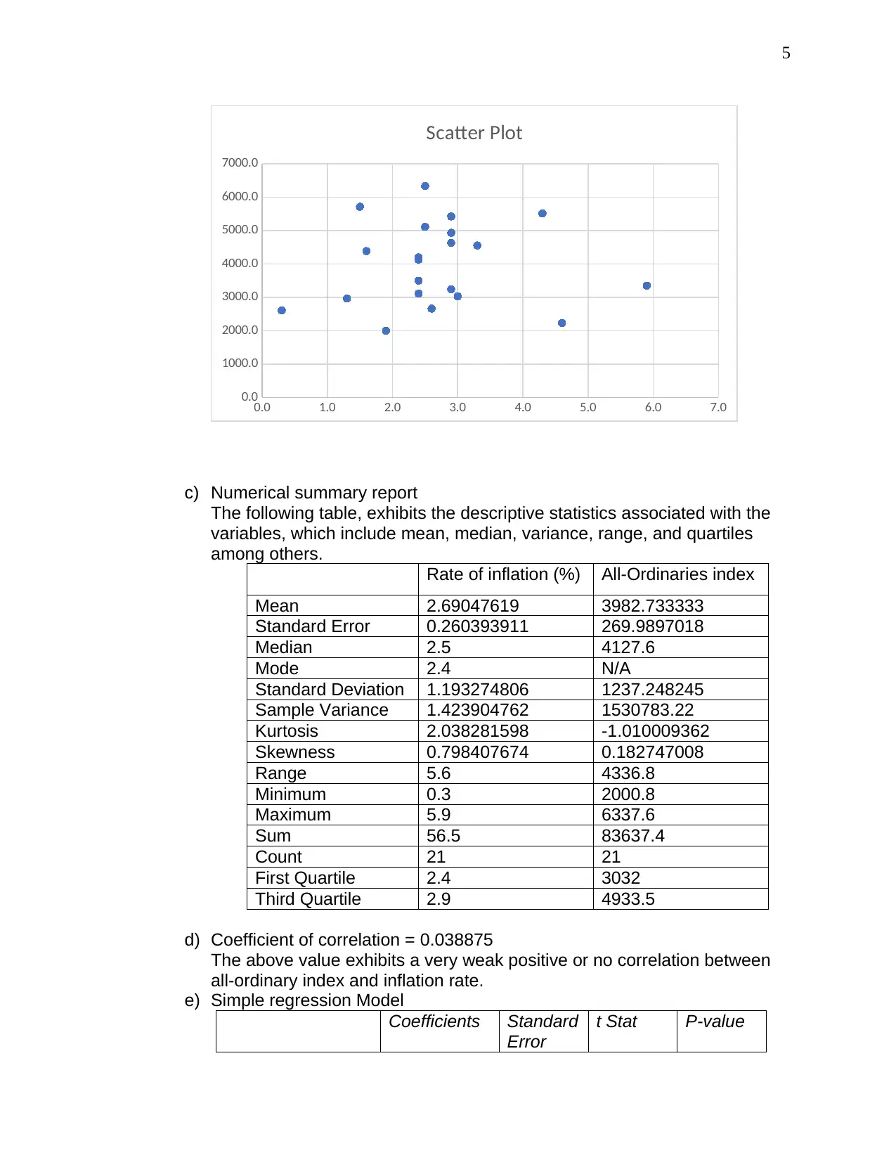
b) The scatter plot below exhibits a weak positive relationship between all-
ordinary index and inflation, whereby an increase in inflation leads to an
increase in all-ordinary index. Notably, Inflation is in the X-axis since it the
independent variable whereas all-ordinary index is in the Y-axis since it is
the dependent variable.
Paraphrase This Document
Need a fresh take? Get an instant paraphrase of this document with our AI Paraphraser
5
0.0 1.0 2.0 3.0 4.0 5.0 6.0 7.0
0.0
1000.0
2000.0
3000.0
4000.0
5000.0
6000.0
7000.0
Scatter Plot
c) Numerical summary report
The following table, exhibits the descriptive statistics associated with the
variables, which include mean, median, variance, range, and quartiles
among others.
Rate of inflation (%) All-Ordinaries index
Mean 2.69047619 3982.733333
Standard Error 0.260393911 269.9897018
Median 2.5 4127.6
Mode 2.4 N/A
Standard Deviation 1.193274806 1237.248245
Sample Variance 1.423904762 1530783.22
Kurtosis 2.038281598 -1.010009362
Skewness 0.798407674 0.182747008
Range 5.6 4336.8
Minimum 0.3 2000.8
Maximum 5.9 6337.6
Sum 56.5 83637.4
Count 21 21
First Quartile 2.4 3032
Third Quartile 2.9 4933.5
d) Coefficient of correlation = 0.038875
The above value exhibits a very weak positive or no correlation between
all-ordinary index and inflation rate.
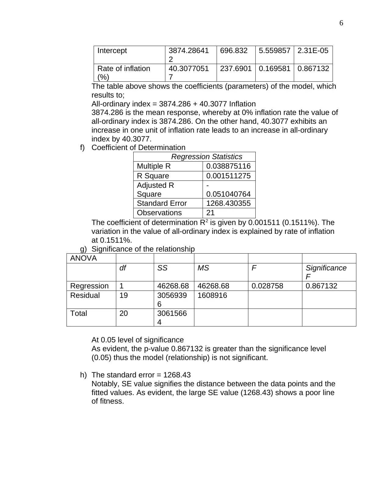
e) Simple regression Model
Coefficients Standard
Error
t Stat P-value
6
Intercept 3874.28641
2
696.832 5.559857 2.31E-05
Rate of inflation
(%)
40.3077051
7
237.6901 0.169581 0.867132
The table above shows the coefficients (parameters) of the model, which
results to;
All-ordinary index = 3874.286 + 40.3077 Inflation
3874.286 is the mean response, whereby at 0% inflation rate the value of
all-ordinary index is 3874.286. On the other hand, 40.3077 exhibits an
increase in one unit of inflation rate leads to an increase in all-ordinary
index by 40.3077.
f) Coefficient of Determination
Regression Statistics
Multiple R 0.038875116
R Square 0.001511275
Adjusted R
Square
-
0.051040764
Standard Error 1268.430355
Observations 21
The coefficient of determination R2 is given by 0.001511 (0.1511%). The
variation in the value of all-ordinary index is explained by rate of inflation
at 0.1511%.
g) Significance of the relationship
ANOVA
df SS MS F Significance
F
Regression 1 46268.68 46268.68 0.028758 0.867132
Residual 19 3056939
6
1608916
Total 20 3061566
4
At 0.05 level of significance
As evident, the p-value 0.867132 is greater than the significance level
(0.05) thus the model (relationship) is not significant.
h) The standard error = 1268.43
Notably, SE value signifies the distance between the data points and the
fitted values. As evident, the large SE value (1268.43) shows a poor line
of fitness.
⊘ This is a preview!⊘
Do you want full access?
Subscribe today to unlock all pages.

Trusted by 1+ million students worldwide
1 out of 6
Related Documents
Your All-in-One AI-Powered Toolkit for Academic Success.
+13062052269
info@desklib.com
Available 24*7 on WhatsApp / Email
![[object Object]](/_next/static/media/star-bottom.7253800d.svg)
Unlock your academic potential
Copyright © 2020–2026 A2Z Services. All Rights Reserved. Developed and managed by ZUCOL.


