HI6007 Statistics and Research: Export Market Analysis Report T1 2019
VerifiedAdded on 2023/04/03
|7
|804
|337
Homework Assignment
AI Summary
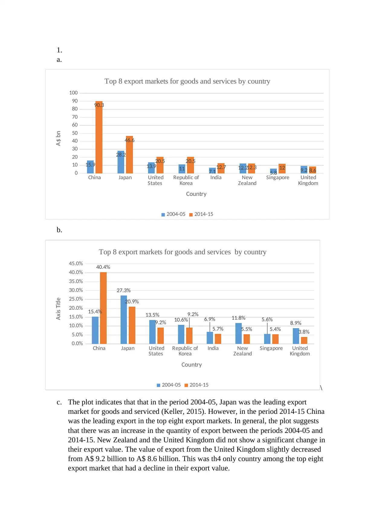
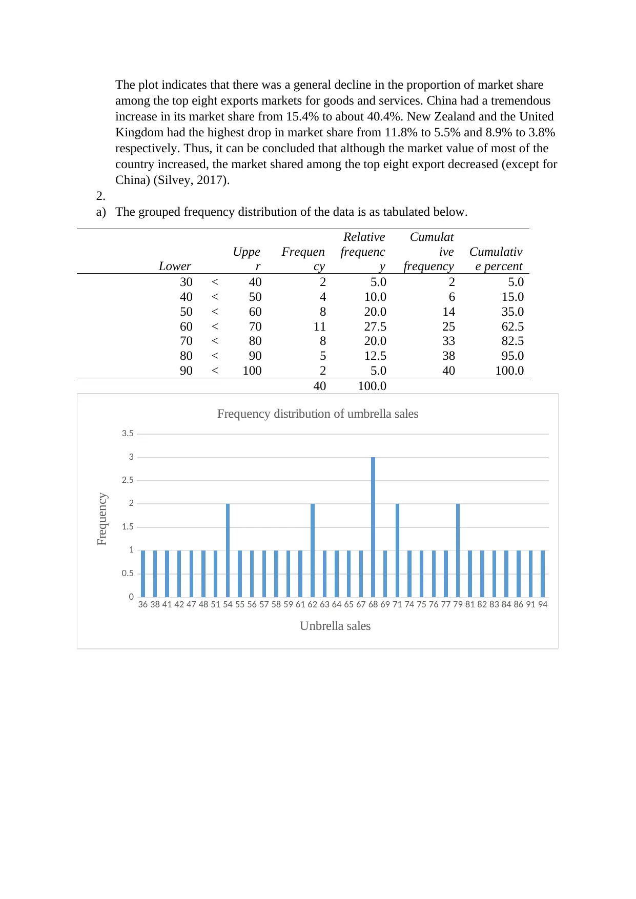
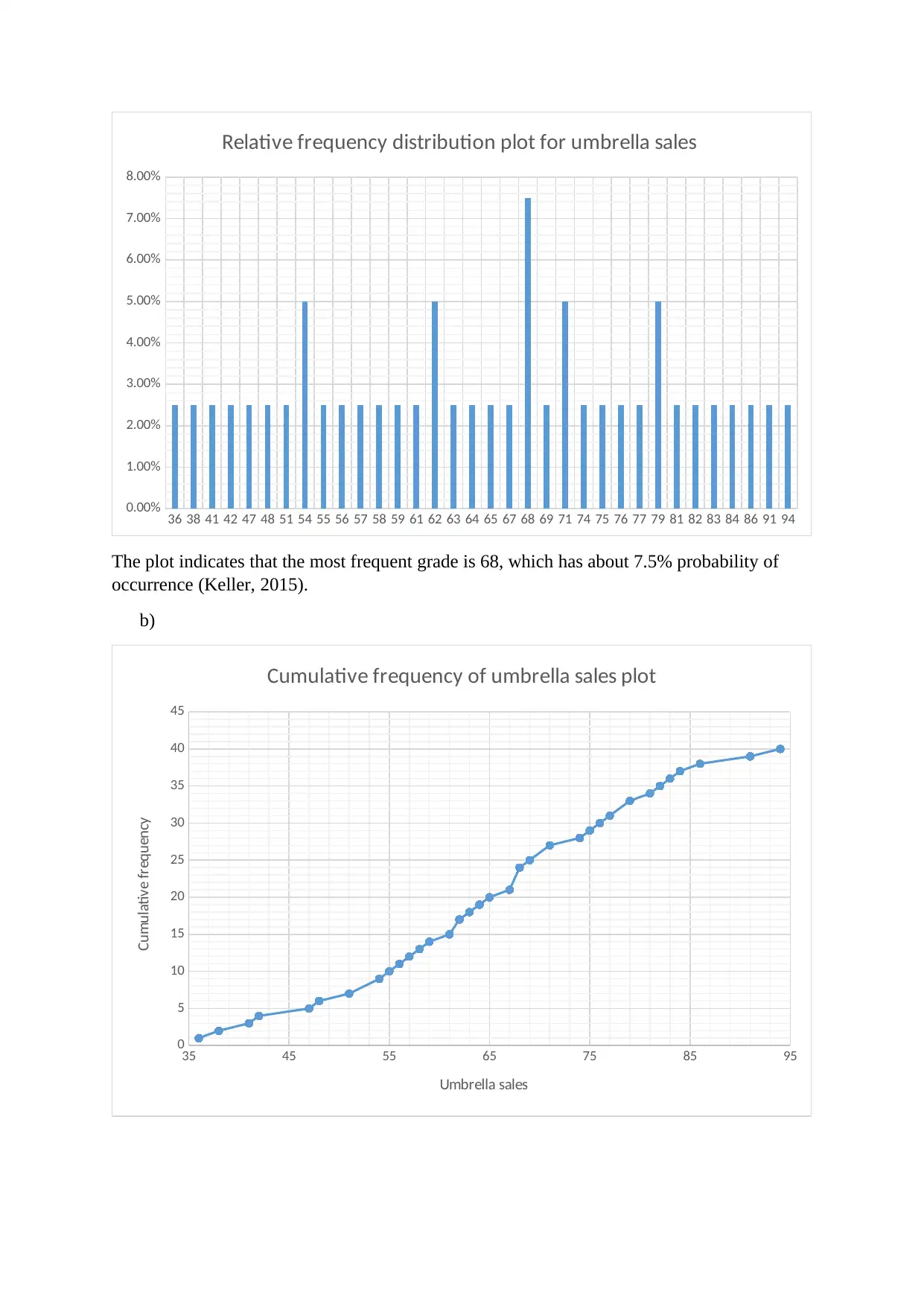
This assignment focuses on the statistical analysis of export markets, specifically examining the top eight export markets for goods and services. It includes a comparison of data from 2004-05 and 2014-15, presented in both tabular and graphical forms. The analysis identifies shifts in market dominan...

Statistics for Business Decision
Name:
The Name of the Class (Course):
Professor (Tutor):
The Name of the School (University):
The City and State where it is located:
Date:
Name:
The Name of the Class (Course):
Professor (Tutor):
The Name of the School (University):
The City and State where it is located:
Date:
Paraphrase This Document
Need a fresh take? Get an instant paraphrase of this document with our AI Paraphraser

1.
a.
China Japan United
States Republic of
Korea India New
Zealand Singapore United
Kingdom
0
10
20
30
40
50
60
70
80
90
100
15.9
28.2
13.9 11 7.1 12.2 5.8 9.2
90.3
46.6
20.5 20.5
12.7 12.3 12 8.6
Top 8 export markets for goods and services by country
2004-05 2014-15
Country
A$ bn
b.
China Japan United
States Republic of
Korea India New
Zealand Singapore United
Kingdom
0.0%
5.0%
10.0%
15.0%
20.0%
25.0%
30.0%
35.0%
40.0%
45.0%
15.4%
27.3%
13.5% 10.6% 6.9% 11.8% 5.6% 8.9%
40.4%
20.9%
9.2%
9.2%
5.7% 5.5% 5.4% 3.8%
Top 8 export markets for goods and services by country
2004-05 2014-15
Country
Axis Title
\
c. The plot indicates that that in the period 2004-05, Japan was the leading export
market for goods and serviced (Keller, 2015). However, in the period 2014-15 China
was the leading export in the top eight export markets. In general, the plot suggests
that there was an increase in the quantity of export between the periods 2004-05 and
2014-15. New Zealand and the United Kingdom did not show a significant change in
their export value. The value of export from the United Kingdom slightly decreased
from A$ 9.2 billion to A$ 8.6 billion. This was th4 only country among the top eight
export market that had a decline in their export value.

The plot indicates that there was a general decline in the proportion of market share
among the top eight exports markets for goods and services. China had a tremendous
increase in its market share from 15.4% to about 40.4%. New Zealand and the United
Kingdom had the highest drop in market share from 11.8% to 5.5% and 8.9% to 3.8%
respectively. Thus, it can be concluded that although the market value of most of the
country increased, the market shared among the top eight export decreased (except for
China) (Silvey, 2017).
2.
a) The grouped frequency distribution of the data is as tabulated below.
Lower
Uppe
r
Frequen
cy
Relative
frequenc
y
Cumulat
ive
frequency
Cumulativ
e percent
30 < 40 2 5.0 2 5.0
40 < 50 4 10.0 6 15.0
50 < 60 8 20.0 14 35.0
60 < 70 11 27.5 25 62.5
70 < 80 8 20.0 33 82.5
80 < 90 5 12.5 38 95.0
90 < 100 2 5.0 40 100.0
40 100.0
36 38 41 42 47 48 51 54 55 56 57 58 59 61 62 63 64 65 67 68 69 71 74 75 76 77 79 81 82 83 84 86 91 94
0
0.5
1
1.5
2
2.5
3
3.5
Frequency distribution of umbrella sales
Unbrella sales
Frequency
⊘ This is a preview!⊘
Do you want full access?
Subscribe today to unlock all pages.

Trusted by 1+ million students worldwide

36 38 41 42 47 48 51 54 55 56 57 58 59 61 62 63 64 65 67 68 69 71 74 75 76 77 79 81 82 83 84 86 91 94
0.00%
1.00%
2.00%
3.00%
4.00%
5.00%
6.00%
7.00%
8.00%
Relative frequency distribution plot for umbrella sales
The plot indicates that the most frequent grade is 68, which has about 7.5% probability of
occurrence (Keller, 2015).
b)
35 45 55 65 75 85 95
0
5
10
15
20
25
30
35
40
45
Cumulative frequency of umbrella sales plot
Umbrella sales
Cumulative frequency
Paraphrase This Document
Need a fresh take? Get an instant paraphrase of this document with our AI Paraphraser

35 45 55 65 75 85 95
0.00%
20.00%
40.00%
60.00%
80.00%
100.00%
120.00%
Cumulative relative frequency distribution of umbrella sales
Umbrella sale
cummulative frequency
The plot indicates that the most frequent sale was 68. Most of the sales were made once and
thus they had a single entry (Chatfield, 2018).
c)
30
40
50
60
70
80
90
100
0
5
10
15
20
25
30
Histogram of Umbrella salaes
umbrella sales
Relative frequency
The plot has a bell-shaped curve, which shows that the data may be from a normally
distributed population.

d)
30 40 50 60 70 80 90
0.0
10.0
20.0
30.0
40.0
Ogive
umbrella sales
Cumulative Percent
The ogive curve indicates that only 14 people out of 40 students got less than 50 on their
grade. Also, about 15 students got 70 and above in their grade.
e)
30 40 50 60 70 80 90
0.0
10.0
20.0
30.0
40.0
50.0
60.0
70.0
80.0
90.0
100.0
5.0
15.0
35.0
62.5
82.5
95.0 100.0
Ogive
umbrella sales
Cumulative Percent
The plot indicates that 35.0% of the grades are less than 60.
f) The plot also indicates that about 37.5% of the grades are more than 70.
30 40 50 60 70 80 90
0.0
10.0
20.0
30.0
40.0
Ogive
umbrella sales
Cumulative Percent
The ogive curve indicates that only 14 people out of 40 students got less than 50 on their
grade. Also, about 15 students got 70 and above in their grade.
e)
30 40 50 60 70 80 90
0.0
10.0
20.0
30.0
40.0
50.0
60.0
70.0
80.0
90.0
100.0
5.0
15.0
35.0
62.5
82.5
95.0 100.0
Ogive
umbrella sales
Cumulative Percent
The plot indicates that 35.0% of the grades are less than 60.
f) The plot also indicates that about 37.5% of the grades are more than 70.
⊘ This is a preview!⊘
Do you want full access?
Subscribe today to unlock all pages.

Trusted by 1+ million students worldwide

References
Chatfield, C., 2018. Statistics for technology: a course in applied statistics. 3rd Edition ed.
New York: Routledge.
Keller, G., 2015. Statistics for Management and Economics, Abbreviated. s.l.:Cengage
Learning.
Silvey, S. D., 2017. Statistical inference. s.l.:Routledge.
Chatfield, C., 2018. Statistics for technology: a course in applied statistics. 3rd Edition ed.
New York: Routledge.
Keller, G., 2015. Statistics for Management and Economics, Abbreviated. s.l.:Cengage
Learning.
Silvey, S. D., 2017. Statistical inference. s.l.:Routledge.
1 out of 7
Related Documents

Your All-in-One AI-Powered Toolkit for Academic Success.
+13062052269
info@desklib.com
Available 24*7 on WhatsApp / Email
Unlock your academic potential
© 2024 | Zucol Services PVT LTD | All rights reserved.