Outlier Detection Methods: Standard Deviation vs. Absolute Deviation
VerifiedAdded on 2020/09/17
|20
|3814
|22
AI Summary
The document provides a comprehensive analysis of different topics within the realm of business statistics and inventory management. It begins with an examination of the Economic Order Quantity (EOQ) model, highlighting its effectiveness in minimizing total inventory costs by determining optimal ordering levels, as evidenced by reduced variable costs. The analysis further extends to educational performance metrics, where statistical measures like central tendency and dispersion reveal significant variability in student marks. Additionally, regression analysis is utilized to determine real estate prices, offering insights into market influences. Lastly, the document discusses outlier detection methods, advocating for absolute deviation around the median over standard deviation approaches, thus enhancing data reliability and accuracy.
STATISTICS FOR
MANAGEMENT
MANAGEMENT
Paraphrase This Document
Need a fresh take? Get an instant paraphrase of this document with our AI Paraphraser
Table of Contents
INTRODUCTION................................................................................................................................1
TASK 1.................................................................................................................................................1
A. Testing statistical significant difference in earnings of men and women in public sector..........1
B. Testing statistical significant difference in earnings of men and women in private sector.........2
C. Earning Time chart for each group for the period of 2009-2016................................................3
D. Determining annual growth rate in earnings for all the groups using above charts...................5
TASK 2.................................................................................................................................................7
SECTION A..........................................................................................................................................7
2.1 Presenting data in comprehensible form....................................................................................7
2.2 (i) Average marks of the students to assess their performance..................................................7
2.2 (ii) Measuring dispersion using accepted dispersion measures.................................................8
2.3 Interpreting and explaining the findings and determining association......................................9
SECTION B........................................................................................................................................10
2.4 Presenting scatter graph with line of best fit............................................................................10
TASK 3...............................................................................................................................................11
B..........................................................................................................................................................11
A. Number of deliveries.................................................................................................................11
B. Number of bottles of olive oil in each delivery.........................................................................11
C. Economic order quantity (EOQ)...............................................................................................11
TASK 4...............................................................................................................................................12
4.1 Showing charts.........................................................................................................................12
(i) Bar chart....................................................................................................................................12
(ii) Pie chart...................................................................................................................................13
4.2 Relationship between number of bedrooms and house prices.................................................14
CONCLUSION..................................................................................................................................14
REFERENCES...................................................................................................................................16
Index of Figures
Figure 1Men's yearly earnings in public sector....................................................................................3
Figure 2 Women's yearly earnings in public sector..............................................................................3
Figure 3 Men's yearly earnings in private sector..................................................................................4
Figure 4 Women's yearly earnings in private sector.............................................................................4
Figure 5 Growth rate of men’s earnings in public sector.....................................................................5
Figure 6 Growth rate of women’s earnings in public sector................................................................5
Figure 7 Growth rate of men’s earnings in private sector....................................................................6
Figure 8Growth rate of women’s earnings in private sector................................................................6
Figure 9 Scatter diagram with line of best fit.....................................................................................10
Figure 10 Bar graph presenting number of houses at different location............................................13
Figure 11Pie graph presenting number of houses at different location..............................................13
Figure 12Calculation of price of 2 & 3 bed room at different location..............................................14
Index of tables
table 1 calculation of average and standard deviation of earnings in public sector.............................1
table 2 calculation of average and standard deviation of earnings in public sector.............................2
table 3 arranging data in continuous series..........................................................................................7
table 4 calculation of median for the marks obtained by students.......................................................8
table 5 calculation of standard deviation of students marks.................................................................9
table 6 calculation of charges for one extra room at various location................................................14
⊘ This is a preview!⊘
Do you want full access?
Subscribe today to unlock all pages.

Trusted by 1+ million students worldwide
INTRODUCTION
In today’s unpredictable market, it becomes too important for the managers to make good
quality decisions to stay competitive and assure long-run survival. The decision making process
involves extracting required information from the huge amount of data base and apply necessary
statistical tools and techniques for carrying out in-depth analysis. The current assignment aims to
apply different methods for hypothesis testing, descriptive statistics and measure dispersion
statistics to determine scatter in the series. Besides this, graphical presentation through different
graphs i.e. pie graph, bar graph and scatter plot will be constructed to present data effectively.
TASK 1
A. Testing statistical significant difference in earnings of men and women in public sector
Null hypothesis: There is no significant difference in the mean earnings of men and women in the
public sector.
Alternative hypothesis: There is significant difference in the mean earnings of men and women in
the public sector.
Level of significance: 5%
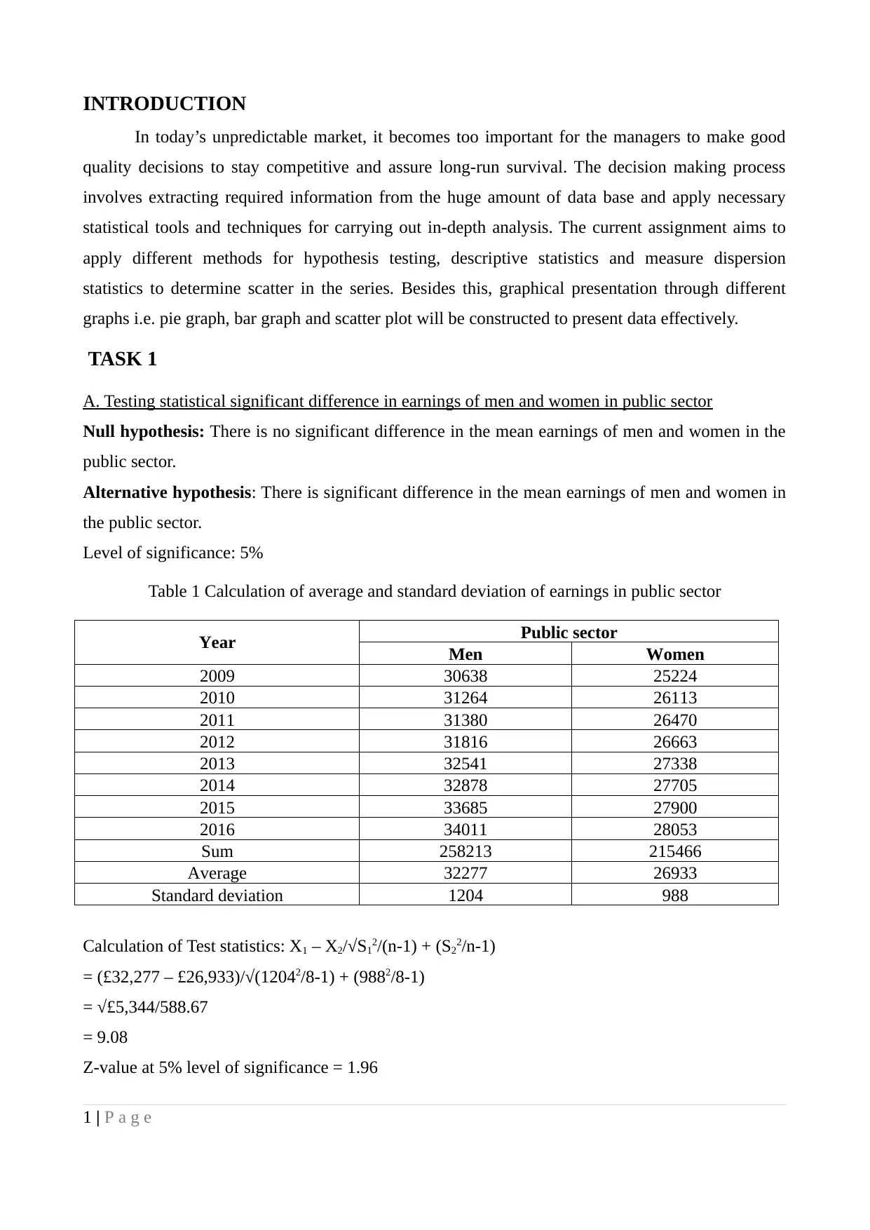
Table 1 Calculation of average and standard deviation of earnings in public sector
Year Public sector
Men Women
2009 30638 25224
2010 31264 26113
2011 31380 26470
2012 31816 26663
2013 32541 27338
2014 32878 27705
2015 33685 27900
2016 34011 28053
Sum 258213 215466
Average 32277 26933
Standard deviation 1204 988
Calculation of Test statistics: X1 – X2/√S12/(n-1) + (S22/n-1)
= (£32,277 – £26,933)/√(12042/8-1) + (9882/8-1)
= √£5,344/588.67
= 9.08
Z-value at 5% level of significance = 1.96
1 | P a g e
Paraphrase This Document
Need a fresh take? Get an instant paraphrase of this document with our AI Paraphraser
Test statistics 9.08 > 1.69 critical value
Therefore, the results make it clear that null hypothesis is rejected and alternative hypothesis
accepted indicating significant statistical difference in the mean earnings of men and women
working in public sector (Levin, 2008).
B. Testing statistical significant difference in earnings of men and women in private sector
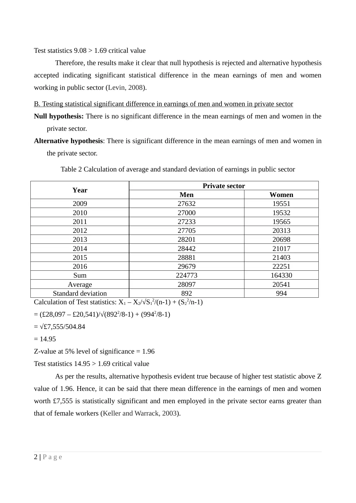
Null hypothesis: There is no significant difference in the mean earnings of men and women in the
private sector.
Alternative hypothesis: There is significant difference in the mean earnings of men and women in
the private sector.
Table 2 Calculation of average and standard deviation of earnings in public sector
Year Private sector
Men Women
2009 27632 19551
2010 27000 19532
2011 27233 19565
2012 27705 20313
2013 28201 20698
2014 28442 21017
2015 28881 21403
2016 29679 22251
Sum 224773 164330
Average 28097 20541
Standard deviation 892 994
Calculation of Test statistics: X1 – X2/√S12/(n-1) + (S22/n-1)
= (£28,097 – £20,541)/√(8922/8-1) + (9942/8-1)
= √£7,555/504.84
= 14.95
Z-value at 5% level of significance = 1.96
Test statistics 14.95 > 1.69 critical value
As per the results, alternative hypothesis evident true because of higher test statistic above Z
value of 1.96. Hence, it can be said that there mean difference in the earnings of men and women
worth £7,555 is statistically significant and men employed in the private sector earns greater than
that of female workers (Keller and Warrack, 2003).
2 | P a g e
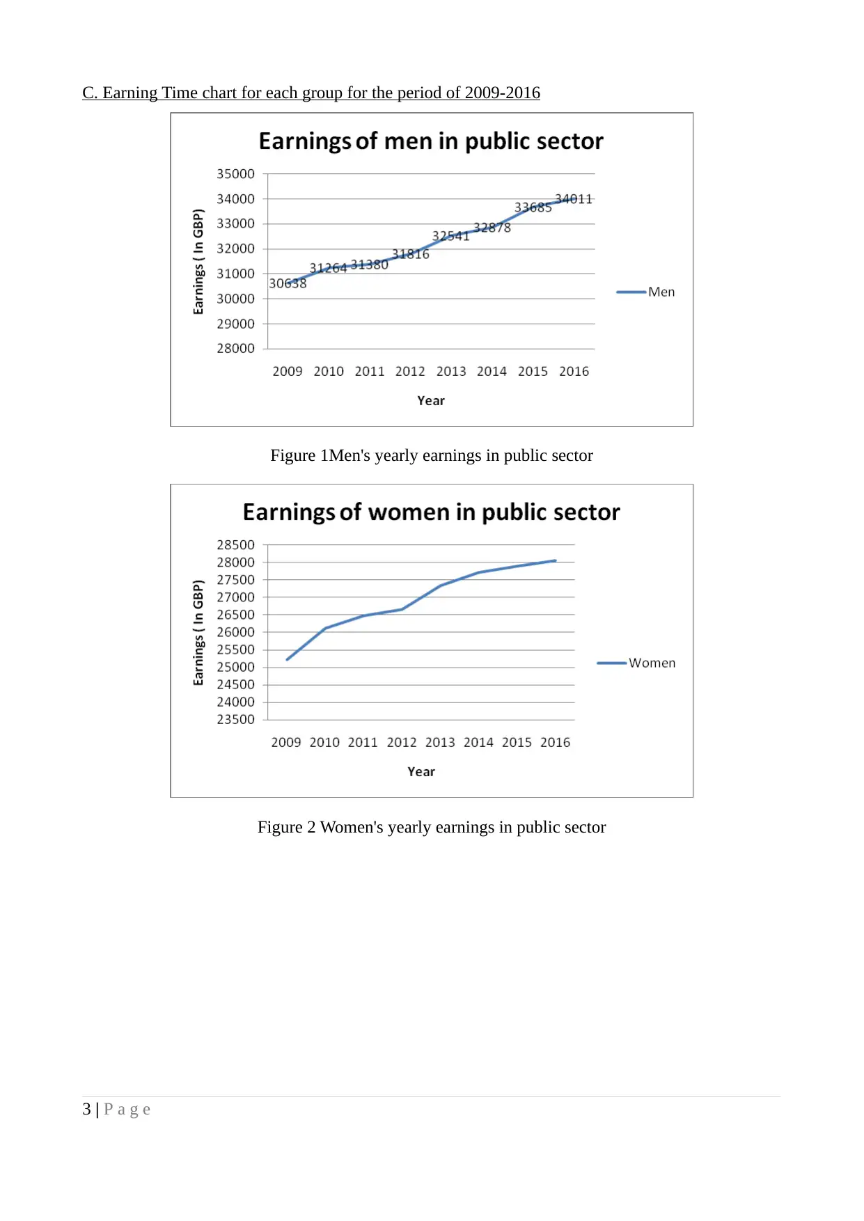
C. Earning Time chart for each group for the period of 2009-2016
Figure 1Men's yearly earnings in public sector
Figure 2 Women's yearly earnings in public sector
3 | P a g e
Figure 1Men's yearly earnings in public sector
Figure 2 Women's yearly earnings in public sector
3 | P a g e
⊘ This is a preview!⊘
Do you want full access?
Subscribe today to unlock all pages.

Trusted by 1+ million students worldwide
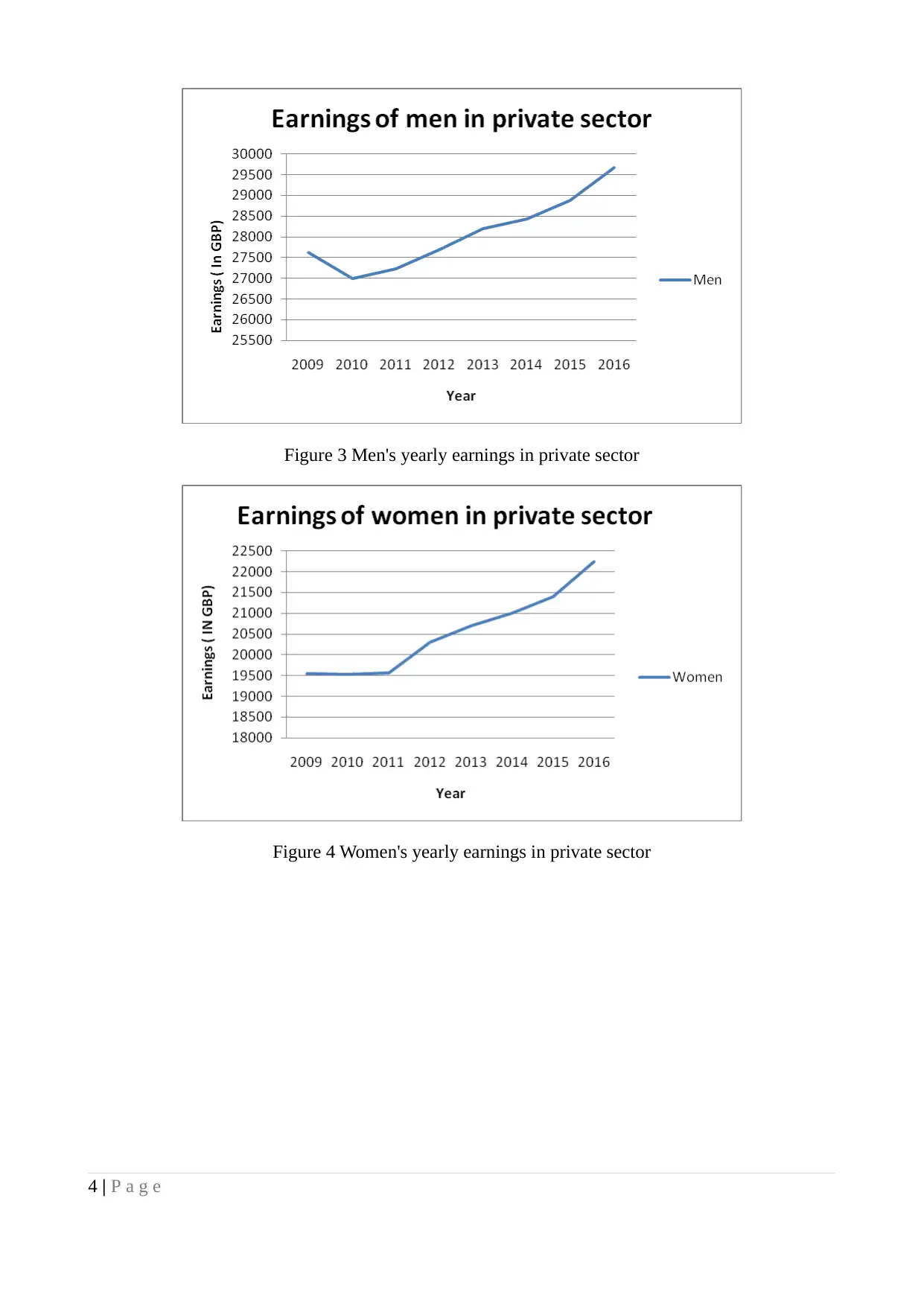
Figure 3 Men's yearly earnings in private sector
Figure 4 Women's yearly earnings in private sector
4 | P a g e
Figure 4 Women's yearly earnings in private sector
4 | P a g e
Paraphrase This Document
Need a fresh take? Get an instant paraphrase of this document with our AI Paraphraser
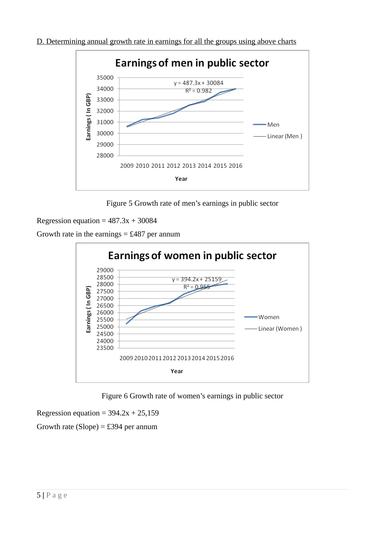
D. Determining annual growth rate in earnings for all the groups using above charts
Figure 5 Growth rate of men’s earnings in public sector
Regression equation = 487.3x + 30084
Growth rate in the earnings = £487 per annum
Figure 6 Growth rate of women’s earnings in public sector
Regression equation = 394.2x + 25,159
Growth rate (Slope) = £394 per annum
5 | P a g e
Figure 5 Growth rate of men’s earnings in public sector
Regression equation = 487.3x + 30084
Growth rate in the earnings = £487 per annum
Figure 6 Growth rate of women’s earnings in public sector
Regression equation = 394.2x + 25,159
Growth rate (Slope) = £394 per annum
5 | P a g e
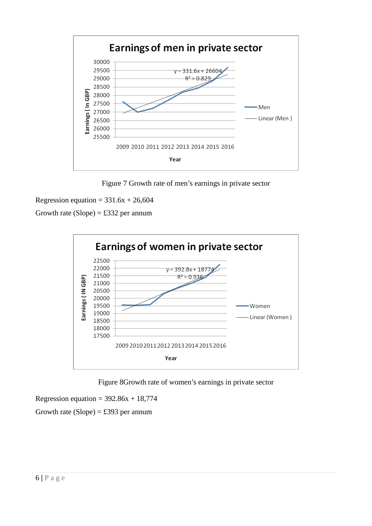
Figure 7 Growth rate of men’s earnings in private sector
Regression equation = 331.6x + 26,604
Growth rate (Slope) = £332 per annum
Figure 8Growth rate of women’s earnings in private sector
Regression equation = 392.86x + 18,774
Growth rate (Slope) = £393 per annum
6 | P a g e
Regression equation = 331.6x + 26,604
Growth rate (Slope) = £332 per annum
Figure 8Growth rate of women’s earnings in private sector
Regression equation = 392.86x + 18,774
Growth rate (Slope) = £393 per annum
6 | P a g e
⊘ This is a preview!⊘
Do you want full access?
Subscribe today to unlock all pages.

Trusted by 1+ million students worldwide
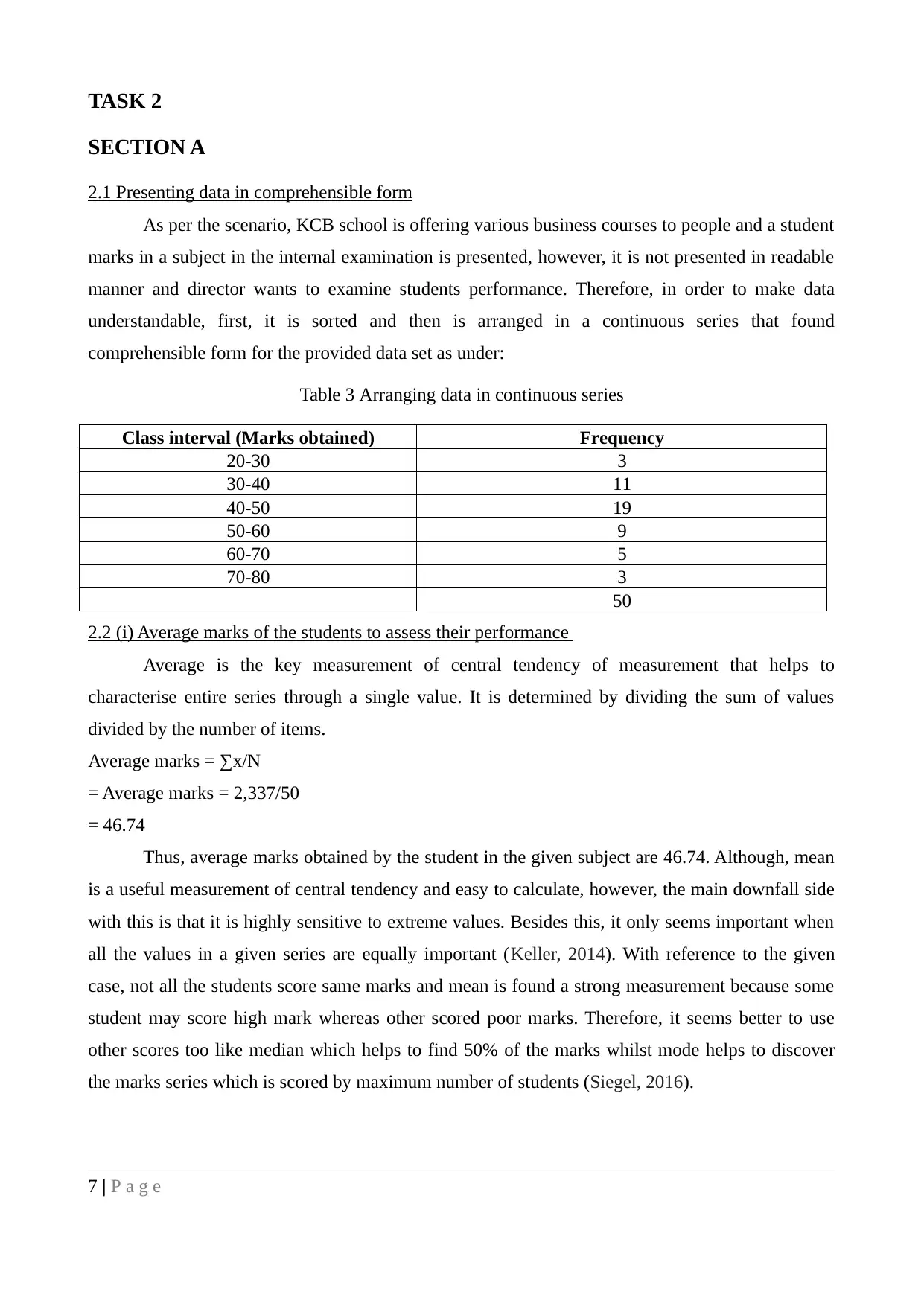
TASK 2
SECTION A
2.1 Presenting data in comprehensible form
As per the scenario, KCB school is offering various business courses to people and a student
marks in a subject in the internal examination is presented, however, it is not presented in readable
manner and director wants to examine students performance. Therefore, in order to make data
understandable, first, it is sorted and then is arranged in a continuous series that found
comprehensible form for the provided data set as under:
Table 3 Arranging data in continuous series
Class interval (Marks obtained) Frequency
20-30 3
30-40 11
40-50 19
50-60 9
60-70 5
70-80 3
50
2.2 (i) Average marks of the students to assess their performance
Average is the key measurement of central tendency of measurement that helps to
characterise entire series through a single value. It is determined by dividing the sum of values
divided by the number of items.
Average marks = ∑x/N
= Average marks = 2,337/50
= 46.74
Thus, average marks obtained by the student in the given subject are 46.74. Although, mean
is a useful measurement of central tendency and easy to calculate, however, the main downfall side
with this is that it is highly sensitive to extreme values. Besides this, it only seems important when
all the values in a given series are equally important (Keller, 2014). With reference to the given
case, not all the students score same marks and mean is found a strong measurement because some
student may score high mark whereas other scored poor marks. Therefore, it seems better to use
other scores too like median which helps to find 50% of the marks whilst mode helps to discover
the marks series which is scored by maximum number of students (Siegel, 2016).
7 | P a g e
Paraphrase This Document
Need a fresh take? Get an instant paraphrase of this document with our AI Paraphraser
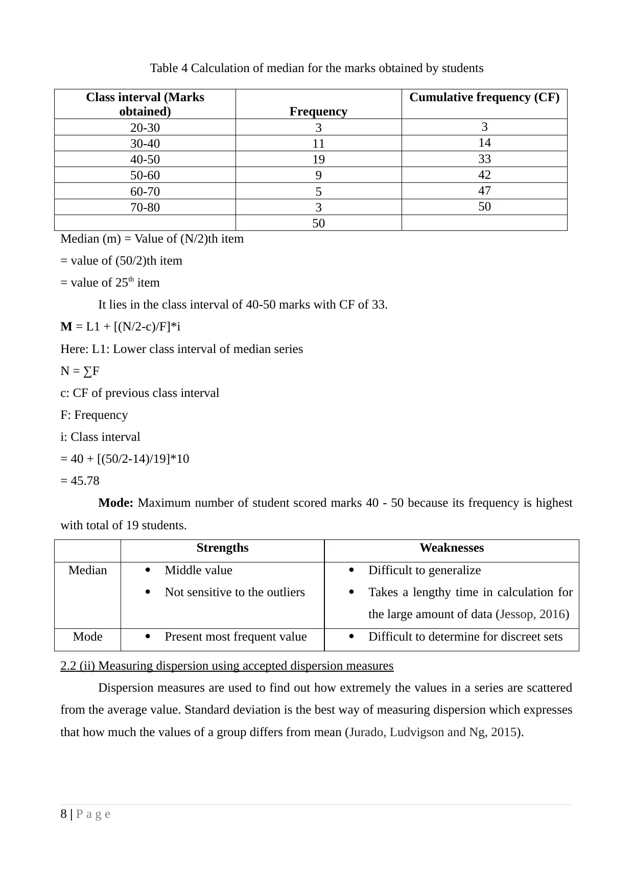
Table 4 Calculation of median for the marks obtained by students
Class interval (Marks
obtained) Frequency
Cumulative frequency (CF)
20-30 3 3
30-40 11 14
40-50 19 33
50-60 9 42
60-70 5 47
70-80 3 50
50
Median (m) = Value of (N/2)th item
= value of (50/2)th item
= value of 25th item
It lies in the class interval of 40-50 marks with CF of 33.
M = L1 + [(N/2-c)/F]*i
Here: L1: Lower class interval of median series
N = ∑F
c: CF of previous class interval
F: Frequency
i: Class interval
= 40 + [(50/2-14)/19]*10
= 45.78
Mode: Maximum number of student scored marks 40 - 50 because its frequency is highest
with total of 19 students.
Strengths Weaknesses
Median Middle value
Not sensitive to the outliers
Difficult to generalize
Takes a lengthy time in calculation for
the large amount of data (Jessop, 2016)
Mode Present most frequent value Difficult to determine for discreet sets
2.2 (ii) Measuring dispersion using accepted dispersion measures
Dispersion measures are used to find out how extremely the values in a series are scattered
from the average value. Standard deviation is the best way of measuring dispersion which expresses
that how much the values of a group differs from mean (Jurado, Ludvigson and Ng, 2015).
8 | P a g e
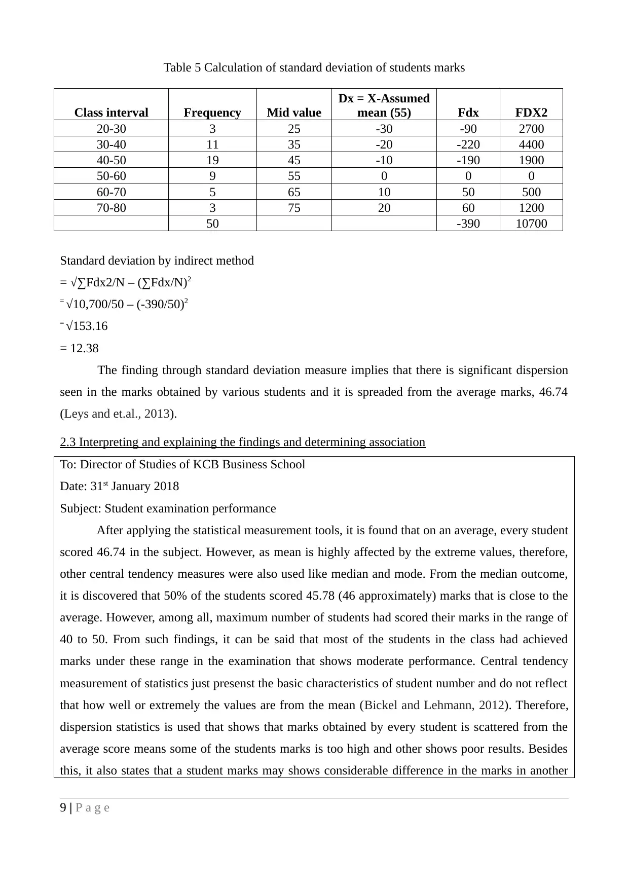
Table 5 Calculation of standard deviation of students marks
Class interval Frequency Mid value
Dx = X-Assumed
mean (55) Fdx FDX2
20-30 3 25 -30 -90 2700
30-40 11 35 -20 -220 4400
40-50 19 45 -10 -190 1900
50-60 9 55 0 0 0
60-70 5 65 10 50 500
70-80 3 75 20 60 1200
50 -390 10700
Standard deviation by indirect method
= √∑Fdx2/N – (∑Fdx/N)2
= √10,700/50 – (-390/50)2
= √153.16
= 12.38
The finding through standard deviation measure implies that there is significant dispersion
seen in the marks obtained by various students and it is spreaded from the average marks, 46.74
(Leys and et.al., 2013).
2.3 Interpreting and explaining the findings and determining association
To: Director of Studies of KCB Business School
Date: 31st January 2018
Subject: Student examination performance
After applying the statistical measurement tools, it is found that on an average, every student
scored 46.74 in the subject. However, as mean is highly affected by the extreme values, therefore,
other central tendency measures were also used like median and mode. From the median outcome,
it is discovered that 50% of the students scored 45.78 (46 approximately) marks that is close to the
average. However, among all, maximum number of students had scored their marks in the range of
40 to 50. From such findings, it can be said that most of the students in the class had achieved
marks under these range in the examination that shows moderate performance. Central tendency
measurement of statistics just presenst the basic characteristics of student number and do not reflect
that how well or extremely the values are from the mean (Bickel and Lehmann, 2012). Therefore,
dispersion statistics is used that shows that marks obtained by every student is scattered from the
average score means some of the students marks is too high and other shows poor results. Besides
this, it also states that a student marks may shows considerable difference in the marks in another
9 | P a g e
⊘ This is a preview!⊘
Do you want full access?
Subscribe today to unlock all pages.

Trusted by 1+ million students worldwide
1 out of 20
Related Documents
Your All-in-One AI-Powered Toolkit for Academic Success.
+13062052269
info@desklib.com
Available 24*7 on WhatsApp / Email
![[object Object]](/_next/static/media/star-bottom.7253800d.svg)
Unlock your academic potential
Copyright © 2020–2025 A2Z Services. All Rights Reserved. Developed and managed by ZUCOL.


