IMAT 5209 Human Factors in Systems Design: Ticket Machine User Test
VerifiedAdded on 2023/06/14
|26
|6194
|387
Report
AI Summary
This report presents a user testing evaluation of an automatic train ticket vending machine (TVM), focusing on user experience, barriers to use, transaction processes, and interface design. The evaluation methodology incorporates heuristics-based assessment, cognitive walkthroughs, and feature inspections to identify usability issues. Key findings highlight challenges related to user confidence, the need for clear communication, and interface improvements. The report details the evaluation process, including the selection of participants, the use of personas and scenarios, and the application of specific heuristics tailored to TVMs. It also discusses the importance of minimizing unnecessary visual elements, ensuring sufficient contrast for visibility, and providing clear feedback to users. The analysis provides recommendations for enhancing the usability and overall user experience of TVMs, ultimately aiming to improve efficiency and reduce user frustration. Desklib provides access to similar solved assignments.
Running head: HUMAN FACTORS IN SYSTEMS DESIGN
IMAT 5209 Human Factors in Systems Design: Assignment Two
User Testing of Automatic train ticket vending machine
Student Name:
University Name:
IMAT 5209 Human Factors in Systems Design: Assignment Two
User Testing of Automatic train ticket vending machine
Student Name:
University Name:
Paraphrase This Document
Need a fresh take? Get an instant paraphrase of this document with our AI Paraphraser
1HUMAN FACTORS IN SYSTEMS DESIGN
Table of Contents
1. The interactive system and its users............................................................................................2
2. The use case.................................................................................................................................3
3. The evaluation methodology.......................................................................................................4
4. The evaluation.............................................................................................................................9
4.1 User Experience.....................................................................................................................9
4.2 Barriers to Use.......................................................................................................................9
4.3 Transaction..........................................................................................................................11
4.4 Interface of the TVM (Ticket Vending Machine)...............................................................12
4.5 Front Screen.........................................................................................................................13
4.5.1 First look.......................................................................................................................13
4.5.2 Favorite destinations list...............................................................................................14
4.5.3 Visibility.......................................................................................................................15
4.5.4 Dominance of Centre Screen........................................................................................16
4.6 Finding destination..............................................................................................................17
5. The findings of the evaluation...................................................................................................18
References......................................................................................................................................21
2HUMAN FACTORS IN SYSTEMS DESIGN
1. The interactive system and its users
The Automatic Train Ticket Vending Machine (TVM) is such a type of machine that are
commonly found to be situated near almost every transport terminal throughout the world. The
machines have come into existence for offering a helpful method of buying tickets or passes for a
day without waiting in long queues. It dispenses tickets to clients naturally as soon as the client
selects a choice for ticket and deposits the required amount by cash or card. The transaction
occurring within the machine begins with client utilizing the machine interface for choosing the
type and amount of tickets, after that picking a option for payment for example, money,
MasterCard or even a smartcard (Choma, Zaina and Beraldo 2015). The chosen tickets are then
printed and dispensed to the client. Along these lines, workers can go through quicker processing
of payments and diminish time waiting in queues. The principle clients of this framework are the
travellers going through rail for their everyday exercises.
Ticket machines are generally famous, particularly in the railroads' segment, with a large
number of travellers collaborating with such machines on an everyday. Enhancing the
cooperation’s with such machines hence can possibly spare time, diminish pressure, and enhance
the general nature of administration on an extensive scale. While web based booking
destinations, for example, thetrainline.com, and versatile applications have moved an offer of
ticket buys on the web, the on location booth display stays typical, for three fundamental reasons
(Sim and Read 2016). Firstly, travellers require an approach to purchase tickets at short notice
nearby when no web prepared gadget is accessible. Furthermore, ticket machines give usefulness
that individual gadgets cannot yet substitute for instance printing tickets acknowledged by
railroad organizations. At last, an offer of the populace will keep on preferring the kiosk model
⊘ This is a preview!⊘
Do you want full access?
Subscribe today to unlock all pages.

Trusted by 1+ million students worldwide
3HUMAN FACTORS IN SYSTEMS DESIGN
over its online partners. Rail ticket vending machines are considered for this specific
examination to dissect the client necessities by demonstrating personas and situations.
2. The use case
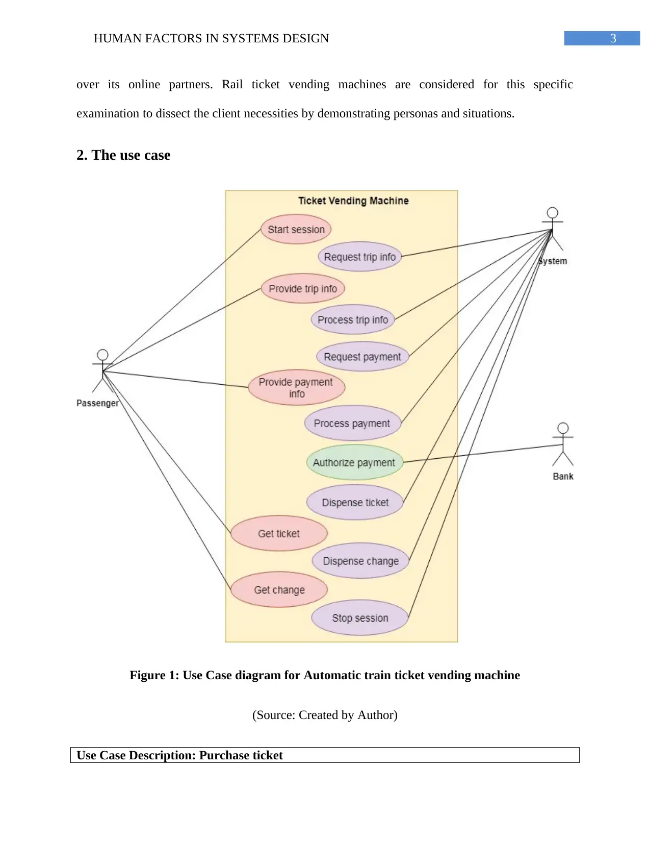
Figure 1: Use Case diagram for Automatic train ticket vending machine
(Source: Created by Author)
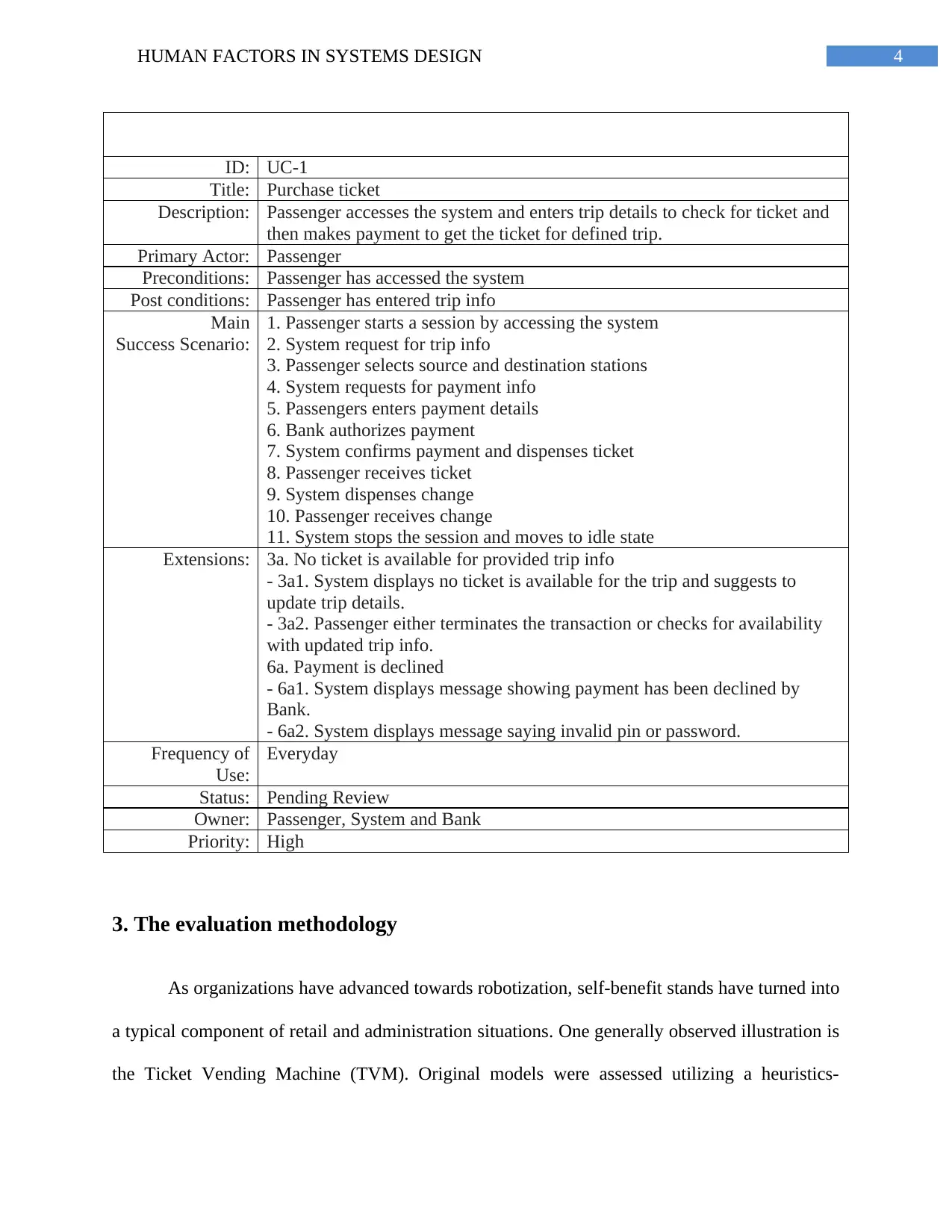
Use Case Description: Purchase ticket
Paraphrase This Document
Need a fresh take? Get an instant paraphrase of this document with our AI Paraphraser
4HUMAN FACTORS IN SYSTEMS DESIGN
ID: UC-1
Title: Purchase ticket
Description: Passenger accesses the system and enters trip details to check for ticket and
then makes payment to get the ticket for defined trip.
Primary Actor: Passenger
Preconditions: Passenger has accessed the system
Post conditions: Passenger has entered trip info
Main
Success Scenario:
1. Passenger starts a session by accessing the system
2. System request for trip info
3. Passenger selects source and destination stations
4. System requests for payment info
5. Passengers enters payment details
6. Bank authorizes payment
7. System confirms payment and dispenses ticket
8. Passenger receives ticket
9. System dispenses change
10. Passenger receives change
11. System stops the session and moves to idle state
Extensions: 3a. No ticket is available for provided trip info
- 3a1. System displays no ticket is available for the trip and suggests to
update trip details.
- 3a2. Passenger either terminates the transaction or checks for availability
with updated trip info.
6a. Payment is declined
- 6a1. System displays message showing payment has been declined by
Bank.
- 6a2. System displays message saying invalid pin or password.
Frequency of
Use:
Everyday
Status: Pending Review
Owner: Passenger, System and Bank
Priority: High
3. The evaluation methodology
As organizations have advanced towards robotization, self-benefit stands have turned into
a typical component of retail and administration situations. One generally observed illustration is
the Ticket Vending Machine (TVM). Original models were assessed utilizing a heuristics-
5HUMAN FACTORS IN SYSTEMS DESIGN
construct approach situated in light of Nielsen's heuristics (Nielsen 1994). Keeping in mind the
end goal to augment the quantity of ease of use issues recognized, every model was assessed,
except for their own. Assessments were directed exclusively to dodge inclination among
evaluators. A cross breed approach between situation based assessment and free investigation
was embraced. Firstly, all situations were screened and an arrangement of basic objectives was
extricated from them. This set framed the premise of an objective situated assessment (Quinones
and Rusu 2017). Every evaluator at first screened the models in perspective of accomplishing
these objectives, finishing up whether the model enables clients to accomplish them and
advocating their decision. In light of this investigation, every evaluator at that point continued
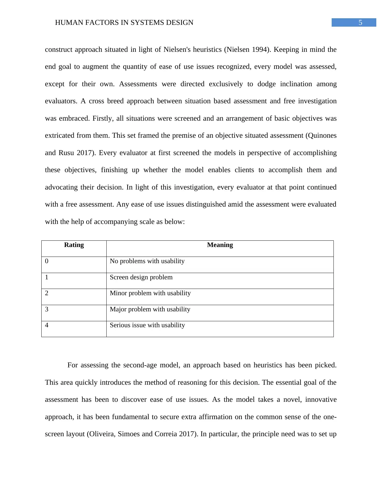
with a free assessment. Any ease of use issues distinguished amid the assessment were evaluated
with the help of accompanying scale as below:
Rating Meaning
0 No problems with usability
1 Screen design problem
2 Minor problem with usability
3 Major problem with usability
4 Serious issue with usability
For assessing the second-age model, an approach based on heuristics has been picked.
This area quickly introduces the method of reasoning for this decision. The essential goal of the
assessment has been to discover ease of use issues. As the model takes a novel, innovative
approach, it has been fundamental to secure extra affirmation on the common sense of the one-
screen layout (Oliveira, Simoes and Correia 2017). In particular, the principle need was to set up
⊘ This is a preview!⊘
Do you want full access?
Subscribe today to unlock all pages.

Trusted by 1+ million students worldwide
6HUMAN FACTORS IN SYSTEMS DESIGN
whether the one-screen configuration can satisfy the particular convenience necessities of open
stand frameworks by and large and of Train TVMs specifically. Because of the peculiarity of the
plan, changes in ensuing stages were viewed as likely. Completing excessive and convenient
assessments would have along these lines involved the risk of wasting resources as revelations
obtained could be rendered unusable if the arrangement was to change significantly in
subsequent cycles. More asset concentrated assessments were in this way esteemed more fitting
for a third era model and the last item (Joshi et al. 2015). In light of these contemplations, client
testing and examinations was disposed of as it is excessively tedious and exorbitant,
subsequently as unfit for reason. Concerning assessment techniques, the accompanying strategies
were utilized:
Heuristic evaluations and estimation
Cognitive walkthrough
Feature and Standards inspection
Formal usability inspection
As to criteria, the picked evaluation method should utilize the made personas and
circumstances, allow to be versatile to the necessities specific to stand structures and TVMs, and
be significantly convincing in recognizing convenience issues while giving a sensible cash
sparing preferred standpoint extent. With everything taken into account, the gathering found that
a heuristic appraisal in light of a course of action of heuristics uniquely crafted to TVMs and
drove by various evaluators scored the most important on the selected criteria (Orfanou, Tselios
and Katsanos 2015). Proceeding onward to the specifics of the assessment approach, the group
concluded that it would not assess its own model, as assessment results would likely be one-
sided. Besides that part the assessment into originators and evaluators, location rates for ease of
Paraphrase This Document
Need a fresh take? Get an instant paraphrase of this document with our AI Paraphraser
7HUMAN FACTORS IN SYSTEMS DESIGN
use issues would endure. Subsequently, an alternate approach of selecting an alternate gathering
to lead the assessment. With a specific end goal to augment extent of convenience issues
recognized, the quantity of evaluators ought to be as high as could reasonably be expected.
Therefore, a gathering with five individuals was picked. Harvey and Stanton (2016), measures
that this number of evaluators grants to perceive around 75% of usability issues. From a strategy
perspective, the social affair considered that each evaluator would be given the four personas the
looking at circumstances. The evaluators would then reproduce using the model to achieve the
goals set out in the circumstances, recalling the motivation and prerequisites of the personas. To
moreover streamline appraisal, evaluators would be furnished with a game plan of heuristics
which show the usability related criteria which the model ought to satisfy notwithstanding the
necessities got from personas and situations.
Rather than utilizing a bland arrangement of ease of use heuristics, the utilizing a subset
of the outline heuristics was decided for open stands as brought about by Scharl, Schafer and
Kolliakou (2017). This arrangement of heuristics takes into contemplations the specific
prerequisites of open booth frameworks and has been demonstrated and tried by experienced
specialists. Keeping in mind the end goal to confine the measure of time and effort required from
evaluators, the amount of heuristics was been 12. Significance and pertinence to the particular
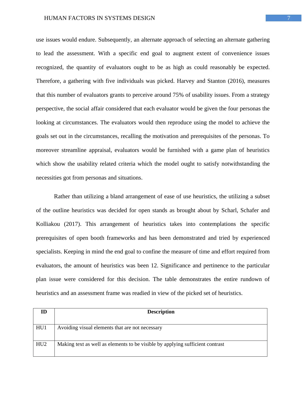
plan issue were considered for this decision. The table demonstrates the entire rundown of
heuristics and an assessment frame was readied in view of the picked set of heuristics.
ID Description
HU1 Avoiding visual elements that are not necessary
HU2 Making text as well as elements to be visible by applying sufficient contrast
8HUMAN FACTORS IN SYSTEMS DESIGN
HU3 Communicating on multiple channels for minimizing the need of reading
HU4 Making the actions to be visible
HU5 Avoiding of steps that are not necessary
HU6 Preference to direct item selection rather than cycling through different items
HU7 Reliance on recall not on memory
HU8 Usage of confirm and next buttons separately and button for undoing certain action
HU9 Avoiding accuracy or detail that is not required
HU10 Not allowing illegal choices
HU11 Request for information in a sequential manner not simultaneously
HU12 Revealing all the required steps from the beginning
At examination time, evaluators were given duplicates of this assessment frame. A
colleague disclosed the heuristics to the evaluators and addressed inquiries with respect to their
significance. Evaluators were requested to report all ease of use issues discovered while
including seriousness scores in light of the scale created by Canicosa et al. (2017), which was
disclosed to evaluators, also. In this way, the augmentation and setting of the model were dense.
Following that, the evaluators were first exhibited the model using a projector. The evaluators
were then offered access to a PC related with the projector with the other intuitive model opened
up so they could survey the coordinated effort coordinate. Evaluators were not given a period
compel. Amid the assessment, there was alternative for evaluators to make any open inquiry they
have as a primary concern with the goal that better outcomes can be accomplished.
⊘ This is a preview!⊘
Do you want full access?
Subscribe today to unlock all pages.

Trusted by 1+ million students worldwide
9HUMAN FACTORS IN SYSTEMS DESIGN
4. The evaluation
4.1 User Experience
Obviously, given the broadness of the enrollment criteria, past encounters of TVM
utilization were amazingly fluctuated over the example. Despite the fact that respondents were
enrolled by asserted certainty levels, this regularly neglected to mean obtaining situations
endeavored over the span of the profundity interviews. Numerous were in the propensity for
utilizing TVMs to gather pre-requested tickets or purchasing a rehash ticket for a journey they
were making frequently (Haddon and Mante-Meijer 2016). Indeed, even the most regular clients
tended not to utilize TVMs for a wide assortment of ticket buys as they will probably be in the
propensity for purchasing advance tickets online so as to exploit less expensive charges. There
was predictable proof to propose, along these lines, that it might be troublesome for travelers to
get adequate information of TVMs to have the capacity to utilize them to best favorable position
since standard travelers were probably going to utilize TVMs to purchase a commonplace
excursion or generally reserving tickets on the web.
4.2 Barriers to Use
The key hindrances distinguished over the example identify with certainty levels and the
requirement for consolation, as opposed to worries among travelers about their capacity to utilize
TVMs. These can be isolated into three gatherings; Main Concerns, Disincentives and Minor
Issues that can be compressed as follows arranged by general significance:
Main Concerns
Paraphrase This Document
Need a fresh take? Get an instant paraphrase of this document with our AI Paraphraser
10HUMAN FACTORS IN SYSTEMS DESIGN
Indeed, even the individuals who were the most able were not generally
sufficiently certain to purchase a ticket from a TVM
Numerous vibe the need to make inquiries about the excursion, particularly one
that is new or complex
Most travelers do not know enough about type of tickets or confinements that
apply for making decisions (Muhammad, Suzianti and Ardi 2017)
Particular issues apply to different incapacity bunches that will require assist
thought
Disincentives
The requirement for consolation is particularly critical for more costly passages
Some may not anticipate that all ticket types will be accessible from a TVM
Travelers periodically speculate that the least expensive ticket for their journey
will not be accessible from a TVM in adequate time to get the for one thing crest
prepare of the day
Notwithstanding purchasing a ticket, numerous need extra data about the journey
they are making, particularly prepare times (Haddon and Mante-Meijer 2016)
Some just want to communicate with a man instead of a machine
Minor Issues
A little minority was frightful of the innovation or felt awkward with it
Some communicated worry that there is frequently no noticeable staff nearness in
case of assistance being required
11HUMAN FACTORS IN SYSTEMS DESIGN
Numerous asserted to be put off by the possibility of feeling under strain from a
line framing behind them if their exchange was not a direct one
Maybe a couple had a poor trouble of misunderstanding the ticket previously
(Kaptelinin et al. 2014)
Some were worried about encountering specialized issues or losing their
installment card in the machine
A minority had been not able utilize a TVM due to having wrinkled banknotes or
accepting that right change was required
4.3 Transaction
Over the span of the meeting, every respondent was requested to 'buy' no less than one
ticket compose from an extensive variety of situations gave by the clients and Passenger Focus.
These were expected to mirror an expansive scope of excursion types with fluctuating degrees of
trouble and intricacy and where conceivable, situations were coordinated to the respondents'
guaranteed certainty with TVMs and sorts of journeys regularly made. All through this report,
screen shots from the TVMs of the clients spoke to in the examination have been utilized to
outline components of the exchange forms (Tobita, Fujito and Kitani 2015). These have been
chosen to mirror an equivalent portrayal of each sort of TVM as opposed to being proposed to
exhibit best or most exceedingly terrible illustrations experienced.
⊘ This is a preview!⊘
Do you want full access?
Subscribe today to unlock all pages.

Trusted by 1+ million students worldwide
1 out of 26
Related Documents
Your All-in-One AI-Powered Toolkit for Academic Success.
+13062052269
info@desklib.com
Available 24*7 on WhatsApp / Email
![[object Object]](/_next/static/media/star-bottom.7253800d.svg)
Unlock your academic potential
Copyright © 2020–2025 A2Z Services. All Rights Reserved. Developed and managed by ZUCOL.


