Analysis of US Health Department Data using SAS Visualization Analytics
VerifiedAdded on 2022/10/10
|24
|4205
|485
AI Summary
This report analyzes the US Health Department's READMIT-HISTORICAL dataset using SAS Visualization Analytics. The report covers various aspects of the data, including gender and diagnosis group, diagnosis group and popularity of diseases, departments and number of patients, patient number by gender, race, hospital, and discharge, patient number, admission, and city, and hospital and patient number map. The report also includes additional visualizations, justification of horizontal and line graphs, discussions, and executive summary.
Contribute Materials
Your contribution can guide someone’s learning journey. Share your
documents today.
Running Head: BIG DATA 1
US health department
<Name>
<University Name>
US health department
<Name>
<University Name>
Secure Best Marks with AI Grader
Need help grading? Try our AI Grader for instant feedback on your assignments.
BIG DATA 2
Table of Contents
Task 1: Background Information.....................................................................................................3
Task 2: Reporting............................................................................................................................4
GENDER and DIAGNOSIS GROUP.............................................................................................4
DIAGNOSIS GROUP AND POPULARITY OF THE DISEASES...............................................5
DEPARTMENTS AND THE NUMBER OF PATIENTS..............................................................7
PATIENT NUMBER BY GENDER, RACE, HOSPITAL, AND DISCHARGE..........................7
PATIENT NUMBER, ADMISSION, AND CITY.........................................................................9
HOSPITAL AND PATIENT NUMBER MAP.............................................................................11
Task 3: Additional Visualizations.................................................................................................12
TREND, DIAGNOSIS AND PATIENTS NUMBER BY ADMISSION DATE.........................12
Dashboard......................................................................................................................................17
Task 4: Justification of Horizontal graphs.....................................................................................18
Task 5: Discussions.......................................................................................................................19
Task 4: Justification of line graphs................................................................................................20
Task 5.1: Discussions....................................................................................................................20
Task 6: Executive Summary..........................................................................................................20
Task 7: The Reflection (Individual Task)......................................................................................21
Conclusion.....................................................................................................................................22
References......................................................................................................................................23
Appendices....................................................................................................................................24
BIG DATA 3
Task 1: Background Information
Normally, every country needs a timely and ready dataset which can be analyzed to inform the
decision-making process. On this note, several organizations and departments including continue
to collect data which with time becomes big dataset. As a result, this information needs to be
analyzed so that productivity of the organization especially health information can be enhanced.
Furthermore, analysis of this big data increases the organization’s reputation thus making health
Organizations or departments to remain competitive. To note, this will lead to an increase in the
organization’s overall performance thus improving its general activities.
For the purposes of accomplishing this task, the "READMIT-HISTORICAL" dataset from
teradatauniversitynetwork.com has been utilized and the analysis conducted by use of the SAS
visualization analytics. Generally, the SAS visualization analytics produces data visualizations
which can be understood by any professional without necessarily requiring them to have a
statistical background. Hence, these visualizations help to increase the decision-making process
within the organization. Furthermore, the visualizations are useful while communicating the
trend and discovering any hidden patterns within the big data.
On this note, the analysis of the health industry of America is important since given the fact that
it has become an expensive industry within the country. Moreover, through the analysis, the
country’s strategic plan can be developed or updated to capture general health issues affecting
the population and citizens in general.
One of the tools for evaluating the quality of service provided by the health industry, in general,
is the requirement and availability of the Big Data analysis. As the department of health
continues to collect daily data, there are chances of having huge data of numerous hospitals as in
the case of (June 2011 – July 2012) dataset. Additionally, visualization of health conditions via
SAS Visual Analytics predict the future of U.S Health Services. Through this, effective control
and prevention mechanisms towards healthcare can be adopted. The fact that the department of
health in US is dealing with the lives of people and need to continue demonstrating general
healthcare services improvement, there is need for this analysis to ensure timely availability of
results for decision-making strategies.
In addition, some of the benefits of data visualizations include its ability to enable an individual
to have a glance on the results and in one way or the other detects any change within the
healthcare-related activities by state, (Yang, Li, & Zhang, 2018). For example, with the
availability of dashboards from the SAS visualization analytics, it is easy to manipulate the
results depending on the variable of interest hence discovering general trends in the analysis.
Comparing data visualizations with static charts, these visualizations are better since, in one way
or the other, they may consider additional interactions unlike to static charts which only consider
what has been presented without any further interactions. Moreover, data visualizations in most
cases attract viewers due to its interactive measures that change the general attitude of non-
statisticians, (Hepworth, & C Canon, 2018).
BIG DATA 4
Task 2: Reporting
ICU_DAYS and DIAGNOSIS GROUP
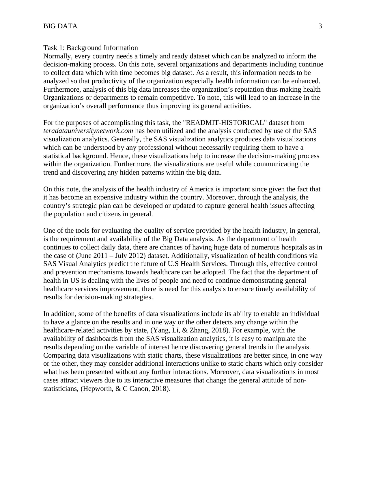
HIGHEST ICU DAYS: Acute Myocardial Infarction (AMI)
GENDER and DIAGNOSIS GROUP
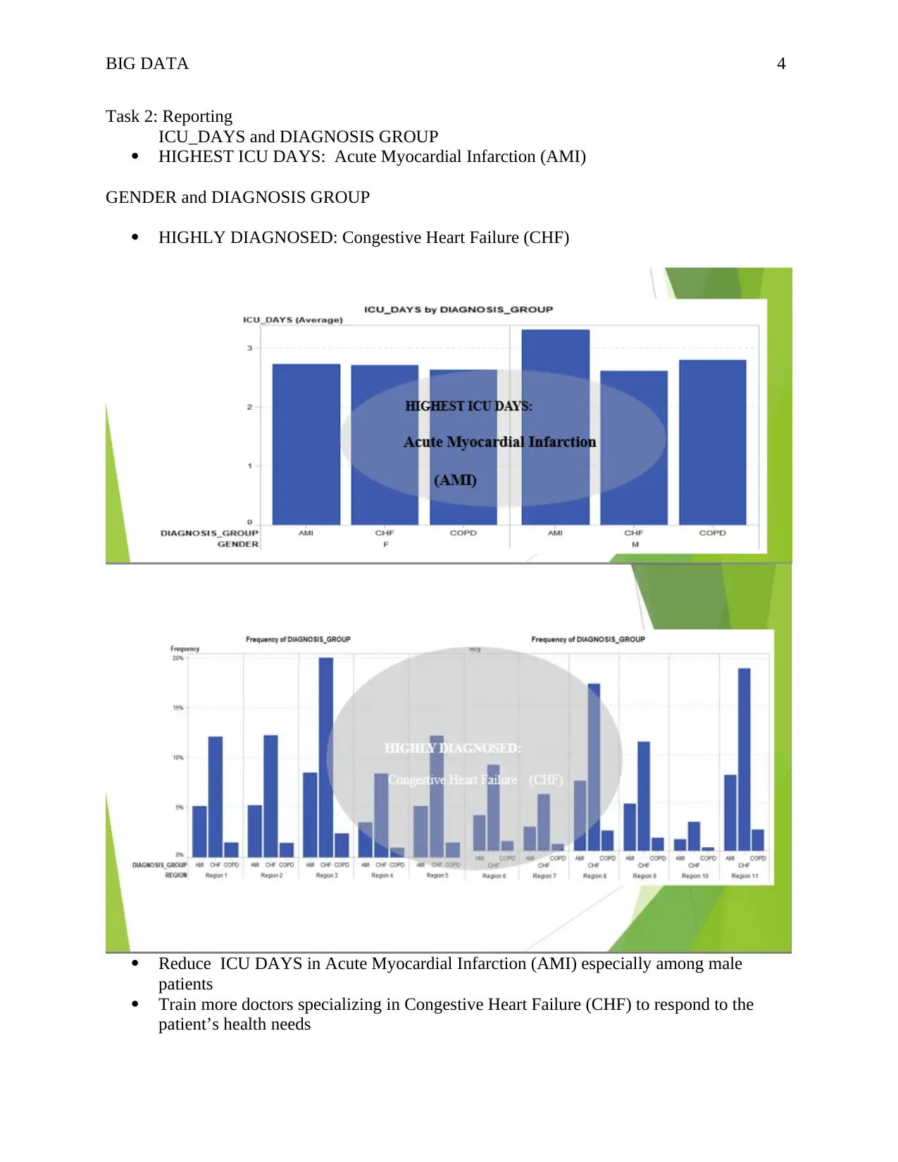
HIGHLY DIAGNOSED: Congestive Heart Failure (CHF)
Reduce ICU DAYS in Acute Myocardial Infarction (AMI) especially among male
patients
Train more doctors specializing in Congestive Heart Failure (CHF) to respond to the
patient’s health needs
Paraphrase This Document
Need a fresh take? Get an instant paraphrase of this document with our AI Paraphraser
BIG DATA 5
Need to benchmark in other regions with low levels of Congestive Heart Failure (CHF)
Like region 1 to come up with lessons learned while addressing these cases in regions
with high levels of Congestive Heart Failure (CHF).
DIAGNOSIS GROUP AND POPULARITY OF THE DISEASES
Need to benchmark in other regions with low levels of Congestive Heart Failure (CHF)
Like region 1 to come up with lessons learned while addressing these cases in regions
with high levels of Congestive Heart Failure (CHF).
DIAGNOSIS GROUP AND POPULARITY OF THE DISEASES
BIG DATA 6
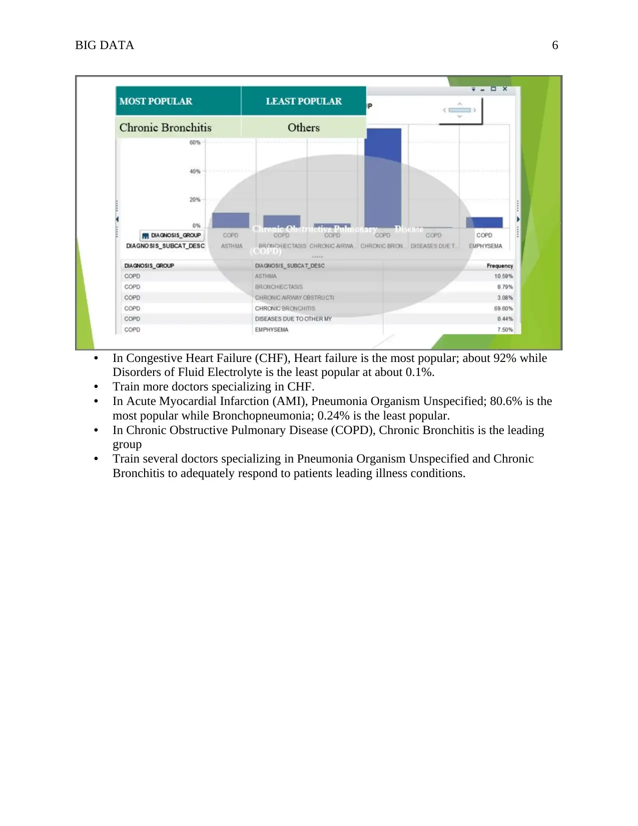
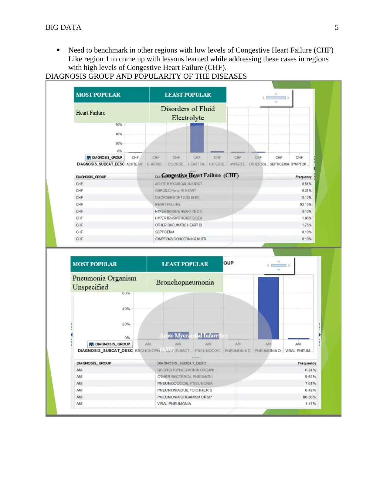
• In Congestive Heart Failure (CHF), Heart failure is the most popular; about 92% while
Disorders of Fluid Electrolyte is the least popular at about 0.1%.
• Train more doctors specializing in CHF.
• In Acute Myocardial Infarction (AMI), Pneumonia Organism Unspecified; 80.6% is the
most popular while Bronchopneumonia; 0.24% is the least popular.
• In Chronic Obstructive Pulmonary Disease (COPD), Chronic Bronchitis is the leading
group
• Train several doctors specializing in Pneumonia Organism Unspecified and Chronic
Bronchitis to adequately respond to patients leading illness conditions.
BIG DATA 7
DEPARTMENTS AND THE NUMBER OF PATIENTS
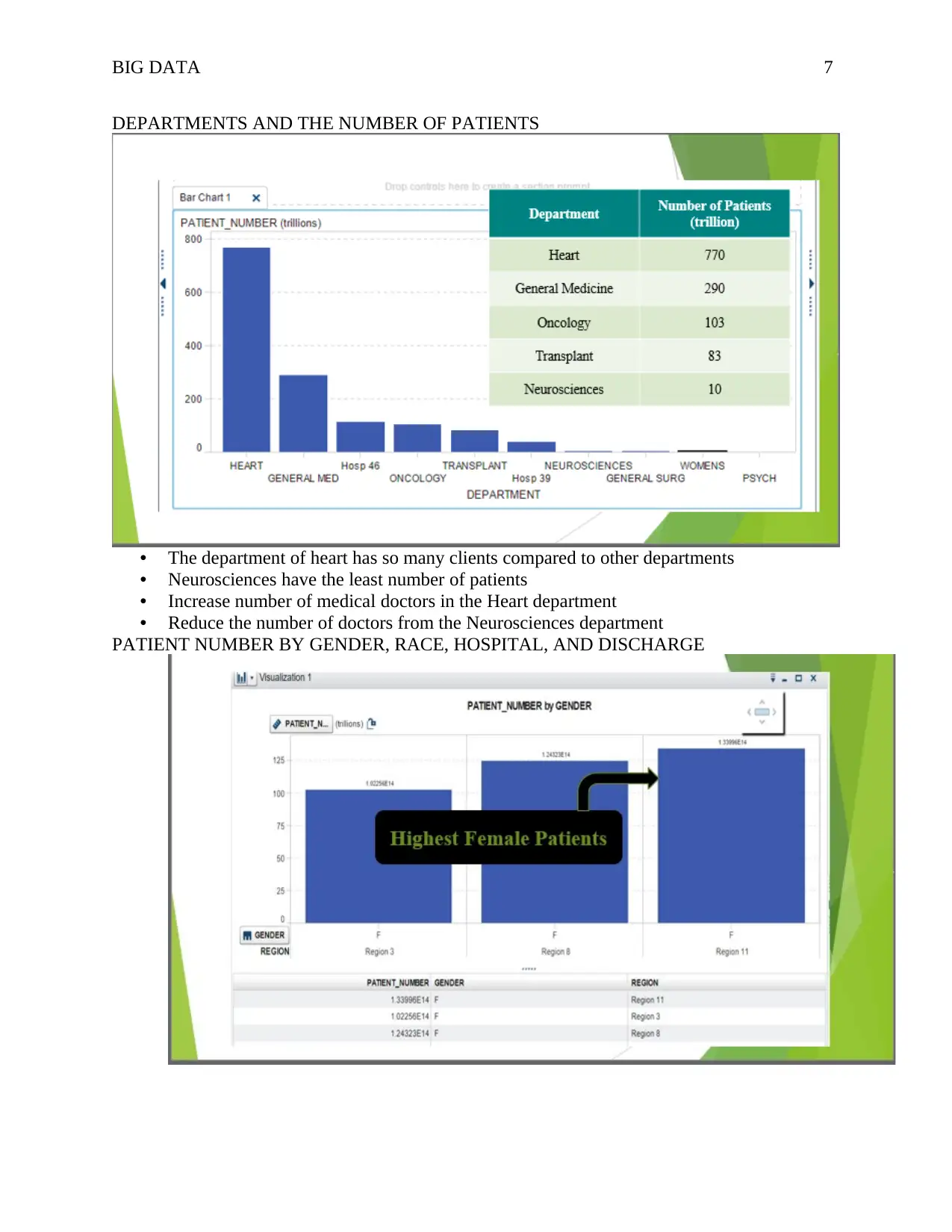
• The department of heart has so many clients compared to other departments
• Neurosciences have the least number of patients
• Increase number of medical doctors in the Heart department
• Reduce the number of doctors from the Neurosciences department
PATIENT NUMBER BY GENDER, RACE, HOSPITAL, AND DISCHARGE
Secure Best Marks with AI Grader
Need help grading? Try our AI Grader for instant feedback on your assignments.
BIG DATA 8
BIG DATA 9
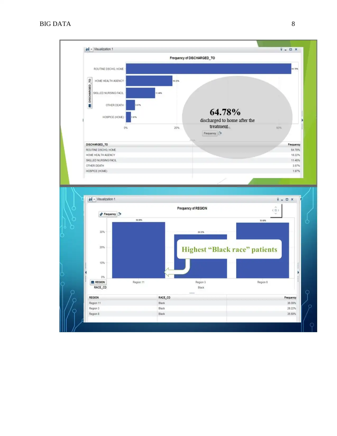
• Highest Female Patients comes from region 11 whereas region 3 has the lowest number
of female patients
• 64.78% of the patients are discharged to home after the treatment
• Highest “Black race” patients are from region 11
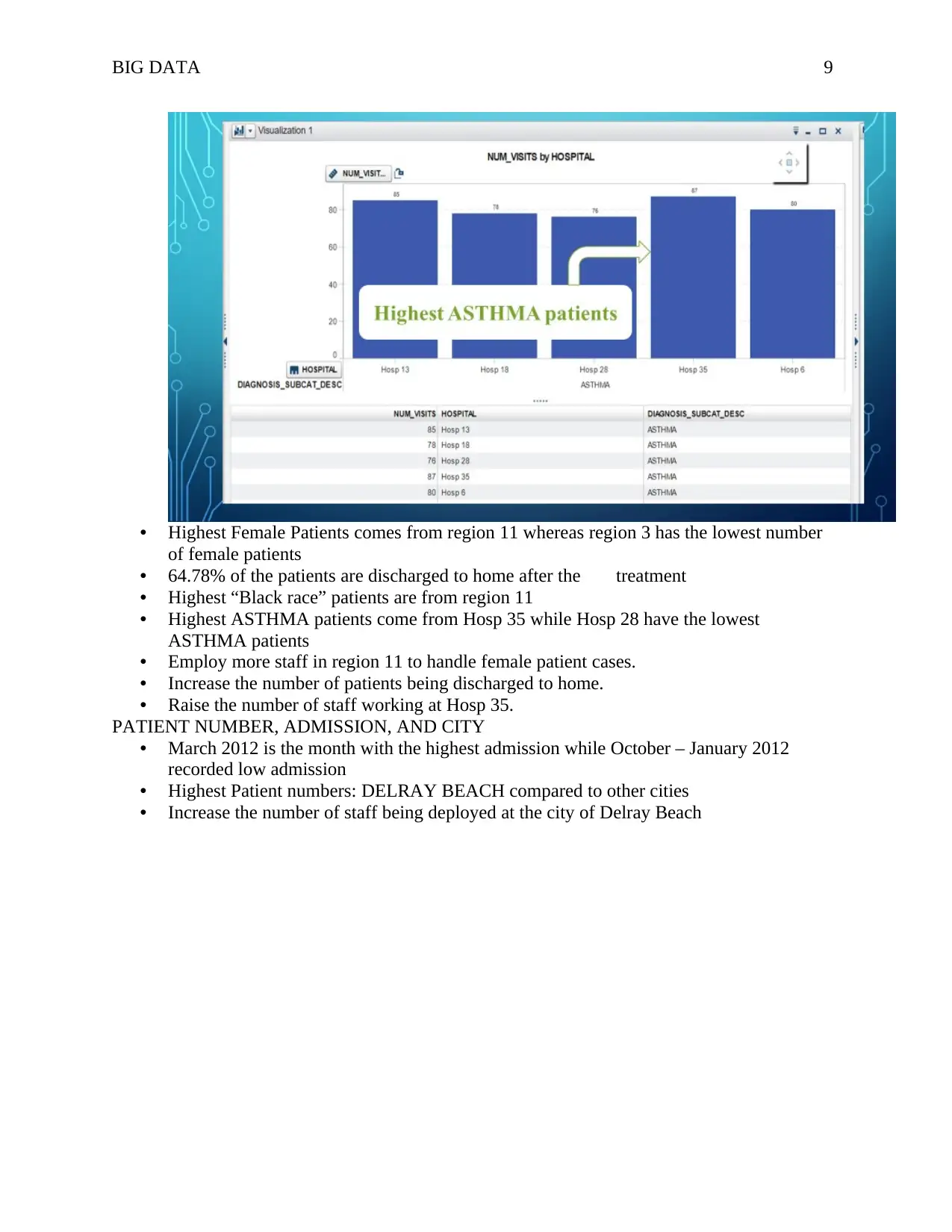
• Highest ASTHMA patients come from Hosp 35 while Hosp 28 have the lowest
ASTHMA patients
• Employ more staff in region 11 to handle female patient cases.
• Increase the number of patients being discharged to home.
• Raise the number of staff working at Hosp 35.
PATIENT NUMBER, ADMISSION, AND CITY
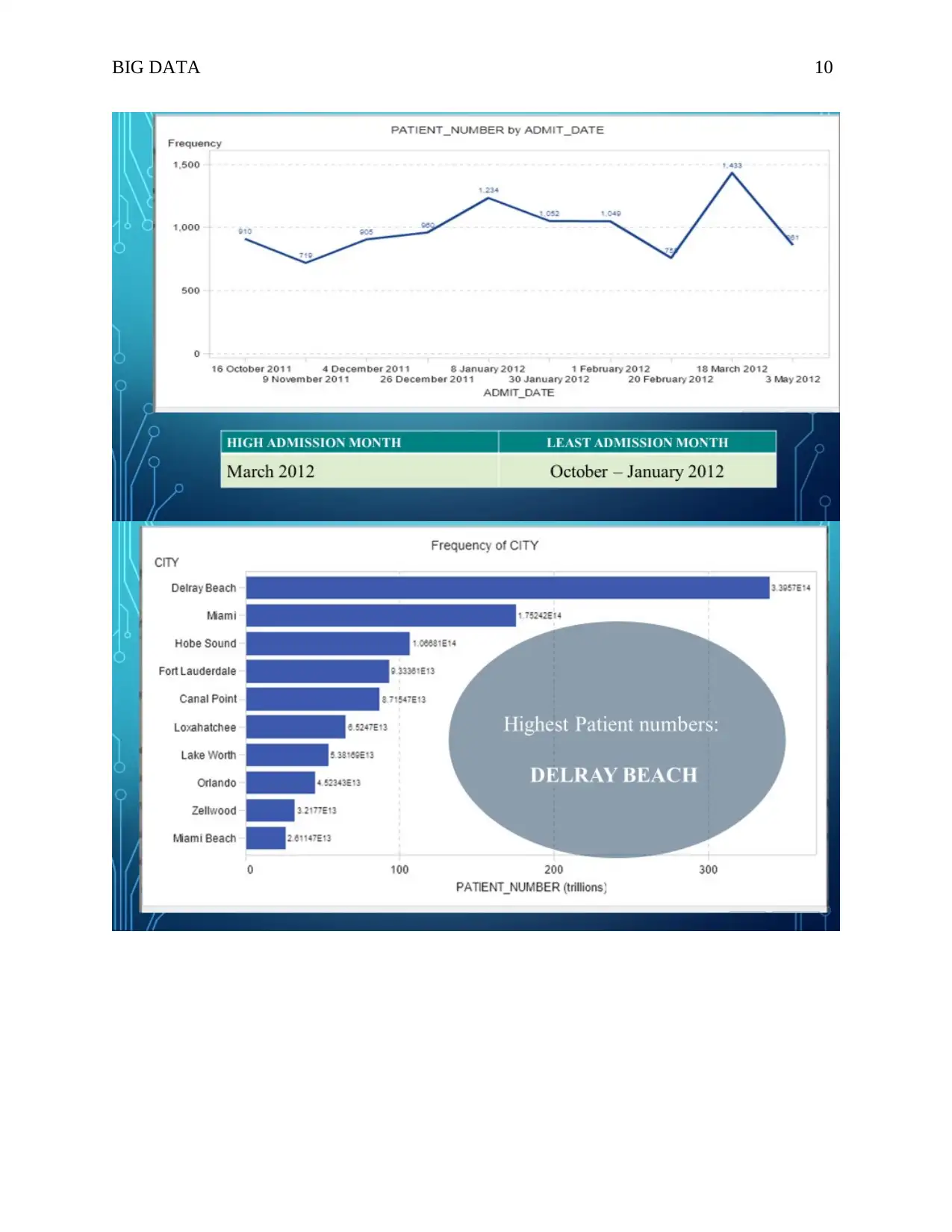
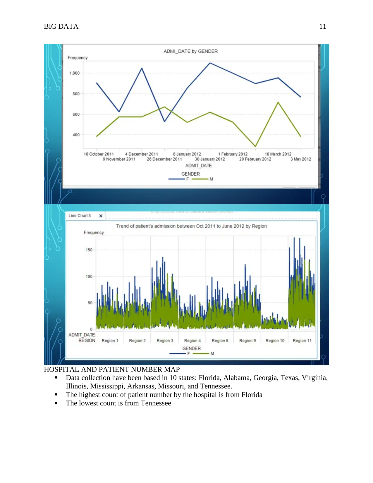
• March 2012 is the month with the highest admission while October – January 2012
recorded low admission
• Highest Patient numbers: DELRAY BEACH compared to other cities
• Increase the number of staff being deployed at the city of Delray Beach
BIG DATA 10
Paraphrase This Document
Need a fresh take? Get an instant paraphrase of this document with our AI Paraphraser
BIG DATA 11
HOSPITAL AND PATIENT NUMBER MAP
Data collection have been based in 10 states: Florida, Alabama, Georgia, Texas, Virginia,
Illinois, Mississippi, Arkansas, Missouri, and Tennessee.
The highest count of patient number by the hospital is from Florida
The lowest count is from Tennessee
HOSPITAL AND PATIENT NUMBER MAP
Data collection have been based in 10 states: Florida, Alabama, Georgia, Texas, Virginia,
Illinois, Mississippi, Arkansas, Missouri, and Tennessee.
The highest count of patient number by the hospital is from Florida
The lowest count is from Tennessee
BIG DATA 12
Task 3: Additional Visualizations
TREND, DIAGNOSIS AND PATIENTS NUMBER BY ADMISSION DATE
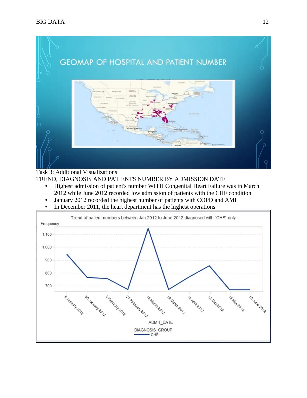
• Highest admission of patient's number WITH Congenital Heart Failure was in March
2012 while June 2012 recorded low admission of patients with the CHF condition
• January 2012 recorded the highest number of patients with COPD and AMI
• In December 2011, the heart department has the highest operations
BIG DATA 13
More females are suffering from COPD
More males are suffered from CHF
More females are suffering from COPD
More males are suffered from CHF
Secure Best Marks with AI Grader
Need help grading? Try our AI Grader for instant feedback on your assignments.
BIG DATA 14
In COPD, diagnosis group with the highest frequency of admission date occurred
between Dec 2011 and Jan 2012.
In addition, highest diagnosis group with the highest frequency admission among AMI
occurred in Feb 2012.
In COPD, diagnosis group with the highest frequency of admission date occurred
between Dec 2011 and Jan 2012.
In addition, highest diagnosis group with the highest frequency admission among AMI
occurred in Feb 2012.
BIG DATA 15
Moreover, CHF ighest frequency of admission occurred between March and April 2012.
Additionally, Heart departments have the highest operation count of about 60000 and
above followed by General medicine at 21000 operation counts.
Moreover, CHF ighest frequency of admission occurred between March and April 2012.
Additionally, Heart departments have the highest operation count of about 60000 and
above followed by General medicine at 21000 operation counts.
BIG DATA 16
Females are more likely to experience higher frequency of admission than their male
counterparts.
Females are more likely to experience higher frequency of admission than their male
counterparts.
Paraphrase This Document
Need a fresh take? Get an instant paraphrase of this document with our AI Paraphraser
BIG DATA 17
Dashboard
Dashboard
BIG DATA 18
Task 4: Justification of Horizontal graphs
In general, a horizontal graph, and a bar graph are some of the data visualizations used. This is
because of their ability to help in categorizing variables of interest by showing frequencies
distribution of the variable.
In these graphs, at least numerical numbers of different categories can be illustrated within the
graph and can be read and interpreted easily by any viewer of the results. Moreover, the graphs
in one way or the other have the ability to give summaries that can be easily interpreted by just
having a glance at the results, (Dobbs, 2018).
Basically, tabular formatting may not give better results since it is difficult to understand the
display more so if there are several table columns. However, the horizontal, and bar charts give
better visualization which can easily be understood by anybody without necessarily requiring
them to have basic analytics skills. Additionally, the accuracy level of horizontal graphs is at par
compared to tables. This is since it can be verified if the calculations are right or not specifically
while arranging the bars in ascending order, levels of accuracy are automatically detected.
Majority of the organizations have continued to use horizontal graphs, line graphs and bar charts
to display results in a simple but very informative manner than can be understood by any staff
within the organization. On the same note, organizations like health department which deals
BIG DATA 19
with big datasets continue to use these graphs to display various dashboards for easy decision
making by the management despite the fact that the managers may not have a statistical
knowledge to understand and interpret the results.
Task 5: Discussions
The number of ICU DAYS in Acute Myocardial Infarction (AMI) among male patients are high
as compared to their female counterparts, These days need to be reduced by learning how female
counterparts are copying up and lessons learned scaled up to other settings. In addition, there is a
need to train more doctors specializing in Congestive Heart Failure (CHF) to respond to the
patient’s health needs. In Congestive Heart Failure (CHF), Heart failure is the most popular;
about 92% while Disorders of Fluid Electrolyte is the least popular at about 0.1%. This implies
that majority of the citizens in US suffer from Congestive Heart Failure (CHF) than any other
condition. As a result, this condition needs specialized treatment and more awareness and
sensitization to be done to the population in general.
Furthermore, in Acute Myocardial Infarction (AMI), Pneumonia Organism Unspecified; 80.6%
is the most popular while Bronchopneumonia; 0.24% is the least popular while in Chronic
Obstructive Pulmonary Disease (COPD), Chronic Bronchitis is the leading group.
Line Graphs
Secure Best Marks with AI Grader
Need help grading? Try our AI Grader for instant feedback on your assignments.
BIG DATA 20
Task 4: Justification of line graphs
In general, line graphs, are some of the data visualizations used. This is because of their ability to
help in categorizing variables of interest by showing frequencies distribution of the variable.
In these graphs, at least numerical numbers of different categories can be illustrated within the
graph and can be read and interpreted easily by any viewer of the results. Moreover, the graphs
in one way or the other can give summaries that can be easily interpreted by just having a glance
at the results, (Dobbs, 2018).
Basically, tabular formatting may not give better results since it is difficult to understand the
display more so if there are several table columns. However, the line graphs give better
visualization which can easily be understood by anybody without necessarily requiring them to
have basic analytics skills.
Majority of the organizations have continued to use line graphs to display results in a simple but
very informative manner than can be understood by any staff within the organization. On the
same note, organizations like health department which deals with big datasets continue to use
these graphs to display various dashboards for easy decision making by the management despite
the fact that the managers may not have a statistical knowledge to understand and interpret the
results.
Task 5.1: Discussions
The department of heart has so many clients compared to other departments. This implies that
Heart department needs to have more doctors with specializations in CHF. Reduce the number of
doctors from the Neurosciences department and the Highest Female Patients comes from region
11 whereas region 3 has the lowest number of female patients. In addition, 64.78% of the
patients are discharged to home after the treatment. Additionally, highest ASTHMA patients
come from Hosp 35 while Hosp 28 have the lowest ASTHMA patients which confirm that Hosp
28 is likely to be a predisposing factor of ASTHMA. Employ more staff in region 11 to handle
female patient cases.
Task 6: Executive Summary
The data explored is on the public health care facilities department with a specific focus on the
facility type, services, facility name, location among others. General data visualization used
include; a horizontal graph, maps, a bar graph, and a dashboard have been used. In Congestive
Heart Failure (CHF), Heart failure is the most popular; about 92% while Disorders of Fluid
Electrolyte is the least popular at about 0.1%. Reduce ICU DAYS in Acute Myocardial
Infarction (AMI) especially among male patients. Train more doctors specializing in Congestive
Heart Failure (CHF) to respond to the patient’s health needs. Need to benchmark in other regions
with low levels of Congestive Heart Failure (CHF) Like region 1 to come up with lessons
learned while addressing these cases in regions with high levels of Congestive Heart Failure
(CHF). In Acute Myocardial Infarction (AMI), Pneumonia Organism Unspecified; 80.6% is the
most popular while Bronchopneumonia; 0.24% is the least popular. In Chronic Obstructive
Pulmonary Disease (COPD), Chronic Bronchitis is the leading group. Neurosciences have the
least number of patients. Highest Female Patients comes from region 11 whereas region 3 has the
lowest number of female patients and 64.78% of the patients are discharged to home after the
treatment. Highest “Black race” patients are from region 11. Highest ASTHMA patients come
from Hosp 35 while Hosp 28 have the lowest ASTHMA patients. March 2012 is the month with
BIG DATA 21
the highest admission while October – January 2012 recorded low admission. Highest Patient
numbers: DELRAY BEACH compared to other cities. Data collection have been based in 10
states: Florida, Alabama, Georgia, Texas, Virginia, Illinois, Mississippi, Arkansas, Missouri, and
Tennessee. The highest count of patient number by the hospital is from Florida. The lowest count
is from Tennessee
Task 7: The Reflection (Individual Task)
Organizations including from health departments have continued to collect big datasets that need
quick interpretations by just looking at the data visualizations, (Singh, Mishra, & Sahana, 2019).
On the same note, data visualizations play an important role in understanding general trends
within the dataset, (Marr, 2016). Despite several befits associated with data visualizations, some
challenges have been witnessed while using data visualizations, (Williams, 2016) including;
As much as there were some challenges, every team member made it possible to see that these
challenges are identified and dealt with appropriately. For example, filtering options were
identified to help in dropping cases with missing values as well as displaying only the required
results.
Data velocity has been affected by the generation of big datasets hence affecting its utilization by
the organizations since results may take several minutes to load into the visualizations,
(Manogaran, et, al, 2017). It has remained a challenge for the organizations to make effective
decisions at the same time utilizing big datasets since it takes time to generate results, (Lee,
2017).
In addition, datasets are either semi or unstructured affects different techniques of data
visualizations since they need to be reformatted to fit into the data visualization of interest and
this takes time, (Kim, Pugh, & Kunen, 2018).
Data demand use is a challenge that affects data quality and timeliness of the information that is
needed by the organizations to make decisions, (Cai, & Zhu, 2015). On this note, due to its huge
nature of the data collected daily, its availability takes time while loading into the system and
this affects the timeliness and availability of ready information from data while making
decisions. Moreover, the identification of valuable insights from a big dataset has also remained
a challenge.
On lessons, while using the SAS visual analytics include the facts that it gives findings that have
deep insights that can support processes involving decision making despite being time-
consuming. This is possible because SAS analytical visualization gives various techniques that
can be employed while doing analytical reasoning to make decisions.
Furthermore, this system provides an opportunity to simultaneously understand information with
large amounts of observations by giving visual representations and interaction techniques like
graphs and maps which can easily be interpreted by all professionals especially those with
interest on the same issues.
Additionally, the SAS analytical visualization makes it easy to support various results produced,
presented and disseminated in a clear and logical way to different types of audiences. Finally,
BIG DATA 22
through SAS analytical visualization, various hidden patterns within the dataset can easily be
discovered.
Conclusion
In conclusion, Acute Myocardial Infarction (AMI) and Congestive Heart Failure (CHF) were
highly diagnosed in region 10 and 11. Congestive Heart Failure (CHF) is the most popular
disease. In addition, Heart Failure has been identified as the most popular diseases while
disorders of disease electrolyte have been identified as the least popular disease. In addition,
Pneumonia Organism Unspecifiedis the most popular disease under Acute Myocardial Infarction
(AMI) while Bronchopneumonia is the least popular disease. Furthermore, Pneumonia Organism
Unspecified and Chronic Bronchitis are the most popular diseases affecting the US general
populations. Highest admission of patient's number is in March 2012 while October – January
2012 recorded low admission. DELRAY BEACH had highest Patient numbers compared to
other cities. Data collection have been based in 10 states: Florida, Alabama, Georgia, Texas,
Virginia, Illinois, Mississippi, Arkansas, Missouri, and Tennessee. The highest count of patient
number by the hospital is from Florida while the lowest count is from Tennessee.
Paraphrase This Document
Need a fresh take? Get an instant paraphrase of this document with our AI Paraphraser
BIG DATA 23
References
Cai, L., & Zhu, Y. (2015). The challenges of data quality and data quality assessment in the big
data era. Data science journal, 14.
Dobbs, D, "Rational functions whose graphs intersect their horizontal asymptotes.". in Far East
Journal of Mathematical Education, 17, 2018, 133-162.
Halpin, K, E Paprocki, & R McDonough, "Utilizing health information technology to improve
the recognition and management of the life-threatening adrenal crisis in the pediatric
emergency department: medical alert identification in the 21st century.". in Journal of
Pediatric Endocrinology and Metabolism, 32, 2019, 513-518.
Hepworth, K, & C Canon, "Improving Science Students’ Data Visualizations: A STEAM-Based
Approach.". in Dialectic, 2, 2018.
Jendrol', S, & M Kle????, "On graphs whose line graphs have crossing number one.". in Journal
of Graph Theory, 37, 2001, 181-188.
Kim, J., Pugh, W., & Kunen, I. (2018). U.S. Patent Application No. 15/701,392.
Lee, I. (2017). Big data: Dimensions, evolution, impacts, and challenges. Business
Horizons, 60(3), 293-303.
Manogaran, G., Thota, C., Lopez, D., Vijayakumar, V., Abbas, K. M., & Sundarsekar, R. (2017).
Big data knowledge system in healthcare. In the Internet of things and big data technologies
for next-generation healthcare (pp. 133-157). Springer, Cham.
Marr, B. (2016). Big data in practice: how 45 successful companies used big data analytics to
deliver extraordinary results. John Wiley & Sons.
O'Dowd, A, "Social care can reduce demand on hospitals for end of life care.". in BMJ, 345,
2012, e6951-e6951.
Singh, D., Mishra, M., & Sahana, S. (2019). Big-Data-Based Techniques for Predictive
Intelligence. In Predictive Intelligence Using Big Data and the Internet of Things (pp. 1-18).
IGI Global.
Williams, S. (2016). Data Visualizations Break Down Knowledge Barriers in Public
Engagement (pp. 165-197). The MIT Press, Cambridge, MA.
Yang, Y, N Li, & Y Zhang, "Networked Data Mining Based on Social Network Visualizations.".
in Journal of Software, 19, 2008, 1980-1994.
BIG DATA 24
Appendices
Some of the questions identified and needed response include;
Guided Questions
1. GROUP TASK: Create a data dictionary for the data source by the group.
2. What are the average number of ICU days with respect to diagnose group and gender?
3. For each region, what is most and least common diagnosis group?
4. For each diagnosis group, which is most and least popular disease?
5. What are top 5 departments with respect to number of patients?
6. What are top 3 regions with respect to female patient numbers?
7. What are top 5 places where patients are discharged?
8. What are top 3 regions with respect to “black” race?
9. What are the top 5 hospitals with respect to Asthma patients’ number of visits?
10. What are the active and inactive months in terms of admission for both male and female
patients? 11. What are top 3 regions with respect to average days spend in hospital? Hint- You
need to create a measure to calculate number of days spend in hospital
12. What are top 10 cities with respect to number of patients?
13. What is the trend of number of patient’s admission from October 2011 to June 2012 with
respect to region for both male and female? Hint- You need to use filter for the dates
14. Display only the most and least popular month in question 9 at a time.
15. What is the trend of patient numbers between Jan 2012 to June 2012 diagnosed with “CHF”
only?
16. What is the trend of different diagnose group over the months? 17. What are top 5
departments in terms of number of operations and how these operations vary across months?
18. What are the most appropriate predictors of heart disease? Hint- use decision tree
19. Create a geomap of the Hospitals and patient number.
20. Create a cluster analysis on patient related data.
1 out of 24
Your All-in-One AI-Powered Toolkit for Academic Success.
+13062052269
info@desklib.com
Available 24*7 on WhatsApp / Email
Unlock your academic potential
© 2024 | Zucol Services PVT LTD | All rights reserved.