Interface Design Report: Local Farm Shop Website - University Project
VerifiedAdded on 2021/04/21
|17
|1134
|23
Report
AI Summary
This report focuses on the interface design for a local farm shop website, presenting two distinct design options with accompanying wireframes. The designs cover key functionalities such as homepages, login/signup, product browsing, checkout processes, and restaurant booking features. The report includes detailed descriptions of each design, highlighting their advantages and disadvantages concerning usability and design principles. A comparative analysis is provided, leading to the selection of the first design, justified by its efficient homepage, navigation, and overall user experience. The report concludes by emphasizing the importance of user interface design and wireframes in website development, with a focus on customer-centric design for product search and purchase.
Running head: INTERFACE DESIGN
Local Farm Shop Website Interface Designs
Student Name:
University Name:
Local Farm Shop Website Interface Designs
Student Name:
University Name:
Paraphrase This Document
Need a fresh take? Get an instant paraphrase of this document with our AI Paraphraser
1INTERFACE DESIGN
Table of Contents
Overview..........................................................................................................................................2
Design 1...........................................................................................................................................2
Design 2...........................................................................................................................................8
Selection of design.........................................................................................................................15
Bibliography..................................................................................................................................16
2INTERFACE DESIGN
Overview
The report provides the information about the website implementation of the Mountain
Artistic Co-operative. The wireframe design for the website implementation have been
developed. Two alternative designs for the development have been provided among which the
client would be selecting one design for the implementation.
Design 1
Home
⊘ This is a preview!⊘
Do you want full access?
Subscribe today to unlock all pages.

Trusted by 1+ million students worldwide
3INTERFACE DESIGN
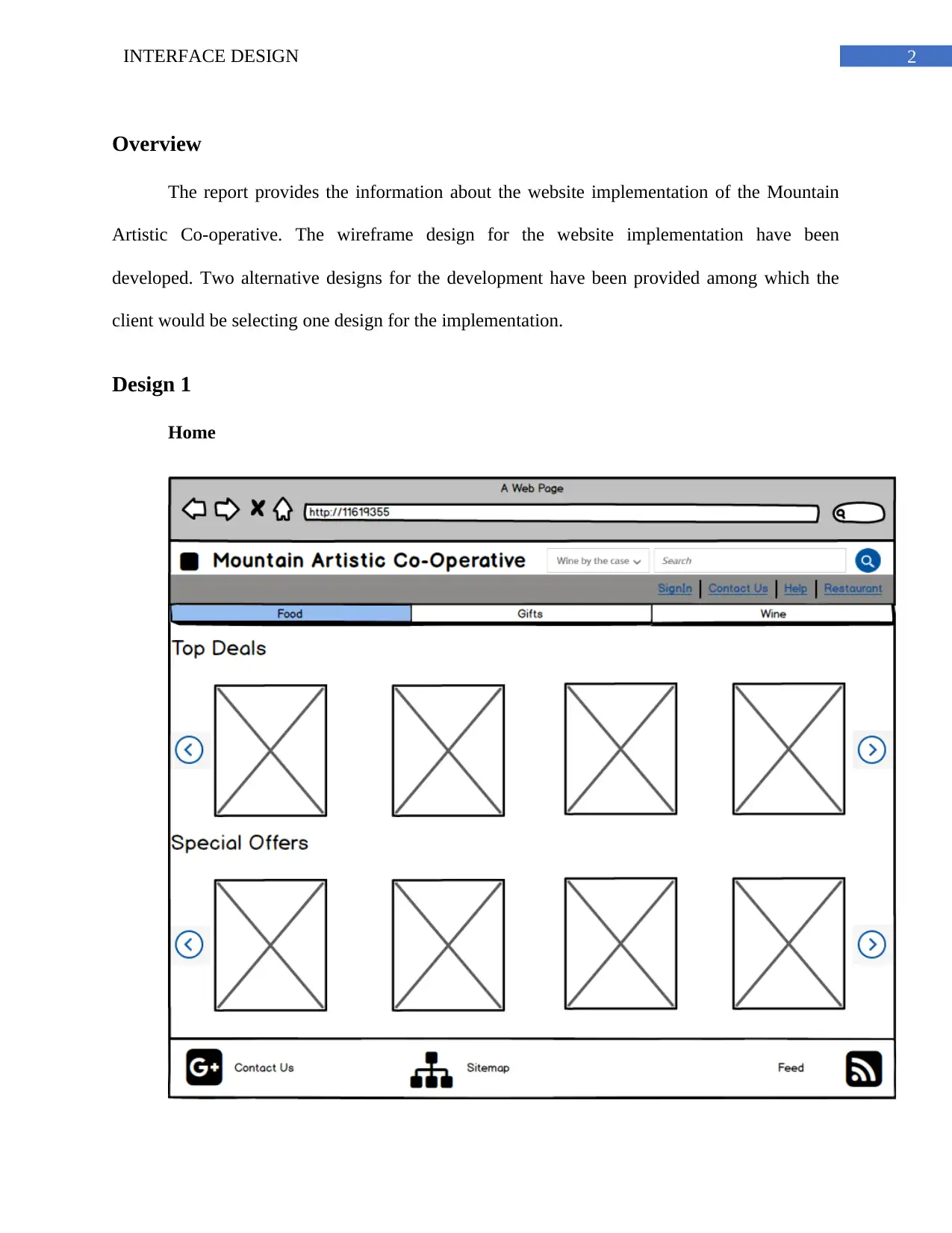
Figure 1: Home page for the website
(Source: Created by Author)
The homepage contains the information about the products. The products are categories
into food, wine and gifts. In addition to this, the products are sorted as top deals and special
offers.
Login
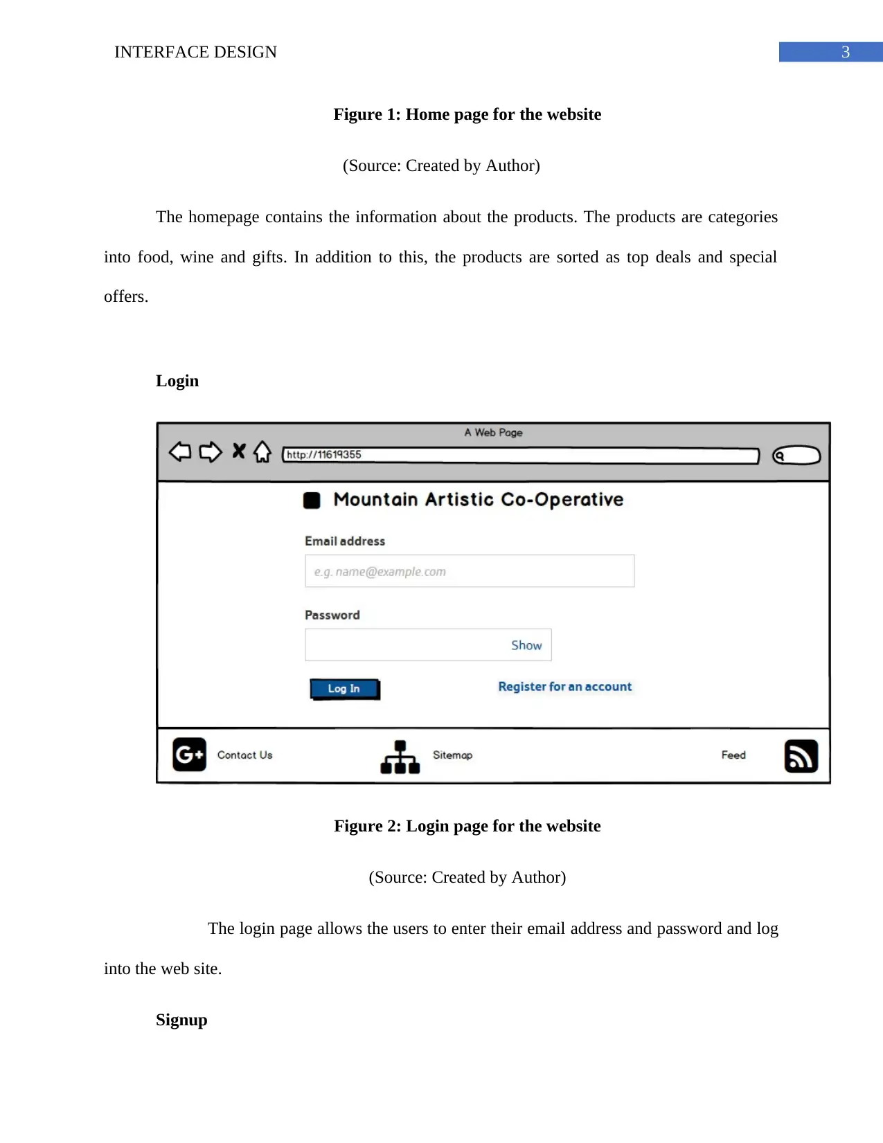
Figure 2: Login page for the website
(Source: Created by Author)
The login page allows the users to enter their email address and password and log
into the web site.
Signup
Paraphrase This Document
Need a fresh take? Get an instant paraphrase of this document with our AI Paraphraser
4INTERFACE DESIGN
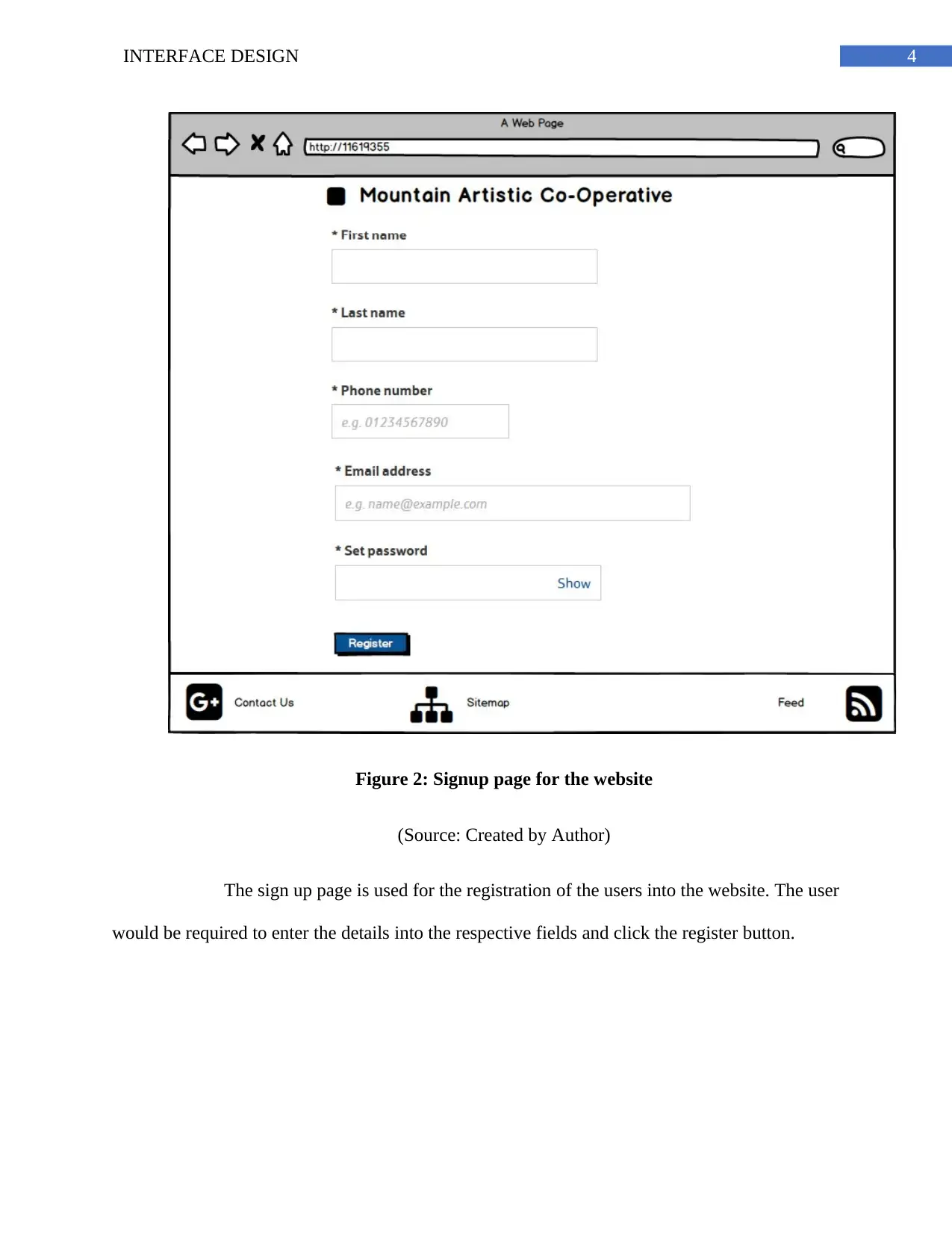
Figure 2: Signup page for the website
(Source: Created by Author)
The sign up page is used for the registration of the users into the website. The user
would be required to enter the details into the respective fields and click the register button.
Figure 2: Signup page for the website
(Source: Created by Author)
The sign up page is used for the registration of the users into the website. The user
would be required to enter the details into the respective fields and click the register button.
5INTERFACE DESIGN
Products
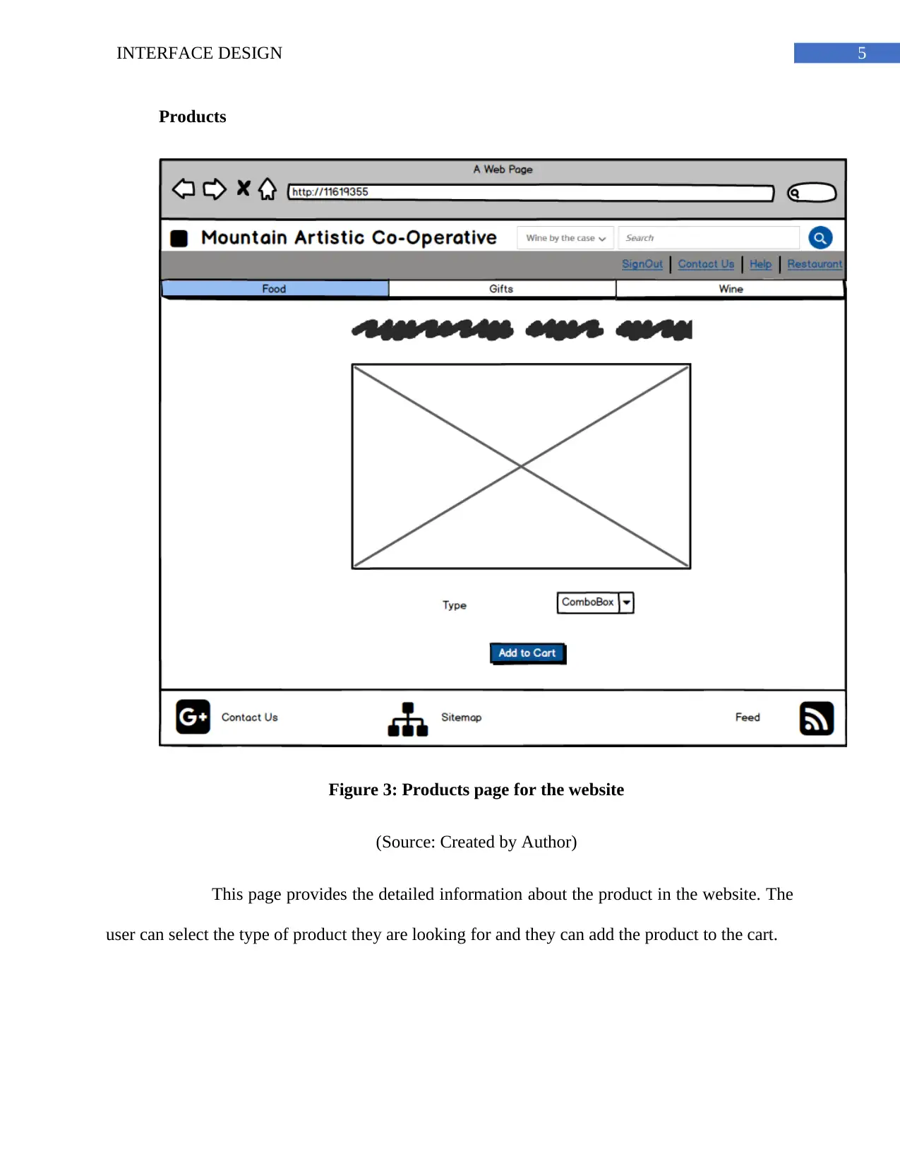
Figure 3: Products page for the website
(Source: Created by Author)
This page provides the detailed information about the product in the website. The
user can select the type of product they are looking for and they can add the product to the cart.
Products
Figure 3: Products page for the website
(Source: Created by Author)
This page provides the detailed information about the product in the website. The
user can select the type of product they are looking for and they can add the product to the cart.
⊘ This is a preview!⊘
Do you want full access?
Subscribe today to unlock all pages.

Trusted by 1+ million students worldwide
6INTERFACE DESIGN
Checkout
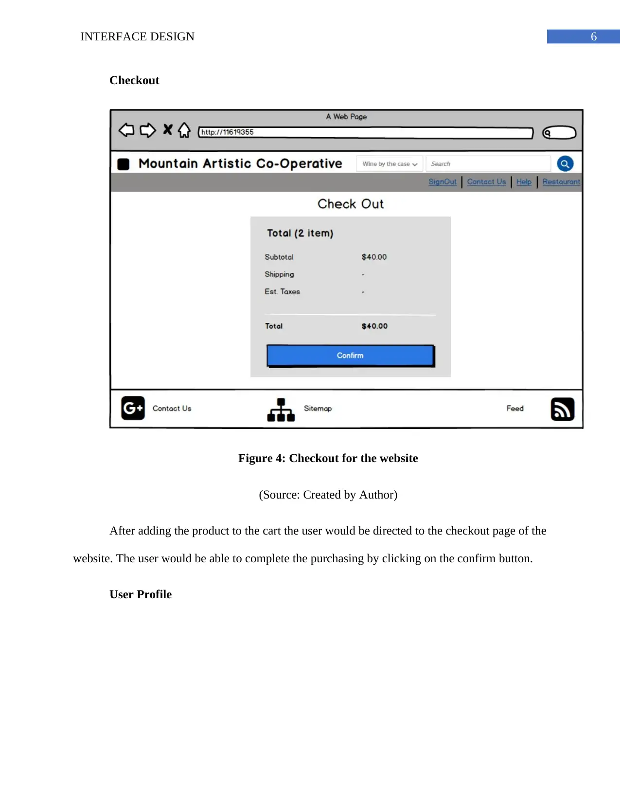
Figure 4: Checkout for the website
(Source: Created by Author)
After adding the product to the cart the user would be directed to the checkout page of the
website. The user would be able to complete the purchasing by clicking on the confirm button.
User Profile
Checkout
Figure 4: Checkout for the website
(Source: Created by Author)
After adding the product to the cart the user would be directed to the checkout page of the
website. The user would be able to complete the purchasing by clicking on the confirm button.
User Profile
Paraphrase This Document
Need a fresh take? Get an instant paraphrase of this document with our AI Paraphraser
7INTERFACE DESIGN
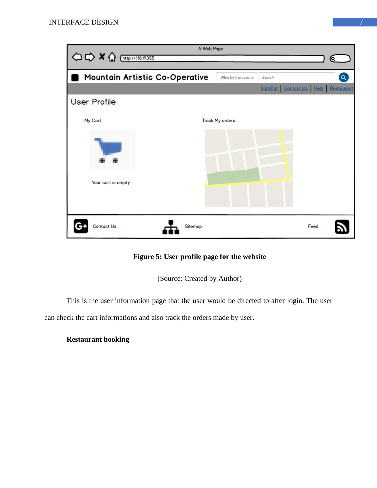
Figure 5: User profile page for the website
(Source: Created by Author)
This is the user information page that the user would be directed to after login. The user
can check the cart informations and also track the orders made by user.
Restaurant booking
Figure 5: User profile page for the website
(Source: Created by Author)
This is the user information page that the user would be directed to after login. The user
can check the cart informations and also track the orders made by user.
Restaurant booking
8INTERFACE DESIGN
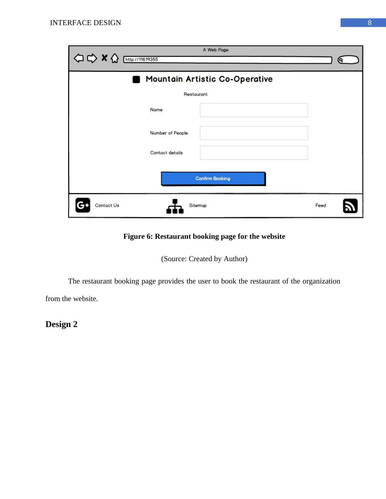
Figure 6: Restaurant booking page for the website
(Source: Created by Author)
The restaurant booking page provides the user to book the restaurant of the organization
from the website.
Design 2
Figure 6: Restaurant booking page for the website
(Source: Created by Author)
The restaurant booking page provides the user to book the restaurant of the organization
from the website.
Design 2
⊘ This is a preview!⊘
Do you want full access?
Subscribe today to unlock all pages.

Trusted by 1+ million students worldwide
9INTERFACE DESIGN
Register/Login
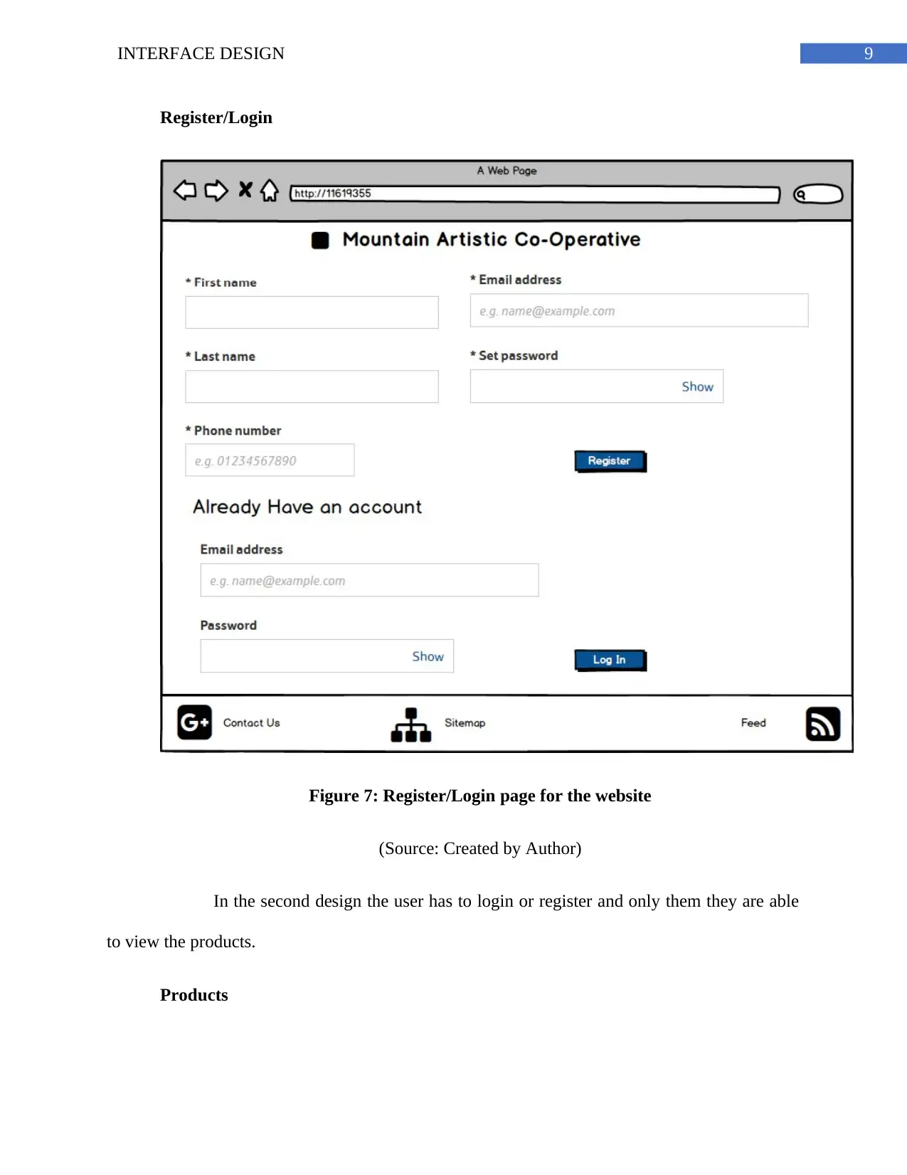
Figure 7: Register/Login page for the website
(Source: Created by Author)
In the second design the user has to login or register and only them they are able
to view the products.
Products
Register/Login
Figure 7: Register/Login page for the website
(Source: Created by Author)
In the second design the user has to login or register and only them they are able
to view the products.
Products
Paraphrase This Document
Need a fresh take? Get an instant paraphrase of this document with our AI Paraphraser
10INTERFACE DESIGN
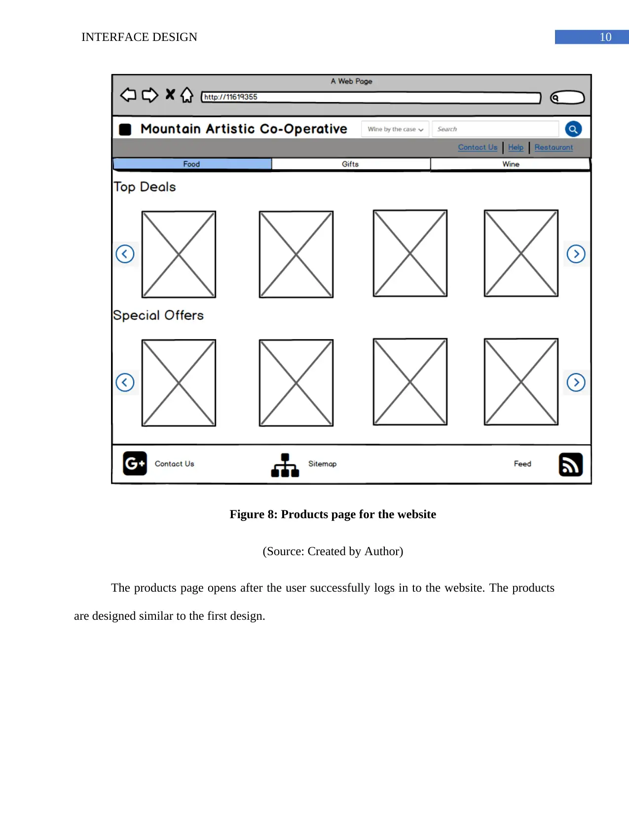
Figure 8: Products page for the website
(Source: Created by Author)
The products page opens after the user successfully logs in to the website. The products
are designed similar to the first design.
Figure 8: Products page for the website
(Source: Created by Author)
The products page opens after the user successfully logs in to the website. The products
are designed similar to the first design.
11INTERFACE DESIGN
Cart
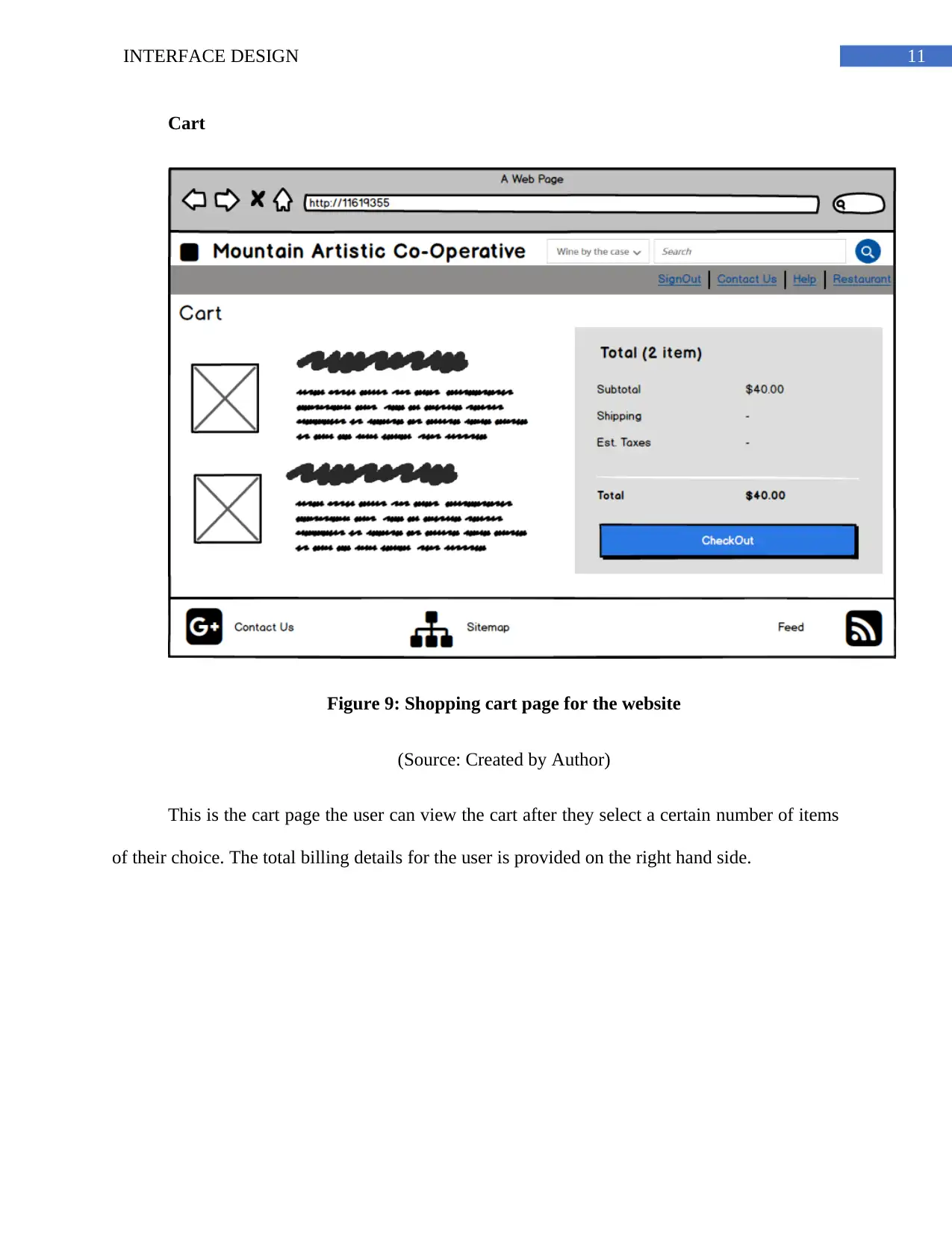
Figure 9: Shopping cart page for the website
(Source: Created by Author)
This is the cart page the user can view the cart after they select a certain number of items
of their choice. The total billing details for the user is provided on the right hand side.
Cart
Figure 9: Shopping cart page for the website
(Source: Created by Author)
This is the cart page the user can view the cart after they select a certain number of items
of their choice. The total billing details for the user is provided on the right hand side.
⊘ This is a preview!⊘
Do you want full access?
Subscribe today to unlock all pages.

Trusted by 1+ million students worldwide
1 out of 17
Related Documents
Your All-in-One AI-Powered Toolkit for Academic Success.
+13062052269
info@desklib.com
Available 24*7 on WhatsApp / Email
![[object Object]](/_next/static/media/star-bottom.7253800d.svg)
Unlock your academic potential
Copyright © 2020–2026 A2Z Services. All Rights Reserved. Developed and managed by ZUCOL.


