User Interface Design and Usability Evaluation Report - iPhone X
VerifiedAdded on 2023/01/20
|25
|3182
|88
Report
AI Summary
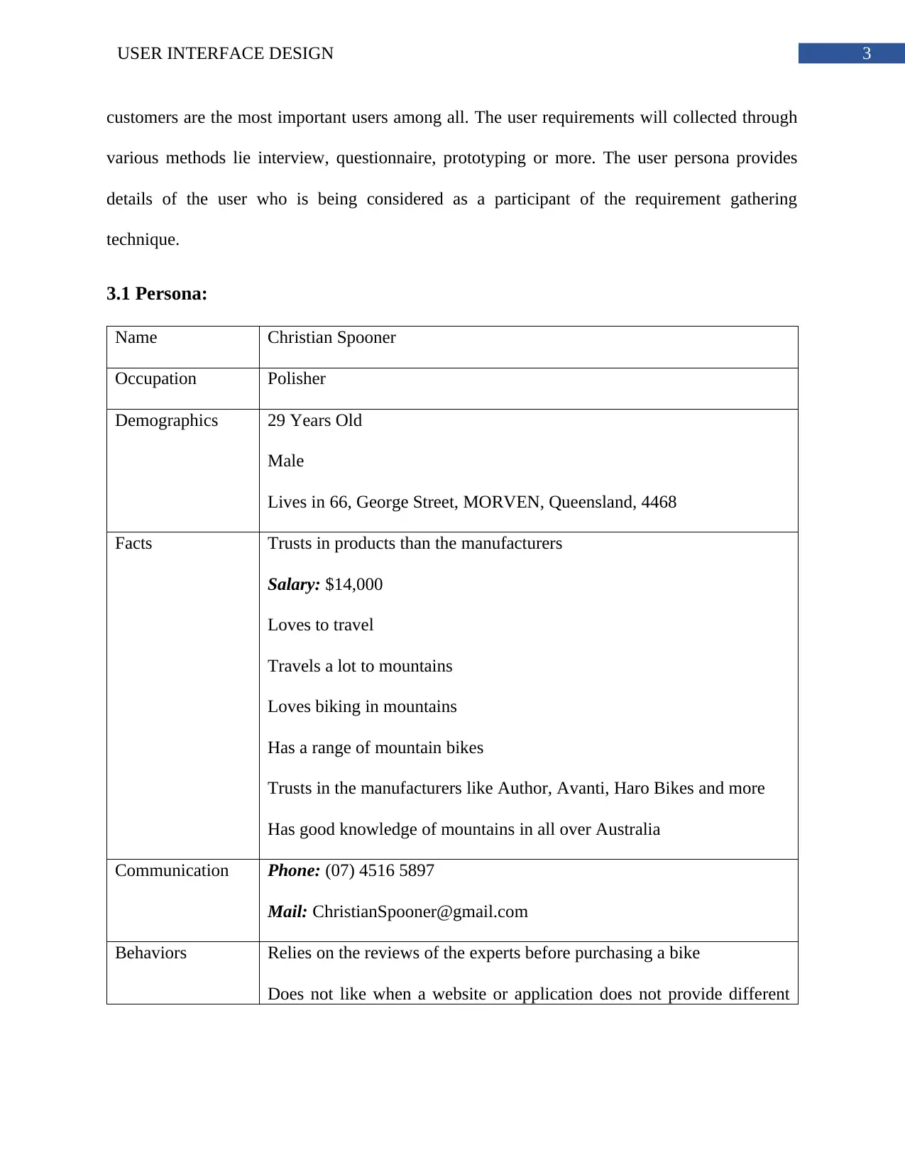
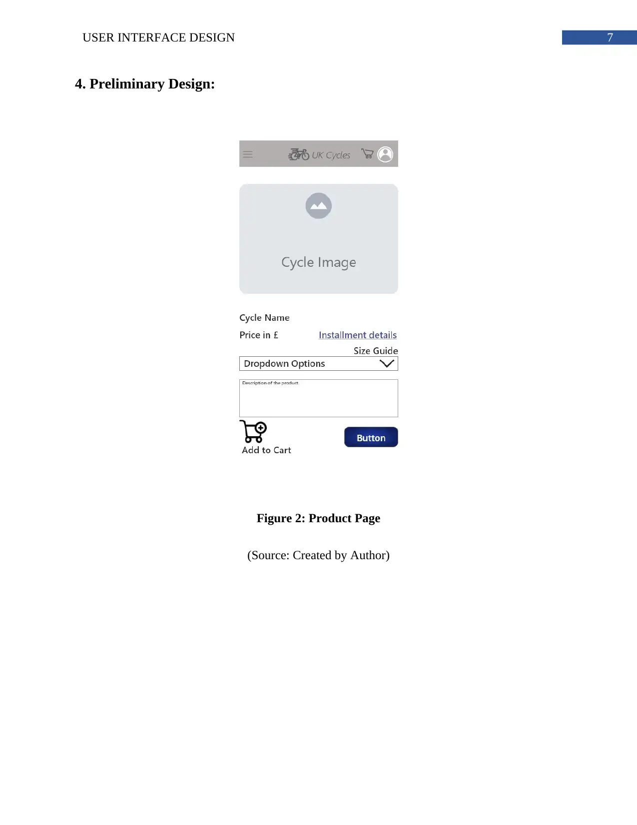
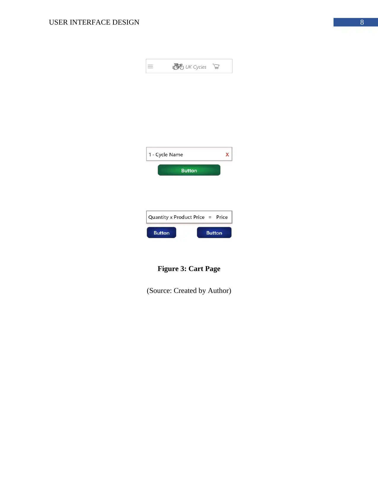
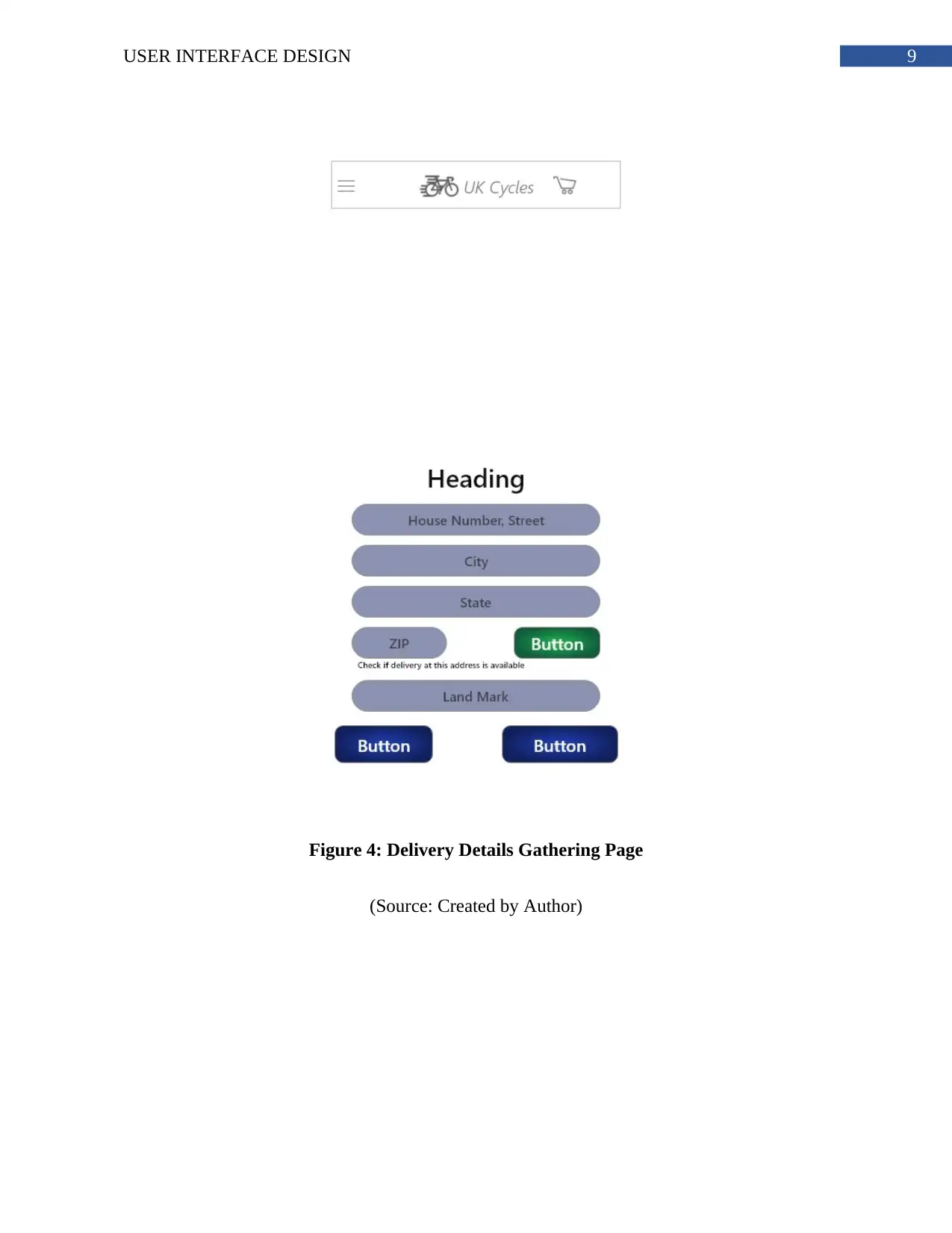
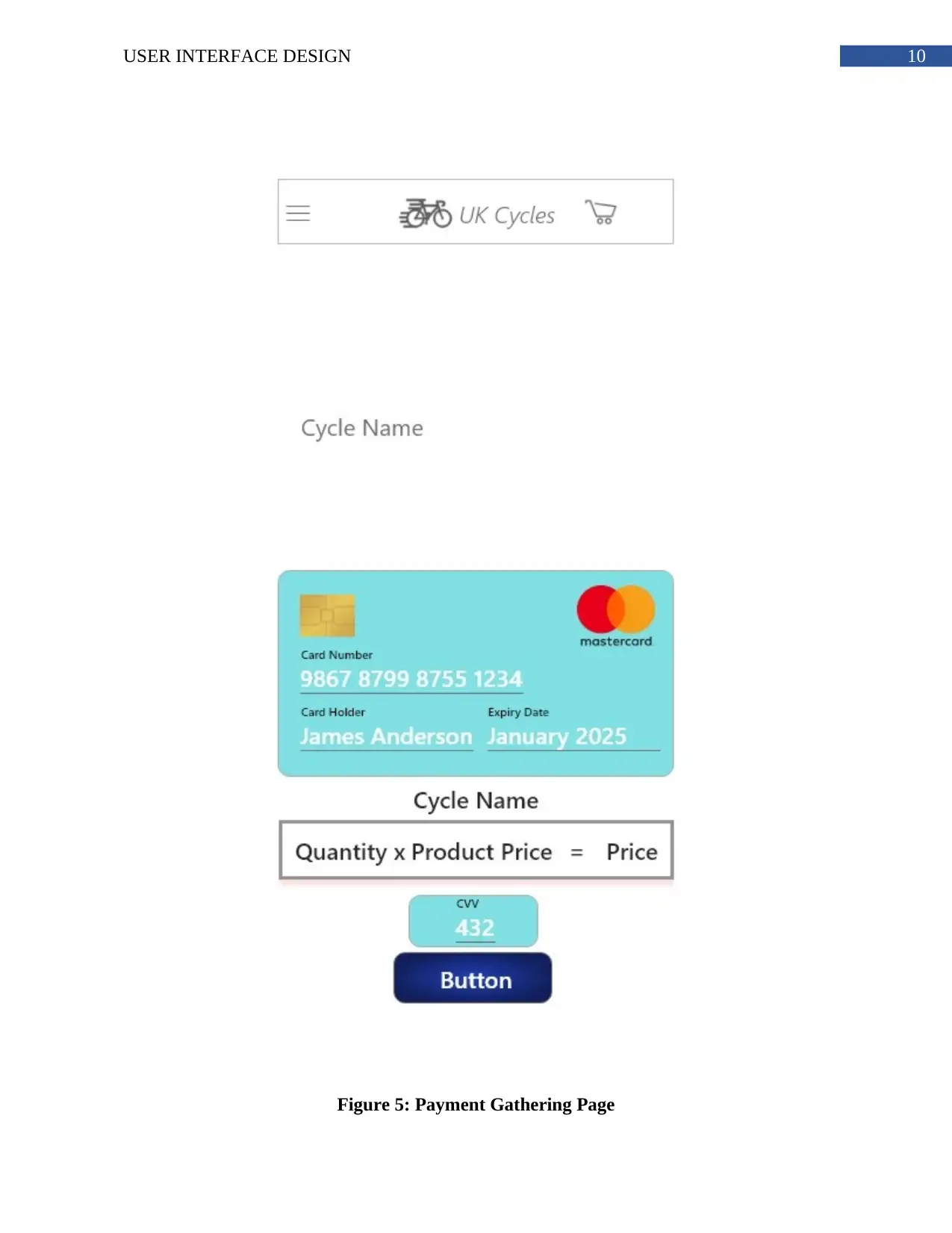
This report delves into the user interface (UI) design and usability evaluation of a mobile application, specifically focusing on an e-commerce platform for purchasing bikes on an iPhone X. The report begins with an introduction, followed by a critical exploration of UI design principles and their impact on user experience. A comprehensive user needs analysis is conducted, including the creation of a detailed persona representing a target user, Christian Spooner, and a scenario outlining his interaction with the application. Furthermore, it incorporates hierarchical task analysis and environmental analysis to understand the user's goals and the context of use. The report proceeds with preliminary and detailed design phases, encompassing storyboards and design decisions related to user needs, usability, and cognitive issues. The implementation section showcases the UI design through screenshots of the product page, cart page, delivery details, and payment pages. Finally, the report concludes with an evaluation of the UI using a cognitive walkthrough, assessing the system's usability and effectiveness in achieving the user's goals.
1 out of 25
Related Documents


Your All-in-One AI-Powered Toolkit for Academic Success.
+13062052269
info@desklib.com
Available 24*7 on WhatsApp / Email
![[object Object]](/_next/static/media/star-bottom.7253800d.svg)
Copyright © 2020–2026 A2Z Services. All Rights Reserved. Developed and managed by ZUCOL.