Effective Visual Communication: Analyzing Layout and Impact Essay
VerifiedAdded on 2023/06/11
|7
|1292
|54
Essay
AI Summary
This essay examines the significance of visual communication in conveying information, comparing a spa brochure and a phone instruction manual to illustrate different approaches. It highlights how the purpose of a document influences the visual elements used, such as color schemes, layouts, and the use of images versus sketches. The analysis emphasizes that while brochures often employ attractive visuals to entice the audience, instruction manuals prioritize clarity and functionality. Ultimately, the essay underscores the importance of tailoring visual communication strategies to suit the specific goals and intended audience of a document, with effective visual communication playing a crucial role in relaying information and achieving the desired impact.
Running Head: VISUAL COMMUNICATION 1
Visual Communication and Layout: A Picture tells a thousand words
Name
Institution
Visual Communication and Layout: A Picture tells a thousand words
Name
Institution
Paraphrase This Document
Need a fresh take? Get an instant paraphrase of this document with our AI Paraphraser
VISUAL COMMUNICATION 2
Visual Communication and Layout: A Picture tells a thousand words
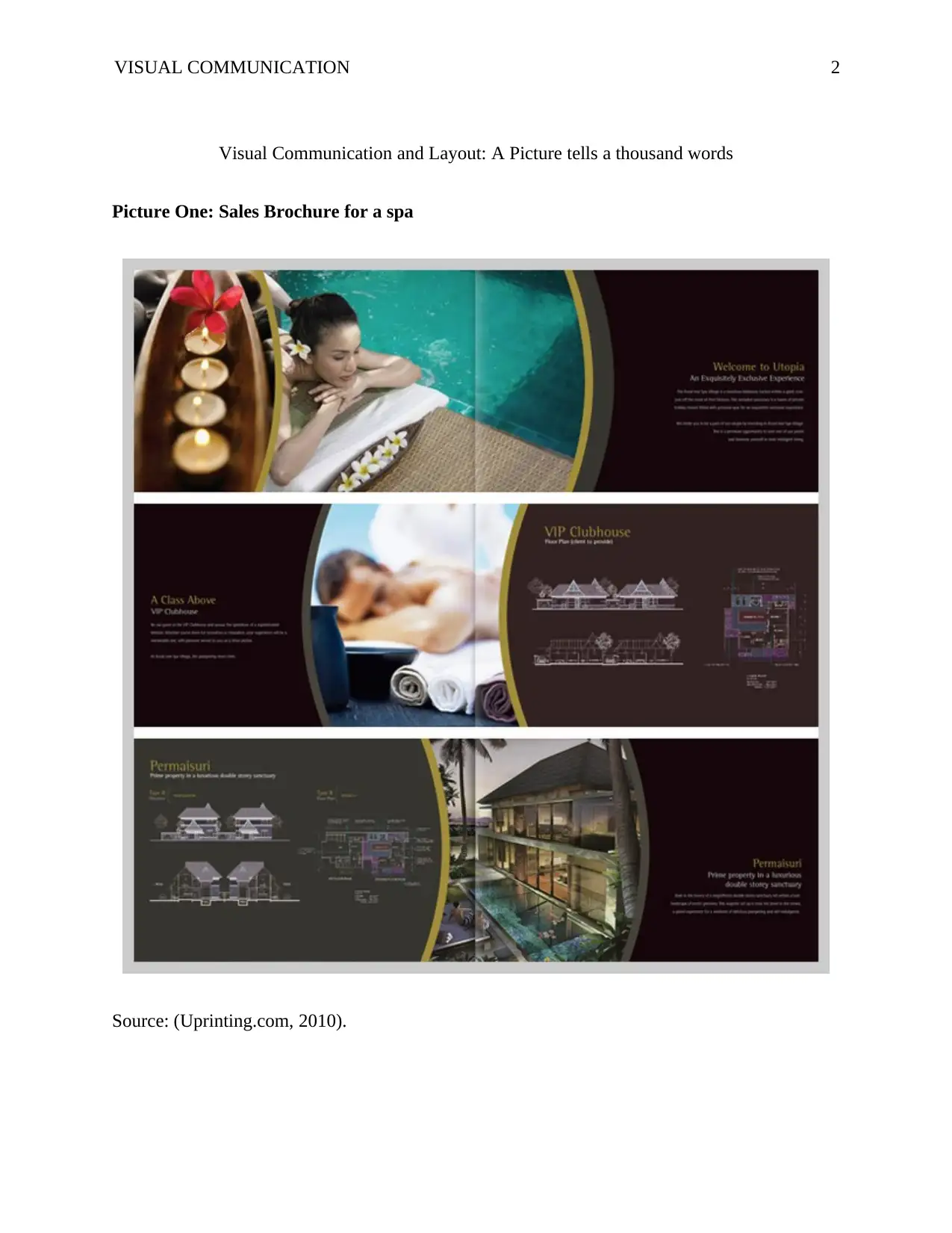
Picture One: Sales Brochure for a spa
Source: (Uprinting.com, 2010).
Visual Communication and Layout: A Picture tells a thousand words
Picture One: Sales Brochure for a spa
Source: (Uprinting.com, 2010).
VISUAL COMMUNICATION 3
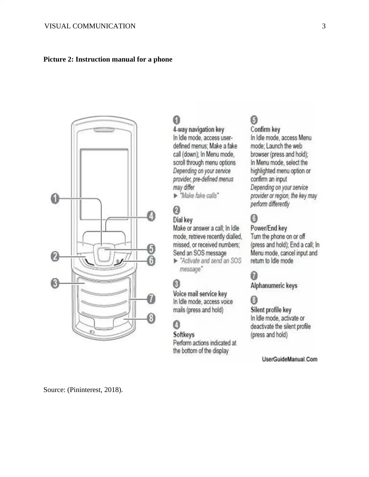
Picture 2: Instruction manual for a phone
Source: (Pininterest, 2018).
Picture 2: Instruction manual for a phone
Source: (Pininterest, 2018).
⊘ This is a preview!⊘
Do you want full access?
Subscribe today to unlock all pages.

Trusted by 1+ million students worldwide
VISUAL COMMUNICATION 4
Visual Communication and Layout: A Picture tells a thousand words
Today, visual communication is one of the most important means of spreading
information. Just as the old adage suggests, a picture is worth a thousand words. Nowadays,
organizations and businesses use strategic visual communication to relay information about the
products they offer with the intention of attracting the intended audience to the message being
passed (Ciotti, 2016). As such, visual communication is very useful as it allows effective
communication, purposeful collaboration, shared clarity when working with groups, and
navigation even in complexity. The importance of visual communication has grown over the
years. Words may be easily forgotten but pictures stay in the minds of the people longer
(Dansereau & Simpson, 2009). Thus, business people strive to integrate visual methods in their
communication to create a lasting impression in the minds of their intended audience. It is,
however, important to note that form of visual communication used within a document by an
organization may vary in size, color, layout, illustrations, and use of picture depending on the
intended purpose of the document.
It is imperative to note that the two pictures above are both important documents. The
first one is a brochure for a spa while the other one is an instruction manual for a mobile phone.
By and large, both documents have utilized the art of visual communication to relay a message to
its intended audience. However, the techniques utilized in communicating the intended
information significantly differ in the two pictures. Mainly, one can attribute this to the fact that
the writers’ purposes for the two images are very different. In the spa brochure, the writer intends
to create a feeling of calmness and the desire to be pampered in their audience’s mind and
thereby attract them to visit the spa for a relaxation session. On the other hand, the writer of the
Paraphrase This Document
Need a fresh take? Get an instant paraphrase of this document with our AI Paraphraser
VISUAL COMMUNICATION 5
instruction manual is only interested in providing directions and information on how to operate
the phone by demonstrating the functions of each button on the phone. Therefore, the fact that
the purpose of the document differs has made the two writers uses different techniques in
relaying their information.
In addition, the colours used in the two documents are very different. Whereas the spa
document has been presented in a very attractive colour scheme, the instruction manual uses no
colour and is very dull. One easily notices that the water blue and maroon colors used in the spa
document are aimed at catching the attention of the reader to the page and the activities being
advertised in the brochure. Additionally, the colors portend and symbolize a cool environment
that is very relaxing and calming. In turn, this attracts the reader who can then be persuaded by
the picture to visit the spa and have the same experience. Contrariwise, the instruction manual
uses a black and white color scheme because it has no intention of attracting the reader. The
writer knows very well that once someone has bought the phone, they would have to read the
manual to know how it operates. For this reason, the writer does not make any effort to entice the
reader with beautiful colors.
Furthermore, the layouts used in both documents are also different. Both layouts are
simple and allow the reader of the information to easily navigate from one side to the other, and
up and down the page. It is worth noting that the spa brochure uses a more creative and attractive
layout that integrates pictures and information. As such, both the pictures and information
written in the document can be easily seen and connected, thereby giving the reader a wonderful
experience while reading the article. In addition, the layout is really attractive and can capture
the attention of the reader and leave a lasting impression in their mind about the product being
VISUAL COMMUNICATION 6
advertised. On the other hand, the instruction manual for the phone uses a plain layout of a
sketch and words placed in an unattractive design. As a result, the reader does not a lasting
impression on their minds after getting the information about how to operate the phone. Thus,
the layout used in a document also plays an important role in visual communication.
Another major contrast in the visual communication used between the two documents is
the use of pictures. One notes that the user manual uses a sketch of a phone and not an actual
picture of the product itself. On the other hand, the spa brochure uses real pictures of people,
hotel, pool and a clubhouse to portray the reality of the product being advertised. When the
reader sees such images, their attention is immediately drawn to the pictures and are enticed to
visit the spa and experience the services being offered at the facility.
All in all, all factors taken into consideration, visual communication play an important
role in relaying information. The complexity or attractiveness of the form of visual
communication used by a writer is often determined by the intention and purpose of the
document. As such, for those documents whose main purpose is to relay instructions from the
manufacturer to the end user of a product, a less attractive form of visual communication is used.
Mainly, this is due to the fact that the document only intends to relay instructions as to how the
gadget functions. On the other hand, for documents that aim at attracting clients, a more
comprehensive and attractive form of visual communication is used. As such, the printer of the
document maximizes on the use of graphics, colour, pictures and layouts to attract the target
audience to the product being advertised. It is, therefore, for this reason that the two documents
differ. As such, the purposes of the documents differ and hence the methods used to relay the
intended information is also different.
⊘ This is a preview!⊘
Do you want full access?
Subscribe today to unlock all pages.

Trusted by 1+ million students worldwide
VISUAL COMMUNICATION 7
References
16 Spa Brochure Design and Print Examples. (2010). UPrinting Blog. Retrieved from
https://www.uprinting.com/blog/16-spa-brochure-design-and-print-examples/
36 Best Instruction Manuals. (2010). Pininterest.com. Retrieved from
https://www.google.com/search?client=firefox-b-
ab&tbm=isch&sa=1&ei=TyQHW4vqHYK8UfmSuZAI&q=instruction+Manual&oq=inst
ruction+Manual&gs_l=img.3...121746.123787.0.124755.12.9.0.0.0.0.0.0..0.0....0...1c.1.6
4.img..12.0.0....0.mGCFVVKStfs#imgrc=gBlnICeBDDjNgM:
Ciotti, G. (2016). Why a Visual Is Worth a Thousand Words. Entrepreneur. Retrieved from
https://www.entrepreneur.com/article/270749
Dansereau, D. F., & Simpson, D. D. (2009). A Picture Is Worth a Thousand Words: The Case
for Graphic Representations. Professional Psychology: Research and Practice, 40(1),
104-110.
1 out of 7
Your All-in-One AI-Powered Toolkit for Academic Success.
+13062052269
info@desklib.com
Available 24*7 on WhatsApp / Email
![[object Object]](/_next/static/media/star-bottom.7253800d.svg)
Unlock your academic potential
Copyright © 2020–2026 A2Z Services. All Rights Reserved. Developed and managed by ZUCOL.
